


















Qingmei Future · Design projects
Built around the actual brief,
across disciplines.
Browse by AI, strategy and positioning, visual and product, and digital, spatial, and service work. Filter by five industries and by domestic or overseas scope.
Search by client
Enter a client or brand name to open the related projects.
Browse the client and brand listNot limited by current case categories
#
A
Alibaba Cloud2 Projects
Anbang Insurance Group2 Projects
Oz2 Projects
B
abalone prince4 Projects
Beijing Academy of Artificial Intelligence2 Projects
BALTAMATICA2 Projects
BYD3 Projects
C
D
Didi Education2 Projects
No. 8, Dongzhimen2 Projects
E
F
G
ICBC / e-ICBC2 Projects
Noble cosmetics2 Projects
H
Haier6 Case Studies
Evergrande Hotel Group2 Projects
Hubei Financial Leasing3 Projects
Huawei4 Projects
I
J
Harvest Wealth2 Projects
Jingzhao Imperial Tea3 Projects
K
L
Lampearl3 Projects
Lenovo6 Case Studies
M
Meituan4 Projects
Mijia2 Projects
N
O
P
Q
R
Sunac2 Projects
Ruige Hot Spring Hotel2 Projects
moisturize beauty2 Projects
S
Sany2 Projects
CSPC Pharmaceutical Group2 Projects
Panasonic3 Projects
Suning4 Projects
SECURTECH3 Projects
T
Tencent5 Case Studies
Tianhe Culture Co., Ltd.2 Projects
Tongrentang3 Projects
V
Versace Bright Crystal2 Projects
W
Wanda Group2 Projects
Vanke2 Projects
NIO4 Projects
X
Xiaomi3 Projects
Ctrip2 Projects
New Channel Education Group2 Projects
Y
Galaxy Financial Holdings3 Projects
Z
Cheung Kong Graduate School of Business2 Projects
Evergreen Capital2 Projects
China Gezhouba Group2 Projects
China Broadcasting Network6 Case Studies
- Logo and visual identityChina Broadcasting and Television (CBN) brand logo design
- Logo and visual identityChina Broadcasting Network Brand Identity
- Logo and visual identityCBN
- Logo and visual identityChina Broadcasting Network
- Logo and visual identityChina Broadcasting Network
- Logo and visual identityRadio and Television 5G is based on the new generation of mobile communication networks and integrates diverse business capabilities such as television, broadband, voice, satellite and mobile communications, and is committed to building a more open, efficient and interconnected digital information service system. The project hopes to demonstrate the brand characteristics of "integrated communications, smart connections" through a new logo system, combine the diverse business capabilities of radio and television with the technological attributes of the 5G era, and transform the brand from a traditional radio and television service image to a modern comprehensive information service brand.
China National Nuclear Corporation4 Projects
China Energy Engineering2 Projects
Ping An2 Projects
Sinopec Conference Center2 Projects
China National Petroleum Corporation3 Projects
CRRC Corporation2 Projects
Sinochem2 Projects
ByteDance2 Projects
No results found. Try an abbreviation or the English name.
Browse All Work ↗Names are based on clients and brands featured in our work. Select a name to view projects, or expand to choose from multiple projects.
All Work
Browse work by capability, core industry, and project scope, or search by describing your needs.

Visual Identity Upgrade
Bank of China Visual Identity Upgrade

Product & Industrial Design
Xiaomi speaker
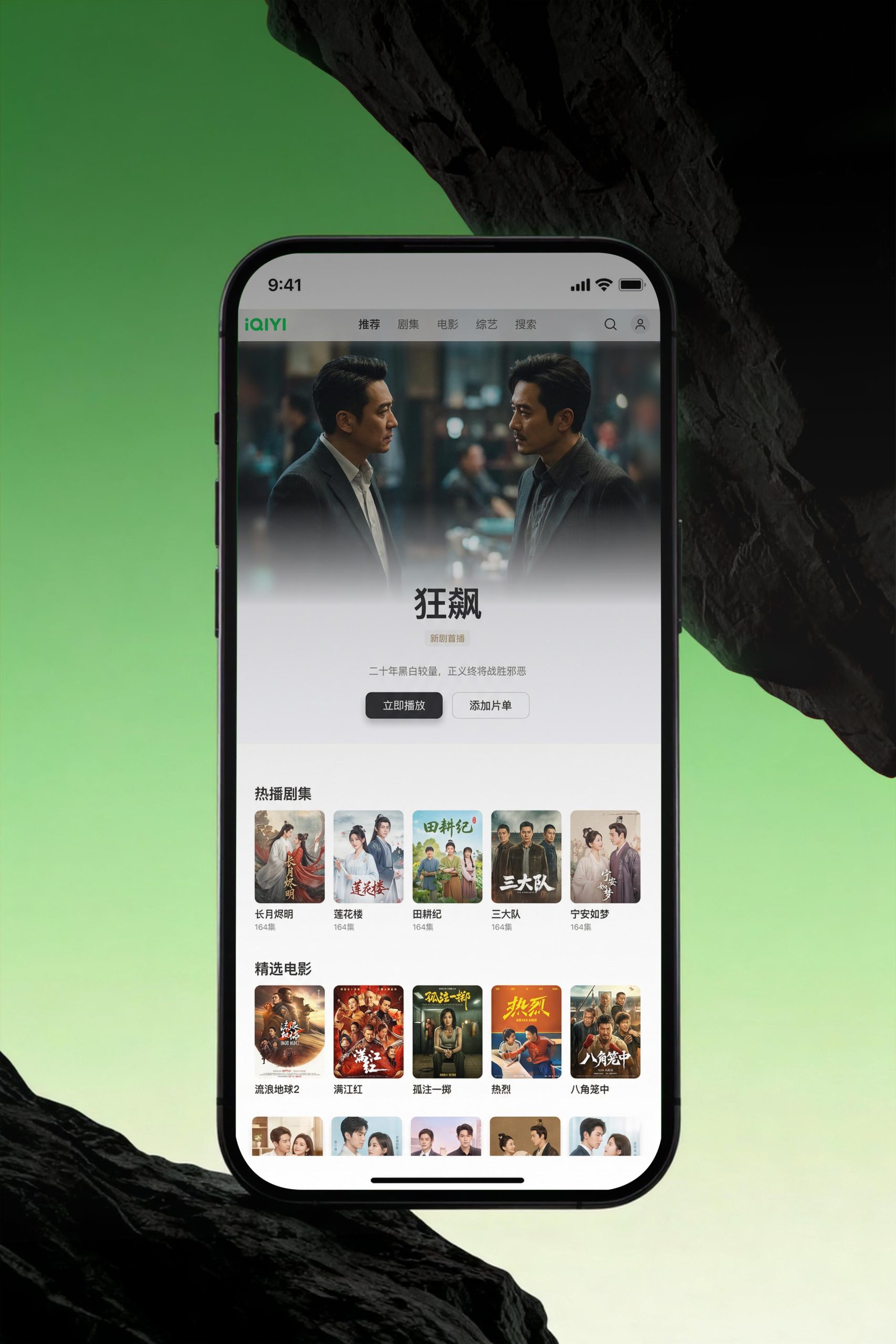
Digital Media & Interaction Design
iQiyi
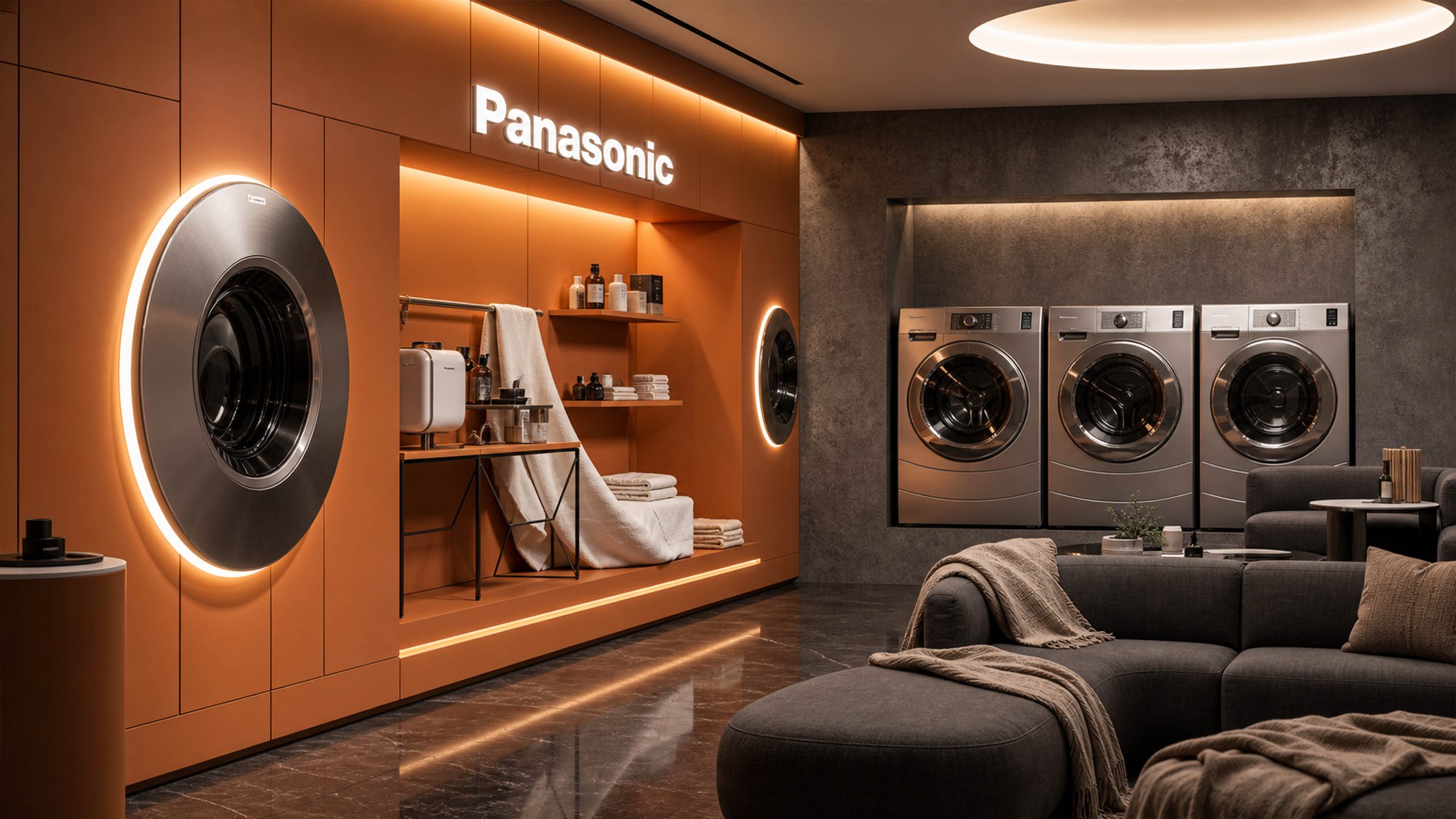
Spatial & Environmental Design
Panasonic

Service & Experience Design
T-SuperFans Club

Strategy & Marketing
terra50km

Visual Communication Design
Tongrentang

Artificial Intelligence
Xiaomi Bluetooth Earbuds

Digital Media & Interaction Design
The Digital Twin Revolution

Spatial & Environmental Design
ICBC Future Finance

Service & Experience Design
The Mixc

Strategy & Marketing
Emotion vs. Function: Optimizing Paid Ads Through A/B Testing

Visual Communication Design
Bubble Mart Brand Manual

Product & Industrial Design
NIO
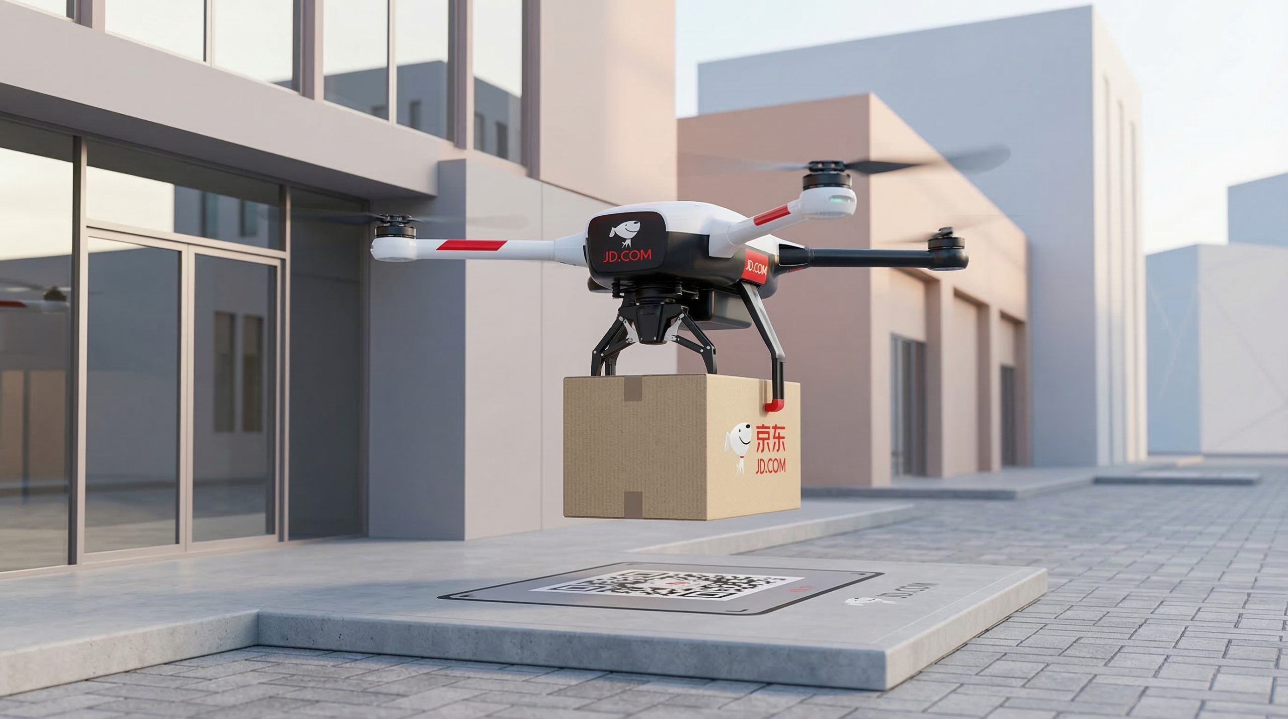
Digital Media & Interaction Design
Future Retail

Spatial & Environmental Design
Innovation Map of China's Leading Digital Enterprises

Artificial Intelligence
Carbon-Neutral Arena

Strategy & Marketing
Suning

Visual Communication Design
Visual Universe: Growing a Xiaohongshu Account Network from 0 to 100K Followers
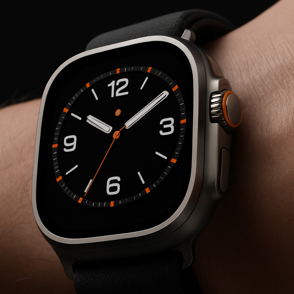
Artificial Intelligence
Huawei Smartwatch

Artificial Intelligence
JD NeoStore

Artificial Intelligence
Huawei

Service & Experience Design
“Reinventing KOCs”

Strategy & Marketing
50km Table
No matching content.
Try adjusting your filters or talk to us about your needs.
Showing 24 / 626
Product & Industrial Design / Research
200 challenges, from problem to solution.
Spanning product definition, human–machine relationships, intelligent interaction and service coordination, organized into 20 research areas. Each challenge sets out the specific problem, a three-step method, deliverables and how results are validated.
Full library: 200 challenges · 20 research areas
Too many features, unclear core value
The product roadmap keeps adding features, yet users struggle to name the main reason to buy.
One product, many user groups
A single specification can't serve professionals, first-time users and operations managers at once.
Procurement needs disconnected from real use
Buyers focus on specs and price; on-site users care about convenience and maintenance.
Technology without a product form
The technical principles and prototypes exist, but clear user scenarios and product boundaries are missing.
Competitive research that stops at appearance
Competitor reviews collect plenty of images but offer little judgment on functional layout or user experience.
Fragmented field insights that are hard to act on
Photos, interviews and feedback are scattered across teams, making them hard to use in design decisions.
One product for very different environments
Indoor, outdoor and mobile conditions vary widely, and the current form isn't adapted to them.
Shifting requirements for a first-generation product
New requirements keep arriving during development, forcing repeated rework of concepts and prototypes.
Public service equipment without field evidence
Equipment is designed mainly around departmental needs, with little research into how the public actually uses it.
Product value that's hard to explain internally
Design, engineering and marketing each describe the product differently, making a shared view hard to reach.
A product range without a shared identity
Each model is designed independently, so users can't tell they belong to the same brand.
Brand positioning and product character out of step
The brand speaks of professionalism and reliability, yet the products look cluttered or frivolous.
No rules for extending the product family
As new products move into different sizes and categories, the original design language becomes hard to carry forward.
Corporate and sub-series identities in conflict
Overlapping colors and logo systems across product series make the hierarchy hard for users to read.
Overcrowded product front faces
Logos, feature callouts and decorative details cluster on the front, weakening the primary control area.
Product identity over-reliant on a large logo
Without the logo, the product lacks distinctive features and series recognition is weak.
Weak differentiation between trim levels
Price tiers differ only in color, so users struggle to see what each configuration offers.
Legacy products that don't bridge to a brand refresh
The new identity system clashes with older models still on sale, creating confusion during the transition.
Product photography that misses the design story
Promotional imagery emphasizes atmosphere while obscuring critical proportions, material qualities, and operational characteristics.
Product semantics lack clarity across cultural markets.
The same color, symbol, or form reads differently across user groups.
Mouse grip tolerance does not account for user variation.
Hand size and grip habits produce markedly different tactile experiences.
Device weight distribution affects operational stability.
Total weight may be acceptable, but actual use reveals forward lean or sustained wrist pressure.
Button placement conflicts with natural motion.
Critical buttons fall outside comfortable reach, forcing users to adjust their grip.
Interactive terminal height fails to accommodate diverse statures.
Standing, seated, and wheelchair users experience different reach zones at the same terminal.
Product operation over-relies on fine motor control.
Dials, clips, and small buttons demand precision; some users cannot complete tasks.
Low-vision users struggle to discern product state.
Small type, low contrast, and color-only indicators compromise status recognition.
Left and right hand experiences diverge.
Openings, buttons, and accessories favor one side; opposite-side users face constraints.
Children and adults share the product.
Scale, operational logic, and supervision method differ; current design makes no distinction.
Extended use offers no postural variation.
Fixed operating height and position limit postural adjustment; users cannot sustain operation.
Gloved operation provides insufficient feedback.
Touch screens and small controls fail in gloved use; confirmation cues are subtle.
Material selection mismatches the use environment.
Material choices prioritize sample appearance; tactile, cleaning, and longevity demands are underweighted.
Supplier color variation becomes apparent.
The same brand color diverges across shells, accessories, and packaging.
Gloss shells readily show visible marks.
Prototypes display brilliantly; daily handling reveals obvious fingerprints and scratches.
Seamed materials create tactile discord.
Different materials form abrupt boundaries at joints, disrupting grip and overall feel.
Color-coded information risks misinterpretation.
Devices use color to distinguish model, status, and function; encoding rules conflict.
Soft-touch material performance destabilizes over time.
Initial tactile comfort may deteriorate after sustained contact and cleaning.
Metal aesthetic and functional layout constrain each other.
Surface pursuit of unbroken metal sacrifices functional openings and interaction zones.
Transparent components expose internal disorder.
Transparency enhances visibility but also exposes unrelated structures and wiring.
Durable products age visually too quickly.
Trendy colors and ornamental detail evolve faster than product lifespan; function persists while appearance dates.
Material samples cannot represent production units.
Small panels behave differently than finished surfaces with actual curvature, texture, and seams.
Aesthetic concept degrades during structural implementation.
Conceptual models ignore internal layout; engineering adjustments distort original proportions.
Seam placement disrupts product order.
Assembly divisions create arbitrary seams, conflicting with outline and operational zones.
Tooling constraints force repeated detail revision.
Styling details miss synchronization with forming methods; surfaces and edges cycle through late adjustments.
Fasteners remain visible, compromising grip and appearance.
Scattered screw positions obstruct grasping, cleaning, and brand recognition.
Assembly direction resists recognition.
Similar parts and accessories install backward; detection relies on operator experience.
Module swaps erode appearance uniformity.
Color and seams drift across batches and configurations; units look fragmented.
Design handoff documentation omits critical intent.
Engineering drawings specify dimensions but not which tactile or formal qualities must endure.
Small-batch trials misrepresent production performance.
Display samples receive manual refinement, masking actual assembly and surface variation.
Multi-variant products repeat development cost.
Similar models lack shared components; each upgrade cycles through redundant design.
Accessory interfaces lack unified layout.
Connector positions shift by model, affecting installation, storage, and user migration.
Device operating state remains inconspicuous.
Standby, active, and completion states show minimal visual shift; users cannot determine next action.
Touch screen and physical controls express conflicting affordances.
The same function uses different names and sequences on screen versus physical controls.
Device error messages fail to guide action
Alerts display only error codes; users don't know how to resume tasks.
First-time use requires repeated reading of instructions
Product entry points and setup sequence unclear; users struggle to start independently.
Critical operations lack adequate confirmation
Appearance and interface fail to distinguish routine operations from critical task-affecting actions.
Multi-device status displays lack unified meaning
The controller, the device, and the service backend describe the same state in different terms.
Long tasks lack progress indication
Users don't know if the device is still executing or when it will finish.
Shared terminals easily retain information from previous users
Data and task state from the previous user affect the next user.
Audio feedback disrupts others in public environments
Identical notification sounds repeat continuously across contexts and tasks without adaptation.
Software upgrades change established operating habits
After interface updates, key operation entry points migrate; experienced users struggle to complete tasks.
Robot intent difficult for on-site personnel to understand
When robots stop or move, nearby people don't understand their task or next action.
Robot form factor misaligned with usage scenarios
Home, office, and commercial scenarios differ in scale and intimacy; appearance is one-size-fits-all.
Robot access port mismatched with user actions
Users must bend, detour, or make multiple attempts to retrieve or place items.
Robot item delivery lacks completion confirmation
No clear handoff information between arrival, retrieval, and task completion.
Robot takeover entry insufficiently clear
When manual assistance is needed, on-site personnel can't find help or takeover methods.
Robot maintenance surfaces mixed with public operation surfaces
Maintenance ports and public operation entries are adjacent, causing accidental contact and confusion.
Robot shell cleaning process inconvenient
Complex seams and decorative structures increase cleaning work for operations staff.
Multiple robots difficult to distinguish quickly
Identical appearance causes task device confusion; on-site dispatch relies on software lists.
Robot service uncoordinated with spatial circulation
Robot docking, public queuing, and staff passage mutually occupy space.
Robot demonstration disconnected from real task understanding
Demos emphasize movement effects; clients struggle to judge how the product participates in work.
Drone on-site deployment steps complex
After transport to site, accessory organization, airframe deployment, and inspection sequence lack structure.
Drone transport case space utilization unreasonable
Equipment and accessories scattered; difficult to verify completeness after transport.
Drone ground control interface overloaded
Massive data displayed simultaneously; operator struggles to quickly identify task-critical information.
Drone accessory connection direction unclear
Battery, payload, or mount connection relies on experience to judge position and orientation.
Drone multi-mission payloads lack unified identification
Different payloads look similar; on-site personnel struggle to confirm purpose and configuration.
Drone maintenance inspection materials difficult to use
Materials lengthy and inconsistent with on-site inspection sequence.
Drone portable ground station deployment inconvenient
Display, control, and accessories occupy multiple cases; difficult to organize field workstation.
Drone product appearance fails to convey professional use
Consumer and professional models lack clear differentiation; clients struggle to understand task positioning.
Drone mission deliverable handoff information incomplete
After device task completion, material delivery status and responsible party unclear.
Low-altitude equipment display lacks scale reference
Display imagery emphasizes airframe; users struggle to judge transport, operation, and site requirements.
Charging equipment entry information unclear
Upon arrival, users struggle to distinguish device status, port type, and operation start point.
Charging cable storage affects user experience
Cable extraction, dragging, and return require extra effort; storage state unclear.
Outdoor equipment interface reading conditions insufficient
Sunlight, rain, and night conditions alter interface visibility; alerts difficult to identify.
Charging equipment model and port labeling chaotic
Users unclear on correspondence among device name, port number, and operation screen.
Charging equipment maintenance access affects neatness
Maintenance surfaces, seams, and public operation surfaces mixed; appearance order unclear.
Fragmented wayfinding at charging sites
Guidance breaks down between the road entrance, parking bays and charging equipment.
Insufficient guidance after charging
Users are unsure of the sequence for finishing charging, paying, stowing the cable and leaving.
Technical information about energy equipment is difficult to explain to the public
Equipment functions are complex, and on-site promotional content is not clearly distinguished from operating instructions.
Inconsistent equipment branding across sites
Differences in suppliers and settings lead to inconsistent equipment appearance, numbering and guidance.
Energy storage displays struggle to communicate value
Technical data is abundant, but users struggle to connect equipment capabilities with everyday tasks.
Overly complex navigation on vehicle screens
As more functions are added, users must frequently switch between tasks.
Poor coordination between cockpit screens and physical controls
The same function appears in multiple places, making it difficult for users to develop consistent operating habits.
In-vehicle interfaces lack clear distinctions between user roles
Controls for drivers, passengers and fleet managers are combined in a single interface.
Glare makes center-console information difficult to read
Screens and trim surfaces interfere with visibility under different lighting conditions and viewing angles.
Confusing QR codes and controls on mobility terminals
Ticketing, charging and service terminals display multiple QR codes and function options at once.
Cabin storage does not accommodate everyday belongings
Phones, cups and small items lack dedicated places and must be moved repeatedly during use.
Unclear equipment status during shared mobility handovers
Previous users, current users and operators interpret equipment status differently.
Vehicle accessories lack consistent identification and storage
Accessories come in different formats, making it difficult to identify their purpose, installation points and storage requirements.
Vehicle handover materials overwhelm users
Handover instructions present too many features at once, making essential first-day tasks difficult to remember.
Inconsistent brand experiences across mobility touchpoints
Equipment, apps, sites and service staff communicate differently, disrupting continuity across the experience.
Keyboard layouts fail to support different tasks
Office work, creative work and specialist tasks require different keys and shortcuts.
Extra mouse buttons are easy to press accidentally
Side buttons overlap with grip support areas, causing users to trigger unintended functions while moving the mouse.
Poor port layout on desktop docks
Cables obstruct one another, forcing users to move the entire dock to connect or disconnect accessories.
Unclear status indicators on video conferencing equipment
Users cannot confirm microphone, camera and meeting connection status at a glance.
Cumbersome monitor stand adjustment
Height, tilt and desk layout are poorly coordinated, requiring repeated adjustments.
Inadequate storage for styluses and accessories
Styluses, charging accessories and replacement parts are stored separately and are easily left behind when moving between locations.
Office equipment is difficult to access for cleaning and maintenance
Maintenance instructions do not clearly correspond to physical locations on the product, leaving users to rely on experience when cleaning.
Confusing connections between digital devices from different brands
Similar-looking ports make it difficult to assess accessory compatibility and connection status.
Shared office equipment lacks personal settings management
As people take turns using equipment, their settings, accessories and session states interfere with one another.
A disjointed journey from delivery to desk setup
The unpacking sequence does not align with cabling, assembly and the first work task.
Appliance controls do not reflect everyday tasks
Functions are organized by technical system, making routine operations difficult to find.
Complicated network setup for smart home devices
Account setup, network connection and device linking are fragmented, with insufficient status feedback.
Appliance placement overlooks the space needed for use
Design focuses on the appliance itself, overlooking the space needed to open doors, retrieve items and clean.
Scheduled and active appliance states are difficult to distinguish
Scheduling, preparation, operation and completion messages look similar, leading users to misread the current state.
Poor coordination when household members share devices
Individual preferences and usage histories overlap, making handovers unclear.
Confusing filter and consumable replacement
Users cannot identify replacement locations, compatible part models or whether replacement is complete.
Smart speakers lack visible interaction feedback
Users cannot tell whether a voice request went unrecognized or is still being processed.
Overly complex disassembly and reassembly for appliance cleaning
Users repeatedly search for clips, tools and component locations while cleaning.
Home devices struggle to fit different interiors
A single design language cannot suit every home interior or placement.
Cables and accessories create clutter around home devices
Power supplies, charging accessories and connectors take up living space, with no clear place to store them.
The appearance of care and wellbeing products can make users self-conscious
Overly prominent assistive features make users reluctant to use products in everyday settings.
Health service kiosks have confusing workflows
Registration, information confirmation and service completion lack a clear sequence.
Care and wellbeing equipment is not intuitive to adjust
Components are adjustable, but the direction and end position are unclear, leaving users hesitant to make adjustments themselves.
Health device information is too complex
Technical parameters and everyday instructions are mixed together, making it difficult for users to know what to do next.
Care teams lack complete equipment handover records
Across shifts and shared responsibilities, settings and outstanding tasks lack a continuous record.
Care and wellbeing products are difficult to hold and set down
Users need extra assistance to move, set down and pick up devices.
The cleaning and handover status of health service equipment is unclear
Cleaned, ready-for-use and maintenance states are presented too similarly.
Home care products are disconnected from remote services
Device information is not communicated clearly to family members and service providers.
Care and wellbeing product instructions are difficult to read
Dense text, graphics and instructions make information hard to find during use.
Health service spaces and device interfaces use inconsistent terminology
Wayfinding signs, service counter names and device interfaces each use different terms.
Hotel self-service kiosks lack a clear starting point
Check-in, check-out and other service information appear together, leaving guests unsure where to begin.
Hotel equipment feels disconnected from its surroundings
Kiosks, signage and service accessories are sourced separately, creating a fragmented experience.
Queue management systems present information out of sequence
Guidance is fragmented between taking a number, waiting, being called and reaching the service counter.
Food service systems lack clear handoff cues
Ordering, preparation, collection and issue resolution are handled across different devices, leaving customers confused.
Service desk terminals expose too much administrative information
Staff functions and public information appear in the same view, disrupting use and requiring extra explanation.
Commercial equipment struggles to balance mobility and fixed use
Events require mobile deployment, while daily operations demand stable placement and tidy cabling.
Hotel room controls are difficult to understand
Similar labels for lighting, climate control and service buttons leave first-time guests relying on trial and error.
Commercial display terminals fail to connect products with content
Physical presentation, screen content and hands-on experience tell separate stories, making the offer difficult to understand.
Unattended service equipment lacks a clear route to help
When problems arise, users cannot find support, revealing a disconnect between the equipment and the service team.
Multilingual service equipment lacks consistency
Terminology, steps and spatial signage do not align across languages.
Industrial equipment control panels lack a clear hierarchy
Critical controls, settings and maintenance functions are mixed together, obscuring responsibilities.
Tool storage makes task switching difficult
Scattered tools and an illogical retrieval sequence force users to reorganize repeatedly between tasks.
Maintenance documentation is disconnected from the equipment
Maintenance staff must repeatedly cross-reference complex drawings with physical equipment to locate the right components.
Industrial equipment design obscures operating status
The enclosure and interface fail to provide a coherent view of operating information, making status difficult to monitor.
Professional tools are not designed for use with gloves
Gripping, pressing and mode selection do not accommodate the protective gear worn on site.
Equipment exteriors lack clearly organized functional zones
Cooling vents, controls, handling points and maintenance openings are scattered, undermining a coherent design.
Industrial equipment models can only be identified by their nameplates
Differences between models are difficult to distinguish through appearance and connections, creating confusion during on-site maintenance.
Professional equipment is awkward to carry
Handles are poorly coordinated with the equipment's center of gravity and dimensions, forcing users to improvise support points.
Operator training relies on informal knowledge
Training materials are disconnected from hands-on operation, making it difficult for new staff to establish consistent procedures.
Industrial equipment presentations lack business context
Presentations list technical specifications without helping customers understand how the equipment fits into their workflows.
Space education exhibits struggle to explain abstract processes
Visitors see models but do not understand mission sequences or how components relate to one another.
Lunar exploration interactives lack a clear mission narrative
Individual interactive stations tell separate stories, making it difficult for visitors to understand the mission as a whole.
Inconsistent terminology across scientific instrument interfaces
Screens, component labels and operating guides use different names for the same things.
Incomplete handover records for shared laboratory equipment
Equipment condition, accessories and outstanding issues are not clearly recorded between users.
Scientific equipment data displays make interpretation difficult
Dense raw data makes it hard for users to identify and interpret changes relevant to their tasks.
Scientific equipment models lack a clear sense of scale
Display models lack a clear connection to actual operating spaces, making them difficult for visitors to understand.
Laboratory equipment accessories are difficult to identify
Similar accessories lack consistent numbering, so selecting and returning them depends on experience.
Scientific equipment maintenance guides lack clear workflows
Documentation is organized by part, making it difficult for maintenance staff to find where to begin.
Science exhibits struggle to engage visitors of different ages
A single level of detail and mode of interaction cannot serve visitors with different levels of knowledge.
Research showcases lack clear links to practical applications
Presentations focus on technology names, making it difficult for the public and potential partners to understand how the research could be used.
Products are difficult to disassemble and sort by material
Different materials are joined together, requiring complex disassembly for subsequent processing.
Product repairs require too many parts to be replaced
A fault in a small component requires an entire module to be replaced, making maintenance inefficient.
Long-life products lack ways to stay up to date
The core product remains usable, but changes to connections, interfaces or accessories make it obsolete.
Recycling information is difficult to understand
Material names, separation points and recycling options are presented in disconnected places.
Product repair processes lack continuity of information
Users, logistics teams and service staff have different understandings of repair status and accessory requirements.
Rental products are not designed for repeated use
Use, inspection, preparation and redelivery are not planned as a complete cycle.
Complex packaging materials are difficult to separate
Multiple materials become mixed during unpacking, making them difficult for users to sort.
Material substitutions lack a full assessment of the user experience
Alternative materials are compared only on cost and appearance, overlooking feel, maintenance and use.
Products are difficult to track after use
Recycling, reuse and repair records lack a common product identifier.
Sustainability claims lack supporting evidence
Broad promotional language fails to explain specific design measures.
Unpacking and assembly sequences do not align
Essential accessories are buried deep in the packaging, forcing users to search repeatedly.
Packaging protection conflicts with display needs
Protective structures obscure the product, while display structures add to transport and packing demands.
Transport cases lack clear handling guidance
The relationship between handles, wheels and opening direction is unclear, leaving on-site staff unsure how to proceed.
Accessory checks rely on lengthy paper lists
Large numbers of items make it difficult for users to confirm that everything is included and understand what each item is for.
Large products require more unpacking space than users have
Users lack sufficient space to turn and unpack products after delivery.
Packaging graphics fail to explain the product’s purpose
Packaging emphasizes decoration and specifications, making it difficult for users to understand how the product is used.
Packaging does not work across e-commerce shipping and in-store delivery
Separate packaging for shipping and display creates duplicate production and extra handovers.
Packaging lacks clear opening and completion cues
Users are unsure where to open the packaging and which parts to keep.
Post-shipment equipment checks lack guidance
Recipients are unsure how to inspect the equipment’s exterior and check accessories and documentation.
Packaging lacks clear guidance for reuse
Users want to keep the packaging but are unsure how to reuse it for storage and transport.
Product and companion app information architectures are disconnected
Device functions do not align with app navigation, forcing users to search repeatedly for the right controls.
Service staff struggle to understand users’ equipment issues
User descriptions, equipment conditions and service documentation lack consistent points of reference.
Digital product records lack clear version relationships
Drawings, instructions, prototypes and versions currently on sale are used interchangeably.
Accessory selection is not linked to product models
Users struggle to find accessories compatible with their equipment, leading to incorrect purchases.
Software and hardware updates lack clear handovers
Software updates change how products operate, while printed instructions and service documentation fall behind.
Equipment installation lacks standardized task guides
Installers and customers rely on on-site verbal communication, with inconsistent procedures and sign-off.
Product performance feedback fails to inform design iterations
Service teams and designers categorize issues differently, making feedback difficult to translate into improvements.
AI-assisted concepts lack clear design review criteria
AI generates many concepts, but it is difficult to assess whether they meet the brief and brand requirements.
Digital product models fall short as collaboration tools
Models are scattered across files, with no clear link between review comments and versions.
Product and service communications focus only on features
Users know what the equipment offers, but not how to access ongoing support.
Concept reviews rely too heavily on renderings
Flat images conceal issues with scale, tactility and operation, leading to inconsistent review outcomes.
User testing captures only broad satisfaction ratings
Comments such as “easy to use” or “difficult to use” are hard to translate into actionable changes.
Prototype reviews lack interdisciplinary input
Design, engineering, operations and service teams review separately, allowing problems to accumulate downstream.
Design decisions lack a traceable record of trade-offs
The final concept is agreed, but subsequent teams do not know why other options were rejected.
Prototype testing fails to reflect real conditions
Clean demonstration spaces and guided use leave real-world problems undiscovered.
Research samples lack diversity
Testing includes only people familiar with the product, overlooking first-time users and maintenance teams.
Design phases lack clear deliverables and responsibilities
Outputs and responsibilities are unclear across research, concept development, engineering and launch.
Design assets lack consistent naming and filing
Teams struggle to find the correct versions of drawings, models, images and documentation.
Post-launch feedback rarely leads to design reviews
Feedback is used only for isolated repairs, without informing the product definition or design principles.
Interdisciplinary design outcomes are difficult to communicate
Research, form, interaction and service outputs are presented together without making their contributions clear.
No matching topics found. Try different keywords or clear the filters.
Expert collaboration focused on the challenge at hand.
Define the design brief and scope of collaboration around your project context, use cases, and goals.