










The Bird's Nest-National Stadium is an iconic sports building built to coincide with the 2008 Beijing Olympics. It was designed by Swiss architects Herzog & de Meuron. It has become a world-famous architectural masterpiece with its unique steel structure woven appearance. After the Olympic Games, the Bird's Nest has been transformed into a comprehensive large-scale venue integrating culture and sports, fitness shopping, catering and entertainment, and tourism exhibitions, and has become a landmark sports building and a precious Olympic heritage.
In order to further extend the brand value, the Bird's Nest has specially planned to launch an exclusive souvenir series. The most important issue in its brand image design is how to inherit the original cultural value of the Bird's Nest - Olympic spirit, architectural aesthetics and national memory. This time, Qingmei Future was commissioned to lead the souvenir brand logo design.
The design goal of the brand logo is to convey the brand spirit of "Olympic heritage, eternal memory" with a souvenir-exclusive brand image on the basis of inheriting the cultural value of the Bird's Nest architecture.
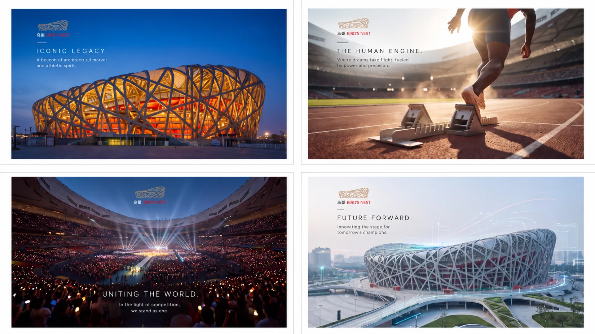
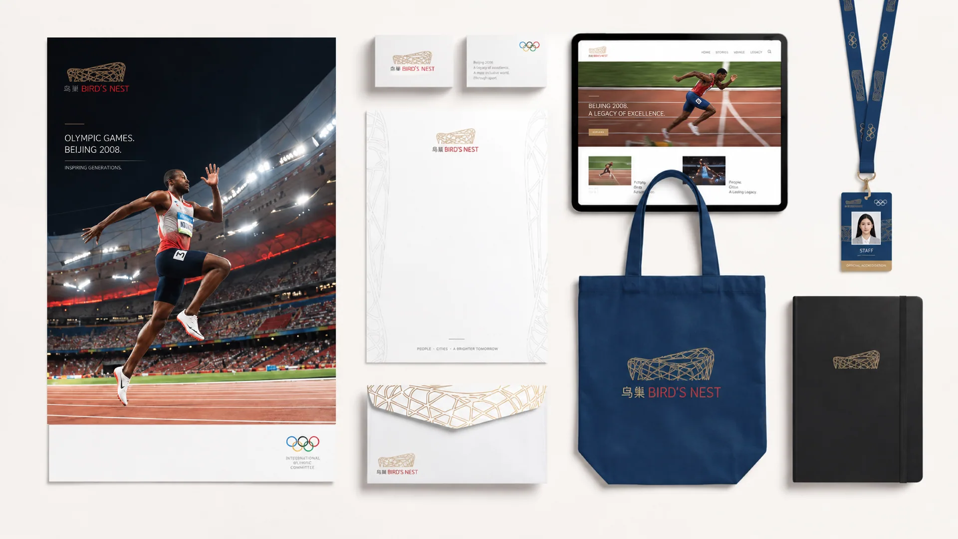
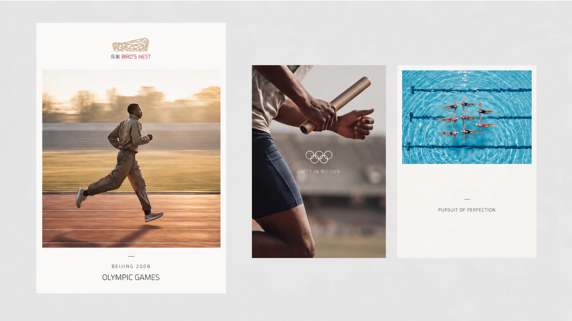
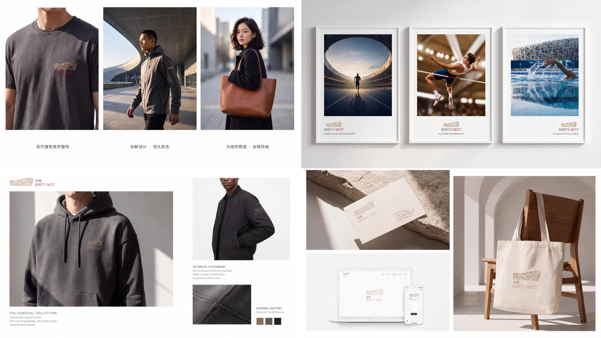
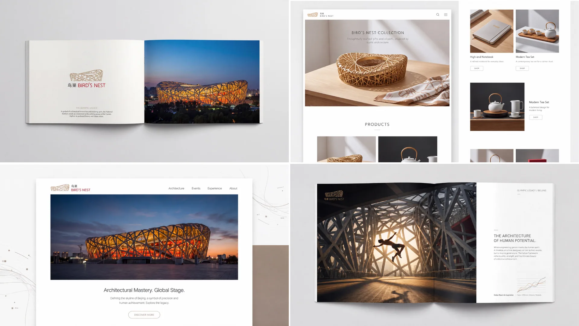
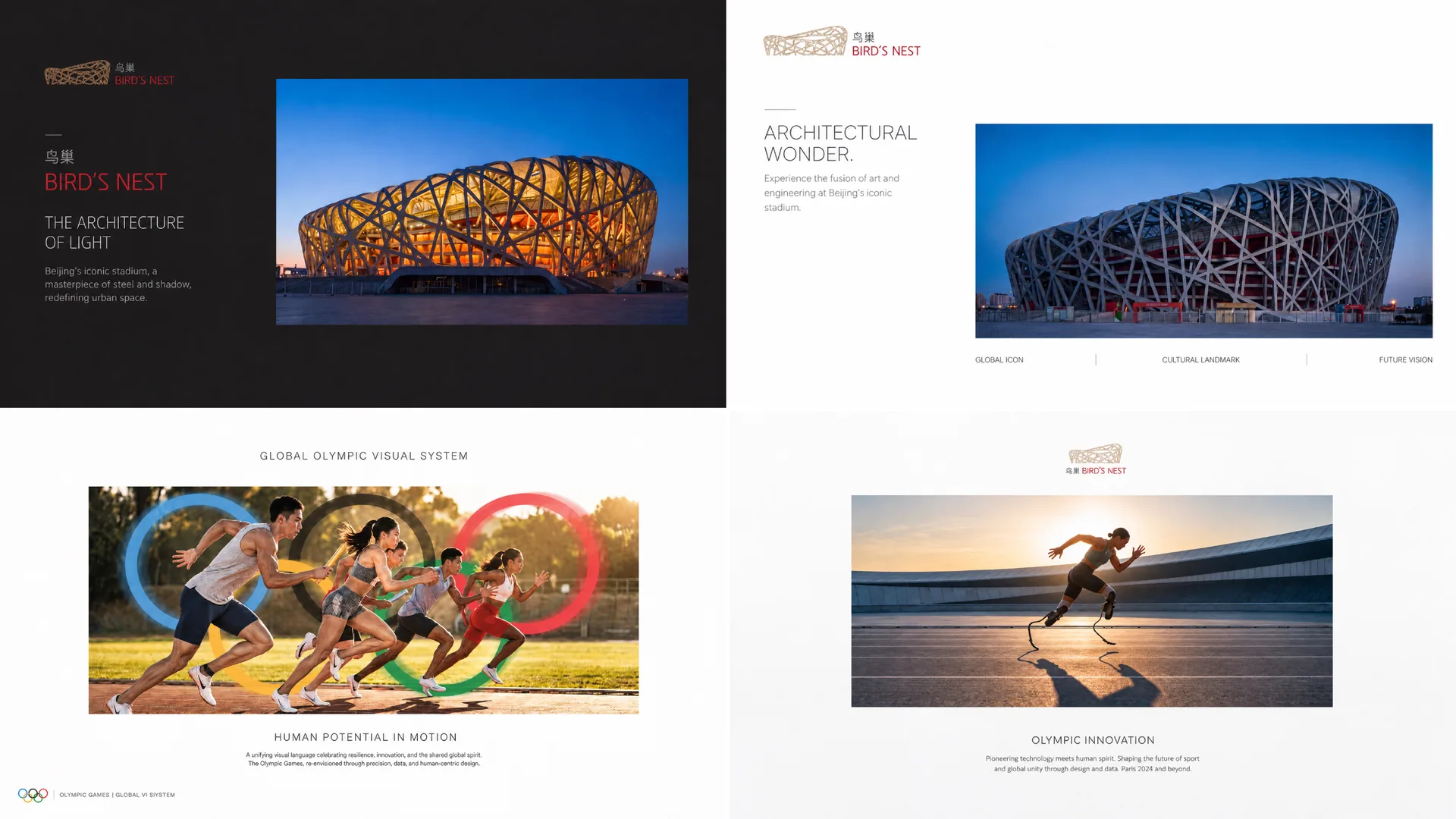
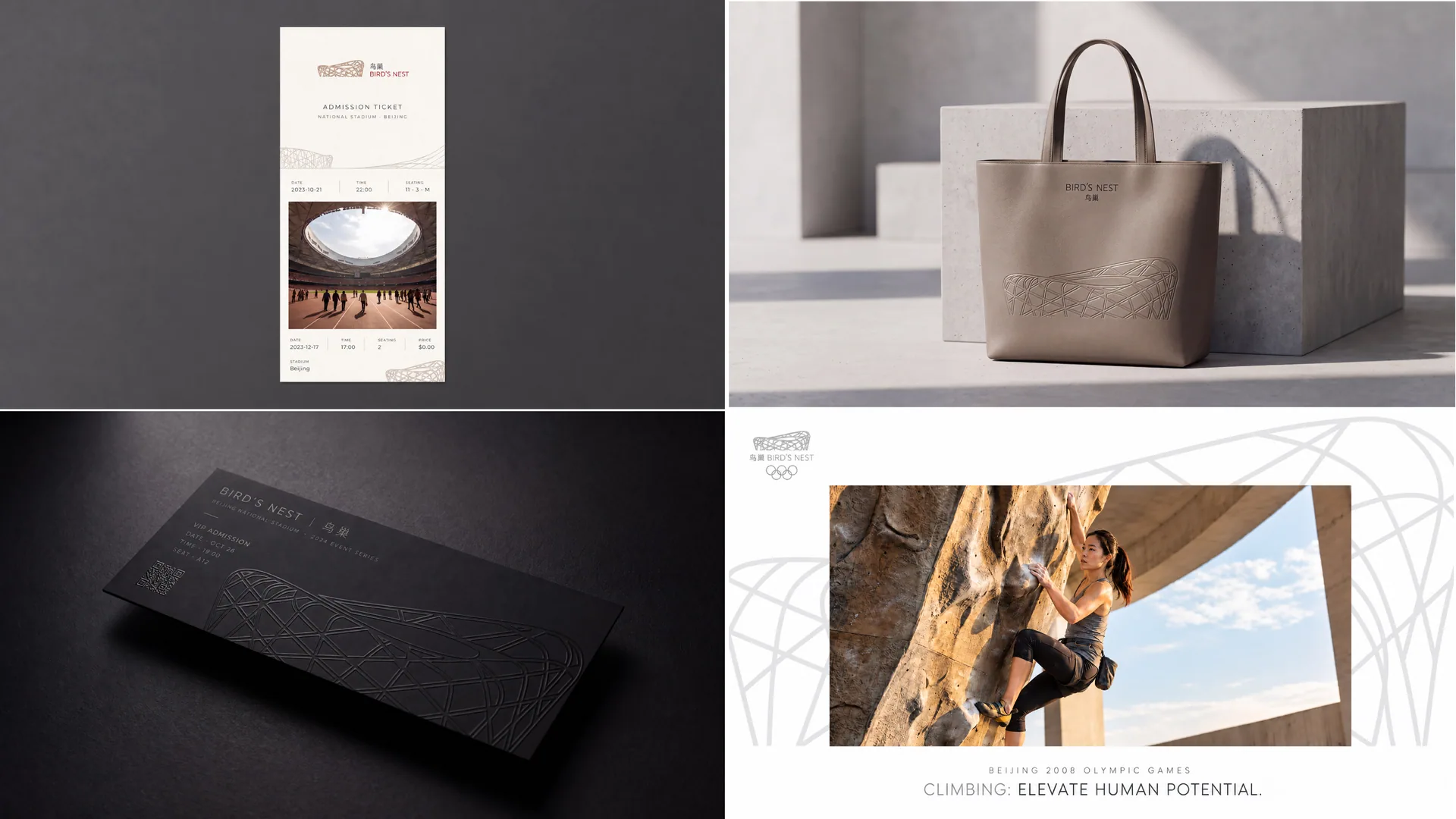
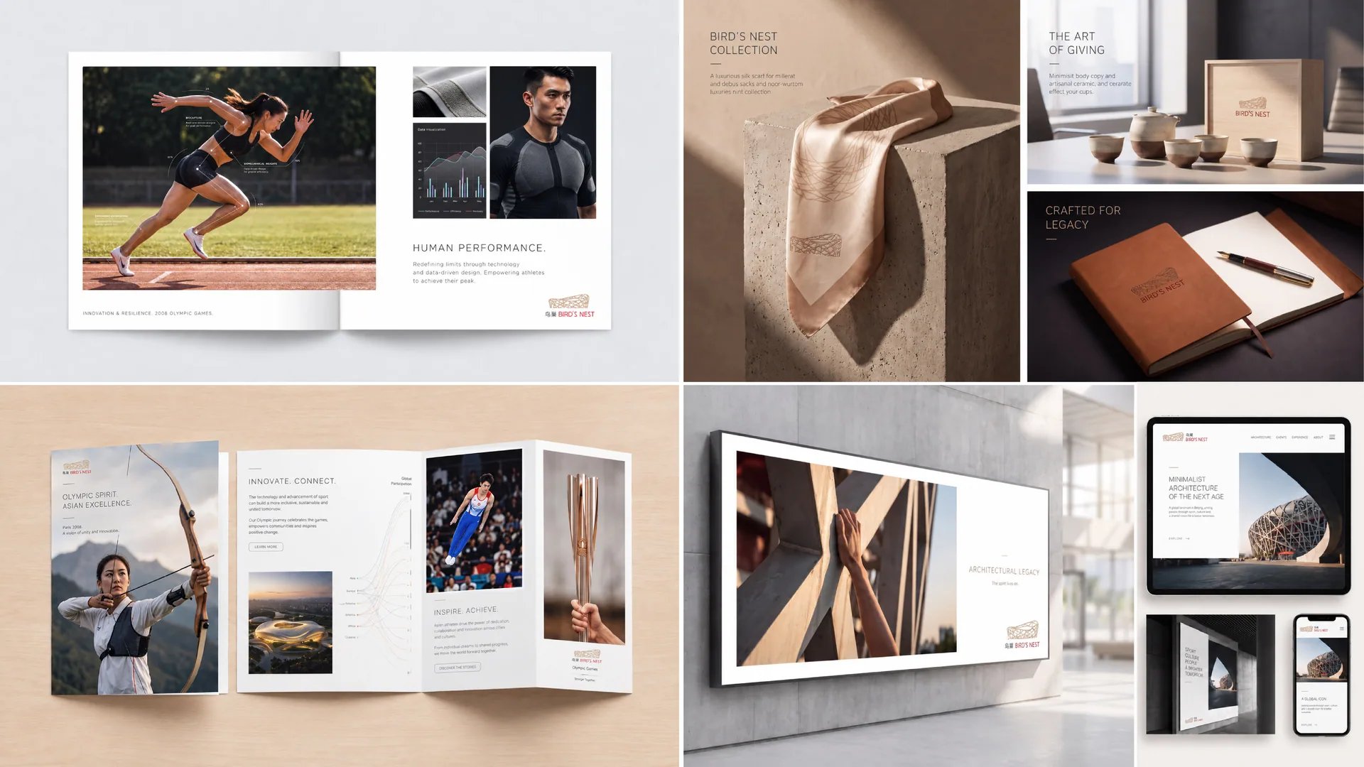
design concept
The logo takes "Woven Memory" as its core concept, extracts the visual gene from the most recognizable steel structure woven texture of the Bird's Nest building, and transforms it into the core graphic language of the souvenir brand. The Bird's Nest is called the "Bird's Nest" precisely because its exterior facade is made up of countless interlaced steel beams to form a unique structure - just like a giant bird building a nest with branches. This woven structure is the unique visual asset of the Bird's Nest that is different from any other building in the world. Inheriting it as the core graphic of the souvenir brand is the most faithful continuation of the original cultural value.
graphic language
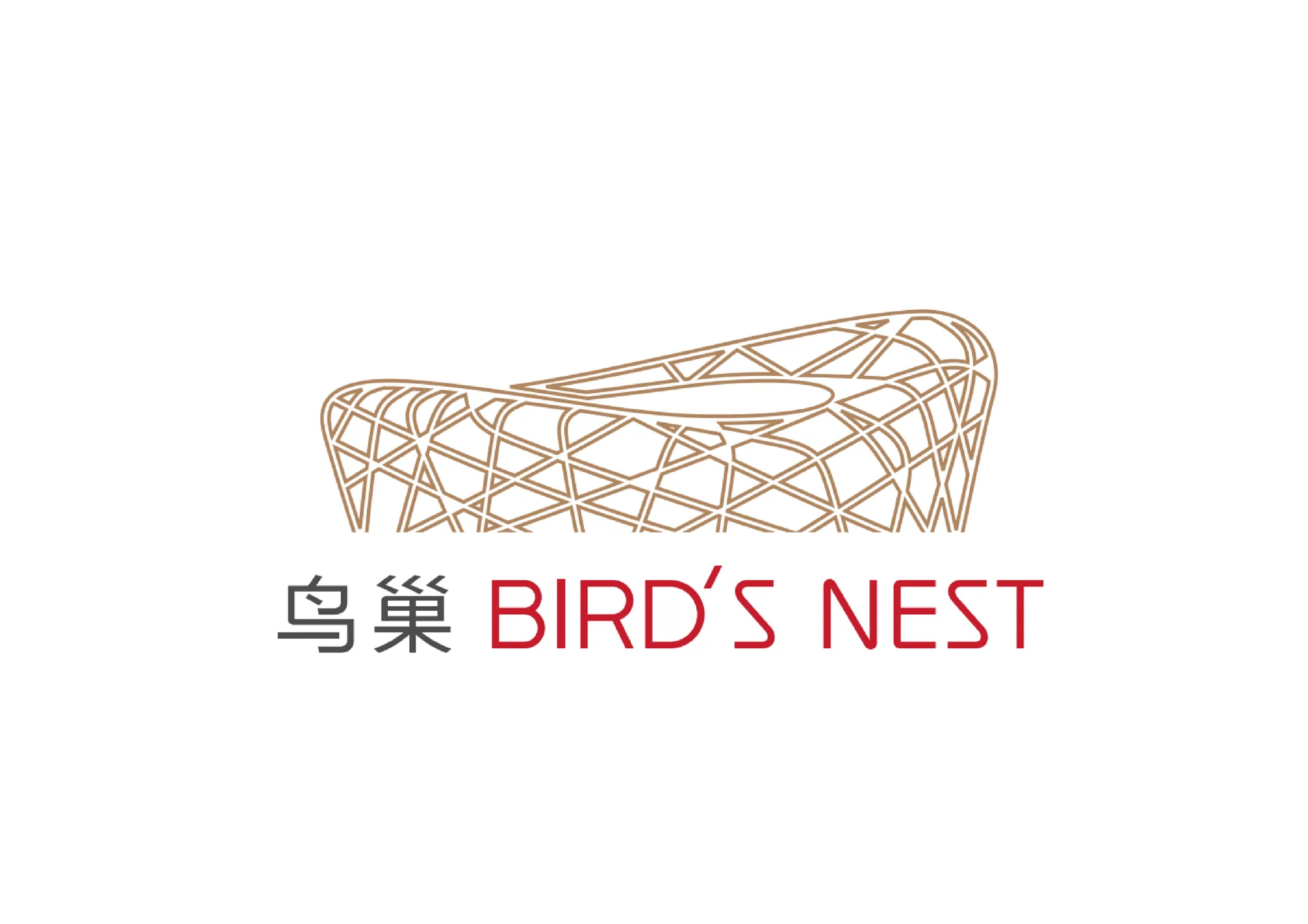
The graphic takes the overall shape of the Bird's Nest building - an oval, the iconic bowl-shaped outline seen when looking down from the air. The interior of the oval is filled with several interlaced arcs. The arcs simulate the cross-woven texture of the steel structure of the Bird's Nest facade. The lines intersect and overlap each other at irregular angles, just like the projection of the criss-crossing steel beams on a real building on a two-dimensional plane.
The thickness of the braided lines remains uniform, conveying the industrial precision of the steel structure. The cross-density of the lines is controlled - neither too dense to avoid loss of recognition, nor too sparse to avoid losing the sense of weaving, with the most appropriate density to remain legible in small-size souvenir applications.
The top center of the oval outline is left blank with an opening, which corresponds to the iconic bowl opening on the top of the Bird's Nest building. This opening is one of the most significant distinguishing features of the Bird's Nest building from ordinary stadiums. Retaining this detail makes the logo more accurate in terms of architectural restoration.
The overall composition uses a three-layer structure of "oval as shape, weaving as pattern, and opening as god" to construct "woven memory".
Font composition
The Chinese "Bird's Nest" is presented in a simple modern sans-serif font, with neat and steady strokes. "National Stadium" is explained in a smaller font size. The English "BIRD'S NEST" is arranged in standard uppercase sans serif font with loose letter spacing. The sub-label of the souvenir series "OFFICIAL SOUVENIR" or "Memorial Collection" is placed below the main logo in a smaller font size, conveying the official attributes and collection value of the souvenirs with exquisite typography.
color system
The main color, Bird's Nest Iron Red #8B4513, represents the warm red hue of rust that the steel structure of the Bird's Nest building displays in the sunlight. The steel beams of the Bird's Nest are not cold gray industrial steel, but have undergone special anti-corrosion treatment to present a unique warm reddish brown color - this color is the most significant color feature that distinguishes the Bird's Nest building from other steel structure buildings. Using the true color of the building as the main color is the most direct visual inheritance of the original cultural value.
Auxiliary Chinese red #CC1A2B is used for special edition products related to the Olympic theme and National Day theme in the souvenir series. Red is associated with the auspicious color that is the core of Chinese culture and the warm atmosphere of the 2008 Beijing Olympics. Auxiliary steel structure gray #5D6D7E is used for the basic elements and product information of the brand system. The gray color conveys the industrial texture of the steel structure building. Auxiliary Olympic gold #C5A55A is used in limited editions, collector's editions and high-end gift lines in souvenirs. Gold conveys the glory of Olympic gold medals and the collection value of souvenirs. Pure white #FFFFFF as standard base color. The overall color is based on iron red gray, reflecting the brand temperament of "architectural nature and heritage texture".
Application extension
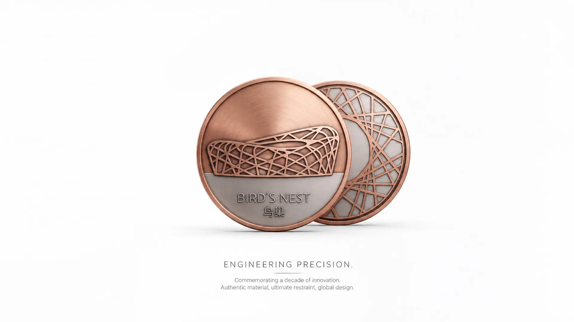
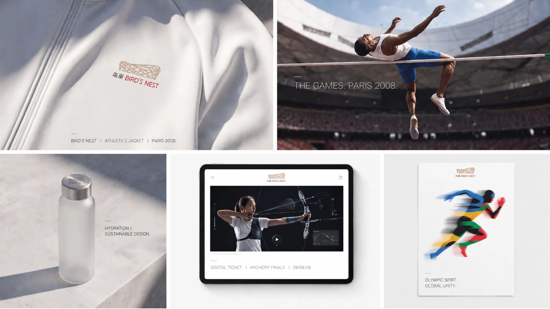
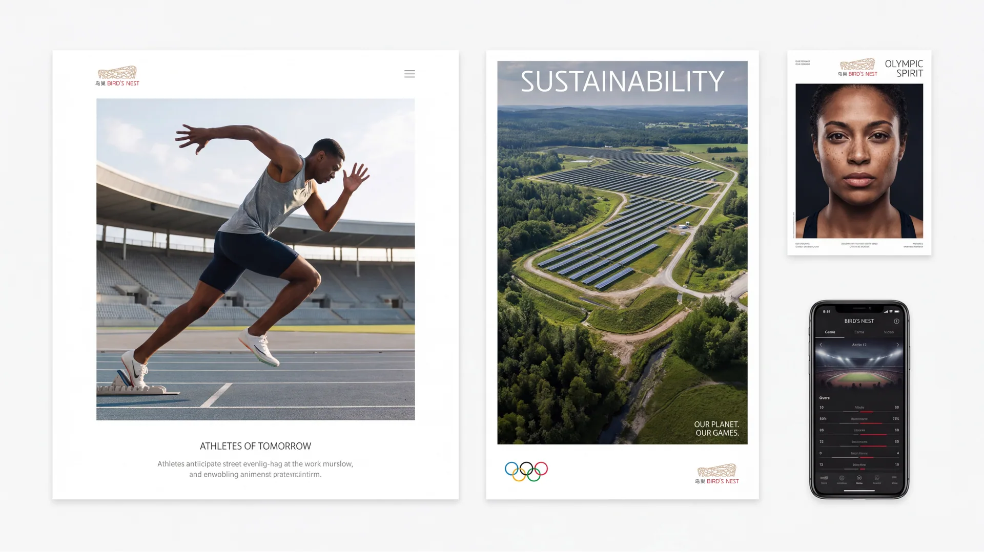
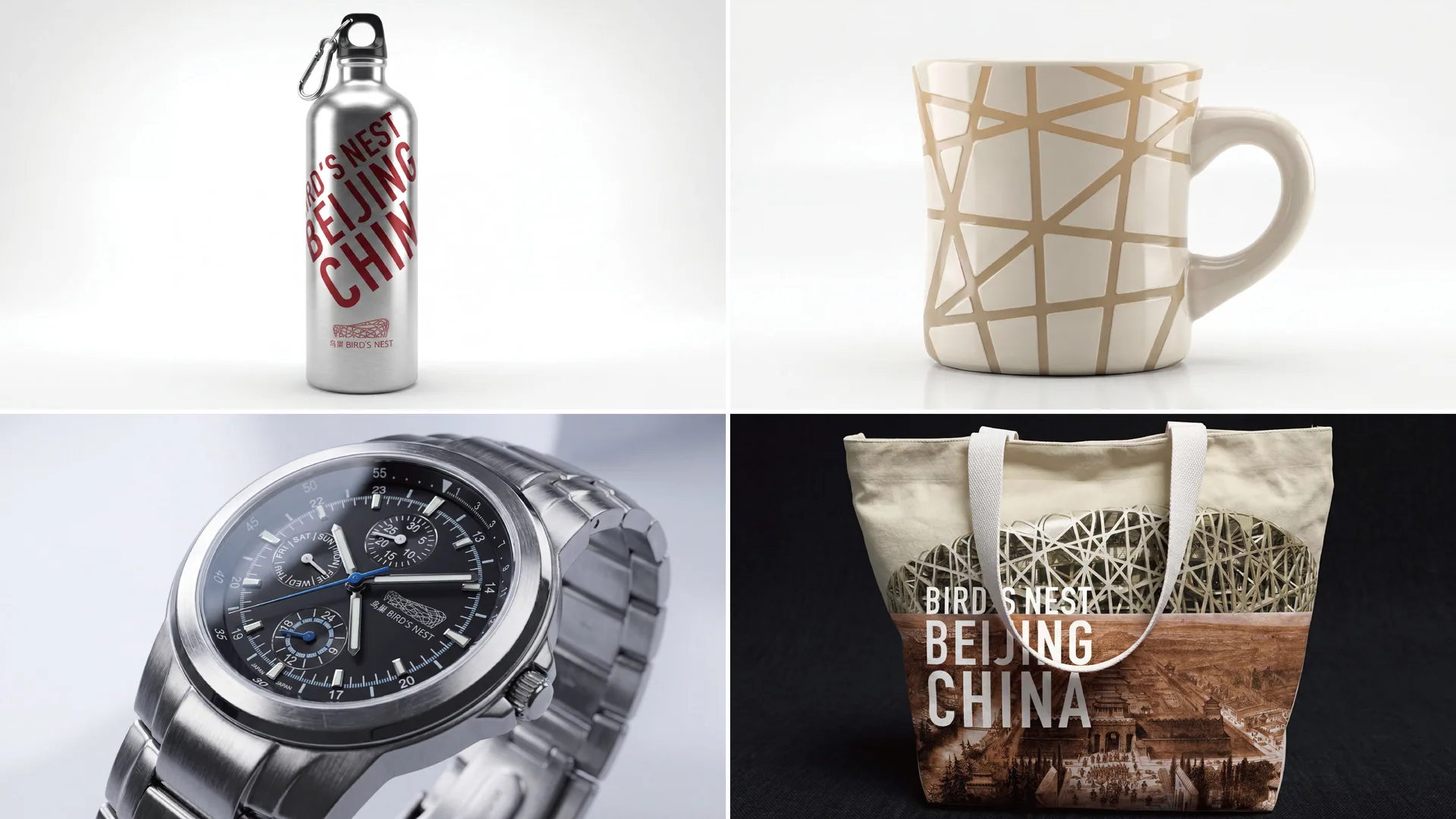
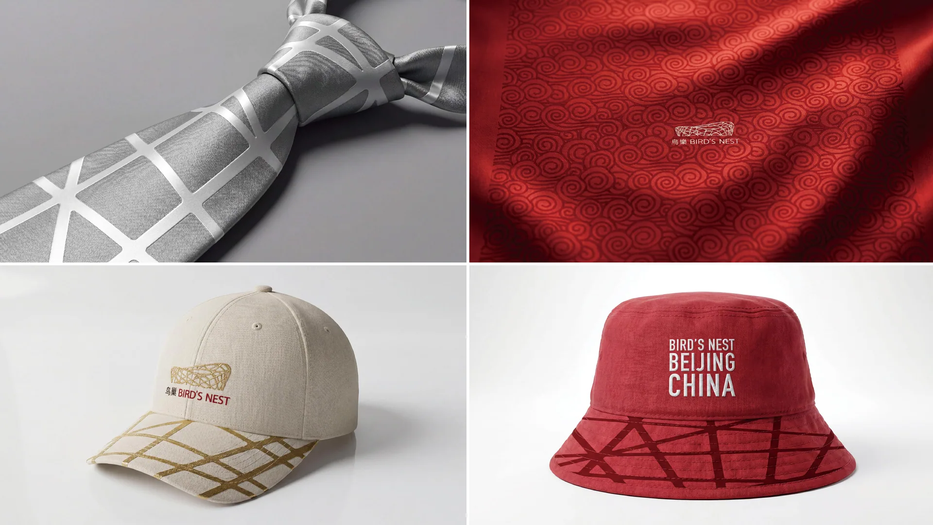
The logo can be widely used in a full range of official souvenirs - refrigerator magnets, keychains and badges are made of metal die-cast woven texture. The pattern touched by consumers' fingertips is the miniature steel structure of the Bird's Nest building; cultural shirts and hoodies use woven graphics as the main chest print, with iron red lines on the white surface. The iconic texture of the Bird's Nest is clearly displayed on the material; mugs and thermos cups use a woven texture to surround the cup body, and the 360-degree texture without blind spots continues the viewing experience like a circle around the Bird's Nest building; notebooks and postcards use woven graphics as the main cover visual, combined with architectural photography and historical information.
The high-end collection souvenirs use the Olympic gold as the main color to present a woven texture. The golden woven lines are presented on the dark gray packaging using hot stamping or gilding techniques, conveying the collection value of "Olympic heritage, golden memory". Limited edition products come with a numbered certificate, printed on woven textured watermark paper and the logo embossed using a gravure process.
The door of the souvenir shop in the Bird's Nest Scenic Spot is presented with a large metal device with a woven logo. The device is made of real metal strips interlaced and woven, echoing the steel structure of the Bird's Nest building behind it - the souvenir shop itself becomes an extended experience of the architectural aesthetics of the Bird's Nest. The shopping bag is made of kraft paper and printed with an iron-red woven texture. When consumers carry the shopping bag out of the Bird's Nest, the woven texture on the bag surface and the steel structure of the building behind them overlap in sight - the brand memory and the architectural memory are bound at the same moment.
brand meaning
The logo contains three core images: Architectural Legacy - the woven texture directly inherits the most recognizable steel structure visual gene of the Bird's Nest building, allowing the souvenir brand to maintain a blood connection with the building itself; Olympic Memory - the oval bowl shape and warm red tones evoke the glorious years of the 2008 Beijing Olympics and the collective memory of the people; Eternal Heritage Heritage) - The restrained and exquisite design language conveys the solemn value and long-lasting cultural vitality of the Bird's Nest as a national Olympic heritage. The overall design conveys the brand spirit of "Olympic heritage, eternal memory".
Improper Usage (Protection Specification)
Preserve the mark’s proportions, structure and colour relationships. Avoid distortion or decoration that reduces recognition. Follow the approved guidelines for clear space, minimum size and authorised use, checking each application at its intended scale.
design results
After the logo was released, the Bird's Nest souvenir brand's brand recognition and consumer emotional recognition in the cultural tourism and Olympic heritage souvenir markets have significantly improved. With its design strategy that directly inherits the core visual genes of the Bird's Nest building, "Weaving Memory" successfully transforms the cultural value of a building into a touchable, portable, and collectible souvenir brand experience, so that every visitor takes away not only a souvenir, but also an eternal memory of the Bird's Nest building and the Beijing Olympics.