










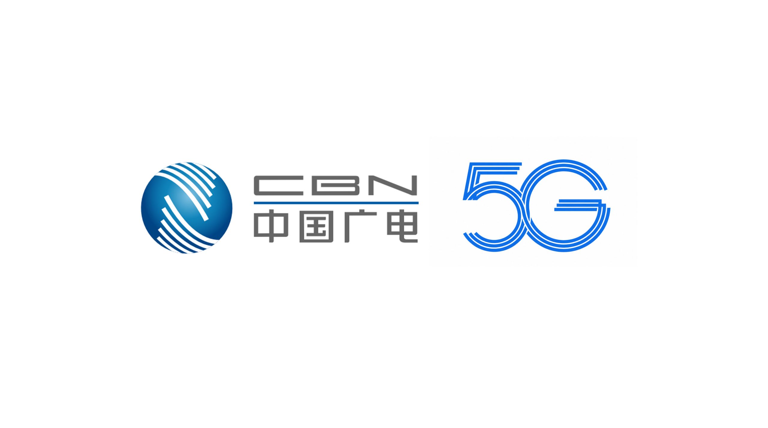
Radio and Television 5G is based on the new generation of mobile communication networks and integrates diverse business capabilities such as television, broadband, voice, satellite and mobile communications, and is committed to building a more open, efficient and interconnected digital information service system. The project hopes to demonstrate the brand characteristics of "integrated communications, smart connections" through a new logo system, combine the diverse business capabilities of radio and television with the technological attributes of the 5G era, and transform the brand from a traditional radio and television service image to a modern comprehensive information service brand.
design concept
The logo uses "5G" as the core visual element, starting from the concept of integrated development of multiple radio and television businesses, abstracting different businesses into multiple independent information lines, which ultimately form a complete "5G" letter shape through orderly gathering, interlacing and connection. The continuously extending lines not only symbolize the data track for high-speed transmission, but also represent the synergistic relationship between different services such as television, broadband, voice, and satellite. The overall composition is composed of "multiple lines" converging into "one", conveying the brand development concept of "diversity integration, interconnection and symbiosis".
graphic language
Multiple parallel line configuration: continuous and orderly lines are used to simulate information networks and data transmission paths, reflecting the high-speed, stable, and interconnected technical characteristics of the 5G era; "5G" letter reconstruction: the number "5" and the letter "G" are reshaped through geometric lines, transforming text information into brand symbols with independent recognition; Intersection structure: 5 and G form a natural connection in the center, symbolizing the continuous integration of different businesses, platforms, and terminals, forming a unified and collaborative digital network ecosystem.
Fonts and composition
The overall logo adopts a simple and modern geometric composition, using horizontal extensions and circular curves to establish a stable and speedy visual relationship. "5" combines horizontal straight lines and arcs to reflect the directionality of information transmission; "G" is presented in an open circular structure, symbolizing open connection and continuous expansion. Multiple layers of parallel lines maintain uniform spacing and proportions, giving the graphics a rigorous technological order. The main color of the brand is technological blue, which enhances the visual experience of professionalism, reliability, intelligence and digitalization.
Application and extension
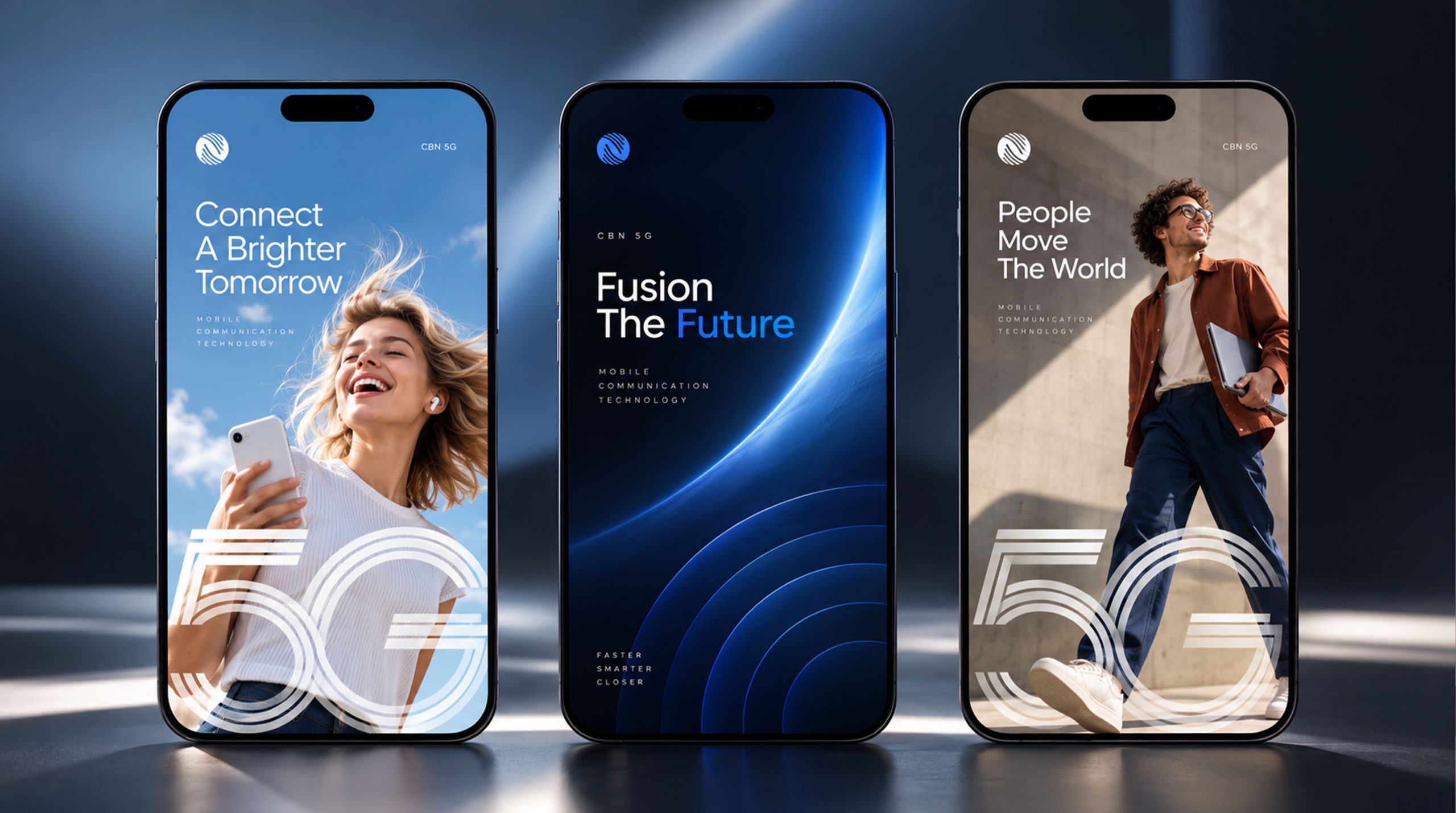
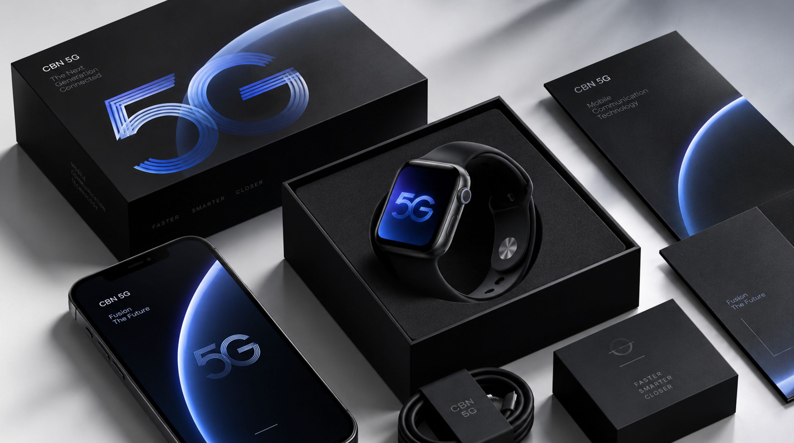
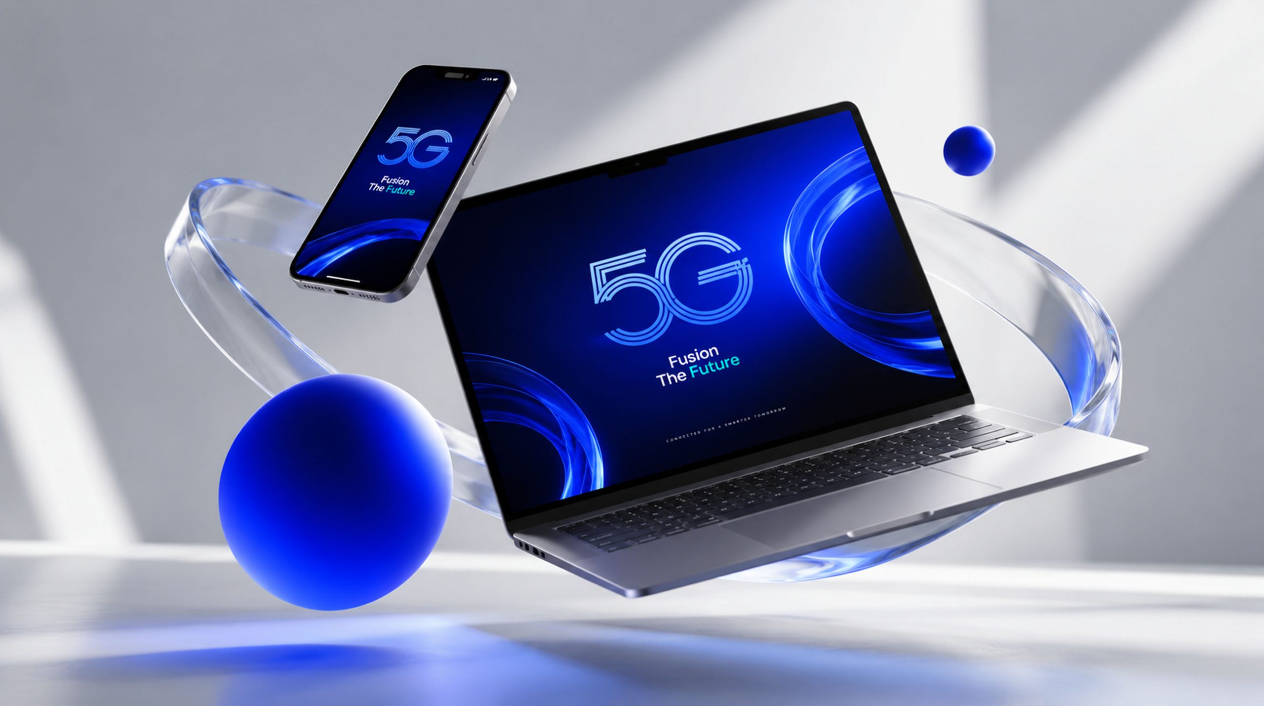
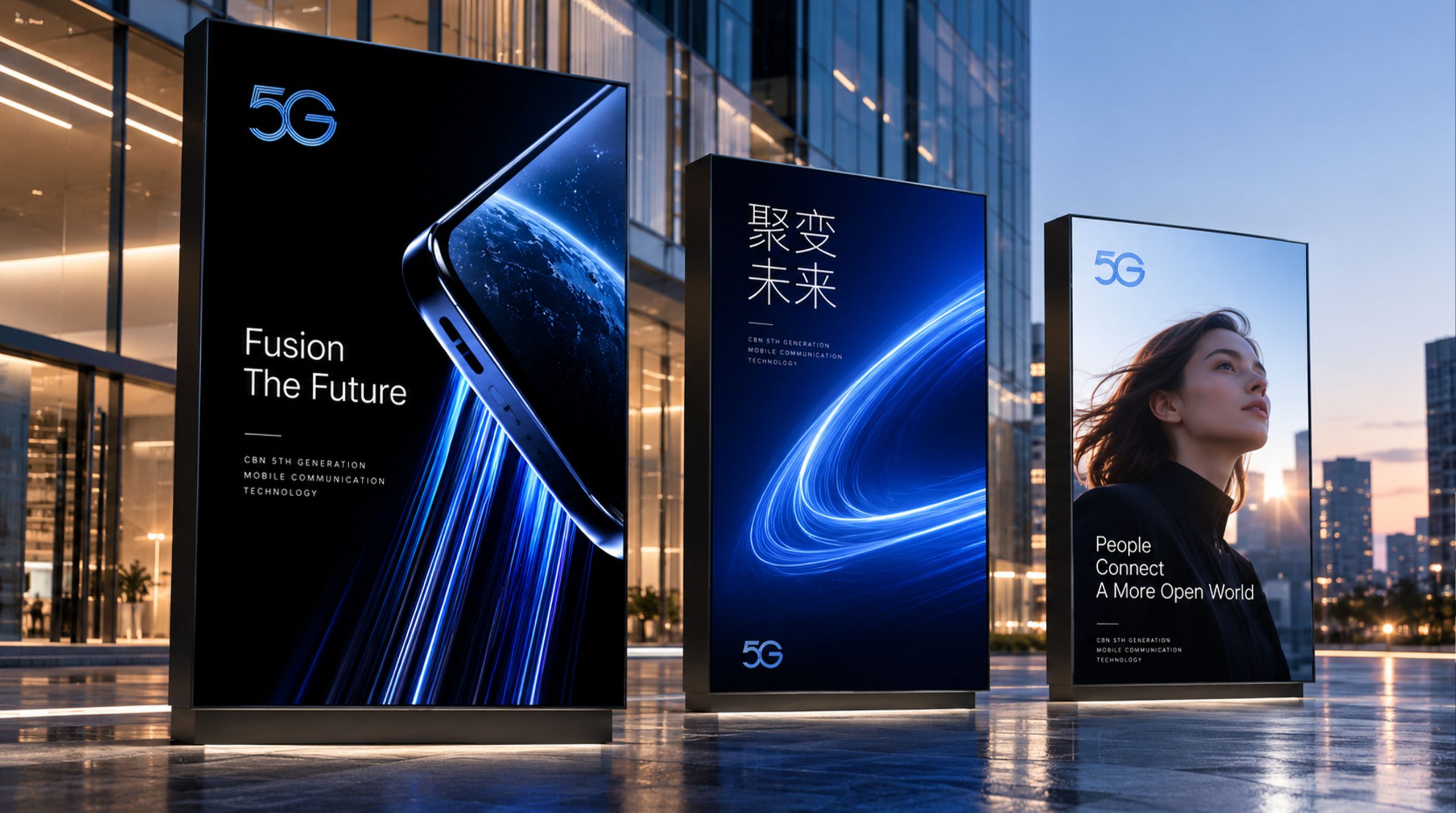
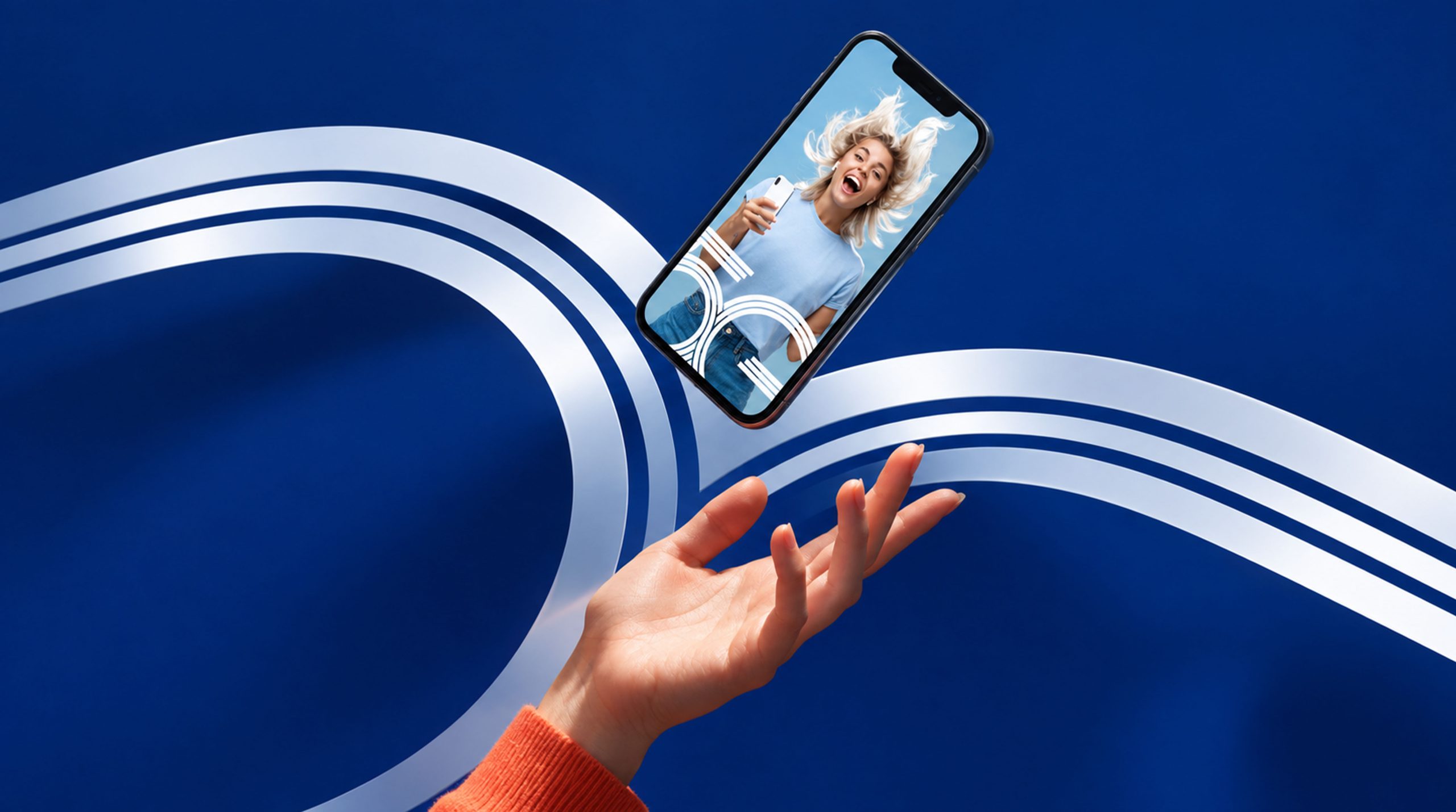
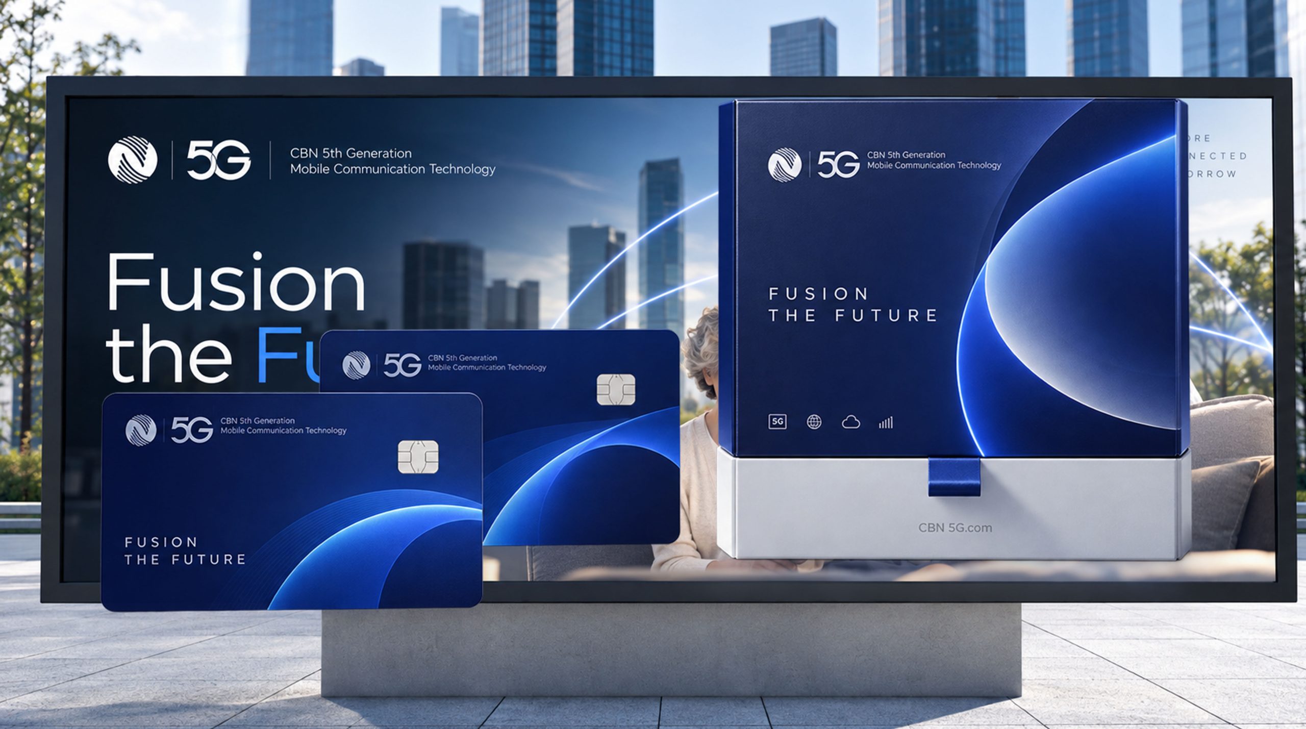
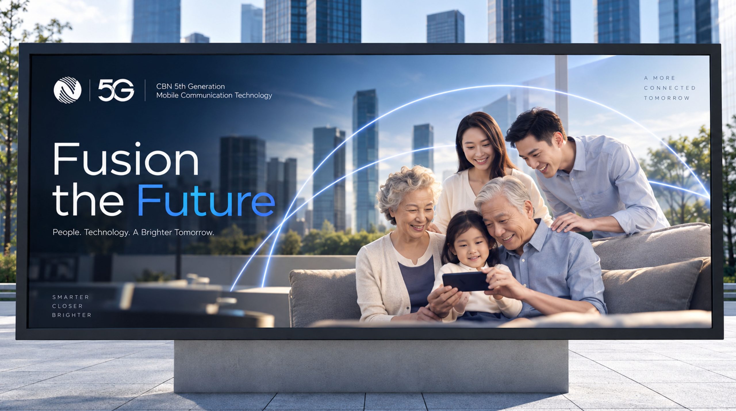
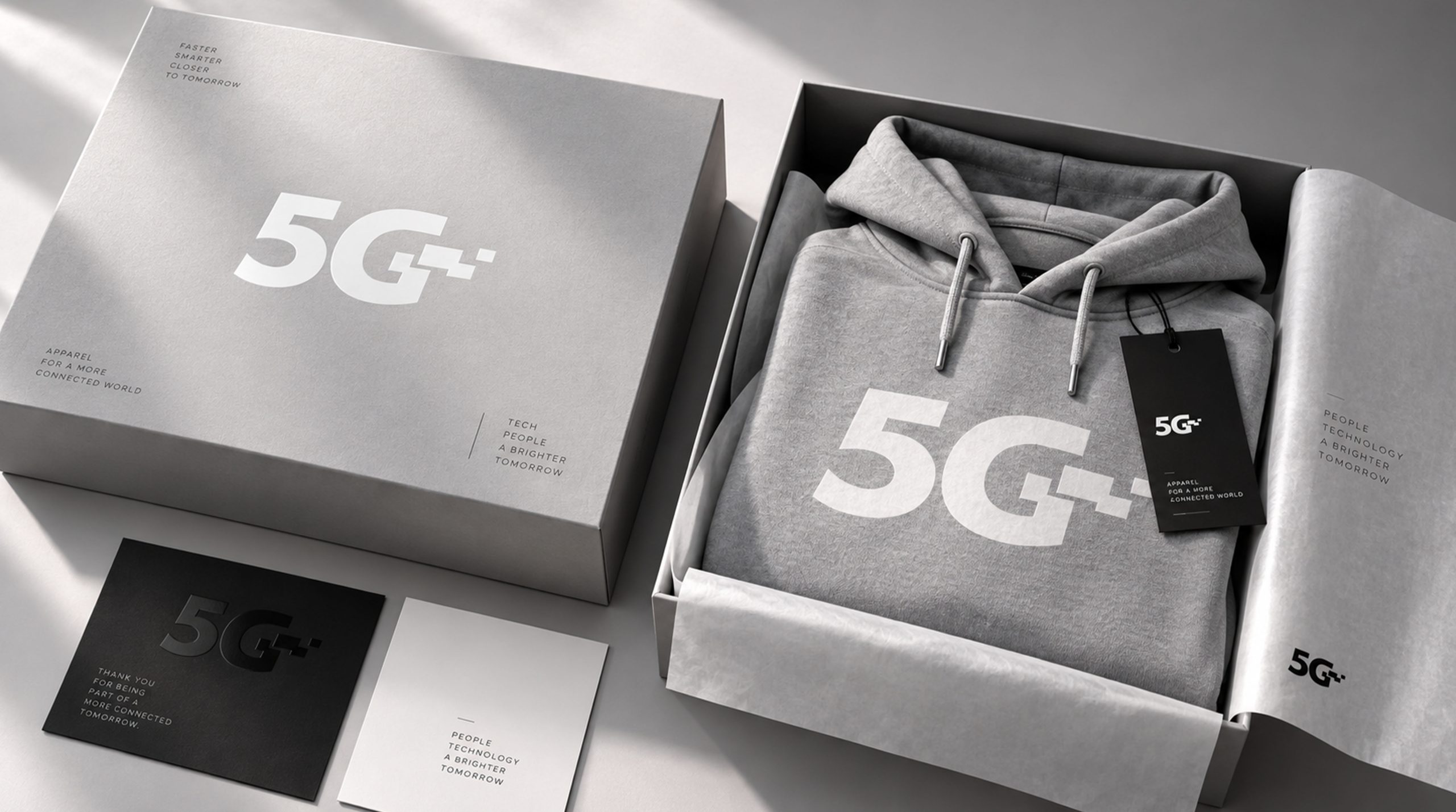
The logo can be widely used in scenarios such as 5G business halls, communication equipment, digital terminals, brand promotion, office systems, and online digital media. Its multi-line structure can be further extracted into brand auxiliary graphics, which can be used in posters, websites, APP interfaces, exhibition hall spaces and dynamic images through extension, connection, convergence, diffusion and other forms. In digital media, lines can also form visual effects of information flow through dynamic growth and intersection, establishing a 5G brand visual system with continuous recognition.
brand meaning
Multiple lines converge to connect the future. The logo takes "5G" as its shape and "fusion" as its core, integrating radio and television's diverse businesses, communication networks and the spirit of digital technology. Each line represents a business capability, and each connection represents an information fusion, ultimately forming a complete 5G visual symbol. It not only embodies the development direction of radio and television 5G from traditional communication network to comprehensive information service system, but also conveys the brand spirit of open connection, collaborative development and smart future.
Improper Usage (Protection Specification)
The basic structure and line proportions of the "5G" logo cannot be changed; the number, spacing, and intersection relationship of the internal lines cannot be arbitrarily adjusted; the logo cannot be stretched, compressed, tilted, or rotated at will; visual special effects such as shadows, strokes, three-dimensional, and luminous effects must not be added without authorization; sufficient safe space and visual contrast should be ensured when applied to complex backgrounds to ensure the integrity and recognition of the logo in different media environments.
design results
The new 5G logo uses highly summarized linear language to transform "diversified business integration" into clear and intuitive visual symbols. The logo not only has the sense of technology and professionalism required by the communications industry, but also strengthens the brand's contemporary characteristics and extension capabilities through a continuous and open line structure. It can form a unified visual asset covering online digital media, offline business spaces, communication equipment and brand promotion systems, and establish a more modern, distinctive and sustainable brand recognition system for radio and television 5G.