










Lao Sichuan Ban is a catering brand with Sichuan flavor culture and regional food memory as its core. It hopes to re-express the pyrotechnics and humanistic heritage of Sichuan food culture through a brand vision with a distinctive oriental temperament. Establishing a new visual connection between tradition and modernity makes the brand not only represent a Sichuan flavor experience, but also become a visual symbol carrying regional culture, lifestyle and emotional memory.
design concept
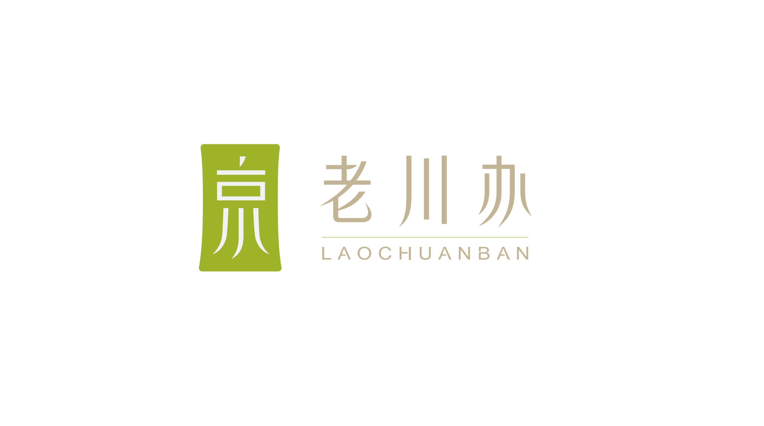
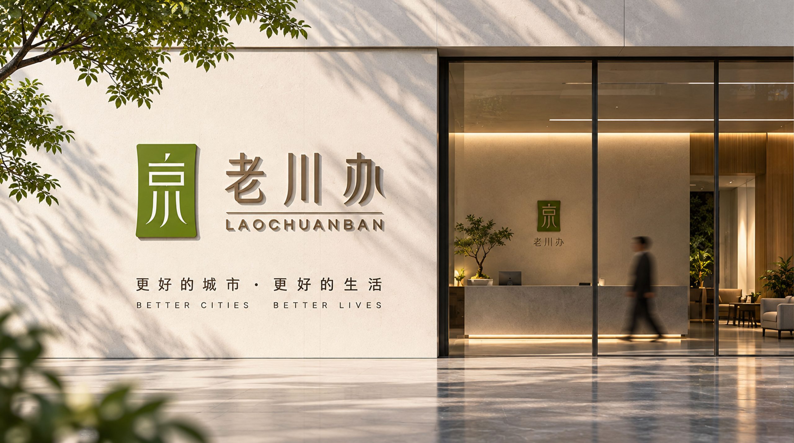
The logo takes visual inspiration from the traditional oriental "seal" and condenses the brand culture into a simple and powerful square graphic. The interior of the graphic is modernized and reconstructed using the structure of Chinese characters. Through the relationship between vertically stretched strokes and white space, a visual symbol that combines Chinese character imagery and a sense of architectural order is formed. The slightly handmade outer contour weakens the cold feeling of mechanical geometry, so that the whole retains the weight of traditional imprints, but also has the affinity and recognition of a modern brand, conveying the brand temperament of "Sichuan flavor has roots, old flavor has sentiment".
graphic language
Seal-like square configuration: taking the meaning of traditional oriental imprints, symbolizing inheritance, credit and cultural accumulation; internal text graphics: extracting the structure from traditional Chinese character writing, reorganizing the strokes in a modern geometric way to make it both symbolic and brand-specific; soft corners and natural curvature: avoiding excessive regularity, incorporating the warmth of handwriting into the stable composition, echoing the warm, relaxed and humane regional character of Sichuan food culture.
Fonts and composition
The brand name adopts a horizontal combination of Chinese and English. The Chinese "LAOCHUANBAN" is presented in a modern font with the charm of oriental writing, embodying a sense of culture and high-end through slender strokes, stretched proportions and moderate white space; the English "LAOCHUANBAN" uses a simple and modern sans-serif font, and uses larger character spacing to strengthen the modern and international expression of the brand. Graphics, Chinese and English form a clear primary and secondary hierarchy, and the overall horizontal expansion enables the brand to maintain a stable and calm visual rhythm in the door, packaging and digital media.
color system
The brand uses yellow-green with natural vitality as the core identification color, which is different from the red, dark black and gold system used by traditional Sichuan food brands, giving the brand a more youthful, natural and modern visual impression; the auxiliary use of low-saturated beige gold expresses warmth, calmness and cultural quality. The two colors form a balance between "natural vitality" and "oriental warmth", while retaining the cultural foundation of Sichuan flavor while establishing a more contemporary aesthetic brand recognition.
Application and extension
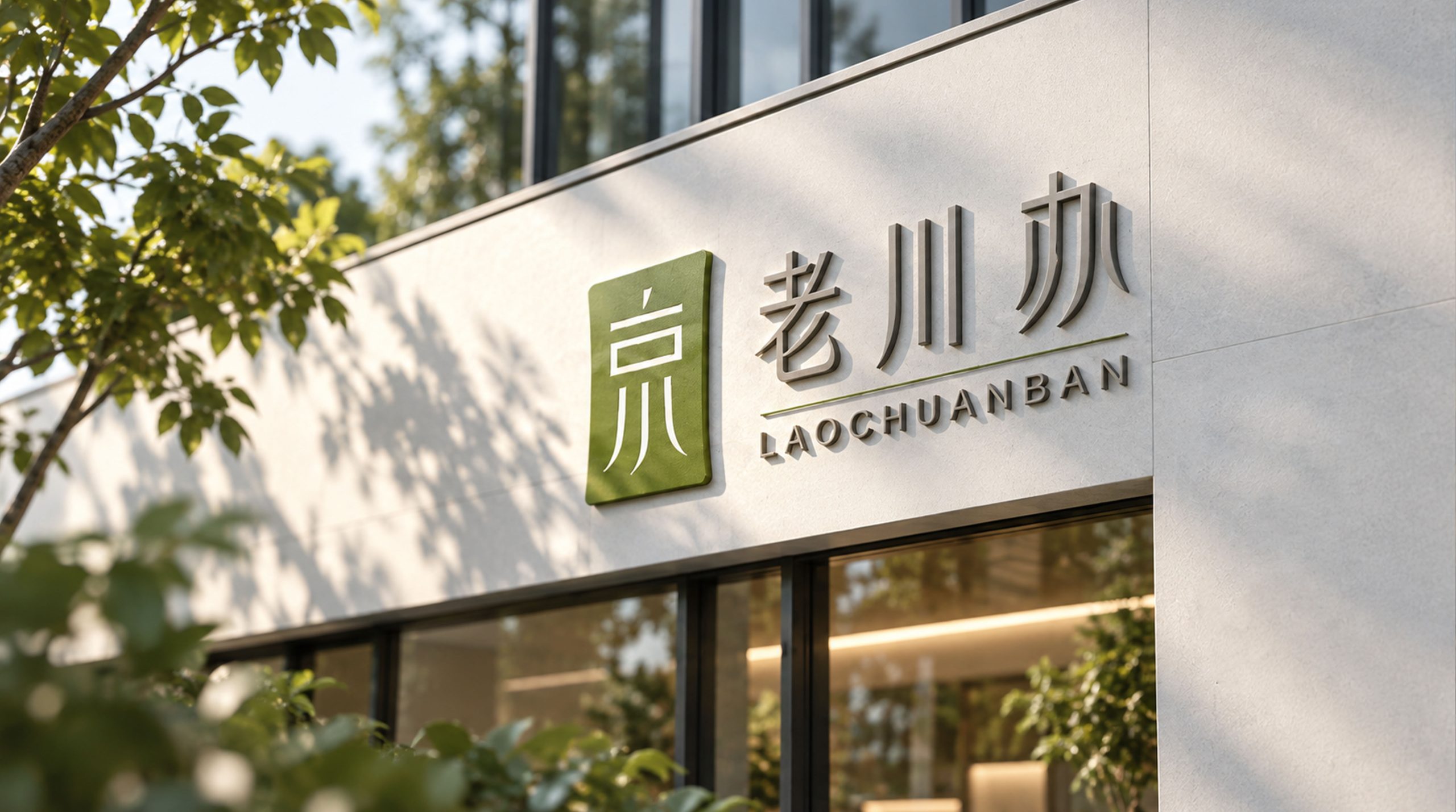
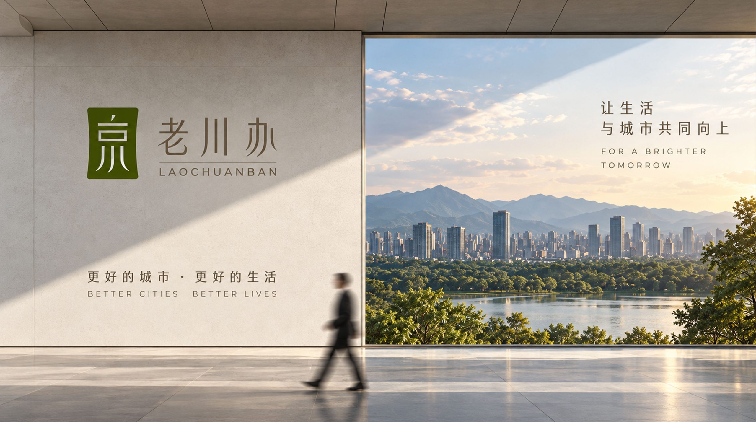
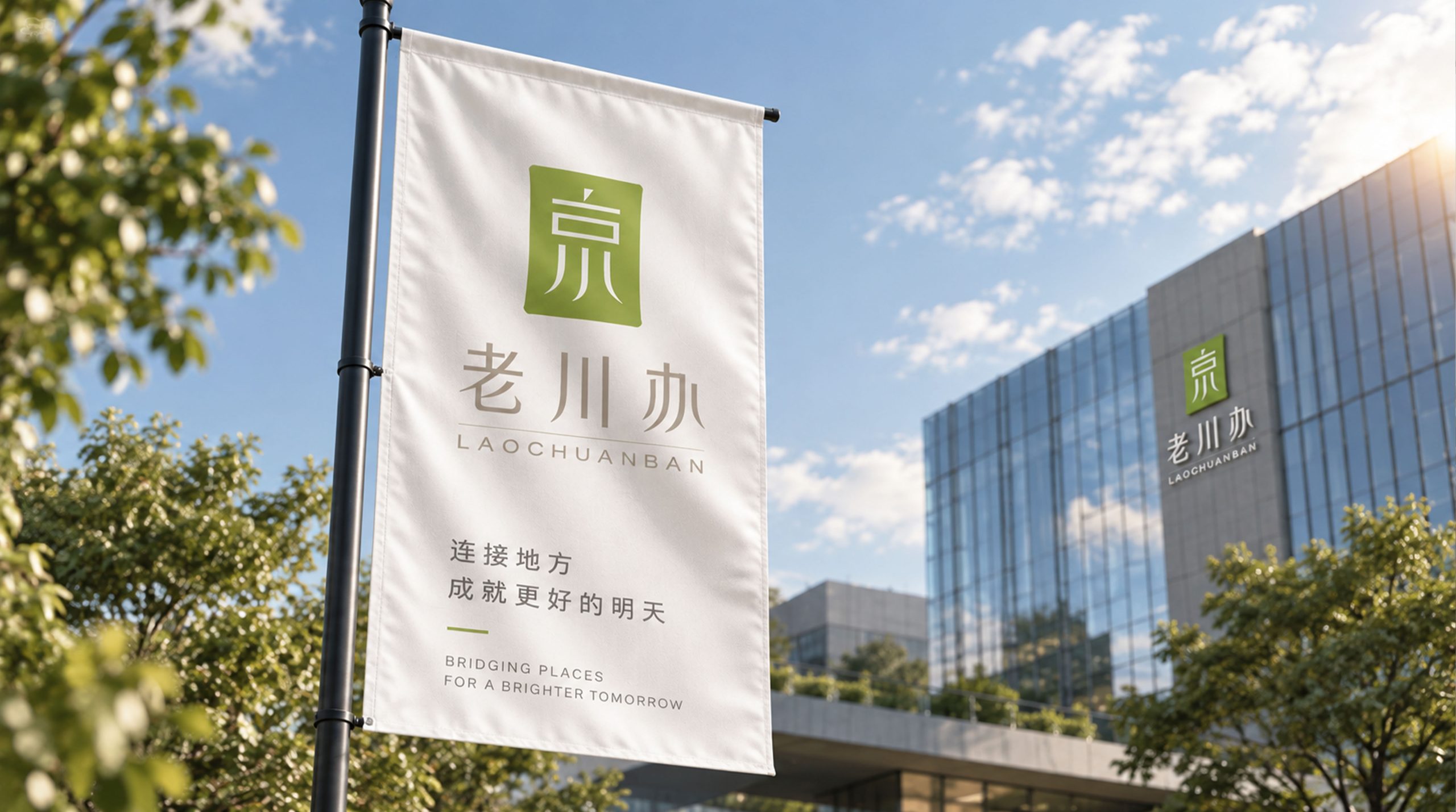
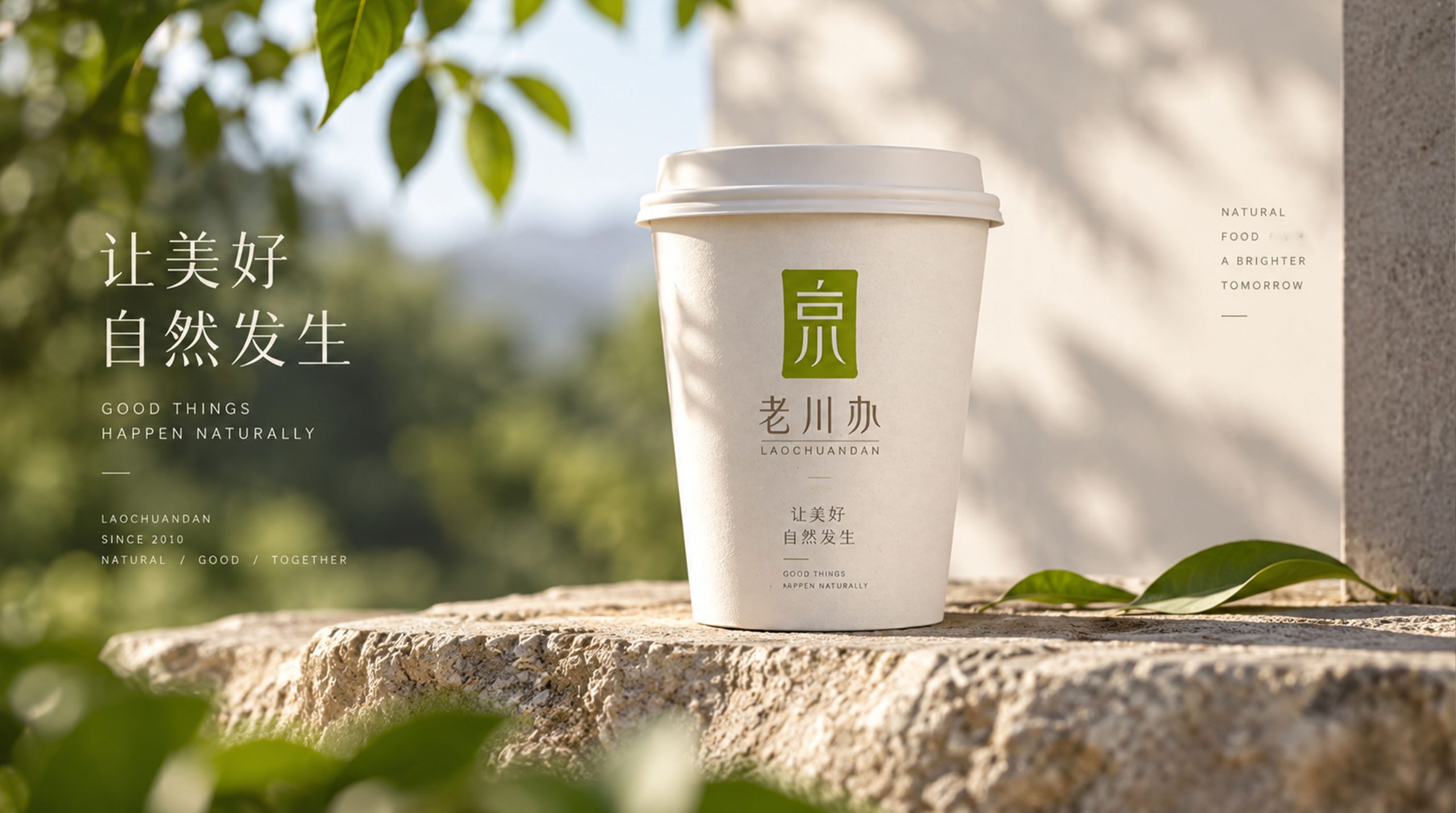
The logo can be widely used in brand doors, restaurant guides, menu systems, tableware, packaging, takeout systems, employee clothing and brand promotion materials. The square seal graphic can be used independently as a brand super symbol, and can be further extended into packaging seals, tableware patterns, space wall graphics and social media visual elements. Its internal lines and Chinese character structure can also be refined to form an auxiliary graphic system, allowing the brand to maintain a unified and rich visual identity in different scenarios.
brand meaning
One imprint hides Sichuan flavor. Lao Sichuan Office takes the traditional seal as its shape and Sichuan flavor culture as its soul, integrating regional memory, oriental characters and modern catering aesthetics. The logo not only retains the heaviness and intimacy of traditional culture, but also gives the brand a new era temperament through a simple and restrained modern design language. It represents not only a taste, but also a way of life and human warmth belonging to Sichuan, allowing the familiar Sichuan flavor memory to be re-visited in a more contemporary way.
Improper Usage (Protection Specification)
The internal text structure and overall proportion of the logo cannot be changed; the logo cannot be stretched, compressed or rotated at will; the brand standard color relationship cannot be changed without authorization; shadows, strokes, gradients, three-dimensional and luminous effects must not be added; Chinese and English standard fonts cannot be changed at will; the logo should be ensured to have enough recognition space in a complex background environment to prevent other text or graphics from entering the safe area of the logo.
design results
Through a unified graphics, font, color and application system, Laochuanban has formed a brand visual system with distinctive regional cultural characteristics and modern catering aesthetics. The seal-type super symbol strengthens the brand memory point, and the yellow-green and low-saturated beige gold establish unique visual assets, allowing the brand to form differentiated expressions from the visual framework of traditional Sichuan cuisine, and provide a unified and malleable visual foundation for subsequent space, packaging, menus and promotional materials.