










This project is a visual identity upgrade for Bank of China. Working with the existing brand identity, Qingmei Future refined its visual applications across different formats while preserving brand recognition. The project scope covers the identity upgrade and its applications.



Upgrade Approach
The upgrade builds on the existing brand identity, focusing on how the emblem, typography, color and layout work together to create a coherent visual language across applications.
Identity Continuity
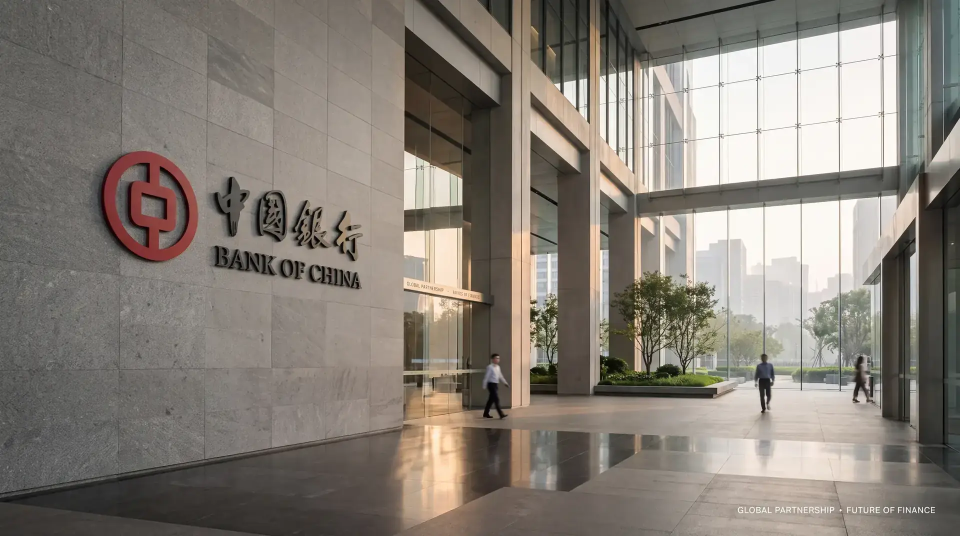
The visual identity upgrade retains Bank of China’s existing emblem. The work focuses on its composition, surrounding space and presentation across formats, maintaining continuity in brand recognition.
Typography and Layout
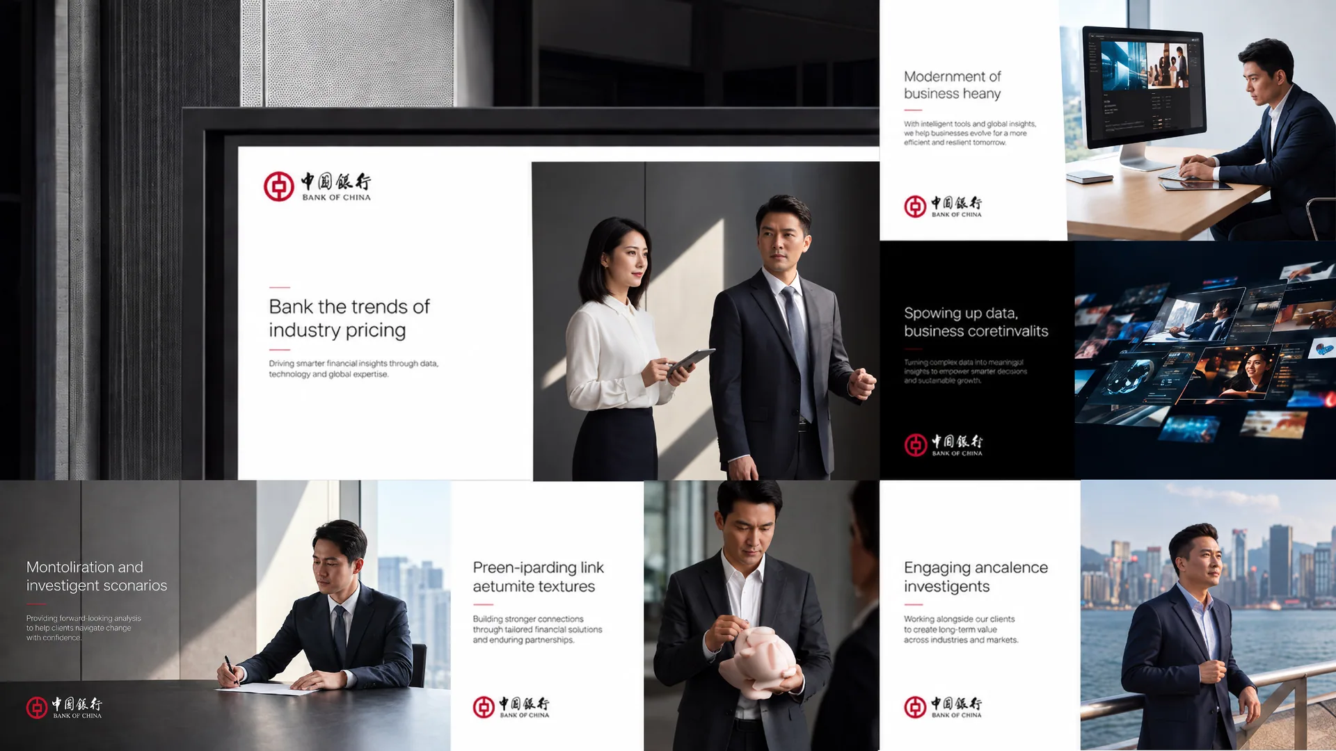
Typography and layout focus on information hierarchy, reading flow and Chinese–English composition, supporting clear presentation of the brand name and service information across sizes and media.
Color Applications
Color applications maintain the existing brand identity, coordinating backgrounds, contrast and space across different layouts.
Design Applications
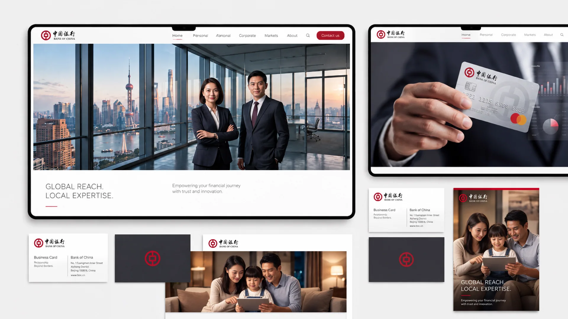
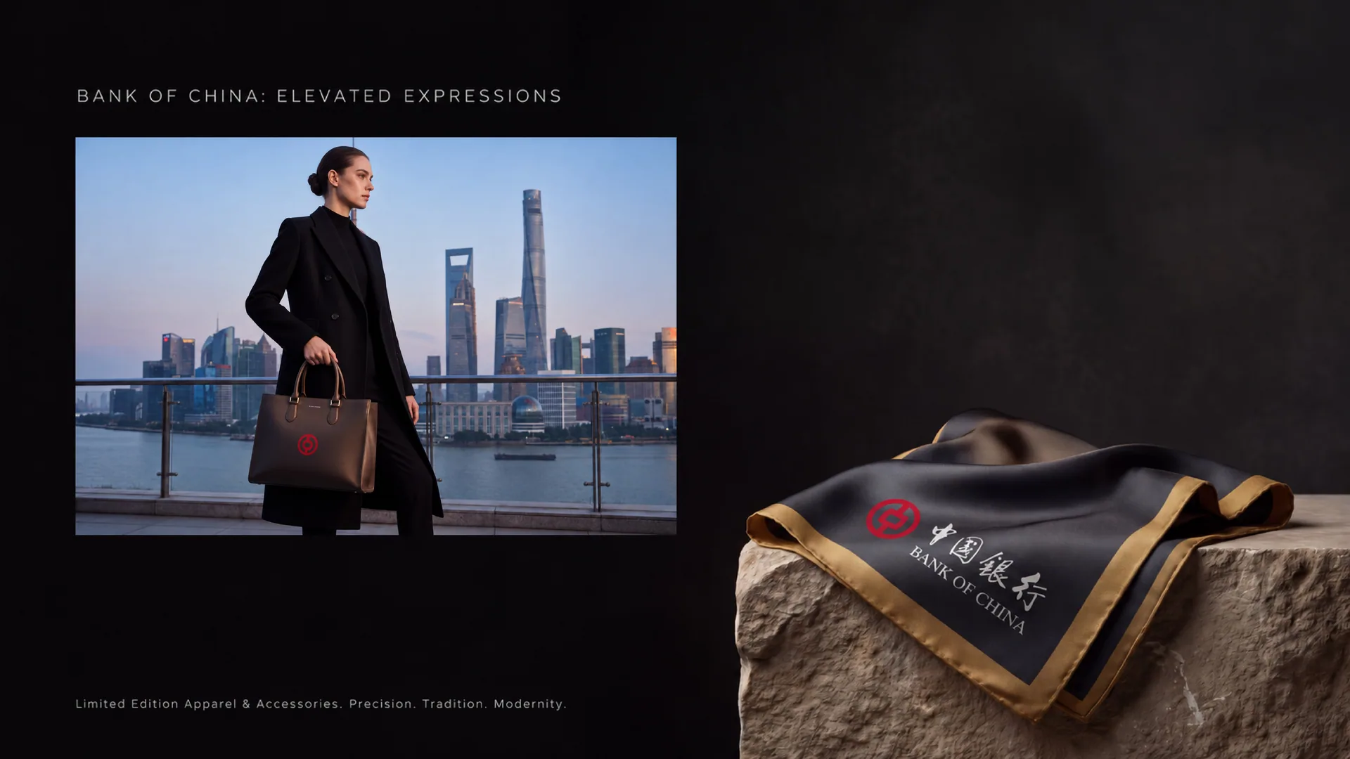
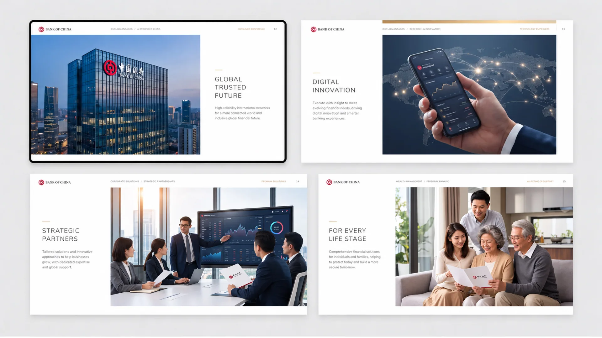
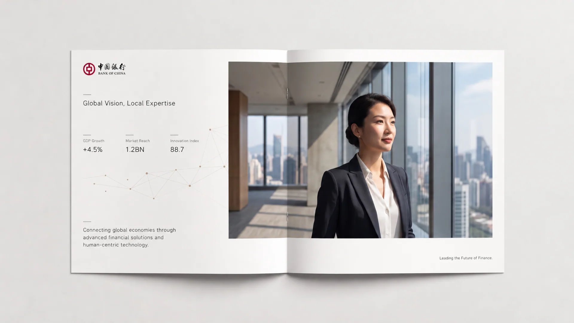
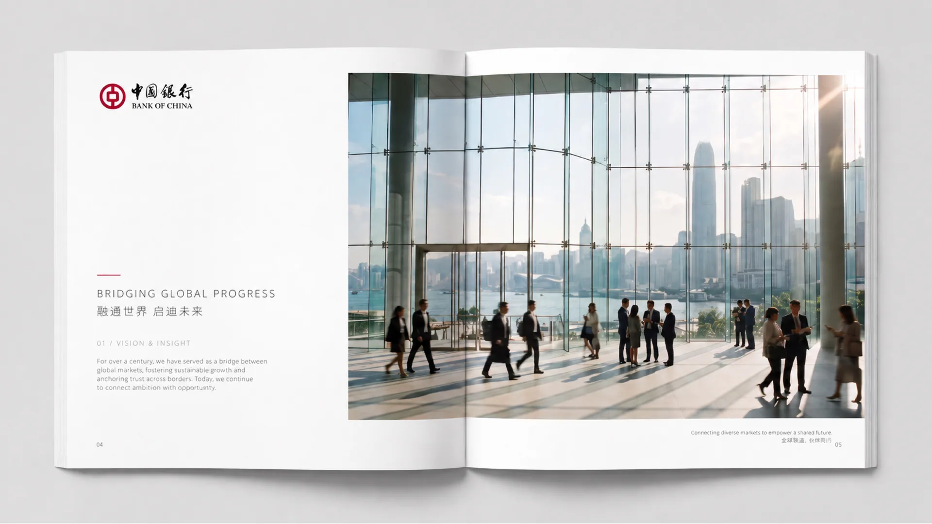
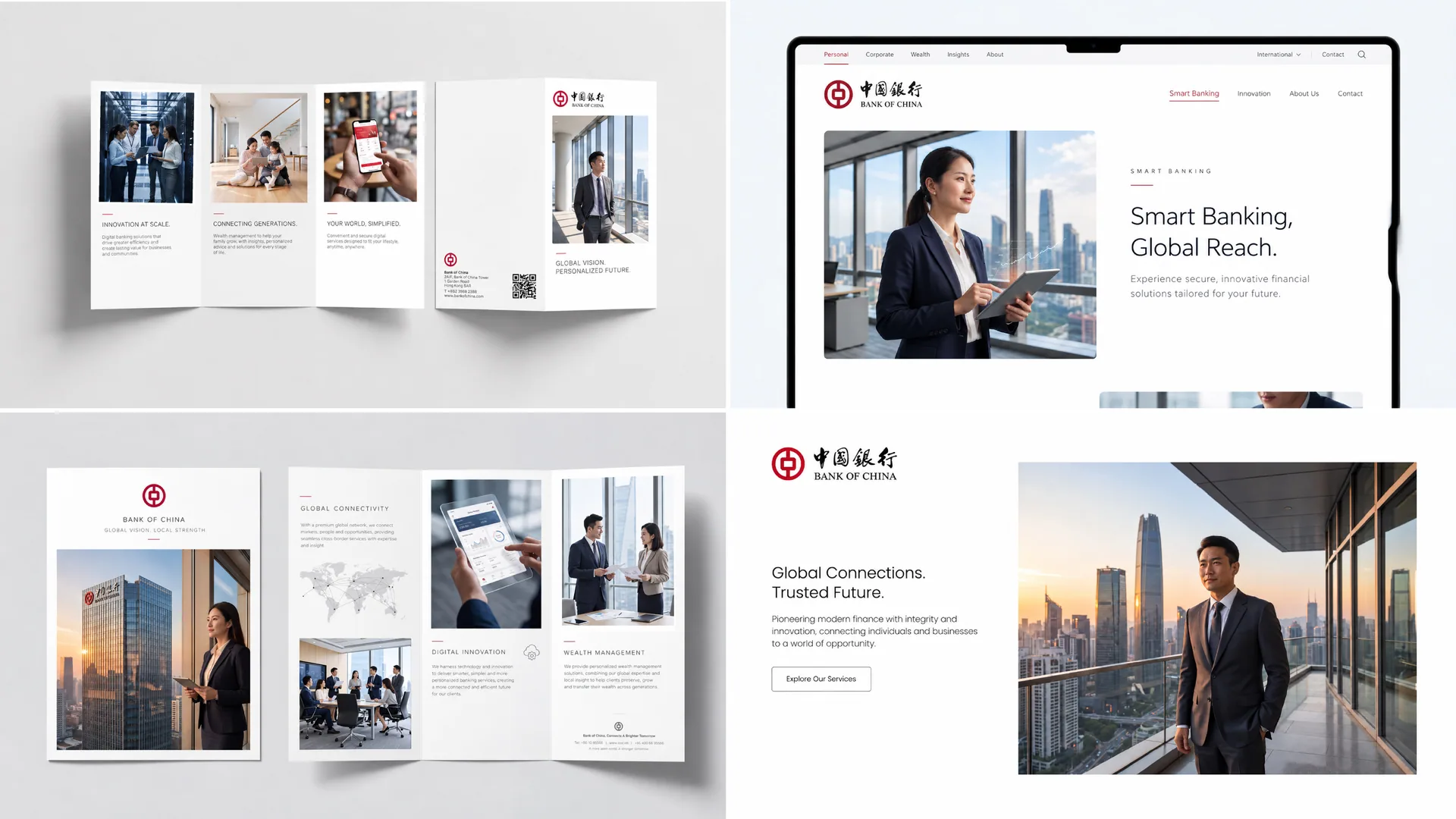
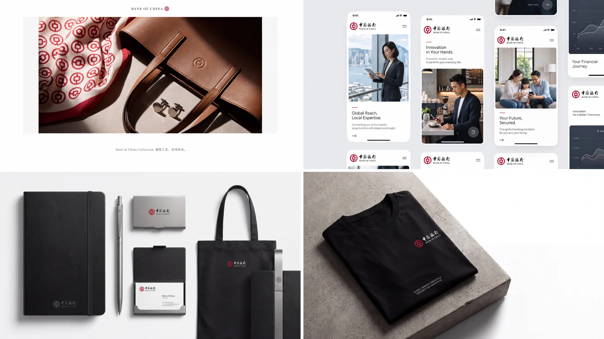
The project images below present the visual identity upgrade across different design formats. Each application builds on the same brand identity, with attention to consistency in context.
Brand Continuity
The upgrade preserves brand recognition while refining its applications, creating continuity between established brand assets and new design expressions.
Application Consistency
Applications coordinate emblem proportions, composition, color and information hierarchy to maintain brand recognition across formats. Detailed specifications are governed by the project deliverables and the brand owner’s approved version.
Project Presentation
The project images present applications from Bank of China’s visual identity upgrade, showing how the existing identity is carried across different design formats.