










Jianke 100 is a digital health platform with Internet medical and health services as its core. It is committed to providing users with one-stop solutions for online consultation, drug purchase, health management and chronic disease services.
The brand name "Jianke 100" is straightforward and powerful - "Jian" means health and points out the core areas of brand services; "Ke" means customers and users, conveying the user-centered service concept; "100" represents 100% health pursuit and 100% service commitment. Qingmei Future was commissioned to lead the brand identity design.
The design goal of the brand logo is to convey the brand image of "100% healthy and wholeheartedly guarded" through the visual language of healthy vitality, technological convenience and warm care.
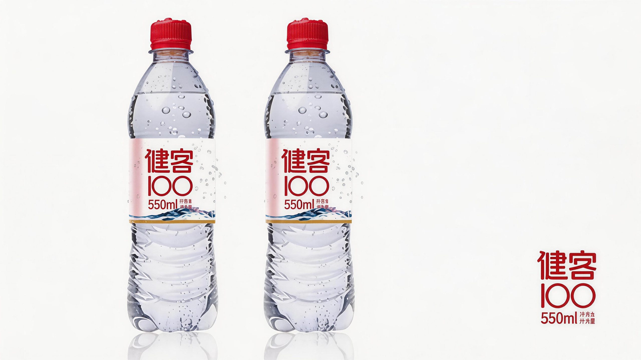
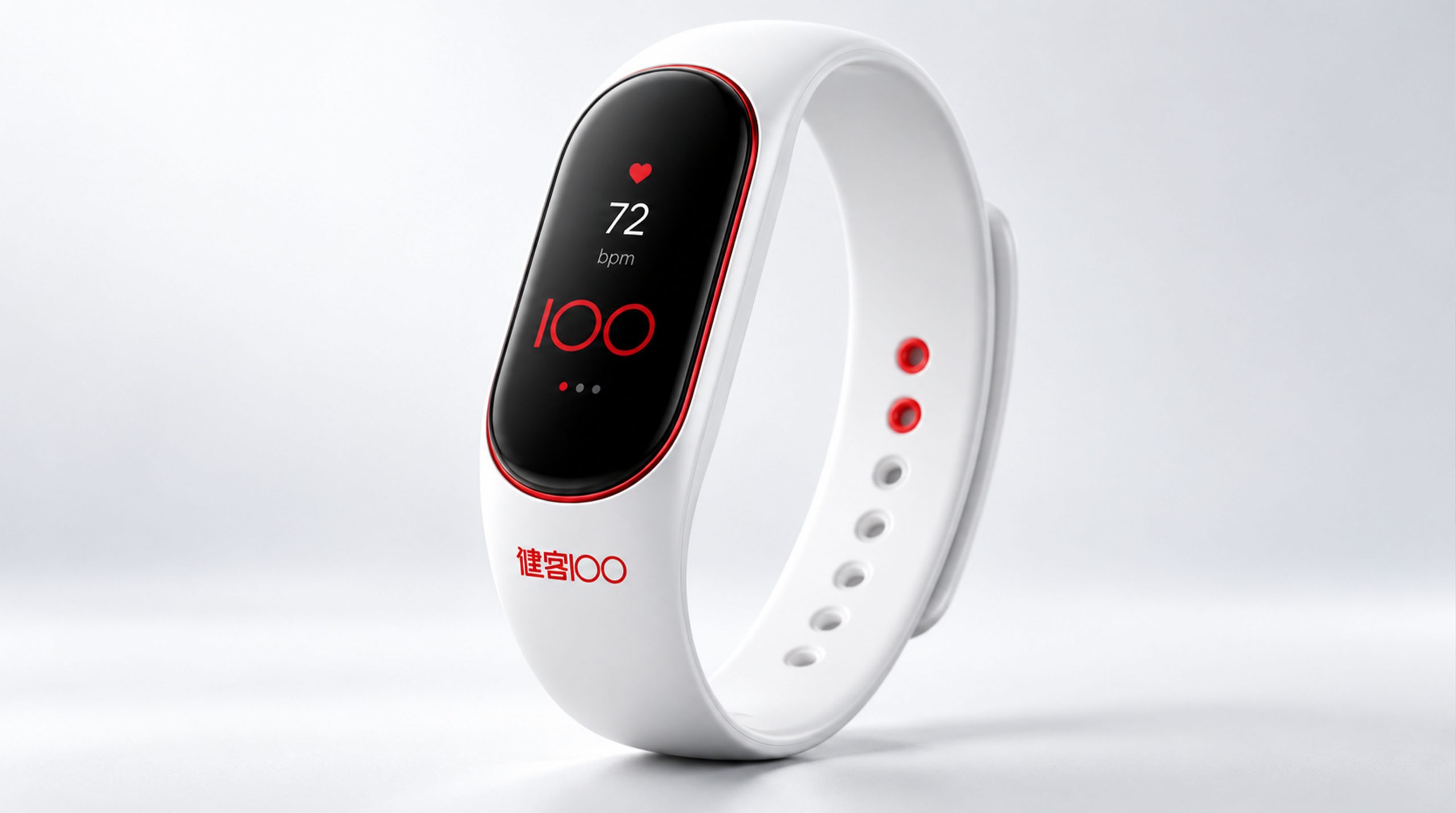
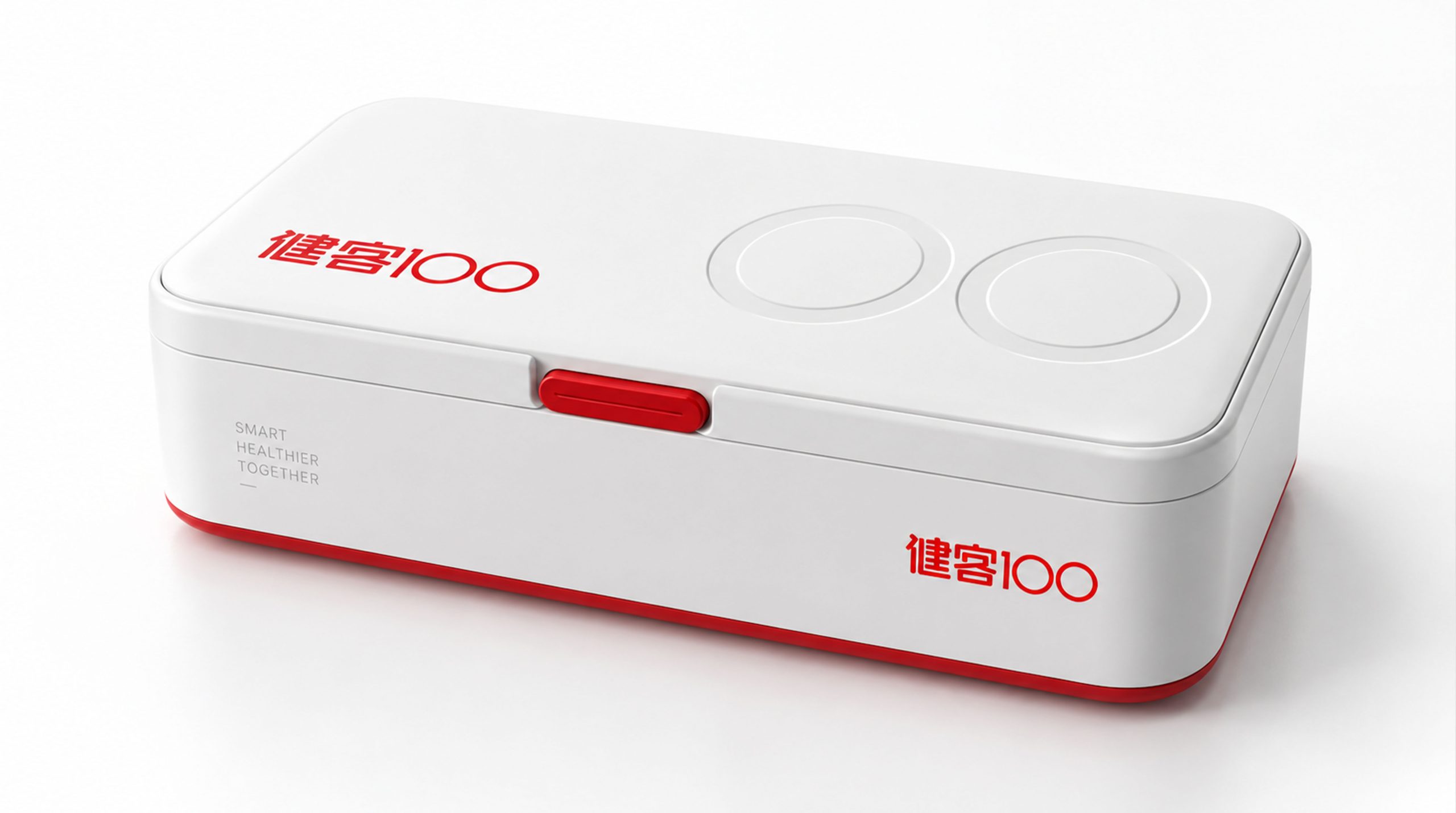
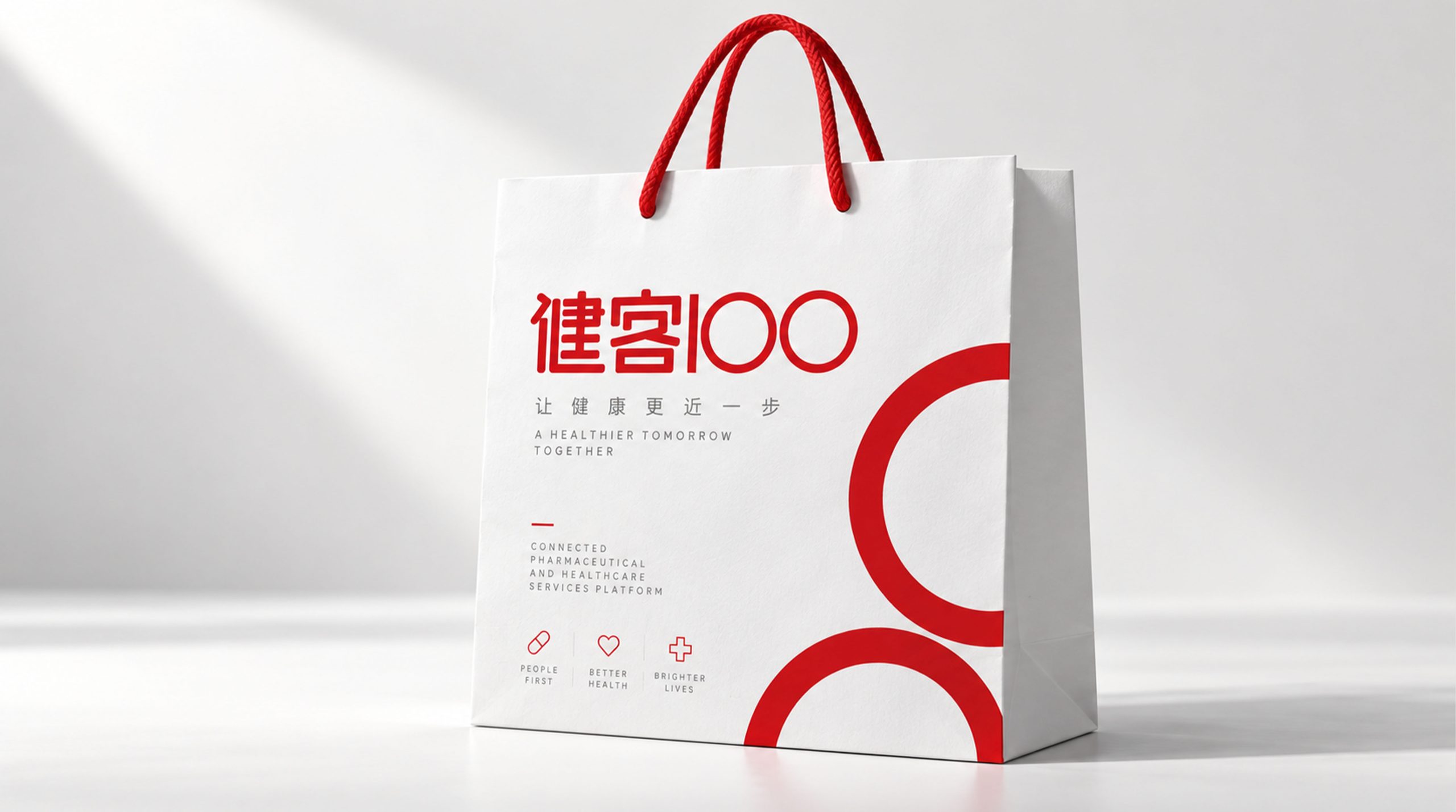
design concept
The logo takes "Pulse of Life" as its core concept and creatively integrates the pulse waveform of the electrocardiogram with the number "100". The electrocardiogram is the most recognizable visual symbol in the health field - a beating pulse is the signal of life. With the pulse waveform as the core of the logo, it establishes an intuitive connection between the brand and "health" in the first place.
graphic language
The graphic uses the number "100" as the visual skeleton, in which "1" is replaced by a powerful pulse waveform. The waveform is based on the QRS complex of a standard electrocardiogram - it starts with a smooth baseline, then rises rapidly to form a sharp peak, and then quickly falls back to the baseline, just like a strong heartbeat. The sharpness and power of the wave crest convey the vitality of life and healthy energy, and the smooth transmission platform of the baseline protects the calmness and reliability of users' health.
The two "0"s are presented in a full circle, and the first "0" can be integrated into a smile arc or a cross medical symbol - a smile conveys the joy of health, and a cross conveys the professionalism of medical services. The roundness and gentleness of the circle are different from the sharp dynamics of the pulse waveform, forming a rhythmic contrast of "dynamic and stillness" and "hardness and softness" within the graphics, conveying the platform's dual brand character of "professional medical capabilities + warm user care".
The baseline of the pulse waveform runs through the three characters "100", which is like a lifeline connecting the numbers into a whole - health is the main thread throughout, and 100 points is the eternal pursuit. The overall composition constructs "Pulse of Life" with the fusion logic of "pulse is life, percentage is commitment".
Font composition
The Chinese "Jianke 100" uses modern boldface with rounded corners, rounded and friendly strokes, and bright structure. "Jianke" conveys the affinity of health services, and "100" maintains a consistent font style with the graphic logo. The English "JIANKE 100" is arranged in standard uppercase sans serif font to ensure clear identification in digital platforms and industry cooperation.
color system
The main color, healthy green #00A86B, represents health, vitality and safety. Green is the most recognized brand color in the global medical and health field - the green cross in the pharmacy and the green interface of the medical APP. Green naturally conveys "health, peace of mind and trustworthiness". Auxiliary Vitality Orange #FF7043 is used for user interaction and marketing activity elements in the brand system. The warmth and enthusiasm of orange inject the joy of healthy life into the rational green. The combination of green and orange conveys "professional protection + dynamic life". Auxiliary pure white #FFFFFF is used as the standard background color and the basic color of the APP interface. Secondary Neutral Gray #666666 is used for secondary text. The overall color uses green and orange as the dual core, reflecting the brand temperament of "healthy, trustworthy, energetic and warm".
Application extension
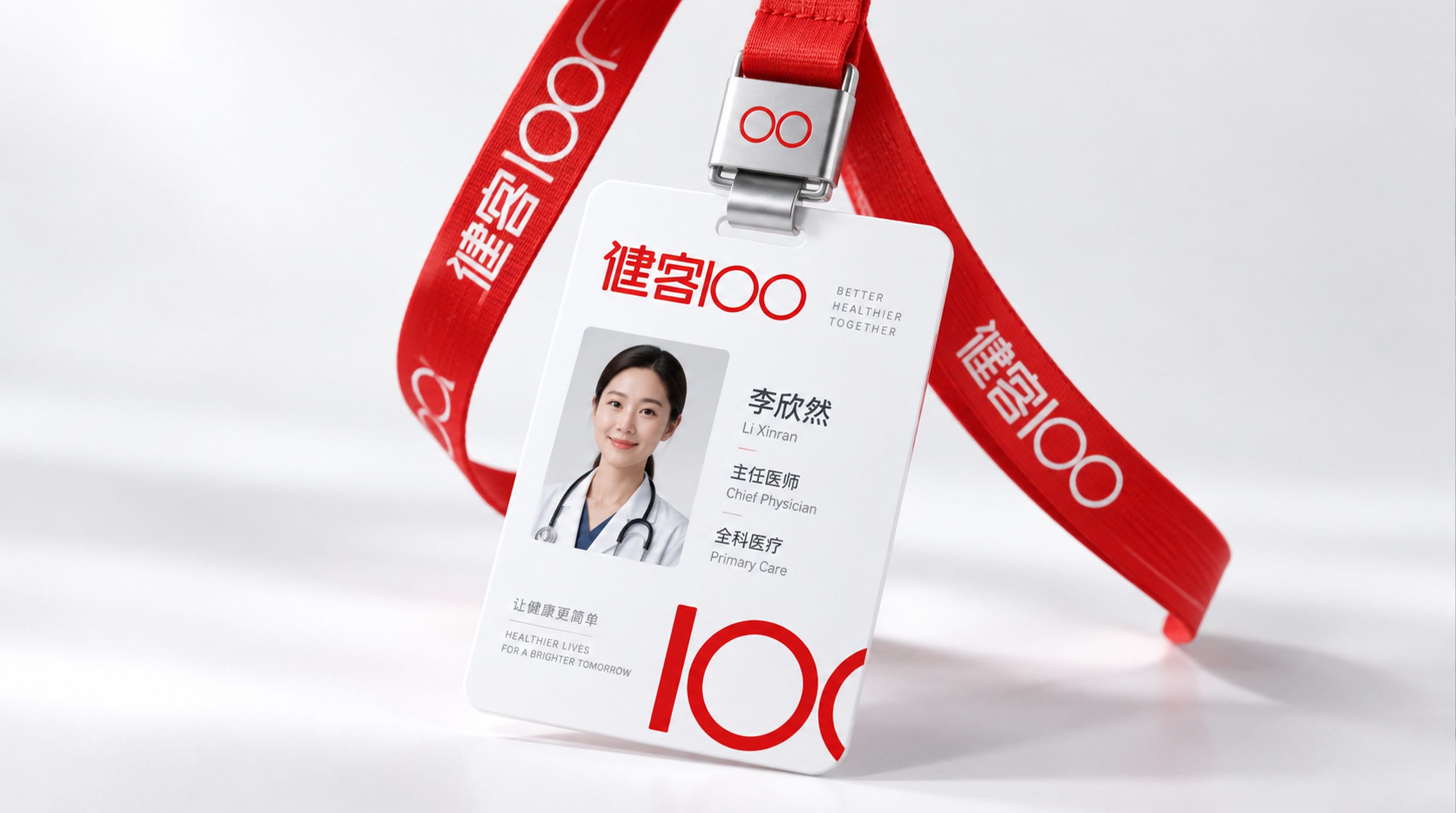
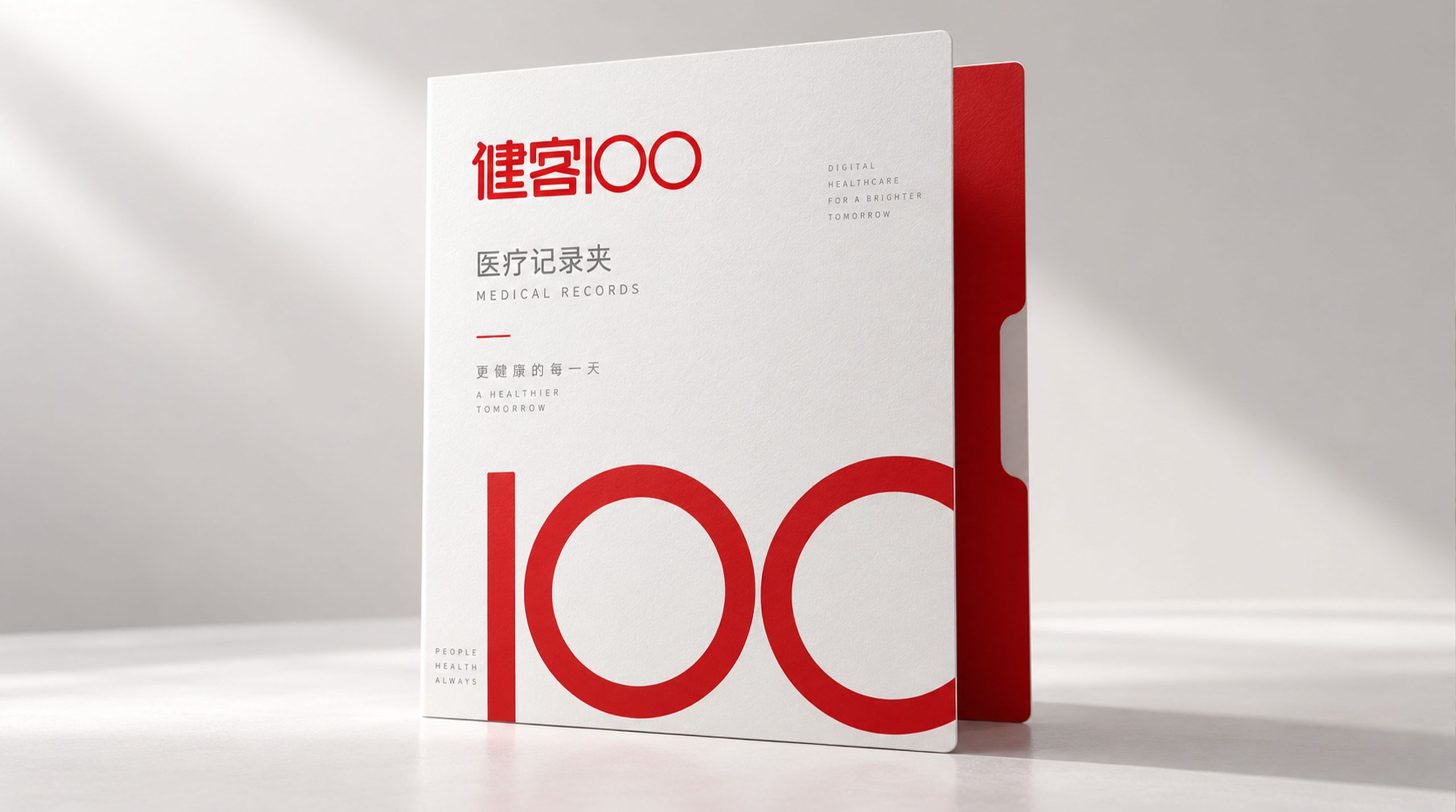
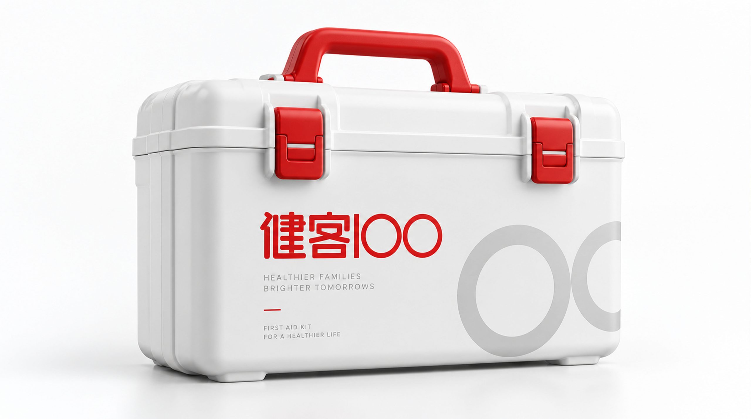
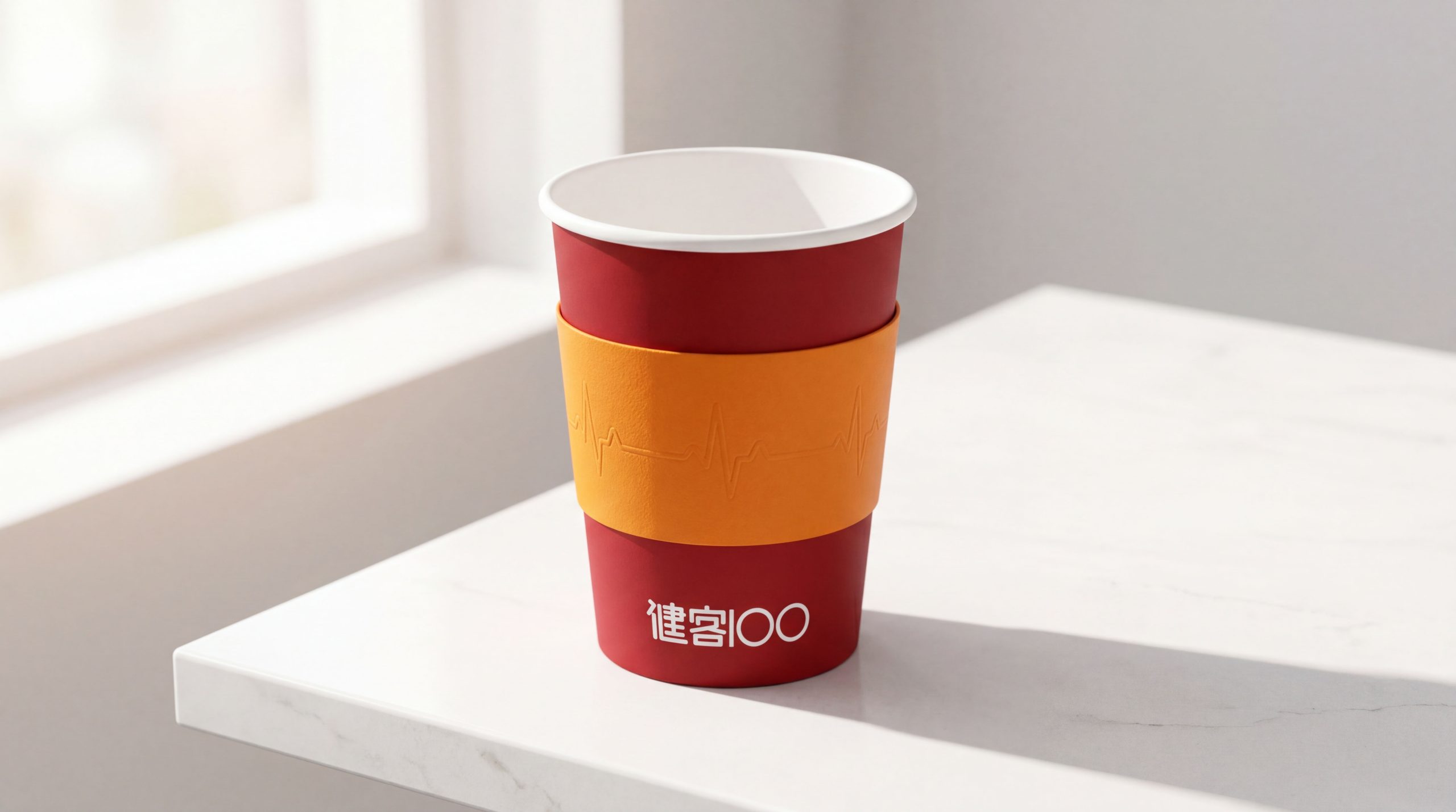
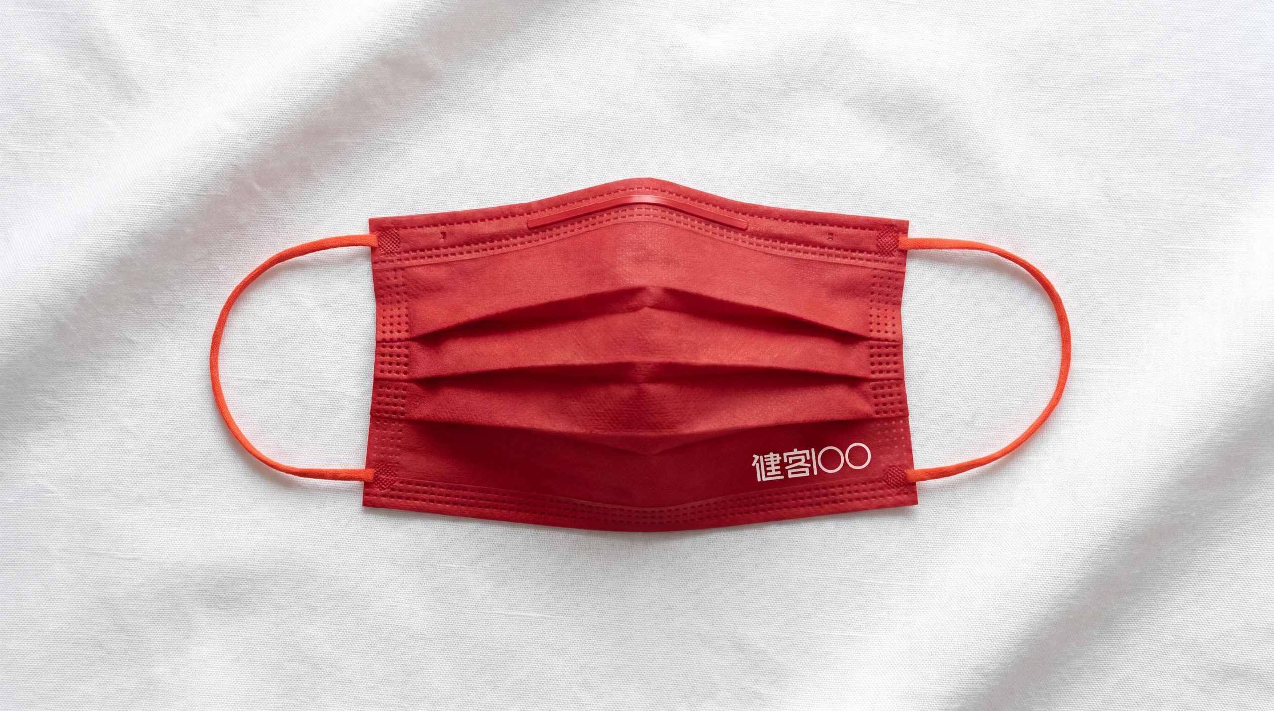
The logo can be widely used in mobile APP icons and interfaces, official websites and mini program entrances; drug package outer packaging, delivery bags and user health manuals; offline cooperative pharmacy logos and smart medicine cabinet brand labeling; big health industry summits, Internet medical forums and brand cross-border cooperation images. On the APP startup page, the pulse waveform beats once with the rhythm of a dynamic heartbeat, and "100" lights up immediately, conveying that "every time you open Jianke 100, it is a focus on health." In the dynamic visual, the baseline extends steadily from left to right, the pulse wave peak jumps powerfully, and the two circles light up with smiles in sequence, symbolizing that Jianke 100 protects the 100% health of every user with professionalism and warmth.
brand meaning
The logo contains three core images: Vital Pulse - the pulse waveform conveys healthy life energy and the platform's real-time attention to user health; 100% Commitment (100% Care) - "100" conveys 100% investment in health service quality and user experience; Warm Protection - the rounded shape and green main tone convey the Internet health platform's brand personality of "professional but not cold, reliable and warm". The overall design conveys the brand vision of "100% healthy and wholehearted protection".
Improper Usage (Protection Specification)
Do not change the QRS complex characteristics of the pulse waveform or replace it with other waveforms; do not modify the numerical ratio of "100" or the penetration relationship of the pulse baseline; do not change the hue of the main color of healthy green; do not add strokes, shadows or decorative effects inconsistent with the healthy style; do not separate the pulse and numbers for separate use; keep the white space ≥ 25% of the graphic height; the minimum display width shall not be less than 25mm.
design results
After the release of the logo, Jianke 100's brand recognition and user trust in the field of Internet medicine and health have been significantly improved. "Pulse of Life", with its visual language that combines healthy vitality and warm care, has become the core identification symbol of the brand system, showing the brand vision of "100% healthy and wholehearted protection".