










Linkage Education is a comprehensive education service organization with the core of educational resource integration and collaborative education. It is committed to linking schools, families and society to provide students with full-chain education services covering subject tutoring, quality training, further education planning and educational consultation.
The brand name "Lianfeng" conveys a clear educational proposition - "Lian" means union and connection, symbolizing the close collaboration between education subjects; "Dong" means drive and interaction, symbolizing the vivid vitality of teacher-student interaction and the integration of knowledge and action in the education process. Alliance is joint force, movement is growth, and linkage is to allow education to stimulate growth in collaboration. Qingmei Future was commissioned to lead the brand identity design.
The design goal of the brand logo is to convey the brand image of "joint education and dynamic growth" through the visual language of collaborative growth, dynamic interaction and knowledge transfer.
design concept
The logo takes "Growth Connection" as its core concept, integrating the posture of two human figures connected to each other and the momentum of upward growth. The essence of education is the connection between people - teachers and students, parents and children, knowledge and practice. Each set of connections is a catalyst for growth.
graphic language
The main body of the graphic consists of two concise human-shaped symbols. Two human figures stand side by side in mirror symmetry, one tall and one short - the taller one resembles the guiding role of a teacher or parent, and the short one resembles the growth posture of a student or child. The two figures each stretch out an arm and hold each other tightly in the middle. The handshake forms a connection point, conveying the core interactive relationship of "guiding and being guided, imparting and absorbing" in education.
The other arms of the two figures are raised upward at the same time, like cheering, like stretching, like struggling to reach a higher goal - this is the most moving gesture of education: one person leads, the other follows, and both parties move upward together. The arc of the raised arms forms an upwardly open arc-shaped space at the top, like an open door or an open sky, conveying the core value of education to "open horizons and expand possibilities".
The legs of the two figures are supported by a stable triangular structure, conveying the solid foundation of education. The overall graphic outline is in the shape of a "V" or "U" that expands upward, with the bottom gathered like a common starting point and the top stretched like their respective futures - education starts from the same starting point and leads to infinite possibilities. The composition uses the humanistic structure of "holding hands and moving forward together" to build a "growth connection".
Font composition
The Chinese "Linked Education" uses modern black font with rounded corners, rounded and friendly strokes, and clear and lively structure. "Linkage" conveys the brand's synergy concept, and "education" clarifies the industry attributes. The English "LIANDONG EDUCATION" is arranged in standard uppercase sans serif font, with a friendly and professional font.
color system
The main color, growth blue #2E86C1, represents the vast sky of knowledge, trust and growth. Blue conveys the brand signal of "professional, reliable and in-depth" in the education industry, just like the sky that children look up to - vast and full of possibilities. Auxiliary Vitality Orange #F39C12 is used in the interactive elements of the brand system for students and parents. The passion and vitality of orange convey the "interesting, informative and motivational" learning experience in the education process. The combination of blue and orange conveys "professional guidance + dynamic growth". Auxiliary sprout green #27AE60 is used for growth and progress-related elements in the brand system, just like a seed breaking through the ground and growing. Pure white #FFFFFF as standard base color. The overall color uses blue and orange as the dual core and green as the finishing touch, reflecting the brand temperament of "professional warmth, dynamic growth".
Application extension
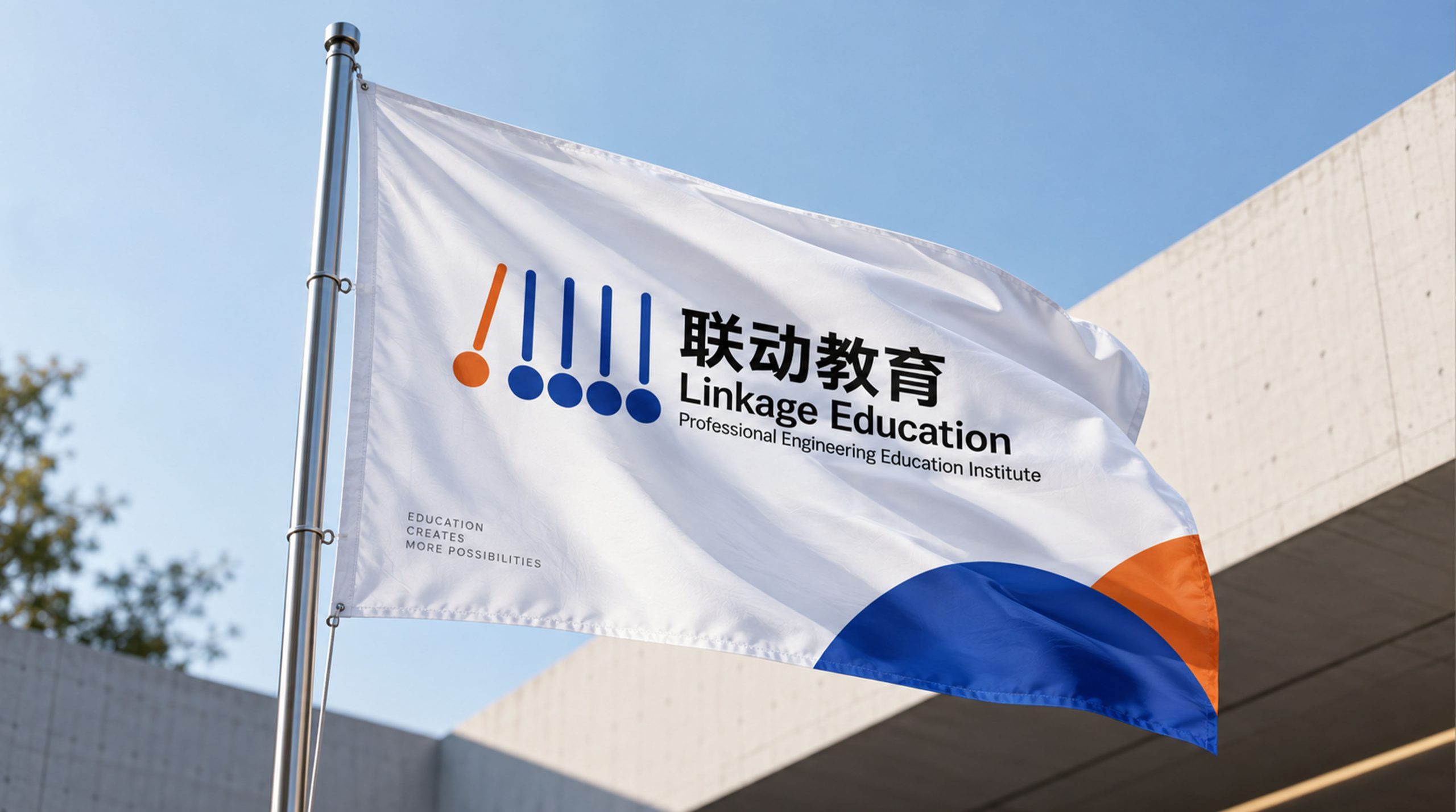
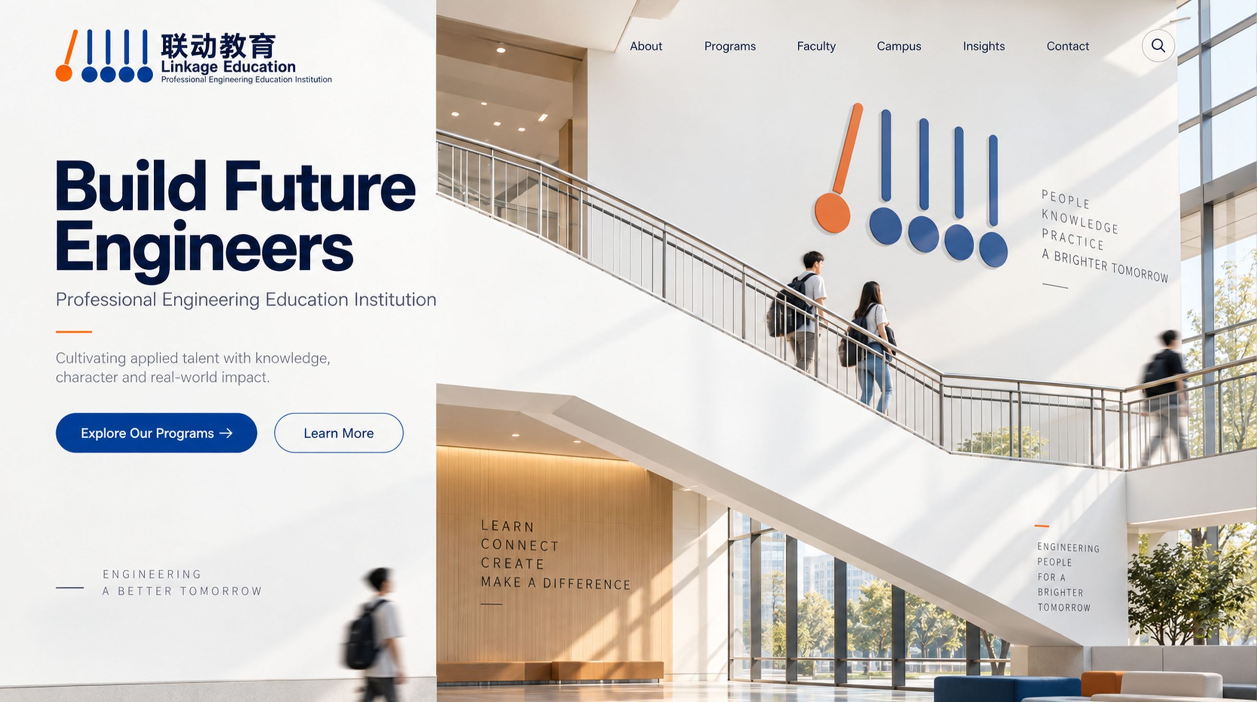
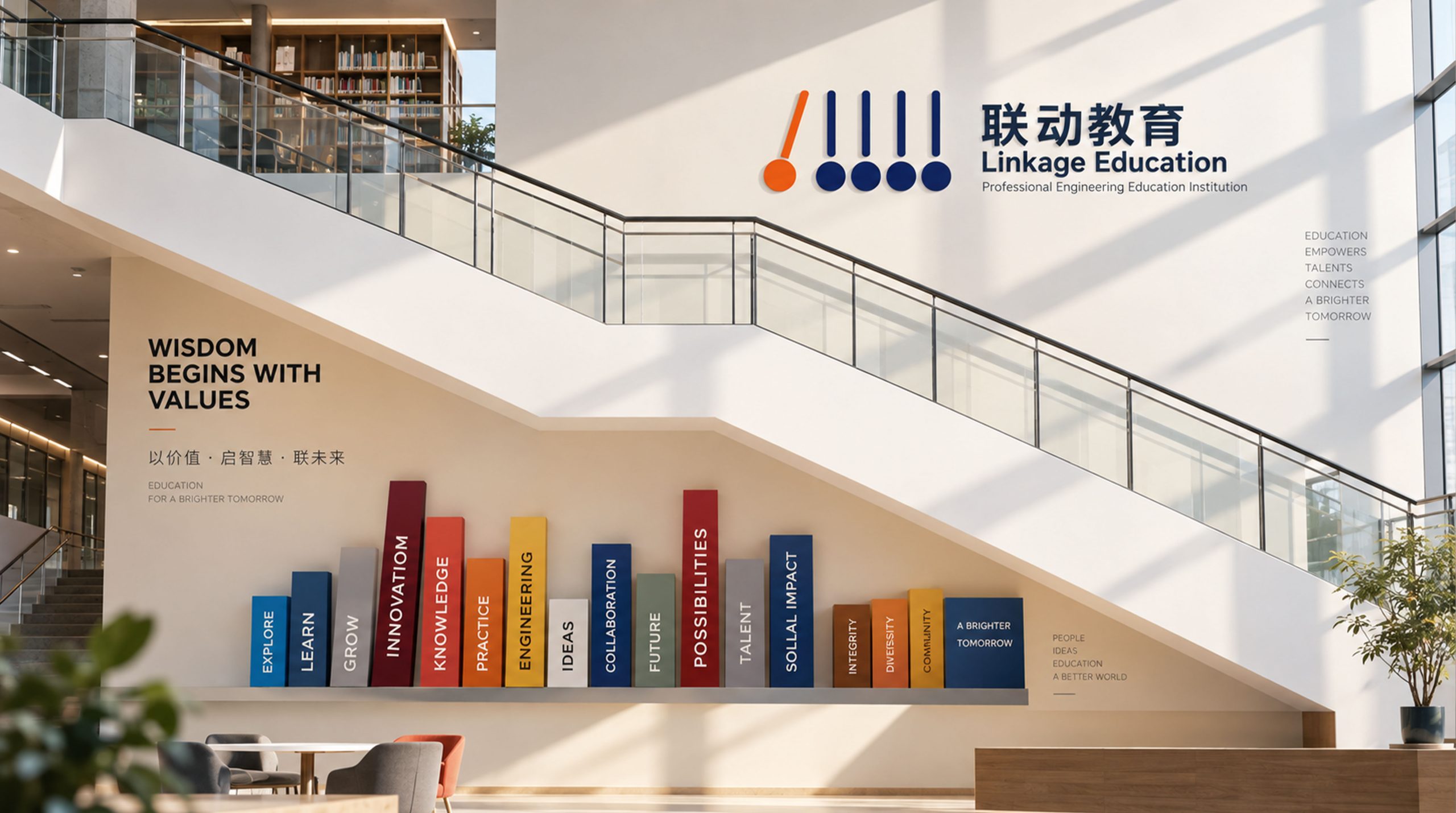
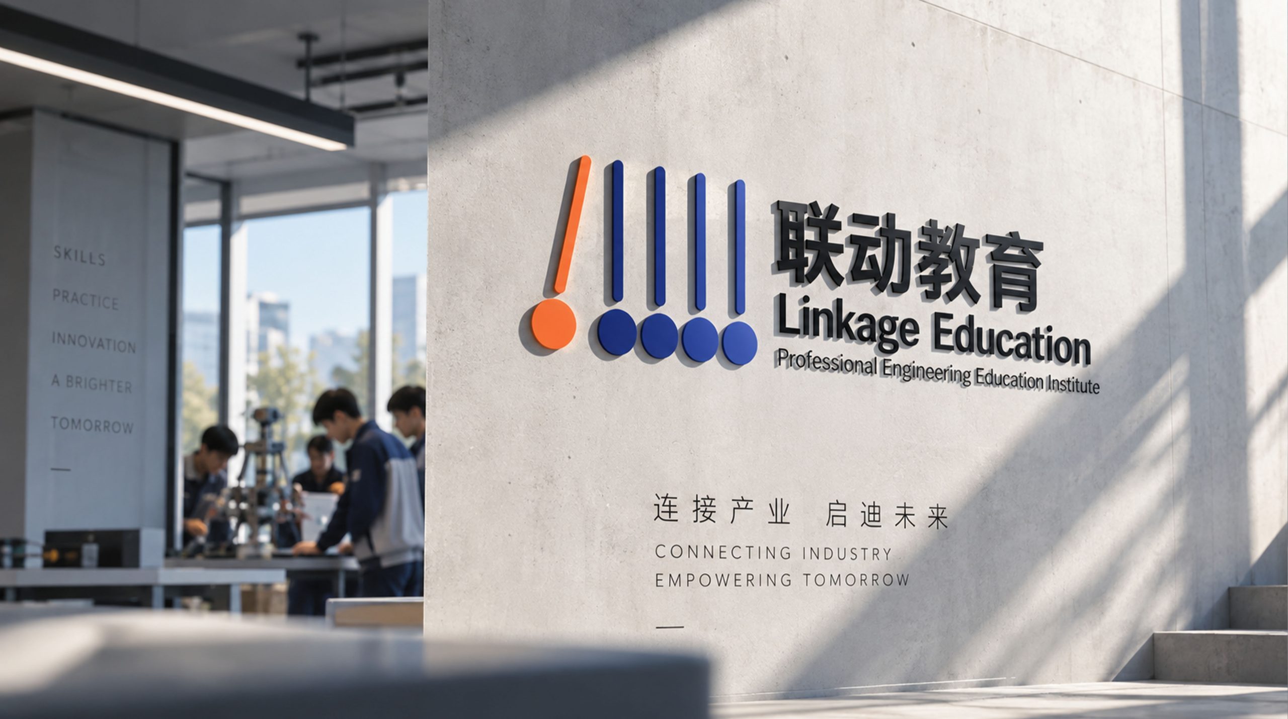
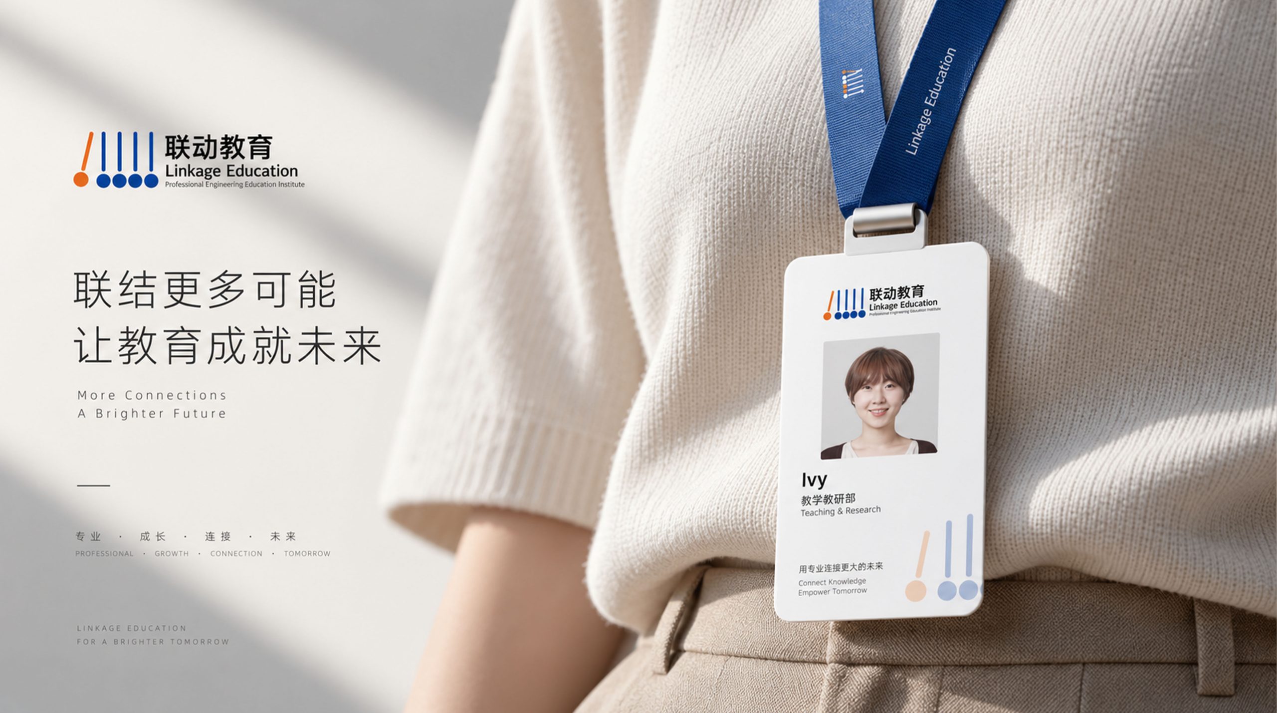
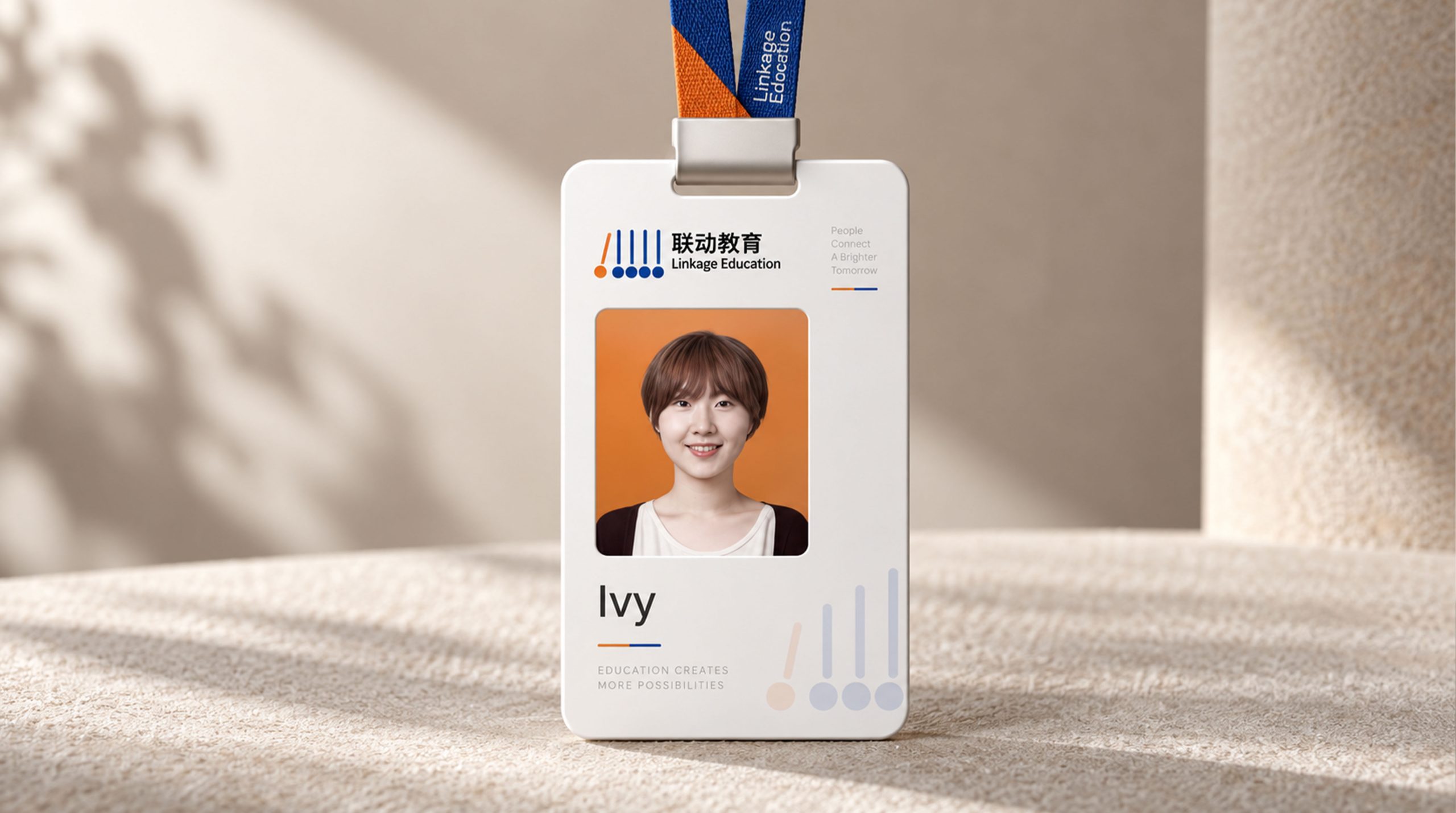
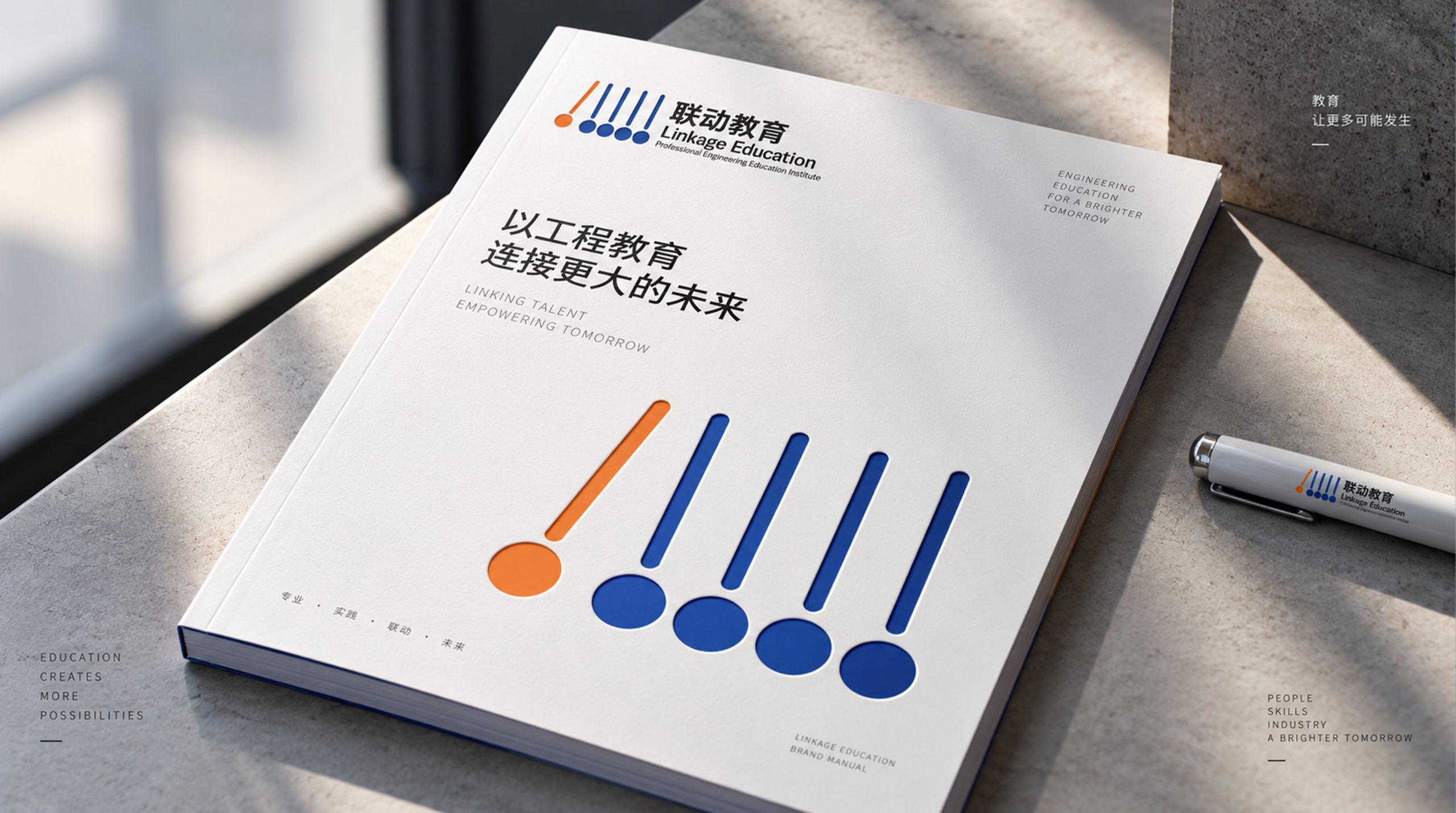
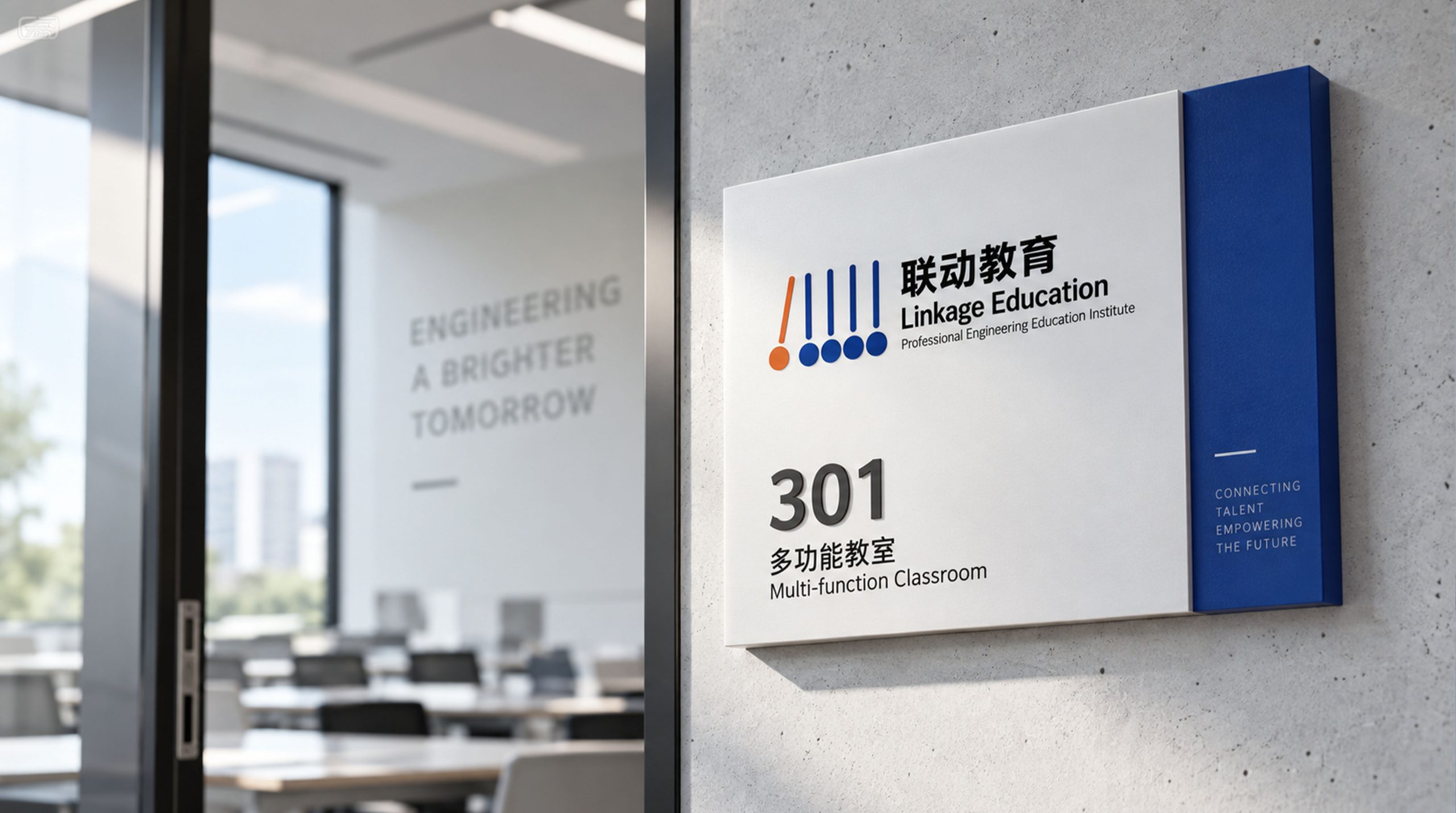
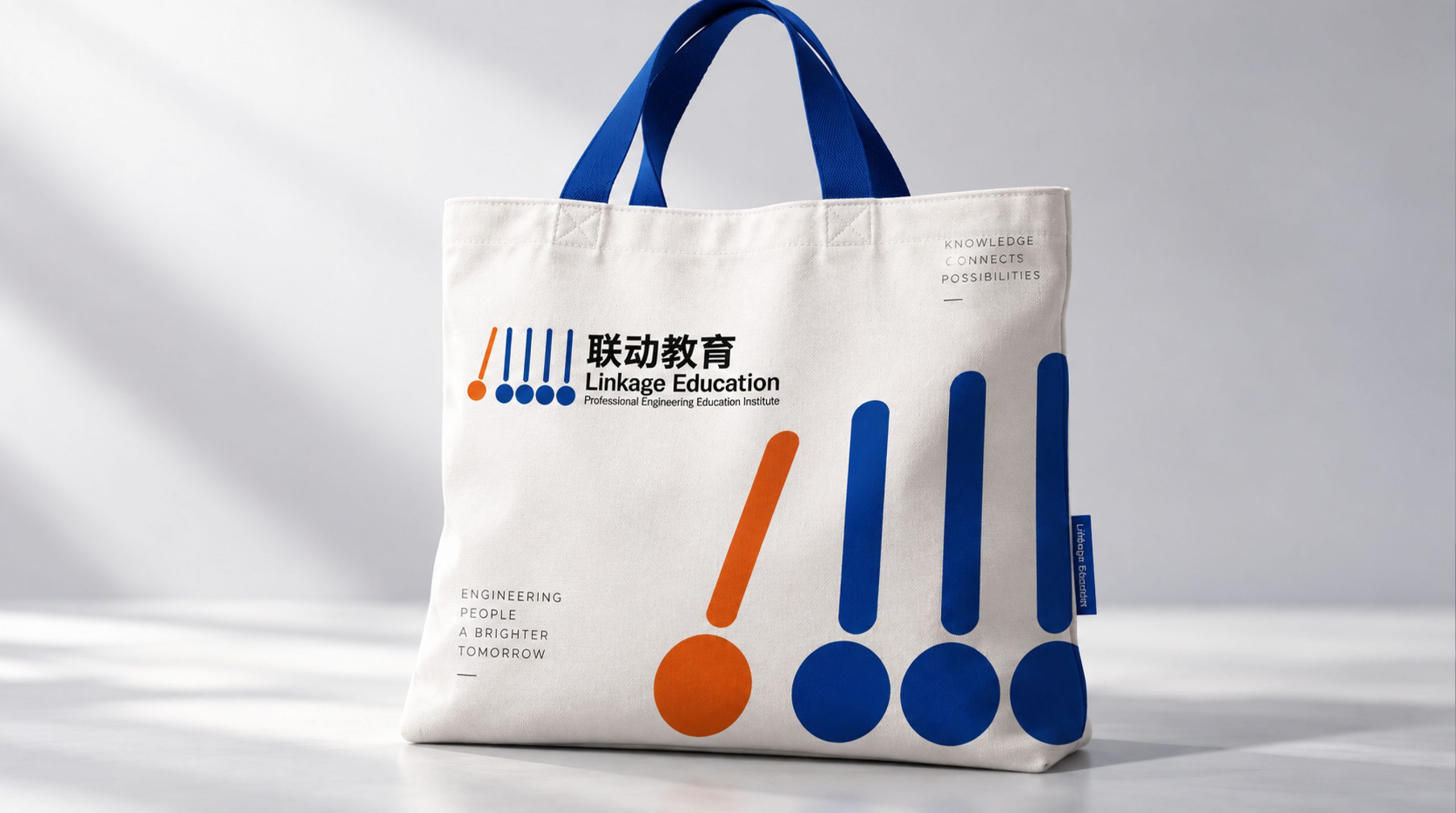
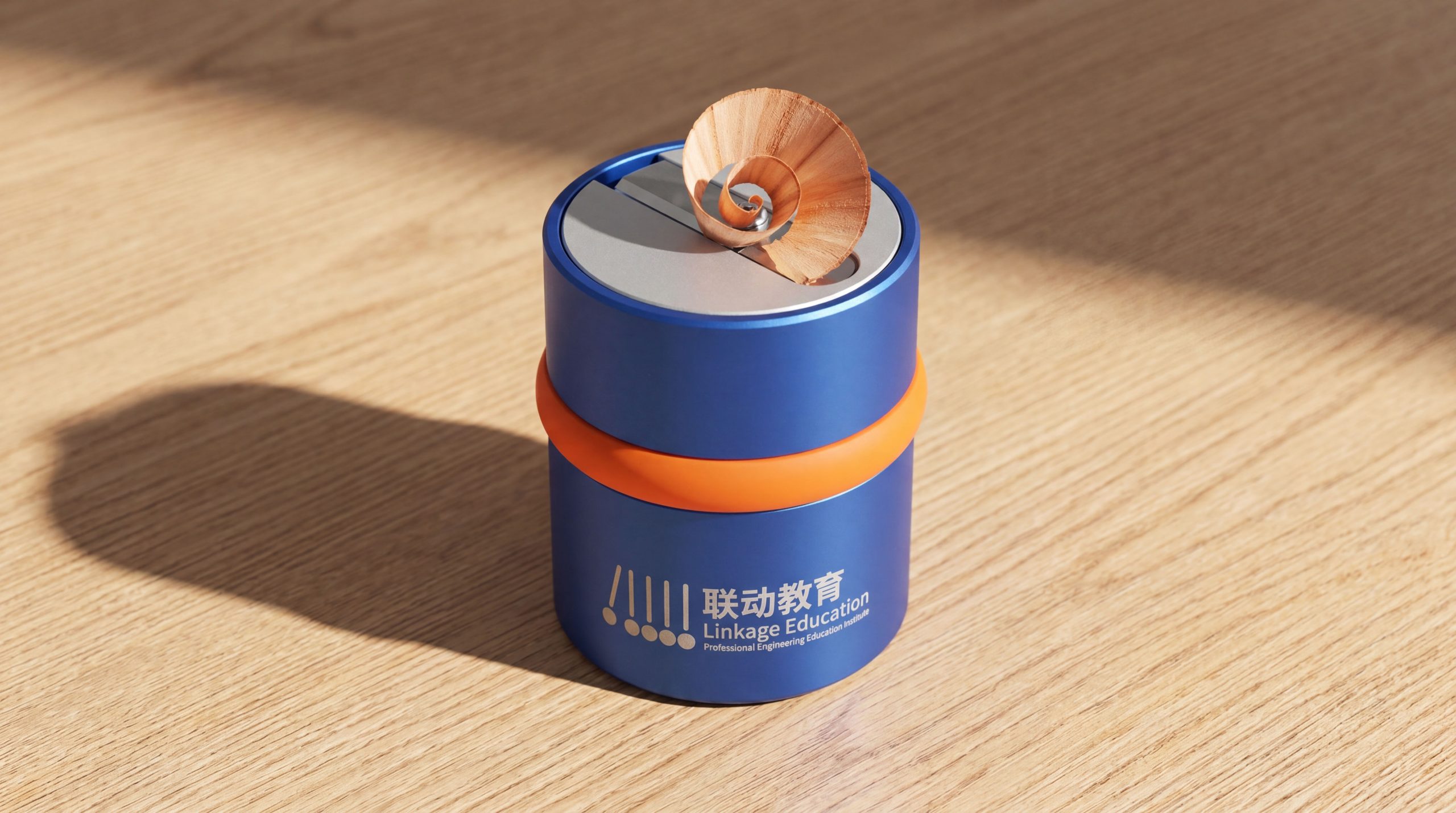
The logo can be widely used in teaching center doors and classroom environment signs; course manuals, student growth files and parent communication materials; official websites, online learning platforms and social media images; education industry forums, further education planning lectures and home-school linkage activity images. At the entrance of the teaching center, a double human-shaped logo is presented as a three-dimensional device. When students walk into the campus every day, they encounter the brand symbol of "Hand in Hand Upward" and subtly feel the brand warmth of "Growing Together". In the dynamic visual, two figures walk in from both sides of the screen, shake hands and connect in the center, and then jump up together, raising their arms, symbolizing the collaborative power of Linked Education to promote the growth and leap of every student.
brand meaning
The logo contains three core images: Collaborative Education - a two-person handshake conveys an education model in which schools, families and society are interconnected; Dynamic Growth - an upward gesture conveys the core value of education that stimulates students' potential and drives continuous growth; People First - a human-shaped symbol conveys the brand's warmth that education is people-oriented and focuses on the growth of each individual. The overall design conveys the brand vision of "joint education and dynamic growth".
Improper Usage (Protection Specification)
Do not change the height ratio or the handshake connection relationship between the two human figures; do not delete the arc of the upwardly raised arm; do not change the hue of the main color of long blue; do not add strokes, shadows or decorative effects that are inconsistent with the educational style; do not separate the two human figures for separate use; keep the white space ≥ 25% of the height of the figure; the minimum display width shall not be less than 25mm.
design results
After the release of the logo, the brand recognition and parent trust of Linked Education in the field of educational services and collaborative education have been significantly improved. "Growth Connection", with its visual language that integrates synergy and growth vitality, has become the core identification symbol of the brand system, showing the brand vision of "joint education, dynamic growth".