










Huaze Group is a comprehensive enterprise group with industrial investment and diversified industrial operations as its core. Its business covers metal smelting, mineral resources, financial investment and commercial circulation. It is committed to promoting the sustainable development of the enterprise with its deep industrial foundation and extensive resource integration capabilities.
The brand name "Huaze" is rich in meaning - "Hua" means China and brilliance, symbolizing the responsibility and brilliant career of a national enterprise rooted in the land of China; "Ze" means moisturizing and benevolence, symbolizing that the company benefits society with its industrial achievements and enriches people's livelihood with its resource advantages. Hua is light, luster is nourishment, and everything the light shines on is moist. Qingmei Future was commissioned to lead the brand identity design.
The design goal of the brand logo is to convey the brand image of "bringing light to the far reaches and nourishing all directions" through the visual language of Huacai's grandeur, moistness, breadth and stability.
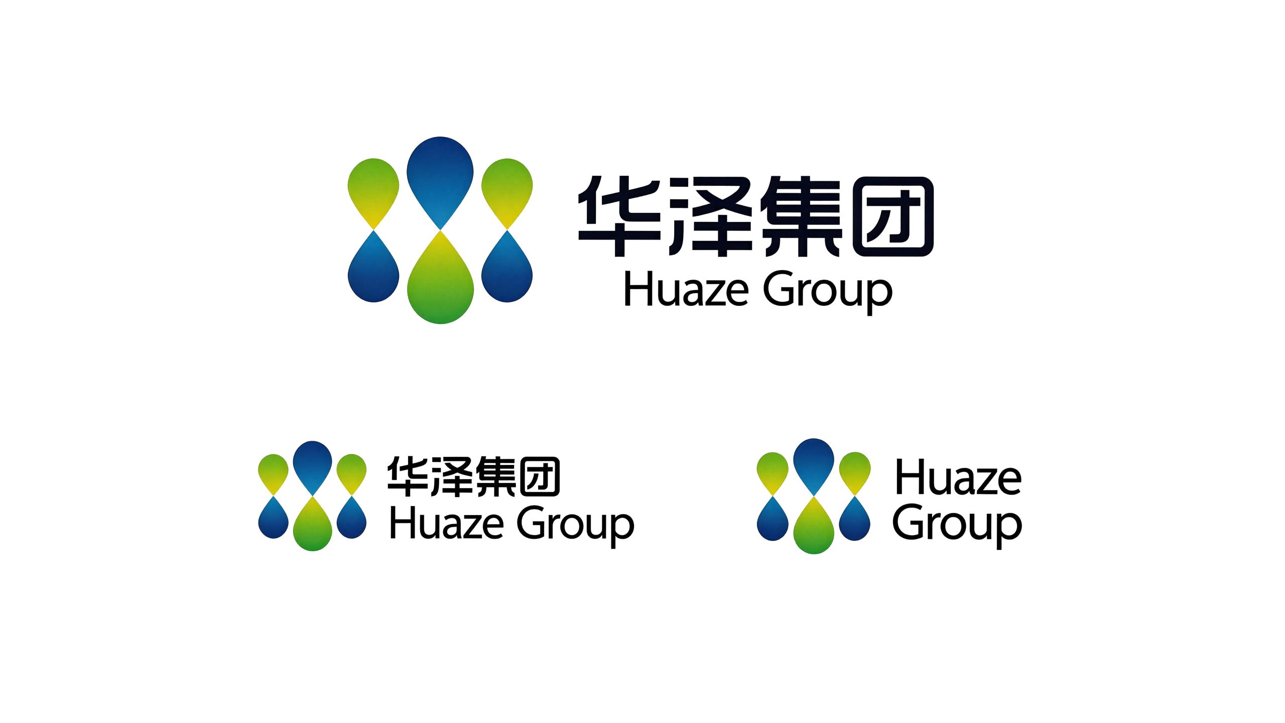
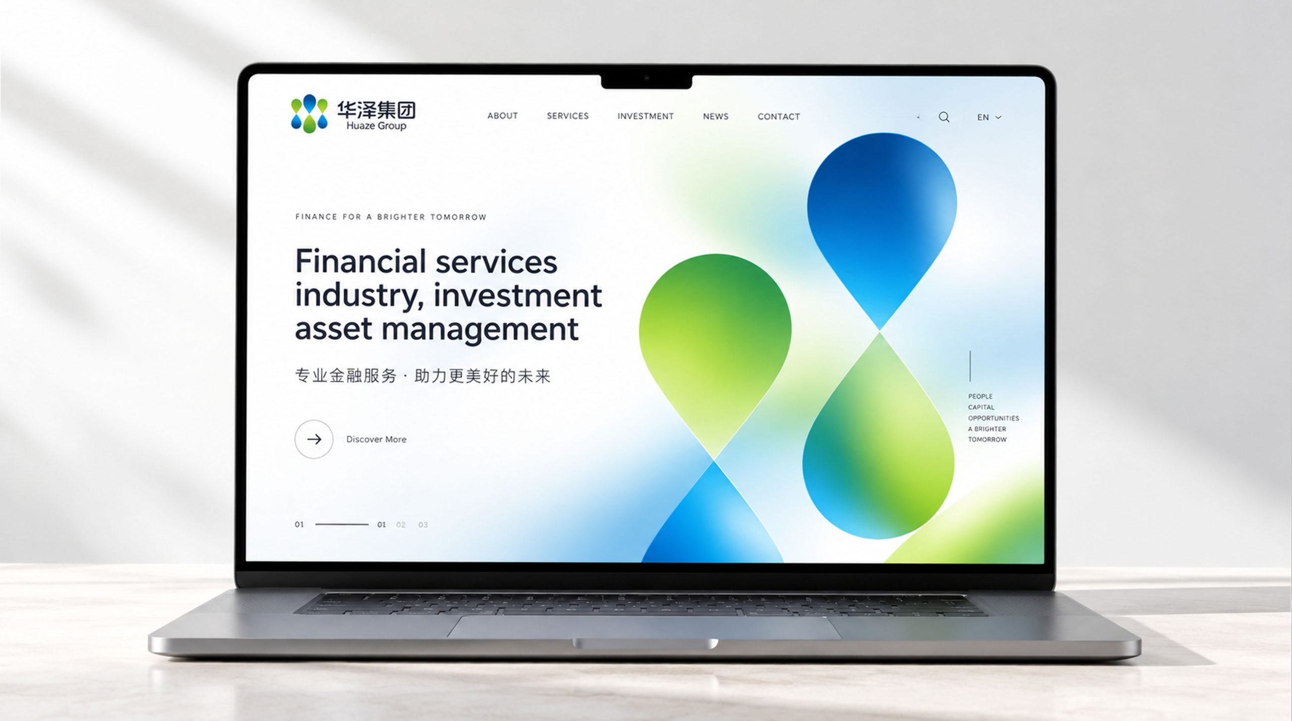
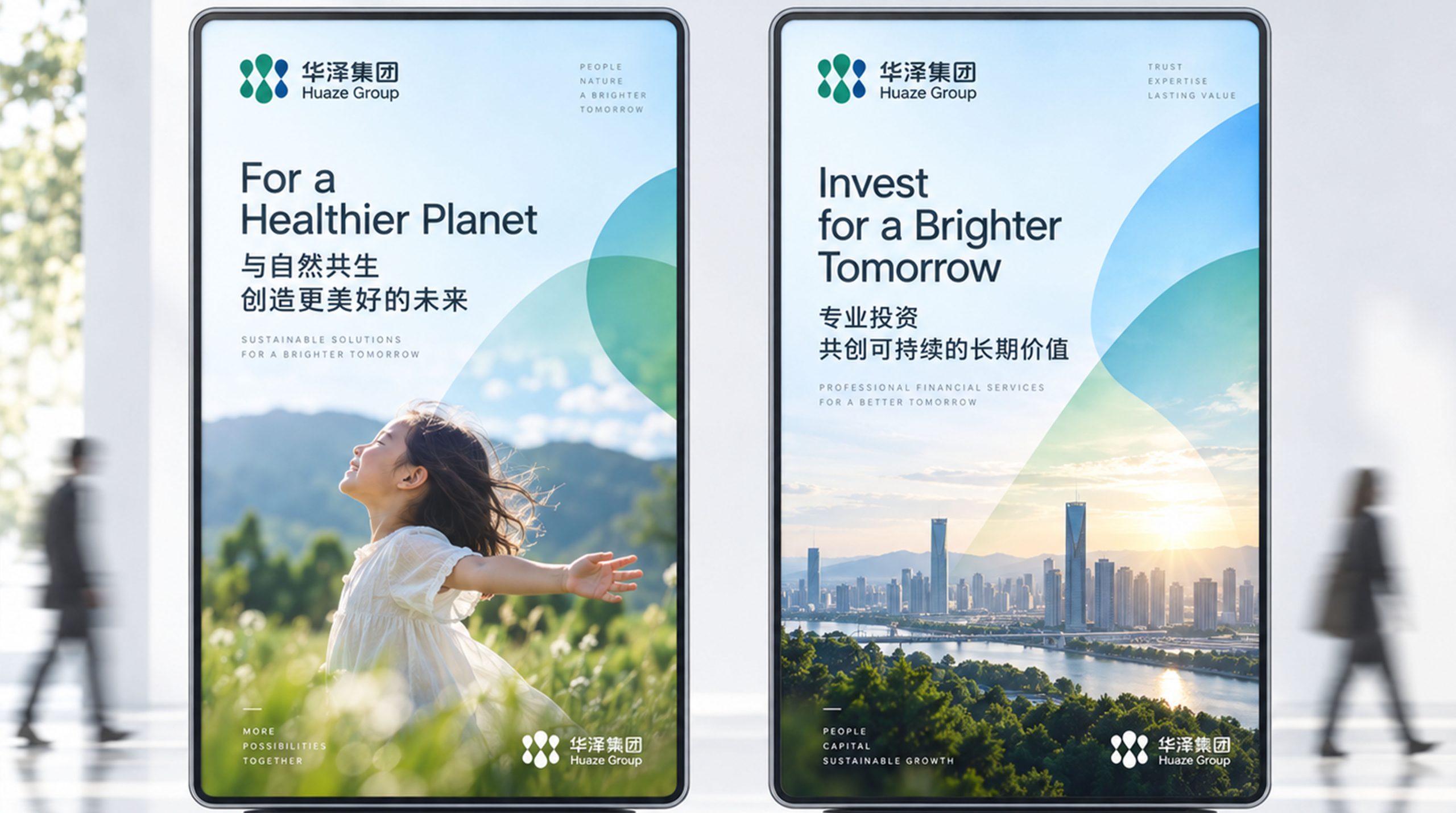
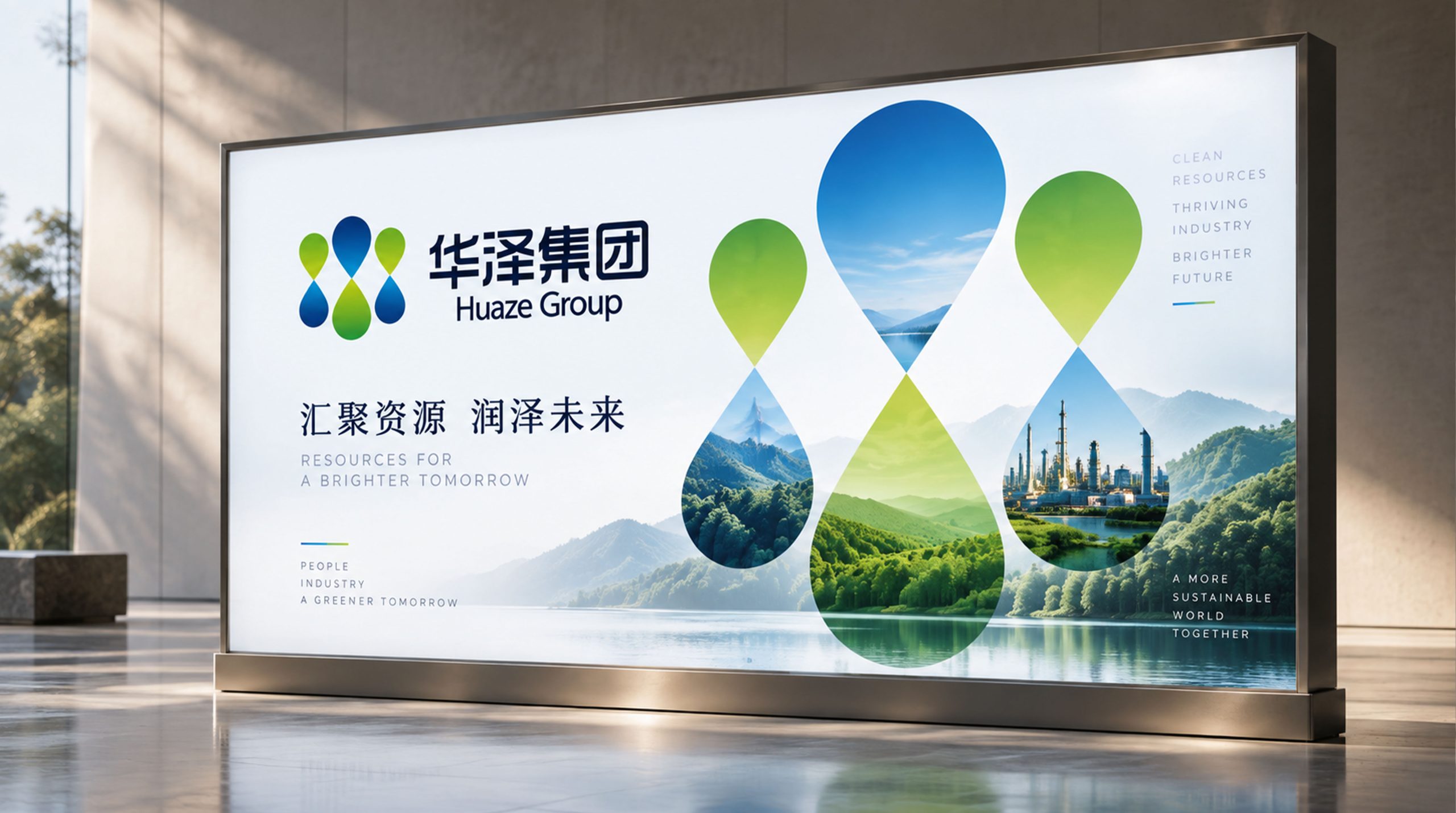
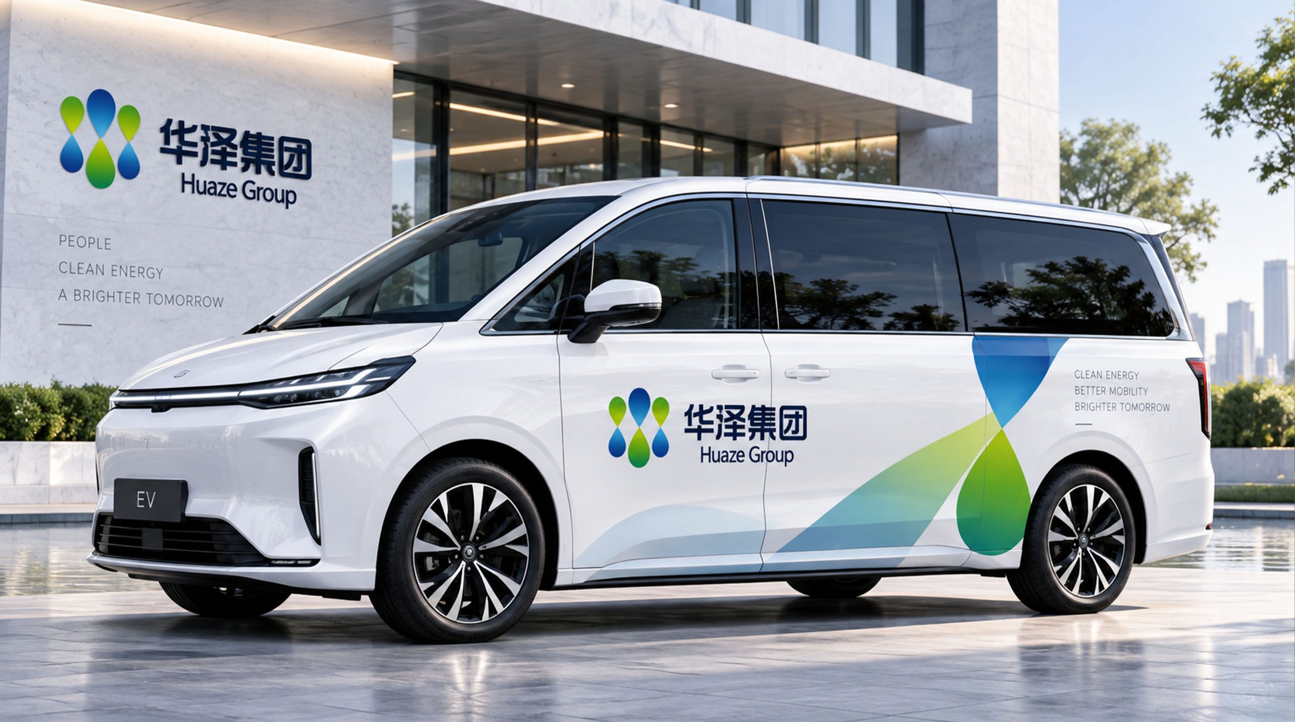
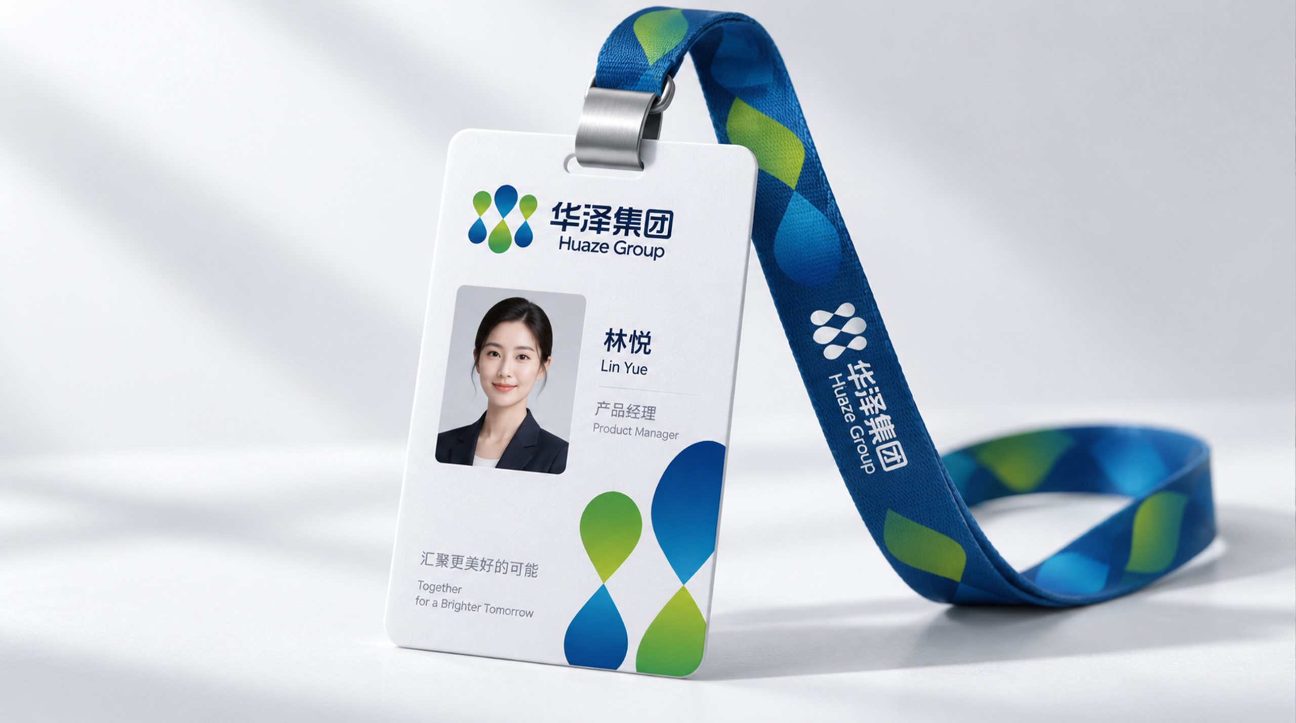
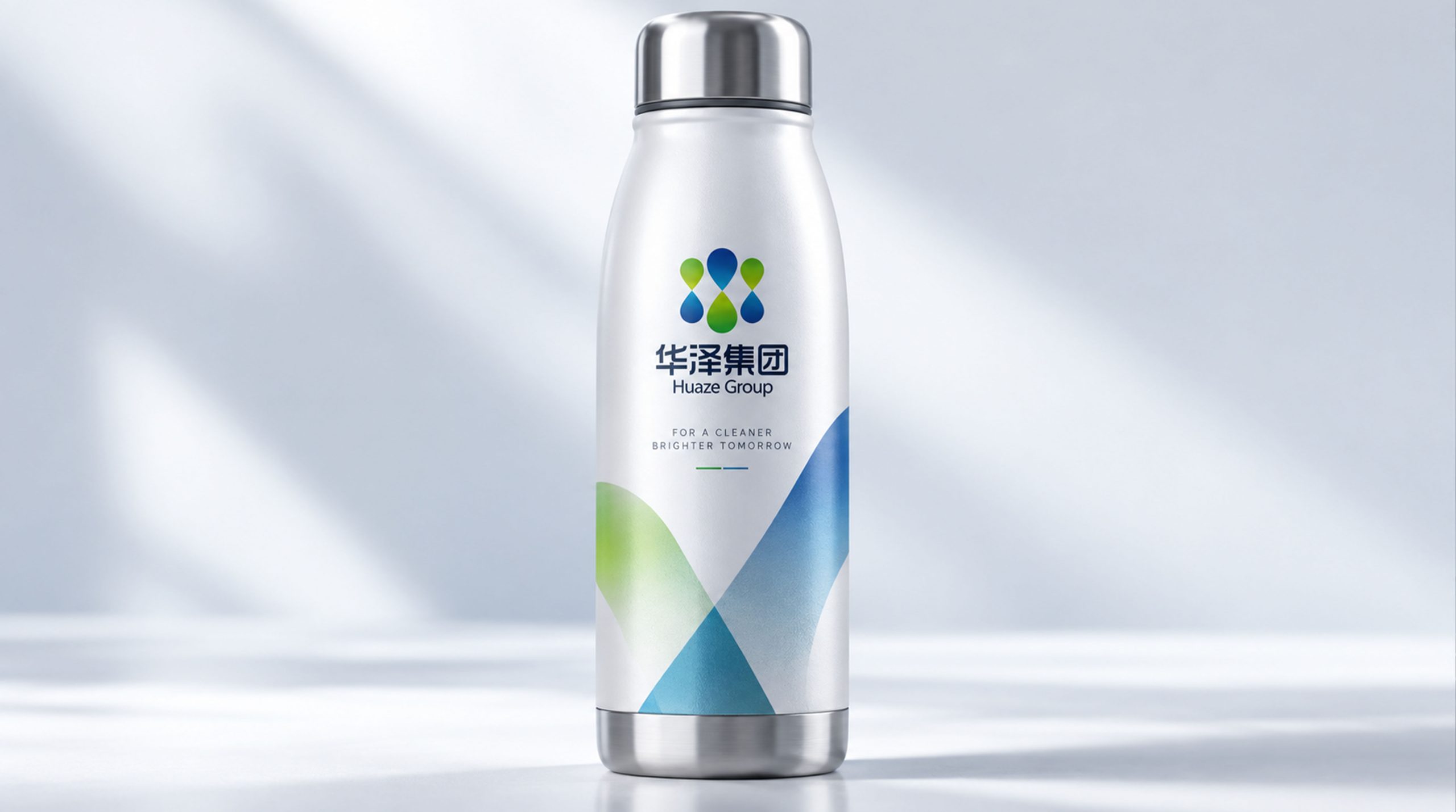
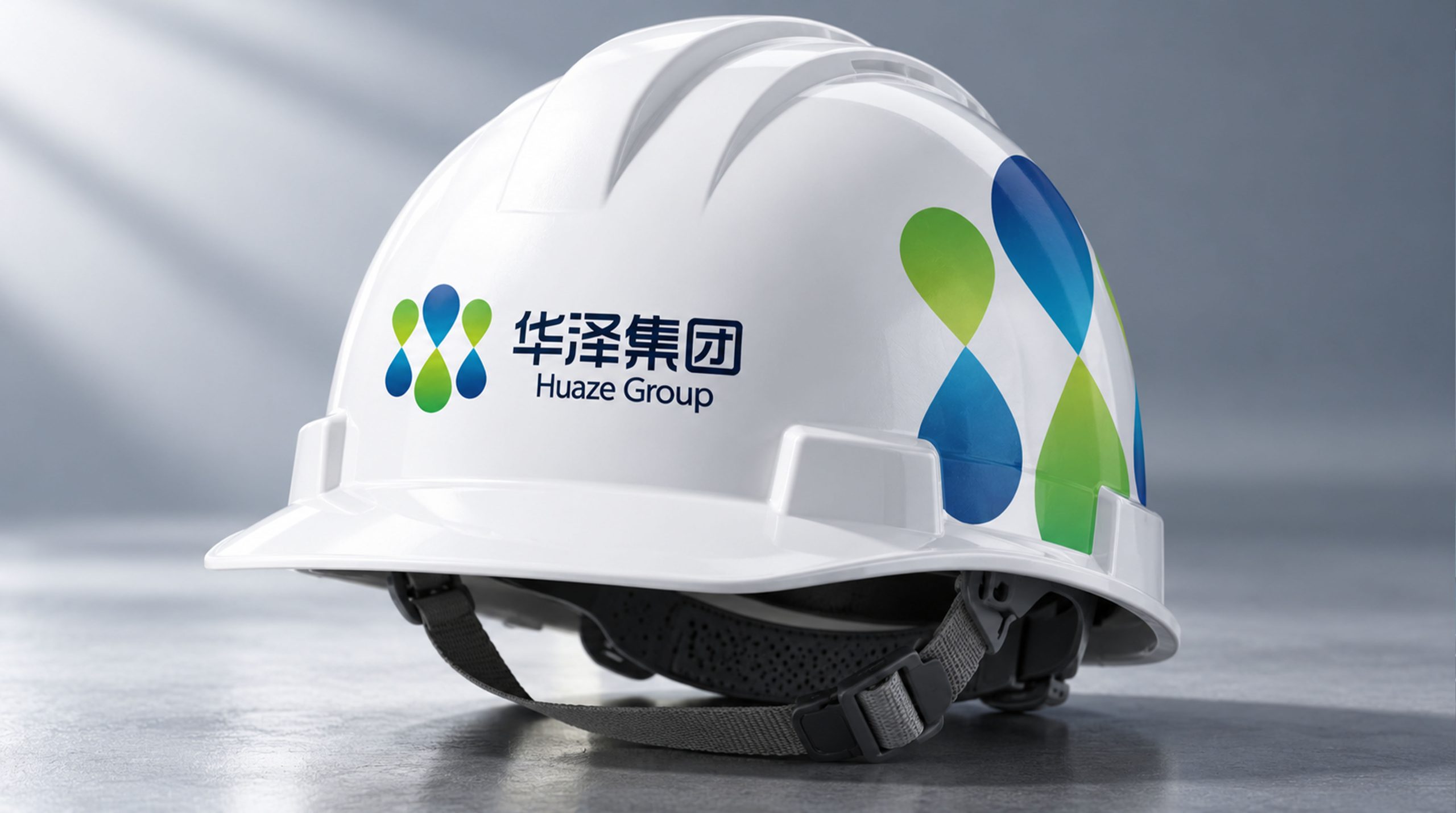
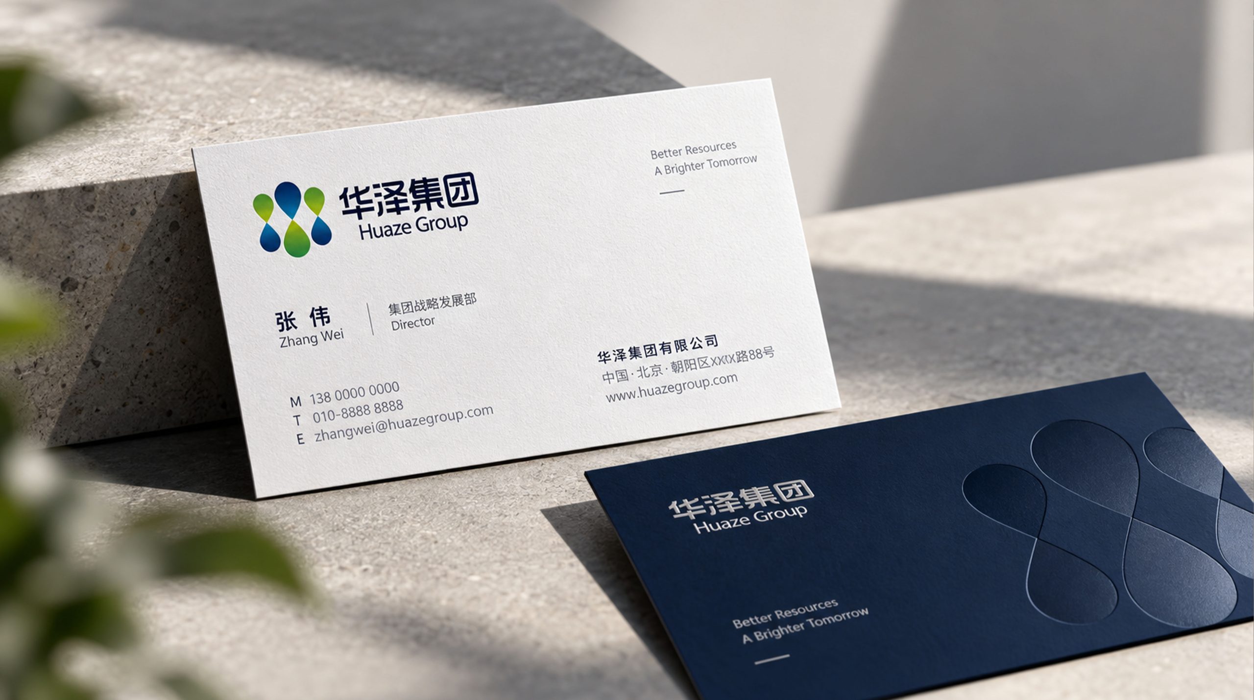
design concept
The logo takes "Seal of Splendor" as its core concept, integrating the colorful image of the Chinese character "Hua" and the moist image of the Chinese character "ze" into a brand symbol that combines the solemnity of the seal with the agility of the water flow. The seal conveys the authoritative structure of the group, and the water conveys the corporate sentiment that moisturizes all directions - the combination of strength and softness, the unity of splendor and luster.
graphic language
The graphic uses a rounded square as the outer frame, between a square and a circle - a square with a circle conveys the group's business wisdom of "there is a tact in the rules". The outer frame is like the border of a company's seal, thick but not heavy, solemn but not stiff.
Inside the outer frame, the calligraphy variant of the brand's initial word "Hua" is used as the core graphic. The character "Hua" is presented with strokes that combine calligraphic whiteness and geometric order - the cursive character in the upper part is summarized by two upward stretching arcs, like two petals blooming or two rays of light blooming, conveying the visual image of "brilliance"; the strokes in the lower part are treated with flowing water lines, and the horizontal and vertical strokes are transformed into soft wavy arcs, just like water surging in the glyph, conveying the flowing texture of "moisture".
The upper part of the character "Hua" is like blooming flowers and shining brightly, while the lower part is like running water and moistening water - one glyph carries the dual meanings of the brand name at the same time. The overall font is centered and full in the printing frame, with smooth charm. The stretch of the upper part and the flow of the lower part form a visual narrative of "sublimation and moisturization". The overall composition constructs the "Chapter of Huashui" with the internal and external structure of "there is China in the seal and there is lake in the center".
Font composition
The Chinese "Huaze Group" adopts solemn modern Song style, with thin horizontal lines, thick vertical lines and clear strokes. The structure of the word "Hua" is stretched to convey the splendor and magnificence, the the three-dot water radical in the word "ze" smartly echo the image of moisture, and the word "group" is calm and closed. The English "HUAZE GROUP" is arranged in a standard uppercase serif font with a broad and steady font to ensure professional recognition of the brand in business cooperation and capital markets.
color system
The main color Huaze Gold #8B6914 represents splendor, nobility and industrial value. Gold is like the luster of precious metal that appears after smelting mineral resources - it is not only related to the core industry of metal smelting of the group, but also conveys the industrial empowerment ability of "turning stone into gold". Auxiliary moisturizing blue #1A5276 is used as a calm and basic element in the brand system. Blue is like deep water - the true color of water, conveying the corporate sentiment of "deep, broad, moisturizing and silent". The combination of gold and blue conveys "bright light + deep calm". Auxiliary earth brown #6E4B3A is used for industrial elements in the brand system, like the thick color of mines and land. Pure white #FFFFFF as standard base color. The overall color uses gold and blue as the dual core, reflecting the brand temperament of "luxurious, calm, moist and atmospheric".
Application extension
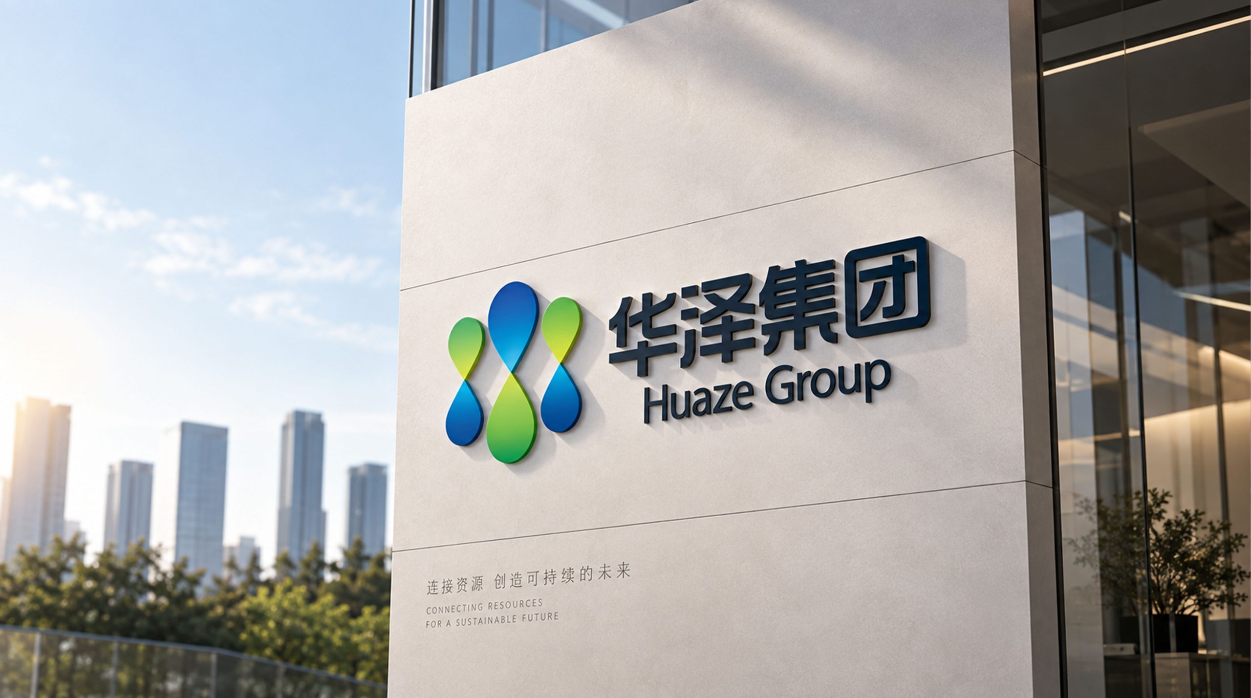
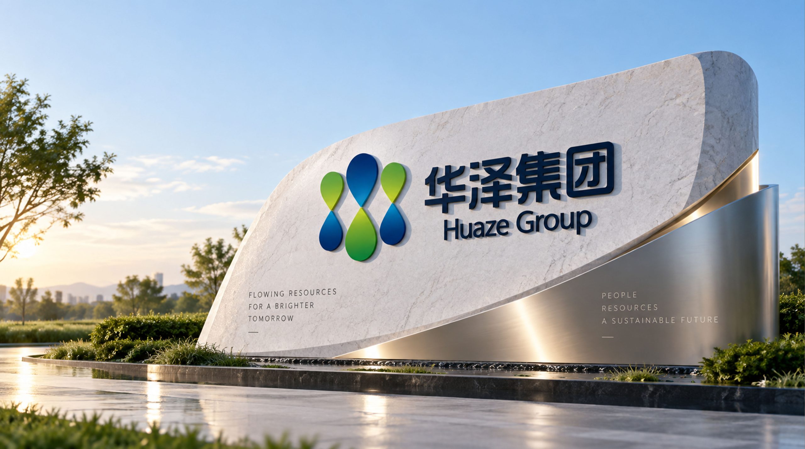
The logo can be widely used in group headquarters and various industrial sector logos; corporate brochures, investment plans and business cooperation documents; official websites, digital platforms and social media images; industry summits, industry forums and brand event images. In the lobby of the group headquarters, the Huashui Chapter logo is presented in bronze relief on the image wall. The golden fonts exude a restrained metallic luster on a dark background, conveying the historical depth and pattern of the large industrial group. In the dynamic vision, the seal frame is completed steadily. The upper part of the character "Hua" blooms upward like petals, and the lower part surges downward like water. The brilliance and moistness intersect and coexist in the same glyph.
brand meaning
The logo contains three core images: Splendid Vision - the blooming posture of the word "Hua" conveys the brilliance and grandeur of the group's business; Nourishing Society - the water-textured strokes convey the company's sense of responsibility to moisten the society with industrial achievements; Solid Foundation - the seal structure conveys the group's industrial base of being rooted in industry and operating steadily. The overall design conveys the brand vision of "bringing light to the far reaches and nourishing all directions".
Improper Usage (Protection Specification)
Do not change the rounded square ratio of the outer frame; do not modify the style difference between the upper bloom arc and the lower water pattern arc of the word "Hua"; do not change the hue of the main color of Huaze Gold; do not add gradients, strokes or decorative effects that are inconsistent with the group's style; do not split the outer frame and use the word "Hua" alone; keep the white space ≥ 25% of the height of the graphic; the minimum display width must not be less than 25mm.
design results
After the release of the logo, Huaze Group's brand recognition and market pattern awareness in the field of diversified industrial operations have been significantly improved. "Chapter of Huashui", with its visual language that combines colorful atmosphere and moist feelings, has become the core identification symbol of the brand system, showing the brand vision of "Huaguang reaches far and moistens all directions".