










Ronshine Investment is a professional investment institution with capital operation and investment management as its core. Its business covers equity investment, asset management, industrial mergers and acquisitions and wealth advisory services. It is committed to realizing the steady appreciation of assets for customers with its professional investment capabilities and prudent risk control system.
The brand name "Rongxin" carries the dual genes of the brand - "Rong" means integration and harmony, symbolizing the integration and circulation of capital and the ability to integrate diverse resources; "Trust" means trust and integrity, symbolizing the core foundation of the investment institution. Harmony is ability, trust is character, and only with faith can you be harmonious. Qingmei Future was commissioned to lead the brand identity design.
The design goal of the brand logo is to convey the brand image of "integration with trust, stability and long-term development" through the visual language of capital expertise, integrity, stability and value growth.
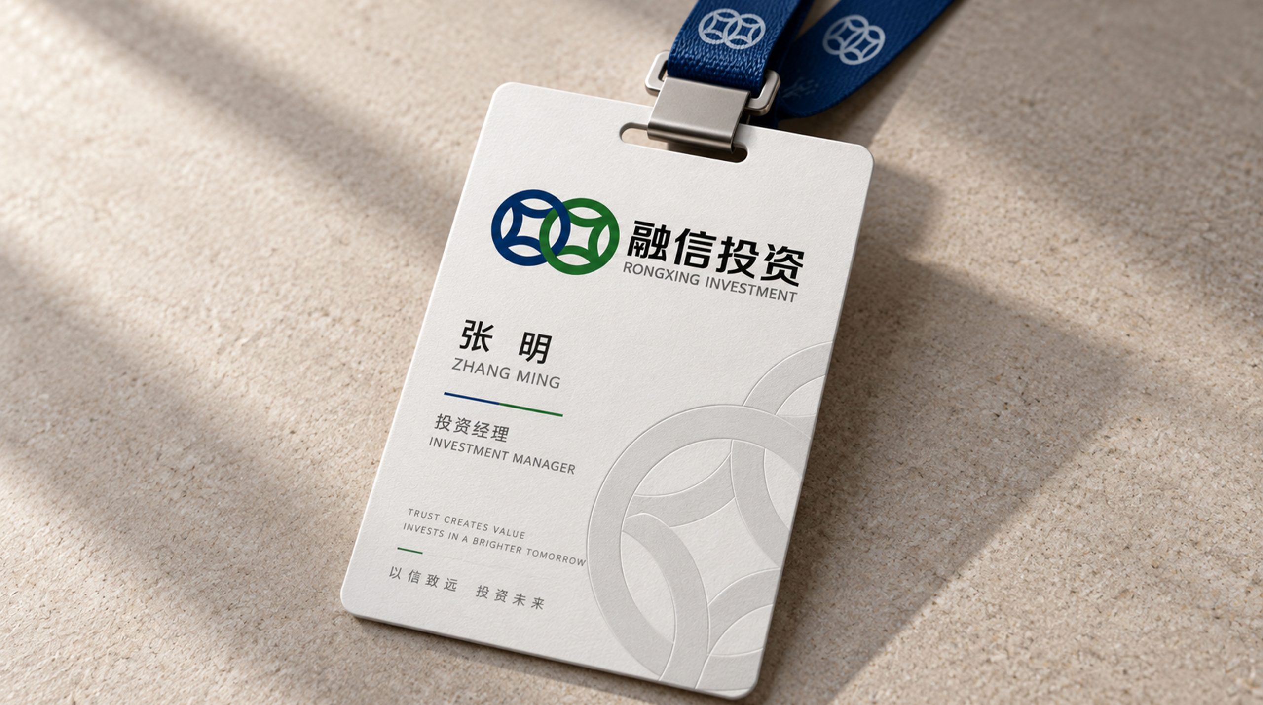
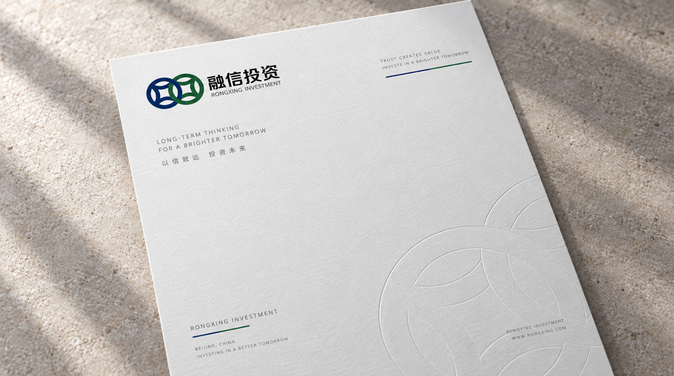
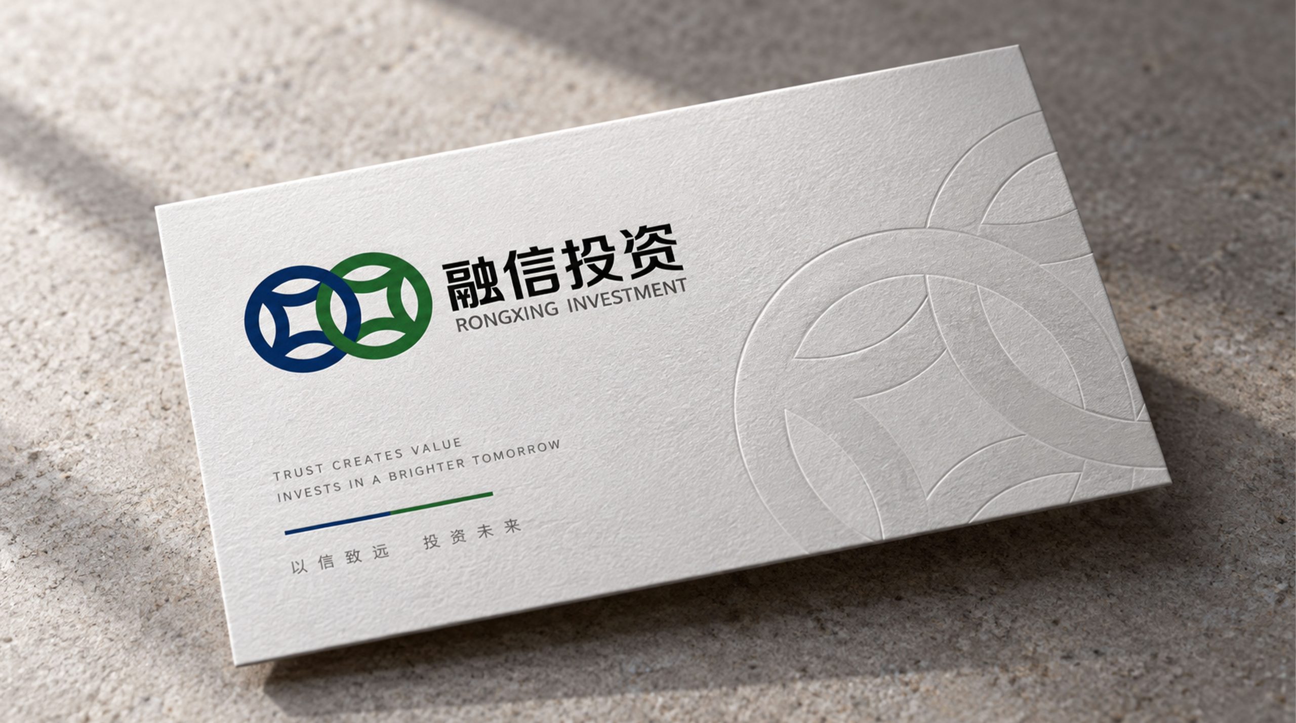
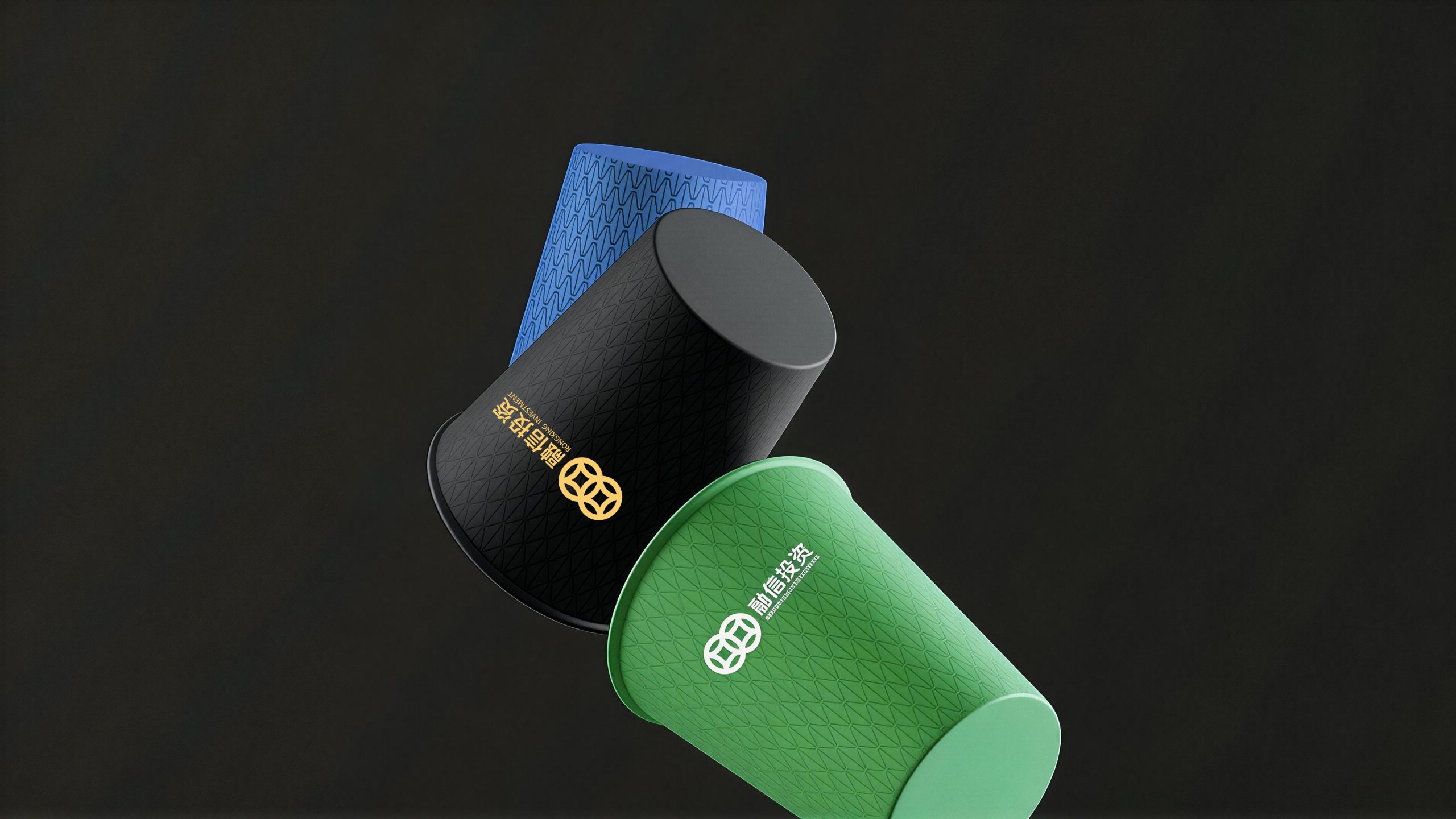
design concept
The logo takes "Shield of Trust" as its core concept, integrating the protective image of the shield with the dynamic arc of capital circulation. The shield is a classic symbol of "security, protection and trust" in the global financial industry - the core responsibility of investment institutions is to protect the safety and trust of customers' assets. There are flowing arcs in the shield, conveying the investment philosophy of "realizing value-added through protection".
graphic language
The graphic is based on a simple shield. The outline of the shield presents a classic shape of wide at the top and narrow at the bottom. The upper edge is horizontally wide to convey a stable sense of security. The arcs on both sides converge downwards and the bottom is converged with an arc. The overall shape is solemn but not stiff. The shield is the visual embodiment of the word "trust" - trustworthiness means protection, and integrity means safety.
Inside the shield, two flow arcs converge and rise from bottom to top, just like two capital forces converging and rising in the institutional platform. The two arcs represent the core semantics of "financing" - the incorporation and outflow of funds, the integration and circulation of resources. After the arcs intersect, they merge into one and extend upward, conveying the investment results of multiple capitals forming a synergy and achieving value-added through professional management.
The trend of the arc shows an upward trend from bottom to top, conveying positive expectations of steady asset growth. The smooth and rounded arcs are different from the sharp fluctuations of the broken lines, conveying the investment style of "steady value-added rather than aggressive gaming". The overall composition uses the internal and external structure of "the shield stands on the outside to keep trust, and the flow flows inside to integrate" to build "the integration of trust and shield".
Font composition
The Chinese "Rongxin Investment" adopts a stable modern Song style, with thin horizontal lines, thick vertical lines, and clear strokes. "Rongxin" conveys the core values of the brand, and "investment" clarifies the business attributes. The English "RONGXIN INVESTMENT" is arranged in a standard uppercase serif font with a generous and solemn font to ensure professional recognition of the brand in the capital market and institutional cooperation.
color system
The main color, Rongxin Navy Blue #0C2340, represents financial authority, professional depth and trust. Navy blue is the most calming brand color among global investment institutions. It is like the deep sea - calm on the surface but profound within, conveying the professional determination of investment institutions to "not chase short-term hot spots and focus on long-term value". Auxiliary value-added gold #B89530 is used for value growth elements and high-end customer materials in the brand system. The gold color is directly related to wealth appreciation and investment return. The combination of navy blue and gold conveys "depth of professionalism + value return". Auxiliary Trust Gray #8A9AAF is used for supporting information and data graphics. Pure white #FFFFFF as standard base color. The overall color uses navy blue and gold as the dual core, reflecting the brand temperament of "stable, professional, noble and trustworthy".
Application extension
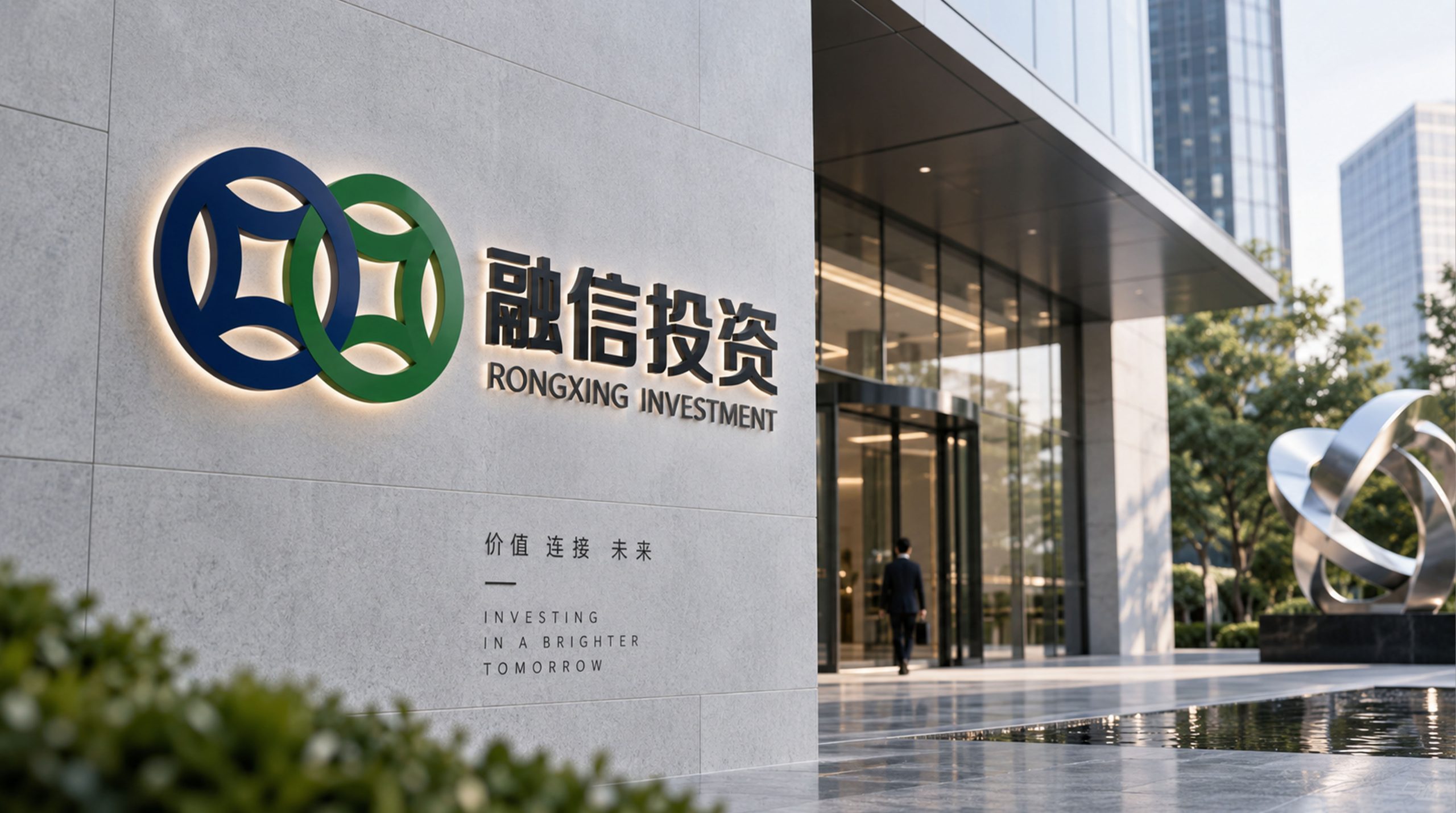
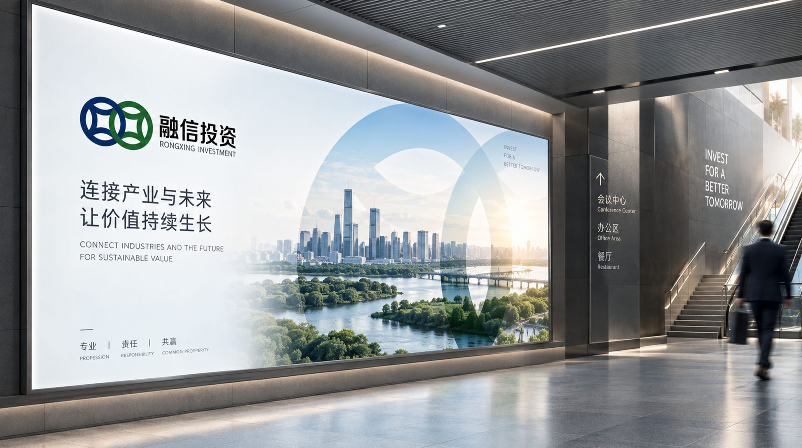
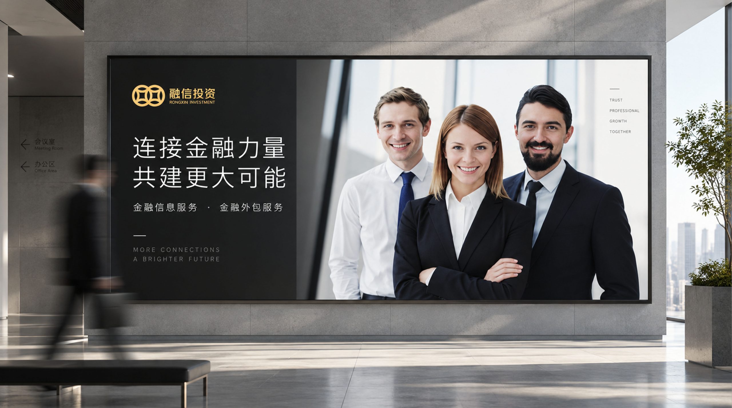
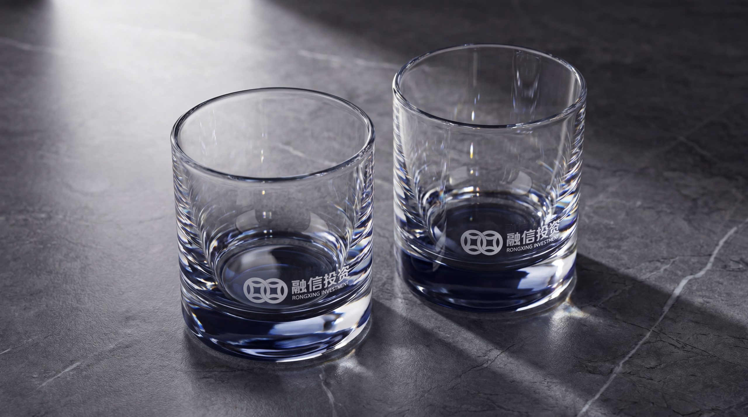
The logo can be widely used in logos of institutional headquarters and branch offices; investment plans, due diligence reports, fund product brochures and investor communications; official websites, investor relations platforms and digital communication materials; investment industry summits, capital market forums and project roadshow images. In high-end investment roadshows, the golden shield logo on a navy blue background was displayed on the demo homepage, establishing brand trust as "professional, stable, and worthy of trust" in the first frame. In the dynamic vision, the outline of the shield is steadily completed, and the internal double arcs flow and converge from bottom to top, converging and rising, symbolizing that Ronshine Investment protects capital with a shield of integrity and drives value growth with professionalism.
brand meaning
The logo contains three core images: Trust & Shield - the shield conveys the core responsibility of investment institutions to protect the safety and trust of clients' assets; Capital Flow - the arc of flow conveys the platform's ability to integrate and circulate diverse capital under professional management; Steady Growth - the upward trend of the arc conveys the investment commitment of long-term steady growth of assets. The overall design conveys the brand vision of "integrating with trust, building stability and achieving long-term goals".
Improper Usage (Protection Specification)
Do not change the classic proportions of the shield or replace it with other shapes; do not modify the intersection mode or rising direction of the internal arcs; do not change the hue of the main color of Rongxin Navy; do not add gradients, strokes or decorative effects that are inconsistent with the financial style; do not separate the shield and the arc for separate use; keep white space ≥ 25% of the graphic height; the minimum display width must not be less than 25mm.
design results
After the release of the logo, Ronshine Investment's brand recognition and institutional trust in the fields of capital operations and investment management have been significantly improved. "Integration of Trust and Shield" has become the core identification symbol of the brand system with its visual language of conveying integrity protection and steady value-added, showing the brand vision of "integrating with trust and achieving stability and long-term development".