










China Quanjude Group is a well-known Chinese time-honored catering company at home and abroad. It was founded in 1864, the third year of Tongzhi in the Qing Dynasty. It takes Beijing roast duck as its core signature dish. After more than 160 years of inheritance, it has become one of the most representative national treasure brands in Chinese catering culture.
The three words "Quanjude" contain the profound business philosophy of "completeness without missing, gathering without separation, virtue with faith", which carries generations of craftsmen's continuous improvement of roast duck skills and devout protection of Chinese food culture. Facing the strategic needs of brand internationalization and youthfulness in the new era, the brand decided to systematically upgrade its logo. Qingmei Future was commissioned to lead the brand identity design.
The design goal of the brand logo is to demonstrate Quanjude's dual identity as a time-honored Chinese brand and an international catering group through the visual language of century-old heritage, state banquet style and cultural confidence, and to convey the brand image of "century-old craftsmanship, state banquet style, and cultural heritage" so that the logo not only retains the historical thickness of the time-honored brand, but also possesses the modern vitality for the global market.
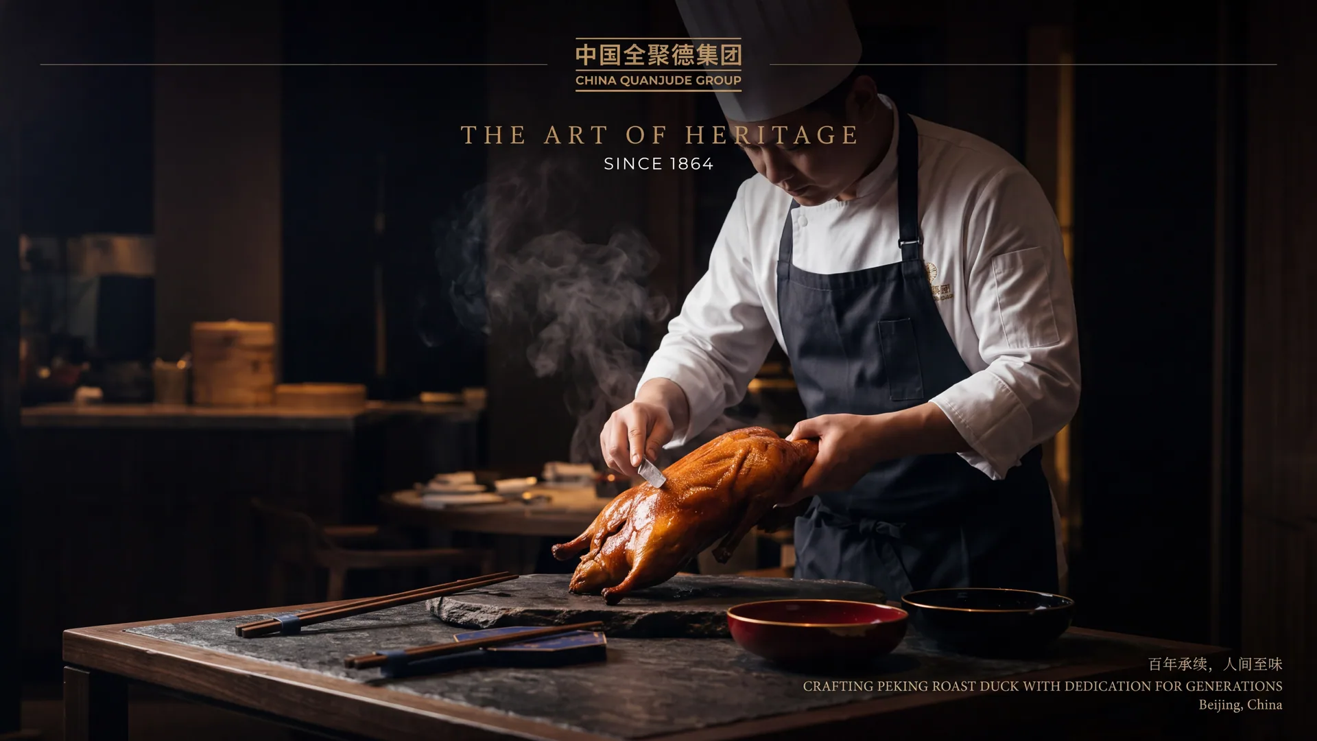
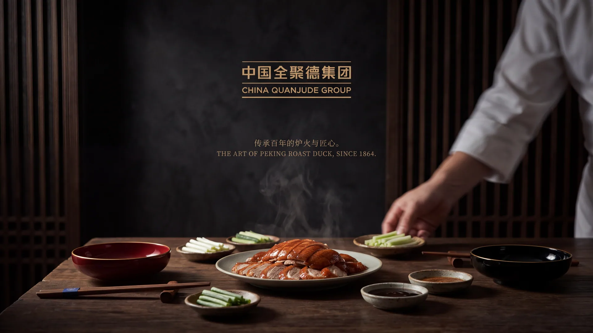
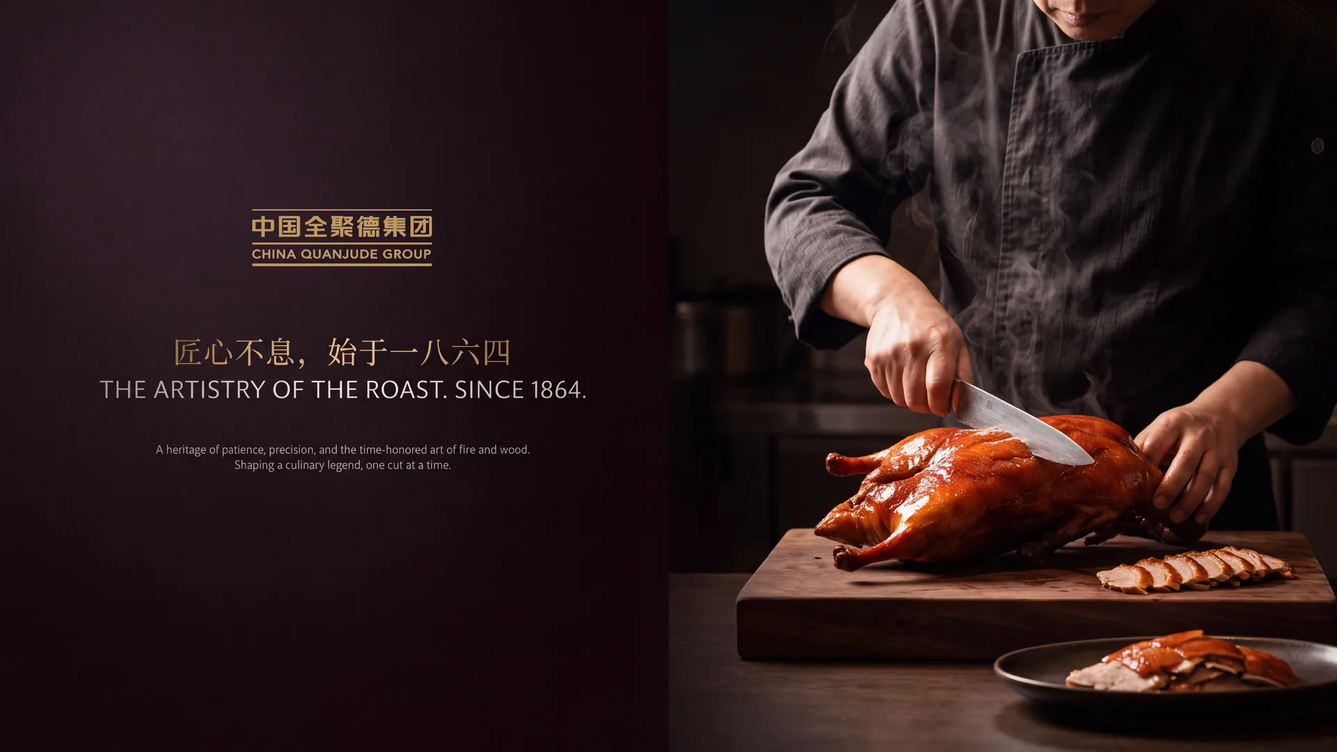
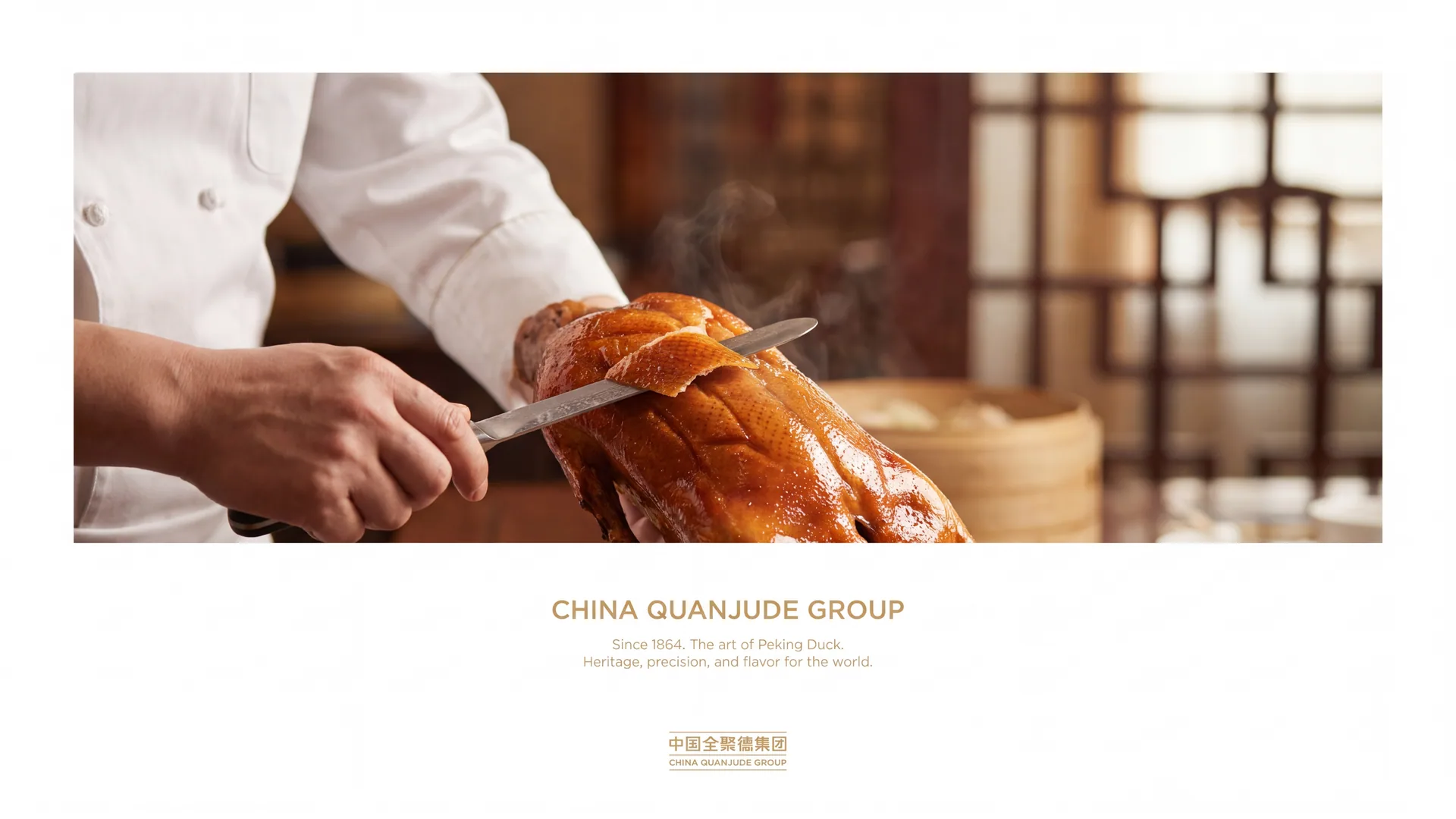
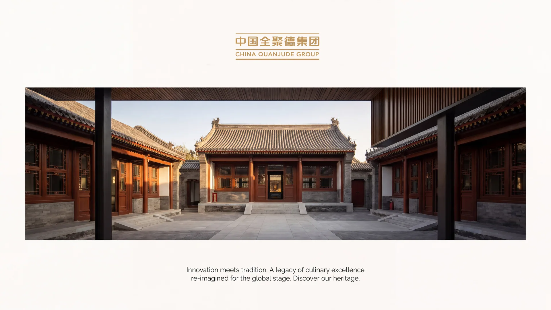
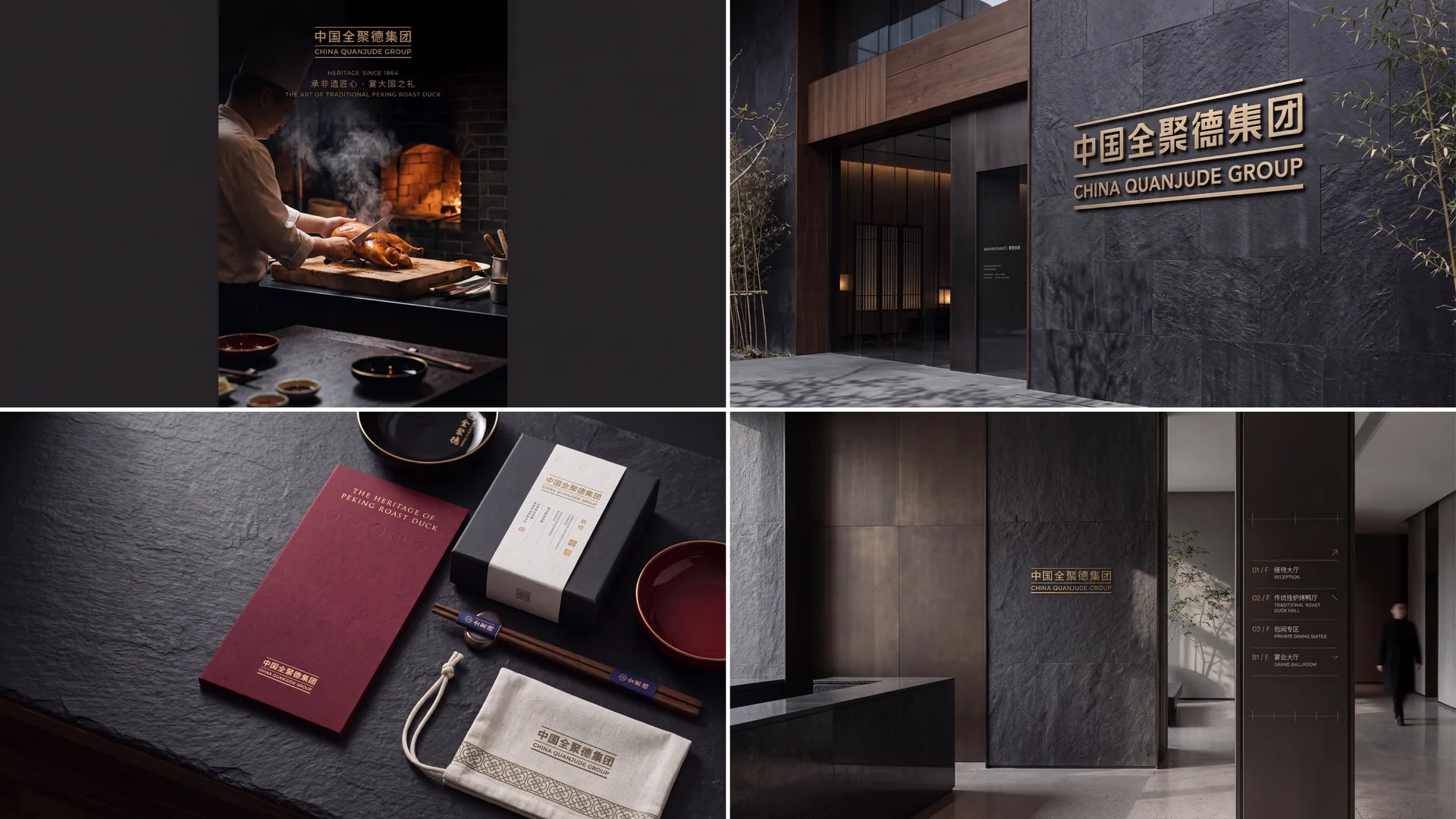
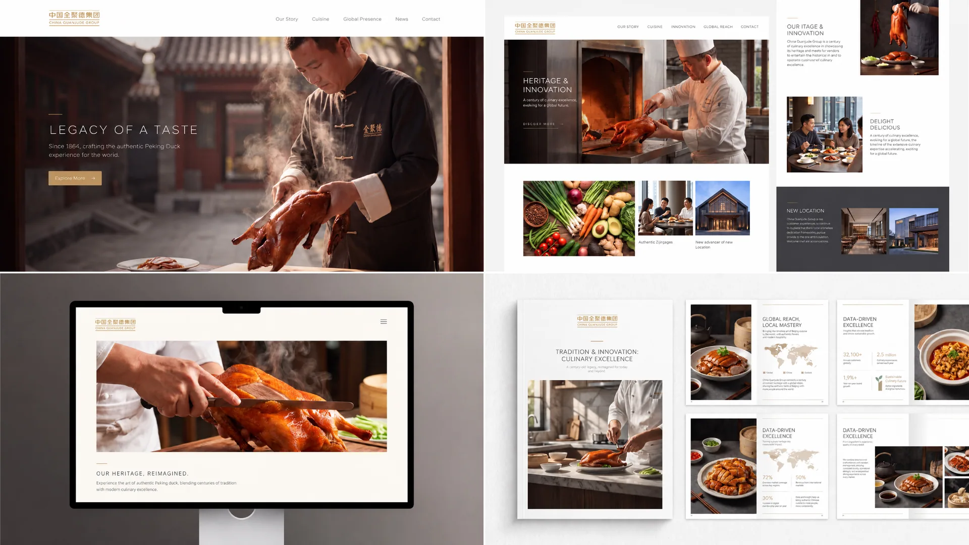
Design concept and graphic language
The logo takes "Golden Tripod & Roast Duck" as its core concept, condensing Quanjude's two core brand assets - the ultimate deliciousness of Beijing roast duck and the majestic history of a century-old brand - into a brand totem that has both a sense of cultural ritual and recognition in the catering industry. The graphic uses a highly artistically refined roast duck as the main body. The duck's body is plump and round, with smooth and graceful lines. The duck's wings are spread out from the side, showing a leaping and agile beauty. It sublimates the roast duck from a delicacy on the table to a visual symbol of the brand spirit - like a golden phoenix, emerging from the fire of a century-old stove, carrying the millennium of Chinese food culture and the century-old glory of the Quanjude brand.
The shape of the duck body has been repeatedly refined to create the unique plump body of roast duck with full arcs - bulging breasts, round belly, and slightly tilted tail. Each arc is faithful to the mouth-watering classic shape of roast duck when it comes out of the oven, allowing diners who are familiar with Quanjude to recognize at first glance that "this is a roast duck." The duck wings open upward in a stretched arc, like a gesture of flying high, breaking the usual impression of roast duck as a static food, giving the brand a high-spirited development momentum and an open mind toward the international market. Several exquisite arcs are used on the surface of the duck body to outline the unique shiny luster and crispy texture of the roast duck skin, just like the perfect presentation after the craftsmen carefully roasted it with fruit wood charcoal fire. Each arc is a tribute to Quanjude's hanging oven roast duck skills.
A circular frame surrounds the graphic to complete the overall composition. The three characters "Quanjude" are engraved in the seal script style on the top of the frame, and the year of the brand's founding "Started in 1864" or "QUANJUDE · SINCE 1864" in English is engraved below. The circular frame is like the gold-lettered signboard of a century-old store or the seal passed down from generation to generation, giving the logo the unique sense of solemn ceremony and the authority of a historical token unique to a Chinese time-honored brand. The inner edge of the frame is decorated with fine fretwork, which is a classic pattern that symbolizes "reciprocation and endlessness" in traditional Chinese decorative arts, implying the century-old inheritance of Quanjude brand from generation to generation and everlasting foundation. The circular wrapping structure also echoes the semantics of "quan" and "gathering" in the brand name "Quanjude" - complete and complete, gathered but not scattered, carrying the richest brand connotation in the most complete geometric form. The overall composition uses a layered structure of "a duck standing on a tripod and a tripod standing on a circle" to construct a "centennial golden plaque", conveying the historical depth of the brand and the height of the state banquet.
Font composition and color system
The three characters "Quanjude" are the core text assets of the brand, and its font design directly carries the brand's historical memory of more than 160 years. The "Quanjude" in the logo adopts a customized regular script font derived from the calligraphy of the Qing Dynasty. The strokes are vigorous and powerful, and the structure is dignified. The natural charm of brush writing is retained at the beginning and end of the brush - the horizontal stroke is like a knife, the vertical stroke is like a pillar, and the strokes are stretched like wings. Each stroke reveals the cultural confidence and craftsmanship of a century-old brand. The word "Quan" is closed at the top and open at the bottom, with a harmonious structure, symbolizing the pursuit of complete quality; the word "Ju" has dense, compact and powerful strokes, symbolizing the spirit of unity that never breaks up; the word "De" is solemn, upright and majestic, symbolizing the business belief of establishing a business based on morality. The three words are read in one go, just like a golden plaque hanging on the lintel of a century-old store. Everyone who walks into Quanjude can feel the historical weight and cultural dignity of the brand from these three words.
The English "QUANJUDE" is presented in a standard uppercase serif font, with steady and straight strokes and refined and distinct serifs, consistent with the solemn temperament of Chinese regular script, ensuring the standard recognition of the brand in the international catering market and overseas stores. "SINCE 1864" is arranged in fine font, directly establishing the time authority of a century-old heritage based on the year of the brand's birth.
The main color Quanjude Red #CC1C1C is the absolute core color of the logo, representing the heat of the fire, the crisp red of the roast duck and the righteousness of Chinese culture. Red is the genetic color of the Quanjude brand that has never changed in more than 160 years. From the red lintels of old stores in the Qing Dynasty to the red lanterns of modern stores, red has become the most profound color memory between the Quanjude brand and consumers. This deep and rich Chinese red is different from ordinary bright reds. It uses a restrained and thick color temperature to convey the unique sense of historical precipitation and cultural solemnity of a century-old brand. The auxiliary plaque gold #B8943E is used for the circular frame, fret decoration and noble elements in the brand system, representing the century-old glory of the gold-lettered signboard and the supreme status of the state banquet character. The gold color is like the weathered gold paint plaque on the lintel of the old store, conveying the brand confidence of "a century-old store with a golden signboard" with the warm luster accumulated over time. The combination of red and gold is the most solemn, festive and ceremonial classic color combination in traditional Chinese culture - red walls with gold tiles, red doors with gold plaques, red candles with gold cups. The two colors of red and gold have become the deepest aesthetic consensus of the Chinese people on "the coexistence of solemnity and jubilation". Pure white #FFFFFF is used for the internal white space and standard background color of the graphics, using clean space to set off the intensity and solemnity of red gold. The overall color system takes red gold as the core, reflecting the brand temperament of "a century-old fire and gold-lettered signboard".
Application extension and brand significance
The logo has strong system scalability and can be widely used in national and overseas store door plaques, restaurant lobby image walls, private room nameplates and menu covers; roast duck takeout boxes, vacuum packaging bags, gift box sets and souvenir products; official website, takeout platform store image, social media avatar and brand content marketing materials; state banquet catering services, international food festivals, Chinese food culture exhibitions and government foreign affairs reception images; brand cultural souvenirs, limited co-branded products, brand albums and corporate culture museum displays. In the most ceremonial application scenario of store plaques, the logo with gold characters on a red background is presented using traditional plaque technology - the wooden base is painted with vermilion lacquer, and the three characters "Quanjude" are decorated with gold foil. Centennial craftsmanship and modern brands complete a dialog across time and space on the same plaque. In the dynamic visual, the fire can slowly rise from the bottom of the picture, and the roast duck gradually appears in the firelight, and the golden luster flows and shines on the surface of the duck body. The circular frame and the three characters "Quanjude" are finally solemnly presented like a golden plaque, symbolizing the brand epic of the century-old fire that continues to grow and the golden signboard passed down from generation to generation. The roast duck silhouette and fringe decoration can be extended into visual mother elements and used for tableware patterns, restaurant space decoration, packaging pattern systems and brand culture peripherals.
The logo contains three core images of the Quanjude brand: Century of Craftsmanship - the exquisite details of the roast duck shape and the 1864 year mark convey the brand's hanging oven roast duck skills and craftsmanship that have been passed down for more than 160 years; State Banquet Prestige - the red and gold color scheme and the circular gold plaque structure convey Quanjude's supreme glory and high character as the designated brand for state banquets; Cultural inheritance (Cultural) Heritage) - the seal script brand name, fret decoration and traditional plaque aesthetics convey the breadth and depth of Chinese food culture and Quanjude's brand mission as a cultural messenger. The overall design conveys Quanjude's brand vision of "a fire that lasts for centuries, a golden brand name that lasts forever, and Chinese delicacies that are handed down from generation to generation".
Improper Usage (Protection Specification)
Do not change the body proportions, wingspan angle or surface texture arc of the roast duck; do not modify the calligraphy font, stroke structure or arrangement of the three characters "Quanjude"; do not change the hue, brightness or primary and secondary relationship between Quanjude red and the plaque gold; do not replace the circular frame with a square or other geometric frame; do not Remove the fringe decoration or replace it with other patterns; do not add gradients, strokes, outer glow or excessive three-dimensional effects to the logo; do not rotate, mirror the orientation of the roast duck or separate the roast duck from the circular frame; keep the white space around the logo not less than 25% of the diameter of the circle; the minimum display width shall not be less than 30mm.
design results
After the release of the logo, the brand unity and cultural influence of China Quanjude Group in the domestic and foreign catering markets and cultural communication fields have been significantly improved. "Jinding Roast Duck", with its unique visual language that combines the historical majesty of a century-old brand and the international vision of a modern brand, has become the core identification symbol of Quanjude's brand system. It is widely used in hundreds of stores across the country and overseas, in state banquet services, cultural exchanges and brand communication, demonstrating the brand vision of "Centennial Quanjude, World Roast Duck King". The red and gold gold-lettered signboard has established irreplaceable brand recognition and cultural identity in the minds of consumers at home and abroad, and has become a shining business card for Chinese food culture to the world.