










Fengzeyuan Restaurant is one of the most representative catering brands of Chinese Shandong cuisine (Shandong cuisine). It was founded in 1930 and is located in Beijing. It is famous at home and abroad for its authentic Shandong cuisine techniques and exquisite food culture. After nearly a hundred years of inheritance, it is recognized as the top Chinese food palace at the level of "Eight Towers in Beijing".
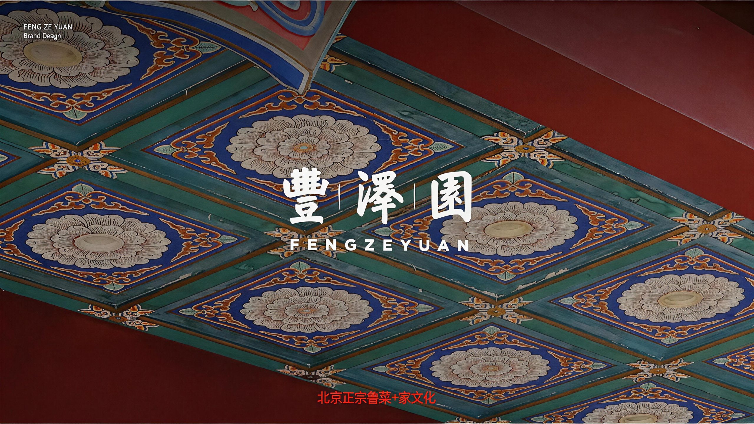
The three characters of the brand name "Fengzeyuan" have profound meanings - "Feng" means abundance and richness, symbolizing the richness of the ingredients and the rich taste; "Ze" means moistening and grace, symbolizing the cooking philosophy of Shandong cuisine with soup as the soul and moistening the food with taste; "Yuan" means garden and elegant garden, symbolizing the elegance of the dining environment and the beautiful mood of the guests and guests enjoying themselves. The three words combined into one outline a picture of Chinese food that is "rich in delicious food, nourishing guests and friends, and gathering in an elegant garden". Qingmei Future was commissioned to lead the brand identity design.
The design goal of the brand logo is to demonstrate the industry status of Fengzeyuan Restaurant as the top Shandong cuisine catering brand through the visual language of Shandong cuisine's orthodoxy, century-old heritage and Chinese food culture, and to convey the brand image of "honest taste, strong virtues, century-old Fengze".
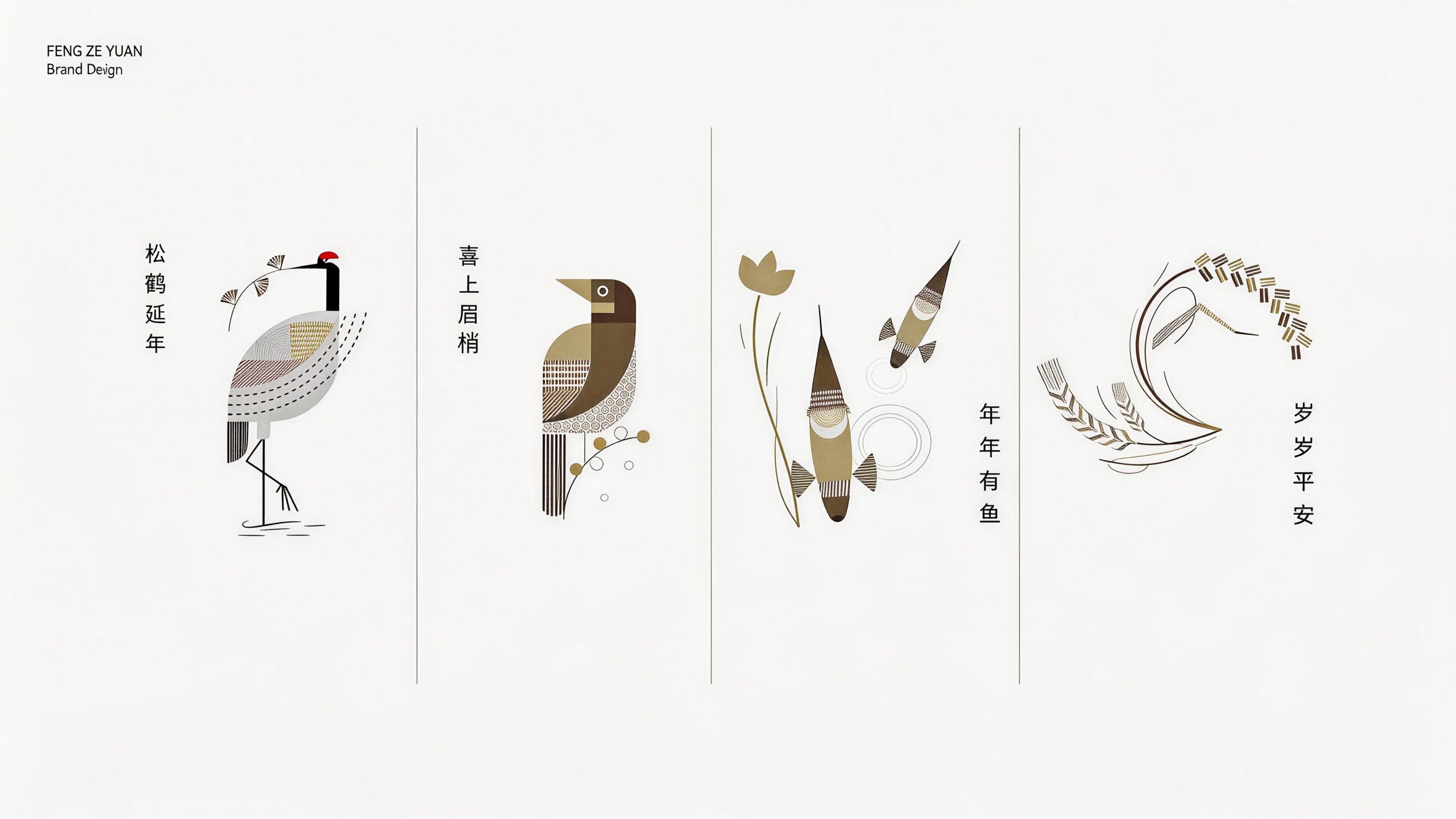
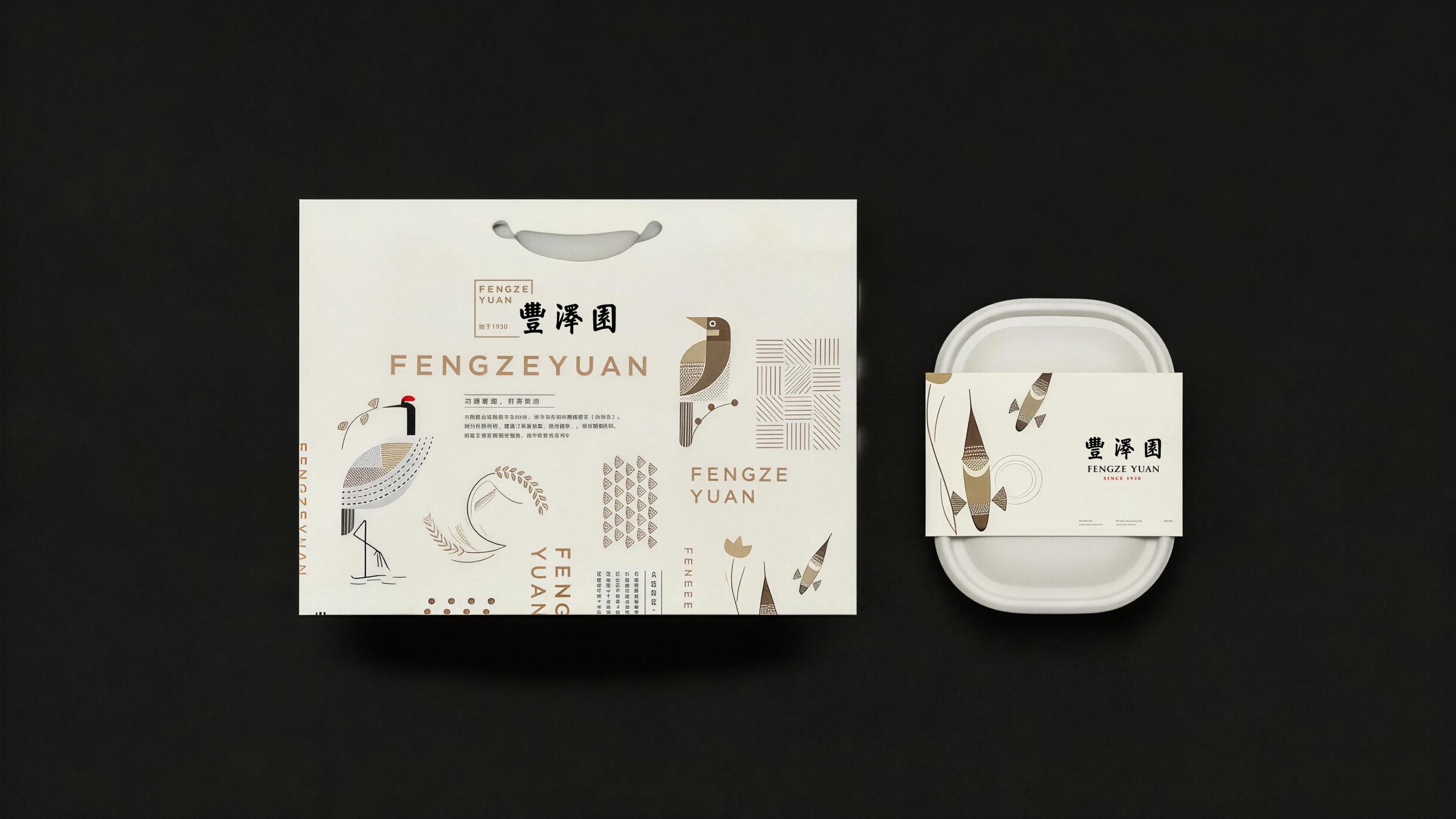
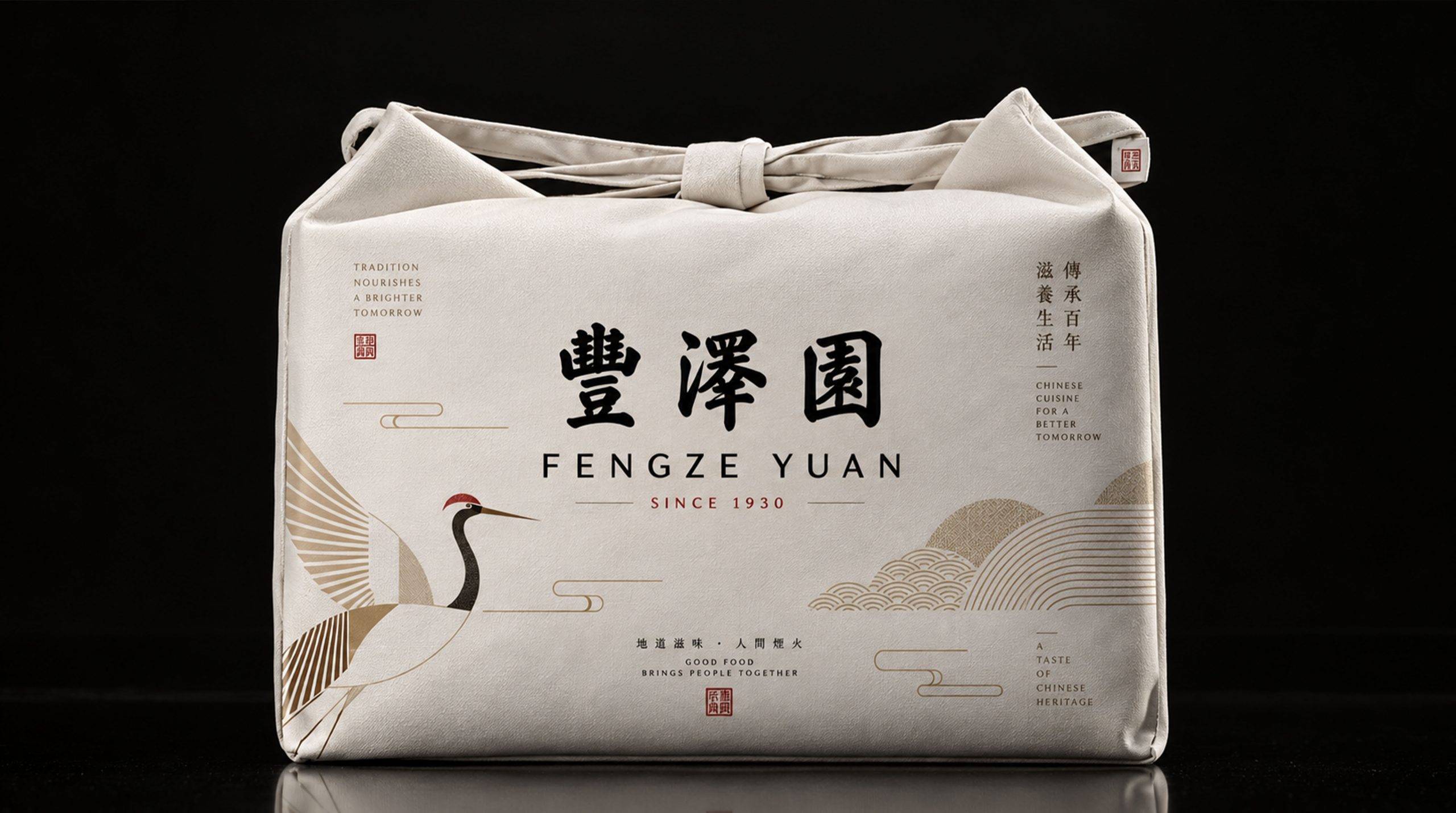
design concept
With the core concept of "Flavor of the Tripod", the logo integrates the solemn image of the ancient Chinese cooking vessel "Tripod" with the cooking essence of "soup as the soul" of Shandong cuisine, creating a brand totem that not only carries the weight of food culture but also conveys the beauty of taste aesthetics. "Ding" is not only a symbol of power in Chinese culture, but also the origin of cooking - "Ding cooking" is the oldest cooking method in Chinese food civilization. Using the Ding as a symbol directly establishes a deep connection between the Fengzeyuan brand and Chinese culinary orthodoxy. The image of steaming steam in the cauldron also hints at the soul of Shandong cuisine's "soup making" technique - clear soup is like water and milk soup is like milk. A pot of soup stock is the foundation of all the flavors of Shandong cuisine. The steam rising in the cauldron is the visual embodiment of this pot of soup stock. The overall design reflects the dual attributes of the Fengzeyuan brand in inheriting Chinese culinary culture and pursuing high-end catering quality.
graphic language
The shape of the tripod has been highly artistically refined and summarized, using simple and correct geometric lines to create a clearly identifiable tripod-shaped outline. The body of the tripod is presented in a full arc shape, and the lines are round and thick, just like the bowl of warm and mellow milk soup in Shandong cuisine - it is natural and uncarved, conveying the simple cooking philosophy of Shandong cuisine of "good taste, thick soup, and good heat". The tripod's ears extend upward from both sides of the tripod in two symmetrical arcs. The shape is dignified and majestic, just like the welcoming gestures on both sides of the door of a restaurant, conveying Fengze Garden's hospitality approach of "feeling at home and treating all directions with courtesy". The tripod is supported downward by three stable short-term lines. The tripod stands as stable as Mount Tai, symbolizing Fengzeyuan's unshakable industry foundation and brand status in the field of Shandong cuisine in the past century. Three gentle curves above the mouth of the tripod outline the image of rising steam. The curves gradually become thicker and thinner, and then thicker and lighter, just like the intoxicating aroma that curls up when the soup comes out of the pot, injecting a touch of the warmth of life and the temptation of food into the solemn tripod. The overall composition uses a three-layer structure of "the tripod as the vessel, the soup as the soul, and the Qi as the rhyme" to construct the "important vessel of flavor" to convey the brand's cultural depth and culinary height.
The circular outer frame is completed with a single-line ring to complete the overall composition, and the inner edge of the ring is supplemented by a circle of evenly arranged fretwork. The pattern symbolizes "recurring and endless", implying the century-old inheritance of Fengze Garden's Shandong cuisine skills being passed down from generation to generation. The circular composition is like a gold-lettered signboard or a seal handed down from generation to generation, giving the logo the solemn ritual sense unique to a time-honored brand and the authority of a historical token. The three characters "Fengzeyuan" are engraved in the body of the tripod or on the ring in the style of seal script. The strokes of the seal characters are uniform, square, simple and elegant, in line with the Bronze Age temperament of the tripod, conveying the brand's cultural confidence rooted in the depth of Chinese civilization.
Font composition
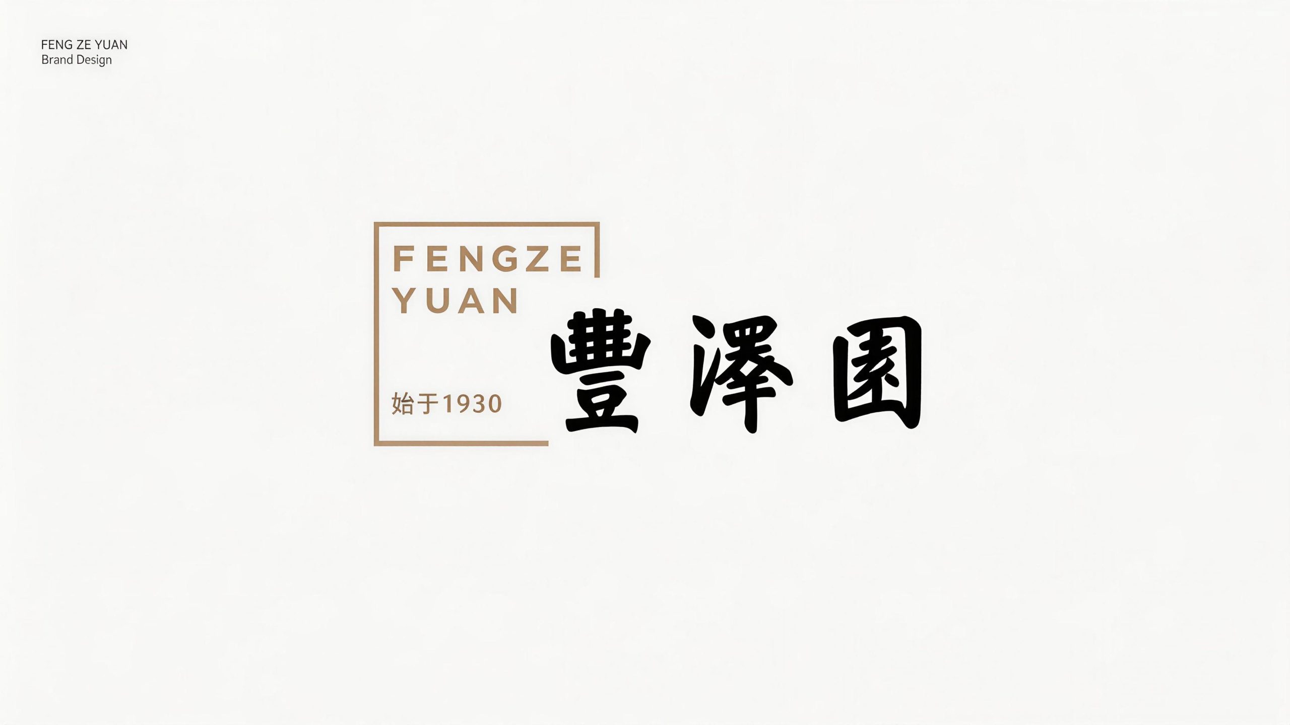
The three characters "Fengzeyuan" adopt customized palace regular script fonts, with rich and full strokes and dignified structure. The vertical stroke of the character "Feng" is as straight as a pillar, and the three horizontal strokes are like three sumptuous banquets spread out in sequence, conveying abundance and fullness; the character "ze" has the three-dot water radical flowing smartly like soup into a bowl, and the strokes on the right are stretched and wide, conveying moistness and grace; the character "yuan" has a square and solid frame like the square world of a restaurant, and the character "yuan" inside is rounded out, conveying reunion and beauty. The three words read together are majestic and resounding, just like the golden plaque hanging above the main entrance of the restaurant. Every diner who walks into Fengze Garden can feel the cultural weight of the Shandong cuisine palace in the past century from these three words. The English "FENGZEYUAN" is presented in a classic uppercase serif font, with broad and solemn strokes and straight and clear serifs. "SINCE 1930" is arranged below the English in a thin font. The year of the brand's founding directly establishes the time authority that has been passed down for nearly a century.
color system
The main color, Shandong cuisine red #8B1A1A, is the core color of the logo, representing the righteousness of Chinese food culture and the perfection of Shandong cuisine cooking. This deep and rich dark red color is like the rich sauce-colored luster on the surface of the classic Shandong cuisine "Nine Turns Large Intestine", and also like the solemn color of the vermillion lacquer door at the restaurant's main entrance that has accumulated over the years. It uses a restrained and thick color temperature to convey the unique sense of historical sedimentation of a time-honored brand. The auxiliary plaque gold #C5A55A is used for tripod-shaped graphics, fretwork decoration and noble elements in the brand system. It is like the warm luster of the large gold lacquer characters on the plaque of an old store. The golden color polished over time conveys the brand confidence of "golden signboard and century-old reputation". The combination of red and gold is the most solemn and festive classic color scheme in traditional Chinese food culture - red door with gold plaque, red candle with gold cup, red case with gold stove, conveying the sense of ceremony and grandeur of Fengzeyuan Restaurant as a top Chinese restaurant. Auxiliary jet black #1A1A1A is used for the word mark and basic text, supporting the luxury and solemnity of red gold with the deepest tone. Pure white #FFFFFF is used for the white space inside the graphics and the steam curve, symbolizing the clarity and purity of the stock and the simplicity and taste of cooking. The overall color system takes red gold as the core, reflecting the palace temperament of Shandong cuisine of "perfection and gold-lettered signature".
Application extension
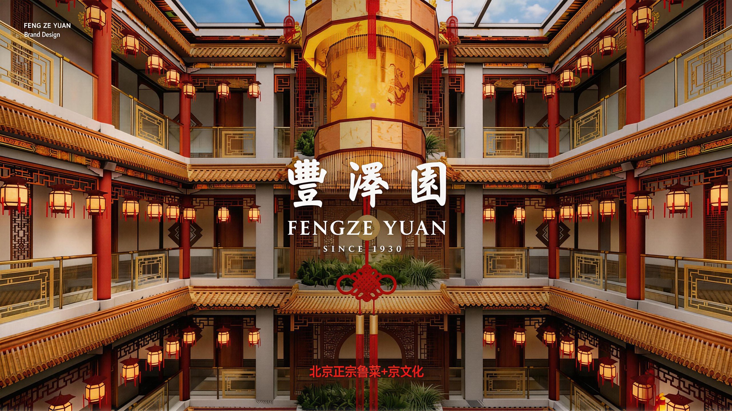
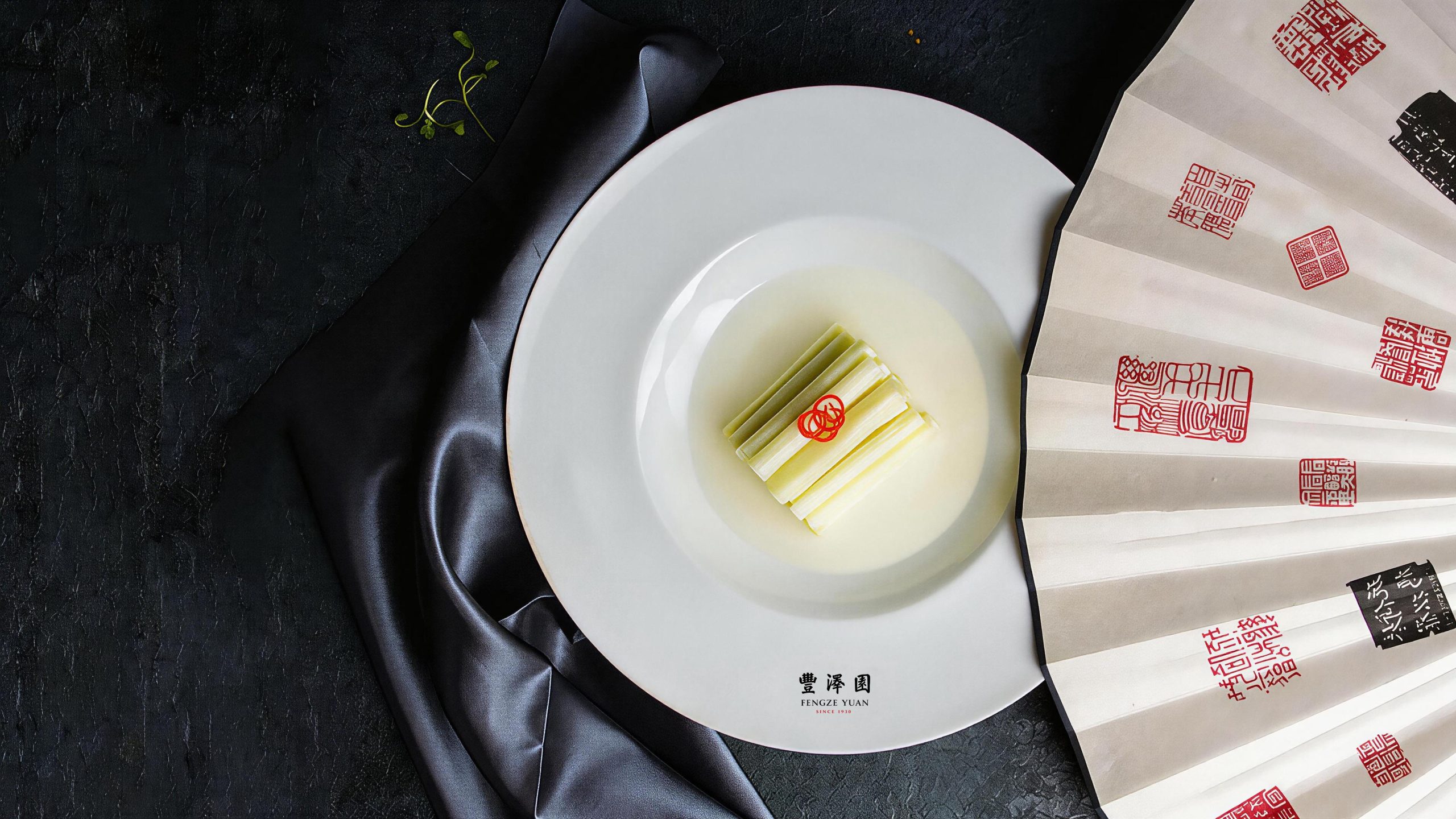
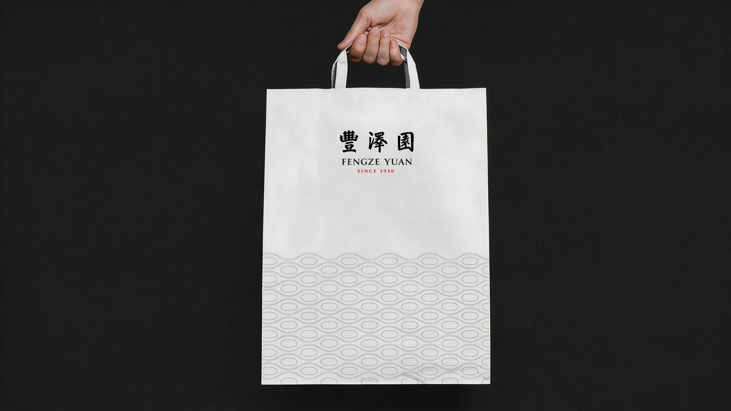
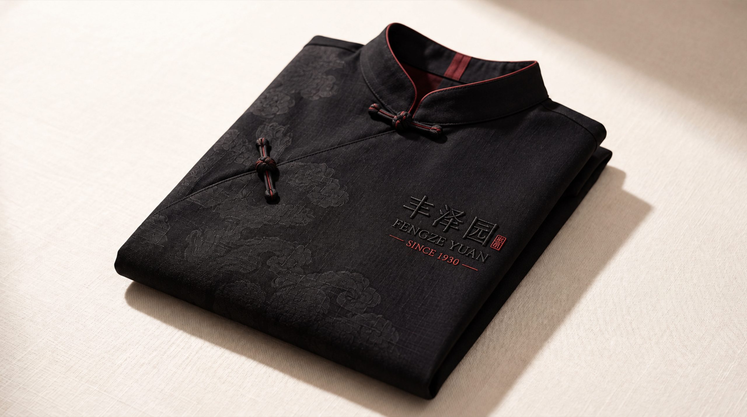
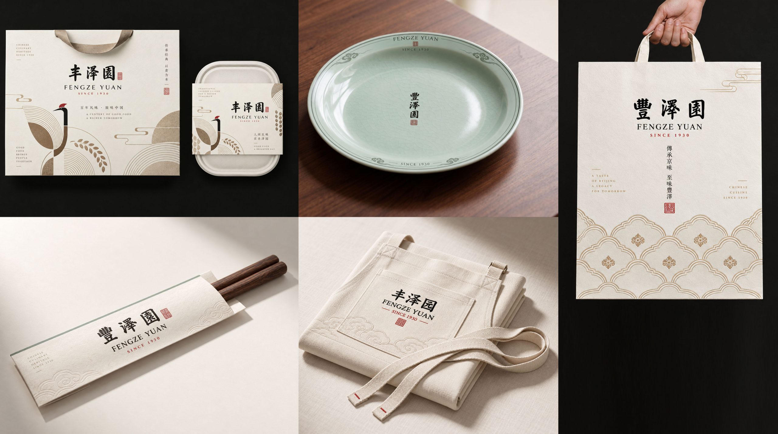
The logo has strong system scalability and can be widely used in restaurant front entrance plaques, lobby image walls, private room nameplates, screen decorations and Chinese-style guide systems; menu covers, napkin buckles, porcelain tableware bases, chopstick sets and toothpick sets and other catering supplies; gift box packaging, Shandong cuisine sauce souvenirs, brand recipe albums and corporate culture publications; official website, takeaway platform store image, social media avatars and food content marketing materials; state banquet reception, Chinese Food Culture Festival, Shandong cuisine intangible cultural heritage skills exhibition and foreign affairs catering event images. In the dynamic vision, the tripod shape stands steadily from bottom to top. The steam curve above the tripod mouth slowly rises and spreads out, just like a pot of century-old soup slowly simmering on the fire to create an intoxicating aroma. Finally, the three words "Fengze Garden" gradually emerge in the steam, symbolizing the precipitation and sublimation of taste and brand together in time. Tripod patterns, fretboard patterns and steam curves can be extended into visual mother elements and used for restaurant space decoration, tableware patterns, packaging pattern systems and brand culture peripherals.
brand meaning
The logo contains the three core images of the Fengzeyuan restaurant brand: Lu Cuisine Orthodoxy - the tripod totem and seal script brand name directly establish Fengzeyuan's orthodox status and cultural authority as the highest palace of Shandong cuisine; Century of Heritage - the fretwork decoration and 1930 vintage label convey the cooking skills and craftsmanship that have been passed down for nearly a century; Authentic Flavor, Profound Virtue) - the warm image of the steam in the tripod and the profound semantics of the three words "Fengzeyuan" convey the brand's business philosophy of treating people with taste and nourishing things with morality. The overall design conveys Fengzeyuan Restaurant's brand vision of "honest taste, good moral character, and century-old Fengze".
Improper Usage (Protection Specification)
Do not change the proportion of the tripod outline, the arc of tripod ears or the number of tripod feet; do not modify the number, arc or rising direction of the steam curve; do not change the hue, brightness or primary and secondary relationship between Lucai red and plaque gold; do not remove the fret decoration or replace it with other patterns; do not add gradients, strokes or modern special effects that are inconsistent with the traditional style to the logo; do not rotate, mirror the tripod graphics or separate the tripod and the circular frame; keep the space ≥ the diameter of the graphic 25%; the minimum display width shall not be less than 30mm.
design results
After the logo was released, the brand unity and cultural influence of Fengzeyuan Restaurant in the fields of Shandong cuisine and Chinese food culture have been significantly improved. "Taste of the Ding" has become the core identification symbol of Fengzeyuan's brand system with its unique visual language that combines the historical solemnity of heavy cooking utensils with the living temperature of gourmet steam. This logo is widely used in restaurant environment, catering services and cultural communication, showing the brand vision of "Honorable Taste, Honest Morality, Centennial Fengze".