










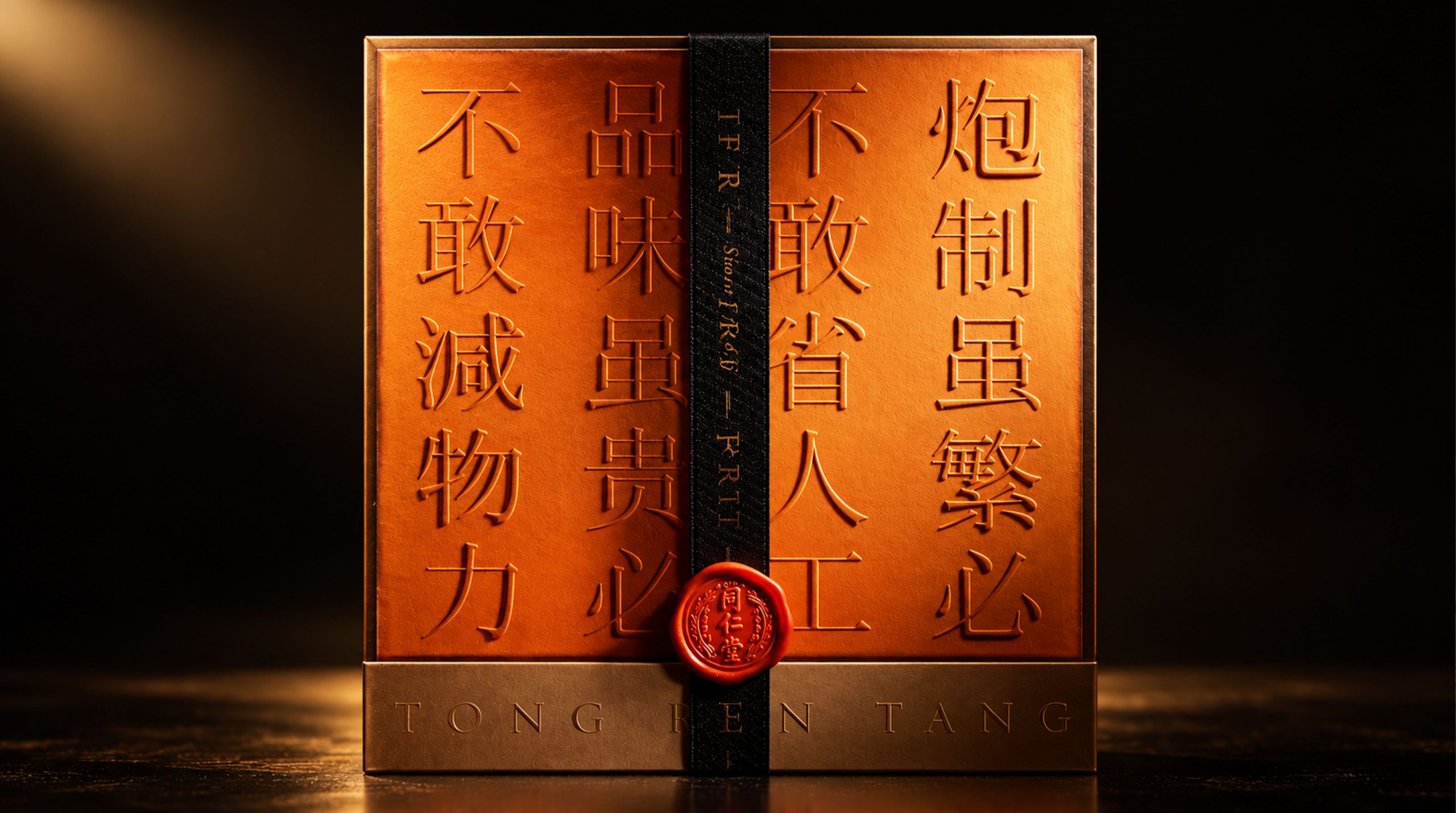
Tongrentang, as a pioneer in the field of traditional Chinese medicine, has a history of more than 350 years. The brand has gone through centuries of ups and downs, and has always been committed to combining traditional Chinese medicine culture with modern science. Inheritance and innovation are the eternal mission of Tong Ren Tang. Today, the brand is entering a new stage of development, not only continuing to deepen its efforts in the domestic market, but also continuing to explore on the road to internationalization. Facing new global challenges and modernization needs, Tongrentang hopes to reshape the brand landscape through a new brand image, find a balance between innovation and inheritance, highlight its cultural heritage and modernity, and further strengthen its position in the global health industry.
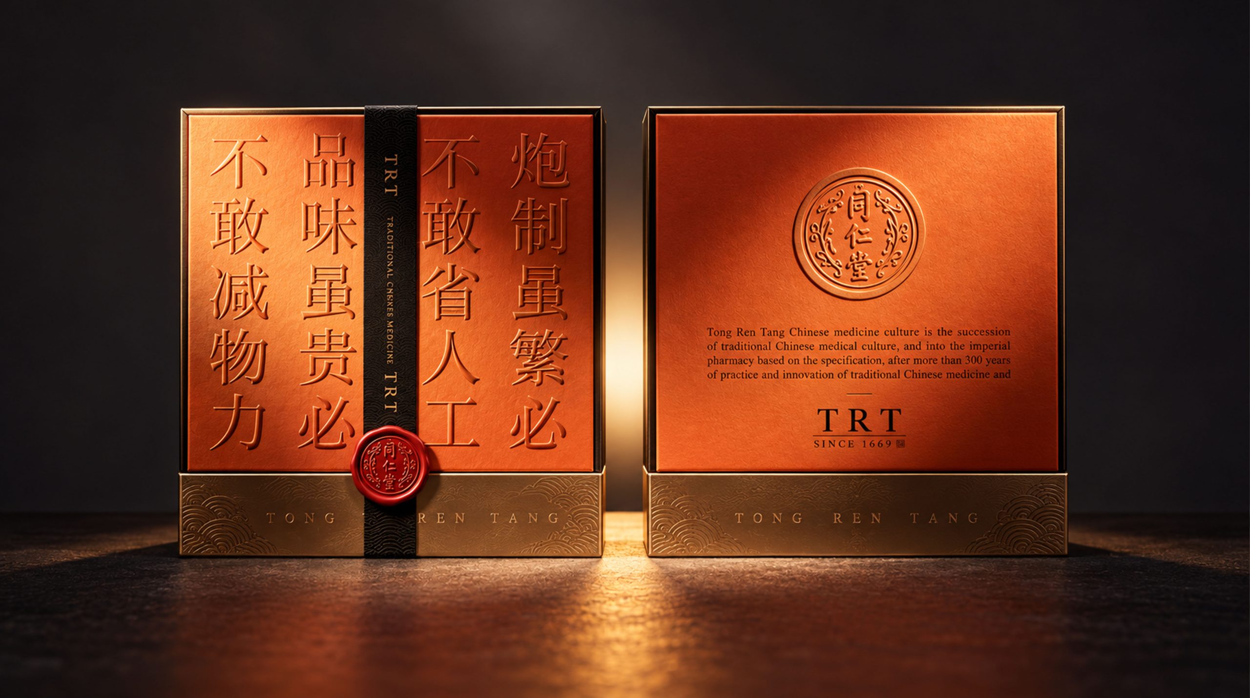
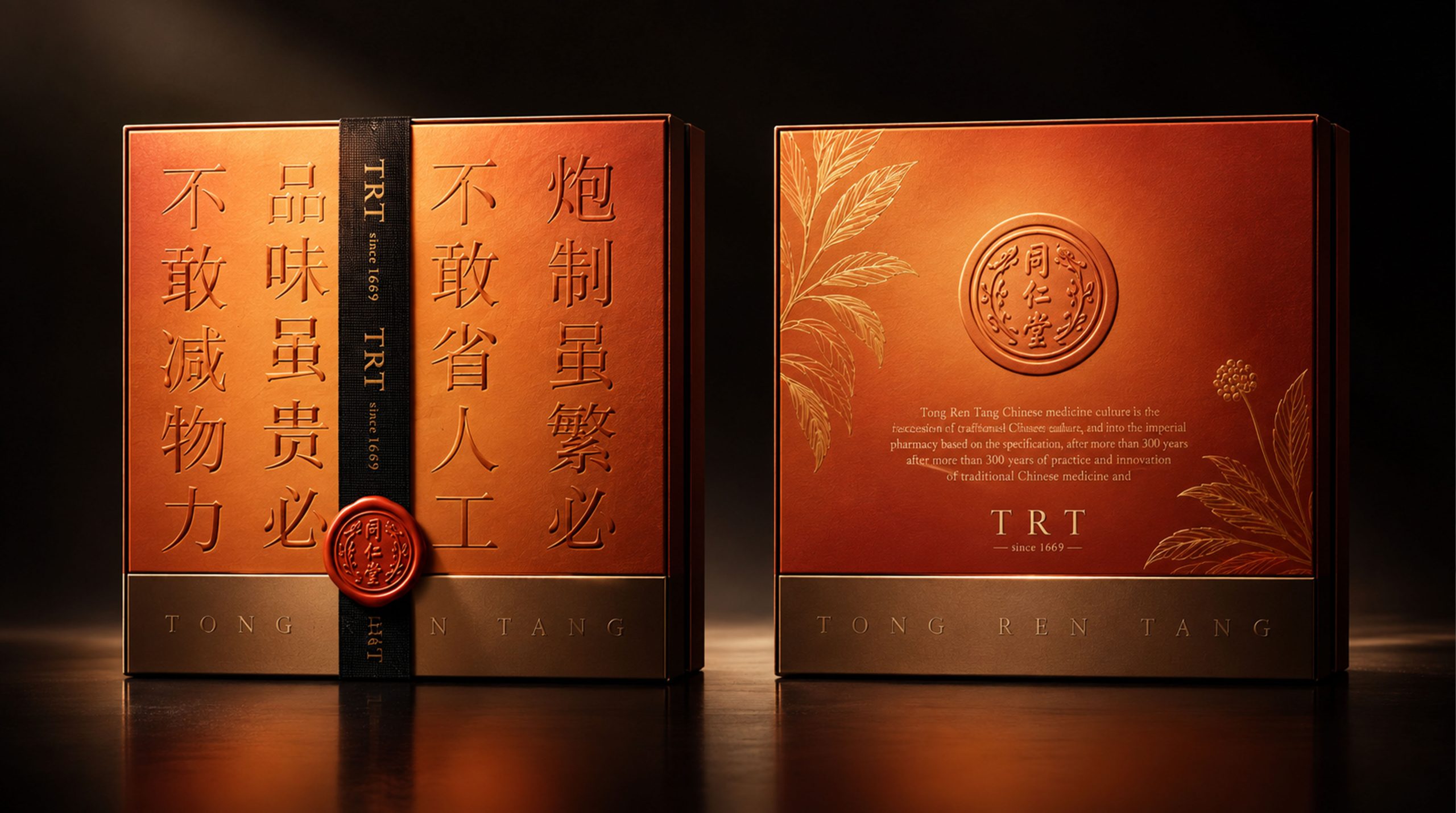
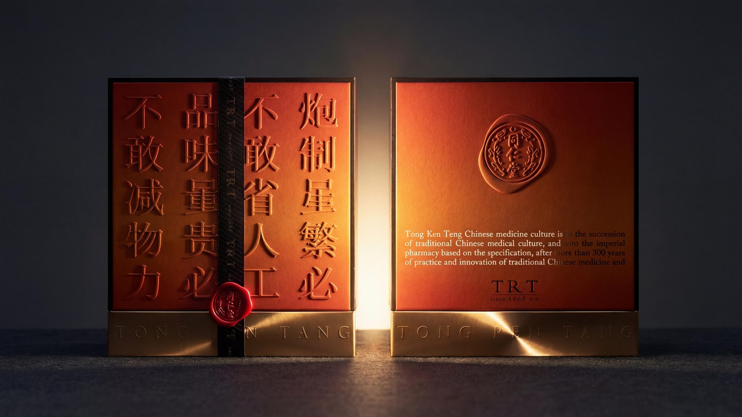
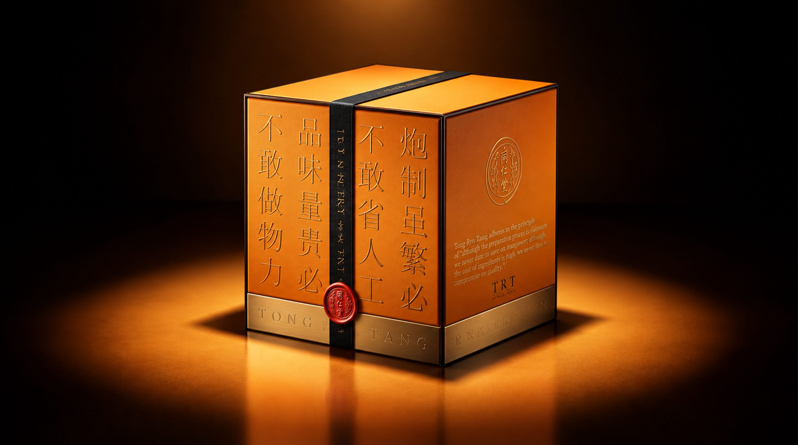
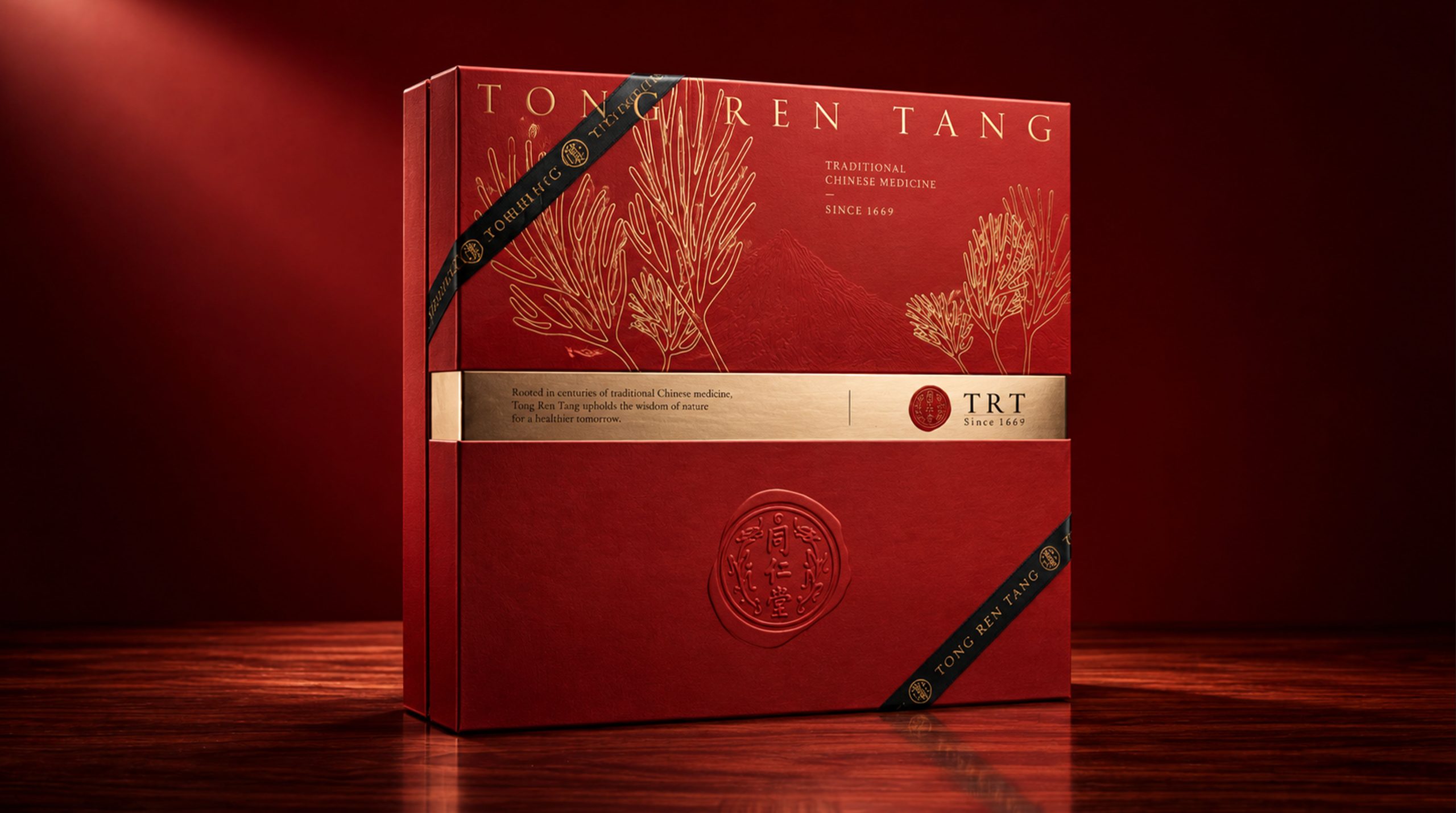
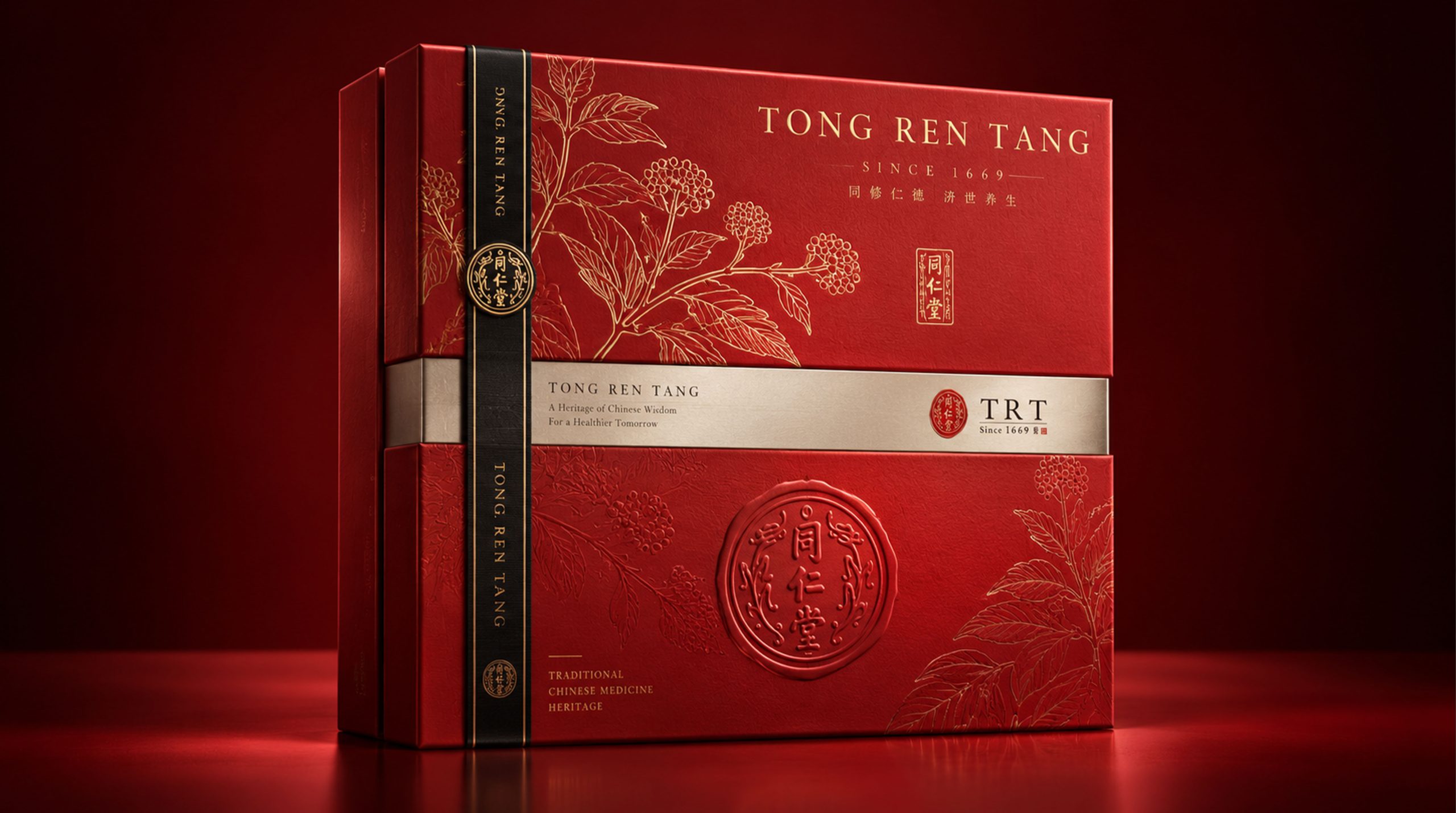
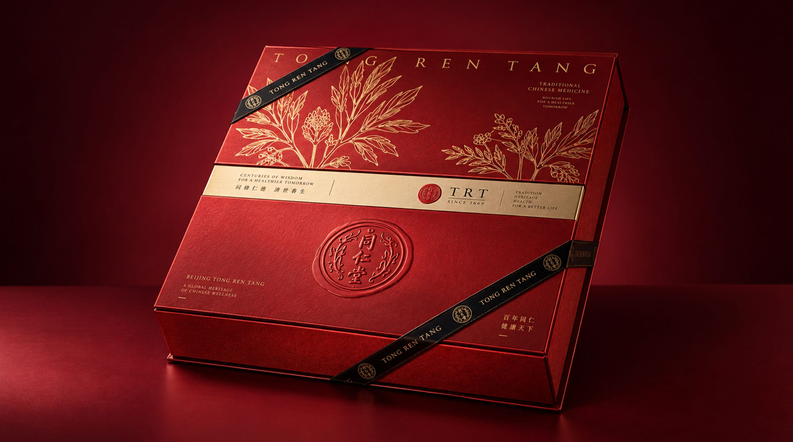
Brand spiritBrand Essence
Tongrentang's brand spirit is deeply rooted in its long-term historical heritage and cultural accumulation, building a brand DNA of stability, innovation and trust.
Stability × Innovation × Trust
Culture × Technology × Humanistic Temperature
These three sets of keywords clearly define the brand spirit of Tong Ren Tang. Stability represents the inheritance of traditional culture, innovation reflects the brand's continuous breakthroughs in technology and services, trust is consumers' recognition of the brand's long-term accumulation, and cultural and humanistic warmth are the core values of Tongrentang to maintain its foundation on the road to globalization.
design conceptDesign Philosophy
Tong Ren Tang’s brand philosophy can be summarized as “rational order × emotional temperature”. In the new brand image, we strive to express the professionalism of Tongrentang through clear and rational design language, and at the same time, convey the humanistic warmth of the brand through the clever use of white space and details. The balance between rationality and sensibility is the core of brand design. From product packaging to brand communication, we integrate this concept into every design element and communication channel, so that consumers can not only perceive the brand culture, but also experience Tongrentang's meticulous care and profound history.
visual languageVisual Language
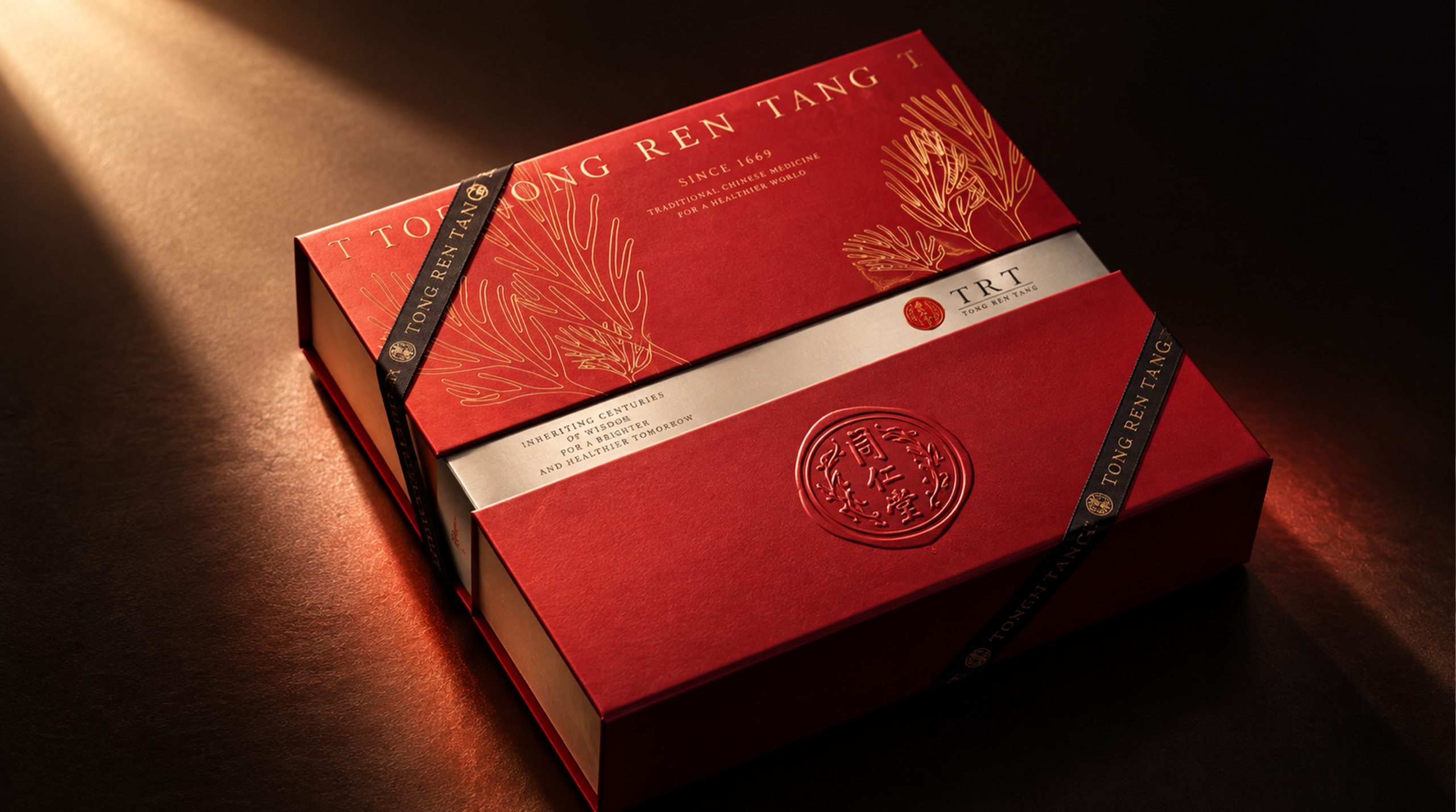
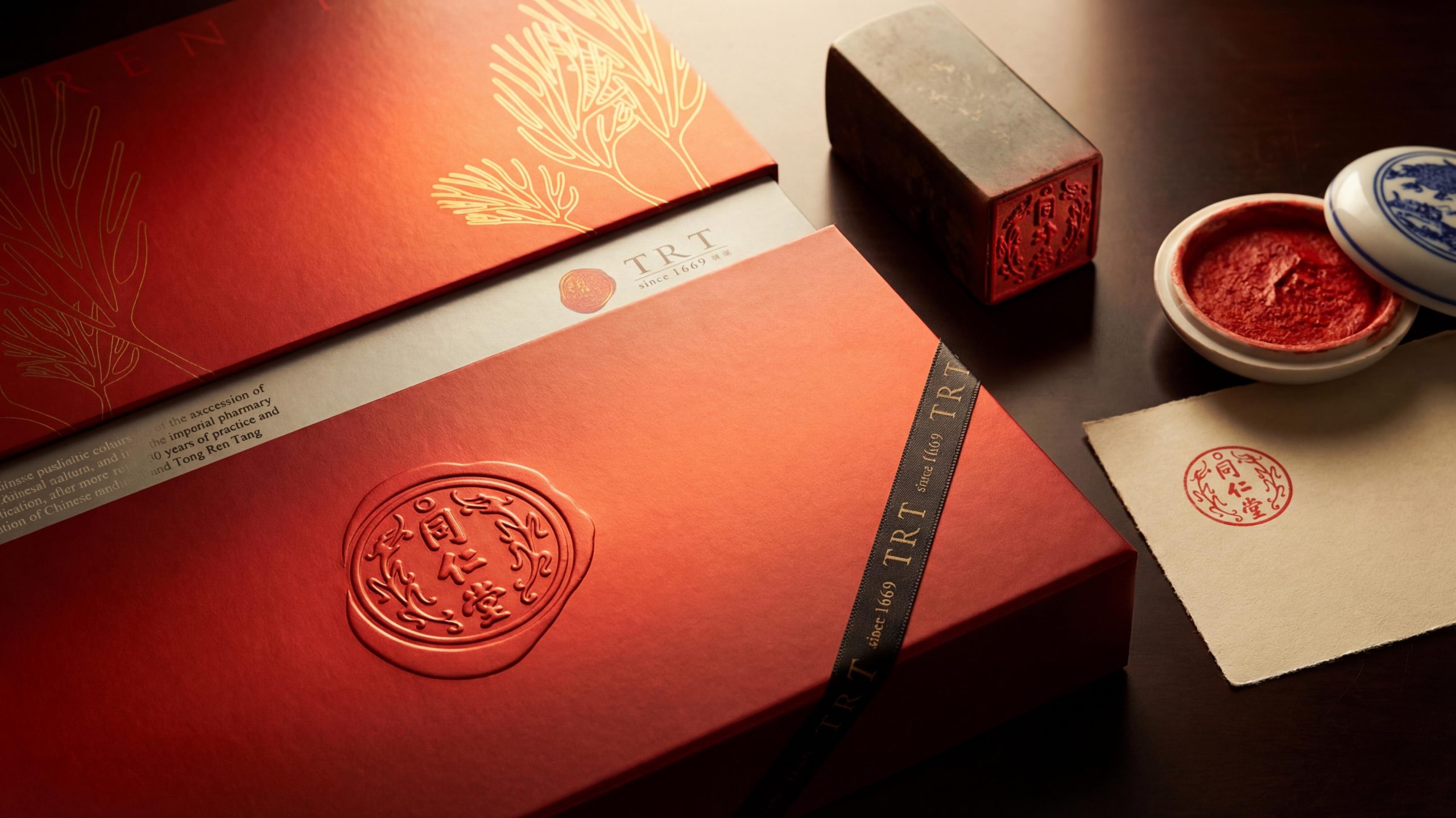
Tong Ren Tang’s visual language follows the principles of clarity and traditional cultural symbolism. Color and structure: Black is the main color, conveying a stable, deep and high-end brand temperament; gold embellishments not only enhance the sense of luxury, but also make the visual effect softer and warmer. Logo and graphics: In the new Logo design, the use of geometric elements reflects the sense of modern technology and precision, while the modern treatment of the traditional paper pattern visually continues the symbolic meaning of traditional Chinese medicine culture. Font and typesetting: We chose a modern geometric font, paired with a simple yet elegant typography layout, so that the entire brand visual system presents a simple but not simple, modern and deep image. Graphic motif: As the cultural motif of the brand, the paper pattern not only appears in packaging design, but is also cleverly used in other design elements to ensure the consistency of visual language and cultural coherence.
language and toneTone of Voice
Tongrentang's brand language is characterized by restraint and honesty, and its language style emphasizes the integration of rational expression and humanistic temperament. The brand language must not only convey professional and precise medical knowledge, but also incorporate warm and caring emotional expressions. Every piece of copywriting and every communication should strive to be concise and sincere, avoid excessive modifications and exaggerated vocabulary, and ensure the effectiveness and clarity of information transmission. In advertising slogans, product introductions, and official website content, the brand tone strives to be consistent with its visual image, which not only demonstrates Tongrentang's leading position in the industry, but also conveys affinity and humanistic warmth.
Brand ExperienceBrand Experience
Tongrentang's brand experience runs through all touch points, from offline stores to digital platforms, from product packaging to after-sales service, every link reflects the brand's consistency and trust. Spatial experience: The brand’s space design adheres to a simple and elegant style, focusing on details and comfort, so that consumers can feel the warmth of the brand while enjoying the products. Digital experience: On digital platforms, the new brand image is extended and displayed through websites, mobile applications and social media. The unification of visual language and brand tone creates a strong brand recognition across different channels. Product experience: Whether it is gift packaging or the product itself, the brand image conveys Tongrentang's professionalism and care through exquisite design and high-quality materials, further strengthening consumers' sense of brand identity.
brand statementBrand Statement
"Shape the brand with the heart of culture." Tongrentang's brand image is not only a visual presentation, but also an expression of cultural transmission and emotional resonance. Through innovative design language and inherited cultural elements, we have created a brand image that is both historical and modern, allowing it to continue to speak out in the global health industry and become a health brand trusted by global consumers.