










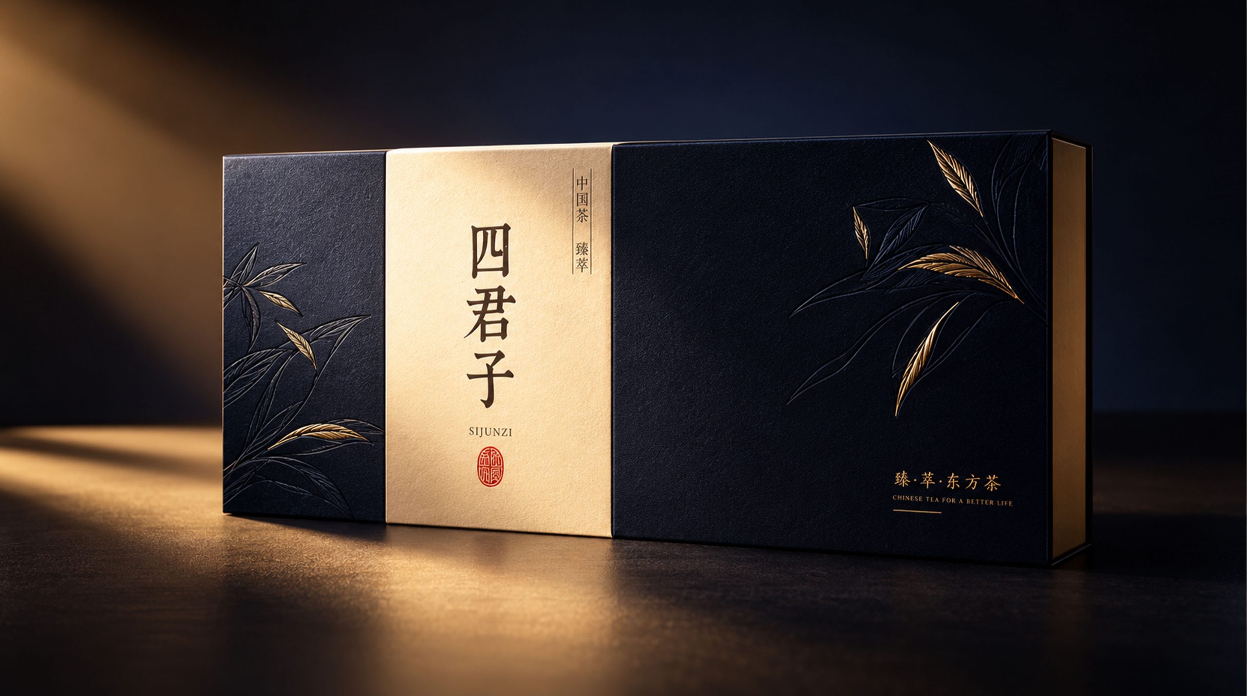
SIJUNZI is a herbal tea brand that uses traditional Chinese herbal tea as its carrier and literati aesthetics as its spiritual core. It belongs to the "Suhuang Laoyang" system. The brand name is taken from the Chinese painting "Four Gentlemen" - plum, orchid, bamboo and chrysanthemum, which is a metaphor for the gentleman's virtues pursued by the brand: purity, integrity, elegance and simplicity.
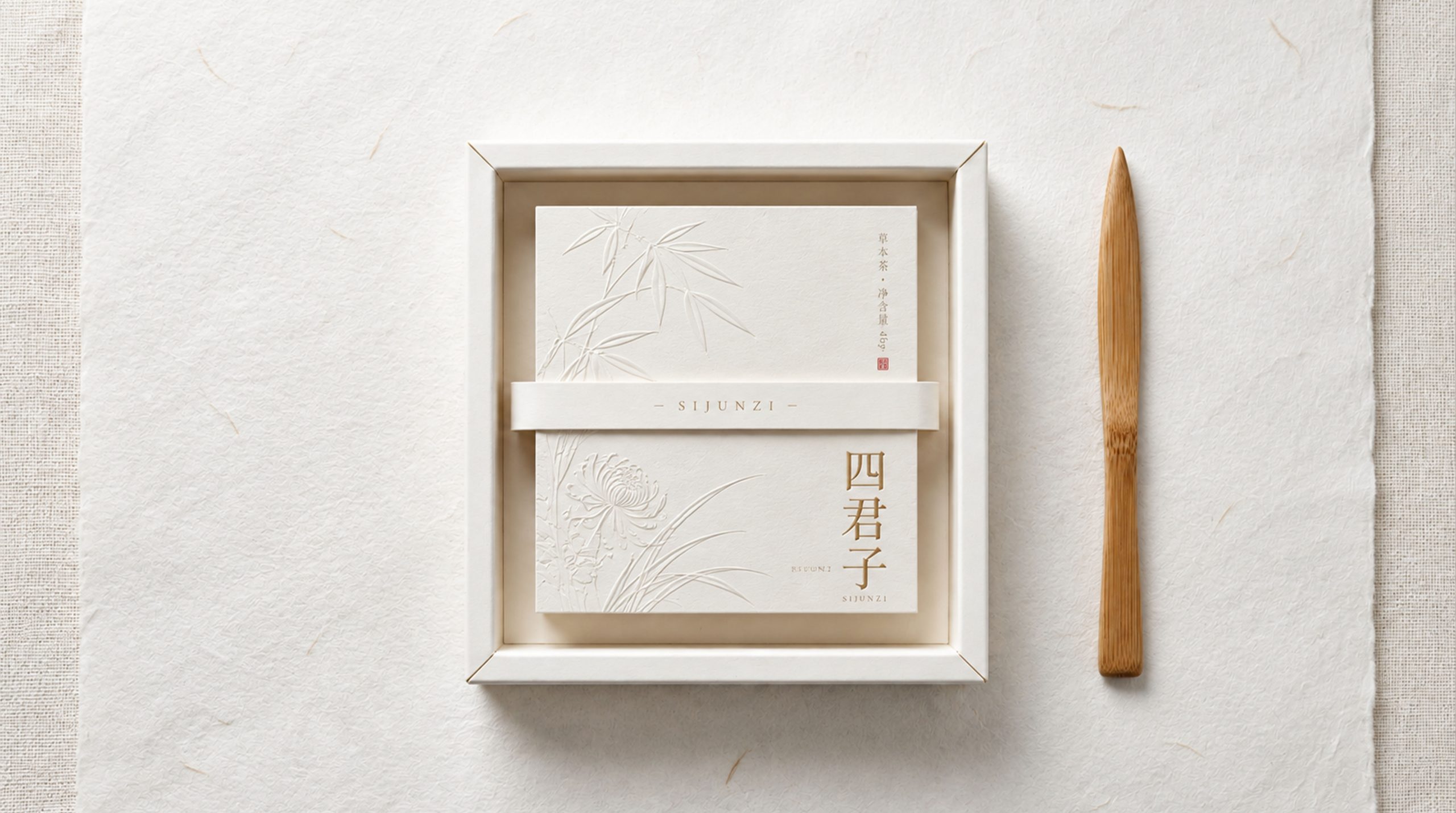
In terms of packaging design, Sijunzi has constructed a minimalist aesthetic system based on three natural materials: "paper × cloth × wood": the white handmade paper box conveys Junzi's aesthetic proposition of "being gorgeous" with almost colorless restraint, the indigo plant-dyed cloth gift box carries the cultural attributes of herbal tea with the tones of the oriental literati's study, and the agarwood round cake redefines the material existence of herbal tea in the form of a materialized product. The three layers of language progress layer by layer, from paper to cloth to wood, from light to heavy, from plain to deep, and together they complete a proposition - herbal tea is not just a drink, but also an elegant gift for literati that can be collected, played with and given away.
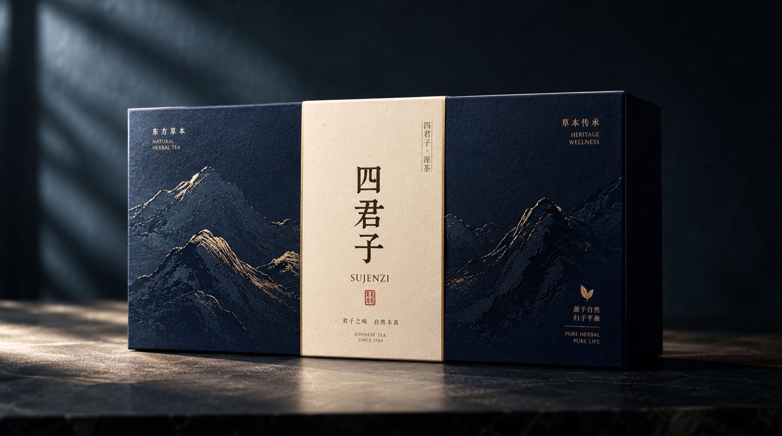
Brand Essence
The core spirit of Four Gentlemen’s packaging design can be summarized as:
Su × Ya × Zang
Restraint × Gentleness × Ritual
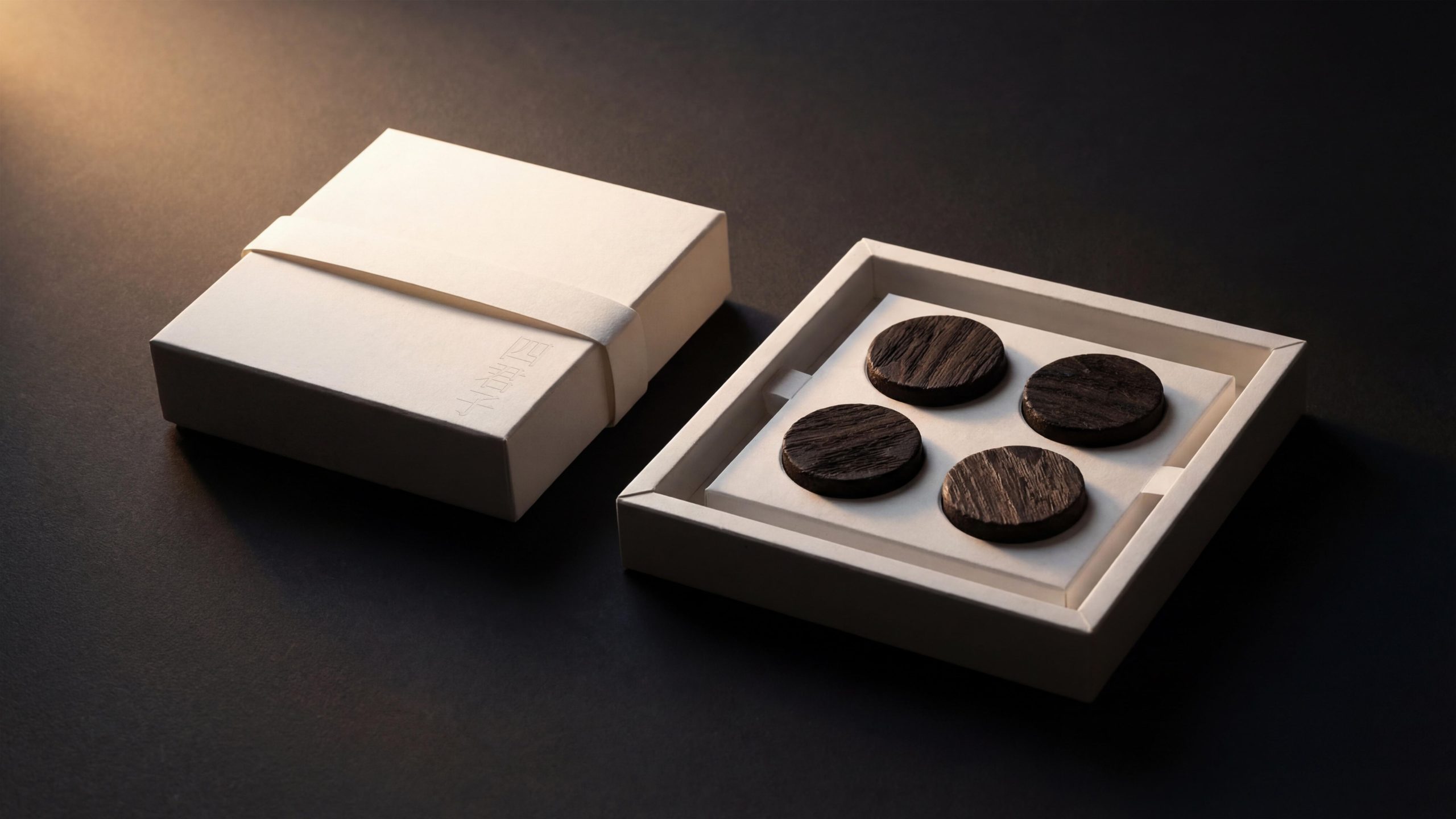
"Su" is the most fundamental visual attitude of the brand. The white handmade paper box gives up almost all visible decoration methods - no printing colors, no metal craftsmanship, no plastic coating, and only uses the fiber texture of the paper itself and embossed text to complete all information transmission. The three characters of the brand name "Four Gentlemen" are recessed into the paper surface using a blind pressing process. They are not one color, but appear as shadows under side light, just like the virtues of a gentleman - they are self-evident and self-evident. This kind of "element" is not poverty, but a well-thought-out restraint, which implies the brand's absolute confidence in the quality of its products - without the blessing of any visual rhetoric, the product itself is the best expression.
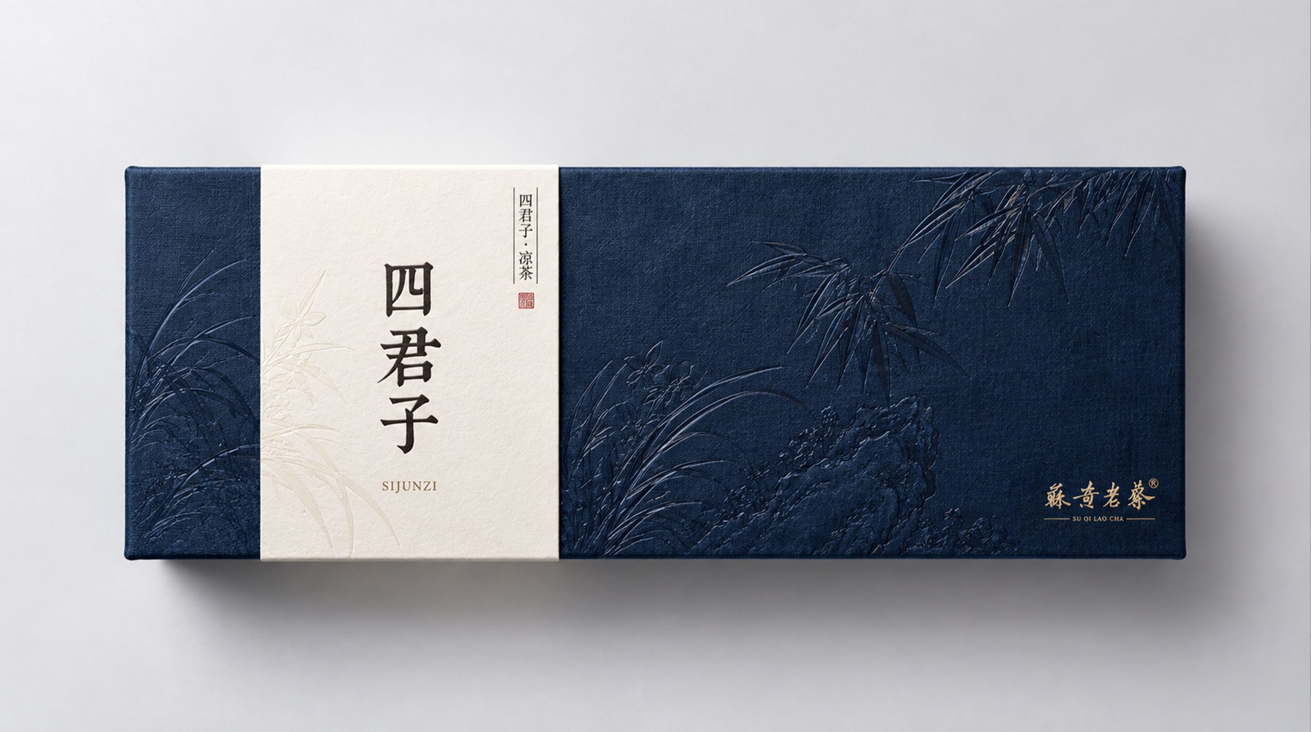
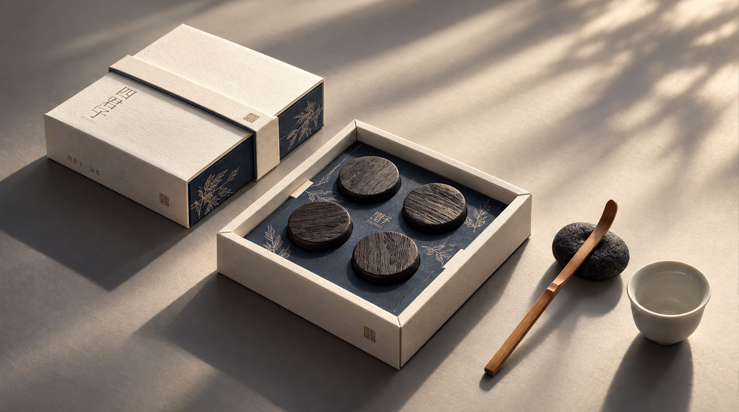
"Elegance" is condensed in the oriental literati charm of the indigo cloth-covered gift box. Indigo is not obtained from printing ink, but a deep blue taken from plant-dyed fabrics. This blue color has the unique unevenness and traces of time of cotton and linen fabrics, just like an indigo-dyed cloth that has been played with repeatedly by literati. On the left side of the box, a white book-cover-style paper tape runs across the box body. On the paper tape, the three characters "Four Gentlemen" are presented in vertical calligraphy, and "SIJUNZI" is followed in Latin small letters below. A thin line frame is used to separate the category label of "Four Gentlemen | Herbal Tea" in the upper right corner. The paper tape is like the title of the book jacket of an ancient book, transforming the entire gift box into a literati classic that can be read. The brand's parent imprint of "Suhuang Laoyang" in the lower right corner is presented in small cursive calligraphy in a low-key manner, just like the seal of an ancient book, indicating the source without overpowering the original.
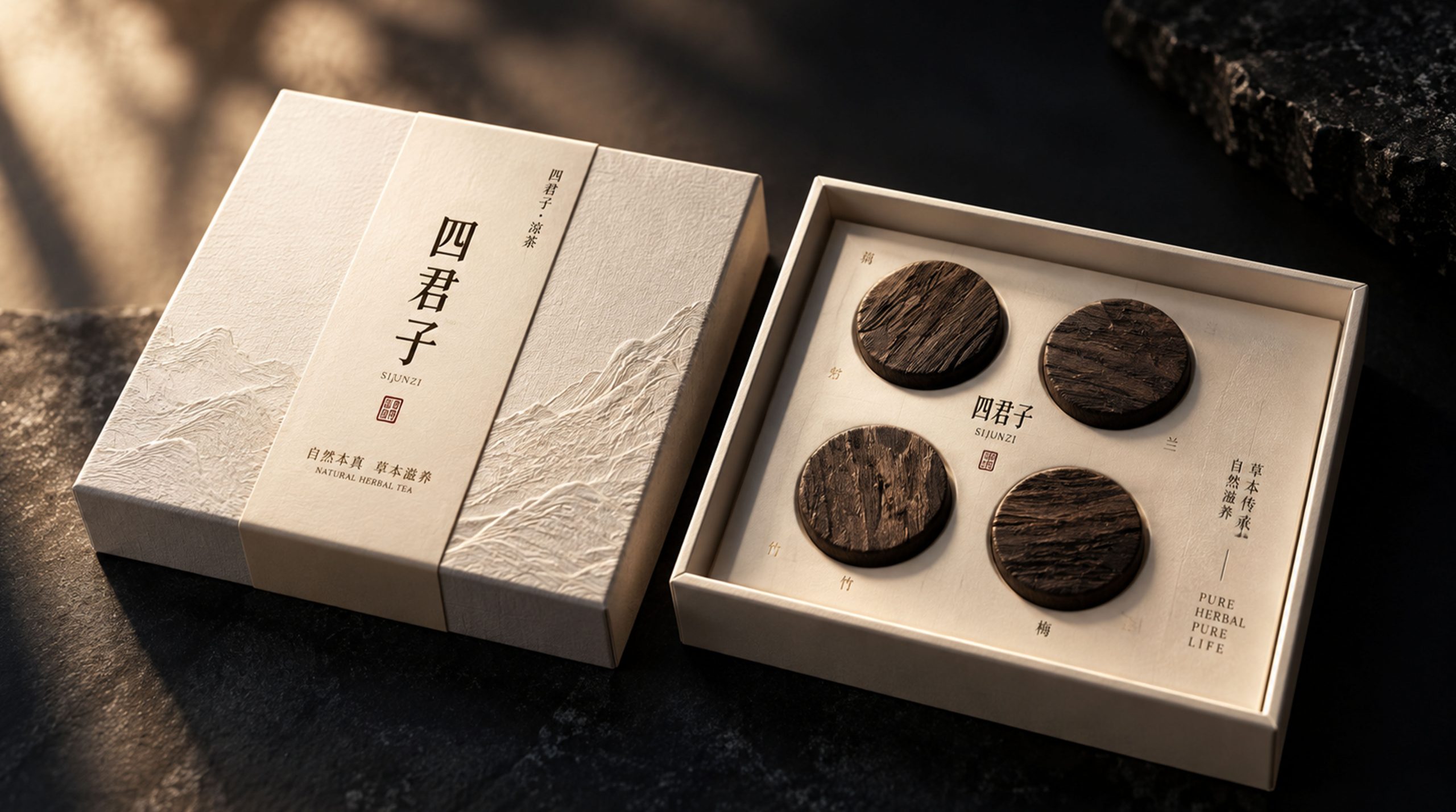
"Tibet" is reflected in the materialized existence of the agarwood round cake. Four dark brown wooden round cakes are neatly arranged in the grooves of the white carton. Each round cake is pressed and molded from natural agarwood or ebony. The surface retains the fiber texture and natural color difference of the wood itself. It is about 5cm in diameter and 8mm thick. It is shaped like the bottom of an ancient chess piece or seal. This is not a tea bag or tea cake in the traditional sense, but an object between tea and utensils - it can be brewed and drank, it can also be placed on the desk for appreciation, and it can even be put into a box for long-term preservation as a study object. The design intention of "Zang" is to liberate herbal tea from the time dimension of fast-moving consumer goods and give it a slow material attribute worth waiting for and cherishing. "Restraint" is the core methodology of the entire design - subtraction is achieved to the extreme, every element is retained and carefully scrutinized, and decorations that cannot bear a clear function are deleted. "Warmth" is the emotional background of material selection - the soft fiber of handmade paper, the warm touch of cotton and linen, and the body temperature of natural wood make the minimalist design not indifferent, but with an oriental implicit warmth. "Ritual" is the design goal of the box-opening experience - every action from untying the paper tape, opening the box lid to taking out the wooden round cake is designed as a ritual moment that requires slowing down and paying attention.
Design Philosophy
Sijunzi adopts the overall design concept of "three-layer container for one-flavored tea". The same herbal tea obtains completely different cultural identities in different ways of serving it: the paper box is its "book", the cloth box is its "box", and the wooden cake is its "body". The three-layer container goes from outside to inside, from light to heavy, just like traditional Chinese literati wrapping a cherished object in layers - first covering it with a cloth towel, then holding it in a brocade box, and finally touching it with hands.
White handmade paper box (Book of Paper): The outer box is made of handmade paper (thick paper similar to Japanese washi or Chinese rice paper). The paper surface retains the filament texture of natural plant fibers. The color is unbleached natural ivory white, slightly warm. The box body is a sky-and-ground cover structure, square, with an outer edge at right angles. The inner wall is also covered with hand-made paper, forming an integrated paper space inside and outside. There is no printing on the front of the box cover. Only the three characters "Four Gentlemen" are dented vertically in the lower right corner of the paper using a blind embossing (colorless embossing) process. The font is in straight Song or Ming fonts. The strokes are slender and clear, and the depth of the depression is about 0.3mm, it is almost invisible when viewed directly from the front, and can only be recognized under side light - this is the most philosophical detail in the entire design: the "presence or absence" of the brand name depends on the angle of the light, just like the name of a gentleman - "I don't know but not stunned." The contents of the box are tied tightly with a white paper tape. The width of the paper tape is about 3cm. Both ends naturally hang down on both sides of the box. There is also no text or pattern on the surface of the paper tape. There is also a bamboo letter opener attached next to the box. The blade is made of natural bamboo and retains the bamboo texture on the surface. The blade has a rounded tip and is about 18cm long. It is both a box-opening tool and an independent study tool.
Indigo cloth-covered gift box (cloth box): The gift box is a horizontal rectangular hard box structure, and the box body is covered with indigo plant-dyed cotton cloth. The tone of the cloth is deep and uneven, retaining the unique natural smudge marks of plant dyes - some areas are slightly darker like night, and some areas are slightly lighter like twilight. This imperfect color difference is precisely the most precious aesthetic quality of natural dyes. The texture of the cloth is rough but delicate, and the warp and weft lines are clearly discernible, just like an unframed indigo-dyed cloth. About one-third of the left side of the box is covered with a white book-cover-style paper tape. The paper tape is made of thick hand-made paper. The paper surface is slightly concave and convex. The upper and lower edges of the paper tape are flush with the box surface. The front of the paper tape presents the brand information in a vertical arrangement: a thin line frame is used to separate the category label "Four Gentlemen | Herbal Tea" at the top. The font size is extremely small, approx. 6pt; The three characters "Four Gentlemen" are presented in large vertical calligraphy characters below. The font is custom-made regular script. The writing style is calm and subtle, not ostentatious and not flashy, just like the inscription casually written on the desk of a literati; "SIJUNZI" is followed below the calligraphy in lowercase sans-serif Latin letters, with loose spacing between characters. In the lower right corner of the box, "Su Huang Laoyang" and the brand subtitle are used as the manufacturer's logo in cursive cursive. The font size is very small and requires a close distance to be recognized. The entire gift box is like a thread-bound ancient book - the indigo cloth is the book jacket, the white paper tape is the title, and the brand name is the title of the book.
Agarwood Wooden Round Cake (Wood Body): The four round cakes are made of natural hardwood (presumably dark hardwood such as agarwood, ebony or old elm) pressed at high temperature. The wood grain direction and color depth of each round cake are slightly different. This natural difference is deliberately retained rather than eliminated, implying that each round cake is a unique natural individual. The surface of the round cake is polished with fine sand to a matte texture, and the edges are slightly chamfered, making it feel round and without edges. There is no text or logo on the front of the round cake, and the texture and color of the wood itself are used as the only visual language. The four round cakes are arranged in a four-square grid in a white paper box, with a gap of about 5mm between each one. The white paper background and the dark brown wooden cakes form the ultimate contrast between light and dark - just like four ancient chess pieces placed on a white jade chessboard, or like a square ink ingot resting on the side of a snow-white inkstone.
Visual Language
The Four Gentlemen constructed a visual system with "blanking" as the core strategy - not to add something, but to subtract something; not to show something, but to hide something. The brand's visual recognition does not come from the vivid colors, the complexity of the patterns or the dazzling craftsmanship, but from the ultimate "little" - too little to be ignored.
Color: Only three "non-colors" are used in the entire package - ivory (the natural color of handmade paper), indigo (the natural color of plant-dyed cloth) and dark brown (the natural color of wood). These three colors are not obtained from printing ink, but are inherent colors of the material itself. They cannot be accurately defined in CMYK or Pantone color numbers because there are natural slight differences in the hue of each batch of paper, each piece of fabric, and each piece of wood. The brand accepts and embraces this uncontrollability and transforms it into a design language - "Natural is the standard". Ivory white is the main color, occupying more than 70% of the visual area of the packaging system. It is not an industrial pure white (#FFFFFF), but a raw white with fiber warmth, just like the natural color of unbleached and dyed cotton. Indigo only appears in cloth-covered gift boxes, accounting for about 25%. Its depth and the simplicity of white form the most classic "blue and white" contrast in Eastern aesthetics, just like the glaze color logic of blue and white porcelain. The dark brown color belongs only to the wooden round cake itself, accounting for less than 5%, but it is the element with the greatest visual weight in the entire design. The four dark round cakes are like four drops of thick ink falling on rice paper in the plain white, instantly becoming the visual focus.
Pattern: None. There are no patterns, patterns, illustrations or decorative graphic elements in Four Gentlemen's packaging systems. The brand name is taken from the four gentlemen of "plum, orchid, bamboo and chrysanthemum", but there are no concrete or abstract graphics of plum, orchid, bamboo and chrysanthemum on the packaging - this is an extremely bold design decision: "no painting" is used to replace "painting", implying presence by absence. When consumers see the words "Four Gentlemen", the image of plum blossoms, orchids, bamboos and chrysanthemums naturally comes to mind, and the plain whiteness and restraint of the packaging itself exactly echoes the aesthetic spirit of gentlemen who "have always been beautiful". This strategy of "blank space is pattern" makes Sijunzi's packaging an isolated example among all herbal tea brands that cannot be imitated - because you can't imitate "nothing".
Font: The brand name "Four Gentlemen" appears in two font forms on different carriers: blind embossed in Song/Ming style on a white paper box. The strokes are slender, the structure is correct, and the temperament is restrained. It is like the font selection of the text of ancient books, conveying It conveys a kind of tranquility like a collection of books; it is presented in custom regular script calligraphy on the white paper tape of the indigo cloth-covered gift box. The writing style is somewhere between the regular script and the flow of running script. It is neither ostentatious nor flying, just like the casual handwriting in a literati's letter. "SIJUNZI" is presented in lowercase sans-serif Latin letters. The font size is extremely small and the font weight is extremely light. The sense of presence is deliberately lowered to the lowest threshold of information transmission - its function is only to provide pinyin notation and international recognition, and does not assume the role of any visual decoration. The category label of "Four Gentlemen | Herbal Tea" is presented in a regular black font with a very small font size, separated by a thin line frame, just like the edition label on the title page of an ancient book. It is extremely functional and has minimal visual interference.
Packaging Structure and Details
The packaging structure of Sijunzi is based on the layered relationship of three natural materials: "paper × cloth × wood". Each layer of the structure is both functional and ritualistic, and together form an opening sequence from outside to inside, from light to heavy:
White handmade paper box: The box body is made of 1.5mm thick gray board as the skeleton, and the inside and outside are covered with handmade paper. Handmade paper is made from long-fiber cotton pulp or mulberry pulp. The paper surface retains the naturally formed filament fiber texture and tiny fiber aggregates. The paper color is unbleached natural ivory white. The paper surface does not undergo any coating or lamination treatment, retaining the most original breath and touch of the paper. The upper and lower covers of the sky-and-ground cover structure fit together with a very small gap (about 0.5mm). When opening and closing, you can feel the weak resistance of the air being slowly squeezed out, just like opening a sealed inkstone box. The blind pressing process of the brand name "Four Gentlemen" uses a brass mold to press at a temperature of 180°C. The pressure is precisely adjusted to ensure that the depth of the depression on the paper surface is uniform at 0.3mm. The edge of the writing is sharp without breaking the fibers on the paper surface. The fibers on the bottom surface of the depression are slightly compacted at high temperature, showing a subtle texture difference that is slightly smoother than the surrounding paper surface. The white paper tape in the box is cut from the same handmade paper. The edges of the paper tape are hand-torn raw edges instead of mechanically cut straight edges. The irregular fiber fibers on the raw edges are like the "flying white" of rice paper, adding a touch of handmade warmth to the overall delicate structure. The bamboo letter opener is hand-cut from natural bamboo. The blade is polished with fine sand until it is silky smooth. The bamboo joints retain natural annular protrusions, and the tip is rounded. The overall shape is like an enlarged bamboo pen or a reduced bamboo sword. It can be used to lift paper strips to assist in opening boxes, or it can also be used as a tea needle or letter knife in the future.
Indigo cloth-covered gift box: The box body is made of 2mm thick gray board and has a horizontal rectangular structure (estimated size is about 35cm × 12cm × 5cm). The box surface is covered with indigo plant-dyed cotton cloth. The fabric is made of medium-density pure cotton plain weave, which is repeatedly dip-dyed with indigo (Isatis root or polygonum indigo extract) until it reaches dark blue. After each dip-dye, it is oxidized by the sun and repeated 6-8 times to achieve the final deep blue tone. This traditional plant dyeing process gives the cloth a unique "activity" in color tone - it shows a subtle color shift from deep sea blue to midnight blue under different light angles, and will produce slight color changes ("color maintenance") with the touch of fingers over time. This is an aesthetic of time that cannot be achieved with chemical dyes. The edge of the cloth is closed with a hidden fold on the inside of the box, with no exposed seams or glue marks. The white book cover paper tape is made of 120g handmade paper. The width of the paper tape is about 80% of the height of the box. The left and right ends of the paper tape are fixed at the junction of the left side and the bottom of the box with hidden adhesive. It is not removable but does not affect the opening of the box lid. The calligraphy text on the surface of the paper tape was written with traditional ink, then scanned and plated with high precision, and printed with a single-color offset printing process. The ink color is pure black, but the amount of ink is deliberately controlled to show the natural dry and wet changes in the density of the brush when writing - the ink is full in the thick strokes, slightly lighter in the thin strokes, and the paper fibers can be seen in the white spots. The thin line frame is printed with a 0.3pt line weight, creating a subtle tension between refinement and boldness in the rough fibers of the paper.
Agarwood wood round cake: Each round cake is made of natural hardwood, ground and crushed, mixed with herbal tea herbal formula, and pressed into shape with a high-temperature and high-pressure mold. The diameter is about 50mm, the thickness is about 8mm, and the weight is about 15-20g. The pressing temperature and pressure are precisely controlled to ensure that the round cake has sufficient structural strength (to withstand light handling without breaking), and retains enough porosity to quickly release the active ingredients during brewing. The surface of the round cake is dry-polished with 800-grit fine sand to a uniform matte texture, and the edges are chamfered with R1 arc for a rounded feel. The front texture of each round cake is formed by the natural arrangement of wood fibers. The color ranges from deep chocolate brown to almost black. This color difference comes from the age, oil content and dryness of different batches of raw materials. The brand regards this natural difference as product personality rather than quality control defects. The round cakes are positioned in a white carton with four-square grooves. The grooves are made of foam padding covered with hand-made paper. After each round cake is embedded, it is slightly higher than the box surface by about 2mm, making it easy to pinch with fingertips. The four round cakes are not separated by any partitions, only the paper ridges between the grooves are naturally distinguished, which is extremely simple.
Tone of Voice
The written language of "Four Gentlemen" runs through the restrained tone of "literati's letter writing". The number of words is very few, and each word appears like a chess player's move - if you make a mistake, you will not regret it, and every word is useful.
The three characters of the brand name "Four Gentlemen" represent the entire brand narrative. It does not explain which four characters "four" is, does not mark "plum, orchid, bamboo and chrysanthemum", and does not attach any explanatory text - because those who understand will naturally understand, and those who do not understand will understand out of curiosity. Both paths lead to the cultural identity expected by the brand. This kind of courage to "not tell" is itself the highest expression of brand confidence. The word "herbal tea" appears as a functional label in the category. It does not say "herb", "health" or "traditional formula". It only uses the simplest category name to convey the information, just like the ancients inscribed paintings - "Bamboo" for bamboo and "Orchid" for orchids, without any unnecessary literary modifications.
The Latinized pinyin of "SIJUNZI" is the only modern element in the entire writing system. It appears in lowercase letters without any decorative treatment and has a very low sense of presence. This treatment implies that although the brand respects the need for international communication, it is never willing to sacrifice the integrity of oriental aesthetics for this purpose. "Suhuang Laoyang", as the parent brand name, appears in small cursive characters on the lower right corner of the gift box. The font size is so small that you need to get closer to identify it. It is like a book seal in an ancient book - it indicates the source and declares ownership, but it will never grab the reader's (consumer's) first attention from the book title (brand name).
There is no marketing rhetoric, product selling point text, efficacy description or usage instructions in the entire package. There is no common language in the herbal tea industry such as "selected authentic medicinal materials", "cooked with ancient methods", and "clearing away heat and relieving summer heat". The Four Gentlemen reduce all explanatory information to a minimum, and may even omit it completely - the brand's attitude is: if you need to be told what it is and how to use it, then you are probably not its audience. This kind of restraint, which is almost arrogant, is precisely the most faithful translation of the "gentleman" temperament in brand language.
Brand Experience
Four Gentlemen has built a complete set of "gentlemen's friendship" experience for consumers from the three dimensions of vision, touch and ritual - as light as water, but with a long aftertaste:
Visual experience: The packaging of Sijunzi is an "alien" on any shelf or display environment - among the colorful herbal tea categories, a package that is almost entirely white, almost wordless, and almost without pictures creates the strongest visual impact with its extreme "little". This is a counter-intuitive attention strategy: when all competing products are striving to be "seen", Sijunzi chooses to be "almost invisible", and it is this invisibility that makes it the most unignorable existence. The white carton shows the unique warm luster of handmade paper under the light, and the fiber texture is looming at different angles, like a piece of uncarved white jade. The deep blue tone of the indigo cloth-covered gift box and the simplicity of the white paper tape form the most classic "blue and white" contrast in Eastern aesthetics - this is the color logic of blue and white porcelain, the color logic of indigo-dyed cloth and white cotton yarn, and the color code of the aesthetic accumulation of Chinese literati for thousands of years. The arrangement of four dark brown wooden round cakes in the white box bottom is like a minimalist abstract composition - four circles, one square, two colors, the purity of geometry and the warmth of material achieve a perfect balance.
Tactile experience: Touch is the most important sensory dimension in Sijunzi packaging design. The touch of hand-made paper is the keynote of the entire experience - the moment your fingertips touch the paper, you can feel the softness of the long fibers and the graininess of the tiny fiber clumps. This touch is somewhere between raw rice paper and hand-woven cotton, warm and vital, in sharp contrast to the cold and smooth industrial coated paper. The hand-torn edges of the paper tape leave a slight burr feeling when fingertips are passed over it, like flipping through an uncut thread-bound ancient book. The touch of the indigo cloth is richer - the warp and weft patterns of the cotton are clearly discernible under the fingertips, and the subtle bumps and convexes formed by the vegetable dyes on the cloth give the touch a "living" texture, just like touching an indigo-dyed garment that has been worn for many years. The wooden round cake is the climax of the tactile experience - when you pick up a round cake, its weight (about 15-20g) forms a just right sense of presence on the fingertips, not frivolous or heavy; the matte polished surface is silky and warm, and the micro-texture of the wood fiber delivers a unique touch between stone and wood when held between the thumb and index finger; the arc chamfering on the edge makes the entire holding experience without any uncomfortable edges and corners. The touch of the bamboo letter opener is an extra surprise - the coolness and silkiness of the bamboo, and the ring-shaped protrusions at the bamboo joints create a pleasure to play with in the palm of your hand.
Ritual experience: The box-opening process of Four Gentlemen is designed as a complete three-act ceremony. Act 1 - Explanation: Take out the bamboo letter opener and gently open the fold of the paper tape with the tip of the knife. The moment the paper tape is released is like unsealing a handwritten letter. This action requires the user to slow down and concentrate, switching from the daily fast consumption rhythm to the slow rhythm of a scholar. The second act - Unveiling: Lift the lid slowly with both hands. The weak air resistance of the lid structure makes this action like opening the lid of an inkstone. The four wooden round cakes in the box are arranged neatly on the white paper lining, just like the first sight after opening a chess box. Act Three - Taking: Pick up a round cake with your thumb and index finger. The warmth and weight of the wood gather at the fingertips. At this moment, the round cake is transformed from "packaging contents" to "an object in the palm of your hand". The functional attributes of herbal tea are temporarily eliminated, replaced by a pure aesthetic experience of materials. The entire three-act ceremony takes about 30 seconds from start to finish, far longer than the unpacking time of any fast-moving consumer goods, but Four Gentlemen needs exactly these 30 seconds - it is a silent agreement between the brand and consumers: please slow down and treat this herbal tea with the same attitude as you would treat an elegant artifact from the study.
Brand Statement
Not a single color, but a refreshing breeze. Sijunzi takes the "elegance" and "hiddenness" of Chinese literati aesthetics as its three spiritual pillars, uses handmade paper, plant-dyed cloth and natural wood as its material language, and uses blind pressing, hand tearing, hand dyeing and high-temperature wood pressing as its technological methods to build a minimalist aesthetic system that is unique in the herbal tea category. It does not draw plum blossoms, orchids, bamboos and chrysanthemums, but it interprets the full meaning of "gentleman" with the restraint and gentleness of the packaging itself; it does not talk about efficacy, tells stories, or makes promises, but completes the most profound brand persuasion with every detail that can be touched, played with, and cherished. The white paper box is the "prime" of a gentleman, the indigo cloth box is the "elegance" of a gentleman, and the wooden round cake is the "hide" of a gentleman. The three are combined into one to form the Four Gentlemen - a herbal tea brand that does not speak with colors or words, but speaks with the silence of materials and the slowness of rituals. Every time you open the box, every touch, every brew is a first-hand encounter with a silent gentleman.