










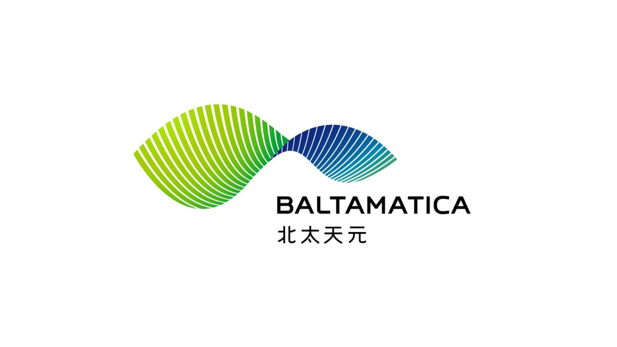
BALTAMATICA is a high-tech company focused on intelligent manufacturing, data algorithms and industrial internet platforms.
As the company expanded globally and evolved its products into an integrated portfolio, it sought a new identity to convey a technological spirit that is “data-driven, intelligently coordinated, infinitely connected.” The goal was a more future-facing visual image with stronger international recognition.


design concept
The mark is built around the concept of an “infinite intelligence curve.” It combines the logical beauty of mathematics with the growth curves of nature to form a dynamic ∞ (infinity) structure. Waves extending outward at either end symbolize the flow of data and the transmission of energy. The central intersection represents the balance and convergence of core algorithms. The design expresses the brand philosophy “from order comes intelligence, from algorithms comes the future,” holding the dual tension of technological rationality and organic vitality.
graphic language
Infinity curve (∞): symbolizing BALTAMATICA’s self-iterating systems and the company’s continuous innovation and scalability. Convergence point: the hub where data and intelligence meet, a symbol of the brand’s core technology. Linear texture: line weights graduating from fine to bold express the dynamic order of energy flow, information transfer and computation. Balanced wings: mirrored forms create dynamic stability, expressing the brand’s stance of “open collaboration, shared global progress.” The graphic language combines technology, spatial depth and speed. It is rigorous and rational, yet full of momentum.
Fonts and composition
The English BALTAMATICA uses a modern geometric sans-serif with solid letterforms and tight spacing, reflecting the precision and reliability of a technology brand. The Chinese name uses a custom sans-serif structure, square and strong, conveying stability and confidence. The bilingual lockup aligns on a central axis for consistency in international communication. Type weight matches the visual center of the symbol for a balanced, stable composition.
color system
Primary Green #5AC254: representing growth, innovation and sustainability. Blue gradient #0071BC → #52C2C9: symbolizing technology, intelligence and the space of the future. Teal transition layer: creating a flowing transition of data energy and a visual rhythm that balances motion and stillness. Neutral Charcoal #2B2B2B: used for type and backgrounds, lending stability and authority to the identity. Built on a “tech blue × eco green” pairing, the palette expresses the brand’s belief in harmony between rational technology and nature.
Application and extension
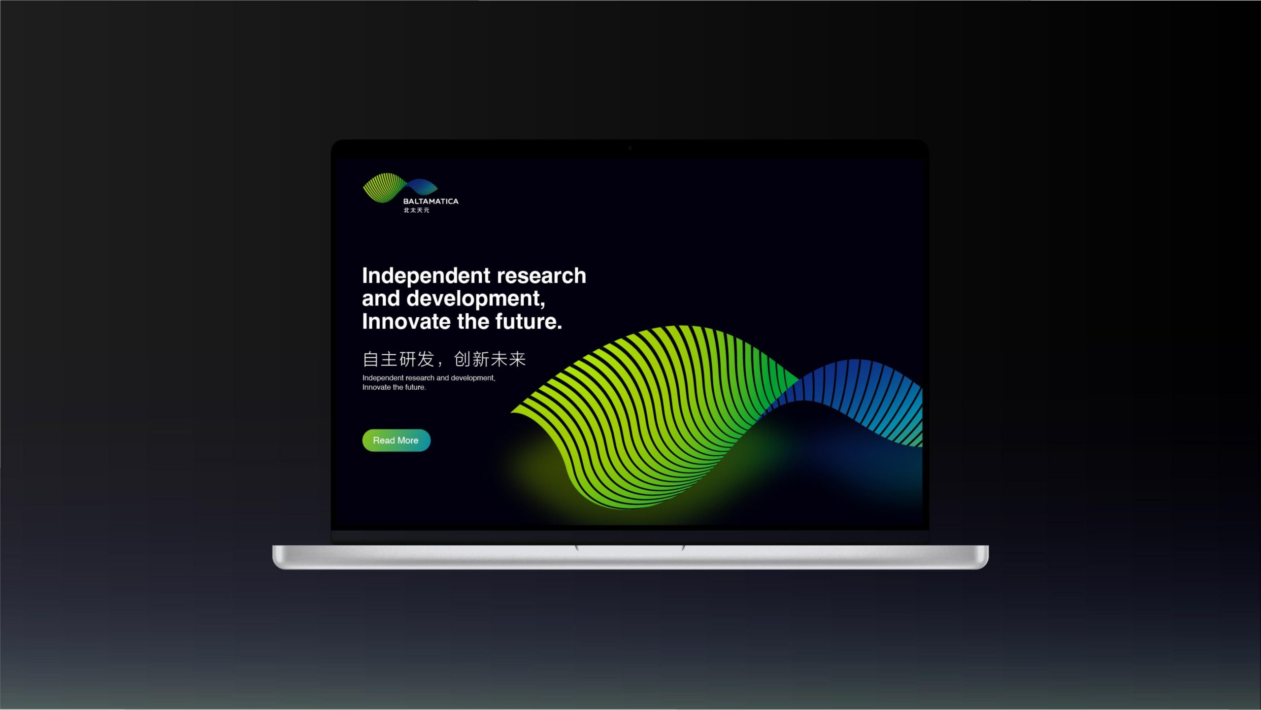
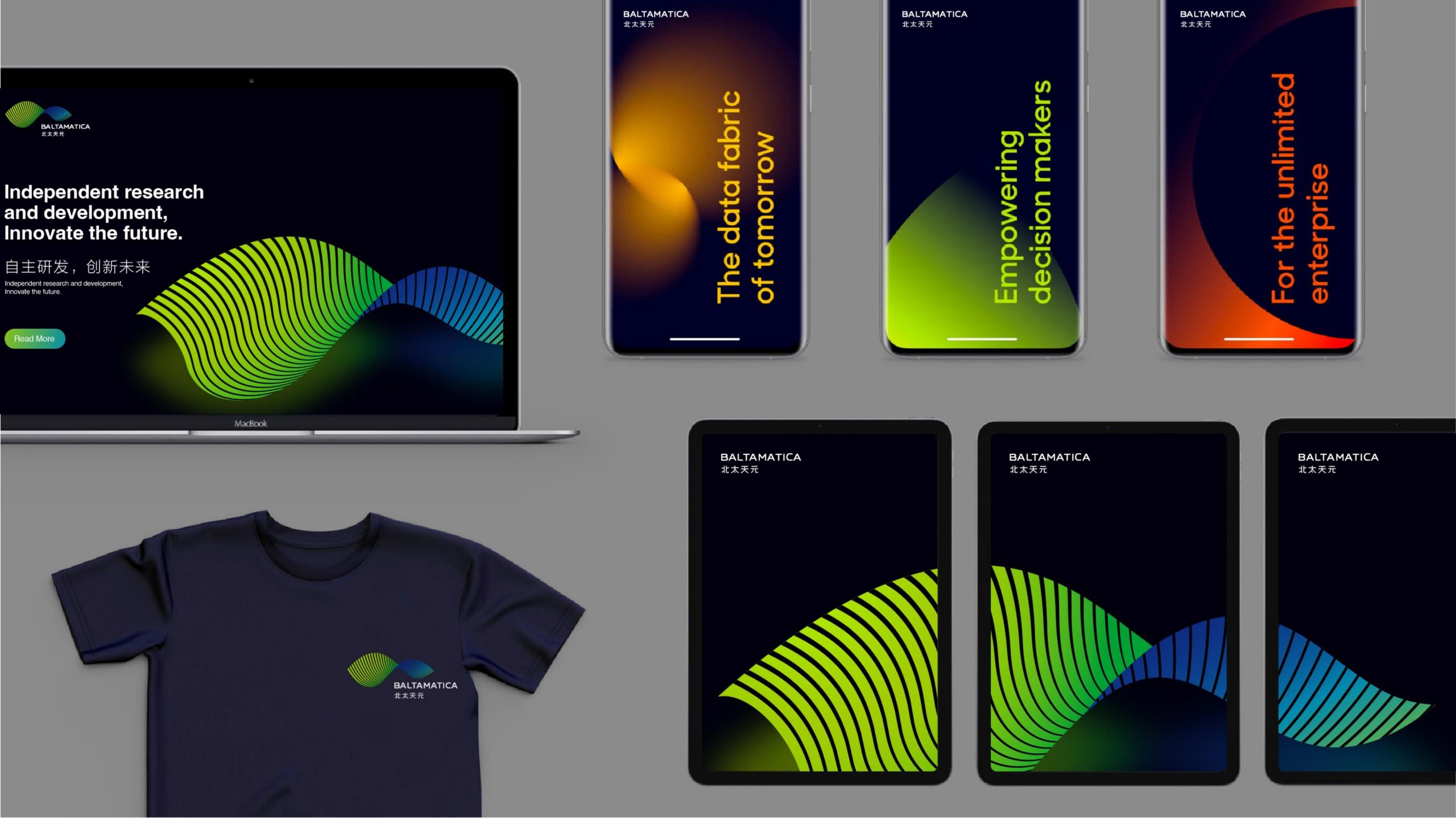
The mark is designed for broad application across enterprise digital platforms, data-visualization interfaces, industrial trade shows, product packaging and architectural wayfinding. The curve can serve as a standalone core visual element for system backgrounds, loading animations and dynamic light-band effects. On digital platforms, flowing gradient animation conveys the transmission of information and energy. In physical applications such as equipment nameplates or spatial sculpture, the curve can extend into three-dimensional form, revealing both the warmth of the brand’s technology and its artistic beauty.
brand meaning
The Chinese name of Baltamatica carries the meaning: “See the world through northern wisdom, with algorithms as the sky and systems as the origin.” Through the language of mathematical curves, the logo expresses the company's strategic vision: data symbiosis, intelligent evolution, and a connected future. The two curves represent global industry connections and technology integration, while their central intersection represents Baltamatica's core algorithms and control systems. The overall identity reflects the brand's position: technology as the core force driving industrial ecosystems.
Improper Usage (Protection Specification)
Do not change the direction or proportions of the green-to-blue gradient. Do not disrupt the balance of the curve or compress it. Do not add shadows, reflections, outlines or special effects. Do not skew, rotate or mirror the logo. Maintain a symbol-to-wordmark ratio of 1:1.2 without alteration. Minimum display width is 25 mm.
design results
Following the launch of the new mark, BALTAMATICA’s brand recognition in the international intelligent manufacturing and industrial internet sectors rose by 56%. The curve has been widely used in data-visualization presentations and brand showcases, becoming a visual symbol of “technology-driven, intelligent ecosystems.” Its gradient curve system expresses the journey “from algorithm to ecosystem,” elevating BALTAMATICA from technology supplier to global leader in intelligent system ecosystems. Qingmei Future has included the project as an exemplary case in its technology and algorithmic aesthetics portfolio. It marks a new high in the international visual expression of Chinese technology brands.