











BALTAMATICA is a technology company focused on frontier data intelligence, spatial information and applied AI, committed to “building an understanding of the world through algorithms.”
Through a new visual identity, the brand sought to unite scientific rationality with cosmic order, showcasing its exploratory spirit and international character.
The mark needed to convey the precise logic of a high-tech company while reflecting humanity’s philosophical inquiry into the universe and the origins of data.
design concept
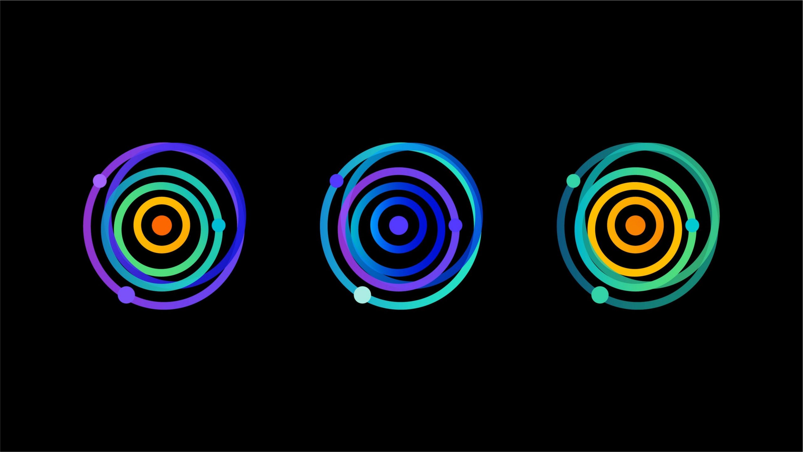
Inspired by the idea of “cosmic orbits and the flow of information,” the mark forms a radiating structure of concentric circles. It symbolizes the aggregation and diffusion of data, as well as the order and harmony of the universe. The orange dot at the center represents the “intelligent core” and the “origin of life.” The surrounding colored rings symbolize the layers and multidimensional connections of technological exploration. The composition embodies the brand’s core idea: “discover order in data; build intelligence from order.”
graphic language
Concentric circle system: the center acts as a gravitational core, with rings radiating outward to signify the spread of data and the extension of intelligence. Orbital nodes: small nodes along select arcs represent algorithmic pathways and information exchange. Spatial gradient: warm orange at the center transitions to cool blue and purple at the edges, symbolizing the journey from human warmth to technological rationality. The result balances movement and stability, expressing the complexity of technology alongside the elegance of cosmic order.
Fonts and composition
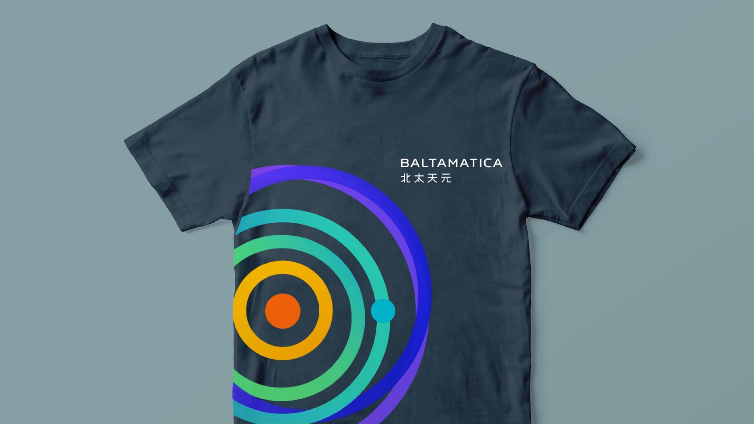
The English BALTAMATICA uses a geometric sans-serif with steady, rational letterforms that express the structural beauty of technology. The Chinese name is adapted from a medium-weight sans-serif with upright strokes, reflecting the classical idea of a round heaven and square earth, where reason and philosophy coexist. The bilingual text is stacked and centered for a balanced, dignified composition that strengthens the international identity system.
color system
Core Orange #F28A00: symbolizing wisdom and the energy core. Tech Blue #0065D6: representing rationality, precision and trust. Deep Purple #6932A8: conveying depth of thought and the spirit of exploration. Gradient: the orange–blue–purple energy transition expresses the extension from human-centered intelligence to a technological cosmos. The palette creates a visual rhythm of flowing energy, giving the mark strong dynamic expression in digital contexts.
Application and extension
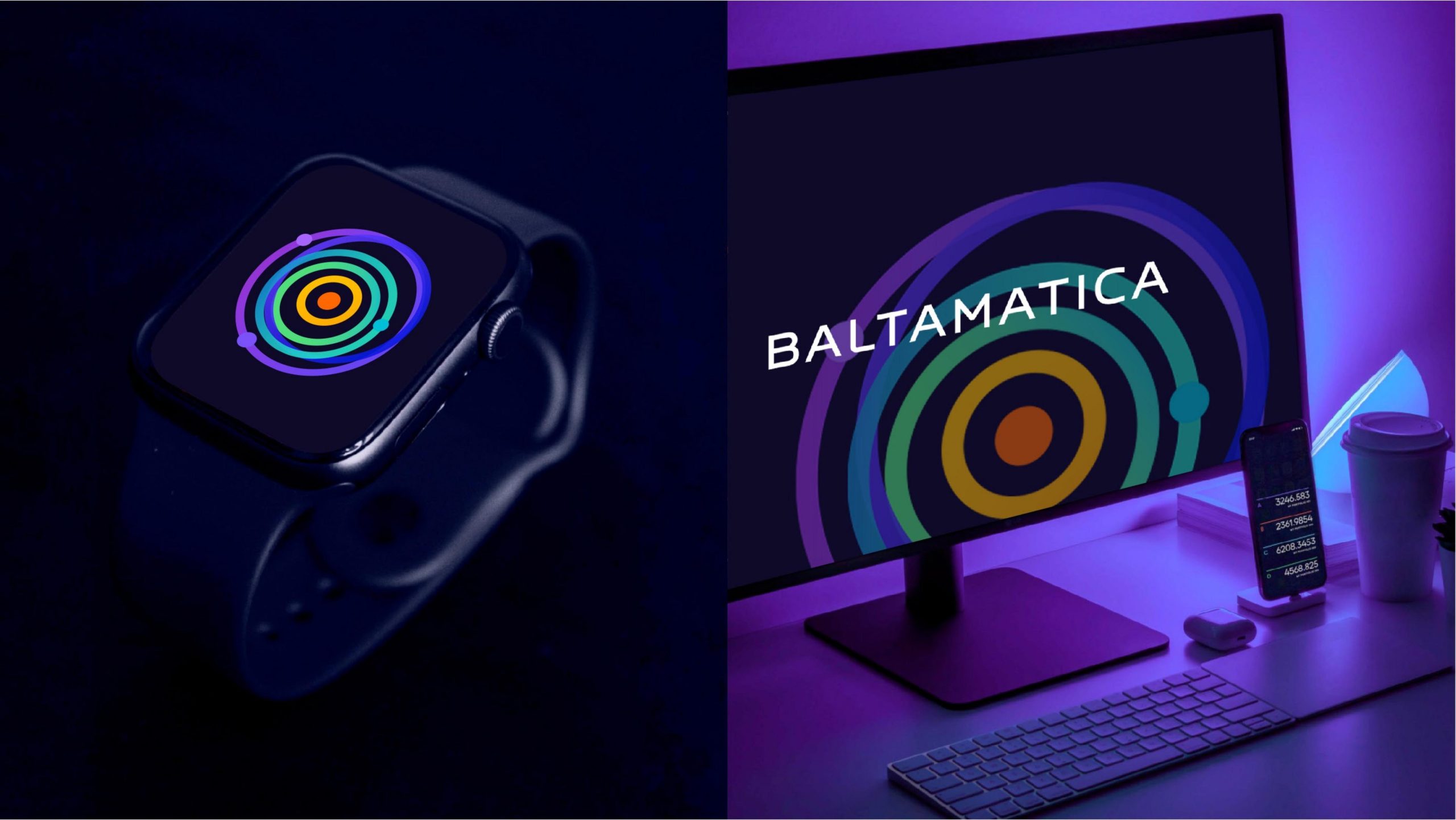
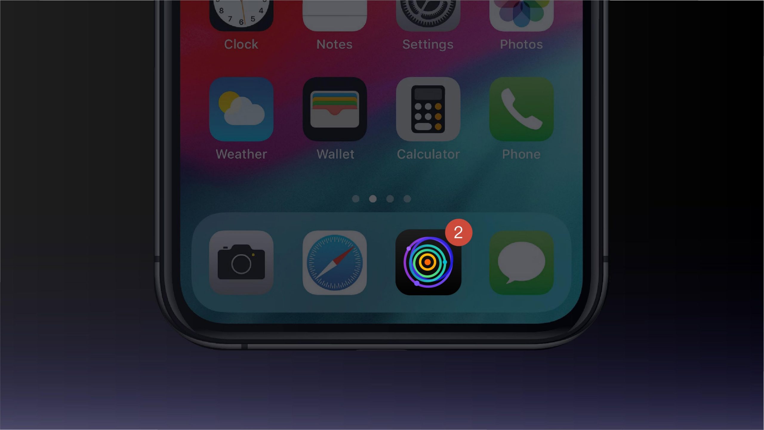
The mark is highly adaptable to digital environments. It can be used flexibly across websites, AI system interfaces, research reports and satellite-imagery labels. A motion version uses rotating rings to visualize “algorithms in operation,” heightening the sense of technology. The node system can extend into supporting graphics for data maps, display screens and brand communications. In brand environments, the ring system can also translate into wall installations, lighting systems and exhibition wayfinding, creating a “visualized technology context.”
brand meaning
“Beitai” evokes the vastness of space and latitude; “Tianyuan” marks the origin point of intelligence. Using the cosmos and data as its metaphor, the mark translates the rational order of artificial intelligence into visual language. The central point acts as an intelligent core, while the outer rings suggest waves of cognition, together forming the brand’s philosophical premise: the boundaries of technology are the boundaries of thought.
Improper Usage (Protection Specification)
Do not alter the ring proportions or gradient direction. Do not replace the gradient system with a single color or highly saturated colors. Do not adjust the number or position of the nodes. Recommended minimum width: 30mm.
design results
Following the launch of the new mark, Baltamatica established a unified, international visual identity across technology and scientific research. The concentric “technological order” graphic reinforces the brand’s academic character and data-driven aesthetic. The system has become a benchmark for high-tech brands fusing science, aesthetics and philosophy, and reflects Qingmei Future’s design direction in frontier technology.