











QIXIU is a premium lifestyle brand that unites physical and mental wellbeing with Eastern wellness traditions, spanning skincare, aromatherapy, meditation and health management. In a comprehensive brand upgrade, QIXIU set out to reinterpret the Eastern ideals of cultivating body, mind and practice through a contemporary visual language, creating a wellness identity with both cultural depth and international aesthetic appeal.



design concept
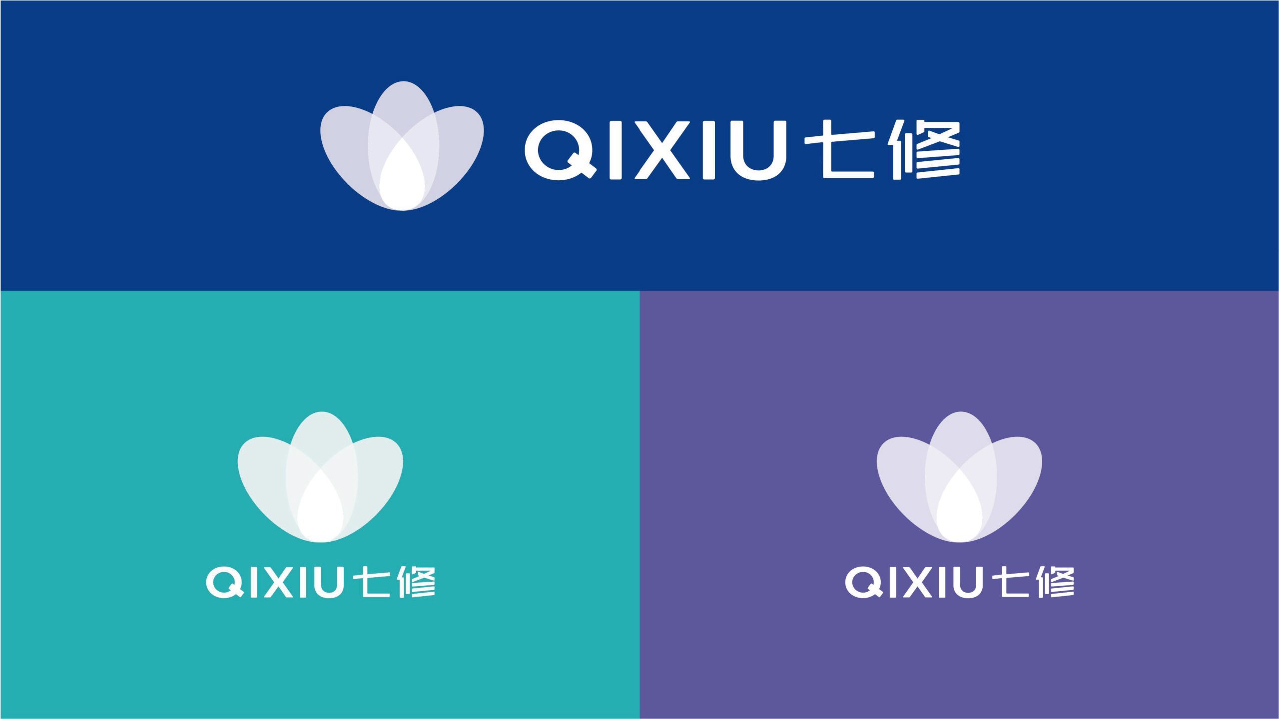
The mark centers on the concept of a “Flower of Harmony”: three translucent, overlapping petals symbolize the progressive cultivation of body, mind and surroundings. Inspired by the still balance of the lotus and the movement of rippling water, it suggests inner calm and outward ease. Its form is soft and restrained, expressing the brand philosophy: “Seven practices, one path: nurturing the mind through stillness.” More than a visual symbol, the mark is a metaphor for self-cultivation and inner coherence.
graphic language
Three overlapping petals: the integration of body, mind and nature. Central negative space: a breathing halo that symbolizes an inner sanctuary. Translucent gradients: a sense of flowing time and layered energy. Elliptical geometry: soft, embracing edges that reflect the balance at the heart of Eastern aesthetics. Built on a stable triangular geometry, the composition remains balanced and elegant in both digital and print.
Fonts and composition
The English QIXIU uses a modern geometric sans-serif with slightly wide letter spacing for a sense of breathing room and spatial order. The Chinese name uses a custom geometric typeface with fluid strokes and rounded corners that echo the soft forms of the symbol. A horizontal bilingual layout emphasizes a modern, international character. Uniform stroke weight keeps the type aligned with the symbol's visual center, balancing reason and warmth.
color system
Primary Indigo #334A9C: calm, wisdom and depth of cultivation. Secondary Teal #5BAFB6: clarity, nature and healing. Gradient system (teal → blue → violet): a flow of energy from light to deep, symbolizing the gradual journey of mind-body practice. White space: lightness and room to breathe. Together, the palette forms an “Eastern serene blue” tonality that delivers layered depth on screen and in print.
Application and extension
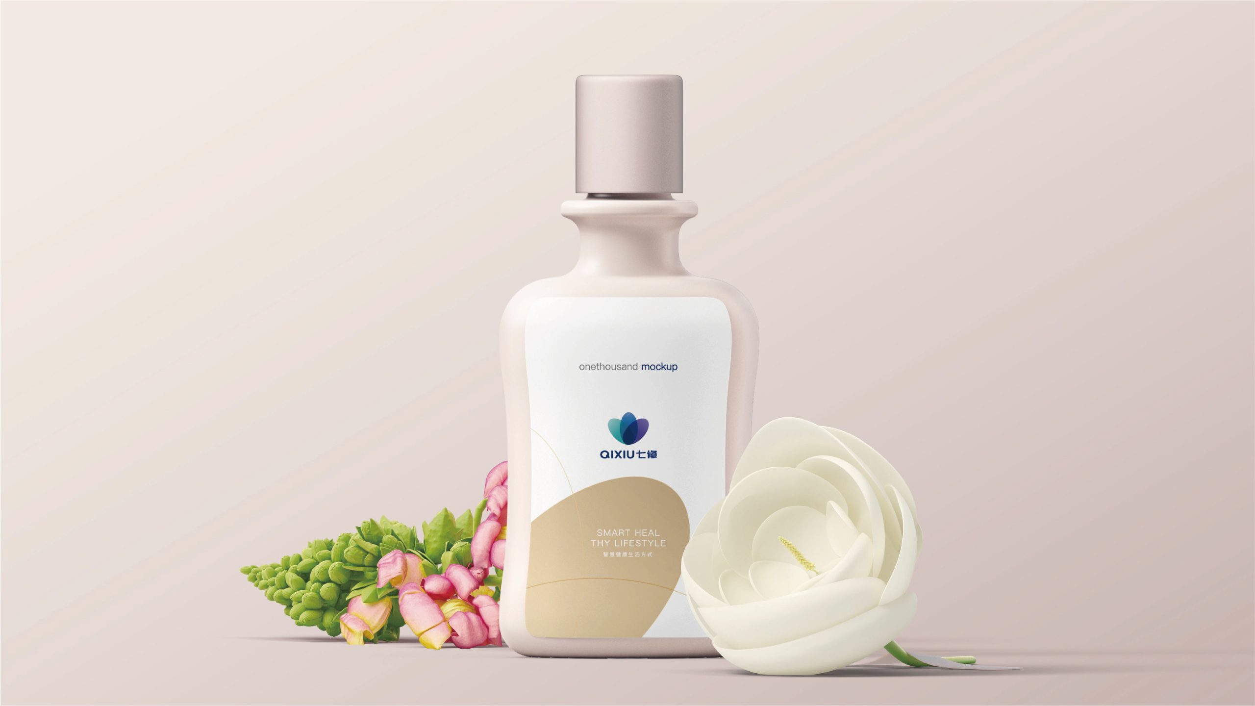
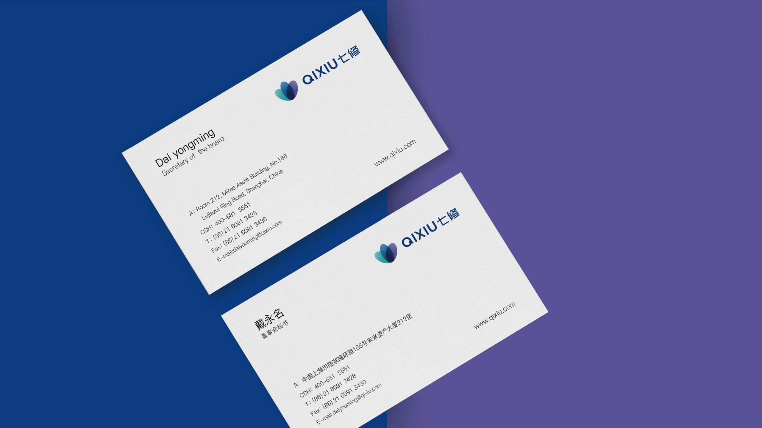
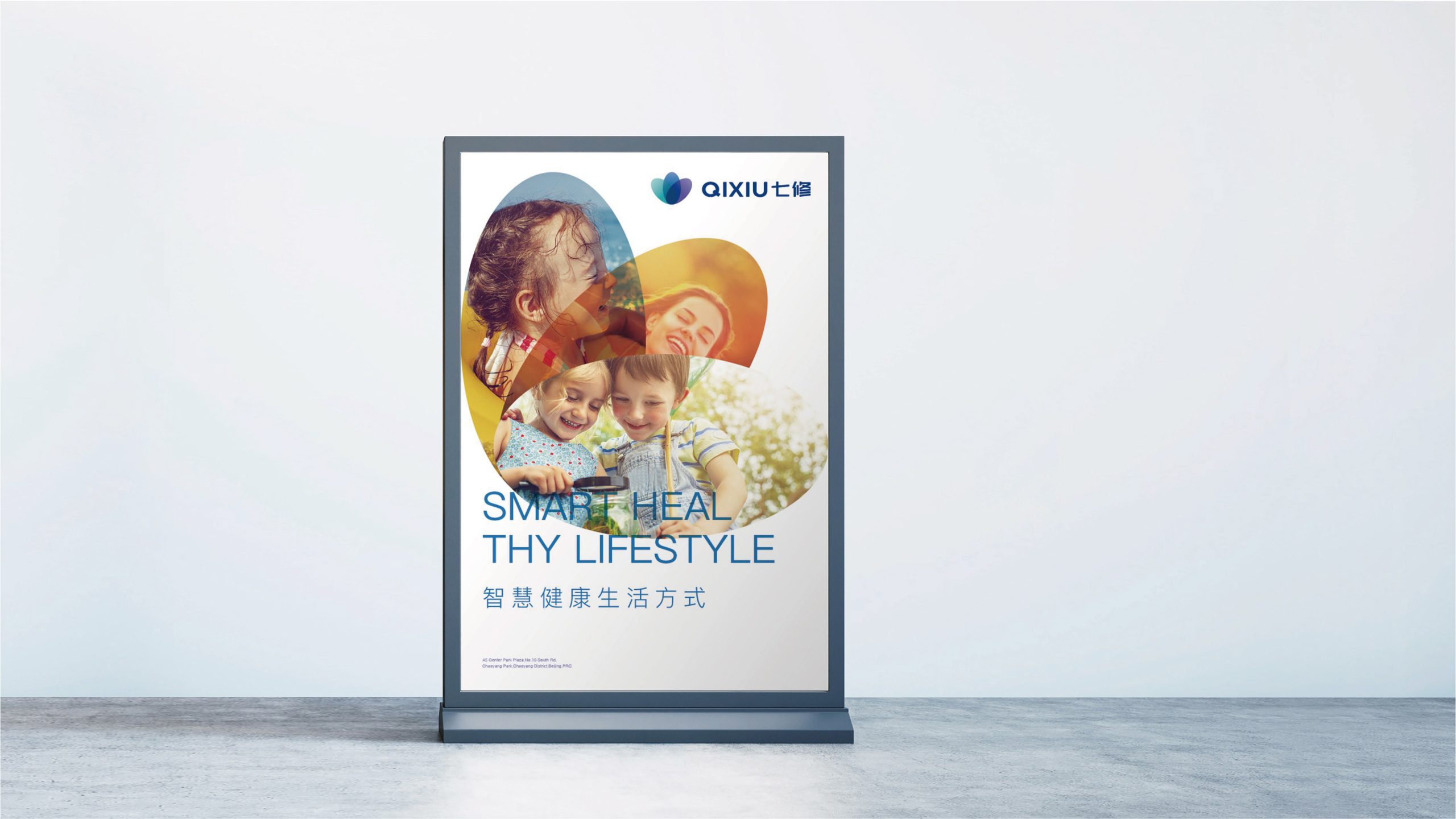
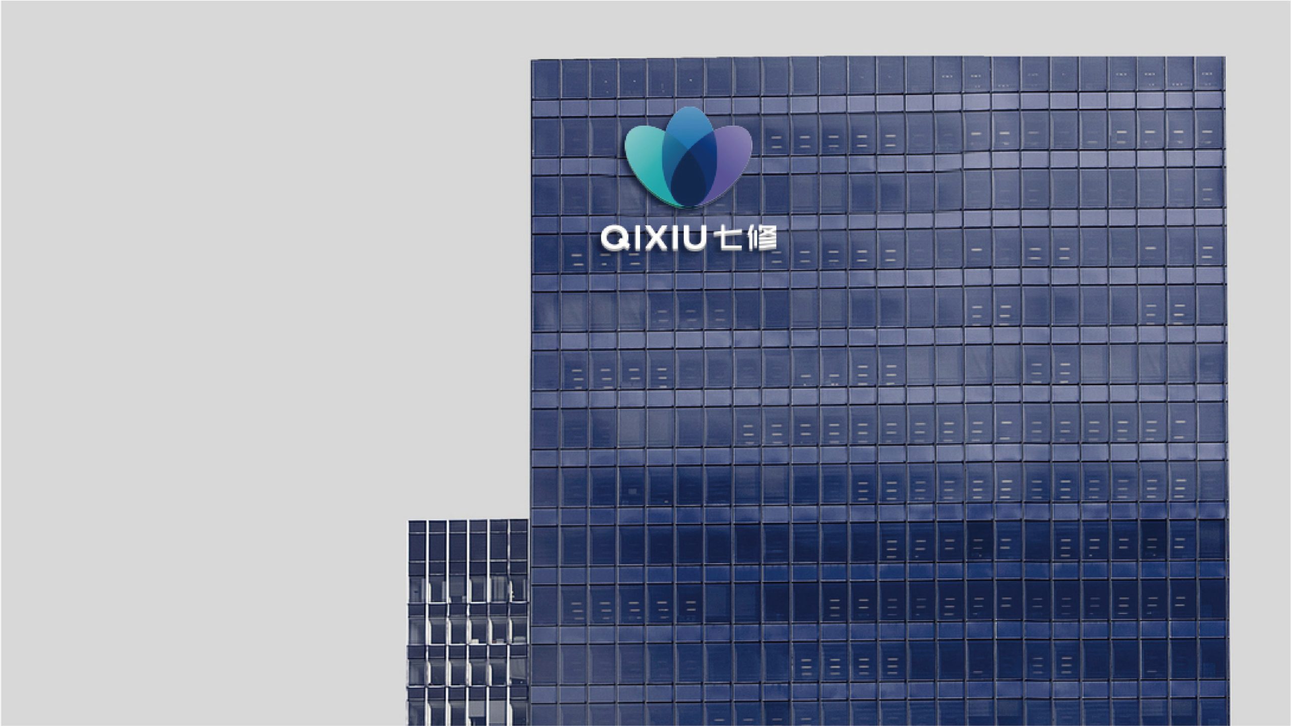
The mark extends across key brand visuals, wellness packaging, meditation-space wayfinding, mobile app icons and video openers. The three-petal flower can stand alone as a versatile core visual element: as a pattern or embossed texture on diffuser bottles, skincare boxes and paper bags; as a gradient “breathing animation” that expresses relaxation and healing; and, in premium spaces, as a light installation or engraved metal symbol that strengthens spatial brand recognition.
brand meaning
The name “Qixiu” draws on the seven classical disciplines of self-cultivation: virtue, speech, body, mind, environment, wisdom and practice. The layered geometric petals represent a transformation that moves from outer to inner, from form to mind. The brand’s core spirit: “Body and mind as one; knowledge and action cultivated together.” Beyond an outward expression of wellness aesthetics, the mark embodies the renewed relevance of Eastern wisdom in contemporary life.
Improper Usage (Protection Specification)
Do not alter the gradient direction or color proportions. Do not stretch, rotate or skew the three-petal structure. Do not add shadows, outlines or effects. Do not place the mark over busy background imagery. Maintain a symbol-to-wordmark ratio of 1 : 1.3. Minimum display width: 25mm.
design results
After launch, QIXIU’s recognition in the premium wellness and healing sector rose by 42%, with users widely describing the visuals as “calm and refined.” The three-color gradient became a unified visual language across packaging and spatial design, achieving strong consistency between flagship stores and digital channels. Qingmei Future has since included the project in its showcase of Eastern wellness brand identities as a leading example of modernizing traditional ideals of self-cultivation.