










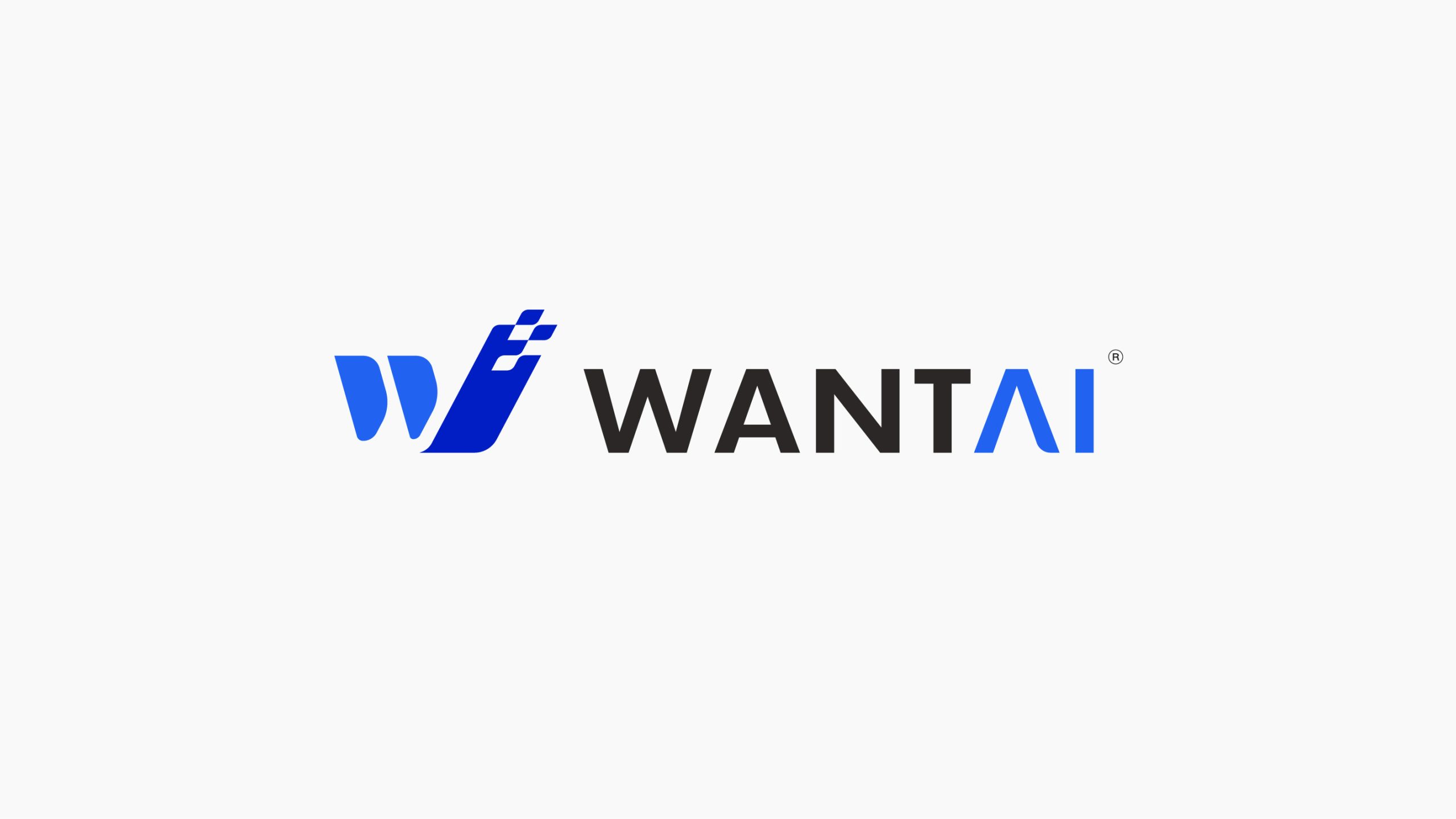
WANTAI is a high-tech enterprise specializing in intelligent manufacturing, automation equipment and industrial digitalization. Through its brand upgrade, the company sought a new visual identity that expresses innovation speed, technological strength and global reach. The mark is both a symbol of the corporate brand and an expression of its technological spirit, signaling a sustained commitment to internationalization and intelligent growth.


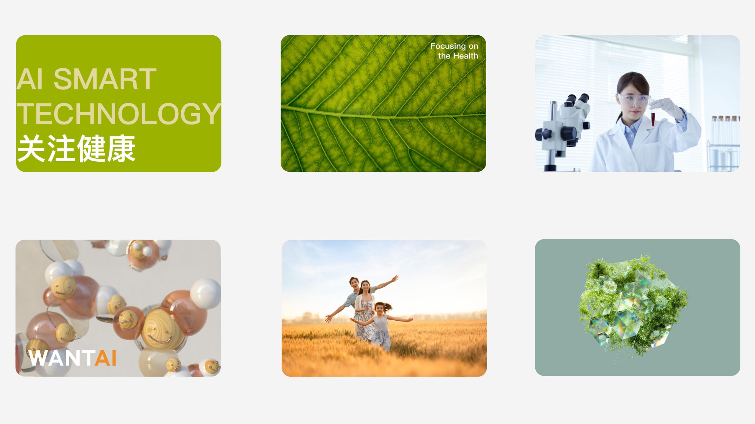
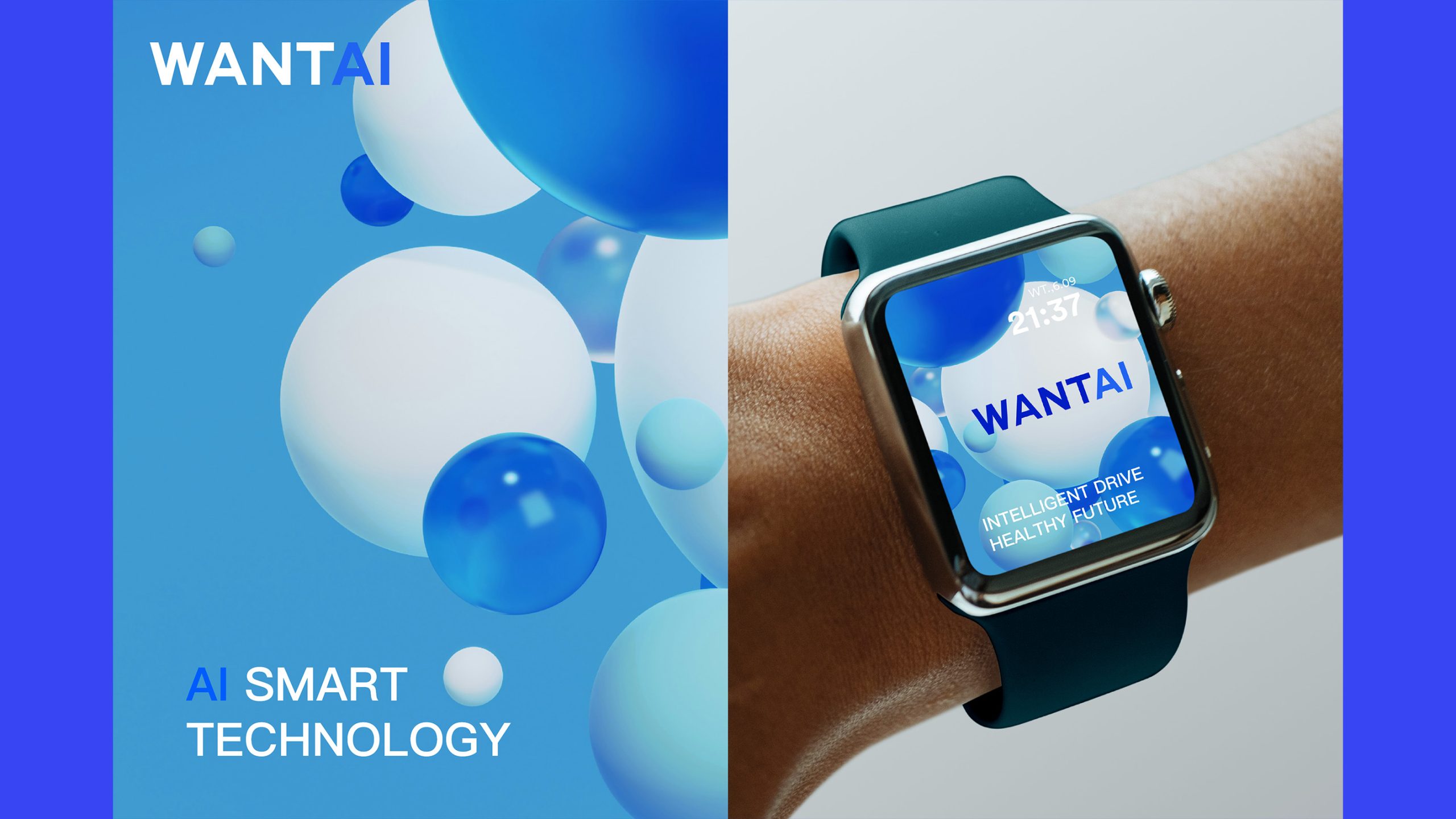
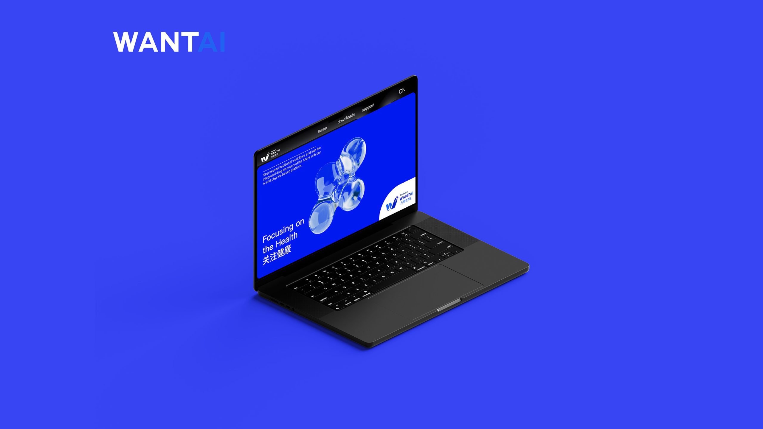
design concept
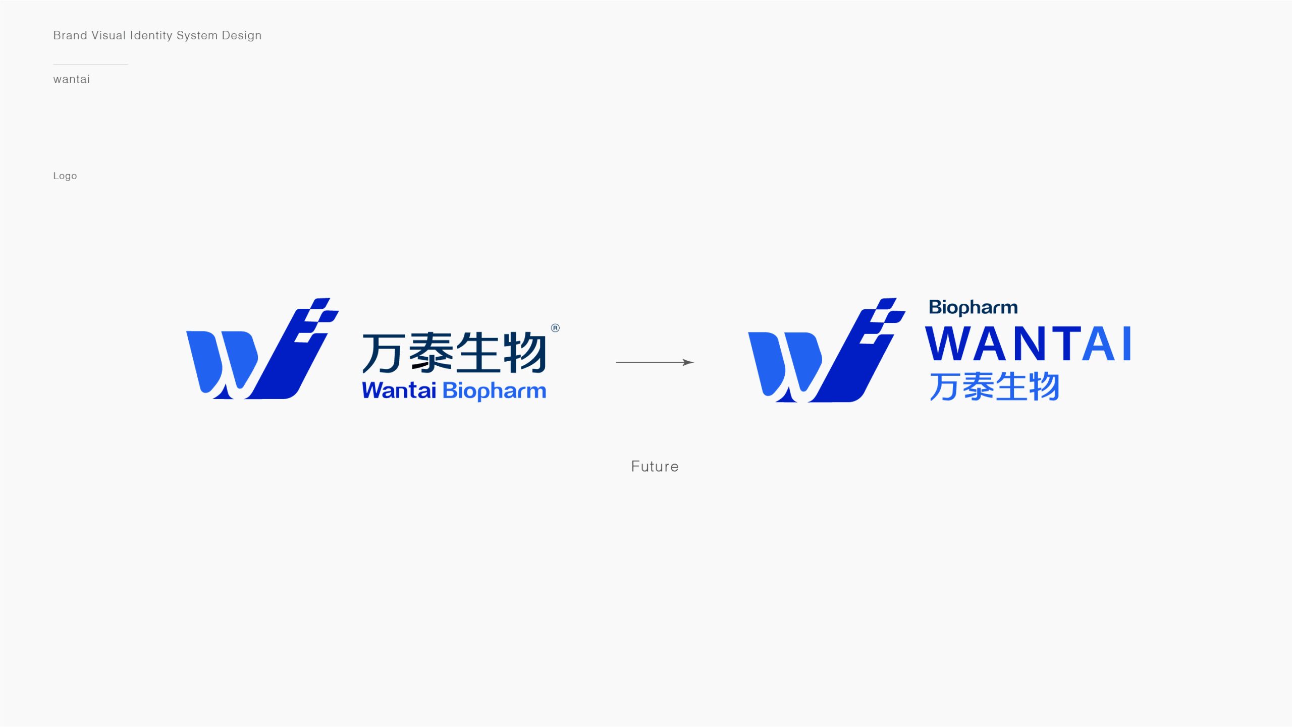
The design centers on the letter “W,” the initial of WANTAI, shaped into a geometric form in rapid forward motion. Angled cuts suggest technological breakthroughs and industrial acceleration. The form reads as both a trajectory and an engine, conveying the brand’s spirit of racing toward the future. The guiding principle: order within motion, strength within intelligence. Rational geometry carries a sense of speed, while gradients reflect innovation and energy.
graphic language
Primary form: two asymmetric blue shapes form a forward-leaning “W,” symbolizing innovation-driven growth and technological leaps. Line rhythm: the angled cut on the right reads as a trail of propulsion, expressing continuous forward momentum. Visual balance: a clean, solid geometric structure strikes a precise balance between speed and industrial stability.
Fonts and composition
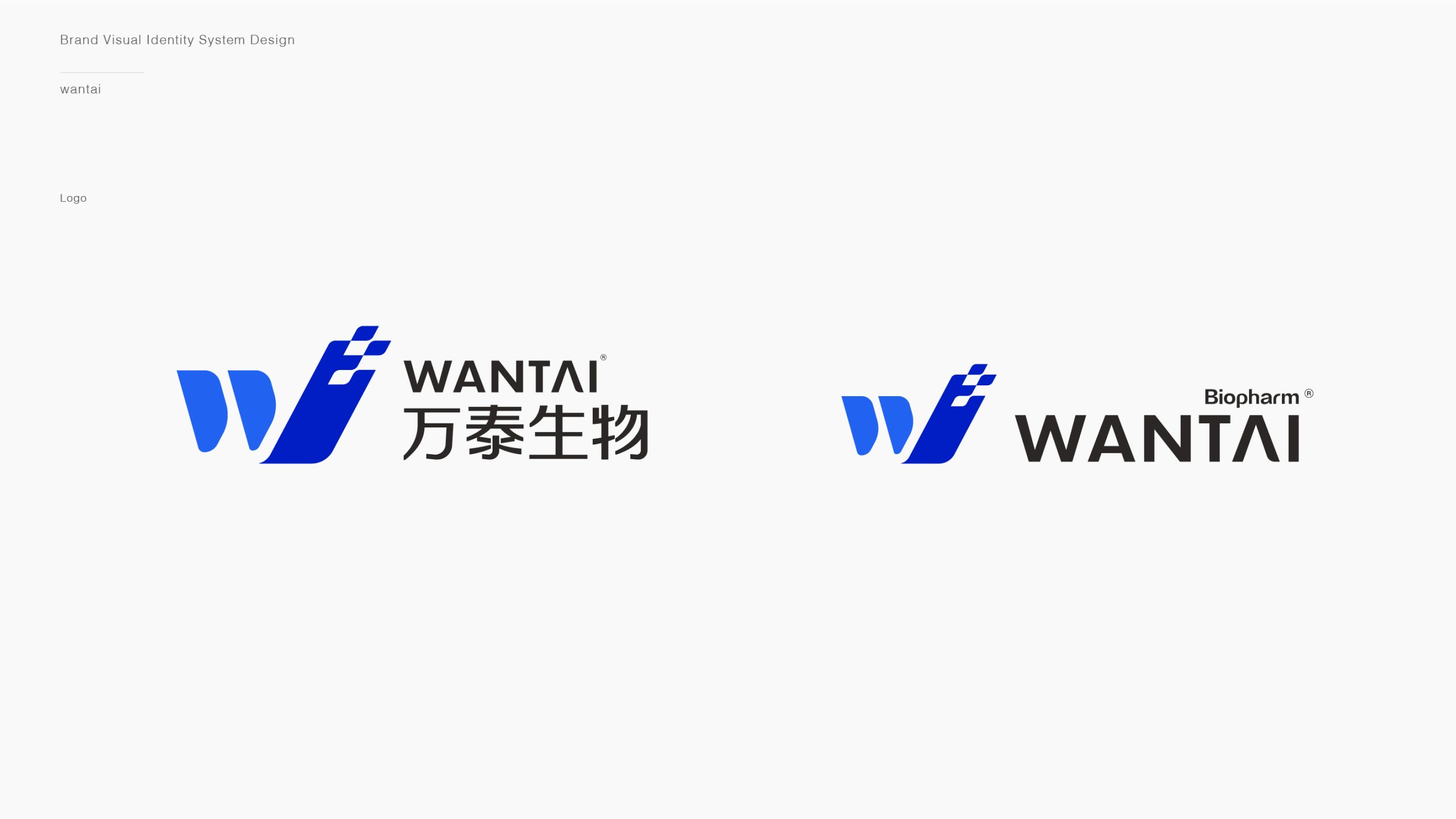
The WANTAI wordmark is set in a bold sans serif with straight terminals and a compact structure, conveying the precision and strength of a technology company. The “A” retains a subtle opening that suggests airflow, echoing the speed of the symbol on the left. A horizontal lockup, with the symbol on the left and the wordmark on the right, follows the modern layout logic of international brands.
color system
Primary Electric Blue #1A54F0: technological innovation and intelligent energy. Secondary Charcoal #2B2B2B: industrial rationality and a solid foundation. Gradient system: the blue shapes shift from deep to light, adding a technological sheen and depth that strengthen the brand’s modern industrial character. The palette suits the high-tech sector while speaking a universally recognized visual language of technology.
Application and extension
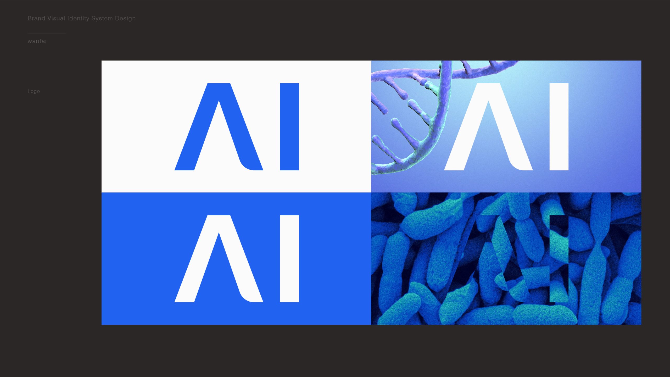
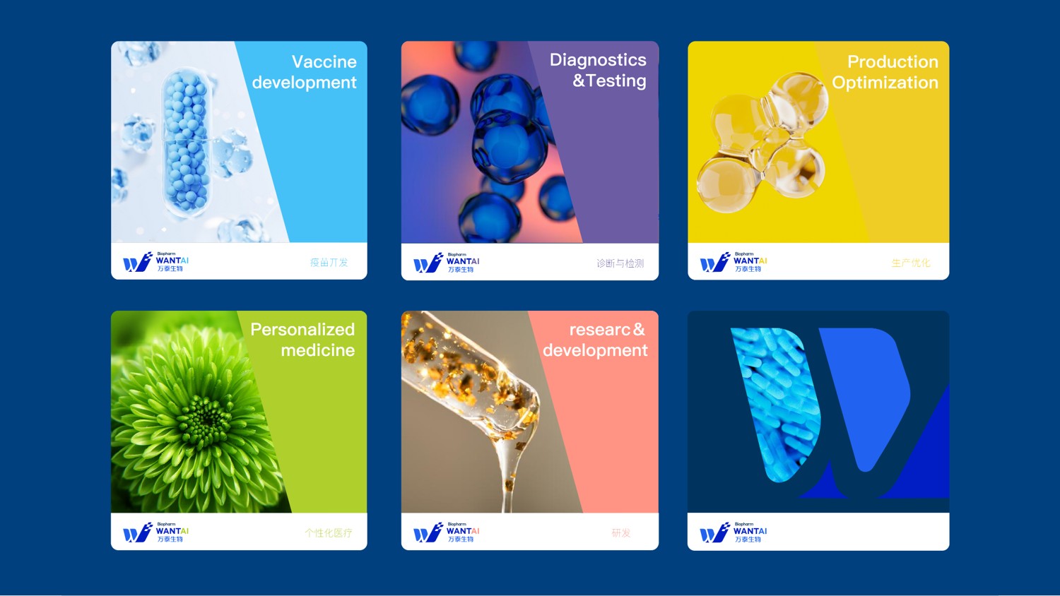
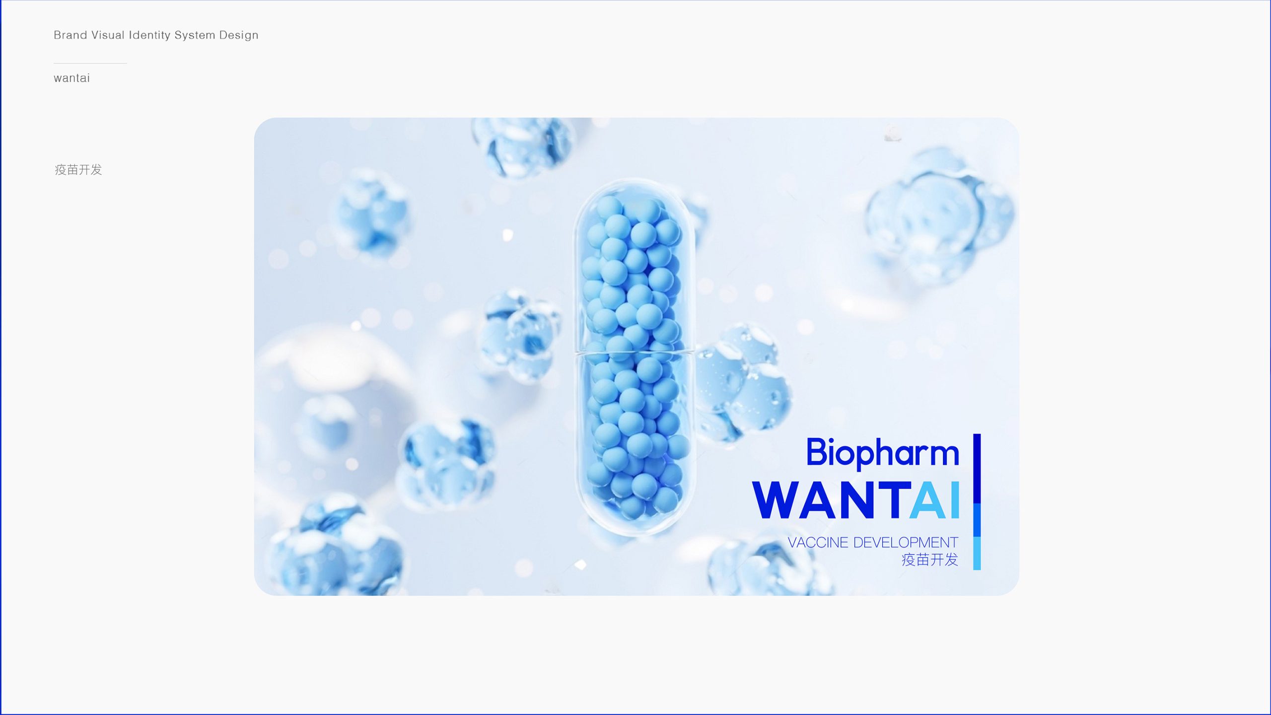
Highly systematic and scalable, the mark applies across: Equipment and industrial housings: strong recognition on machinery, control panels and nameplates. Digital media and exhibitions: LED screens, video openers and animated logos. Office systems and collateral: business cards, envelopes, ID badges and brochures, for consistent brand presentation. The “W” symbol can evolve independently into an icon system for apps, software and brand animation.
brand meaning
“WANTAI” stands for intelligence + industry + forward momentum. The geometric “W” on the left represents technological drive and the path of innovation; the wordmark on the right conveys strength and direction. In a clean, fast-moving visual language, the mark distills the company’s belief in “technology driving the future of manufacturing.” More than an identifier, it is an industry stance: continuous iteration, never standing still.
Improper Usage (Protection Specification)
Do not alter the proportions or angle of the “W” symbol. Do not change the blue values or gradient direction. Do not add shadows, embossing or glow effects. Recommended minimum width: 30mm.
design results
Since the new mark’s launch, WANTAI’s brand recognition in intelligent manufacturing and automation has risen significantly. The blue-and-gray system now provides a unified standard across international exhibitions, digital channels and industrial equipment, reinforcing a professional, trustworthy and cutting-edge image. With a visual language that balances speed and precision, the design has shaped a modern, international image for a Chinese intelligent manufacturing brand.