










BALTAMATICA is a technology company specializing in AI algorithms, industrial automation and advanced digital-intelligence systems. Its core capabilities span intelligent manufacturing, data hubs, cloud computing and industrial simulation.
As the brand prepared for international growth, it needed a mark that embodied technological rationality, algorithmic logic and the beauty of system architecture. The mark had to convey its strategic positioning: “algorithms driving the industries of the future.”
design concept
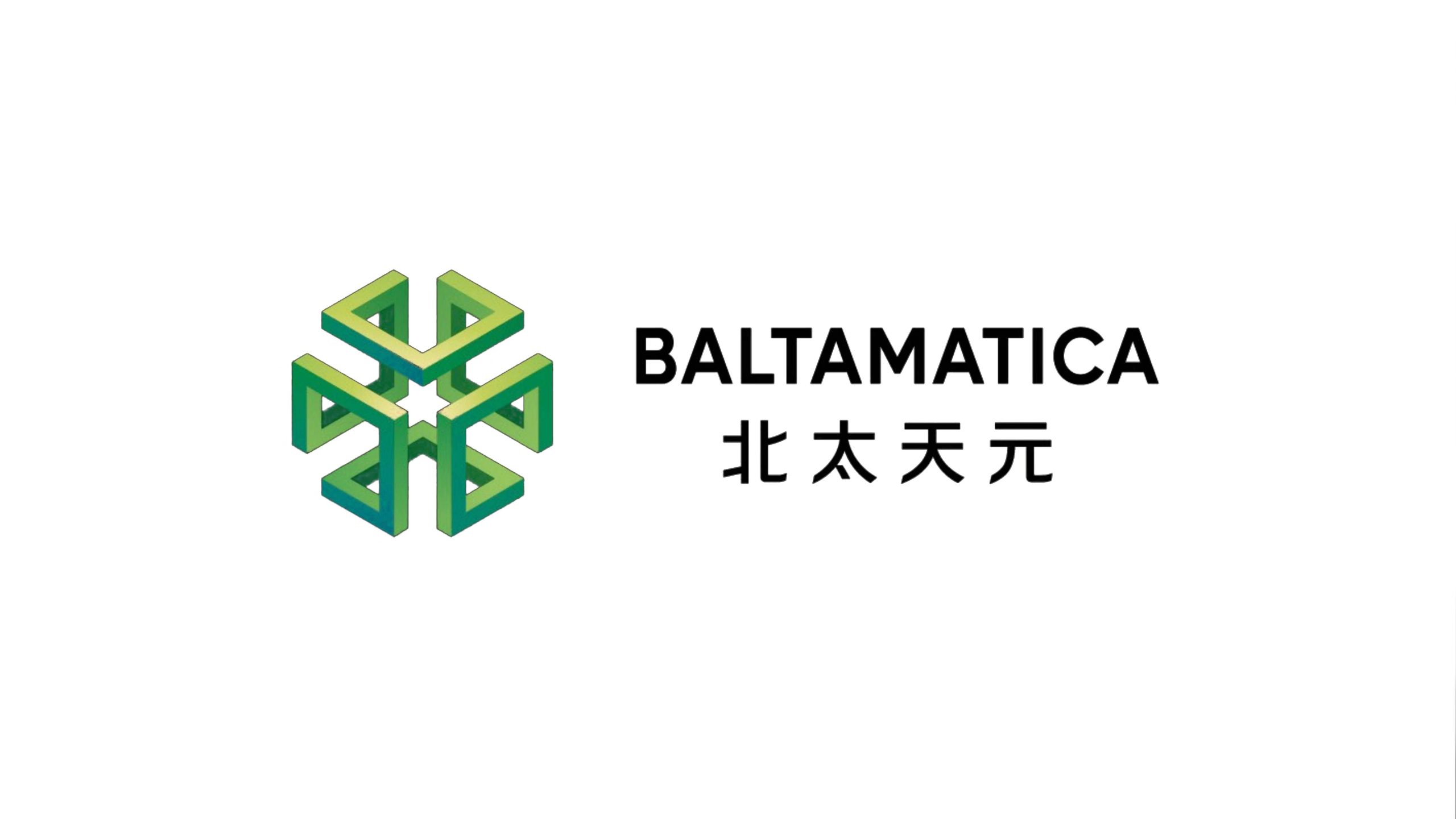
The mark is built on the concept of a “geometric intelligent entity.” A three-dimensional geometric structure resembling a crystal lattice symbolizes the self-organizing nature and limitless scalability of algorithmic systems. Inspired by the principles of cubic evolution and centripetal spatial force, it represents BALTAMATICA concentrating energy around its core technology and expanding outward. The open six-directional structure represents multidimensional collaboration through data exchange. The central convergence point embodies the brand ethos of “core algorithms + open platform.” The result conveys a computable beauty of order that is rational, precise and forward-looking.
graphic language
Three-dimensional hexagon: six interlocking triangular modules form a stable geometric body, symbolizing systematic thinking and logical rigor. Central axis of symmetry: expressing the interconnection between core algorithms and the surrounding ecosystem. Gradient layering: a transition from deep green to bright teal evokes the flow of data and the distribution of energy. Perspective space: dynamic depth reflects multidimensional exploration in technological innovation. The symbol carries both the rational beauty of technology and the balance and wisdom of tianyuan, the Eastern concept of the center point.
Fonts and composition
The English BALTAMATICA uses a strong geometric sans-serif with precise lines and a clear rhythm, conveying the professionalism of a high-tech brand. The Chinese name uses a custom simplified sans-serif with an upright structure and balanced stroke spacing, forming a well-proportioned bilingual pairing with the English. With the symbol on the left and text on the right, the layout maintains a rigorous, balanced order. Black and gray type contrasts strongly with the green symbol, keeping the logo highly recognizable on screens and in physical spaces.
color system
Primary Green #48B178: symbolizing technological innovation, growth and enduring vitality. Accent Teal #74C2C4: representing rational thinking, openness and collaboration. Deep Gray #3C3C3C: conveying stability, professionalism and trustworthiness. Gradient system (deep green → bright teal): expressing the transformation of data flow into algorithmic energy. Together, the palette creates a technological impression that is both calm and energetic, in line with the company’s vision of “green intelligence driving the industrial future.”
Application and extension
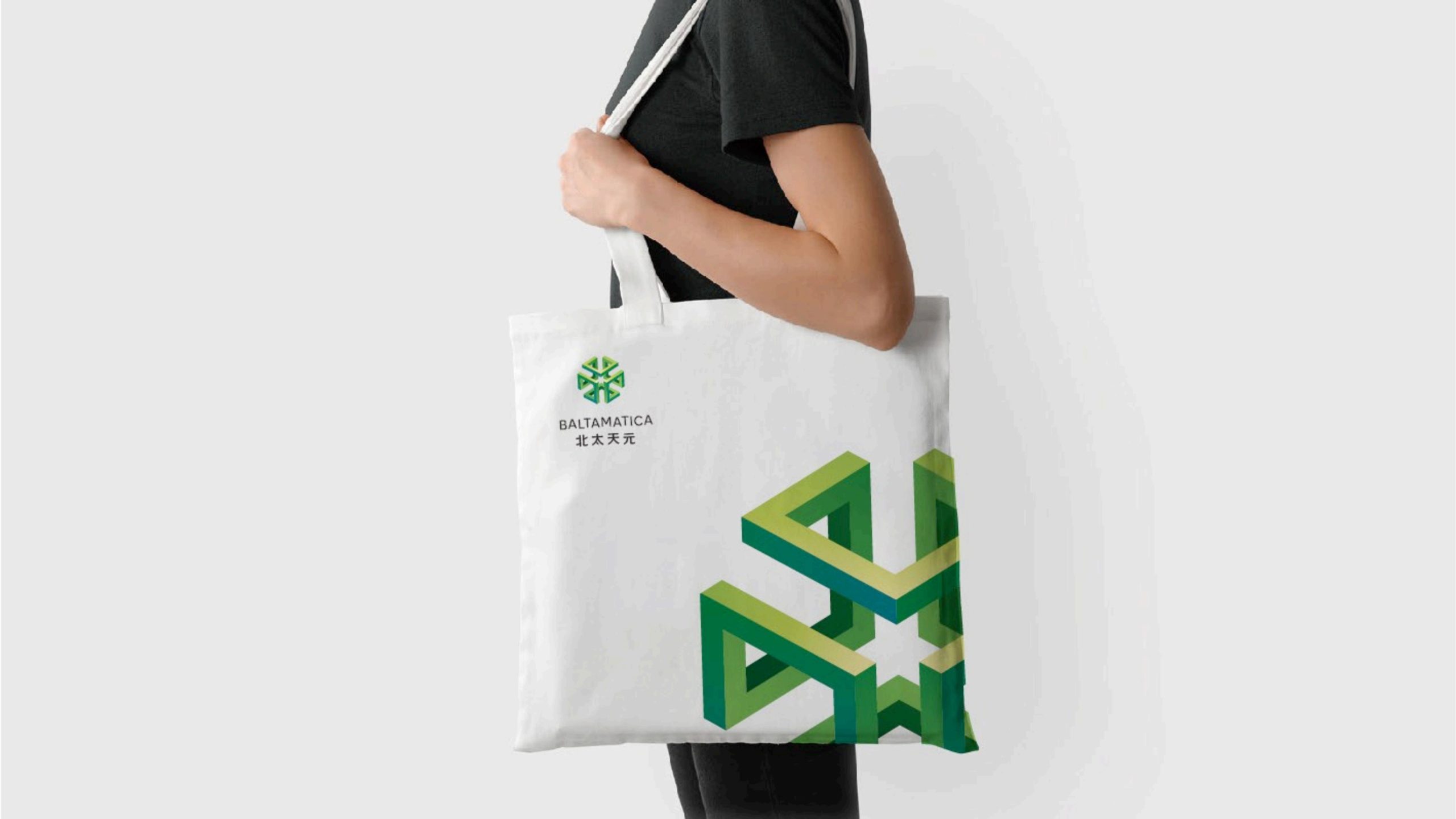
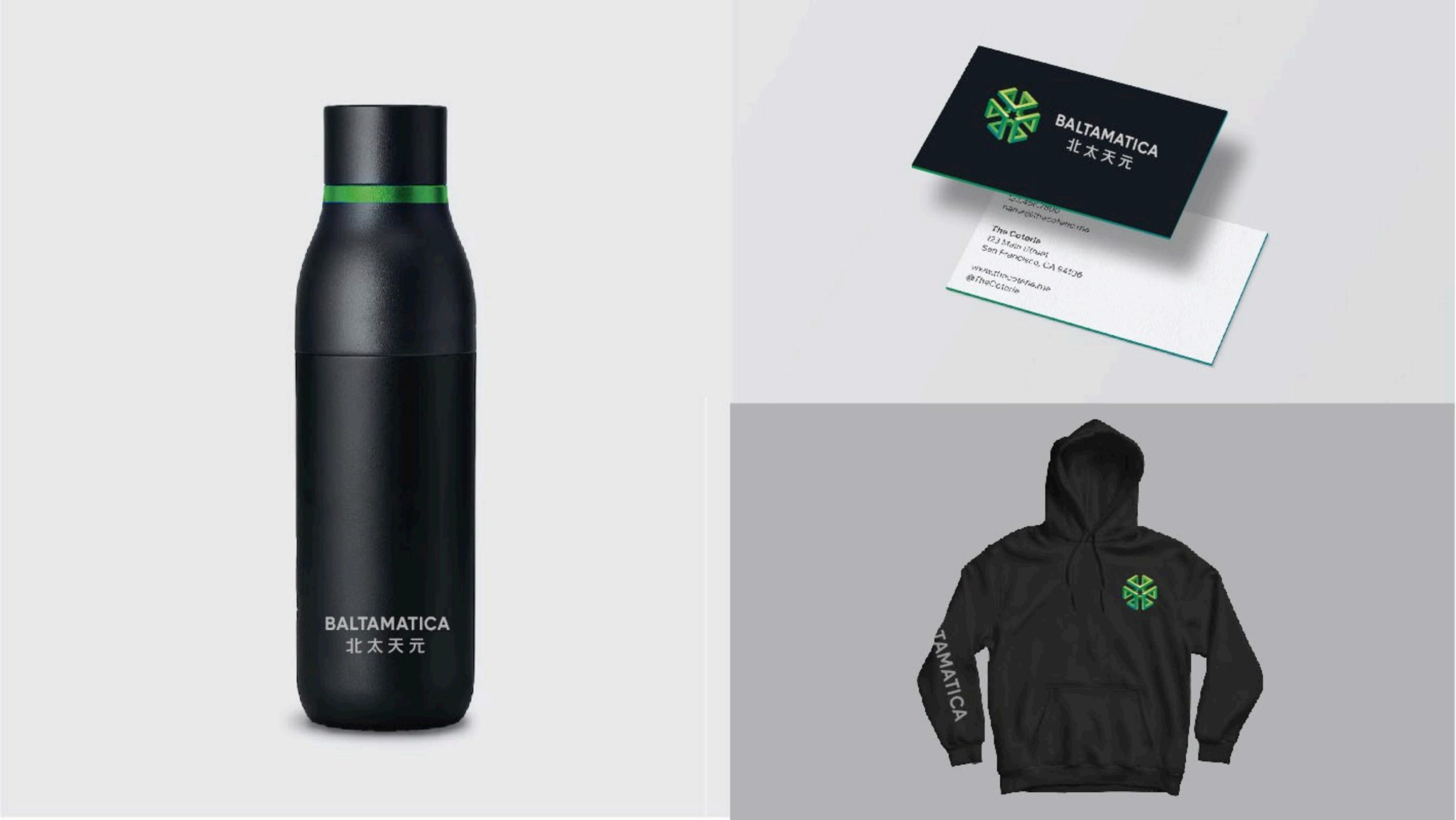
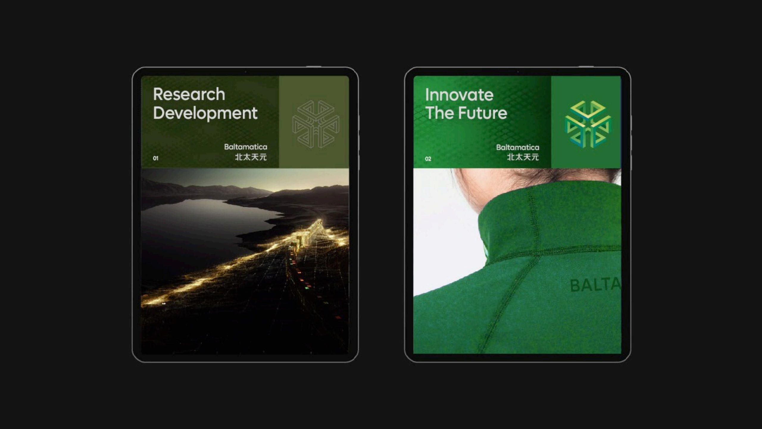
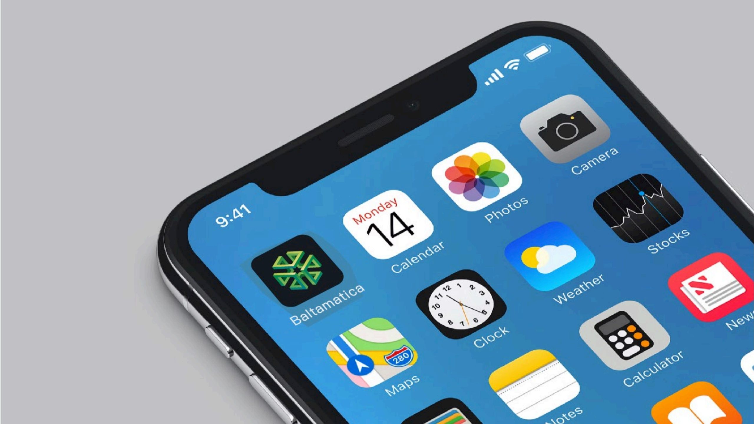
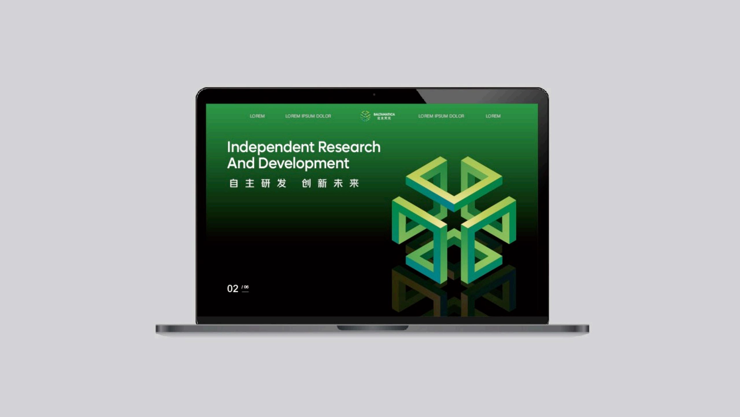
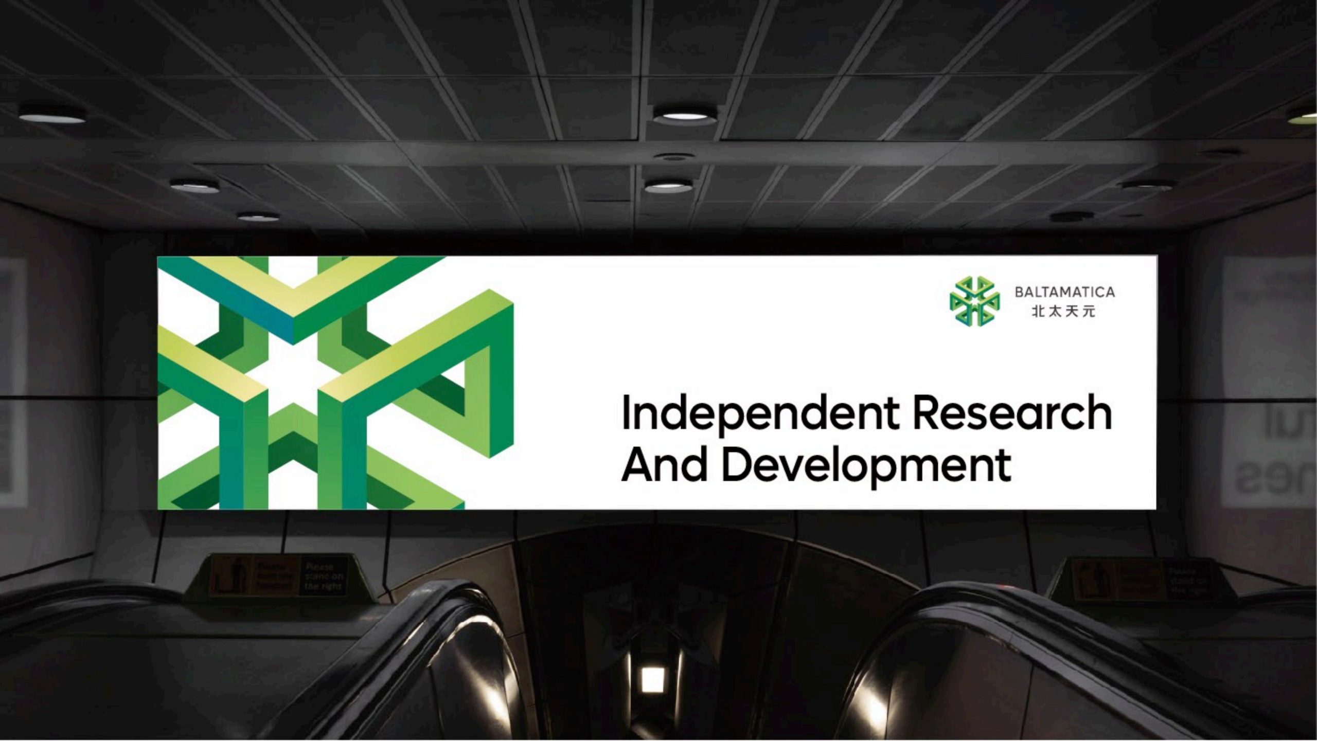
The mark applies across industrial equipment nameplates, the corporate website, data-platform interfaces, smart-device icons and international trade-show materials. The 3D geometric symbol can stand alone as a core brand element for motion graphics, embossed product housings and three-dimensional wayfinding. On digital platforms, a rotating animation simulates data flowing into the center as an “algorithmic convergence,” for use in brand intros and interactive loading screens. The mark retains excellent legibility and depth on paper, metal and lenticular media.
brand meaning
The Chinese name of Baltamatica means “rooted in northern wisdom, with technology and algorithms at the center of all things.” Through rational geometric structure, the logo expresses the company's core values: algorithms as the foundation, systems as the core, intelligence as the future. Expansion in six directions represents global collaboration, while central symmetry represents a stable core and an open ecosystem. The visual system gives the brand a distinctive symbol and depth of thought in the global technology field.
Improper Usage (Protection Specification)
Do not alter the primary green or gradient proportions. Do not break the geometric perspective or add shadows or special effects. Do not skew, stretch or rotate the symbol. Do not place the logo over complex imagery or highly saturated backgrounds. Maintain a symbol-to-wordmark ratio of 1:1.4 without alteration. Minimum display width is 20 mm.
design results
The design brings together the logo, color system and applications to establish a consistent visual language across digital interfaces, equipment and presentation materials.