










Bangcle is an innovative technology brand specializing in mobile security, data protection and encryption for smart devices. The brand sought a visual system for a global context that combines technical authority with modern approachability.
The goal was a mark that is more than a technology symbol. It is an “emotional language of trust” that brings complex security technology into users’ minds in an elegant, simple form.
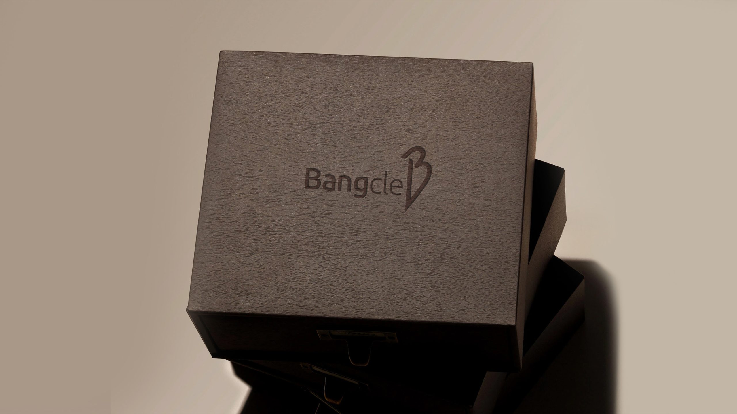
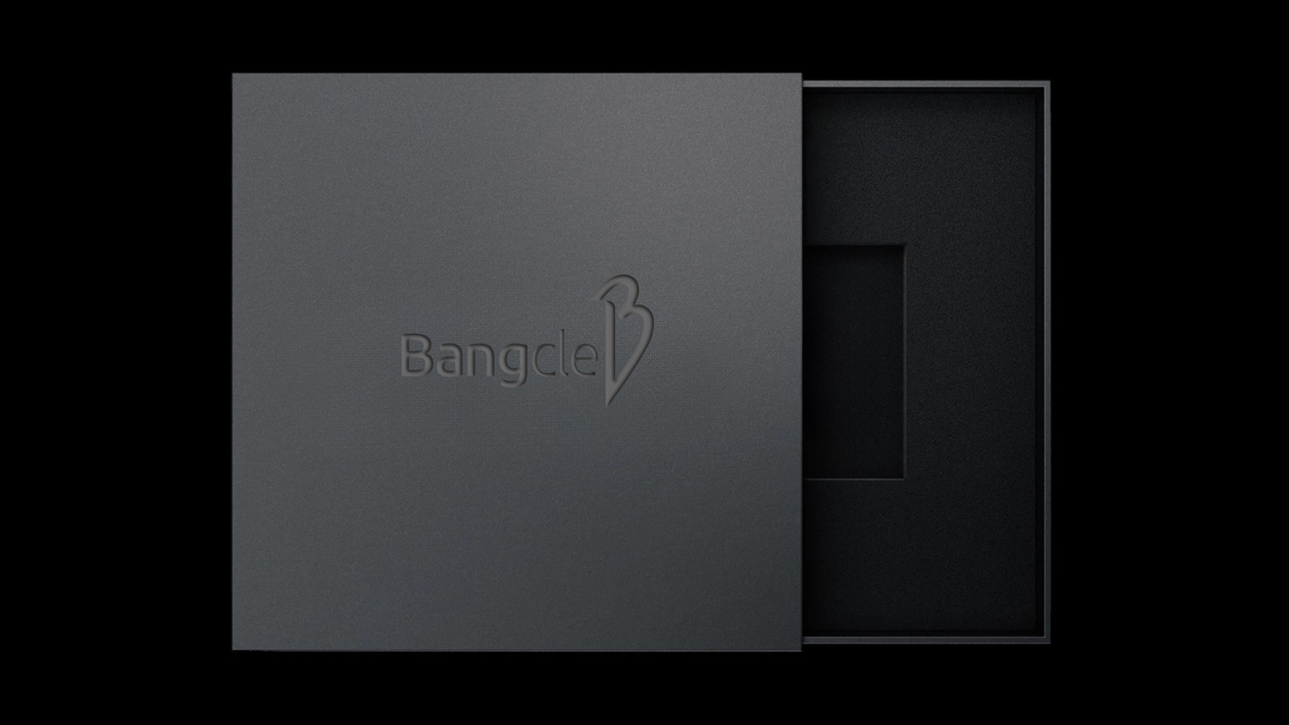
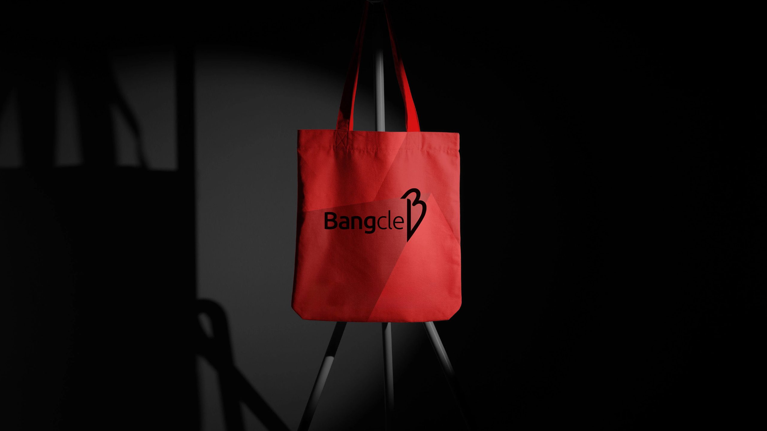
design concept
The design takes the initial B as its visual core and evolves it into a symbol that fuses a shield and a heart. The shield stands for security and protection, and the heart for trust and care. Fluid strokes and smooth curves create a soft aesthetic of technology, bringing warmth to the cool logic of security. The overall structure symbolizes “technology safeguarding trust,” embodying the brand’s core idea: Technology with Heart. At its essence, technology should give people peace of mind.
graphic language
Abstracted B: the main graphic is formed from a single continuous stroke, merging shield and heart to signify protection and connection. Linear momentum: curves progress from top to bottom, conveying the flow of technology and the direction of data security. Negative space: the counter at the center forms a secure, enclosed space, symbolizing the encryption the brand provides its users.
Fonts and composition
The Bangcle wordmark uses a custom sans-serif with rounded yet taut letterforms, balancing technical rigor with human warmth. The lowercase “c” and “l” create a vertical rhythm that amplifies the upward momentum of the symbol. Spacing between wordmark and symbol is precisely calibrated for clear legibility in both digital and hardware applications.
color system
Primary color, Charcoal Black #1C1C1C: representing the rationality, stability and professional trust of technology. Secondary color, Silver White #EDEDED: symbolizing a futuristic, pure technology. In digital interfaces, a subtle gradient (#000000 → #444444) can add depth. Anchored in a minimal black-and-white palette, the system reinforces the brand’s calm authority in security technology.
Application and extension
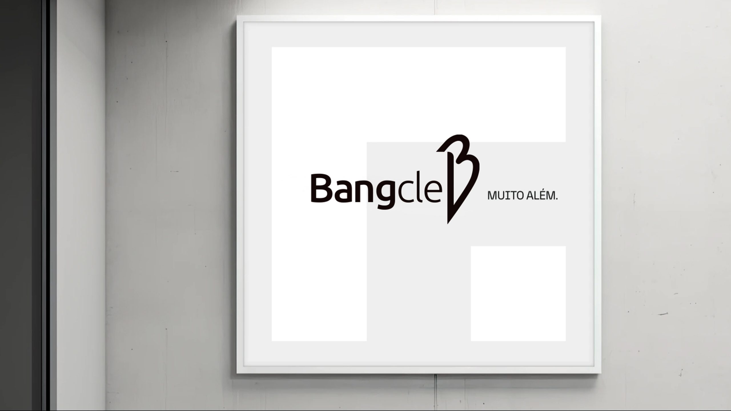
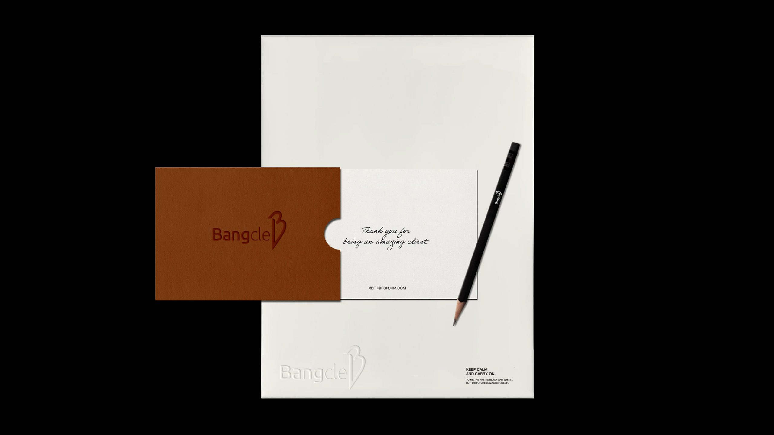
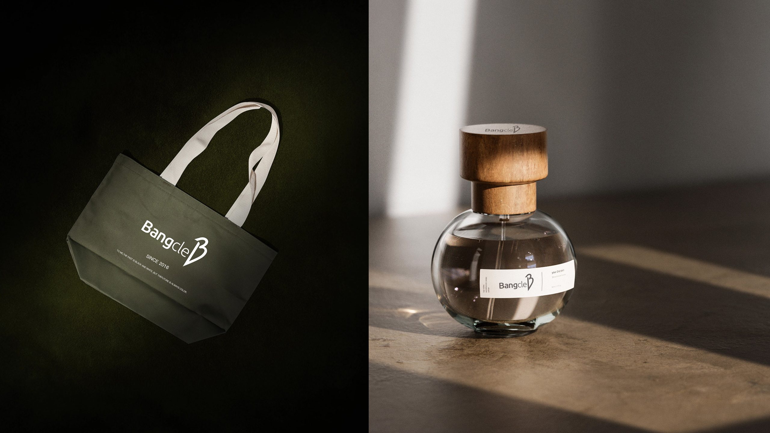
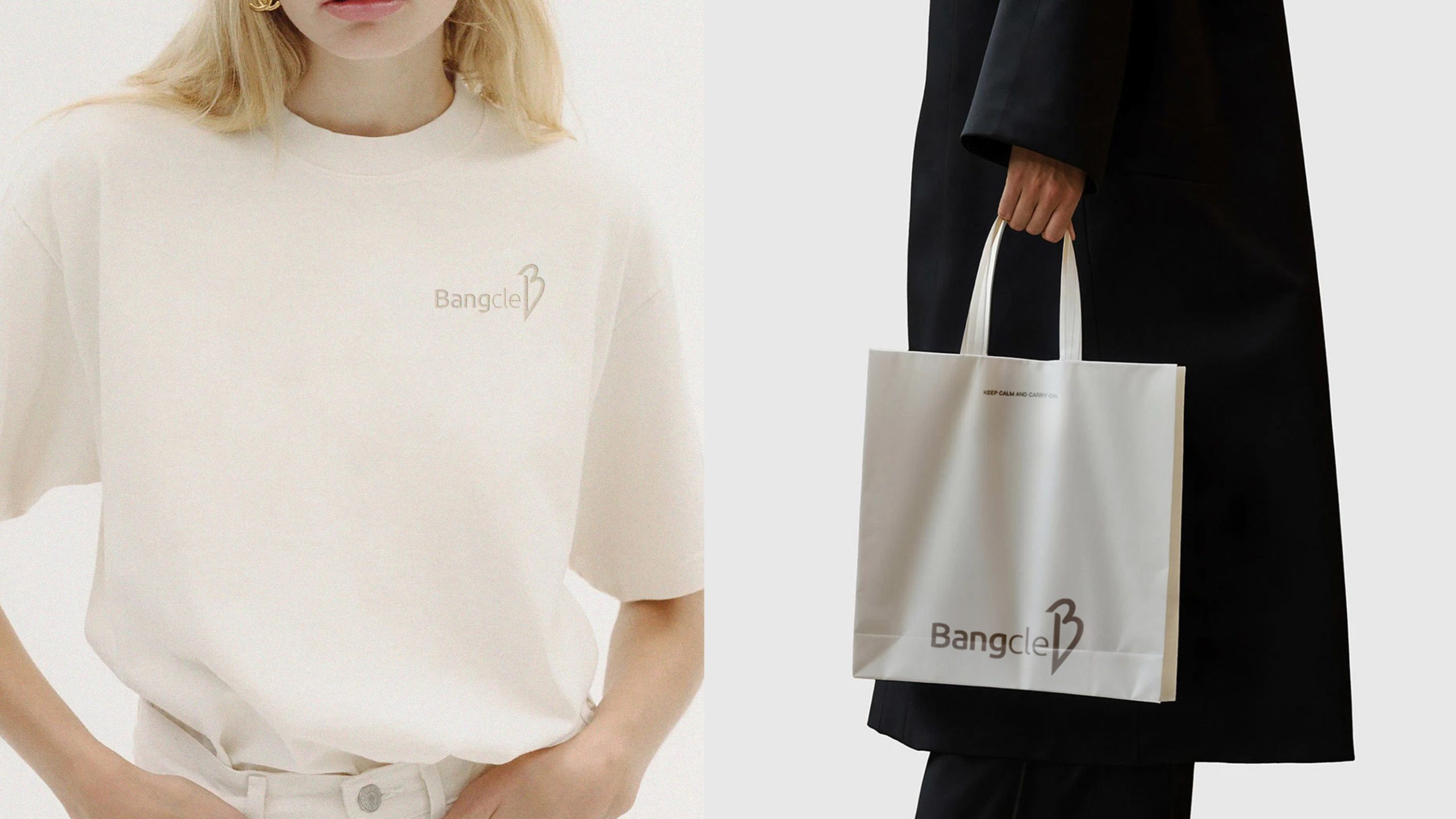
Highly versatile and built to international standards, the mark applies across: Digital products: app icons, splash screens, login pages and web navigation; Hardware: device nameplates, packaging, manuals and UI boot animations; Brand communications: promotional videos, crystal awards, conference backdrops and brand guidelines. The B symbol can also stand alone as a sub-brand identifier across different security product lines.
brand meaning
The Bangcle mark uses the B to represent the brand’s founding purpose and the heart to represent user trust. Its structure embodies the idea of “technology in service of people.” The upper half stands for intelligent protection, the lower half for human-centered experience, and the central axis for the bridge between security and trust. Through this identity, the brand aims to bring the essential warmth of technology to the world, making security an everyday reality and trust the norm.
Misuse (Protection Guidelines)
Do not alter the angles of the B structure. Do not apply gradients or shadows that distort the original form. Do not separate the symbol and wordmark for independent use. Recommended minimum display width: 25 mm.
design results
Bangcle’s new visual system debuted at an international security technology expo, winning the award for “Most Modern Tech Brand Identity.” With its clean, highly recognizable graphic language, the mark has become a key visual symbol in intelligent security. By abstracting technology into “the shape of trust,” the design moved the brand from “protection tool” to “trusted ecosystem.”