










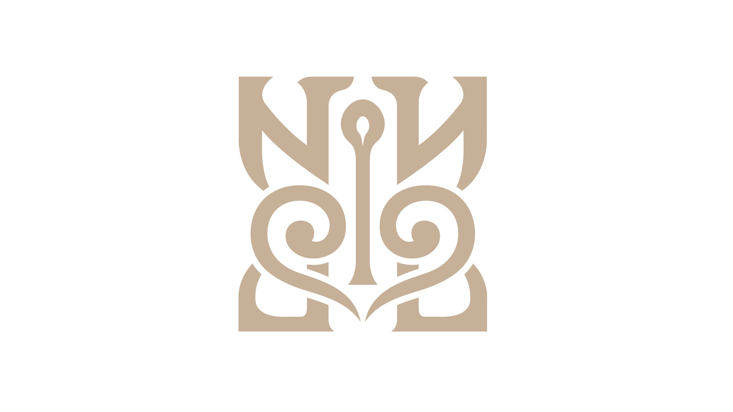
This mark comes from a premium brand identity project rooted in Eastern cultural aesthetics. The brand centers on “a contemporary expression of traditional culture,” serving the art, cultural-creative, hospitality and luxury lifestyle sectors.
The visual objective was to reinterpret the spirit of Eastern ornament through pure form. It combines cultural depth with an international sensibility to achieve “ancient elegance reborn, the East reimagined.”
design concept
The design draws on two motifs from traditional Chinese pattern, the ruyi cloud and the wings of an auspicious beast. These are combined with the structural strength of calligraphy and the symmetry of classical vessels. Built on an axially symmetrical composition, the mark gives form to the idea of honoring tradition while innovating. It recalls both an ancient seal and the ornamental corner motifs of Eastern architecture, symbolizing cultural roots and the reach of the spirit. Its design philosophy: Eastern form, contemporary meaning.
graphic language
Symmetrical structure: top and bottom echo each other and left and right are balanced, symbolizing harmony between heaven and earth and the equilibrium of yin and yang. Central axis: the vertical core evokes a candlewick or a spark of light, representing cultural inheritance and the flame of wisdom. Curved linework: lines derived from calligraphic brushwork carry a sense of breath and warmth. Symbolic imagery: the whole reads as a seal and as a fusion of ornament and letterform, creating a cross-cultural language of recognition.
Fonts and composition
The mark is primarily graphic. The wordmark can be paired with Song, serif or calligraphic typefaces depending on context, creating an adaptable multilingual system. Within the brand system, the symbol serves as the primary emblem. It can carry recognition on its own or act as a central totem across touchpoints such as packaging, swing tags, hotel signage and brochure covers.
color system
Primary color, Rice Gold #CBB89A: a neutral tone drawn from xuan paper and bronze, symbolizing cultural heritage and refined elegance. Secondary color, Ivory White #F8F6F2: representing purity and the beauty of negative space. In print or metal, hot-foil stamping, embossing and debossing can heighten tactile depth and cultural richness.
Application and extension
The mark suits cultural brands, art spaces, luxury hotels, museums and collectible cultural products. In three-dimensional spaces, the symbol can extend into decorative patterns or carved details, forming a continuous visual language. On digital platforms, a motion version creates a “breathing axis” animation that evokes the endless renewal of Eastern culture.
brand meaning
The mark expresses “a modern composition of the Eastern spirit”: Form → drawn from nature and ancient artifacts; Meaning → a vessel for culture and heritage; Spirit → a fusion of rational order and aesthetic softness. More than a visual identity, it is a spiritual totem that carries the order, warmth and dignity of Eastern aesthetics.
Improper Usage (Protection Specification)
Do not stretch, rotate or break apart the structure. Do not replace the colors with highly saturated or glossy metallic tones. Do not add shadows, gradients or outlines. Recommended minimum width: 25 mm.
design results
Since its launch, the mark has been widely applied across premium cultural venues and art exhibitions. Its distinctive “modern Eastern ornamental vocabulary” has been hailed as a benchmark for visual renewal in cultural branding. The design bridges traditional symbolism and contemporary visual language. It stands as a signature work in Qingmei Future’s practice of bringing Eastern aesthetics to an international audience.