











B-EYE is a technology brand specializing in AI-powered visual recognition, image algorithms and data analytics. Its core business spans smart security, machine vision and human-computer interaction systems.
As the company evolved its brand system, it sought an internationally relevant logo that could embody a “visual intelligence core,” expressing the perceptive and analytical power of technology through concise geometric forms.

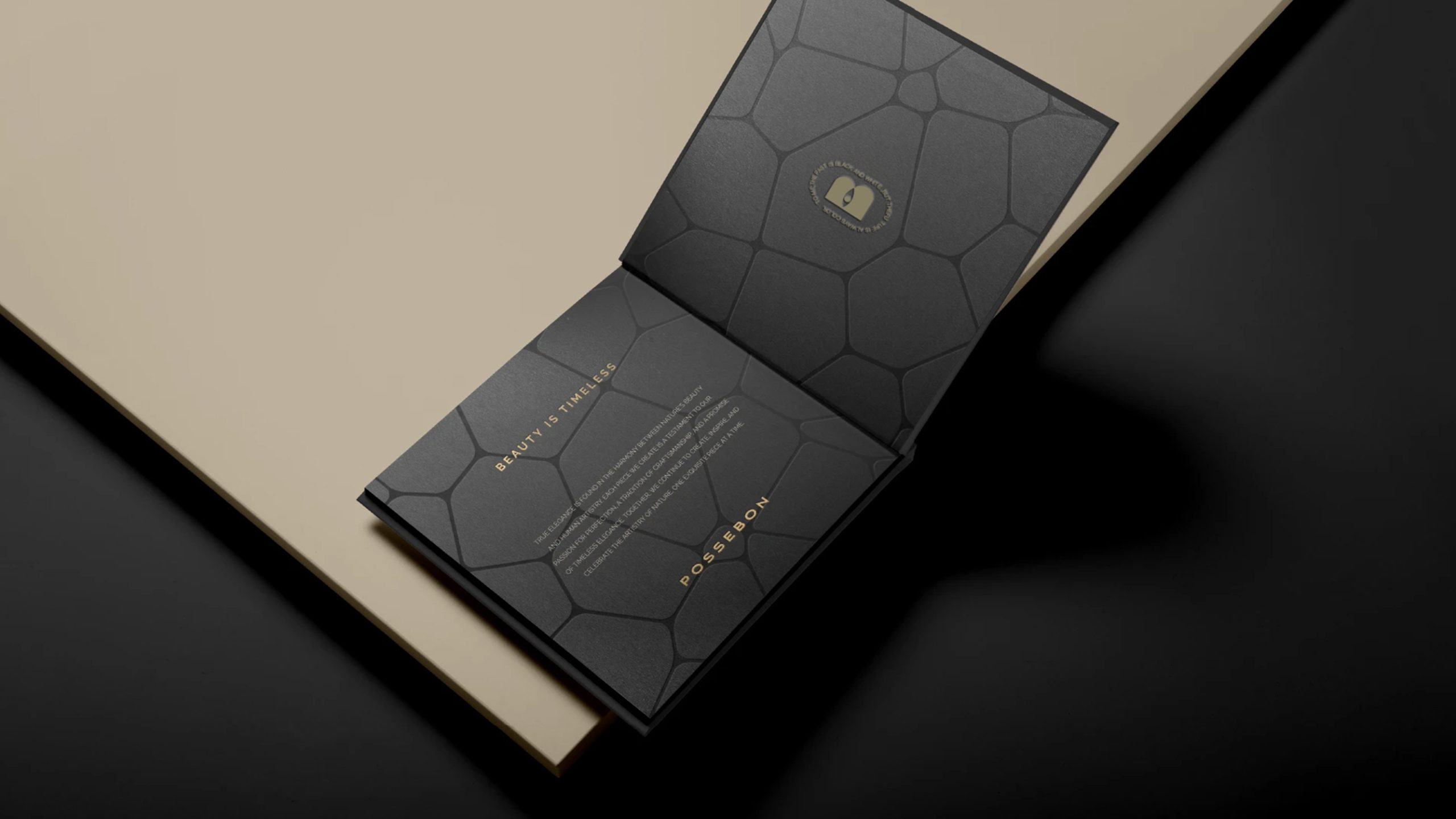
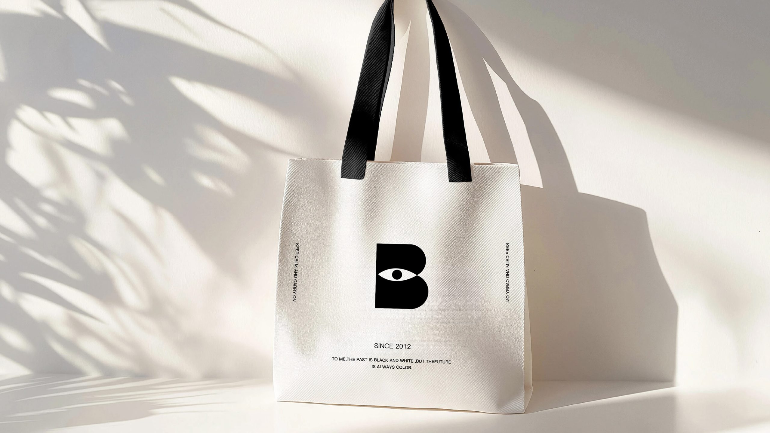

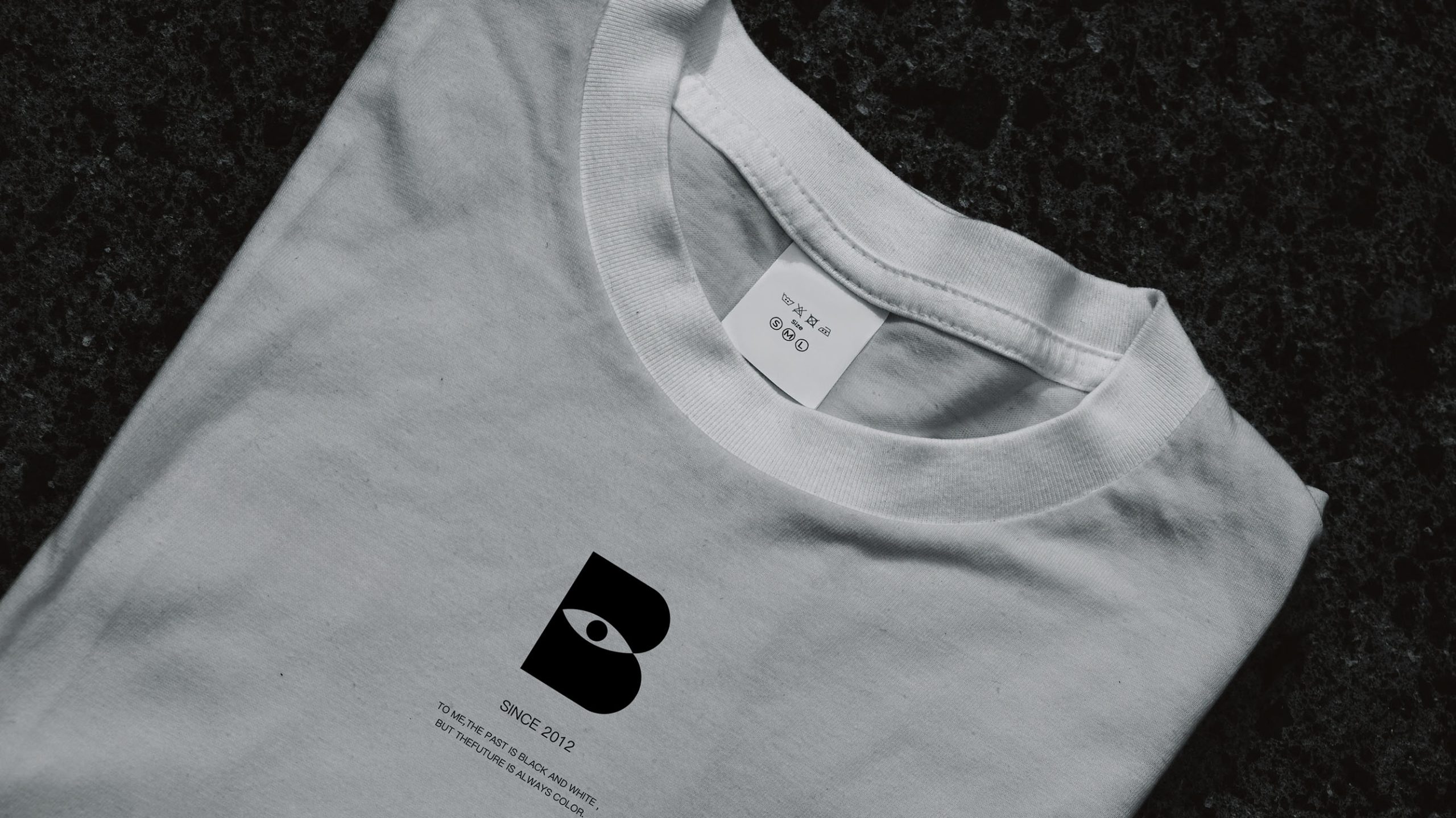
design concept
The logo brings together the letter B and an eye, uniting the company name with its core proposition of visual insight. Inspired by the balance between human perception and algorithmic recognition, the vertical stroke on the left represents rational computation, while the curved structure on the right evokes biological perception. At the center, an eye signifies the “machine eye.” The overall composition expresses the brand promise: “Helping machines understand the world, and making vision more intelligent.”
graphic language
The letter B forms the structural backbone, representing the brand and its system framework. The central eye symbolizes the core capability of visual recognition. The black pupil represents data capture and focus, reinforcing the idea of insight. The blue gradient, shifting from light to dark, conveys technological depth and intelligence. Grounded in minimalism, the visual language unites symbol, function and emotion in a distinctive technology mark.
Fonts and composition
The logo uses a geometric sans serif typeface with a clean, confident structure, reflecting the rational character of the visual recognition sector. The proportions of the B are refined using the golden ratio to create a stable visual center. The mark can be paired with the English wordmark B-EYE or a Chinese name, maintaining strong recognition and an international presence across digital screens, equipment labels and software interfaces.
color system
Technology Blue #0D2D6C represents rationality, insight and technology. The blue gradient, #4C91D9 to #0D2D6C, suggests learning and evolution from light to depth. The black pupil #1A1A1A conveys focus, precision and security. White space represents transparency, clarity and objective truth. Together, the palette creates a composed, professional and future-facing impression, strengthening confidence in the brand’s technology.
Application and extension
The logo is designed for broad application across AI product interfaces, vision-algorithm software, hardware nameplates, conference backdrops, digital media and promotional animation. The eye symbol can be extracted as a standalone core visual element for dynamic recognition cues, loading animations and security-system indicator lights. In digital communications, light-scan or iris-focus animations reinforce brand recognition. Its pared-back geometry also reproduces precisely in print, engraving, laser etching and embossing.
brand meaning
Built around the symbol of “B-EYE, the Eye of Technology,” the logo embodies the brand’s mission: empowering vision through algorithms and extending perception through intelligence. The central eye is a window onto the world. It expresses the brand’s proposition for the age of AI vision, moving from seeing to understanding and from recognition to judgment. It is more than a corporate mark. It is the symbol of a visual system that keeps learning and evolving.
Improper Usage (Protection Specification)
Do not alter the dominant blue or the direction of the gradient. Do not adjust the proportions of the eye or the position of the pupil. Do not add shadows, outlines, reflections or other non-standard effects. Do not skew, stretch or place the logo over busy backgrounds. Maintain a symbol-to-wordmark ratio of 1:1.3. Minimum display width is 20 mm.
design results
Following the launch of the B-EYE identity, the company’s recognition within the AI visual-recognition sector rose by 48%. The mark has been widely praised at trade shows, across software systems and in international partnerships, and hailed as “a minimalist benchmark for vision-algorithm brands.” The B-shaped eye has become a core company asset in algorithm visualization and brand recognition, uniting technical symbol and brand spirit. Qingmei Future has included it among its representative case studies in AI and visual-recognition brand systems.