










Beijing Science Center Wayfinding System Planning and Design
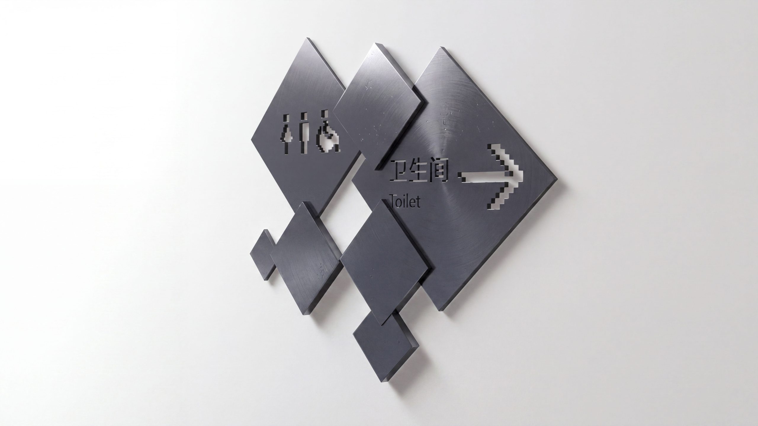
Wayfinding system planning and design for the Beijing Science Center. The scope covers the urban arrival interface, external campus pedestrian network, main hall and themed pavilions, public service facilities, education and study-tour circulation, and accessibility and emergency evacuation.
The overall goal: amid heavy footfall and visitors of all ages, build a replicable, low-maintenance, scalable wayfinding system so that first-time visitors orient themselves within 30 seconds, and families and groups can tour the exhibits and reach their classes on their own, without relying on staff.
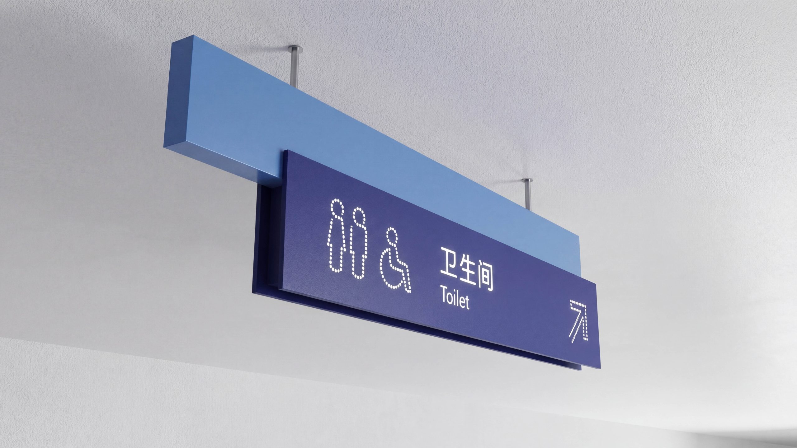
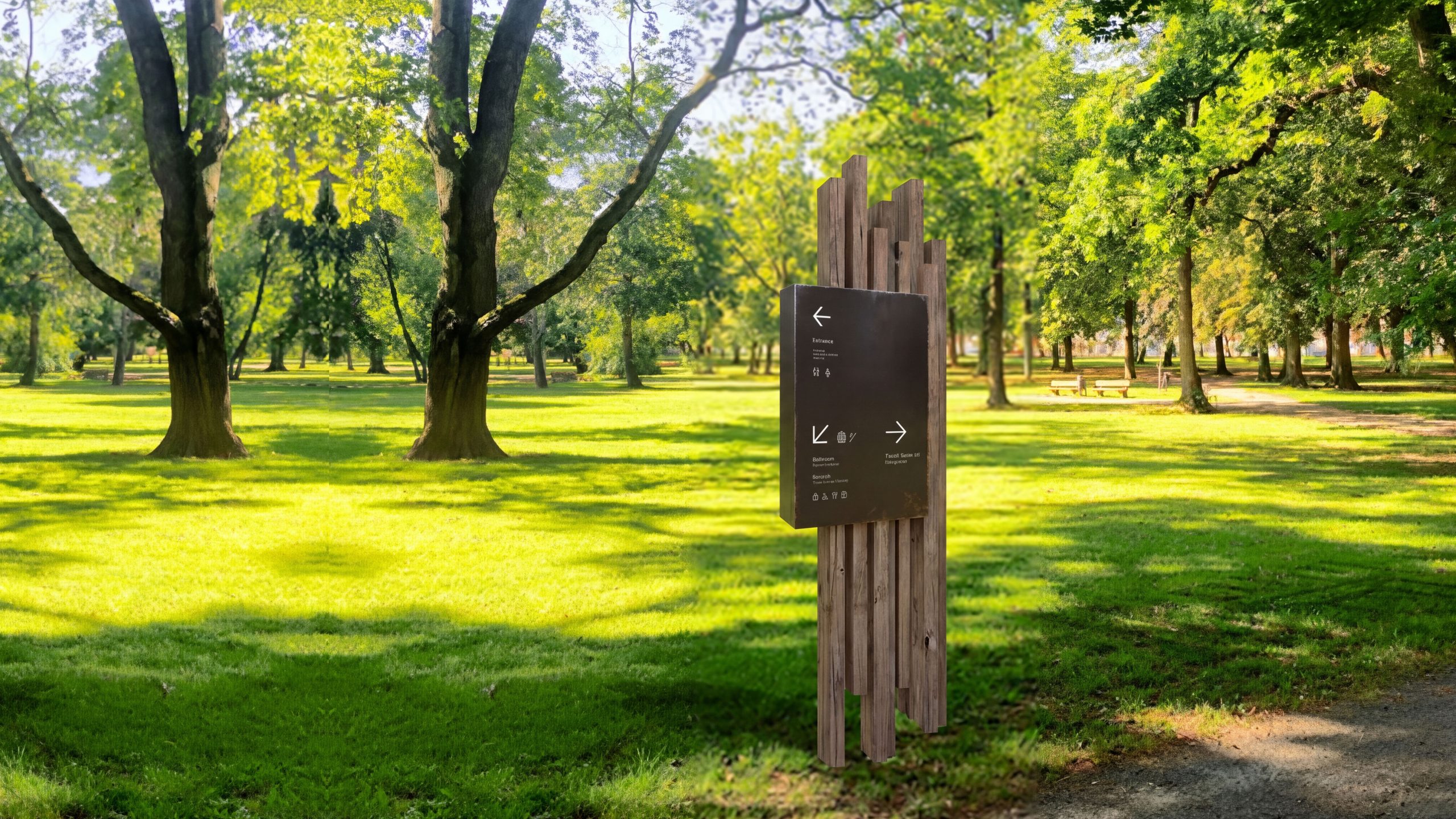
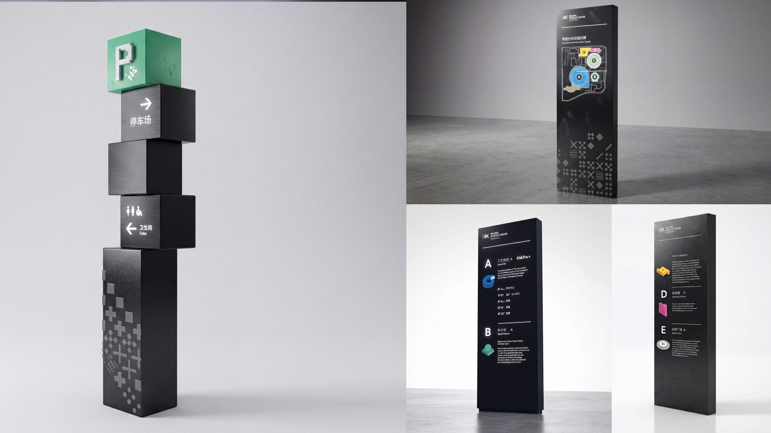
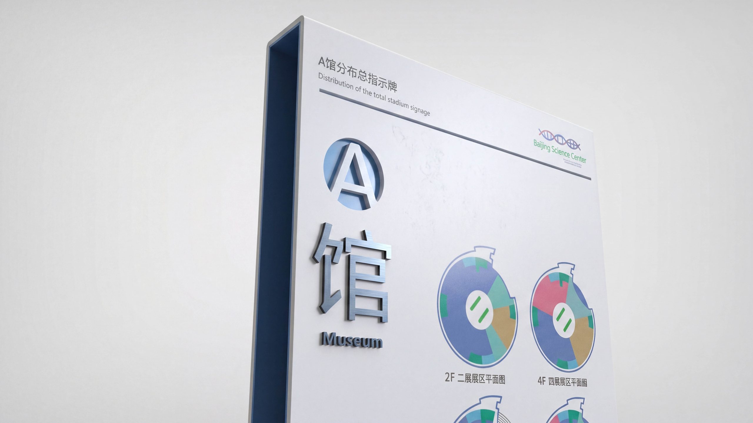
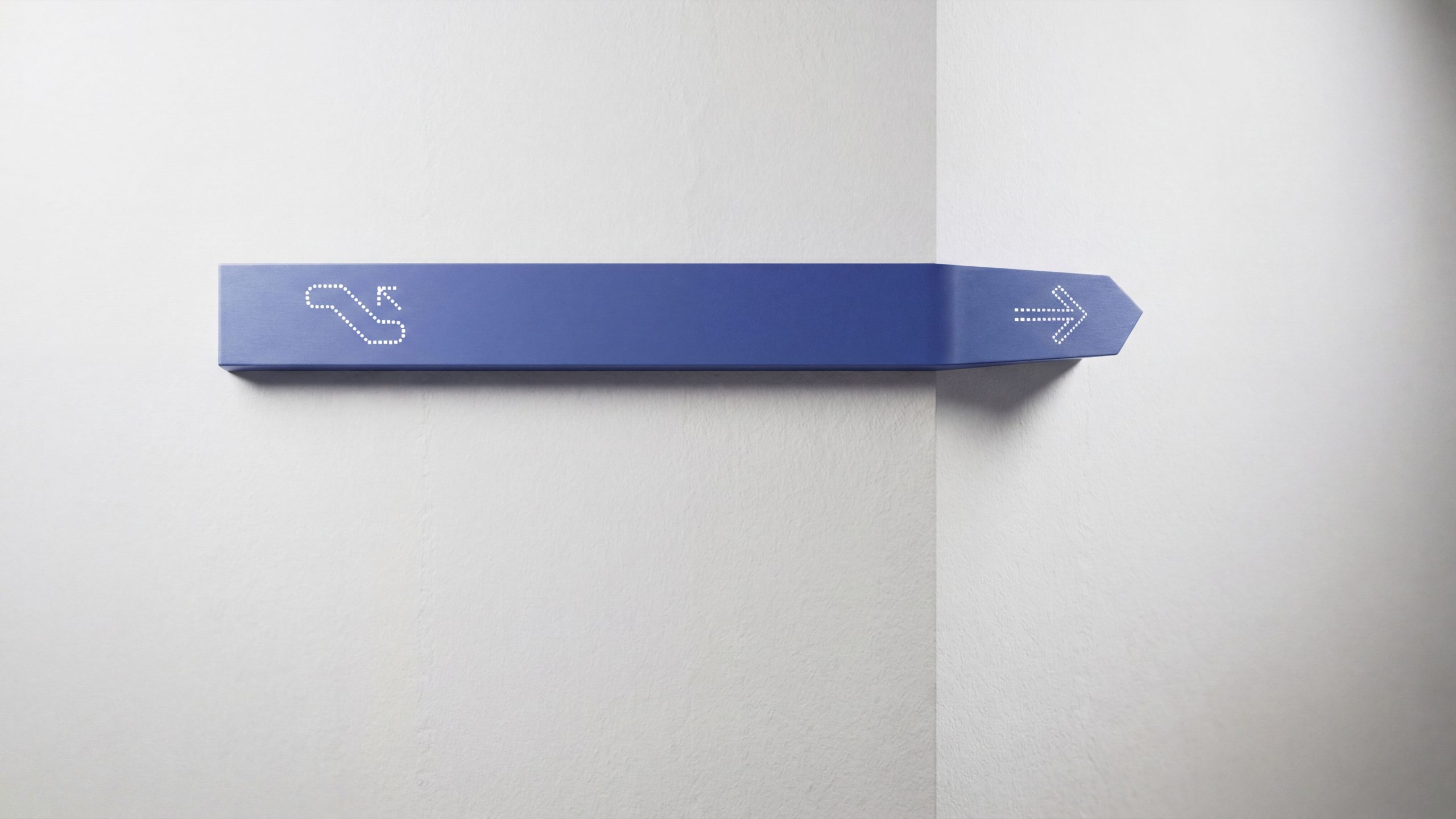
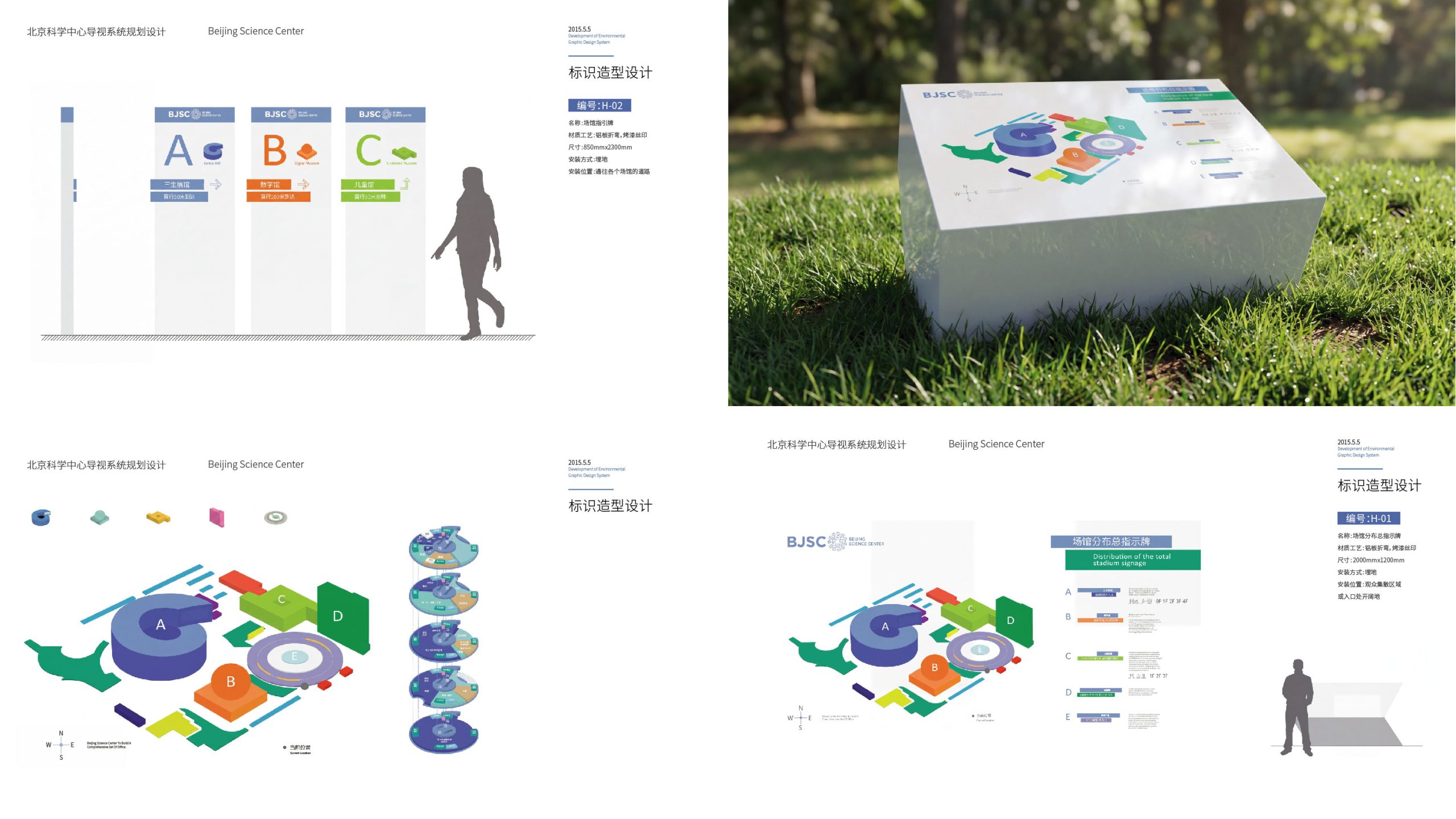
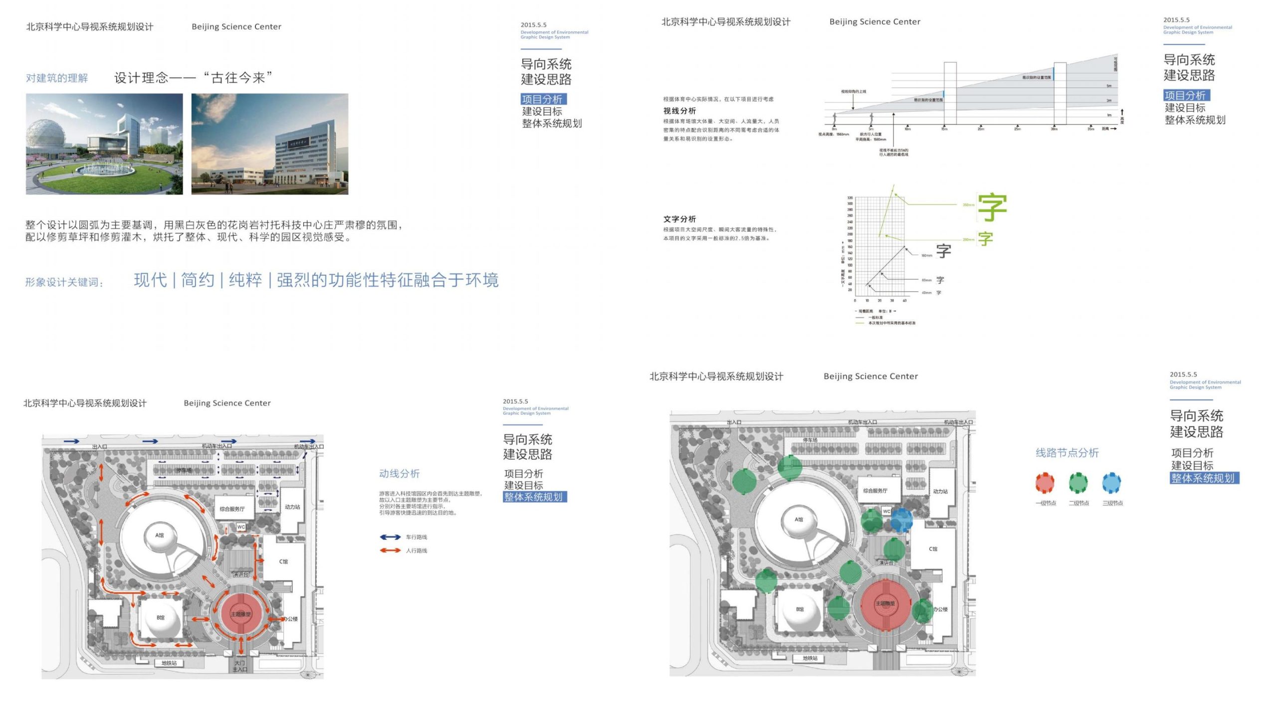
Assess the current state and define the goal
Site surveys and visitor profiling identified three issues: poor arrival continuity across multiple entrances; frequent theme changes between pavilions eroding the timeliness of information; and children and older visitors being sensitive to text density, with a greater need for graphics. Quantified objectives followed: continuous guidance (100% advance notice and progress confirmation at key turns); stable legibility (a type size–contrast–illuminance parameter library for vehicular and pedestrian viewing distances); efficient operations (templated fixed, variable and temporary information, with changeovers in 5–10 minutes, consistent across pavilions).
Systematic Strategy and Coding System
One grid: a unified 8pt/4mm module runs through sign layouts and component tooling, ensuring a consistent look across pavilions. Two viewing distances: separate minimum reading distances, type sizes and illuminance thresholds for vehicular and pedestrian viewing (vehicular 20–60 m, pedestrian 1–15 m). Three sign types: fixed signage (gateways, pavilion overviews, floor directories, node zone signs), variable information (exhibition news, showtimes, reservations and temporary closures) and temporary guidance (peak queuing, one-way diversion, construction detours and severe-weather plans). Four-level coding: campus–building–floor–gallery/classroom (letters + numbers), integrated with ticketing and reservations, security clearance and class scheduling systems. Five-step delivery: baseline survey–prototype night testing–pilot calibration–full rollout–asset register and SOP handover.
Visual and information rules
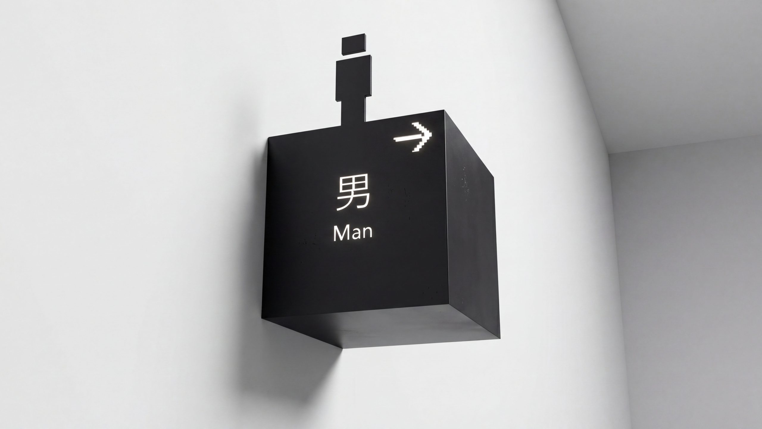
Color: deep graphite gray and ivory white form the information base, with “Science Blue” as the functional accent; child-friendly areas add low-saturation, vibrant color bars without disrupting the core system. Typography: highly legible sans-serif Chinese leads, with Chinese and English at equal weight; monospaced figures preferred for numbers and times. Type hierarchy: long-distance primary identification ≥140 mm, node zone signs 60–90 mm, directions 30–40 pt, rules and ticketing information 18–24 pt. Iconography: redrawn to ISO and accessibility standards, with new pictograms for interactive exhibits, study classrooms, science shows, quiet rooms and family restrooms; arrows, numbering and color bands share geometric parameters. Layouts stay left-aligned with equal columns and fixed leading, following the reading order “Where am I – Where to – How to get there – Which floor – Which number – Notes.” Optics: 4000–4300K neutral, glare-controlled light sources and matte panels, with dual thresholds for minimum illuminance and maximum glare at night.
Circulation Organization and Scenario Implementation
City arrival: illuminated gateway identification plus tall pylons, with separate routes for vehicles, pedestrians and school buses; parking zones use color bands and zone letters for quick orientation, and elevator lobbies list the “nearest entrance and key exhibition areas.” Main hall and themed pavilions: the first view at each entrance presents an “overview map + today’s showtimes + booking QR code”; a suggested loop route and a central-axis return route are shown side by side, with progress confirmation every 12–15 m along long corridors. Education and study tours: assembly points and classroom door signs carry four elements, “code + course name + time slot + instructor”; queue organization and accessible alternative routes are marked together. Family and public services: infant care, drinking water, dining and the gift shop share unified icons; quiet rooms and rest points are spaced every 200–250 m, with repeated confirmation signs nearby. Safety and emergency: evacuation maps, assembly points, AEDs and fire equipment follow a unified high-contrast template; switchable temporary guidance plans cover severe weather, crowding and equipment failures.
Delivery and operation and maintenance mechanism
A closed loop of “asset register + template library + data integration.” Every sign has a unique code, installation coordinates and materials list; integration with ticketing and scheduling platforms automatically generates daily showtime and temporary-exhibition boards, exported for local printing in one click. O&M SOPs define inspection frequency, cleaning methods, tolerances and illuminance standards; one person can deploy or remove temporary diversion materials in under 5 minutes. Deliverables include: master wayfinding plan and location drawings, layout and icon manual, coding and naming standards, hardware exploded views and bill of materials, installation and optical parameters, an emergency template library and training materials. Respecting both the architecture and the exhibition narrative, the system delivers controlled peak-hour order, clear and legible information and sustainable operations.