










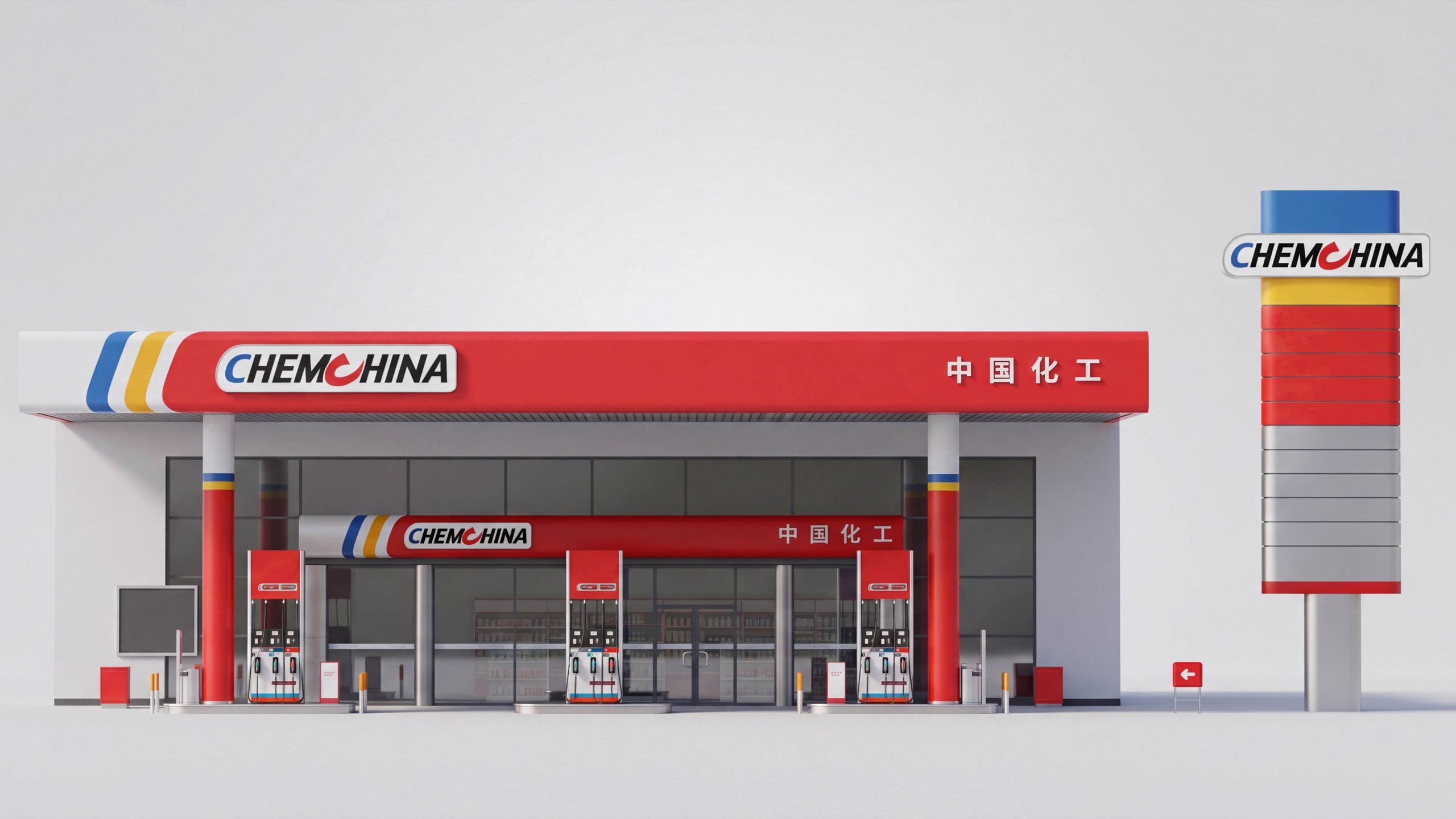
Qingmei Future provided the methodology and case-study support for this project for Sinochem. The scope spans a network of touchpoints, including fuel and hydrogen refueling stations, integrated service areas, convenience stores, and vehicle entrances and exits.
Our goal is a repeatable, low-maintenance and scalable wayfinding system for complex environments where vehicle and pedestrian traffic intersect—from highway junctions and major urban roads to internal campus routes. It helps first-time visitors orient themselves quickly, keeps vehicles moving efficiently, and makes updates and management straightforward for operators.
Brand positioning and guidance goals
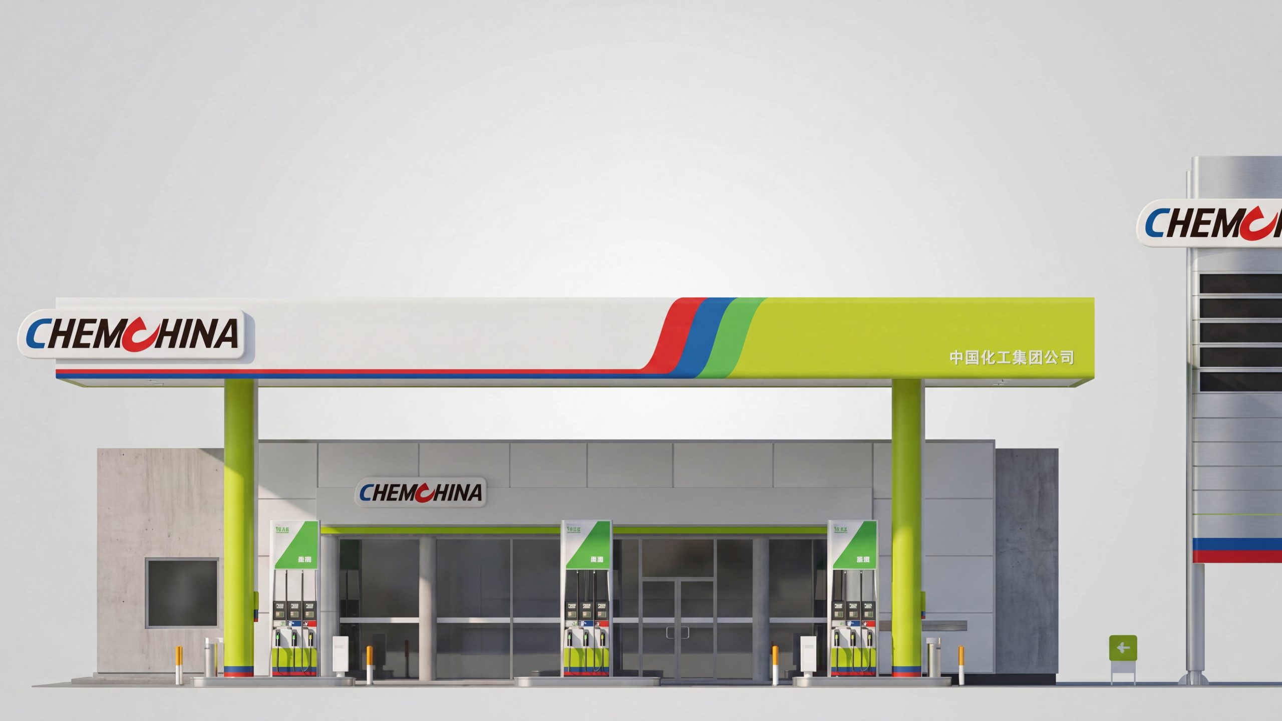
Sinochem's brand stands for safety and reliability, green technology, and professional efficiency. The wayfinding system expresses these qualities through a clear sense of order, environmental responsibility and an approachable tone. We define wayfinding as the first point of service in station operations, with three objectives: faster vehicle access, more accurate information recognition and a smoother end-to-end service experience. A four-level information architecture—identification, direction, confirmation and supplementary information—covers key touchpoints, from long-distance fascia recognition and separate entry and exit lanes to fueling-island numbers, convenience store and service-area directions, and emergency and operational information.
systematic strategy
The methodology brings together one grid, two viewing ranges, three sign types, four coding levels and five-minute updates. One grid: a consistent 8 pt/4 mm module governs sign layouts and lightbox tooling, ensuring consistency across stations. Two viewing ranges: separate type size, contrast and illuminance standards for drivers at 20–60 m and pedestrians at 3–10 m. Three sign types: permanent signs for storefronts, columns and overhead fueling-island identification; variable information for fuel prices, promotions and opening hours; and temporary guidance for diversions, maintenance and emergencies. All use standardized magnetic or slide-in fittings. Four coding levels: station–functional zone–fueling island–nozzle, combining letters, numbers and color bands to connect with payment and maintenance systems. Five-minute updates: price signs, temporary notices and promotional materials are generated from templates in a single step and can be updated by one person.
Vision and information order
The color system centers on brand red, deep blue and fresh green, with white carrying text to create a layered yet restrained, high-contrast information environment. High-visibility yellow highlights environmental and safety messages. A highly legible sans-serif family gives Chinese and English equal prominence. Type sizes follow a vehicle-speed and viewing-distance model to maintain legibility at different speeds. Icons and arrows share consistent stroke weights and corner radii; fuel types, payment methods, accessibility and emergency symbols follow internationally recognized standards. Left alignment and fixed columns organize information around three questions—Where am I? Where am I going? What should I do?—reducing rereading and hesitation.
Contact points and landing applications
Long-range visibility: Illuminated fascia lettering and a band of brand color make the station recognizable from two approaches. Tall price signs balance visibility against the city skyline with advance guidance for drivers. Traffic flow: Ground graphics and posts at the entrance establish a one-way route—enter, refuel, exit—with separate lanes for heavy vehicles and passenger cars. Pump islands and nozzles: Large island numbers and fuel-specific color bands help drivers find the right pump. Nozzle labels present three lines of information—fuel type, grade, payment—to reduce misfuelling. Service areas and convenience stores: A fascia-mounted service directory identifies restrooms, unattended retail, air compressors, charging points and other amenities. Inside, adaptable shelf-end templates communicate promotions and member benefits. Safety and sustainability: Consistent, high-contrast red and yellow templates identify emergency assembly points, fire extinguishers, spill response equipment and high-voltage charging hazards, with minimum illumination levels maintained at night. Recommended materials include matte metal, weather-resistant acrylic and environmentally responsible screen-printing inks. Lighting should remain within 4000–4500K, with anti-glare shields to support safe driving after dark.
Implementation and operation and maintenance mechanism
Delivery follows a continuous cycle: site survey, prototype validation, pilot operation, full rollout, asset registration and ongoing maintenance. Prototypes undergo viewing-distance and reflectance tests to calibrate type size, contrast and illumination. During the pilot, queue times, wrong-entry rates and customer movement heatmaps inform adjustments to information density and sign placement. Following rollout, a signage asset register and coding library support management across the network. QR codes link to current floor plans, emergency procedures and replacement instructions. The maintenance manual defines inspection intervals, tolerances, cleaning methods and nighttime lighting checks, enabling station staff to handle more than 80% of routine maintenance. A standard grid, consistent coding and templated materials allow Sinochem Holdings to replicate the system quickly across cities and station formats, sustaining a clear, disciplined visual order and a professional, trusted and welcoming brand experience.