










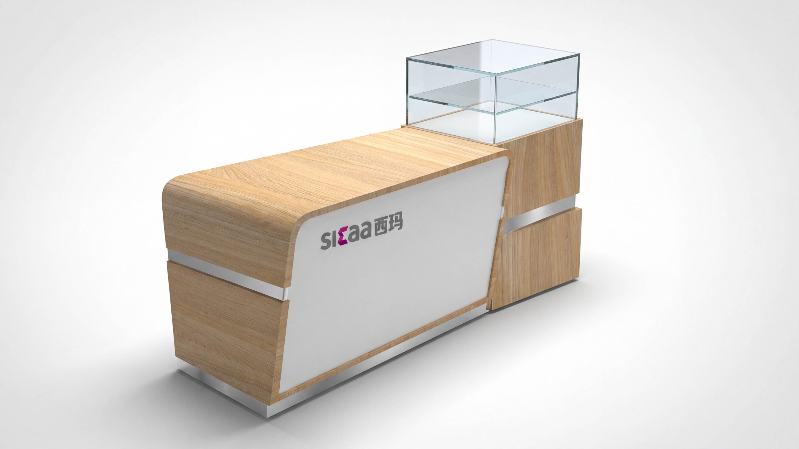
This project is supported by methodology and cases provided by "Beijing Qingmei Future Advertising Design Company", and the service brand is "Xima". Application scenarios include supermarket stores, shopping mall displays and temporary promotional spaces.
Our goal is to build a replicable, low-maintenance, and scalable wayfinding system in a small-to-medium-sized retail environment with frequent changes of shelves, allowing first-time visitors to quickly find products and service nodes, and allowing store clerks to complete information updates and line management in the shortest possible time.
Client
Xima Retail
Challenge
Small- and mid-scale retail environments needed a wayfinding system that was easy to replicate and low to maintain.
Approach
We built a layered information structure (identification, direction, confirmation and supplementary) underpinned by a unified grid and a four-level coding system.
Brand positioning and guidance goals
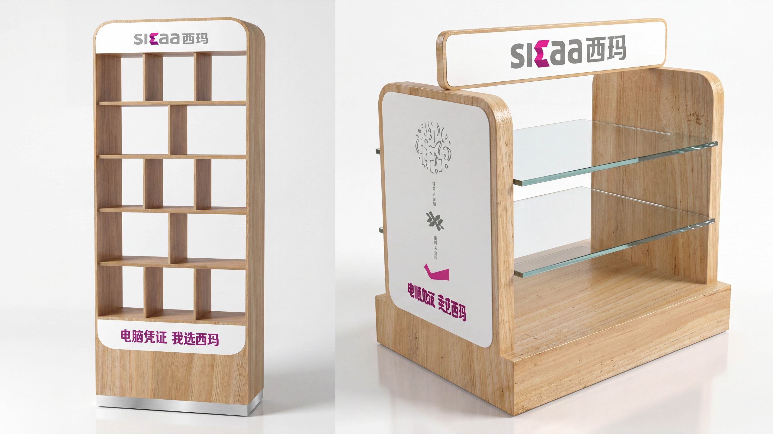
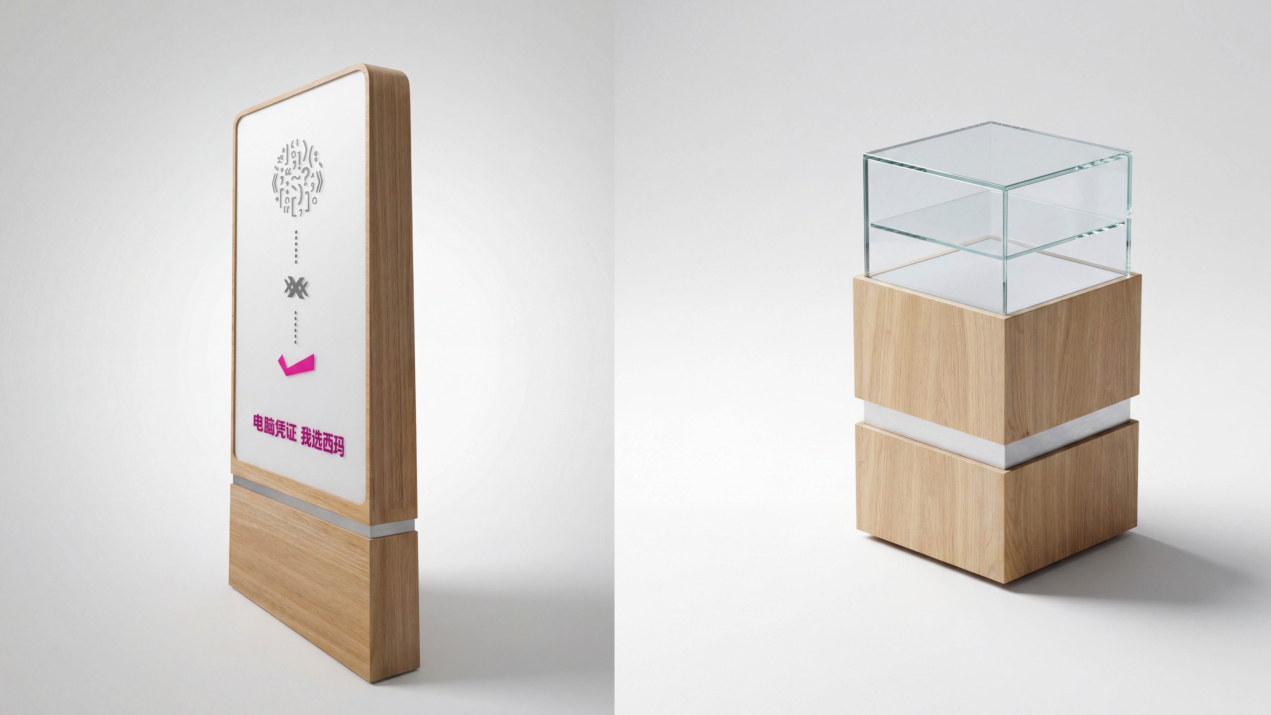
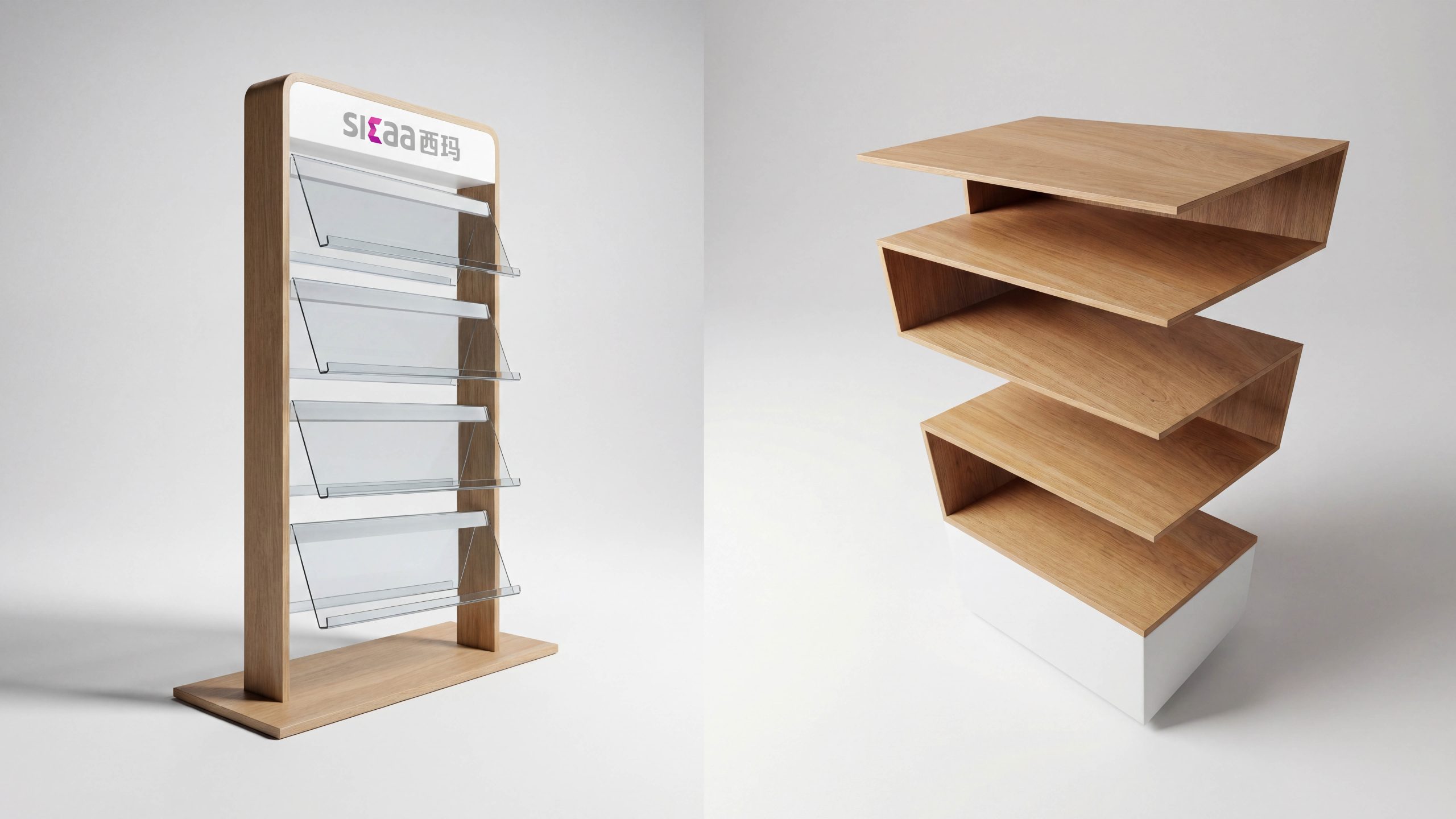
Sima emphasizes "reliable, clean and friendly". The tone of the guide therefore needs to be rational and clear but not cold. We define wayfinding as "the real-time service interface in the store" and set three goals: arriving without getting lost, choosing without effort, and waiting for information. Focusing on the four major links of entrance identification, functional area guidance, shelf identification and checkout confirmation, an information structure of "identification layer - guidance layer - confirmation layer - supplementary layer" is constructed to ensure that customers can receive clear prompts at every key node.
systematic strategy
A systematic approach of “one grid, two densities, three types of carriers, and four levels of coding” is adopted. A grid: unified 8pt/4mm module, running through the card layout and prop molding. Two densities: long-distance guidance uses low information and high contrast, and short-distance shelves use high information and low density arrangement. Three types of carriers: fixed logos (store brands, district brands), variable information (price tags, selling point cards), temporary guidance (event and replenishment stickers), with consistent interfaces for easy replacement. Four-level coding: store - area - shelf - location number, a combination of letters + numbers, supporting the linkage between in-warehouse picking and online shopping guides.
Vision and information order
The color is based on warm wood color and neutral white. The functional color is brand purple as a key reminder. The black and gray text ensures high contrast and readability. The fonts are uniformly used in highly readable sans-serif Chinese and numeric families, with Chinese and English equally represented; font size classification is managed according to viewing distance: 15m for main identification, 7m for regional signs, 3m for shelf signs, and 1m for price tags. Icons and arrows share line width and corner radius, forming a stable geometric rhythm. The layout adheres to left alignment, fixed line spacing and column spacing. The label information is progressive in the order of "category - selling point - specification - price - discount", and the scanning path is clear.
Contact points and moving lines landing
Facade and entrance: door head recognition + movable horizontal strips to establish the first impression of "where am I and what do I see when I enter the door". Areas and passages: Turn signs must be set up at corners, and mileage confirmation points must be set up every 12–15 meters in long passages to reduce turning back. Shelves and terminals: The terminal signs emphasize the main products, the front edges of the shelves unify the serial numbers and prices, and a QR code is reserved at the replenishment port to directly access the inventory and SOP. Experience and checkout: The trial station is equipped with "getting started" and precautions; the checkout area is equipped with a "preparation list" and queuing time to prompt a closed loop. The material is made of matte metal, scratch-resistant acrylic and recyclable paper inserts, and the light source is 4000–4500K anti-glare to ensure comfortable reading all day long.
Implementation and operation and maintenance mechanism
Promote according to "Survey - Proofing - Pilot - Calibration - Global - Operation and Maintenance". During the proofing stage, viewing distance, illumination and reflection tests were conducted to calibrate the font size and contrast; the thermal trajectory and dwell time were collected during the two-week pilot period to optimize the density of the card surface. After going online, a "guidance asset ledger" will be established, price tags and event cards can be generated with one click through templated files, and exhibition changes can be completed within 10 minutes. The operation and maintenance manual clearly clarifies inspection cycles, tolerance standards and cleaning methods, and store staff can complete 80% of the updates without the need for professional tools. Through standard grids, unified interfaces and coding rules, Xima Guide can be quickly copied between different stores, maintaining a sense of strict order for a long time, while continuing the friendly and easy-to-use brand experience.