










Client
Poly Group
Challenge
Establishing a unified campus wayfinding system
Approach
A four-tier information hierarchy: identification, direction, confirmation and supplementary
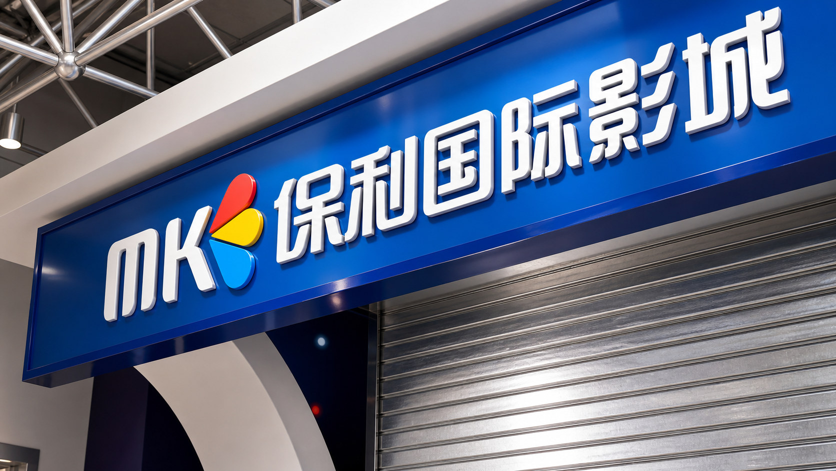
This project is supported by methodology and cases provided by "Beijing Qingmei Future Advertising Design Company", and the service brand is "Poly". The guidance objects cover various types of spaces such as the headquarters campus, commercial supporting facilities, and cultural and sports venues.
The goal is to establish a replicable, low-maintenance, and scalable wayfinding system in a complex environment with multiple business formats, multiple people, and multiple nodes, so that first-time visitors will not get lost and permanent staff can pass efficiently, while embodying Poly's brand temperament of "stable, professional, and trustworthy."
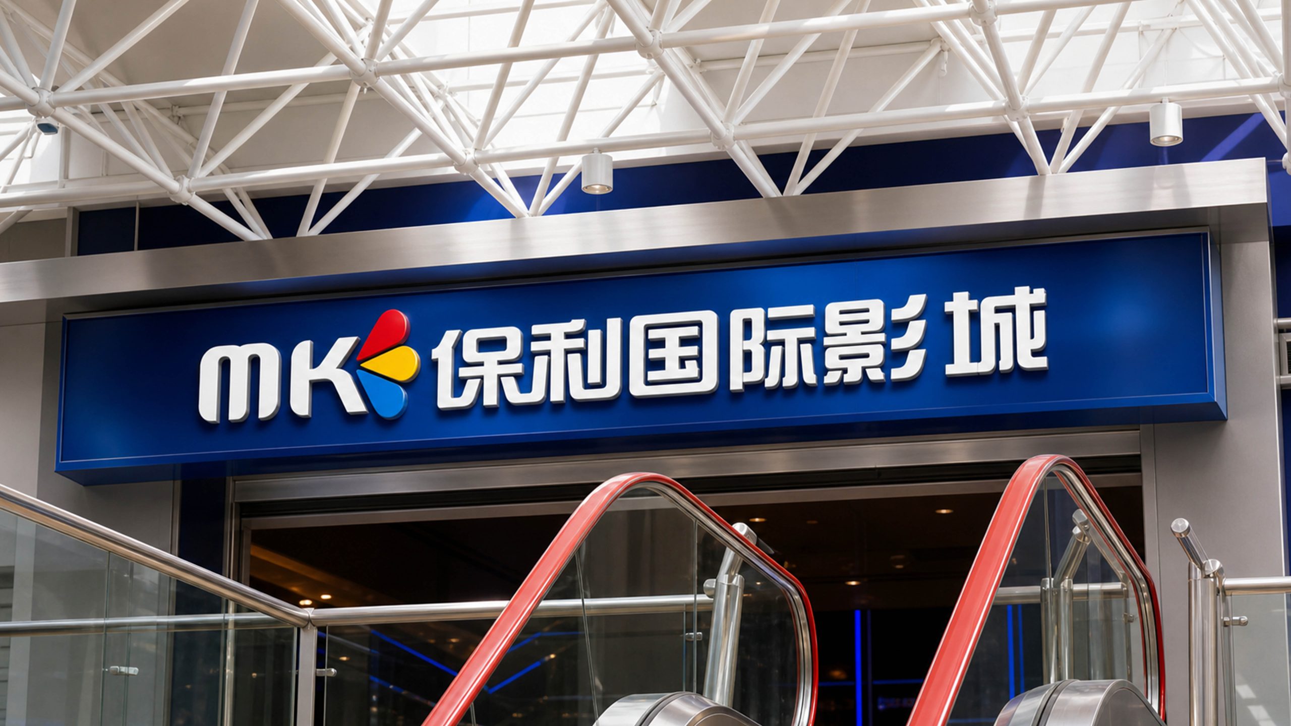
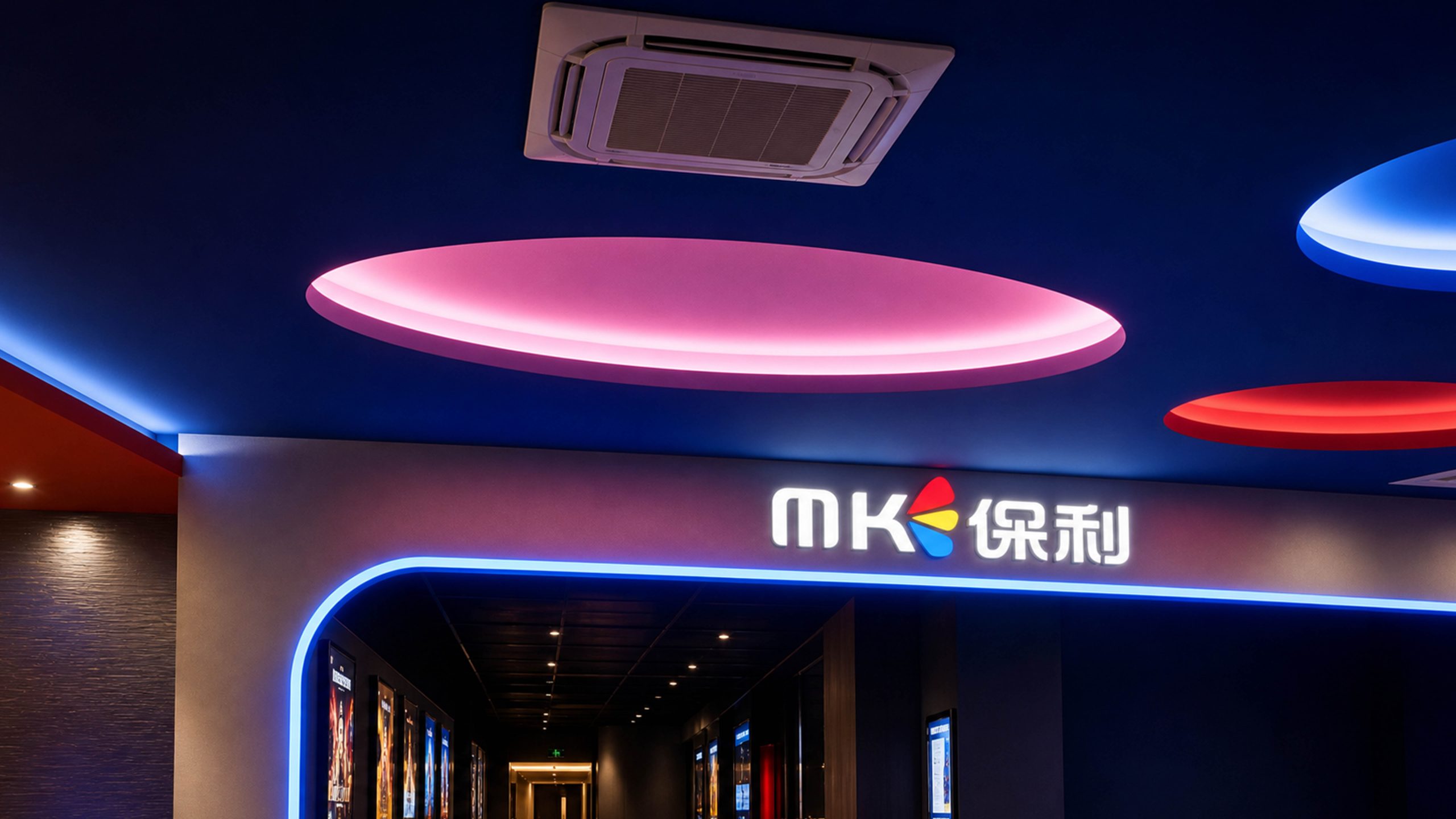
Brand positioning and guidance goals
We regard the guide as "the first front desk of Poly services". The visuals should be restrained and clear, and the tone should be friendly and direct. The guidance goals focus on three points: faster arrival, more accurate reading, and more stable experience. The information architecture adopts a four-level structure of "identification layer - guidance layer - confirmation layer - supplementary layer", covering the park entrance, parking and pedestrian transformation, lobby and vertical transportation, floor corridors and terminal rooms, so that users always have visible guidance and information to follow at key nodes.
Systematic Strategy Framework
The methodology is composed of "one grid, two sets of sight distances, three types of modules, four levels of coding, and five steps to implementation". One grid: unified 8pt/4mm module, running through the card layout and hardware mold opening, ensuring batch consistency. Two sets of viewing distances: vehicle traffic and pedestrian traffic respectively set font size, contrast and illumination standards. Three types of modules: fixed identification (long-term), variable information (departments, tenants), temporary guidance (construction, activities), and the interfaces are unified and hot-swappable. Four-level coding: park-building-floor-room, alphanumeric mixed, supports expansion and digital docking. Five steps to implementation: survey - plan - proofing - pilot - full-scale implementation to reduce one-time error costs.
Vision and information order
The color is based on dark navy blue, which symbolizes stability and professionalism; the functional color uses Poly Corporate Red as the key emphasis, and is paired with high-contrast white text to ensure long-distance readability. The font adopts highly readable sans-serif Chinese and Spanish families, with equal weight display of Chinese and English; font sizes are graded according to viewing distance, 15m for main recognition, 7m for nodes, and 2m for details. The icon library unifies strokes and corner radii, and arrows, numbers, and accessibility symbols share geometric rules; the layout is left-aligned, fixed line spacing, and equally spaced columns to ensure visual continuity from far to near.
Touchpoint scenarios and applications
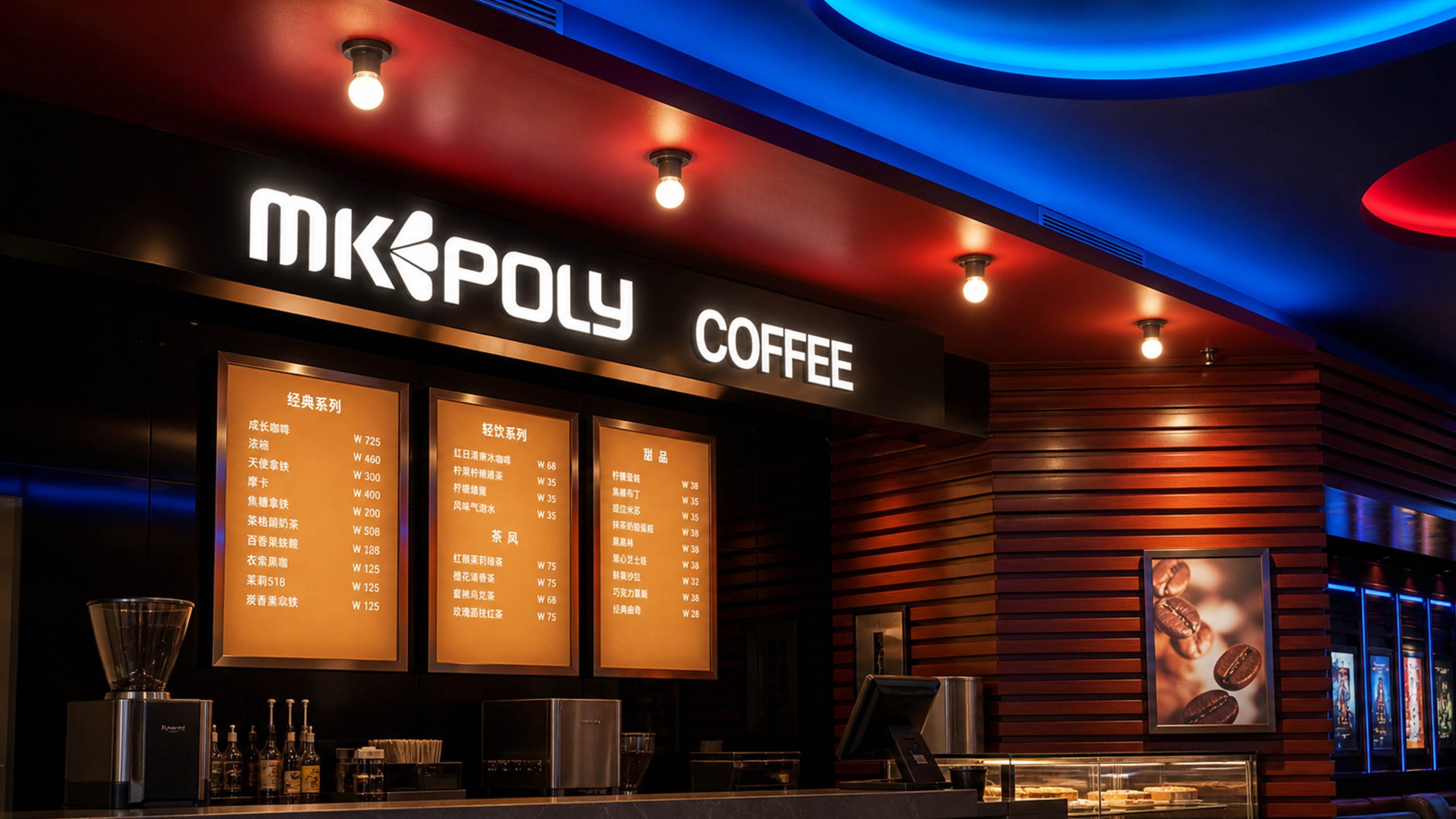
Park and car dealership: General identification of the gate building + lane diversion, synchronization of ground guidance and column numbers, and rapid positioning of parking areas by color + location letters. Lobby and vertical transportation: general index map + quick destination list, "frequently visited floors" and "doing items - corresponding floors" are set in the area in front of the elevator. Floors and corridors: There must be turns at corners, and mileage confirmation signs are set up every 20–25 meters in long corridors; the terminal door number adopts the three-in-one format of “number + function + unit name”. Cultural and commercial supporting facilities: Events and exhibitions use a unified variable template, and supporting facilities such as coffee and bookstores are lightly differentiated with sub-brand colors without disrupting the overall order. The material is made of matte metal, scratch-resistant acrylic and environmentally friendly screen printing ink, and the light source is 4000–4500K with glare control to ensure all-day reading.
Implementation and operation and maintenance mechanism
Establish an operating mechanism of “asset-based ledger + template-based update”. Before the full-scale implementation, the actual viewing distance and illumination of the prototype were measured, and the font size and contrast were calibrated. After going online, the QR code was used to link to the real-time floor plan and visitor navigation, and the changes were integrated and issued through the process management table. The operation and maintenance manual clearly clarifies inspection cycles, tolerance standards, cleaning and replacement guidelines, and 80% of maintenance can be completed by the property management. Through standardized grids, codes and templates, the wayfinding can be quickly replicated in new buildings and new businesses, maintaining a sense of strict order for a long time, while continuing Poly's professionalism and warmth.