










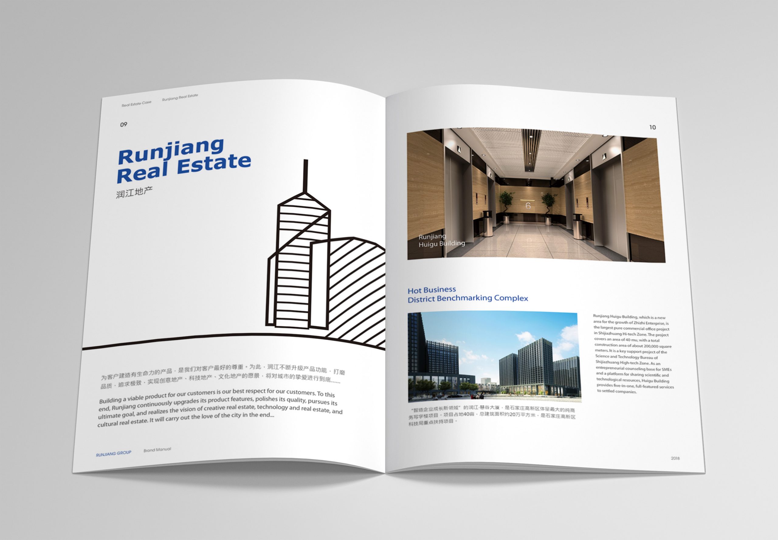
Runjiang Real Estate is a property developer focused on urban renewal and high-quality residential development. This project created a corporate brochure that embodies the company’s strength and modern spirit.
The design direction, “modern character through rational order,” uses structured content and a clean visual system to give the corporate image greater international appeal and credibility. The overall visual strategy draws on the logic of European modernist architecture: strip back to essentials, put function first and keep information clear. Design restraint becomes an expression of the brand’s confidence.
design challenge
Real estate brochures are typically information-heavy, with complex visual hierarchies. Runjiang wanted to move away from the “image stacking” common in the property sector toward a cleaner, more systematic and more data-driven form of expression.
The challenges were threefold. The first was to present rich information within a minimal structure while maintaining visual balance. The second was to replace decorative logic with design logic, making the brochure an extension of the company’s way of thinking. The third was to convey the sophistication of “European modernism” through material, proportion and space.
Strategy and philosophy
The design concept is “Constructing a Rational Aesthetic.” From the logic of modern architecture, we distilled a design language defined by clear structure, visible order and precise proportion. Structural logic: a grid system organizes all information, giving the layouts an architectural sense of order. Information design: charts, data modules and proportional structures replace long passages of text, improving readability and conveying a data-driven feel. Visual rhythm: white space and alignment let the layouts breathe, making space the brochure’s implicit language. Color system: cool grays and neutrals lead, with accents of metallic texture or brand spot colors, expressing a modern character that balances strength and restraint.
Design presentation
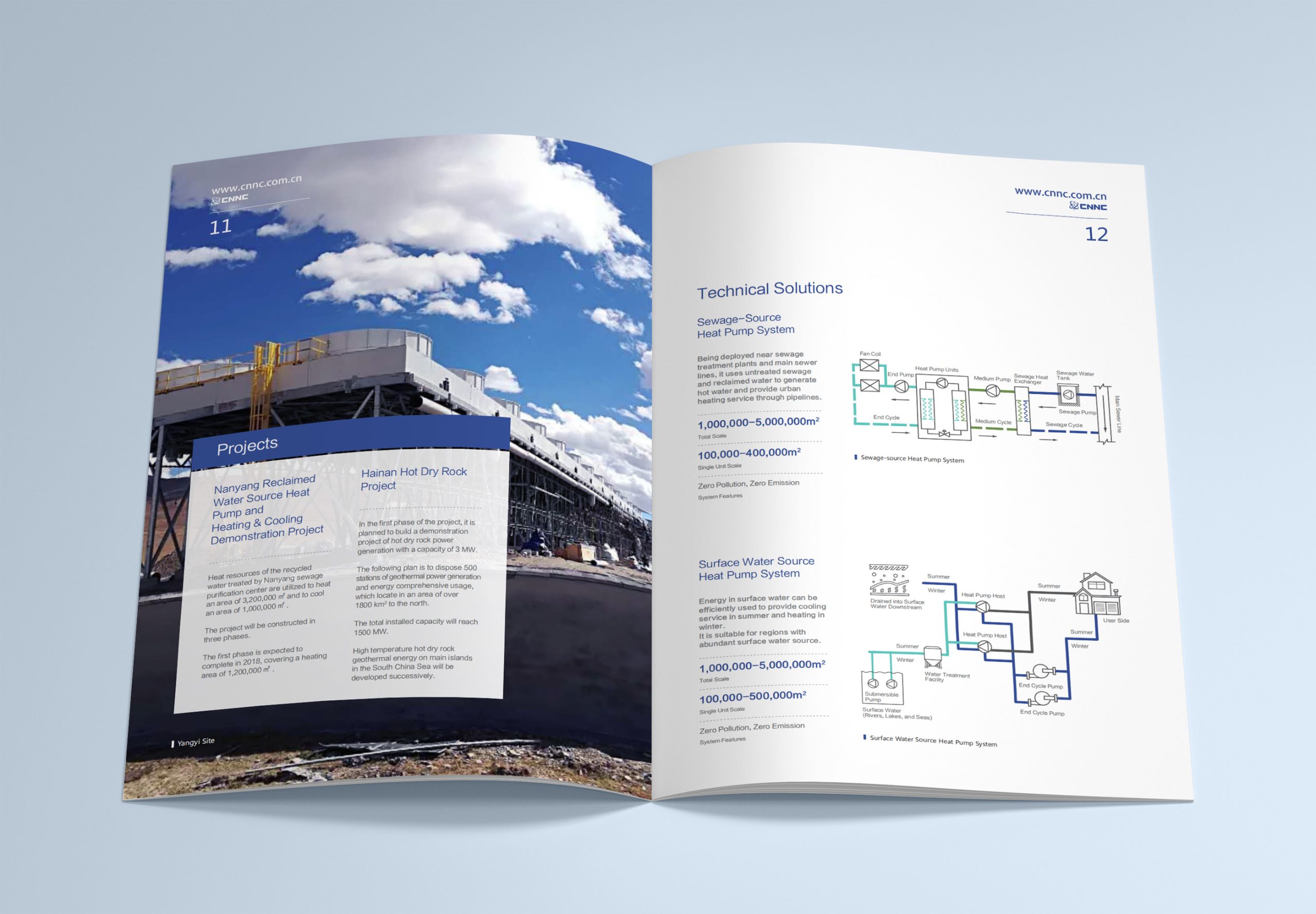
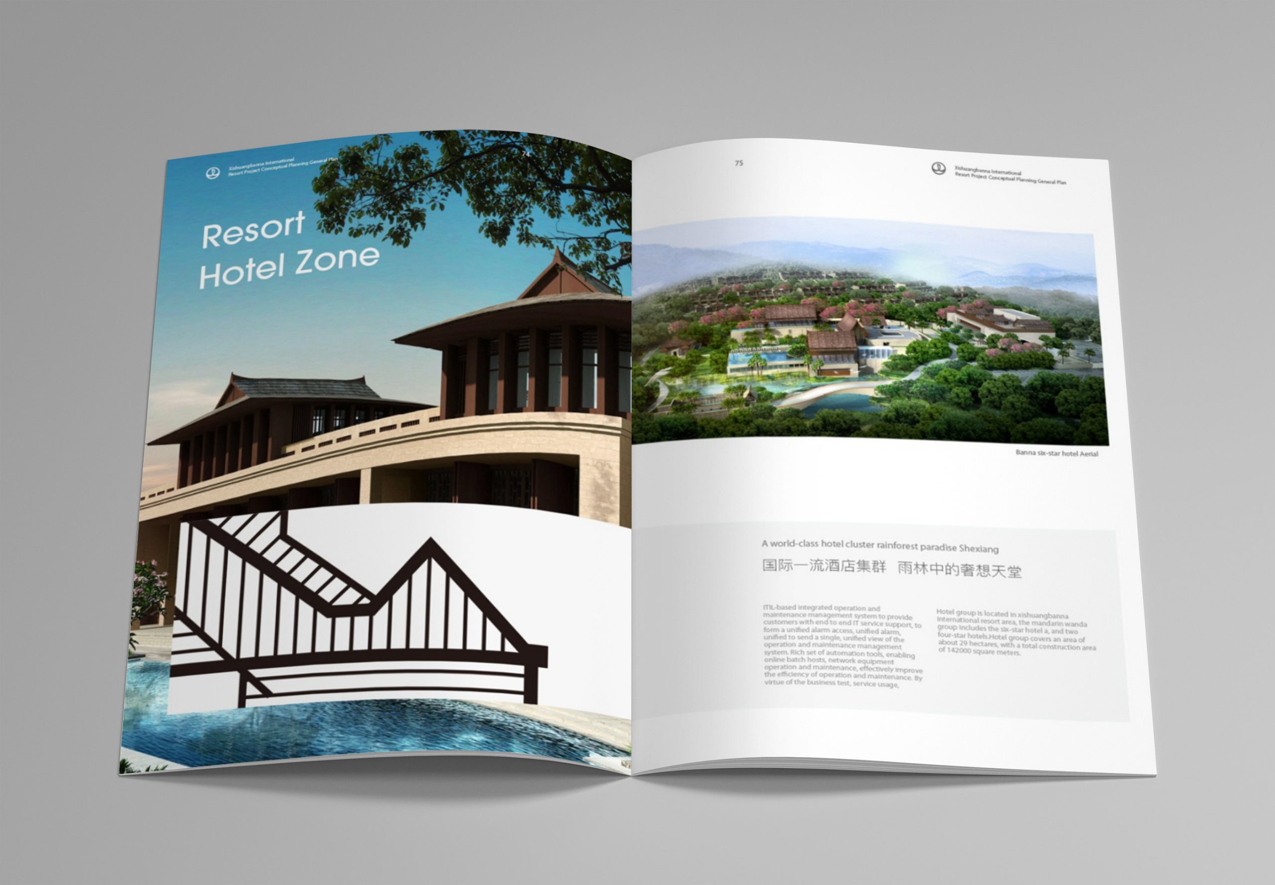
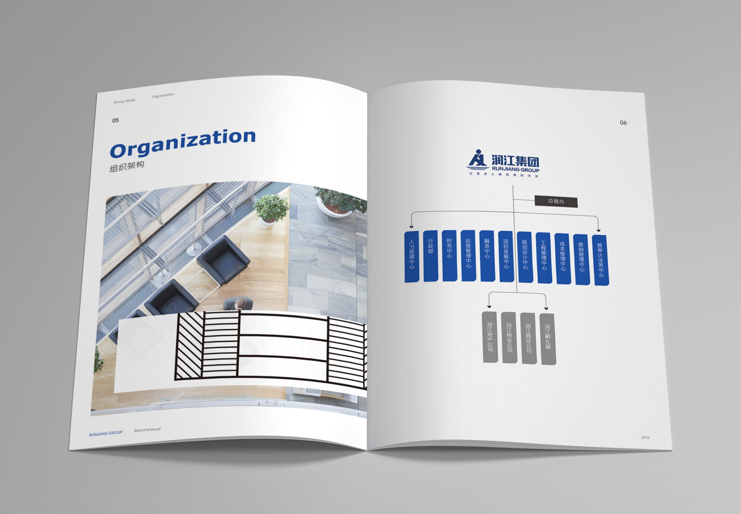
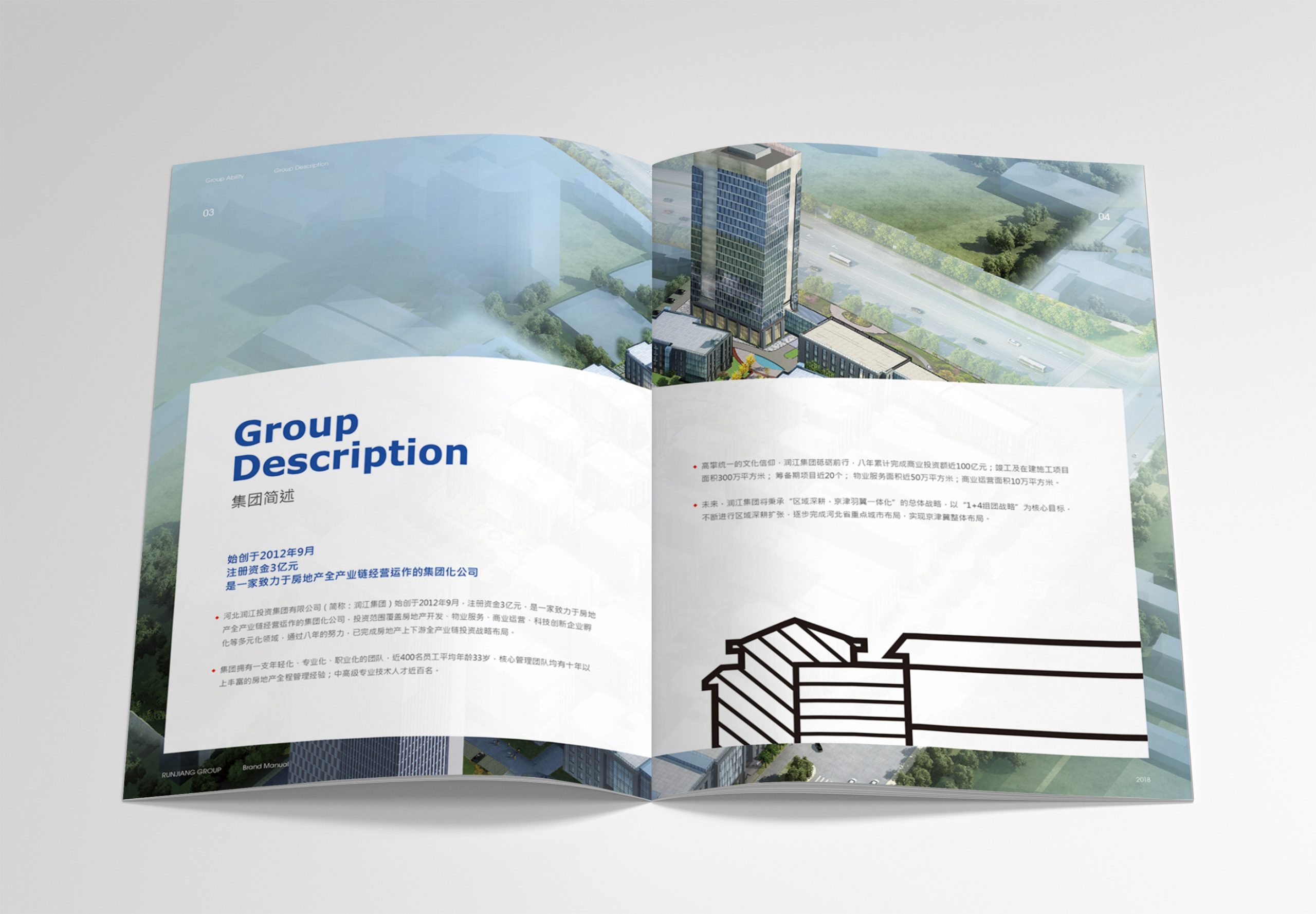
The entire brochure is grounded in “architectural thinking.” The cover uses a minimal linear composition that echoes the proportional order of a building façade, and the title area reinforces that order with monoline type and finely divided blocks. Inside, a 12-column grid governs the layout, with information on the left and visuals on the right. Charts, modules and information blocks present corporate data, project achievements and strategic footprint. Photography adopts an architectural perspective, emphasizing the interplay of light, shadow and structure. Carefully calibrated proportions between imagery and white space give the brochure an architectural rhythm and breath. For print, matte coated paper and a light gray ground pattern are finished with spot UV, keeping tactile and visual qualities in consistent, restrained harmony.
Achievements and Impact
The brochure has become a key brand communication tool for Runjiang Real Estate, widely used in corporate presentations, investment partnerships and exhibitions. Its “rational, clear, international and modern” visual system successfully reshaped the brand image, moving Runjiang away from conventional property storytelling and toward a corporate expression with a more contemporary character. Beyond showcasing the company’s strength, the brochure signals its embrace of modern design and structured thinking.