










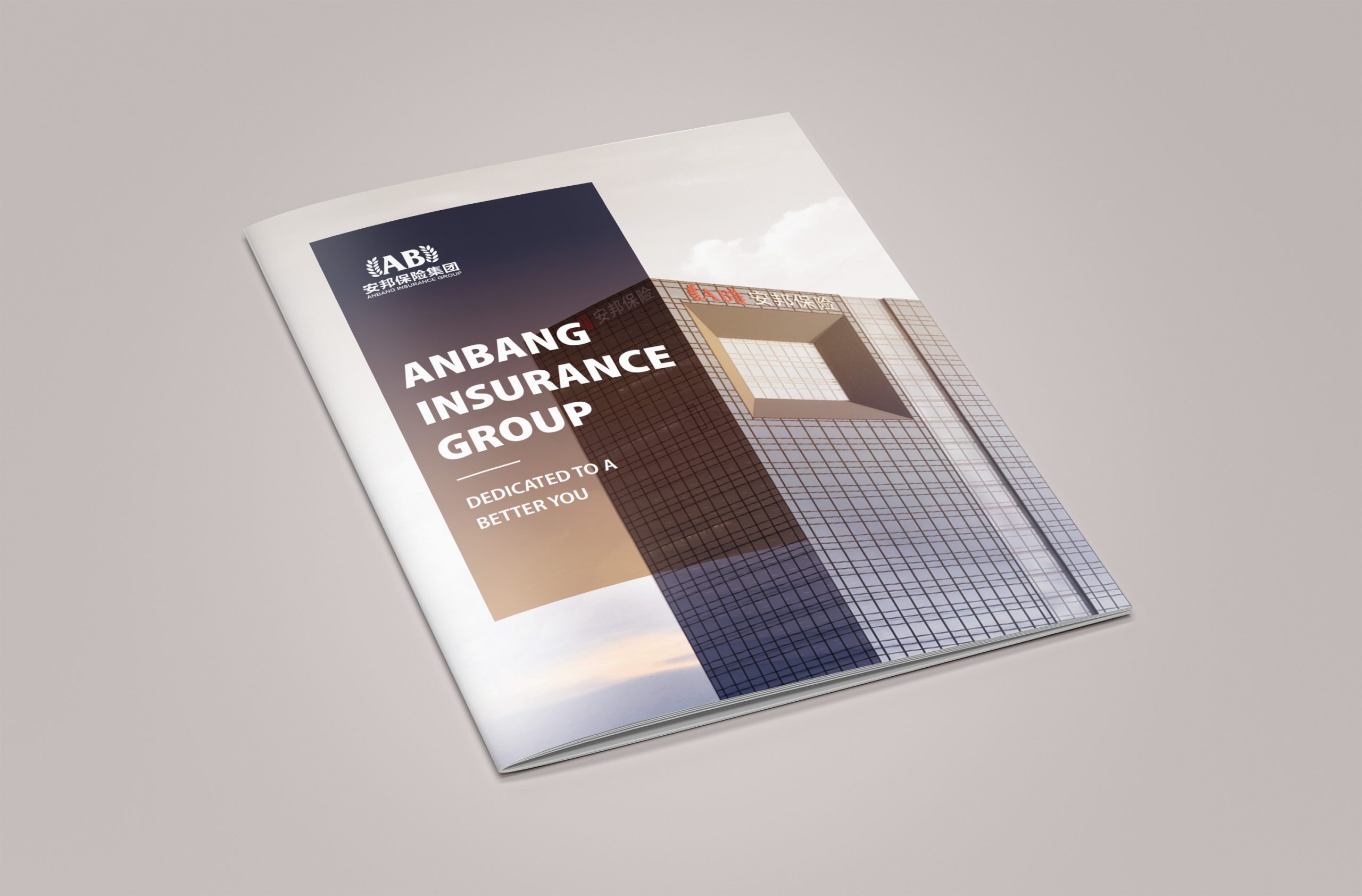
We created a data-driven corporate brochure system for Anbang Financial Group. Its core task was to showcase the Group’s expertise in financial services, asset management and global investment through an international visual language.
Guided by the core concept of “the ordered expression of data,” the design visualizes financial logic. Precise control of structure and proportion reflects Anbang’s systemic thinking and macro perspective as a major financial group.
Gold anchors the visual language as a symbol of stability, authority and value. Paired with dark grounds and rational compositions, it conveys the brand’s strategic stature and financial strength.
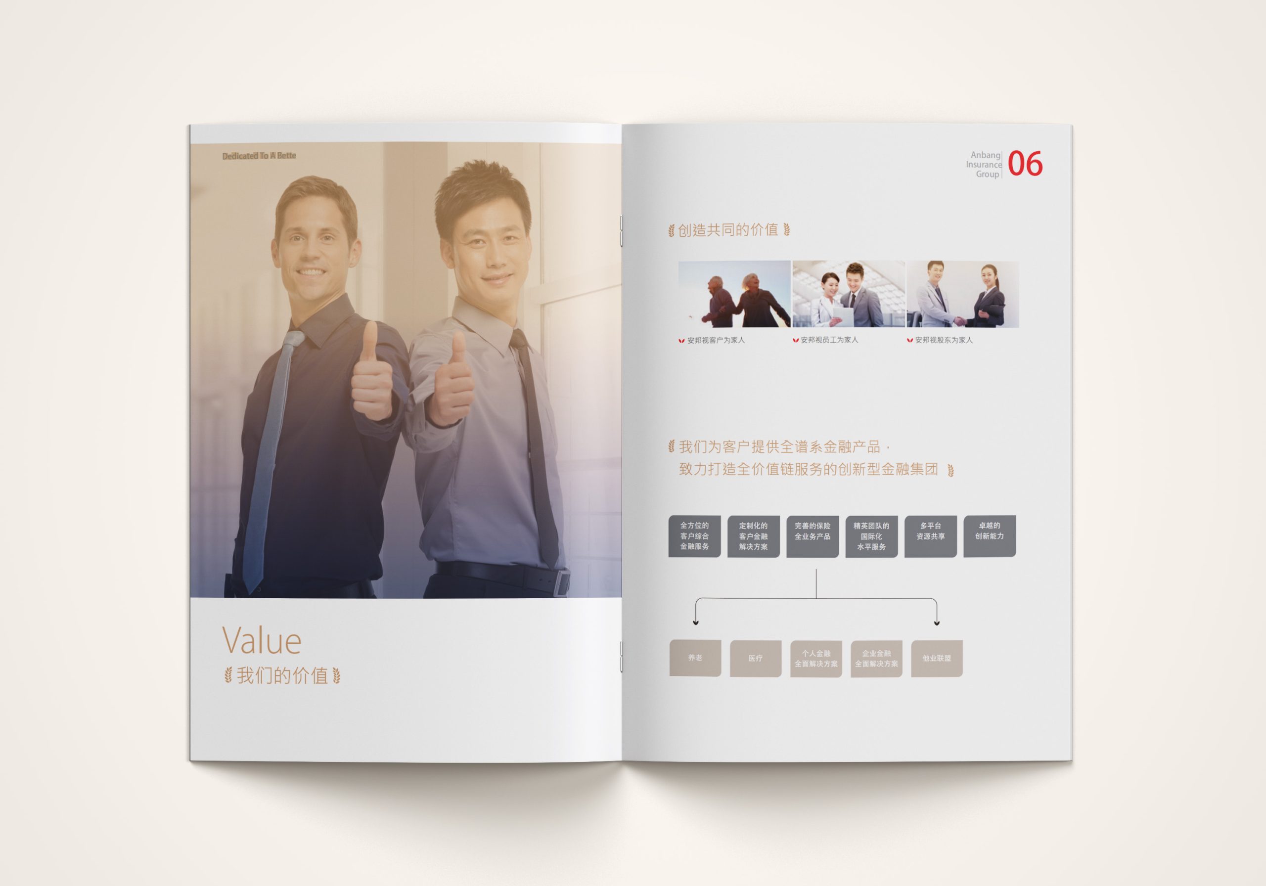
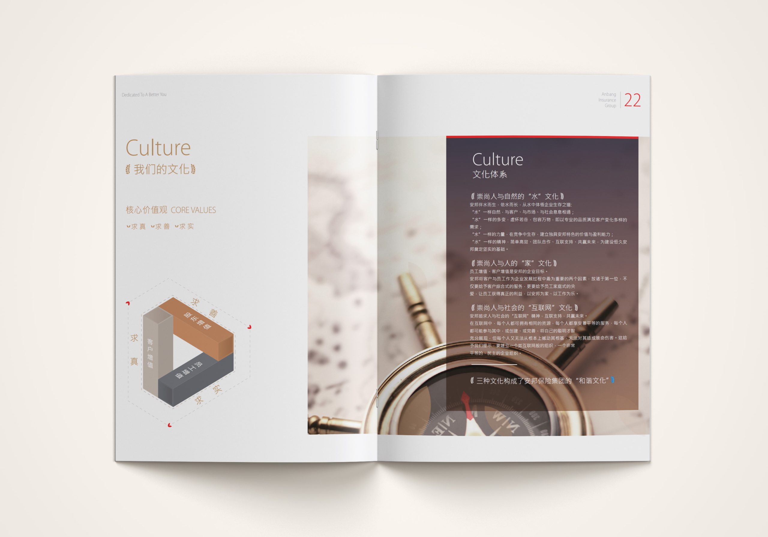
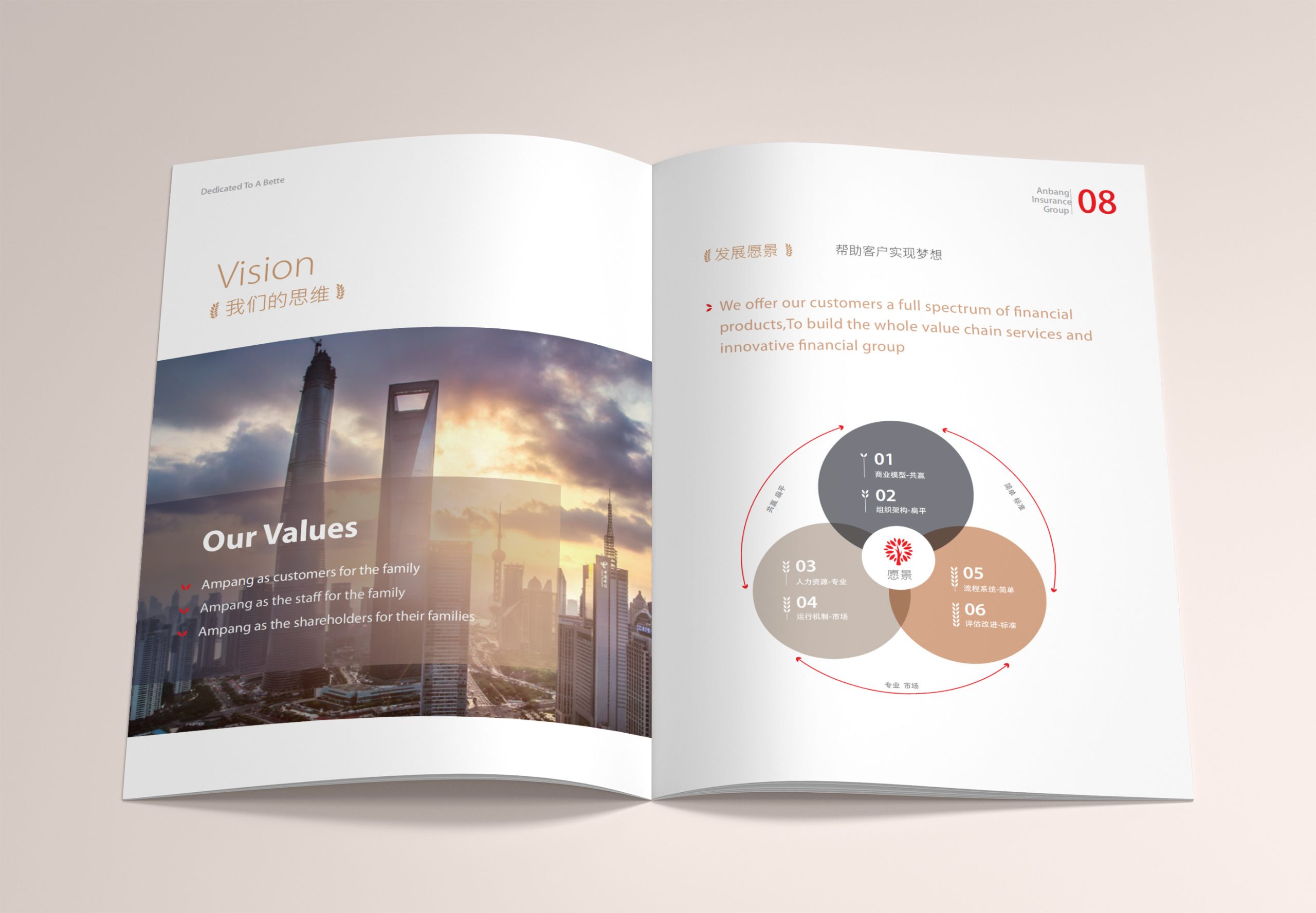
design challenge
The financial sector is information-dense, and its content is deeply layered. The project’s main challenge was to present the structured logic of a financial system clearly within a limited number of pages, while making the data both readable and visually ordered.
As an international enterprise, Anbang also held exceptionally high standards for the brochure’s aesthetics and expression. It had to convey the professional depth of the data while keeping the visual language concise and restrained. It had to match the character of international financial brands while preserving the company’s own cultural identity. And structure, proportion, white space and color had to work together to create a cohesive sense of “financial rationality.”
Strategy and philosophy
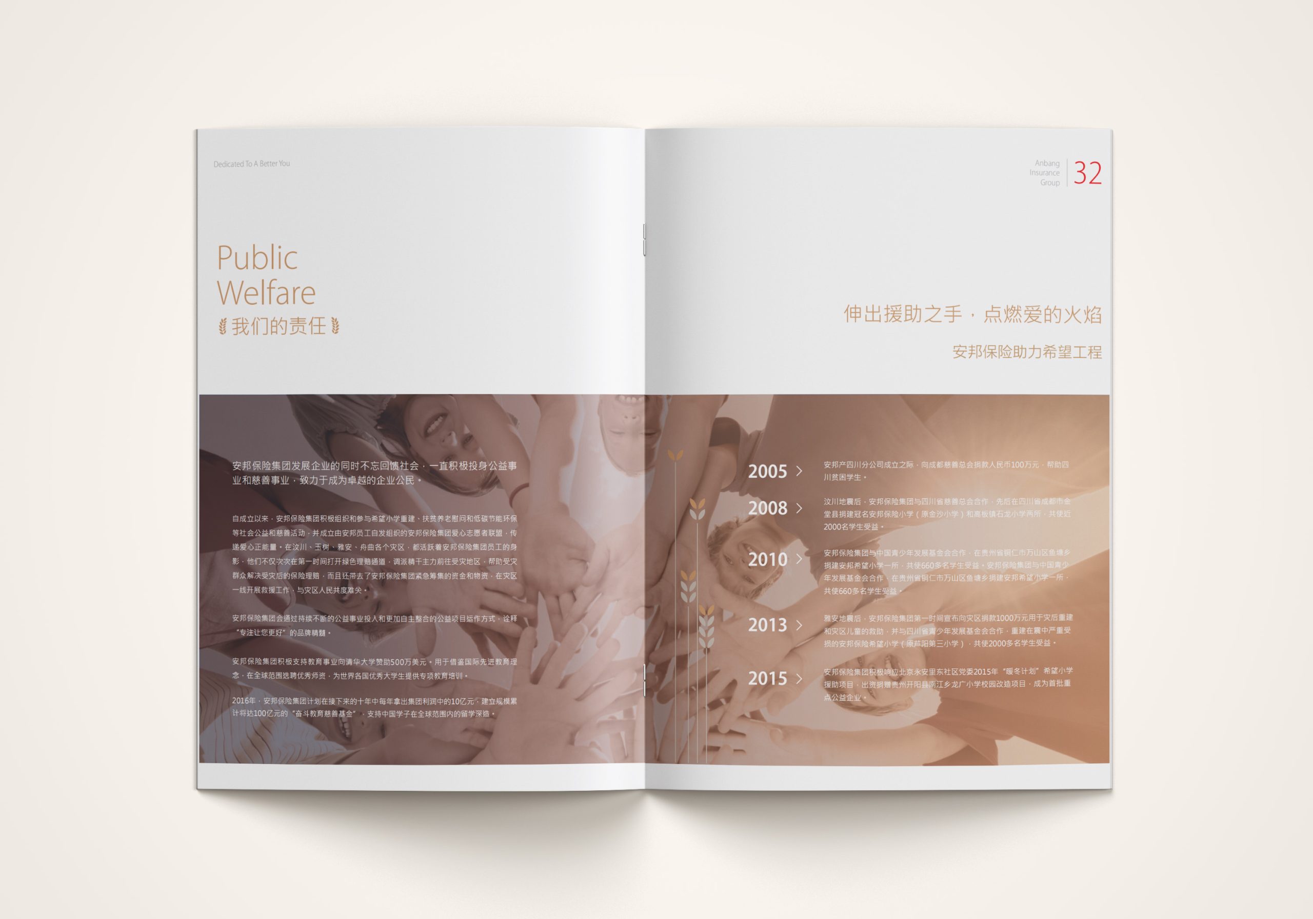
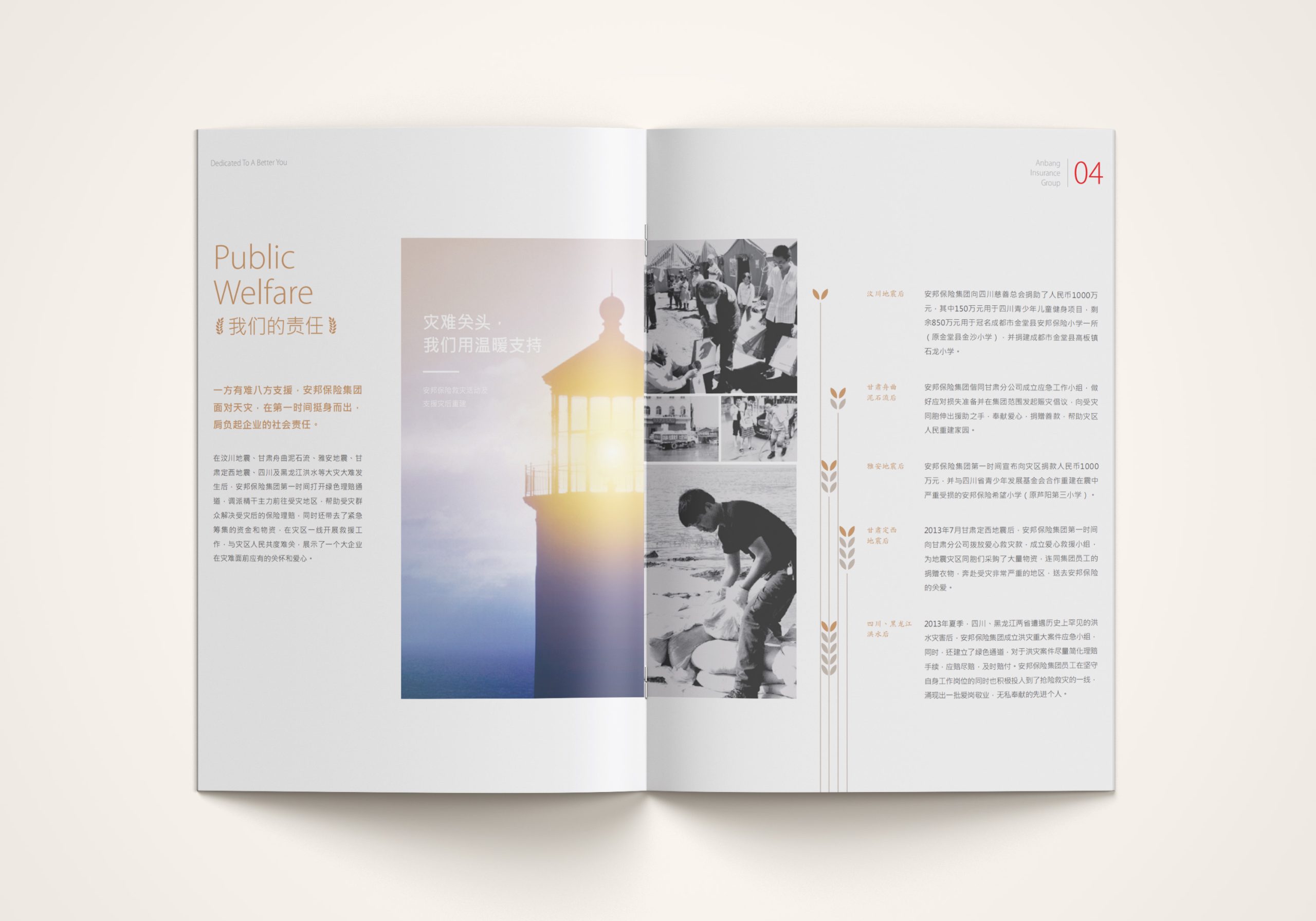
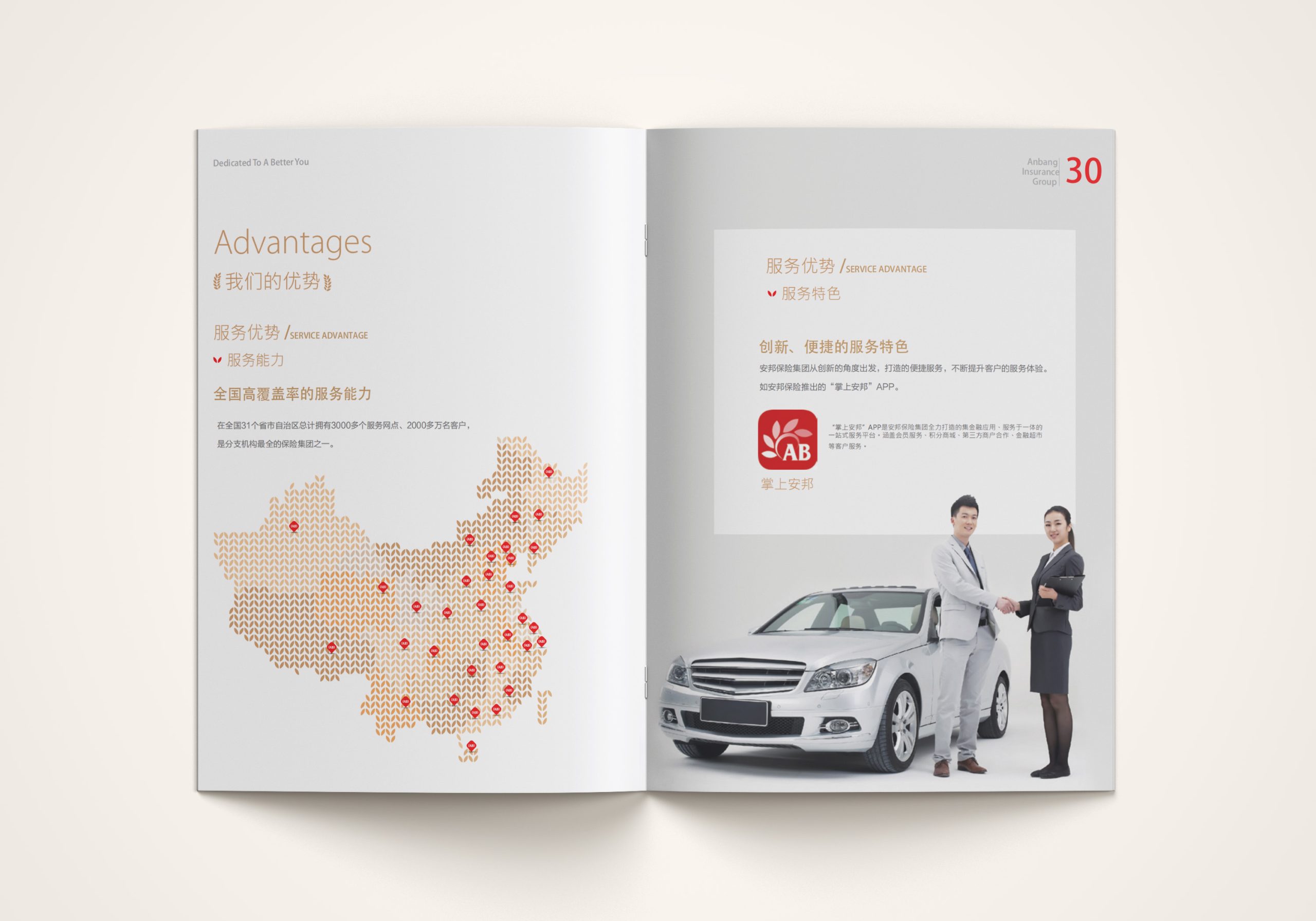
The brochure is built on the core concept of “building order through data.” Starting from the structural characteristics of the financial system, we developed a visual method of expression. Structural logic: a grid-based layout system lets data, charts and text operate under a single logic. Infographic system: minimal linear charts and geometric proportions form a visual language for finance. Color strategy: gold for value and authority, deep blue for rationality and trust, and gray and white to balance space. Visual rhythm: generous white space and precise linework create a visual presence befitting the Group’s stature. The overall concept centers on calm, precision and international polish, conveying the intellectual strength of a financial institution.
Design presentation
The content follows a five-tier structure: “Group Overview, Financial Footprint, Investment Portfolio, Data & Charts, Future Strategy.” Cover: contrasting metallic gold and matte black materials with an embossed logo, symbolizing the “golden thread of financial order.” Interior: a 12-column grid governs text and data, ensuring consistent order and proportion on every page. Chart language: all financial data is rendered in flat, geometric form, with uniform line weights and proportions establishing a visual standard. Materials and finishing: heavyweight silk-finish paper with spot UV and metallic inks lends the reading experience tactile depth. Visual tone: an international financial aesthetic of “authority within rationality, power within restraint.”
Achievements and Impact
The brochure has become a key visual vehicle for Anbang Group's external communications, used widely in investor relations, brand promotion and international forums. Through a rigorous data structure and a unified visual system, the project translates the company's professional strength into a visual language of finance. The design makes complex data logic intuitive and gives tangible form to the brand's authority. More than a publication, it is a visual statement of corporate stature and financial trust.