










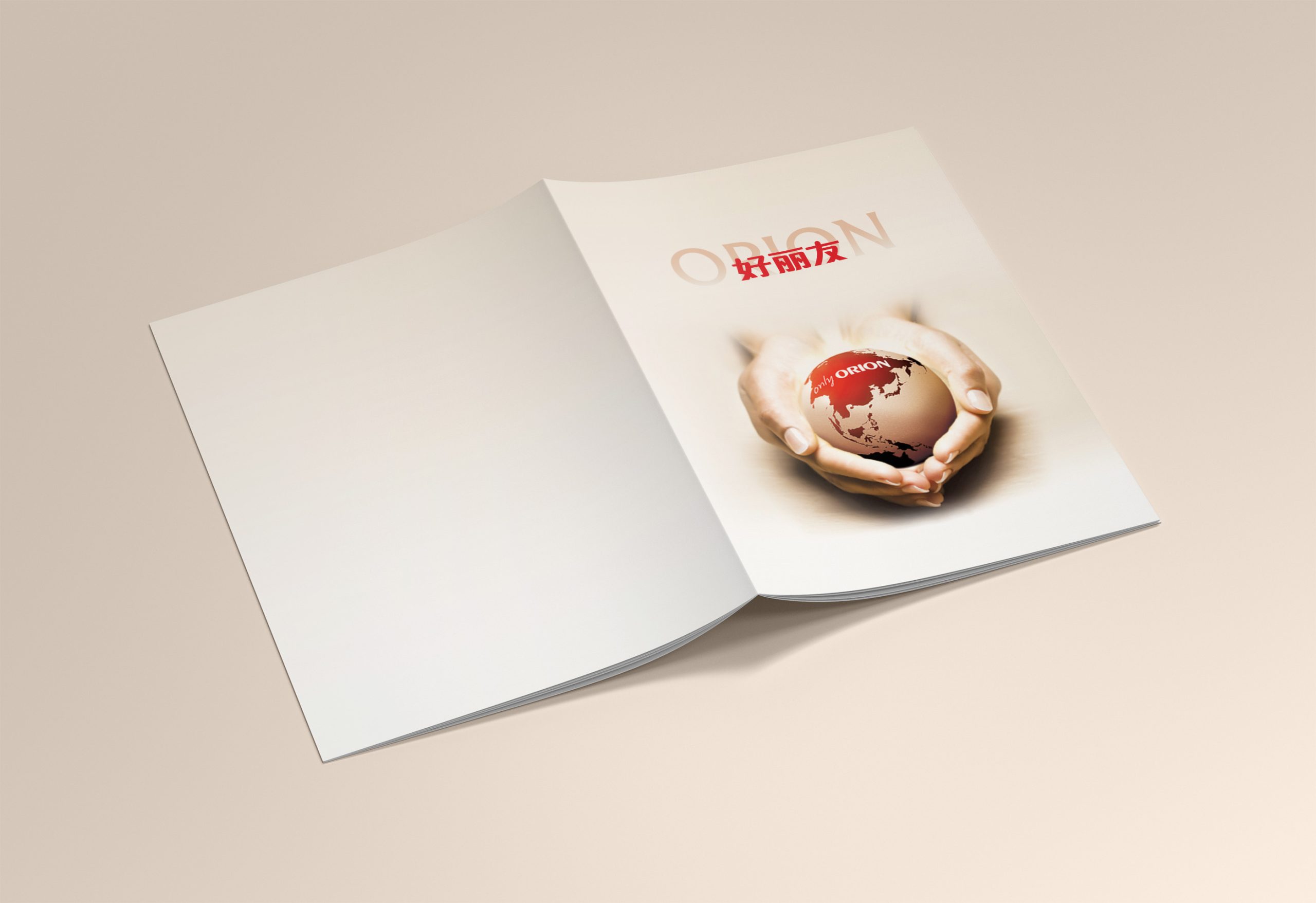
An annual report designed for an international partner, presenting the brand's journey in China and its plans for the future through visual language.
The core goal was to portray the company's growth in the local context through a clean structure and a warm, refined sensibility, while maintaining the rationality and premium feel the international brand is known for.
The project balances quality, warmth, and global sensibility, transforming the annual report into the most humanistic chapter of the brand's global identity system.
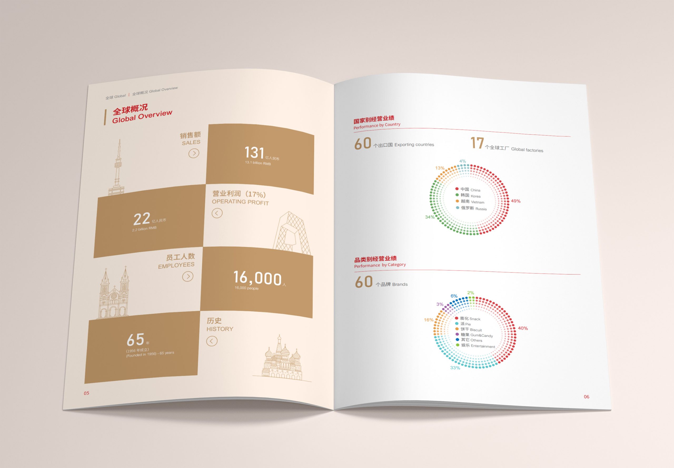
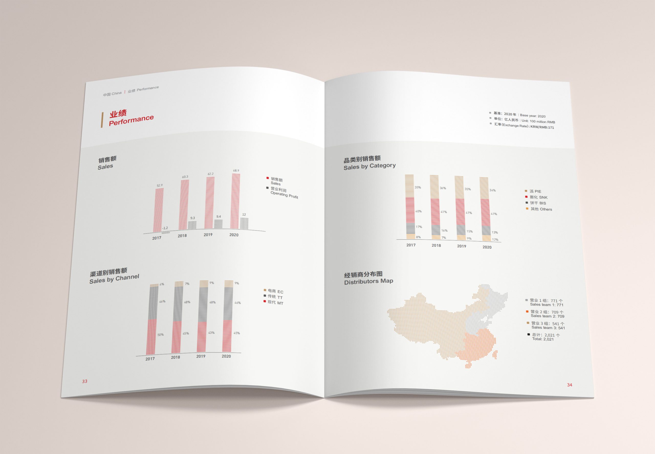
design challenge
The central design challenge: how to convey organizational culture and a sense of place within a highly data-driven annual report.
We needed to balance several dimensions: expressing a Chinese narrative through international visual standards; finding the right threshold between clarity and warmth; and preserving space for artistry while maintaining information legibility and systematic data visualization.
The report must deliver information with precision while extending the brand story—a task that demands rigorous control of structure, pacing, and color.
Strategy and philosophy
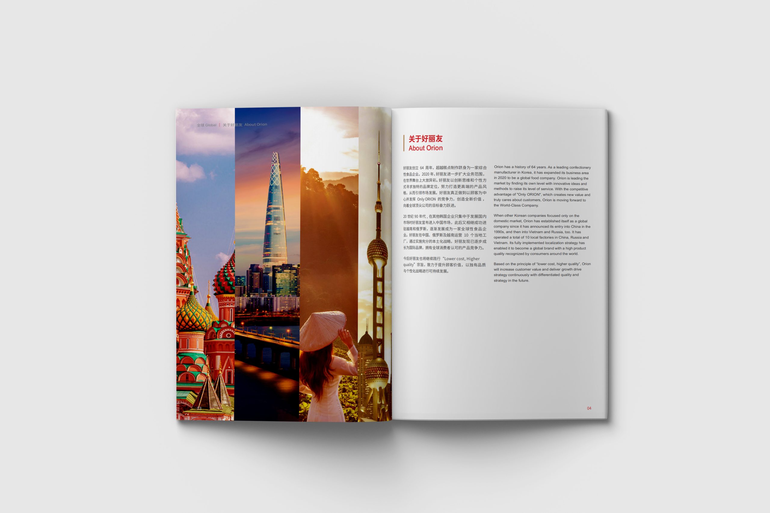
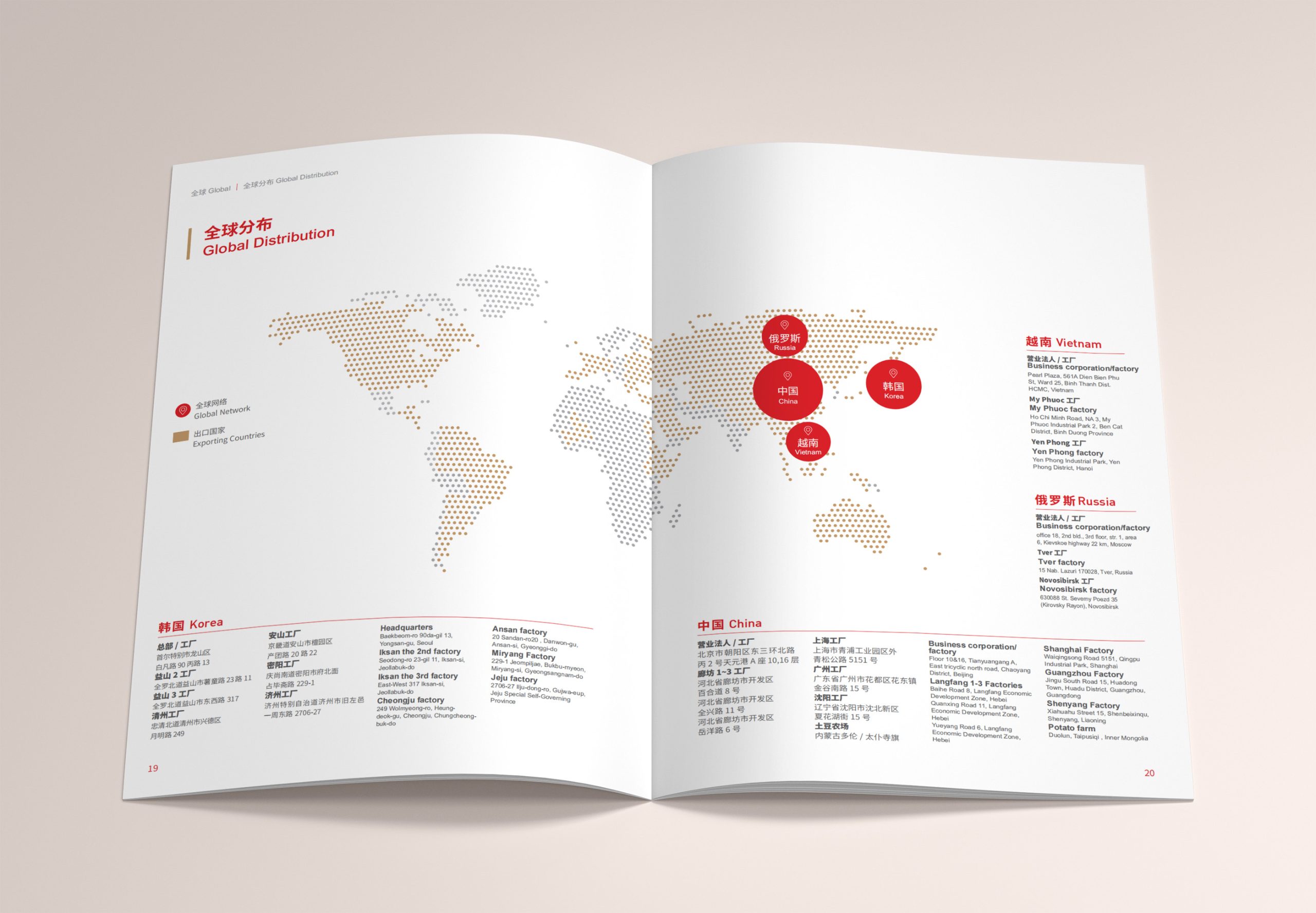
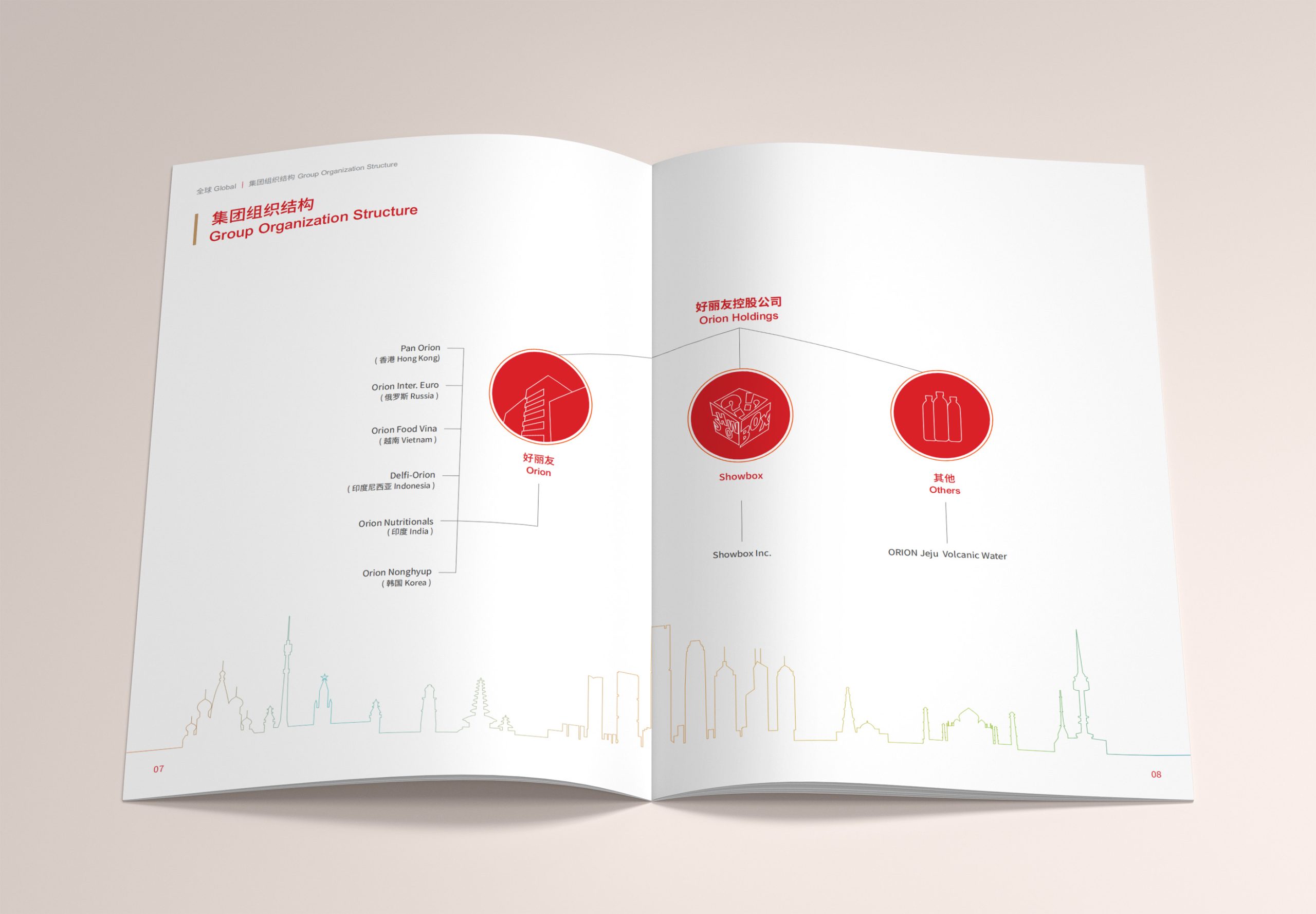
The project is rooted in the concept of 'co-constructing rationality and warmth.' The design language fuses the structural logic of international modernism with the subtlety of Eastern sensibility: Visual logic—clean lines and generous white space establish reading hierarchy and clarity; Color strategy—gold, red, and gradient accents symbolize the brand's global vitality and the diversity of the Chinese market; Data visualization—minimalist geometric forms structure information, reinforcing professionalism and order; Human warmth—photography and illustrative graphics balance information density, giving the report narrative rhythm. The overarching strategy: let data speak while making the brand felt.
Design presentation
Structural system: A modular chapter structure segments brand strategy, market data, and social responsibility; Visual rhythm: expansive white space paired with linear dividers creates clear reading guidance; Graphic language: flowing lines, geometric forms, and gradients form an abstract symbol of global connectivity; Color and materials: gold signifies trust and quality, red conveys Chinese warmth, and multicolor forms express brand vitality and inclusiveness; Print craft: heavyweight matte paper with metallic foil stamping and soft-touch lamination creates restrained luster and premium tactility. The overall visual expression carries both financial gravitas and a 'locally rooted, globally minded' character.
Achievements and Impact
Following its global release, the annual report became a key medium for showcasing the brand's achievements in China. The design—international in structure, local in warmth—successfully established a new visual signature within the brand's global context. More than an information vehicle, it extends brand spirit and cultural resonance. Through the balance of reason and emotion, the project demonstrates the brand's confidence and openness.