










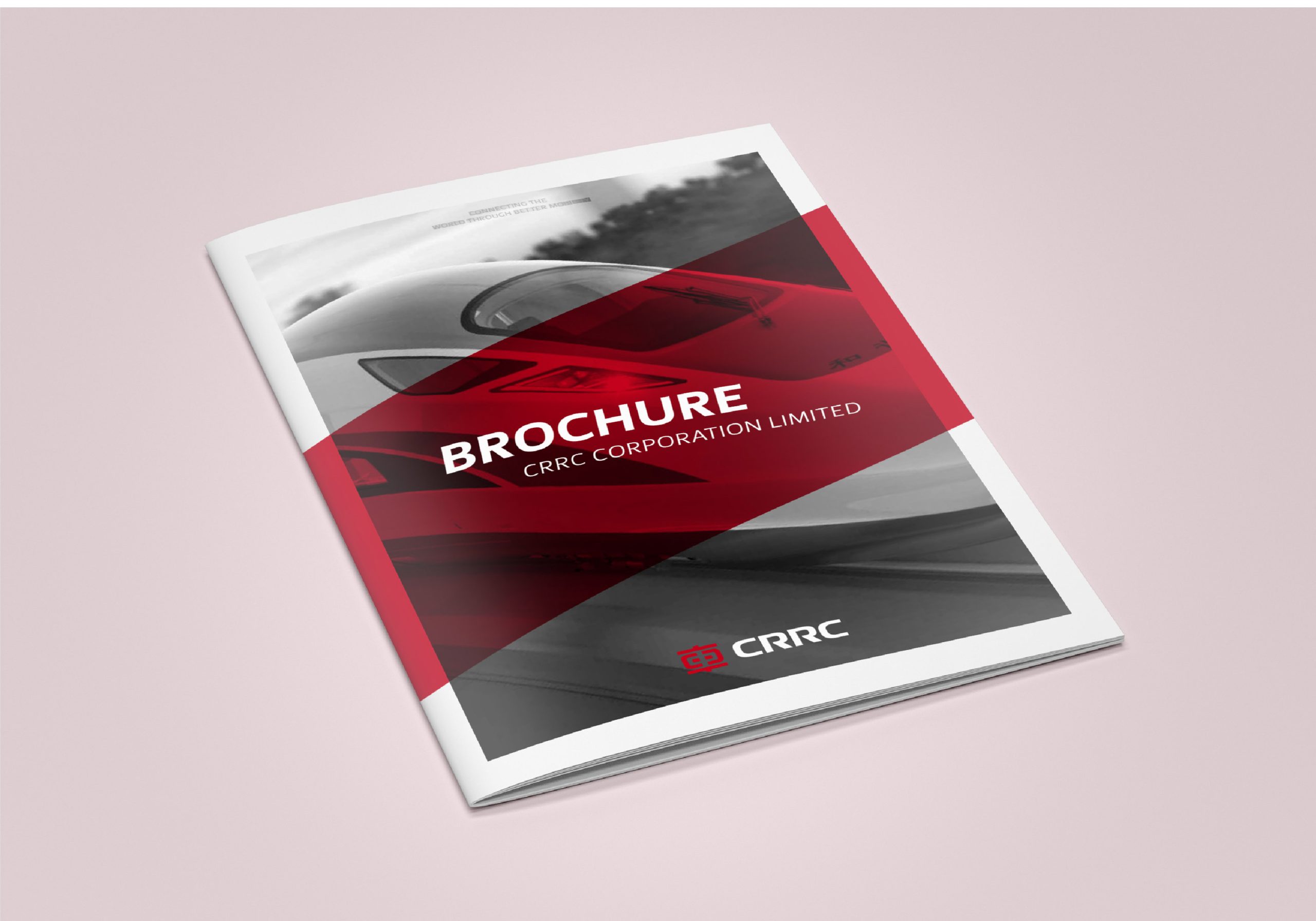
This project creates a brand book system for China Railway Rolling Stock Corporation (CRRC) targeting overseas markets.
The design objective: to convey the enterprise's integrated, end-to-end solution capabilities in rail transit through clear structure and internationalized visual language.
The project employs 'infographic information architecture + rational systematic design' to transform CRRC from an 'equipment manufacturer' into a 'global transportation system solutions provider,' reinforcing its professionalism, safety, and comprehensive strength.
design challenge
In international market brand communications, CRRC faces multidimensional communication challenges: overseas clients hold narrow perceptions of Chinese manufacturing, creating urgent need to establish a 'systematic, professional, safe, credible' brand impression; content spans transportation equipment, technical services, and system engineering across multiple tiers with complex information architecture; the project must simultaneously accommodate international standards, cross-cultural reading habits, and visual unity. The project's challenge: how to translate massive data and system logic into concise, credible, sophisticated visual narrative.
Strategy and philosophy
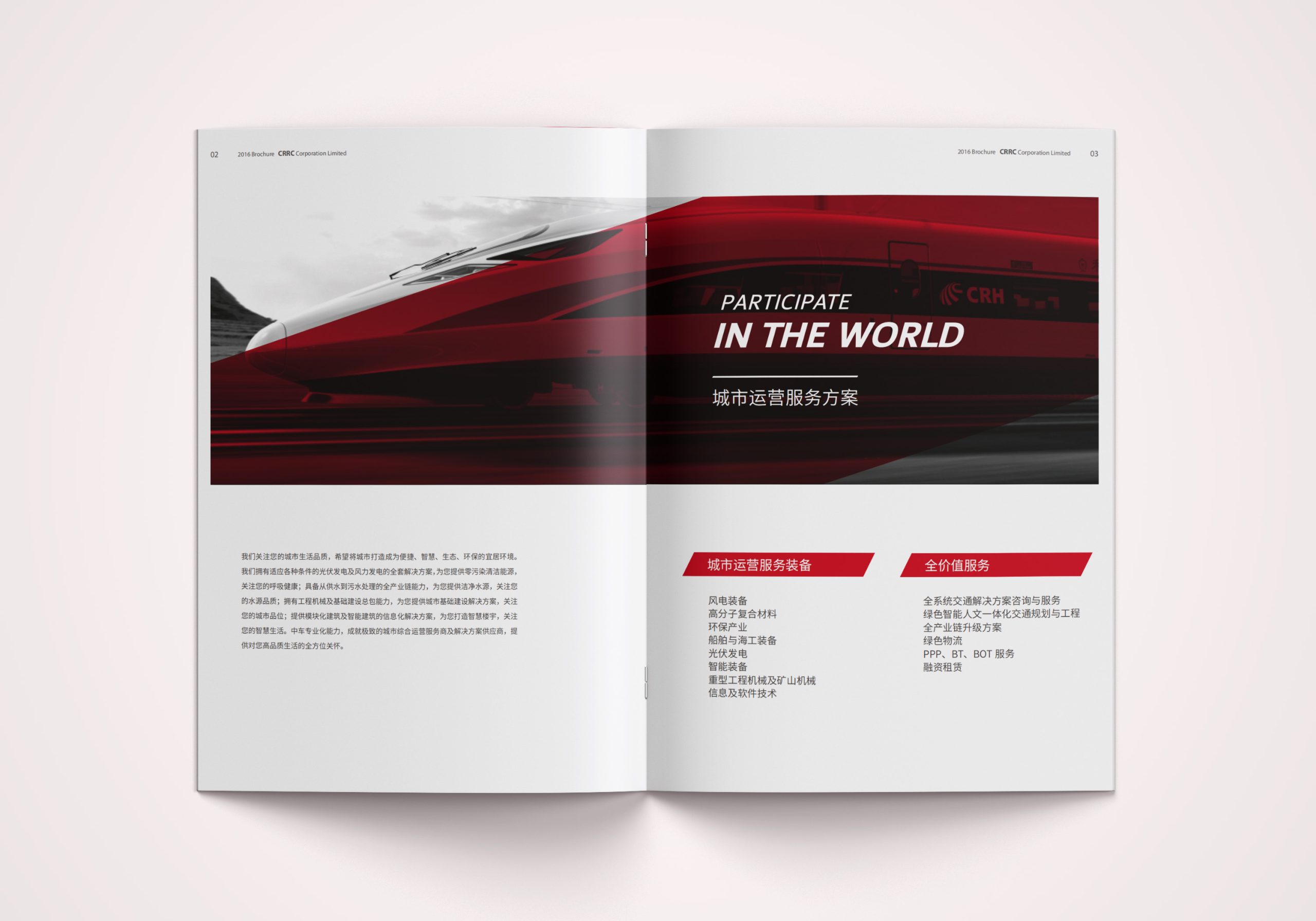
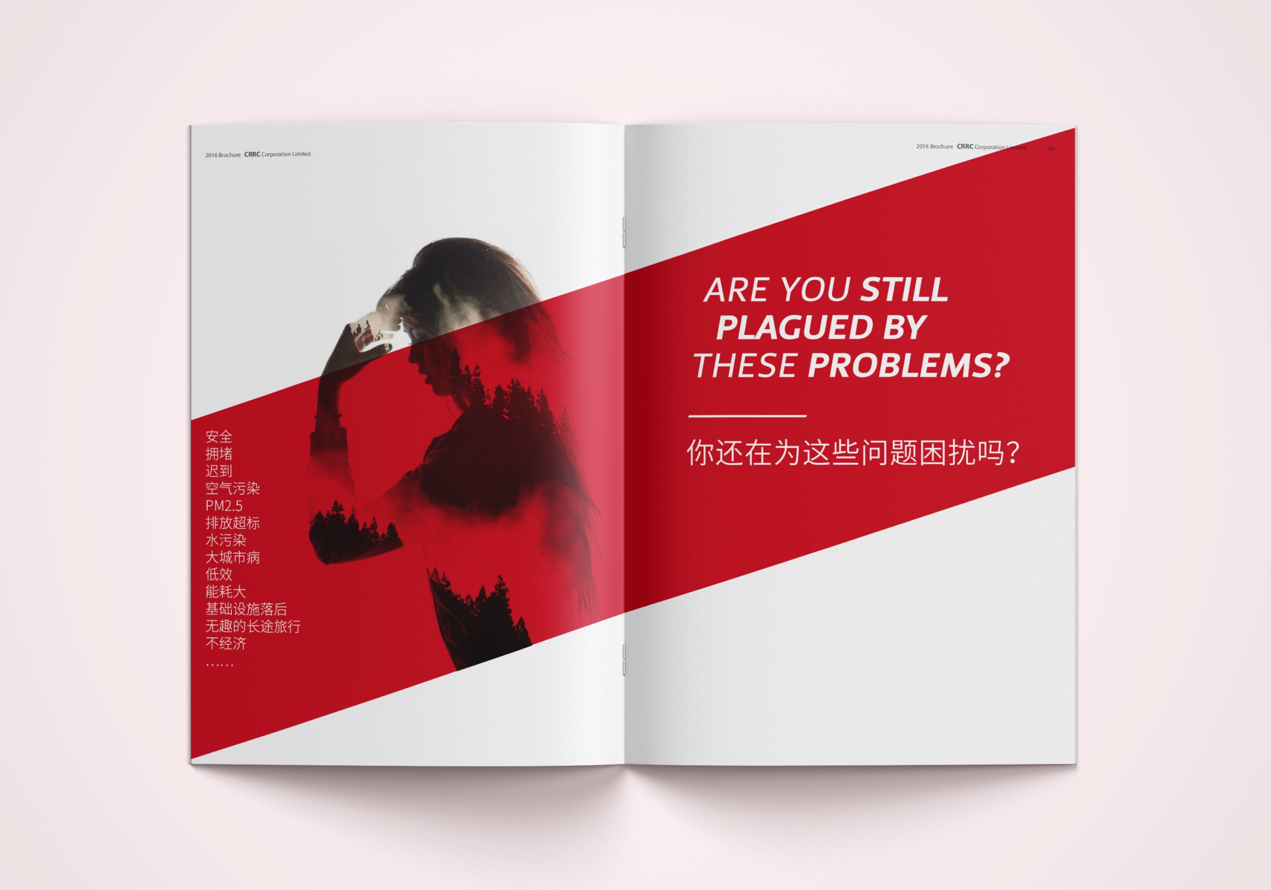
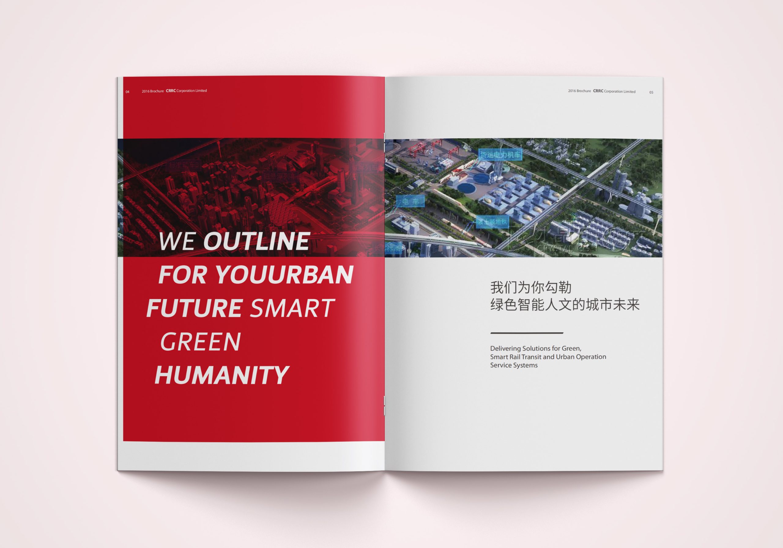
The project is rooted in the design concept 'Form of Systems, Intelligence of the Global.' We construct CRRC's international brand expression framework through infographic visual language and modular layout systems: Structural logic: systems thinking reorganizes content structure, presenting technology, products, and solutions in logical hierarchy; Visual language: introduces 'Infographic Design' methodology, using geometric lines, network nodes, and data visualization to express complex relationships; Color system: CRRC brand red as core identifier, complemented by deep gray and silver blue to create a visual presence balancing composure with power; International tone: generous white space, grid alignment, and modular distribution establish rational, high-trust reading experience. The overarching strategy: make design the proof of professionalism, not decoration.
Design presentation
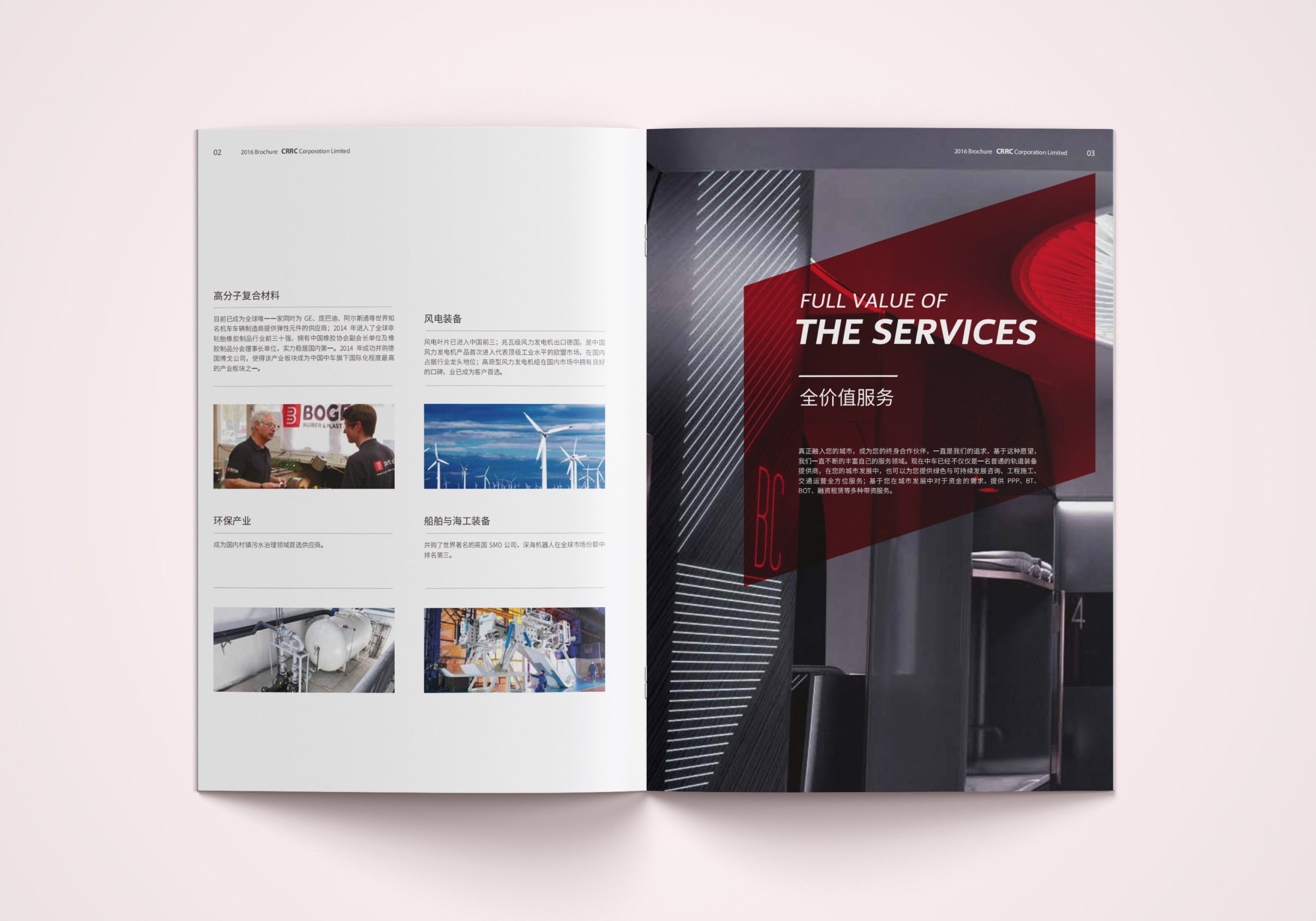
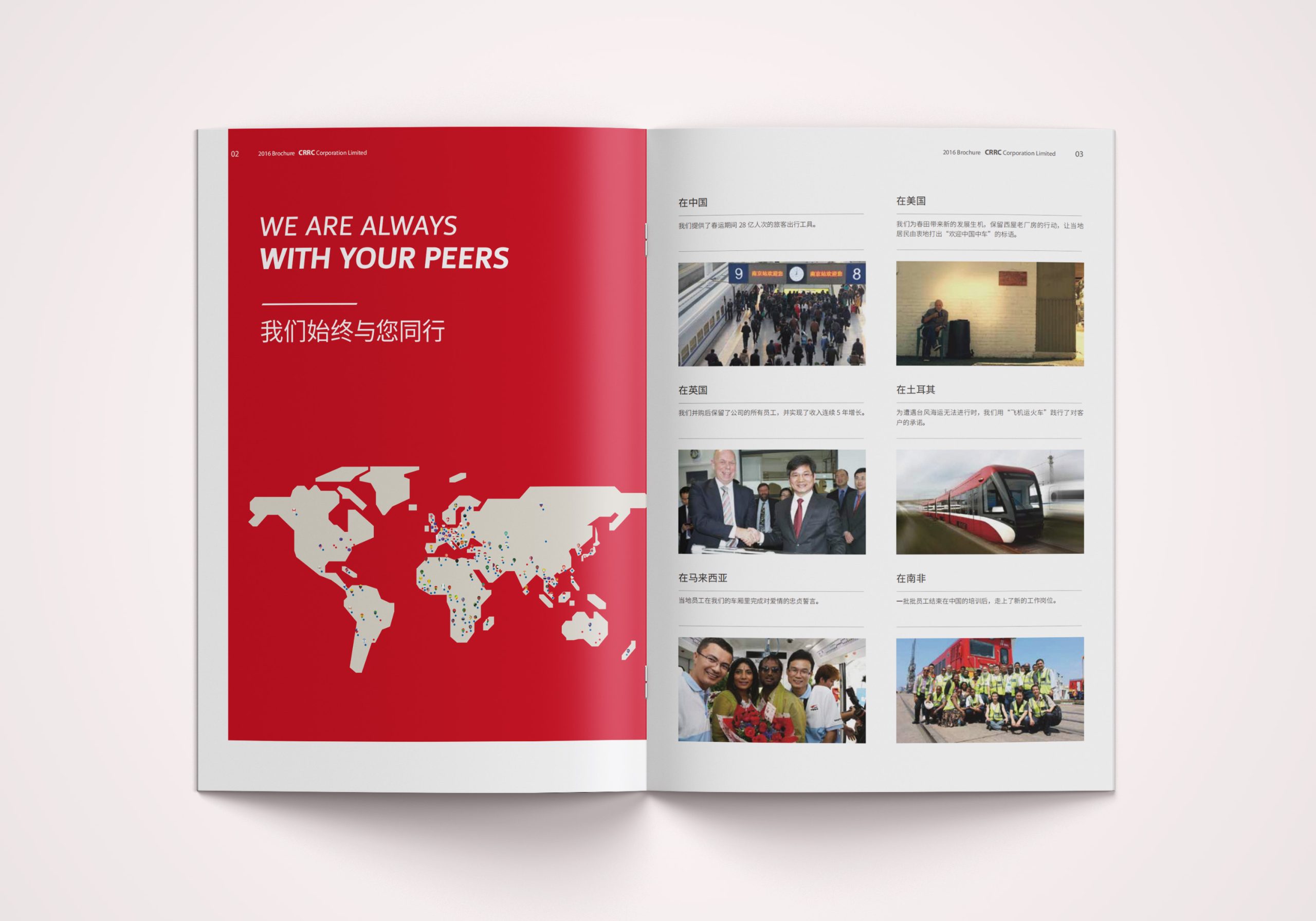
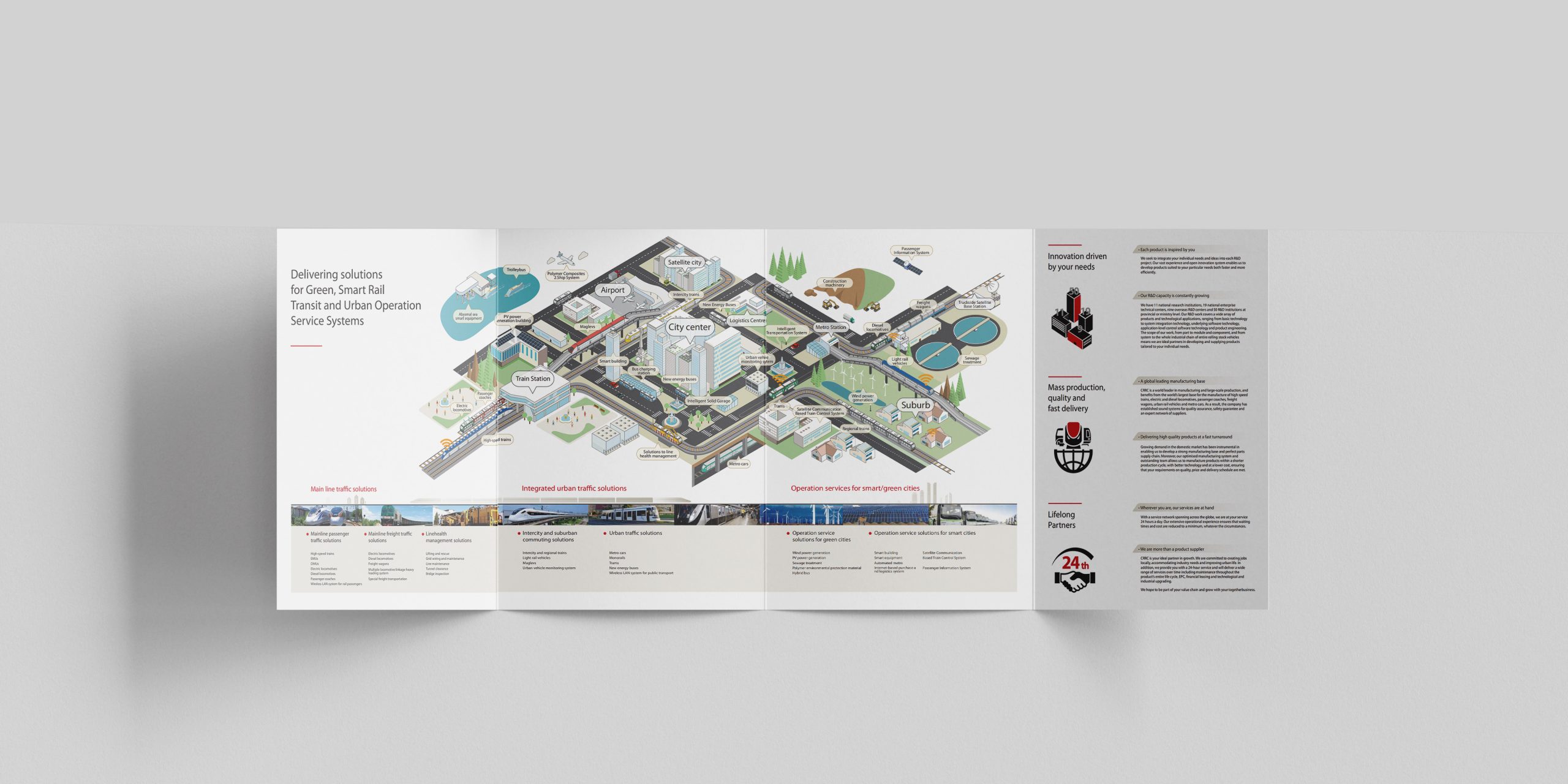
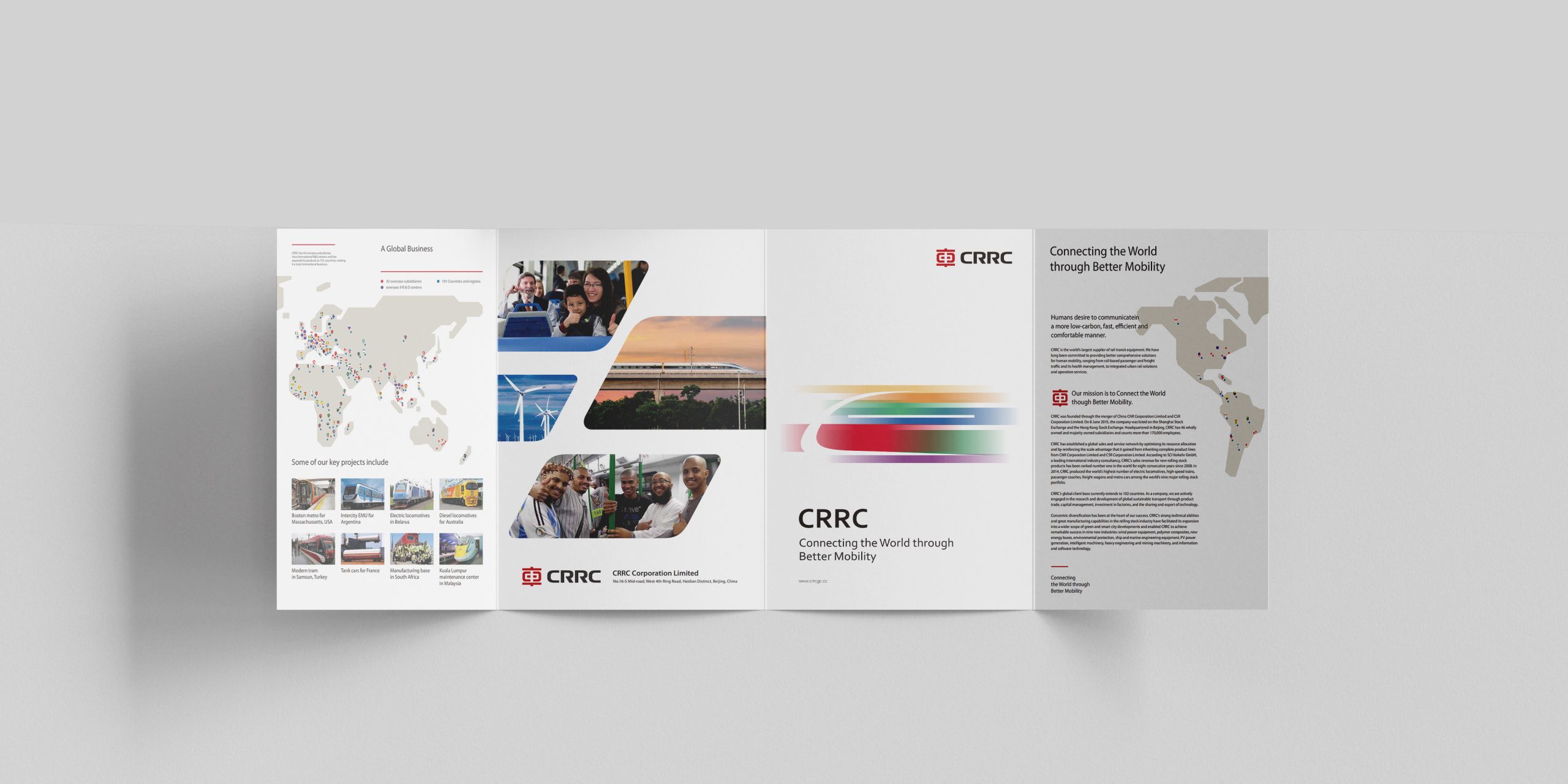
Cover: layered geometric composition with red lines symbolizing track and connectivity, silver foil lines reinforcing technical precision; Interior structure: 12-column grid system organizes information, unifying data, diagrams, schematics, and text within a single visual logic; Infographic system: core use of graphic language to present transportation systems, route networks, equipment modules, and service loops, demonstrating systems thinking and visual depth; Layout rhythm: white space and alignment clarify information hierarchy with reading rhythm meeting international publishing standards; Materials and craft: cover with fine matte lamination + selective UV, interior pages using heavyweight matte paper ensure crisp rendering of diagram lines and text. The overall design balances rational technological sensibility with stable corporate character, projecting the brand's internationalized professional image.
Achievements and Impact
The book became a core communications tool for CRRC in external presentations, international exhibitions, and business negotiations. Through infographic visual language and international layout systems, CRRC's brand image successfully shifted from 'product-oriented' to 'system solutions-oriented.' The project not only elevated brand recognition but established a trustworthy Chinese brand image in the minds of overseas clients.