










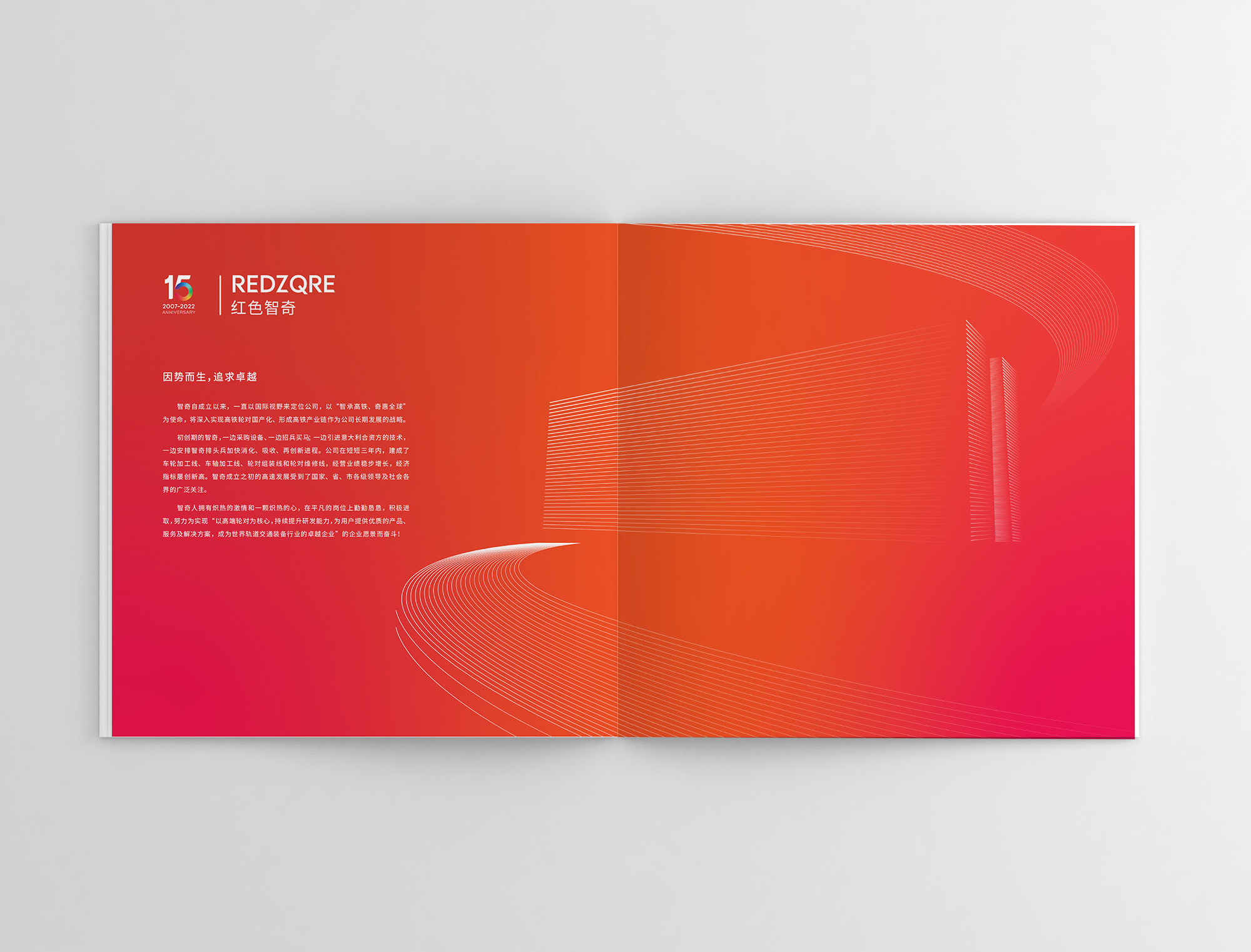
This project creates a commemorative book and annual report design for the group's twentieth anniversary.
The book not only traces twenty years of enterprise development but adopts 'Seven Colors, Infinite Wonder' as its theme, symbolizing diverse creativity and sustained growth as the brand's defining spirit.
The design centers on a 'square memorial system' as its visual core, using rational geometric language to express ceremonial remembrance, and color and structure to convey the brand's vital energy.
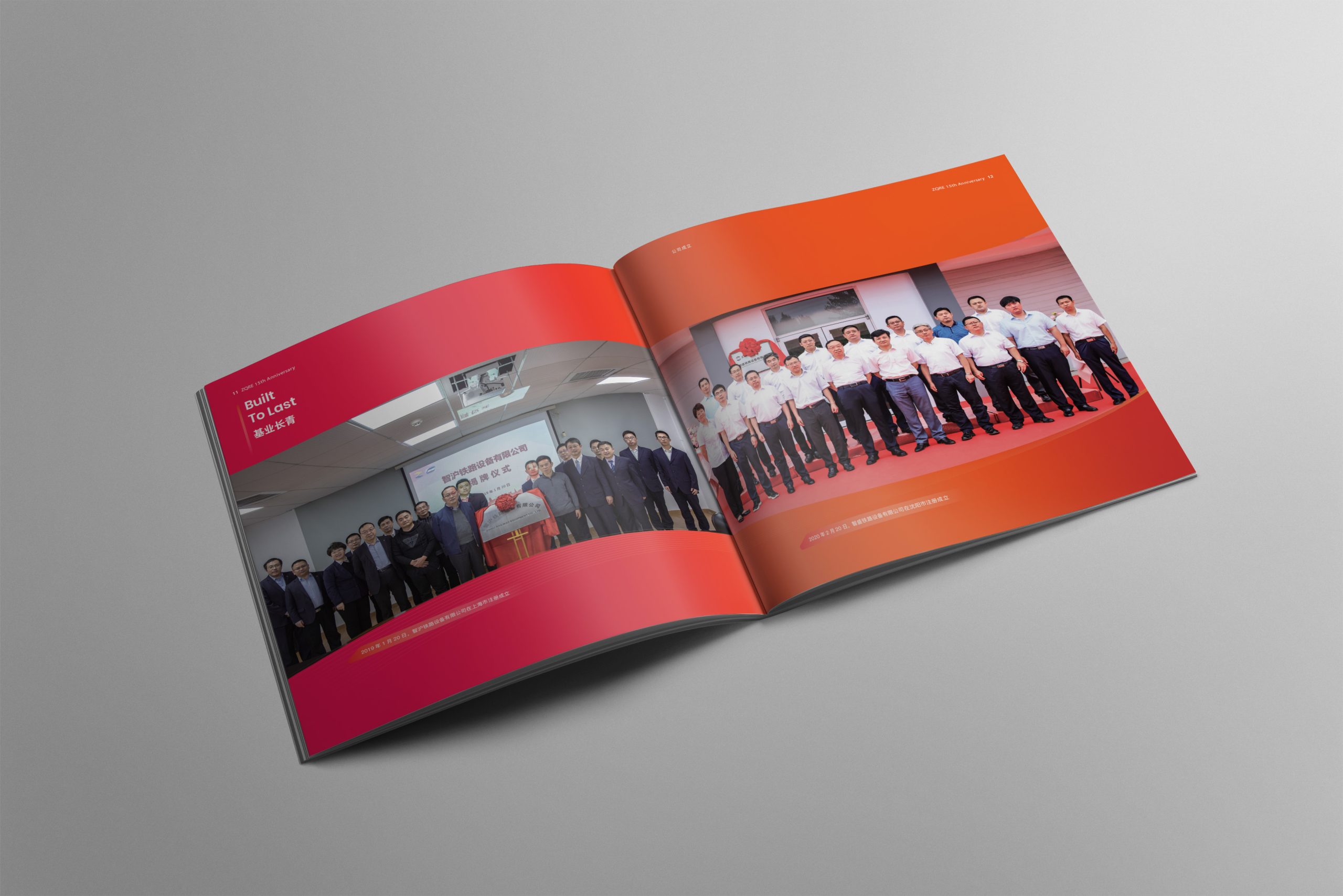
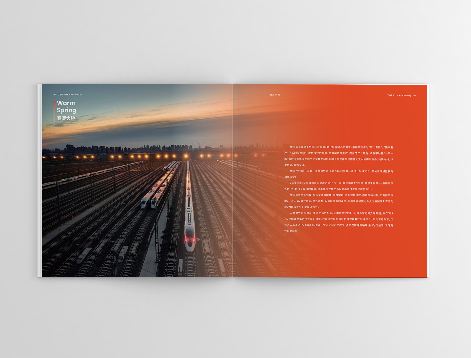
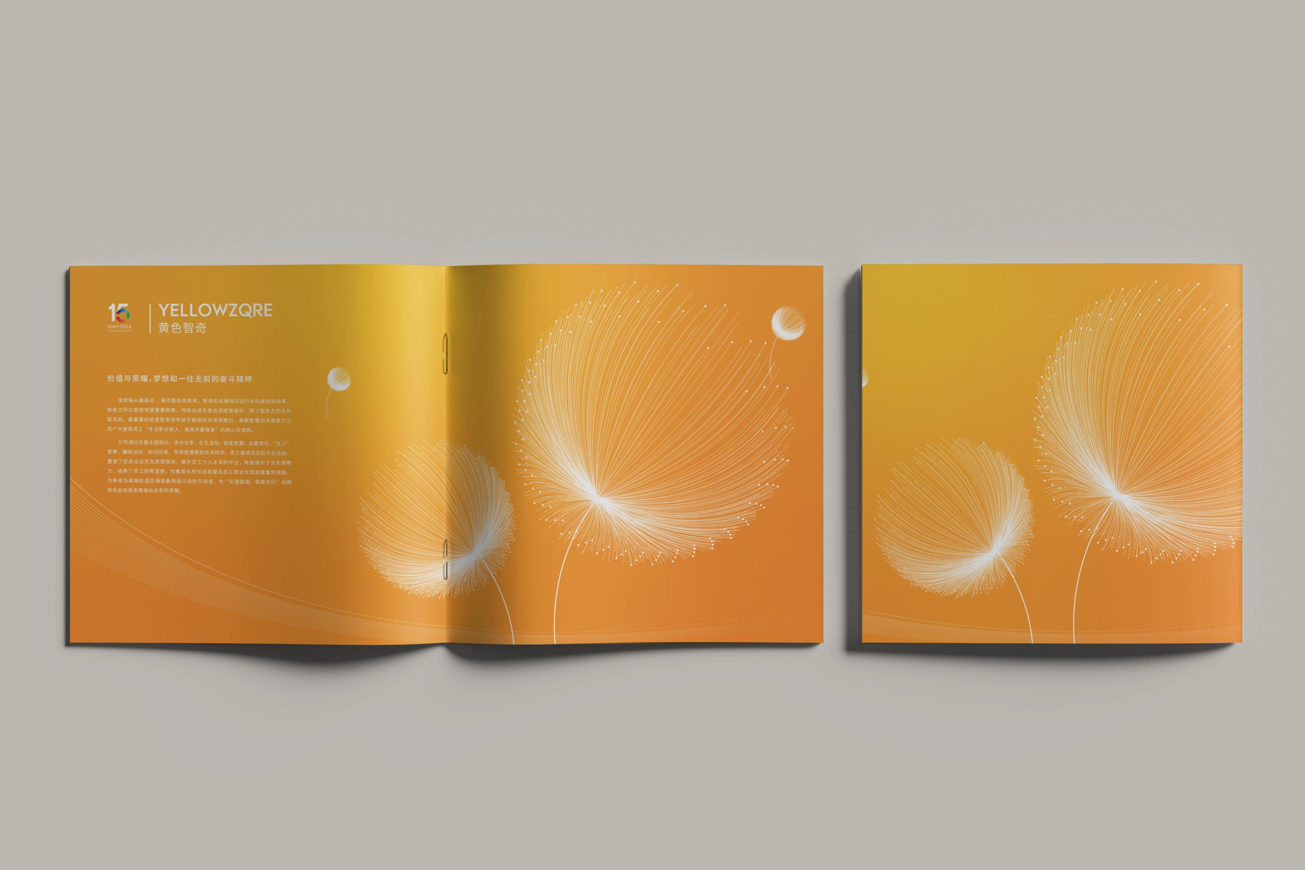
design challenge
The key proposition: how to make 'commemoration' not merely retrospective, but a re-expression of brand spirit.
As a self-initiated commemorative project, the design must fulfill three roles simultaneously: Documentary—authentically presenting twenty years of milestones and achievements; Symbolic—constructing ceremonial meaning through iconic structure; Visual—balancing rational documentation with artistic expression to reflect international aesthetics and brand stature. Within a complex narrative, the core challenge is maintaining visual simplicity and brisk pacing.
Strategy and philosophy
The project follows the conceptual thread of 'Seven Colors, Infinite Wonder,' signifying twenty years of diverse development and continuous innovation. Structural concept: the square serves as the foundational symbol of commemoration, representing stability, balance, and permanence, while establishing the visual order of the entire design system. Color logic: inspired by 'seven colors,' seven tones symbolize seven dimensions of enterprise spirit—innovation, responsibility, collaboration, trust, growth, culture, and vision. Visual language: geometric composition and white space ratios establish a balance between reason and feeling. Material expression: through paper texture, embossing, metallic lines, and gradient color layers, the commemorative book achieves both tactile and spiritual depth. The overarching strategy: commemorate time through structure, narrate spirit through color.
Design presentation
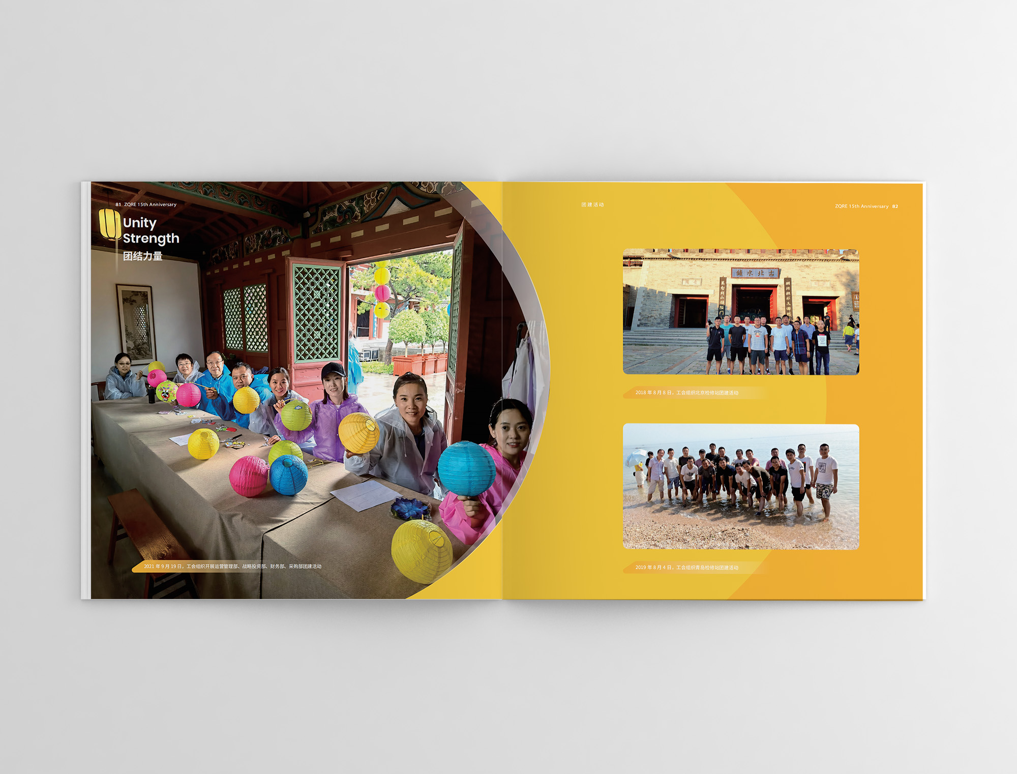
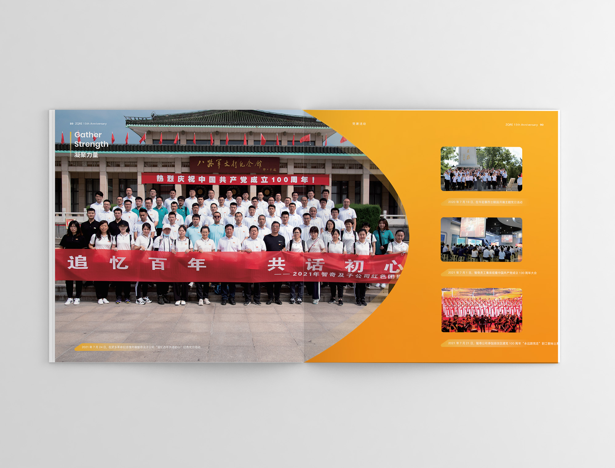
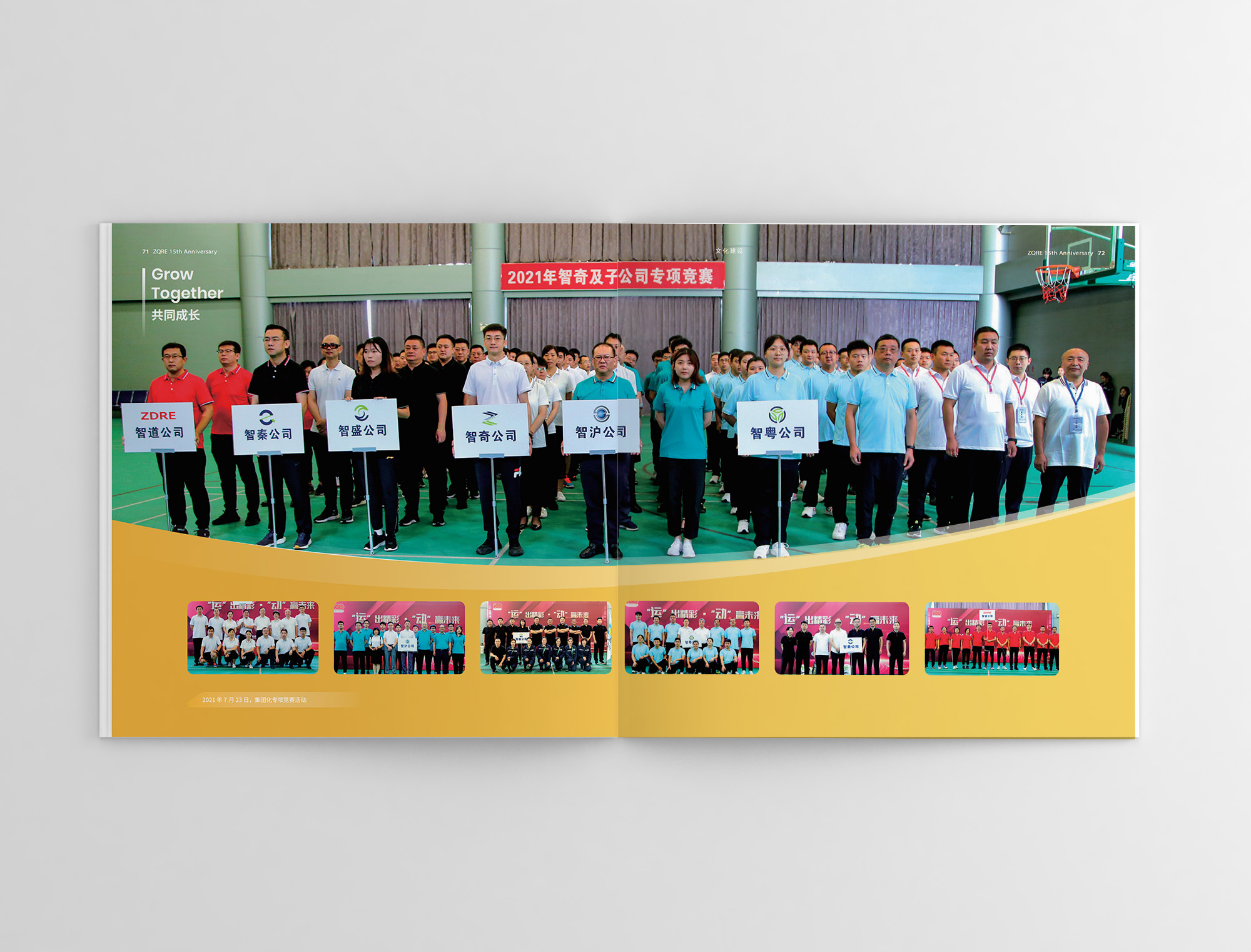
The book adopts 'square memorial structure' as its core design language throughout. Cover design: pure white base with embossed squares and seven-color linear rings, symbolizing layered time and creation. Chapter divisions: seven chapters form a complete narrative, corresponding to the spiritual themes of 'Seven Colors, Infinite Wonder.' Interior layouts: balanced grid systems integrate text, data, and imagery into a unified whole, presenting orderly beauty. Graphic elements: linear structures, transparent overlays, and geometric composition construct a spatial sense of commemoration. Print craft: heavyweight art paper with matte lamination + selective UV + silver foil creates refined, restrained luminosity. The design functions as a memorial installation—rational, quiet, yet charged with symbolic power.
Achievements and Impact
'Seven Colors, Infinite Wonder' became an important cultural symbol for the group's twentieth anniversary. It not only documents the enterprise's development but reconstructs the brand's spiritual image through visual systems. The book has been widely used in annual meetings, exhibitions, and partnership communications, serving as both visual footnote and spiritual extension of twenty years of brand development.