










China Gezhouba Group is one of China's most influential integrated energy and infrastructure groups, responsible for numerous major national and international projects.
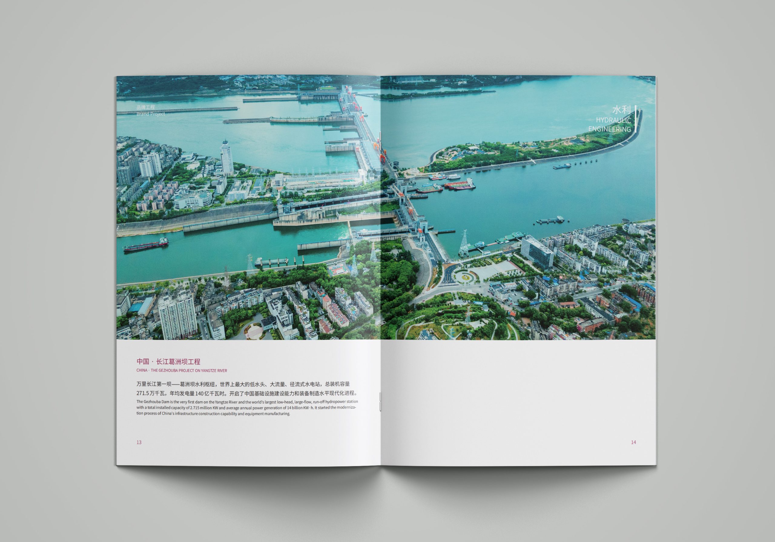
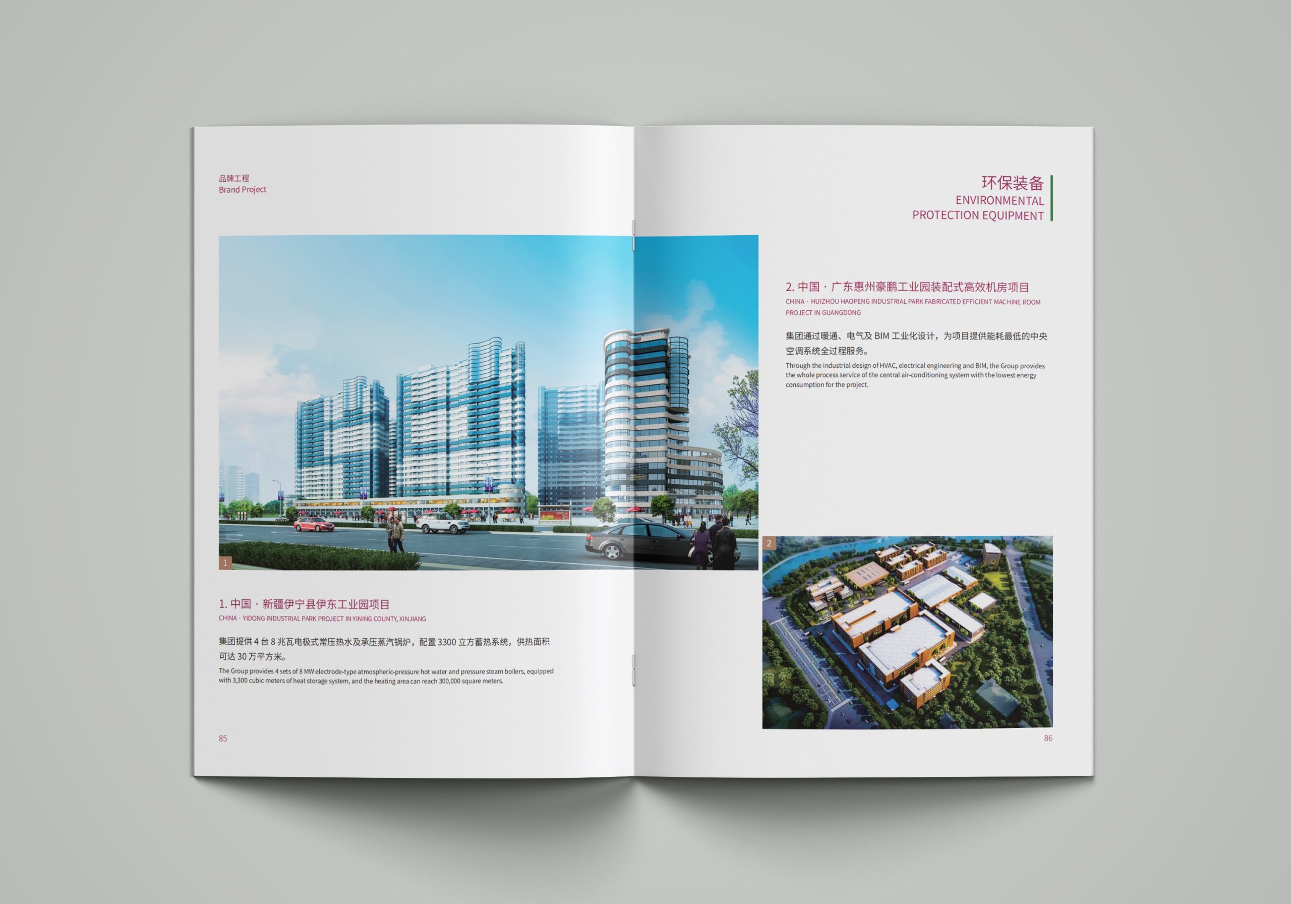
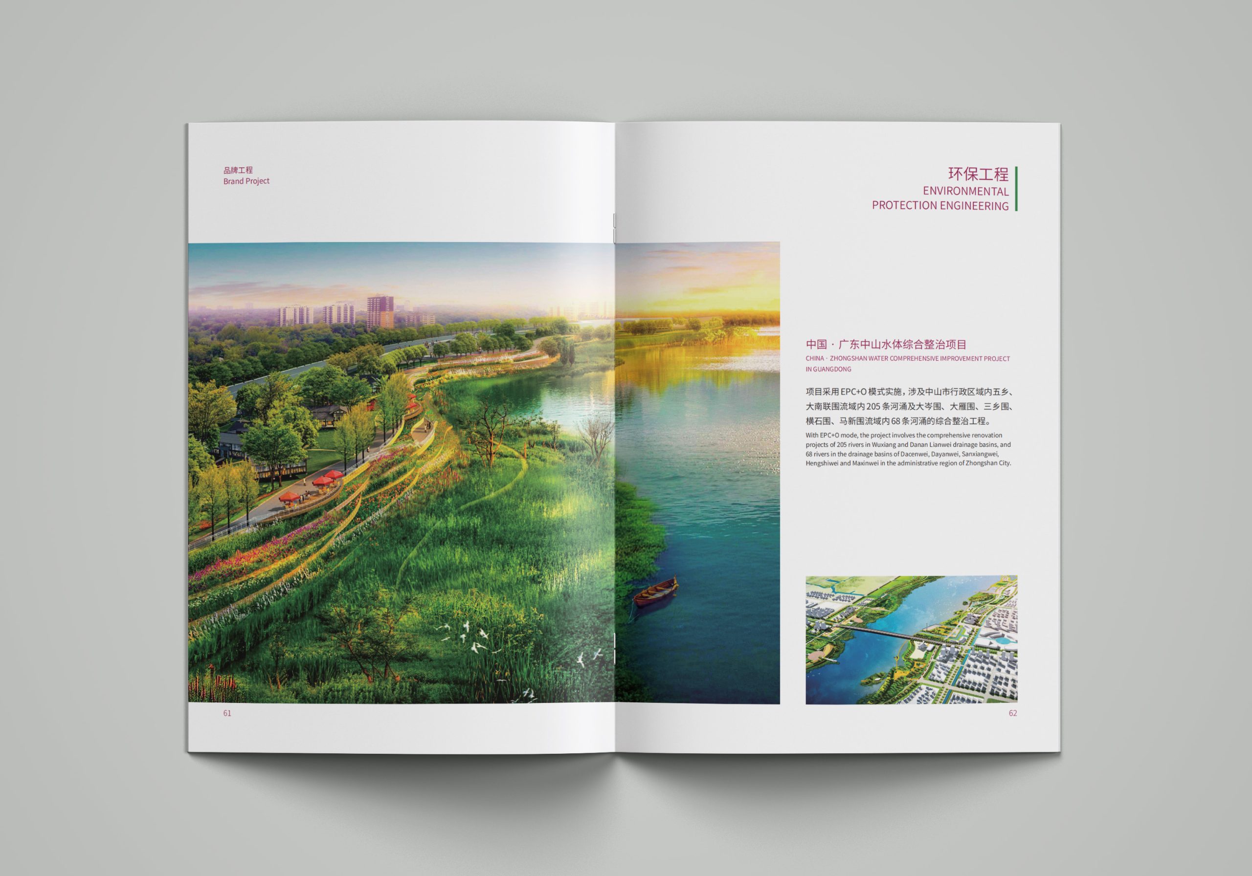
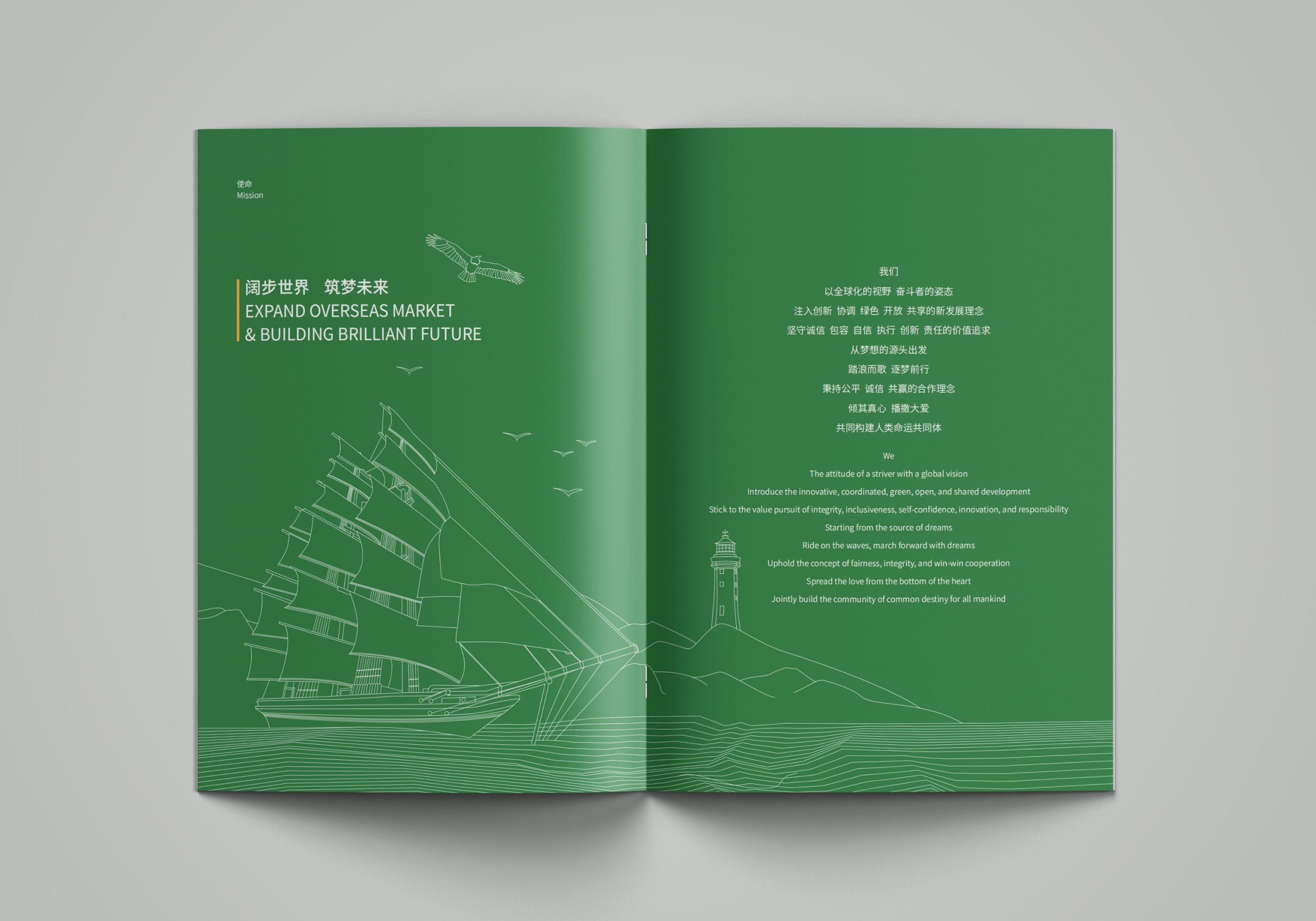
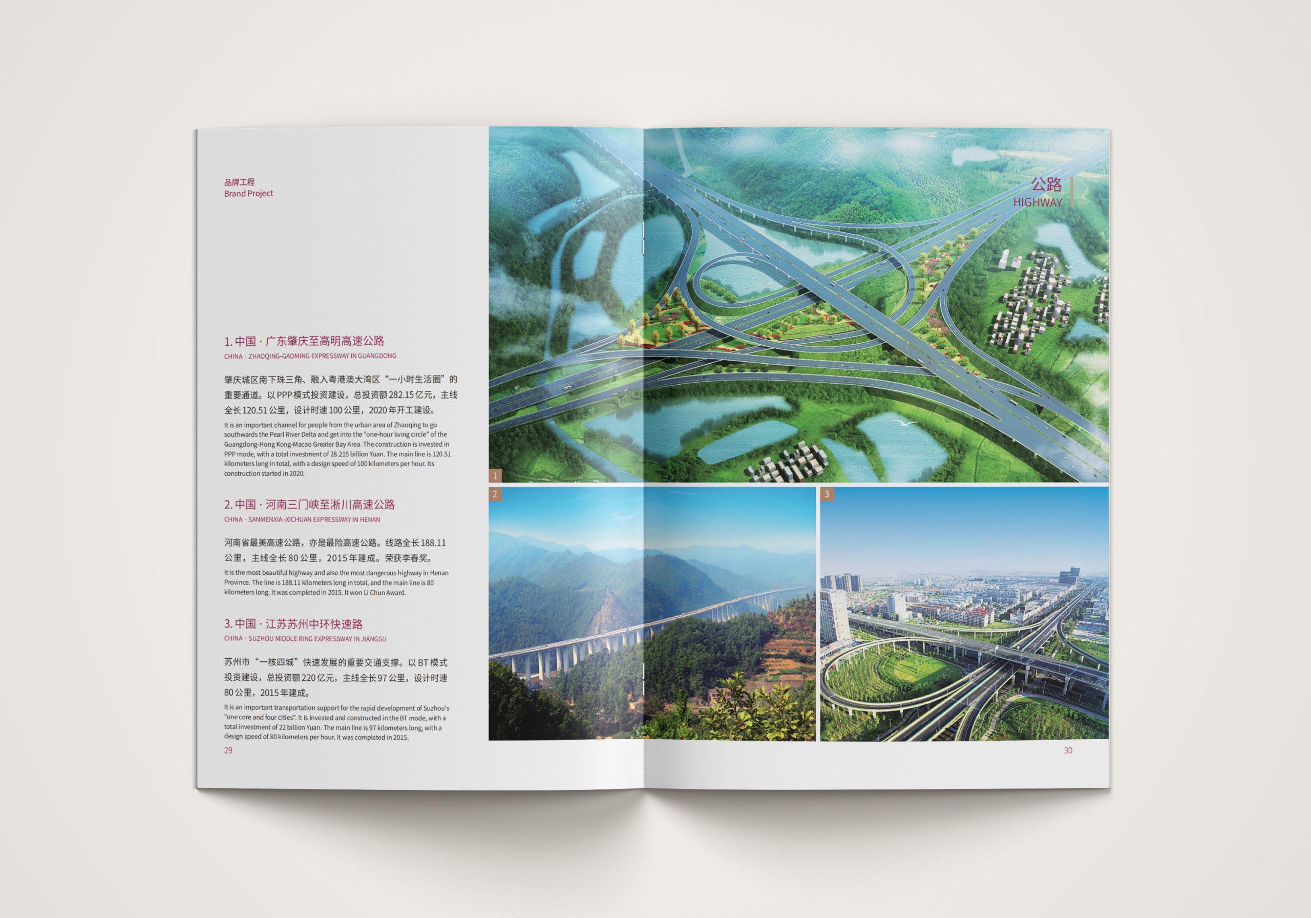
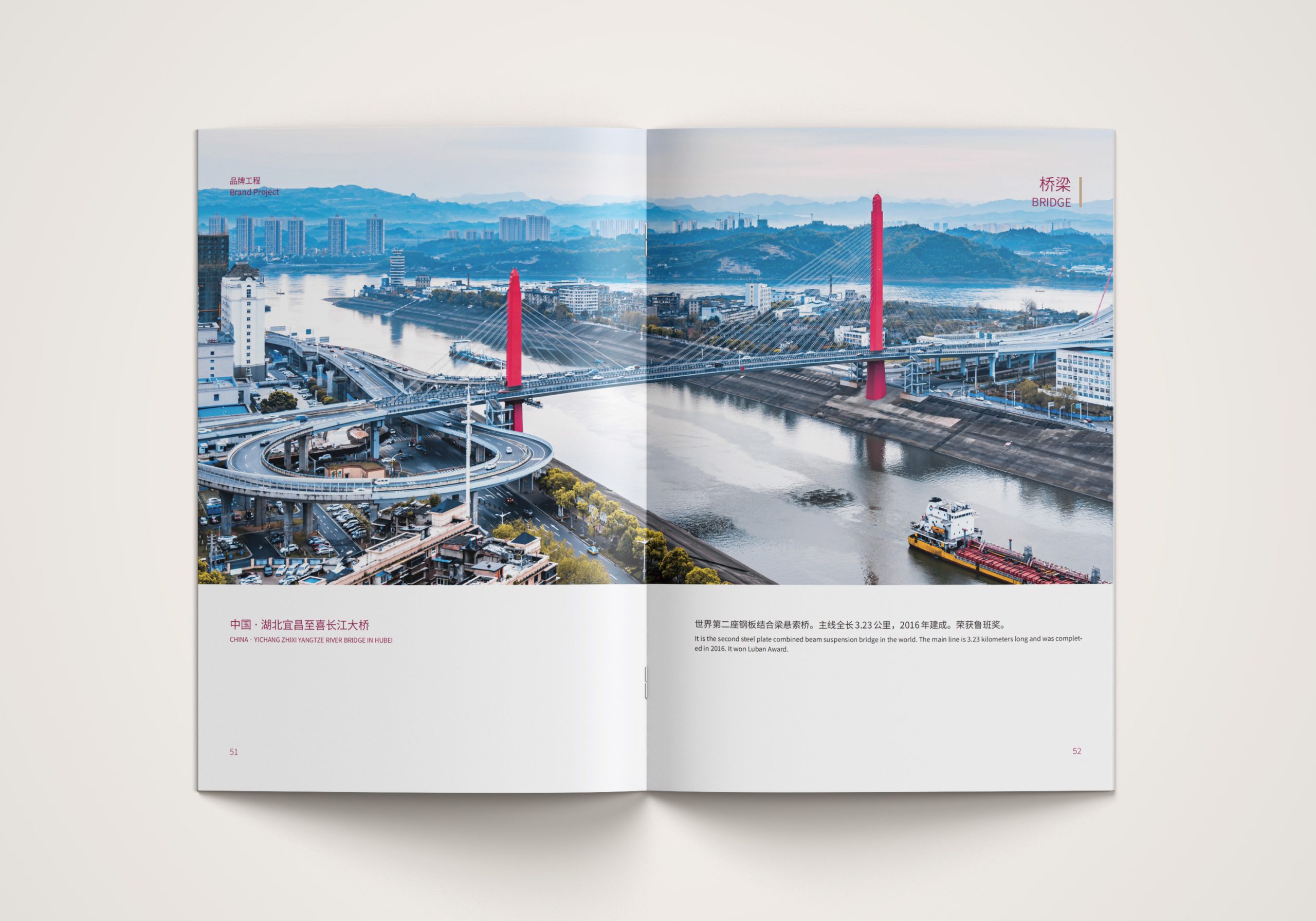
We created an international brand brochure system spanning more than ten volumes, including a corporate profile, business overview, investment projects and international editions, to reshape the image of a “new Gezhouba” on the global stage. The core mission of the design was to translate the engineering strength of a construction enterprise into brand expression with design sensibility and an international voice.
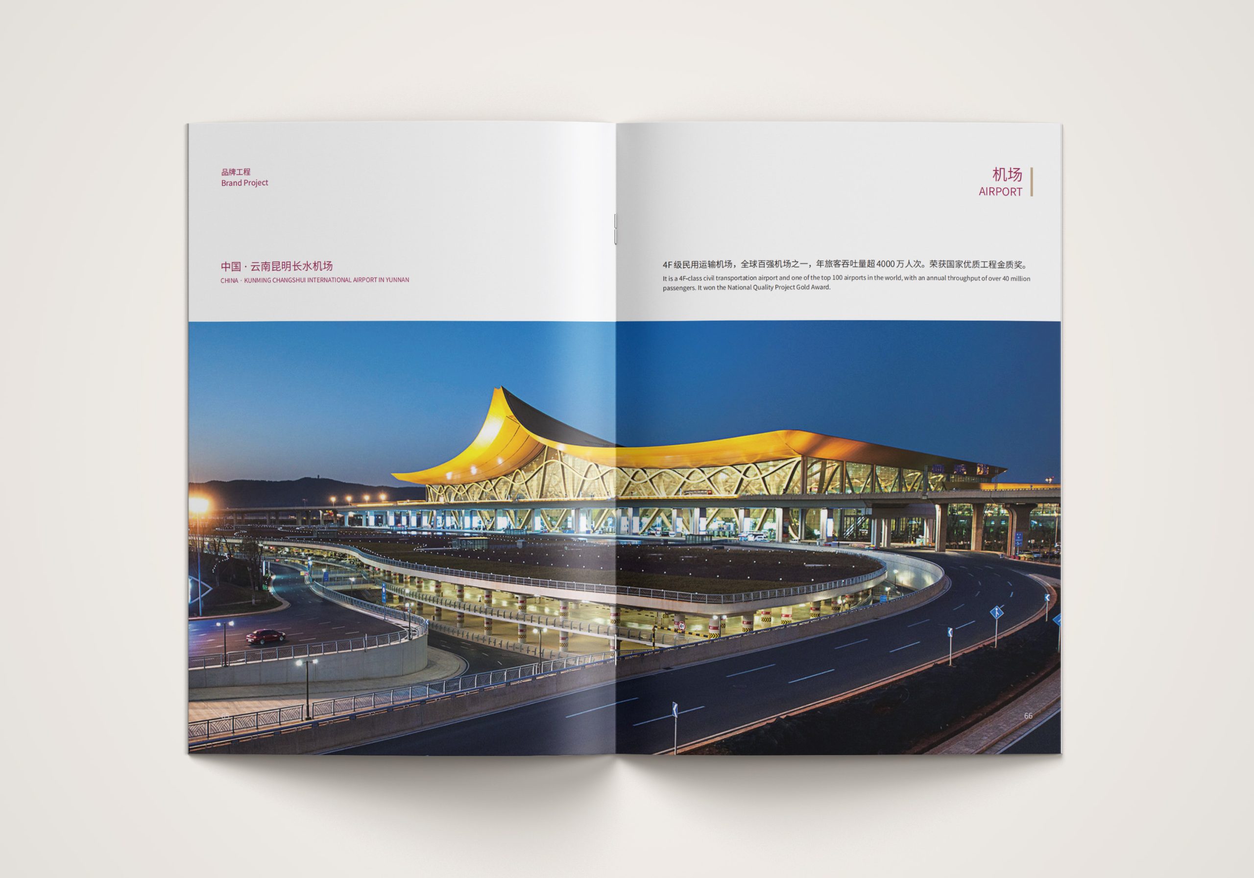
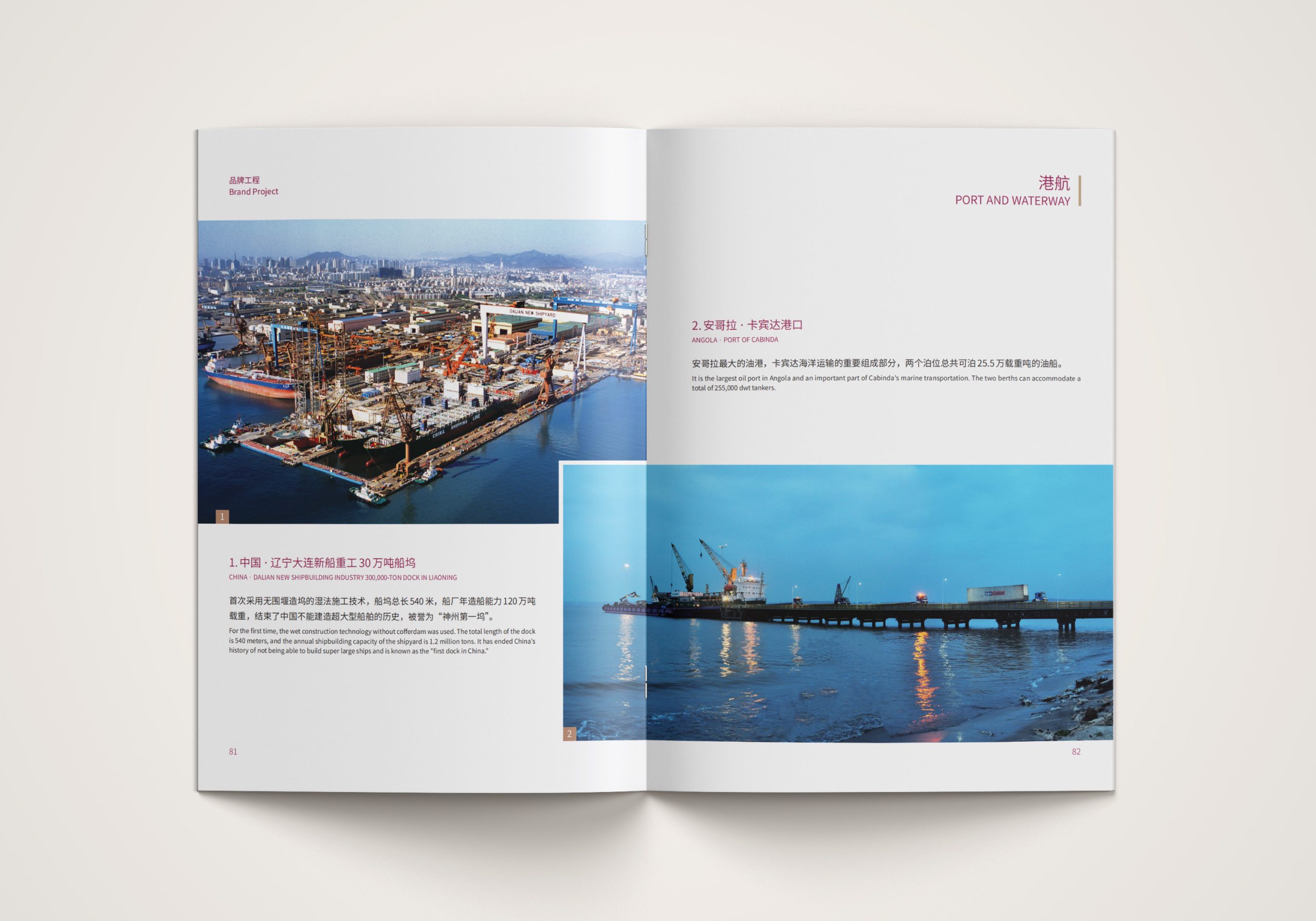
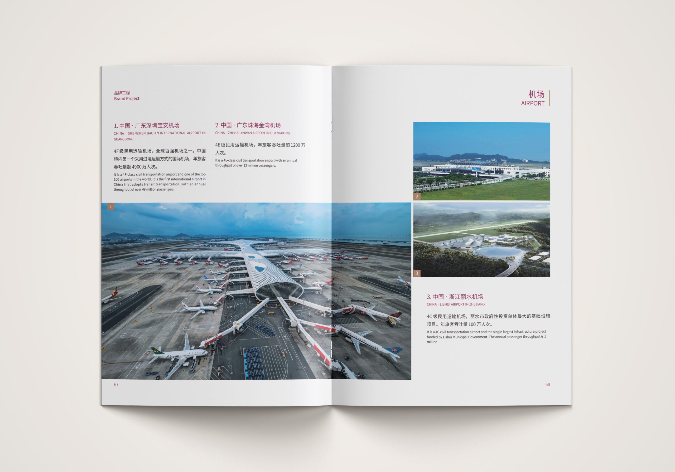
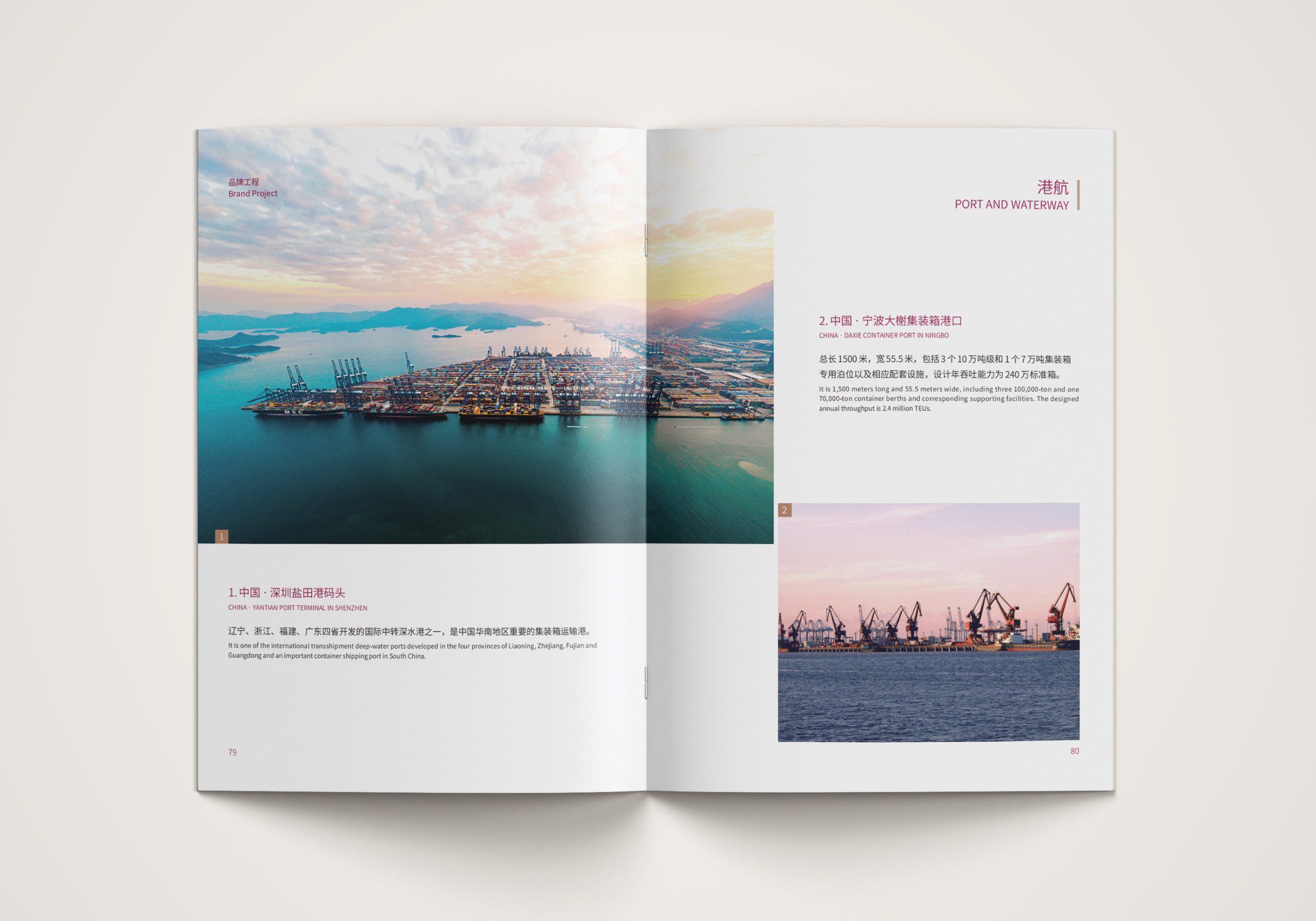
design challenge
For years, the public has seen Gezhouba Group as an “engineering giant,” but one lacking in design sensibility and international expression.
The challenge was threefold. The first was how to use visual language to elevate the Group's image from “builder” to “creator.” The second was how to maintain visual consistency across a multi-volume system while distinguishing its different business units. The third was how to balance rational information with brand emotion for both government and international audiences. The system needed to combine the macro perspective of a major group with micro-level data precision, expressing both the brand's structural logic and its cultural character.
Strategy and philosophy
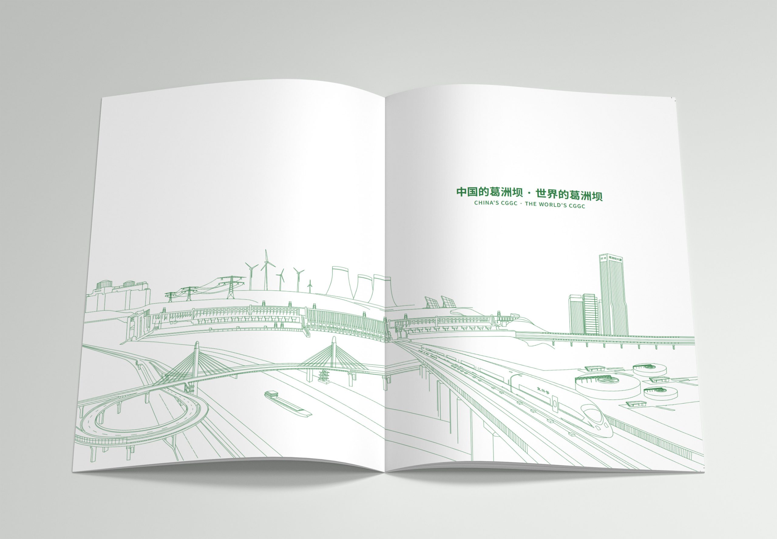
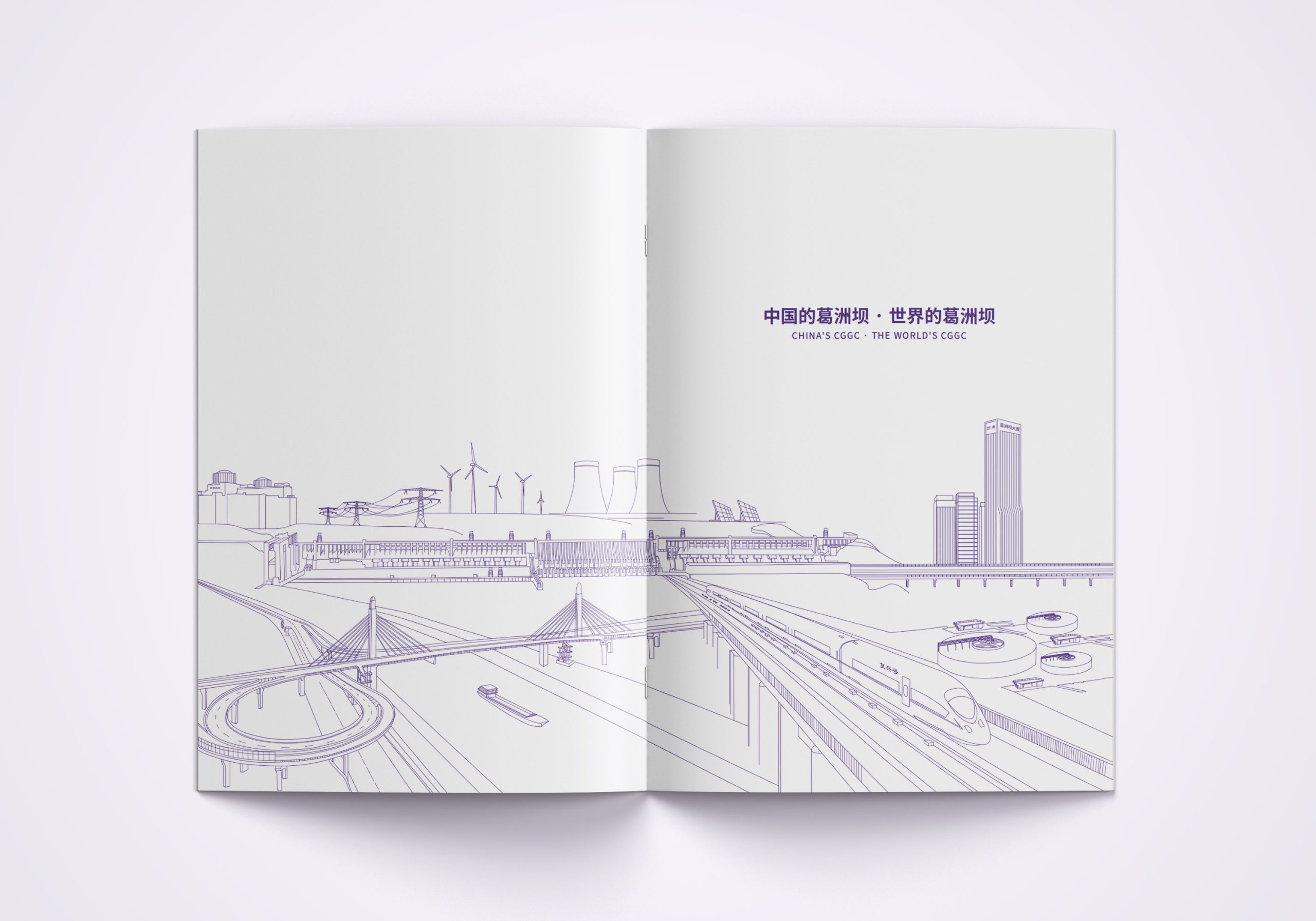
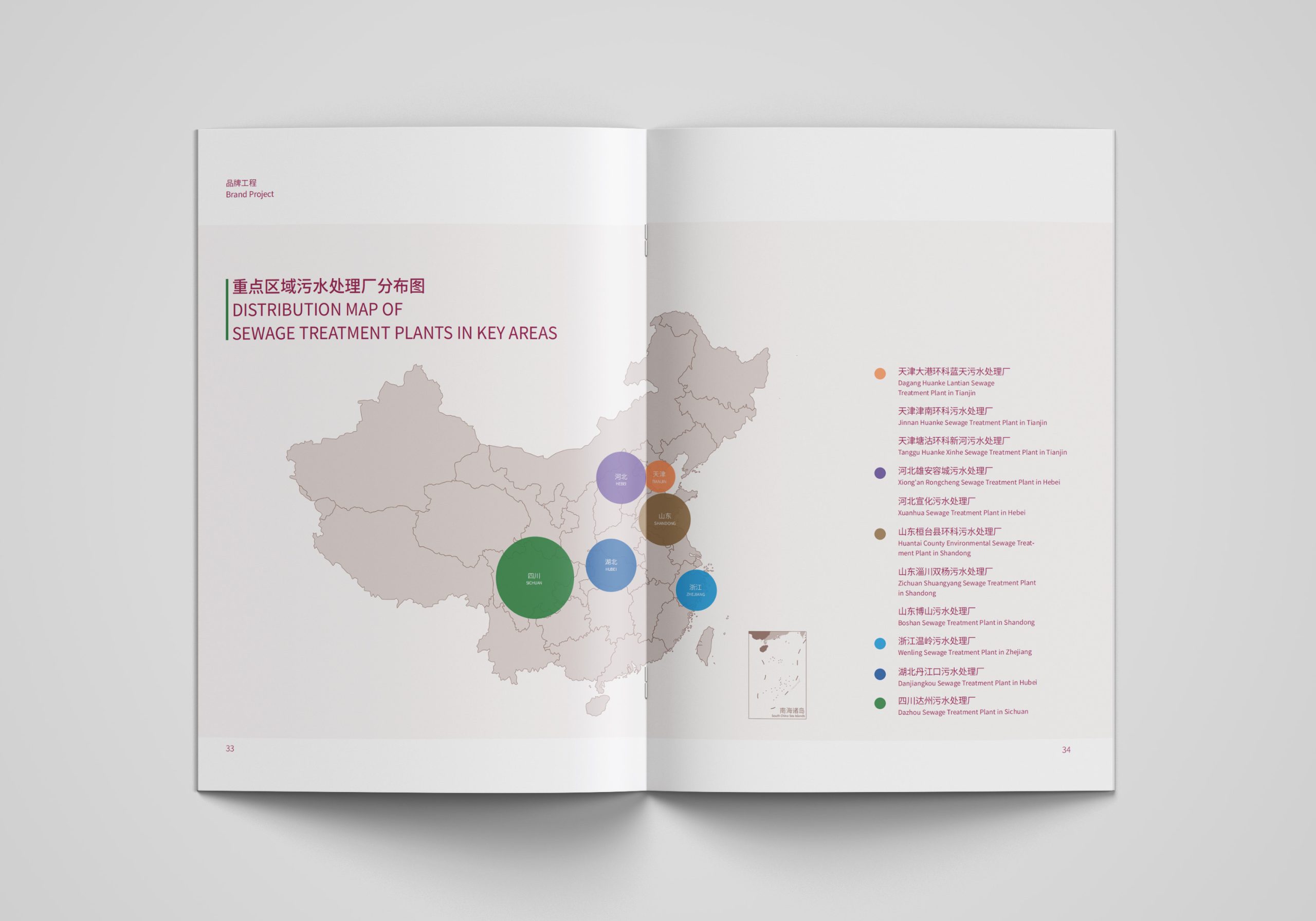
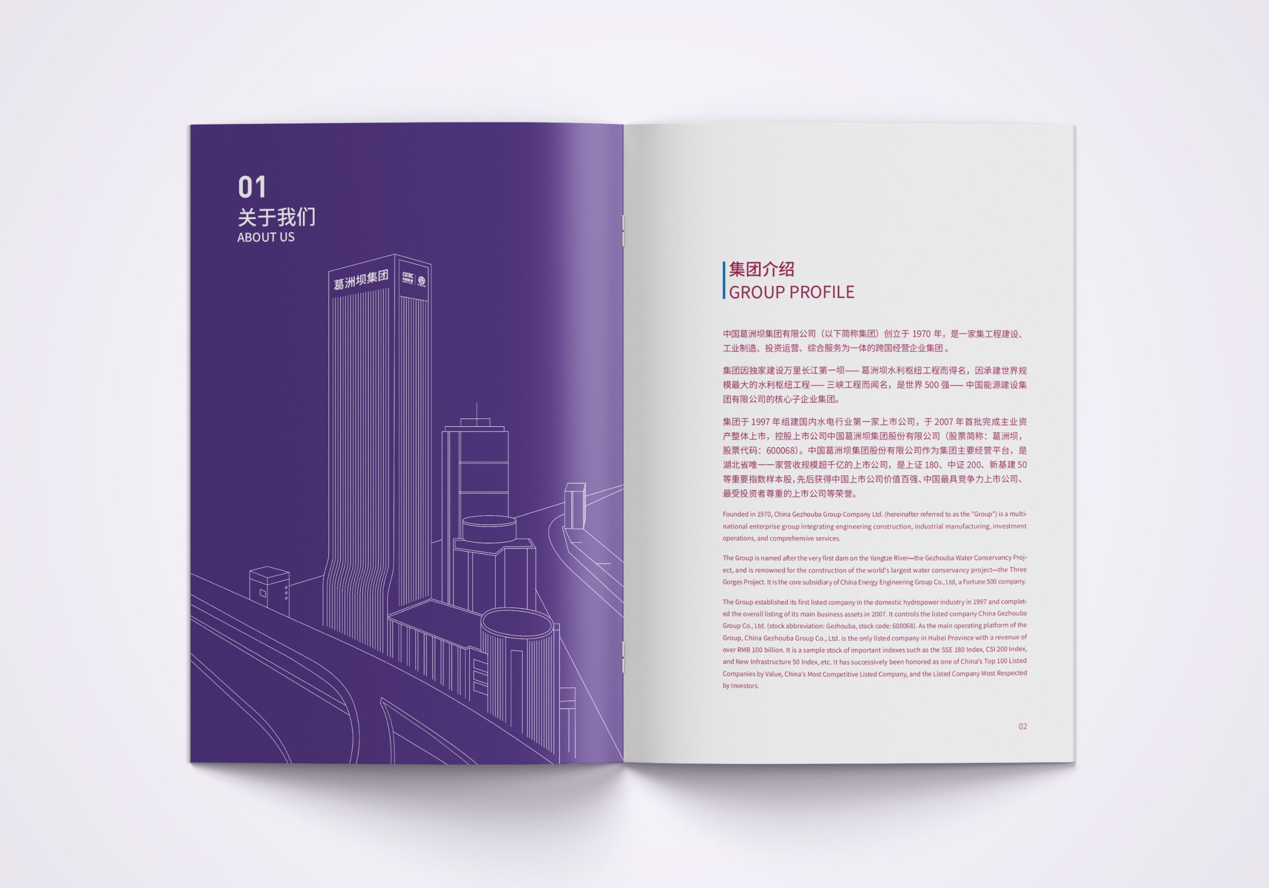
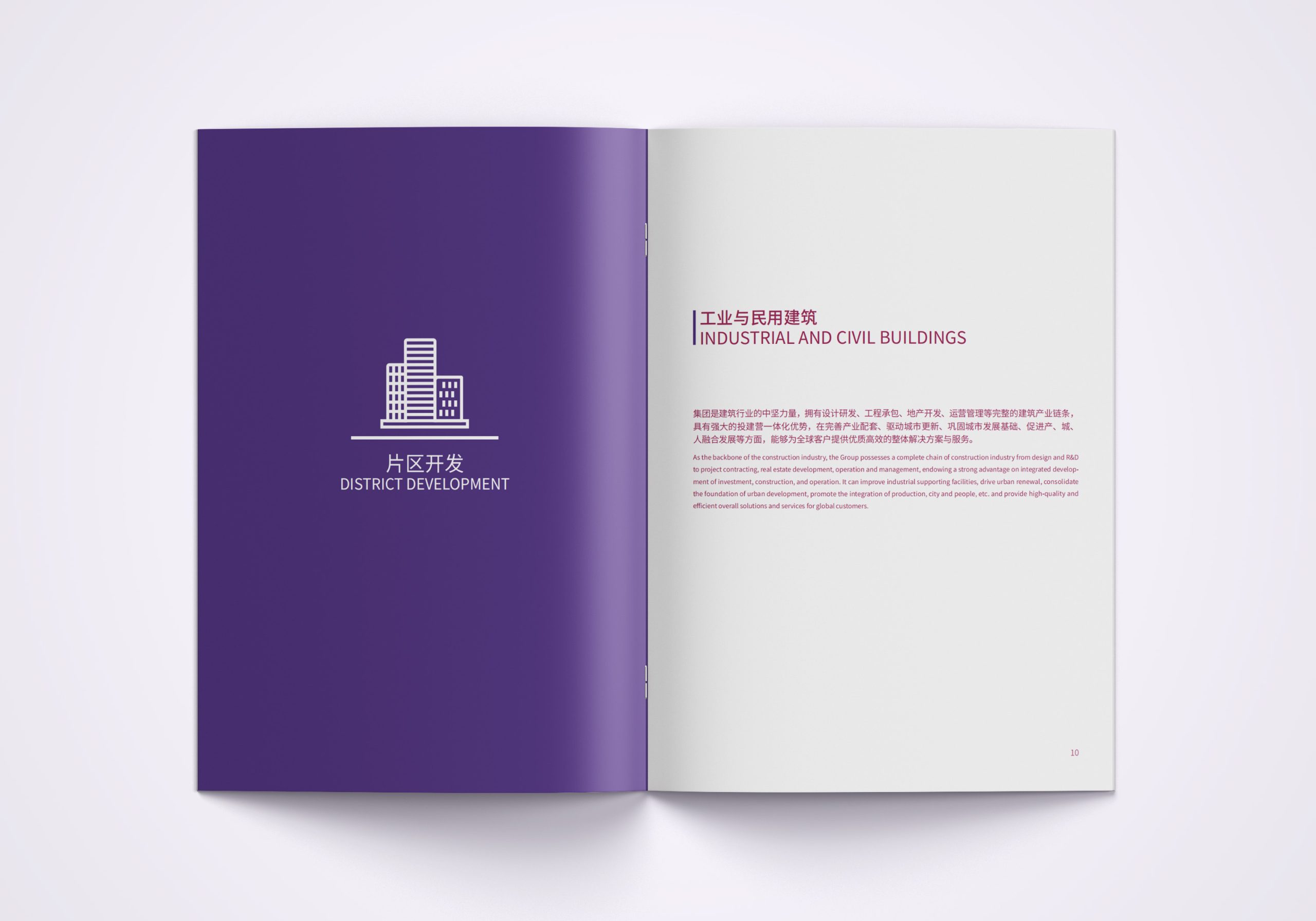
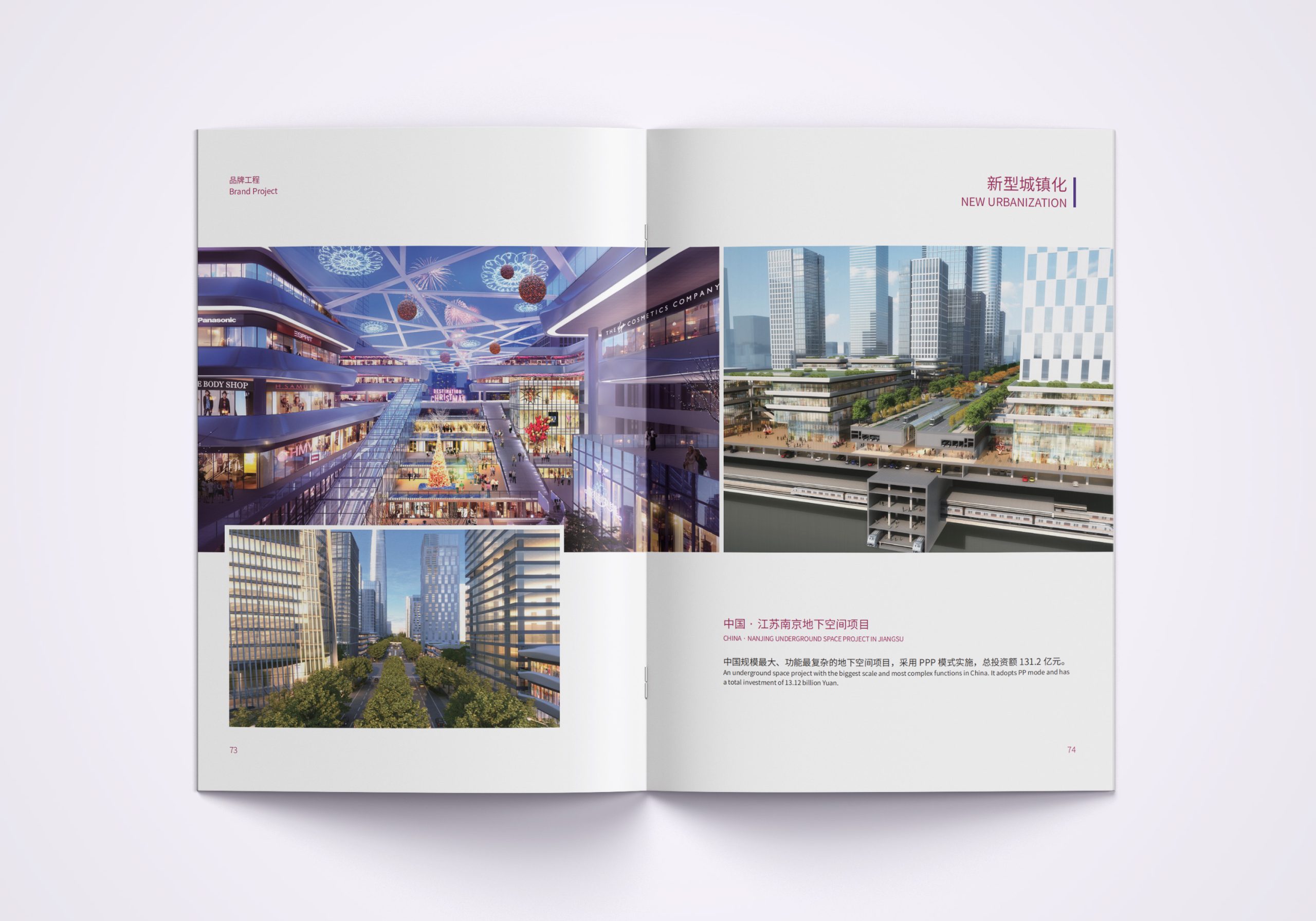
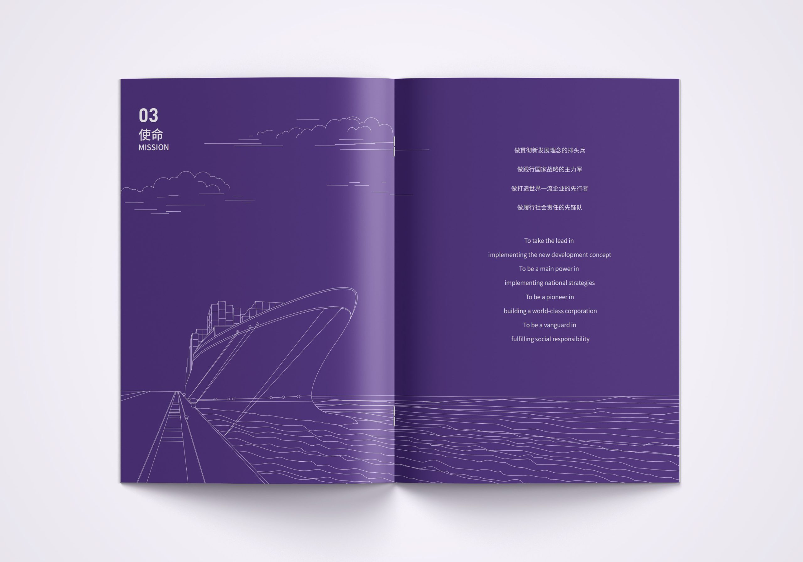
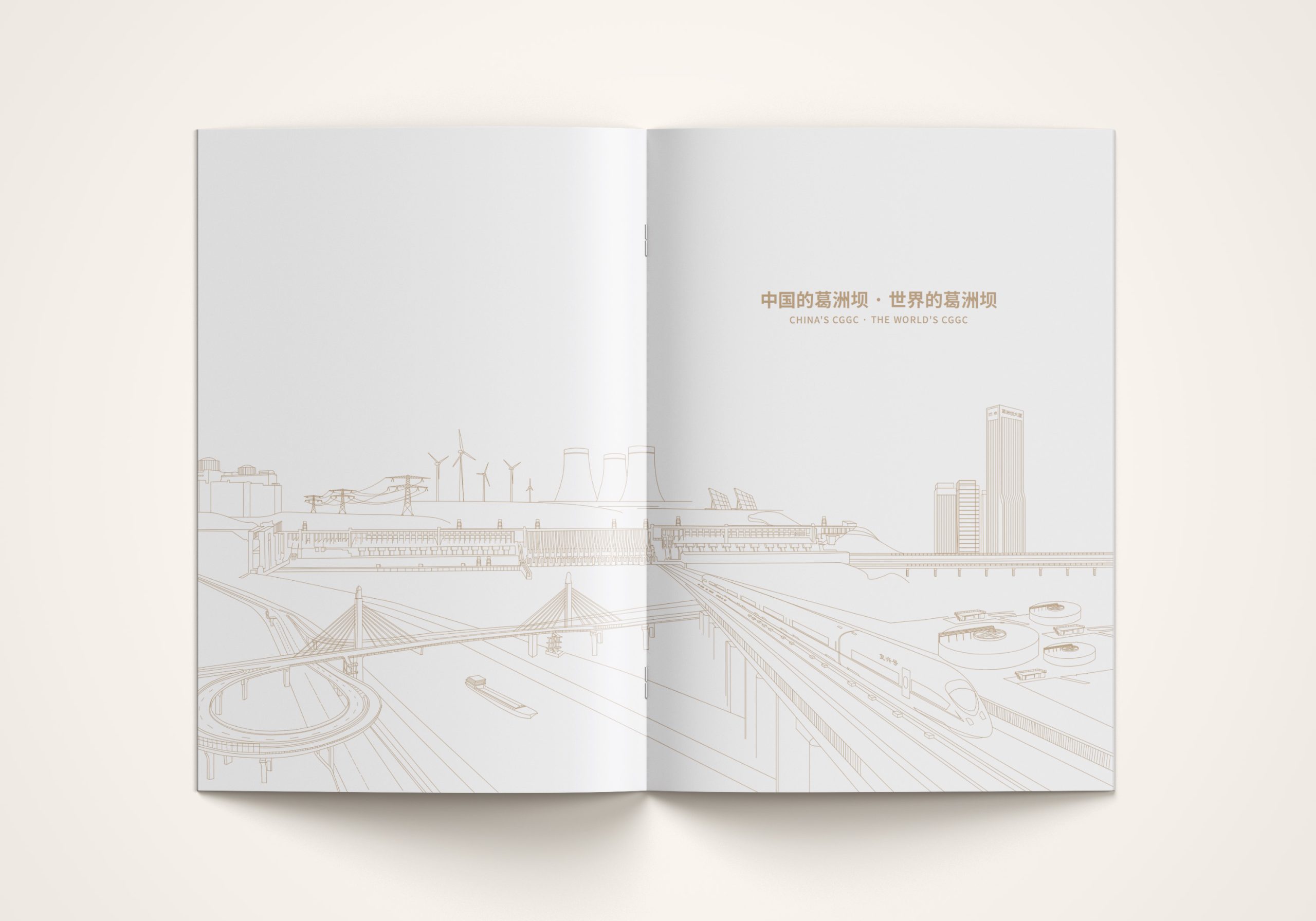
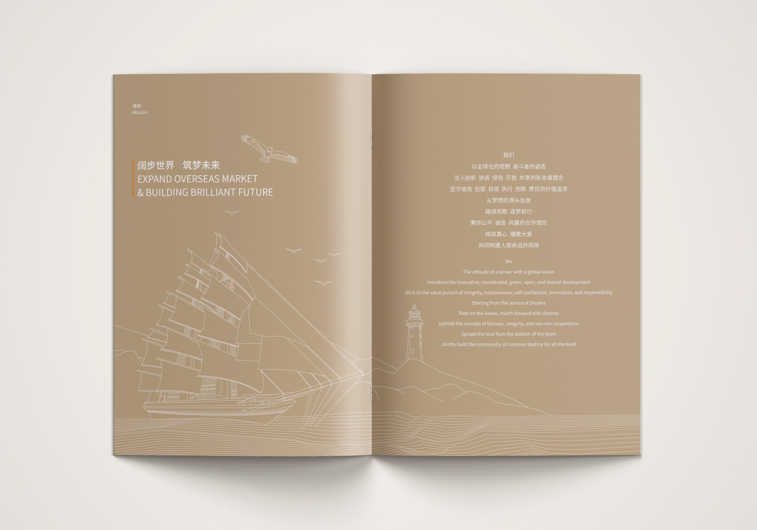
The project is built on the core idea of “Structure · Strength · Trust.” Its design language draws on the structural order of architecture and the rational aesthetics of international modernism, using line, proportion and data visualization to build a new brand identity system. Linear composition: geometric lines and structural grids abstract the logic of construction into a unified visual order. Infographic system: an international information-graphics language visualizes the Group's engineering scale, global footprint and key data, making “rationality an aesthetic.” Color system: each business line has its own primary color, creating a system that is distinguishable and extensible. Visual tone: calm, restrained and international throughout, with texture and white space in place of ornament to convey composure and strength. The essence of the concept: structure expresses strength, and design builds trust.
Design presentation
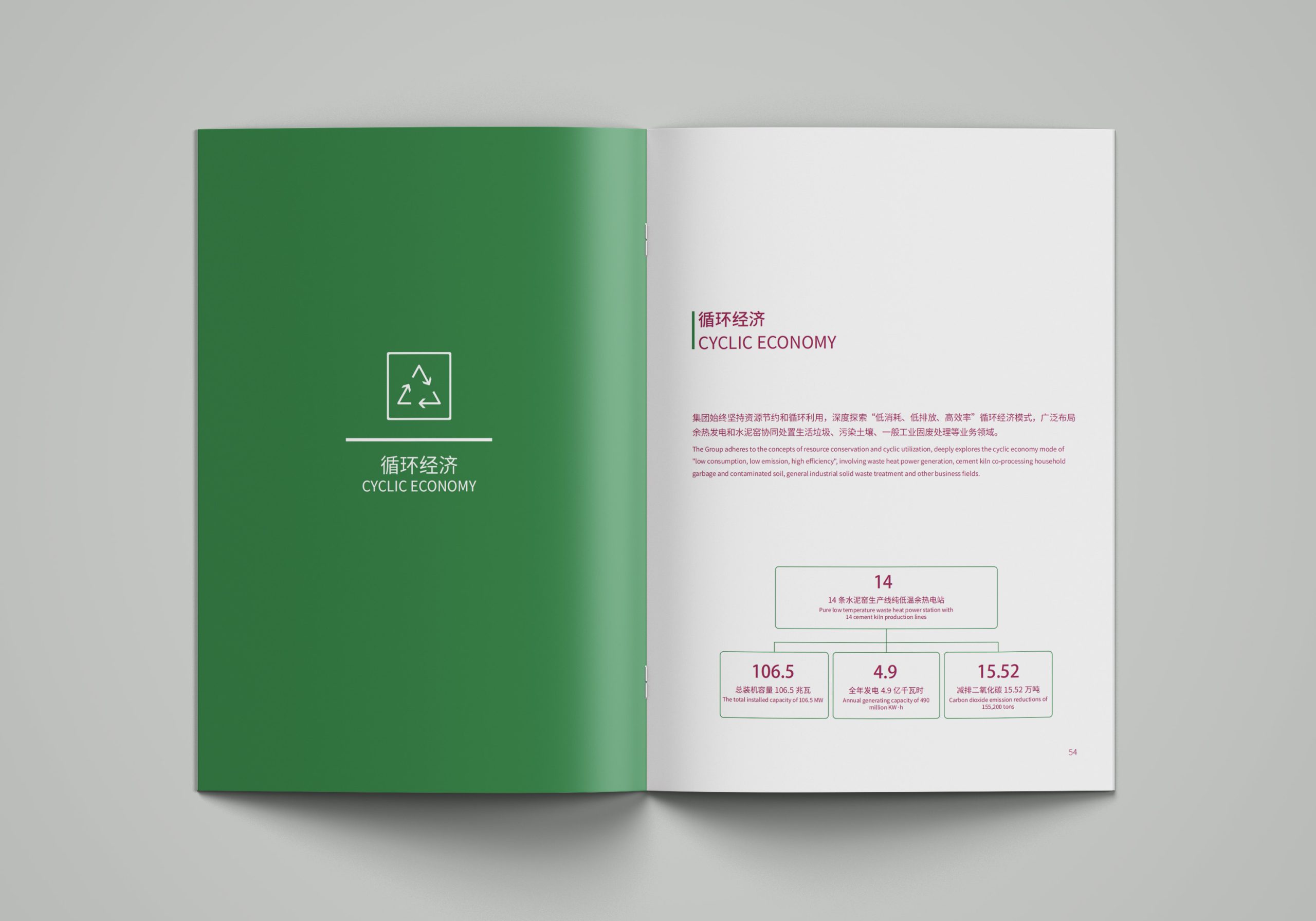
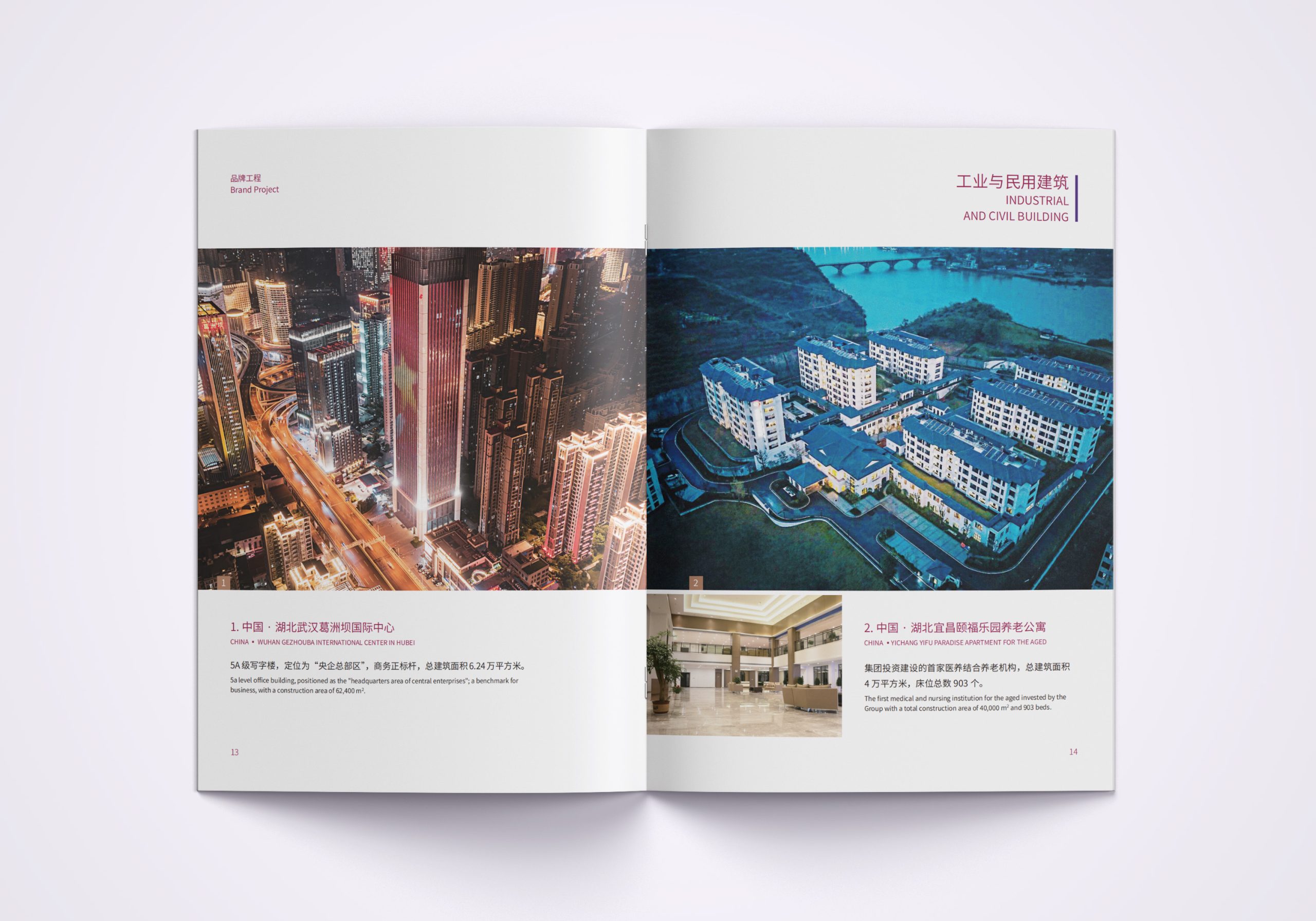
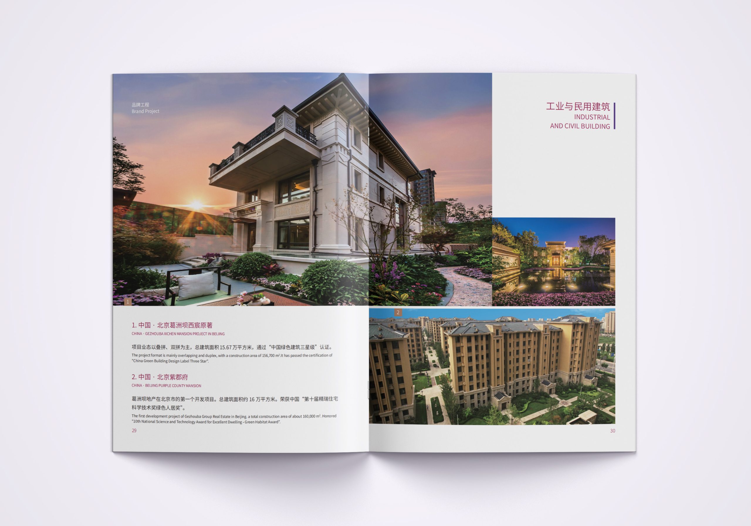
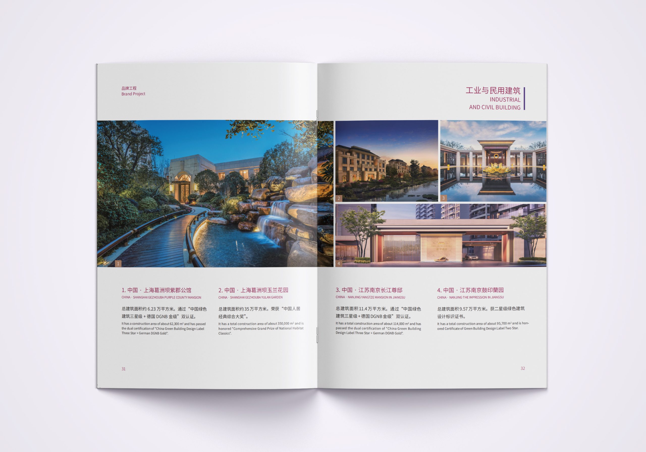
The entire brochure system rests on a unified visual architecture and layout system. Covers: linear graphics form abstract architectural images, paired with an embossed logo in the brand's metallic finish for an international feel. Layout: a 12-column grid organizes information and charts, ensuring reading rhythm and logical hierarchy. Color zoning: energy, water resources, overseas projects and urban development each have a distinct color, forming a clear identification logic. Infographics: all statistics are rendered as geometric infographics, reflecting “the precision of engineering.” Materials and finishing: heavyweight matte coated stock, spot UV and silver-foil lines create a unified tactile and visual quality. The result is a new brand presence with both structural strength and international character.
Achievements and Impact
The launch of the international brochure system gave Gezhouba Group a new visual voice for presenting international projects and communicating with government partners. A systematic design language helped the company shift from “traditional engineering contractor” to “global infrastructure solutions provider.” Used at numerous international conferences and overseas exhibitions, the brochures are regarded as one of the visual hallmarks of Gezhouba's international transformation.