










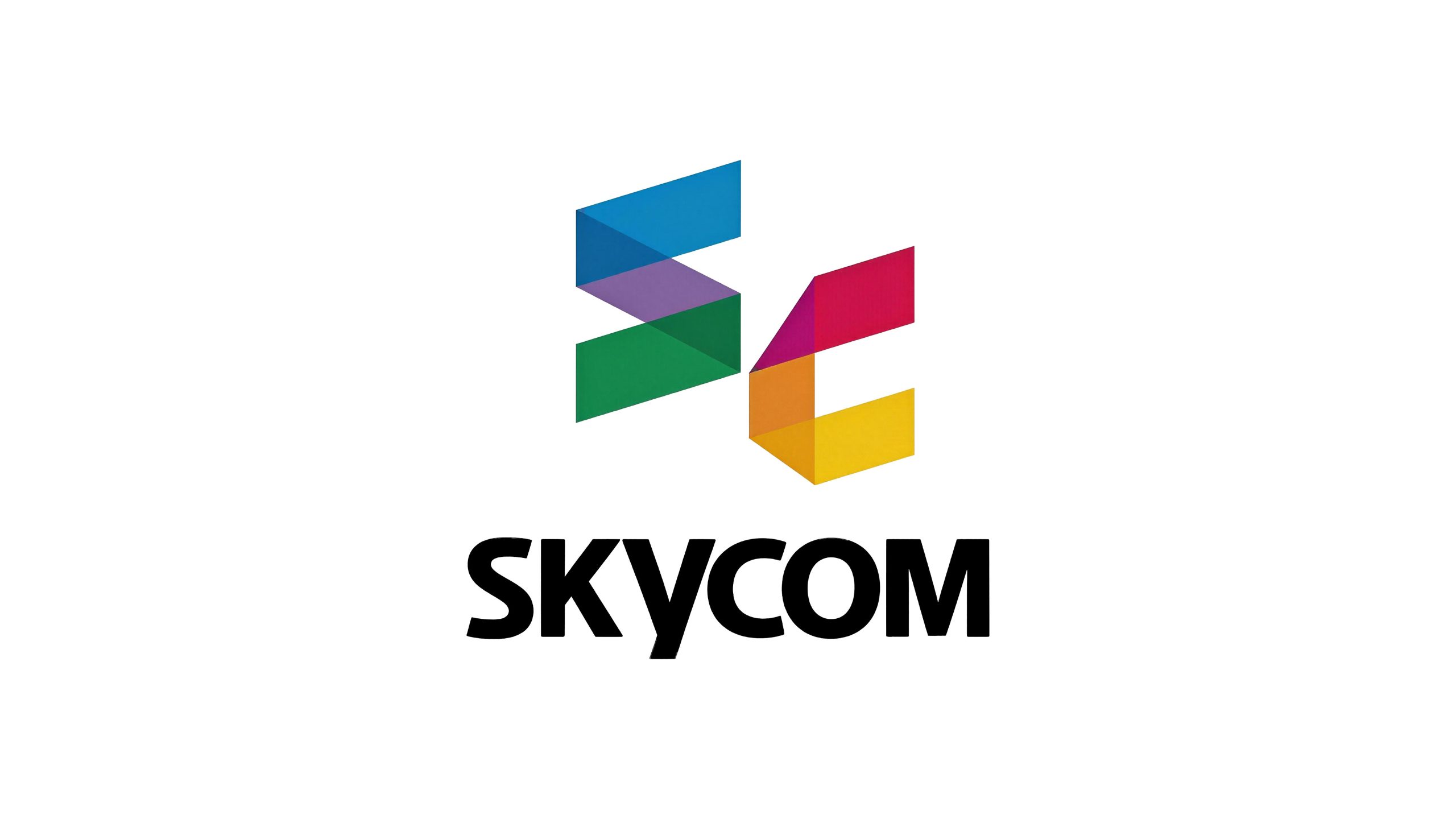
SKYCOM is a comprehensive media company with diversified operations. The brand name "SKYCOM" is derived from the abbreviation of Sky Communication, which means "the power of communication as vast as the sky".
The company's business covers content production, media operations, entertainment planning and cultural communication and other fields. With dedication, responsibility, innovation and cooperation as its core values, it is committed to providing the market with international, modern and dynamic media services.
The design goal of the brand logo is to demonstrate SKYCOM's industry positioning as a comprehensive media enterprise through a visual language of internationalization, modernity and entertainment vitality. It focuses on embodying international, modern, entertainment attributes and sunny, positive and healthy brand characteristics, and conveys to consumers the brand image of dedication, responsibility, innovation and cooperation.

Design concept and graphic language
The logo uses "SC Monogram" as the core concept and the initials "S" and "C" of the brand name SKYCOM as design elements, representing Tianhe culture. The two letters are composed of geometric parallelogram color blocks. Through color superposition and spatial interlacing, a three-dimensional figure full of dynamic and modern flavor is formed. The "S" letter is composed of two inclined parallelogram color blocks in a Z-shaped fold, extending from the upper left to the lower right; the "C" letter is also composed of two parallelogram color blocks forming an open arc, unfolding from the upper right to the lower right. The two letters overlap each other in the central area and the colors merge to form a tightly interlocked whole, symbolizing the essence of "communication and connection" in the media industry - the intersection of Sky and Communication. The overall design integrates the recognizability of letters with the artistry of abstract graphics, reflecting the dual attributes of the SKYCOM brand between media professionalism and cultural diversity.
The two color blocks of the "S" letter are presented in sky blue and emerald green respectively, with blue at the top and green at the bottom. Blue symbolizes the vastness of the sky and the unbounded communication, and green symbolizes vitality and innovation. The two color blocks of the "C" letter are presented in rose red and bright yellow respectively, with rose red at the top and bright yellow at the bottom. The rose red symbolizes the enthusiasm for entertainment and the appeal of culture, and the bright yellow symbolizes the sunshine, positivity and health of the brand. The two letters produce a rich mixture of colors in the overlapping area - deep emerald appears at the intersection of blue and green, soft purple appears at the intersection of green and rose red, and warm orange appears at the intersection of rose red and bright yellow. The colorful superposition effect not only symbolizes the diversification of the company's operations, but also expresses the rich and colorful industry characteristics of the media industry. The inclination angle of the parallelogram gives the graphics a sense of forward momentum and speed, conveying the dynamics and lively rhythm of the media industry; the edges of the geometric color blocks are neat and clean, with no rounded corners or decorations, reflecting the simple and elegant design principle. The overall composition uses an orderly combination of geometric color blocks to build a "colorful SC", conveying the brand's international vision and diversified pattern.
Font composition and color system
The English "SKYCOM" uses a customized bold sans-serif font with rounded corners. The strokes are thick and full, and the corners are slightly rounded. The font is generous, stable and friendly. The letter spacing is tight and even, and the six letters are closely arranged to form a complete visual whole, conveying the brand's team cohesion and cooperative spirit. The three letters "S", "K" and "Y" constitute the first half of the semantics of "SKY (sky)", and "C", "O" and "M" constitute the second half of the semantics of "COM (communication)". The complete spelling conveys the core meaning of the brand's "sky-like communication power". The overall style of the font is concise, steady and international, making it easy to recognize and remember. At the same time, the rounded stroke ends create good affinity and avoid the cold and oppressive feeling common in bold fonts. The word mark is presented in pure black, with the most stable tone supporting the colorful graphics above, forming a classic brand composition of "color on top and black on the bottom", ensuring the clarity and professionalism of the logo in various application scenarios.
In terms of color, the logo adopts a five-color system, with each color carrying independent brand semantics. Sky blue #009FE8 represents the sky, communication and international vision, and is the color incarnation of the "Sky" spirit; emerald green #009B4D represents the corporate vitality of innovation, growth and sustainable development; rose red #E50050 represents the appeal of entertainment, enthusiasm and culture, conveying the passion and energy of the media industry; sunshine yellow #FFD100 represents the brand characteristics of sunshine, positivity and health, and is the color externalization of the "happy media" concept; overlapping purple #7B5EA7, as a natural fusion color at the intersection of blue, green and red, symbolizes the integration and symbiosis of multiple businesses and the deep accumulation of brand culture. The rich colors symbolize the dynamics and brightness of the logo, and also express the diversification of the company's operations. Pure black #000000 is used for the brand wordmark, unifying the overall vision with the calmest tone. The overall color system is run through with colorful and orderly colors, reflecting the brand temperament of "multiple media, colorful world". Each color is a dimension of SKYCOM's brand value, and together constitute a complete brand color spectrum.
Application extension and brand significance
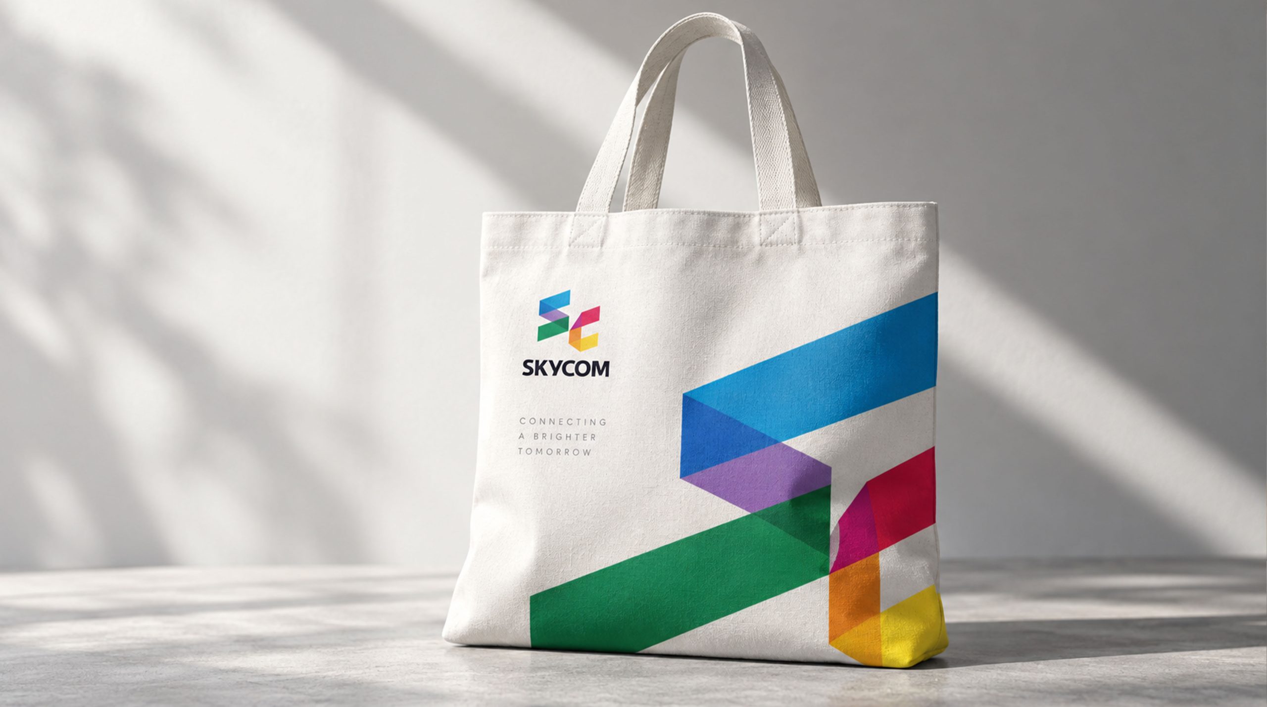
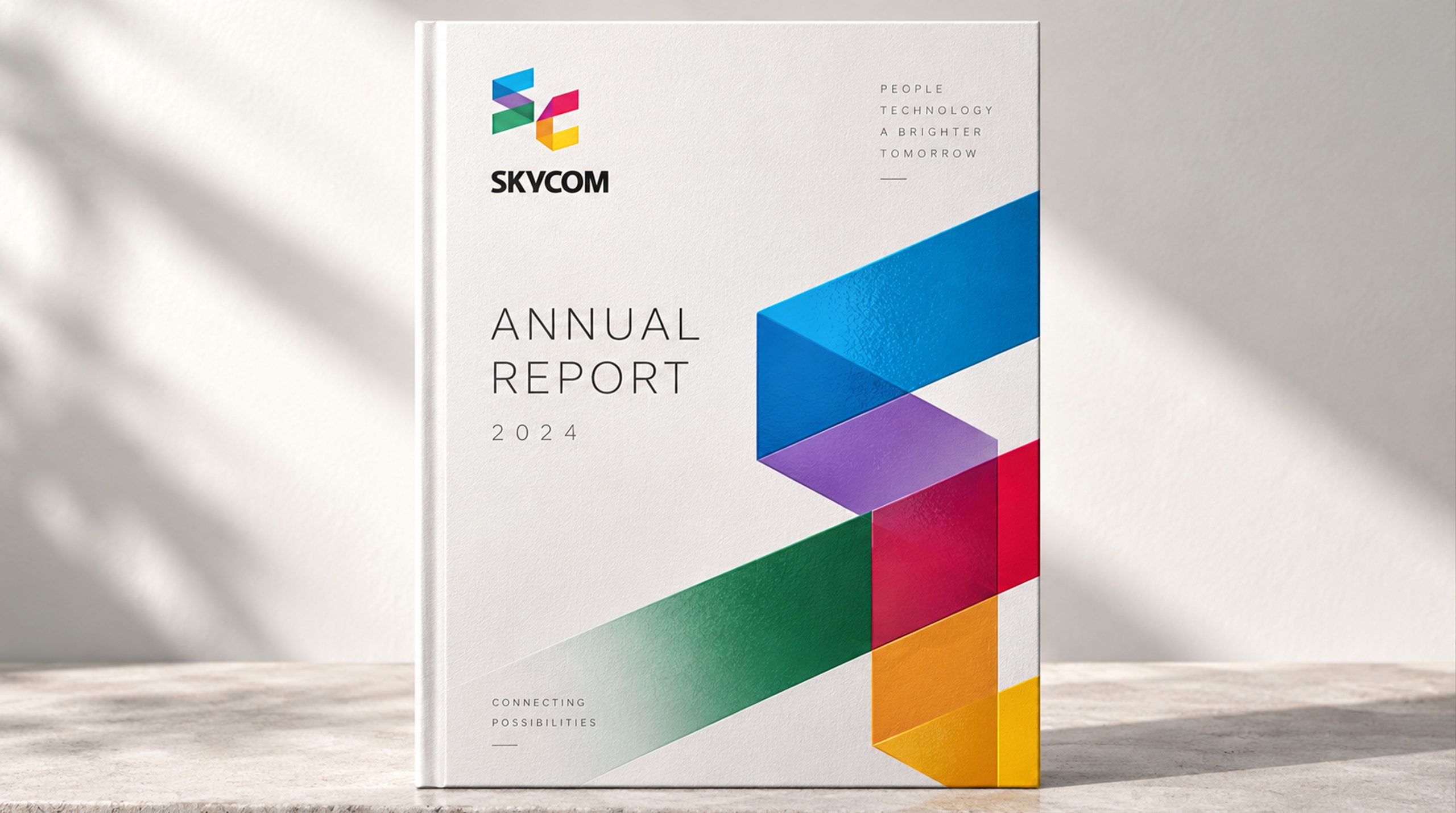
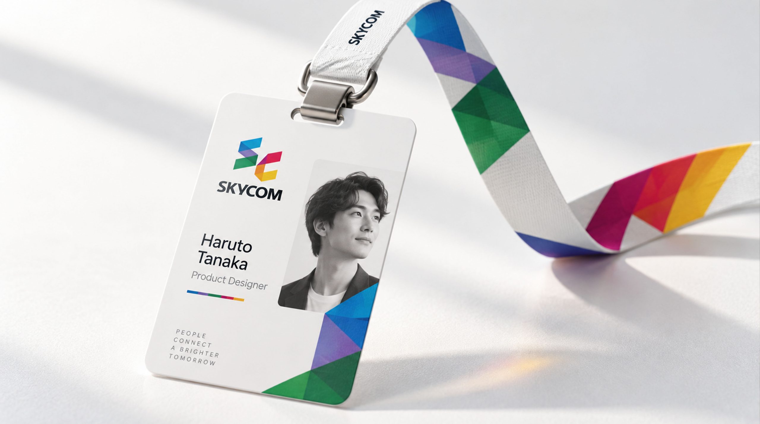
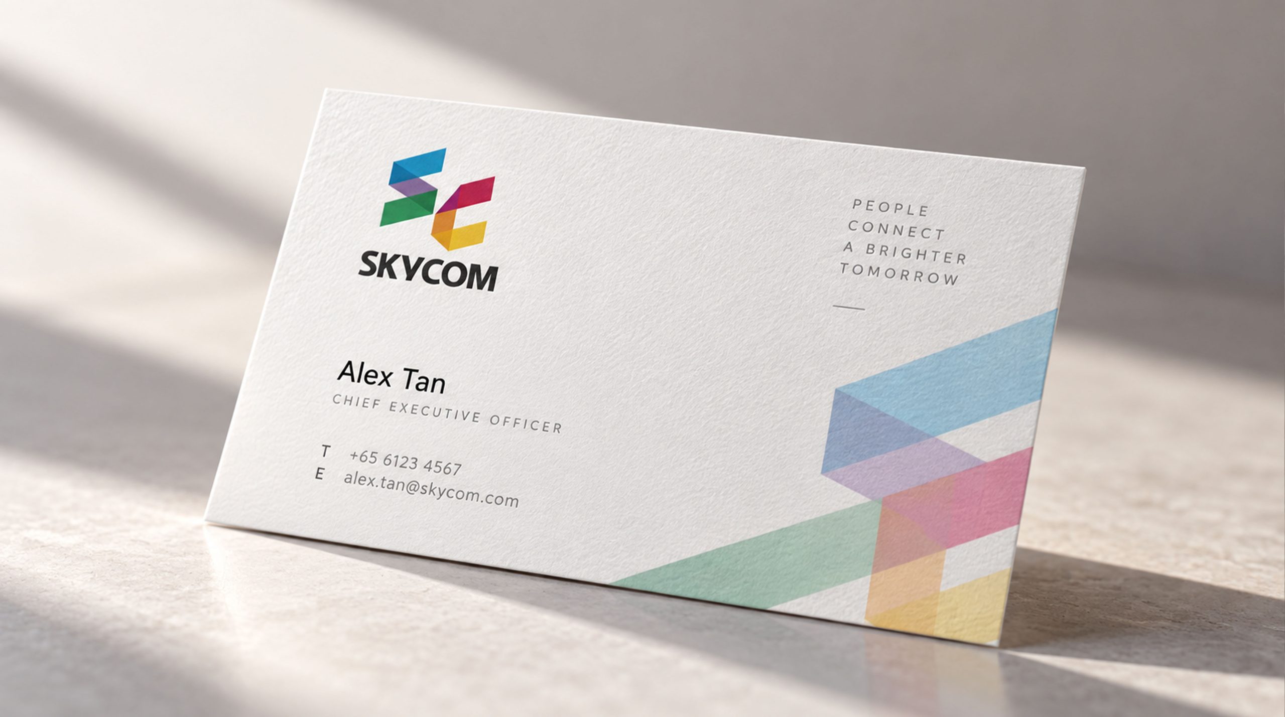
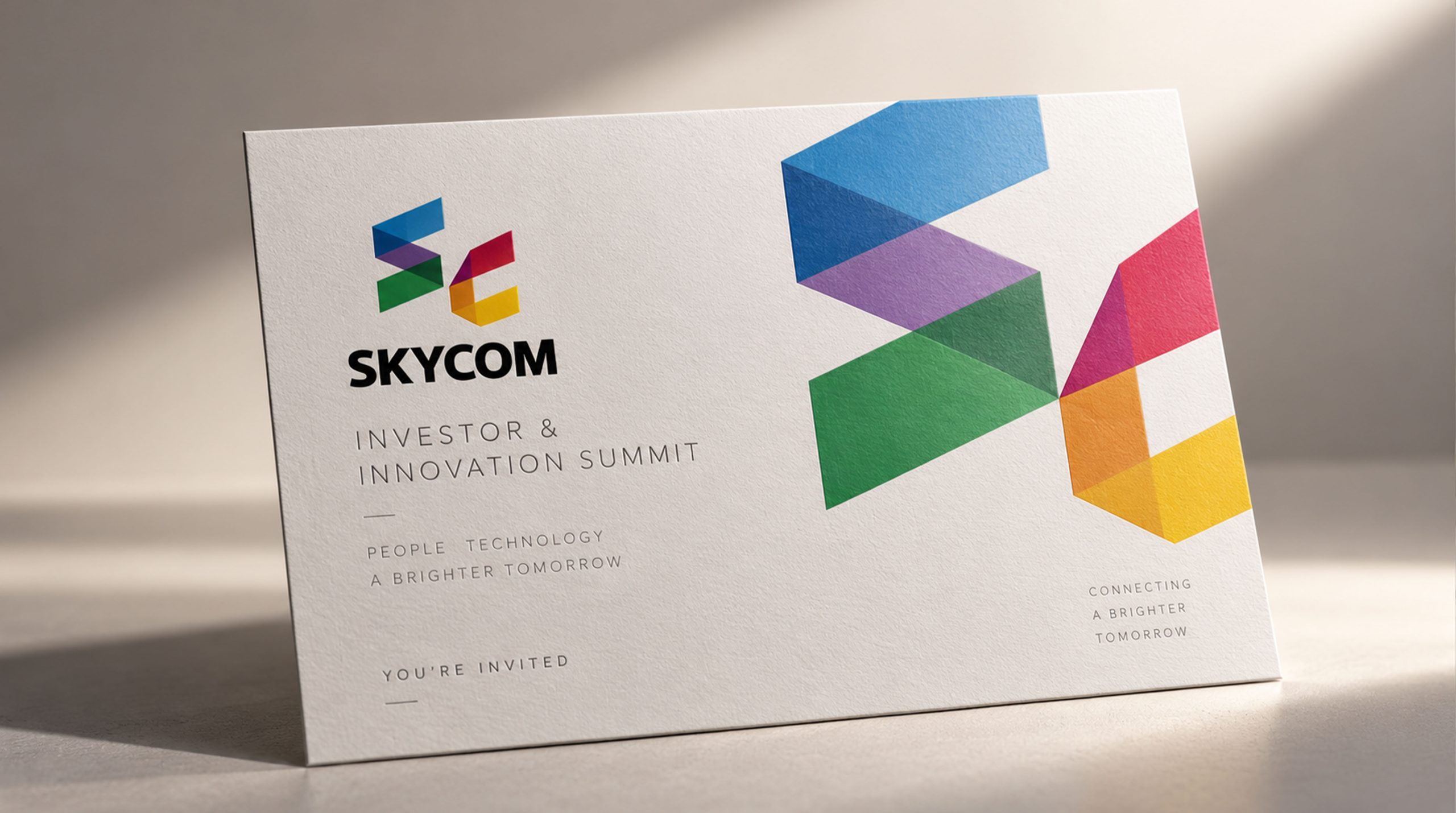
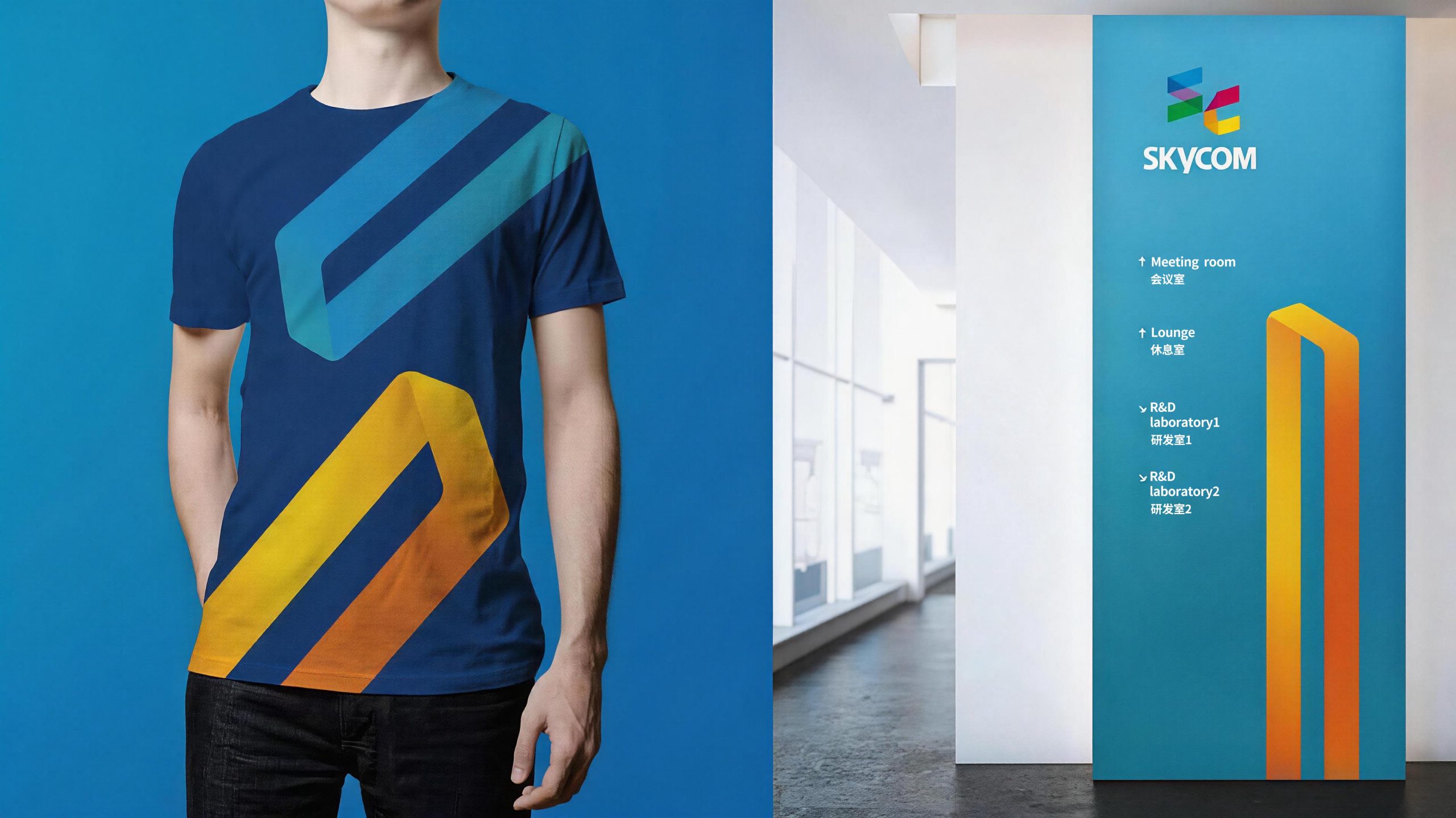
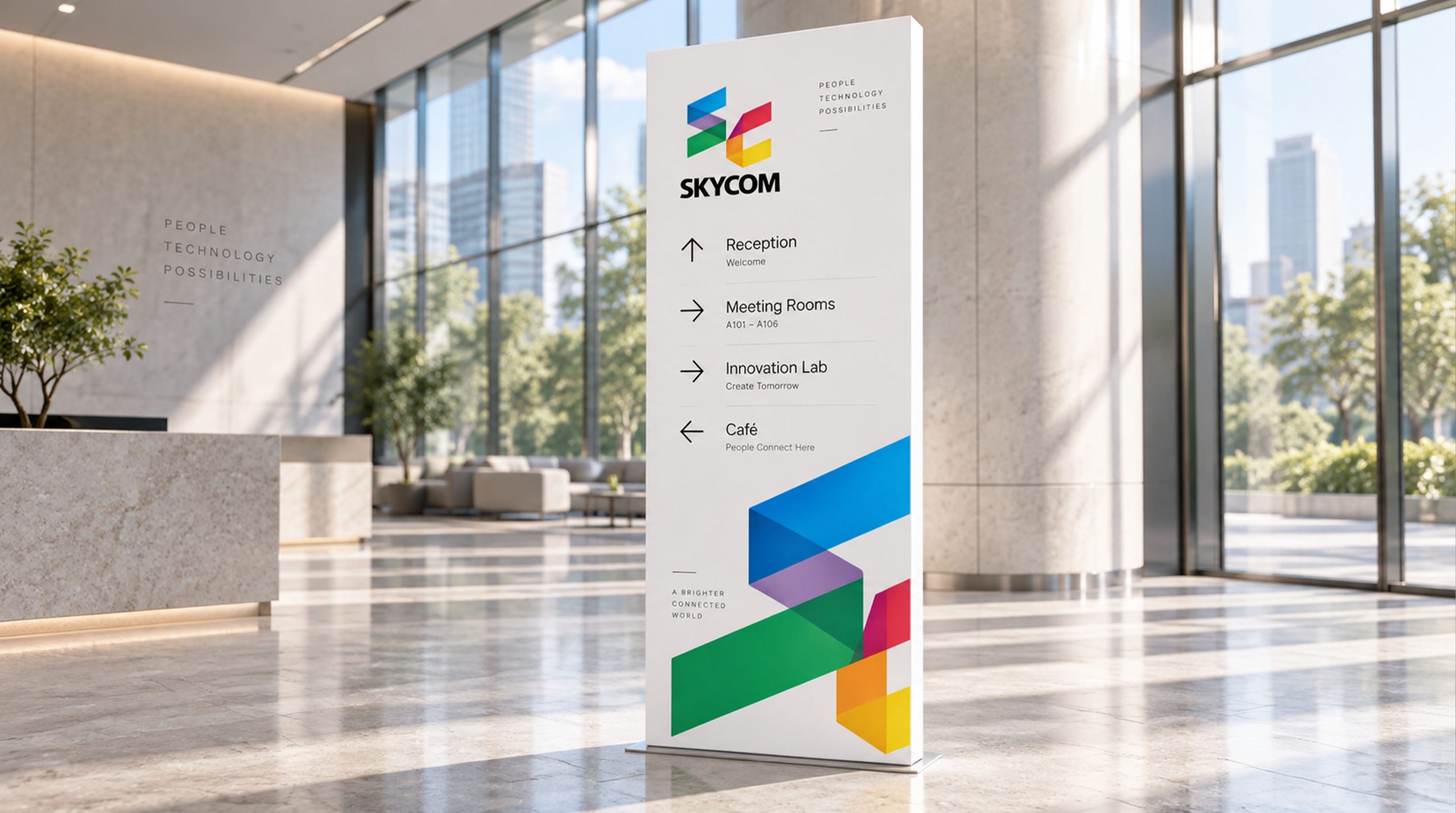
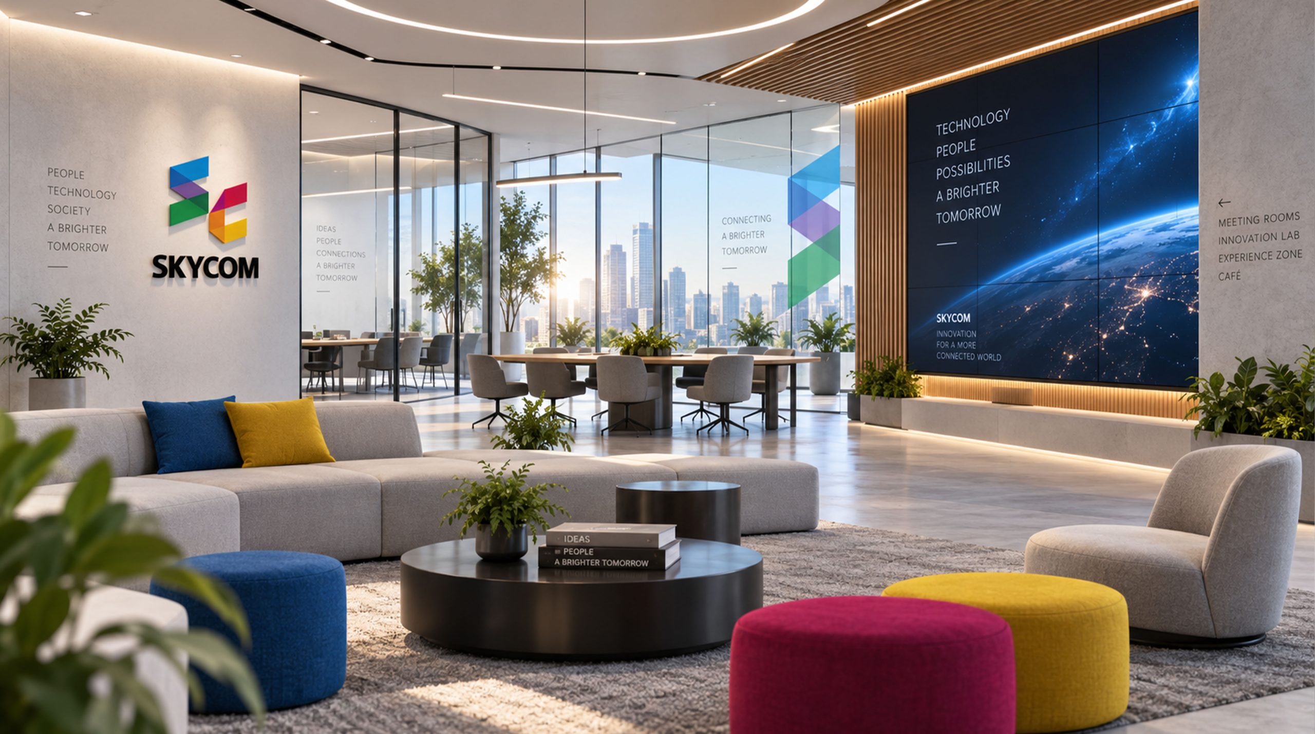
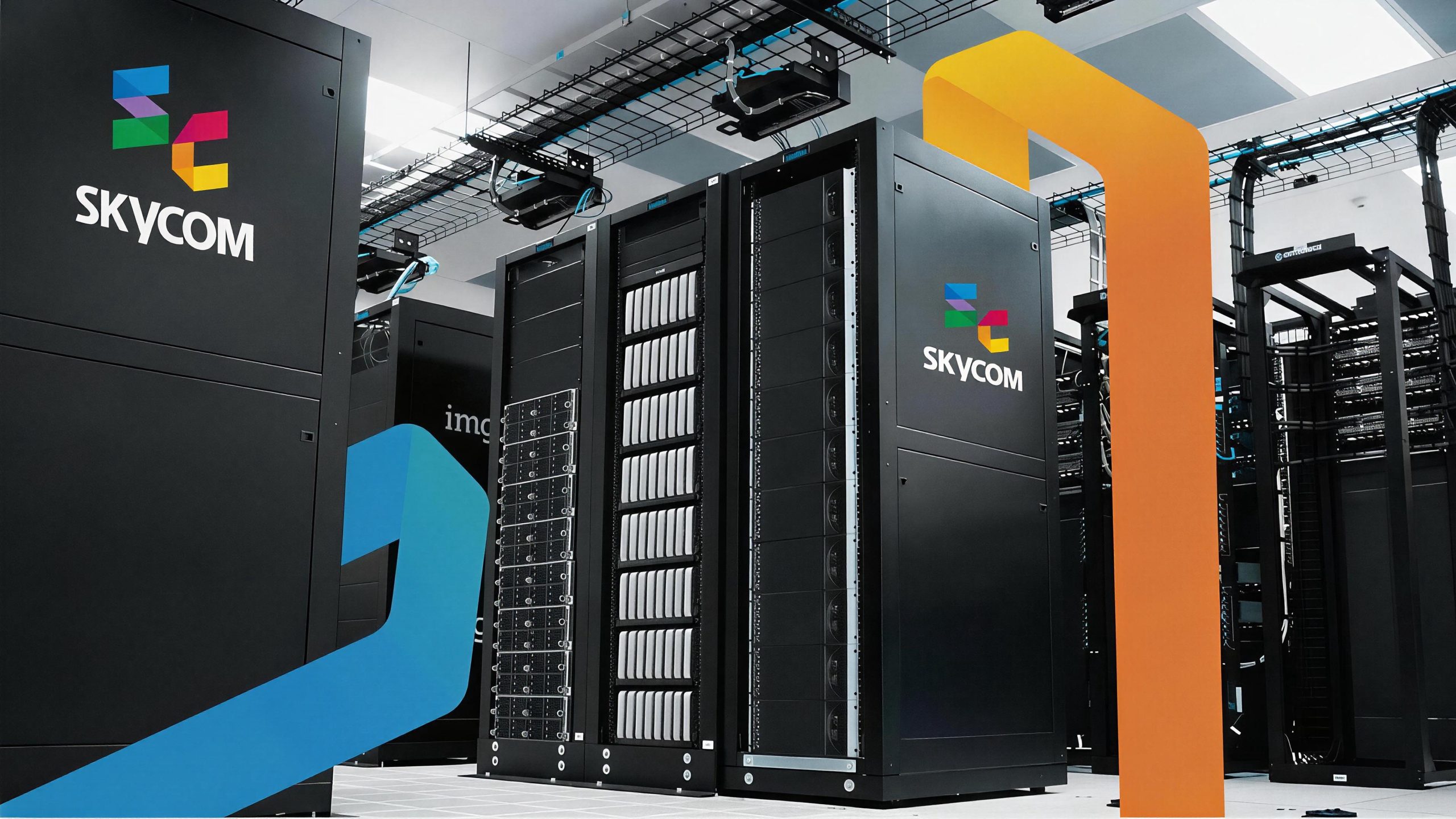
The logo has strong system scalability and can be widely used in company headquarters office environment, front desk image wall, conference room nameplates and floor guidance systems; corporate business cards, business letters, project proposal covers and brand albums; official websites, new media platform matrices, social media avatars and digital marketing materials; film and television project titles, variety show corner signs, performance event stage backgrounds and press conference images; industry exhibitions, media summits, international cooperation negotiations and government cultural project reporting images. In the dynamic vision, the five-color parallelogram color blocks can be slid in from different directions, rotated and combined, producing a rich color fusion effect at the overlap. Finally, the "SC" graphic is fully formed, and the word mark emerges steadily from below, symbolizing the convergence and collaboration of diverse business sectors under the SKYCOM brand banner. The five-color color blocks can be independently extracted as visual parent elements, corresponding to the color logos of different business sectors, and used for department division, project classification, brand pattern system and digital interface design.
The logo contains the four core values of the SKYCOM brand: Dedication - the vast sky blue symbolizes dedicating high-quality content with a sky-like mind; Responsibility - the stable word mark and rigorous geometric structure convey the company's social responsibility and industry responsibility; Innovation - the colorful overlapping color fusion symbolizes continuous exploration and innovation in diversified businesses; Collaboration - the close integration of "S" and "C" represents the brand spirit of teamwork and partnership. The overall design conveys SKYCOM's brand vision of "international vision, diverse communication, and sunshine forward".
Improper Usage (Protection Specification)
Do not change the order, tilt angle or overlapping relationship of the "S" and "C" letter color blocks; do not modify the hue, brightness or saturation of any color in the five-color system; do not remove the color fusion effect at the overlapping color blocks; do not add strokes, shadows, outer glow or texture to graphics. Physical superposition; do not replace geometric color blocks with rounded corners, circles or other non-parallelogram shapes; do not rotate, mirror or extract part of the color blocks separately from the SC for overall use; keep the white space around the logo not less than 25% of the height of the graphic; the minimum display width shall not be less than 30mm.
design results
After the release of the logo, SKYCOM Tianhe Culture's brand recognition and international image in the media industry have been significantly improved. "Colorful SC geometry" has become the core identification symbol of SKYCOM's brand system with its concise, dynamic and diverse visual language, which is in line with the temperament of the media industry. The logo is widely used in corporate communications, project cooperation and industry exchanges, successfully conveying SKYCOM's brand image of dedication, responsibility, innovation and cooperation to consumers, and demonstrating the brand vision of "international vision, sunshine media".