










Hengyu Daye Investment is an investment company positioned in the high-end market. Its core business is the exclusive rental of top luxury cars such as Rolls-Royce and Bentley, serving high-end customers who pursue ultimate quality and noble experience.
The brand name "Hengyu Daye" implies a long-lasting and broad business territory and a grand career pattern. It builds trust with "Heng", expands territory with "Yu", and achieves extraordinary things with "Great cause".
The design goal of the brand logo is to demonstrate the high-end positioning of Hengyu Daye Investment as a top luxury car rental brand through the visual language of aristocratic temperament, noble taste and classic inheritance, and to convey the brand image of "nobility, trust and permanence".
Design concept and graphic language
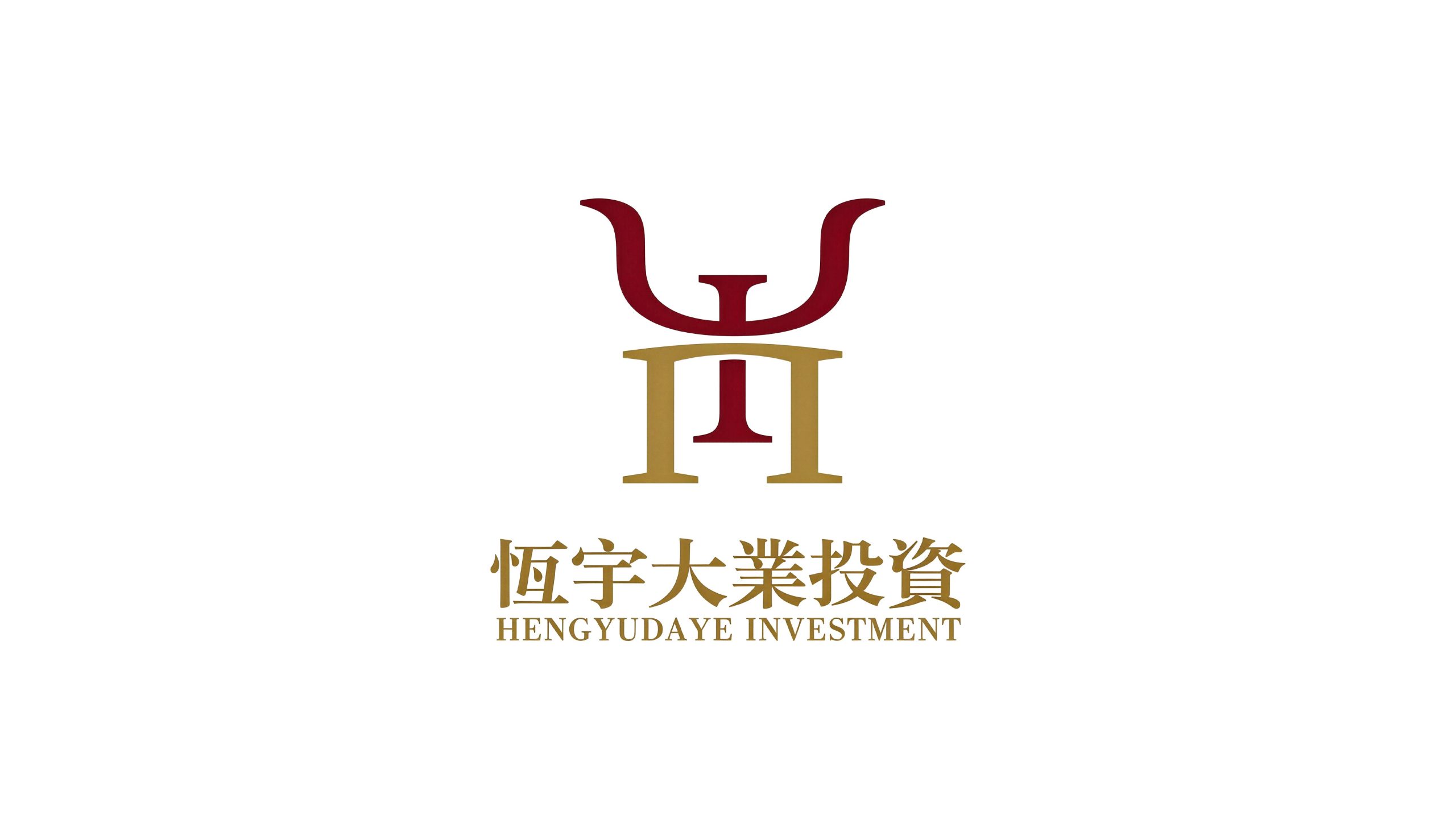
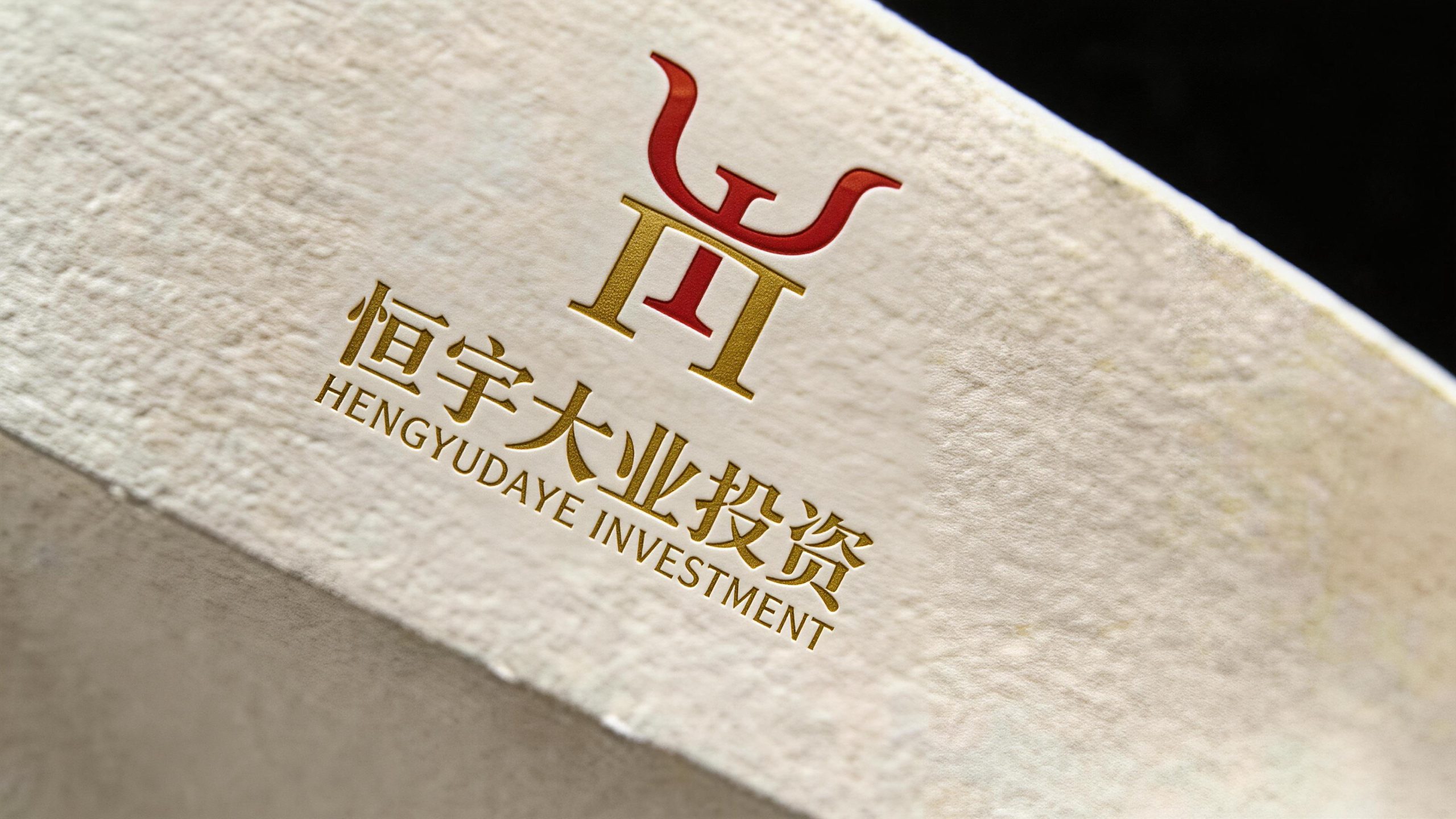
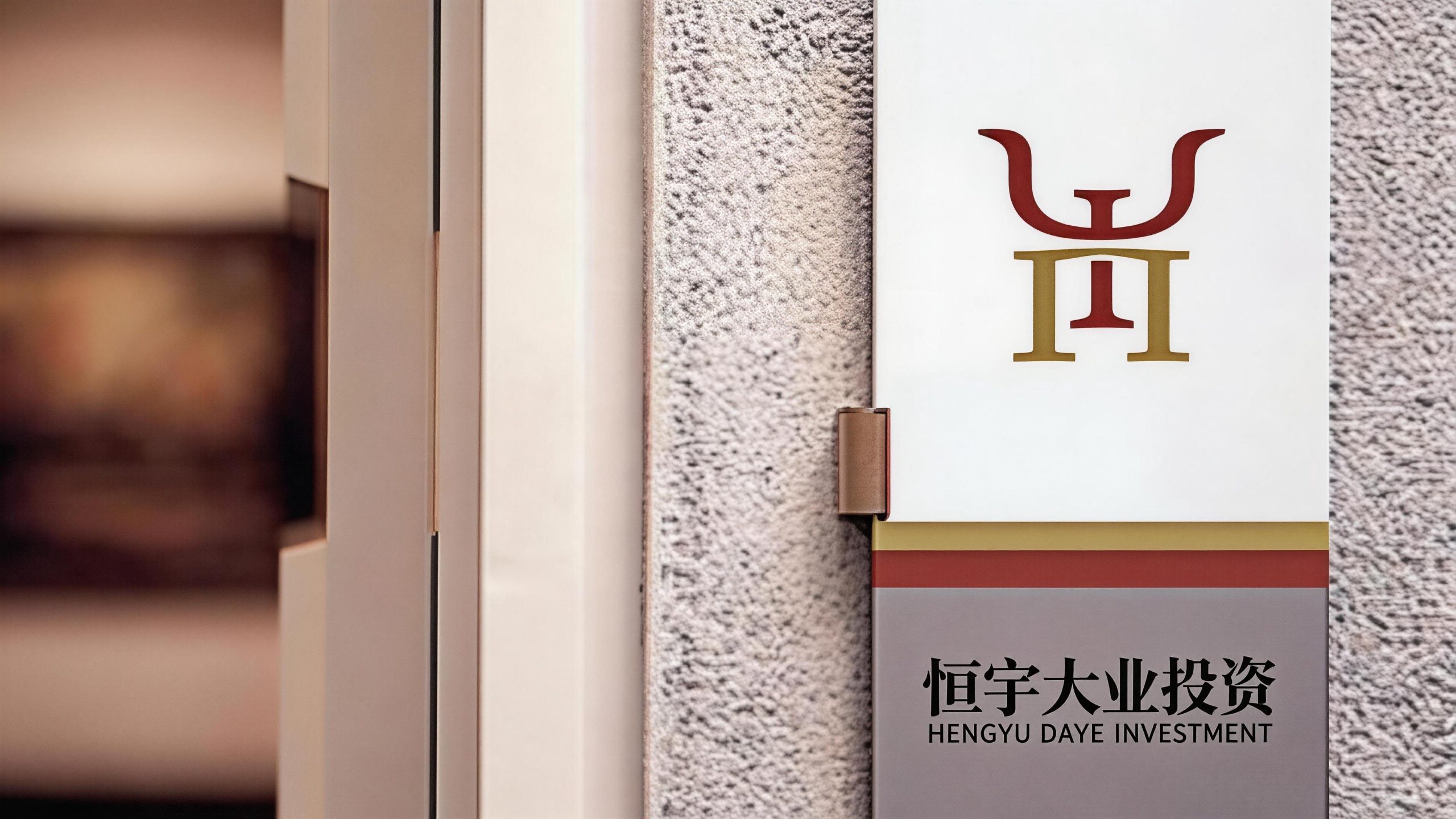
The logo uses "HY Monogram" as the core concept, integrating the initial letters "H" and "Y" of Hengyu Daye through a unique shape design to form an inseparable brand totem and strengthen the brand's visual memory. The two letters are not simply arranged side by side, but have achieved organic integration through ingenious space interleaving and structural sharing - the two diagonal strokes of "Y" spread gracefully from the top to both sides, like the spread of wings in a noble heraldry; the double vertical strokes of "H" stand tall and straight in the middle and lower part, carrying the stretch of "Y" with a stable structure. The two share the central horizontal stroke, forming a seamless structural connection at the intersection. The overall design integrates the recognizability of letters with the ritual sense of heraldry, reflecting the dual attributes of Hengyu Daye Investment between high-end business and aristocratic taste.
The two strokes of the "Y" letter are elegantly rolled upwards on both sides, and the ends are slightly upward to form curled corners, just like the classic flying wing decoration on the hood of a top-end luxury car. This detail directly echoes the brand image of Rolls-Royce's "Flying Goddess" and Bentley's "Spreading Wings B Logo", and hints at Hengyu Daye's core business areas in the most subtle way. The rolling arc injects a touch of elegance and agility into the strong linear structure, conveying the "elegance in power" temperament unique to top luxury brands. The "H" letter uses symmetrical double vertical strokes to form a stable base structure. The strokes are tall and thick, like the columns of a classical building, symbolizing the stability of the brand's foundation and the solid foundation of its investment business. The horizontal stroke of "H" exactly coincides with the intersection of "Y", and a powerful horizontal line closely connects the soaring above and the steady below, implying the brand spirit of "down to earth, ambitious". The overall graphic has a symmetrical composition, balanced left and right, and echoed up and down. It is like a carefully carved family coat of arms or seal emblem, conveying the solemn order and sense of inheritance of an aristocratic family. The overall composition uses classic symmetrical heraldic aesthetics to construct a "brand totem", conveying the noble positioning and long-lasting pattern of Hengyu's great cause.
Font composition and color system
The Chinese "Hengyu Daye Investment" is presented in traditional Chinese fonts, using the classic Song font, with thin horizontal lines and thick vertical strokes, and clear strokes. The complex strokes and dignified structure of the traditional fonts directly give the brand a sense of historical depth and cultural nobility, conveying the grand atmosphere and inheritance meaning carried by the word "Daye". The English "HENGYUDAYE INVESTMENT" is arranged below the Chinese characters in a standard uppercase sans-serif font. The fonts are regular and evenly spaced. The letter spacing is slightly wider than the regular arrangement. It conveys the leisure and confidence of the high-end brand with a calm and relaxed breathing. Chinese and English are arranged in the middle, with clear hierarchy. Traditional Chinese at the top shows cultural heritage, and English at the bottom ensures international recognition.
The main color, noble red #8B1A2B, is used for the "Y" letter and the upper flying wing shape, which represents nobility, enthusiasm and the core strength of the brand. This deep dark red is different from ordinary bright reds. It uses a restrained and deep color temperature to convey the low-key luxury unique to top brands - just like the deep red tone in Rolls-Royce's classic car paint, it is calm and full of tension. Brilliant Gold #B8943E is used for the "H" letter and the lower base structure, representing wealth, quality and value accumulation in investment careers. The warmth and heaviness of gold fit the trust attributes of the investment industry and the noble positioning of luxury cars. The combination of red and gold is the most classic color combination between aristocratic heraldry and top brands - the enthusiasm and power of red combined with the nobility and eternity of gold form a strong and harmonious high-end contrast visually, reflecting Hengyu Daye's aristocratic positioning of "exclusively renting top-end Rolls-Royce and Bentley cars". The Chinese logo adopts the same color tone as gold, and the English logo is also presented in gold to ensure the color unity and high-end tonality of the overall brand system. Pure white #FFFFFF and dark black #1A1A1A are used as standard background colors, adapting to light and dark application scenarios respectively, ensuring the clarity and dignity of the logo on various media.
Application extension and brand significance
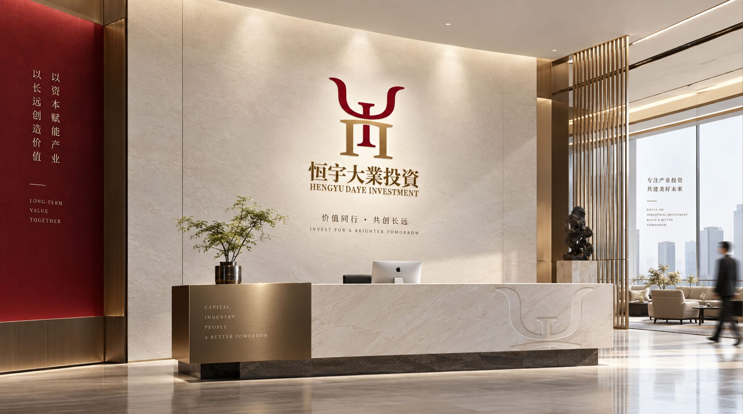
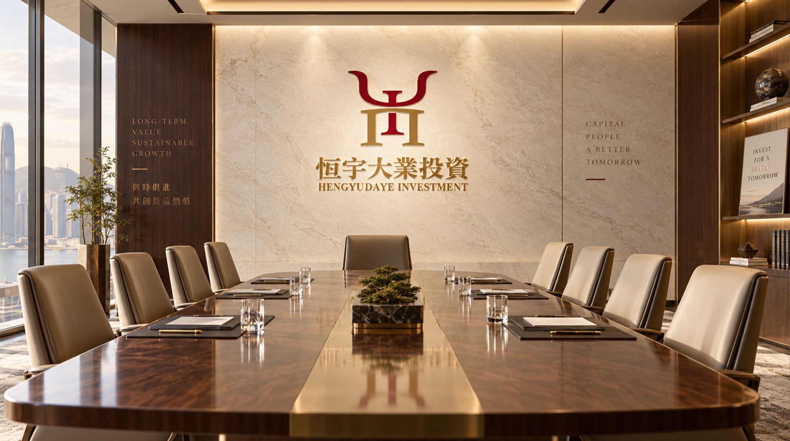
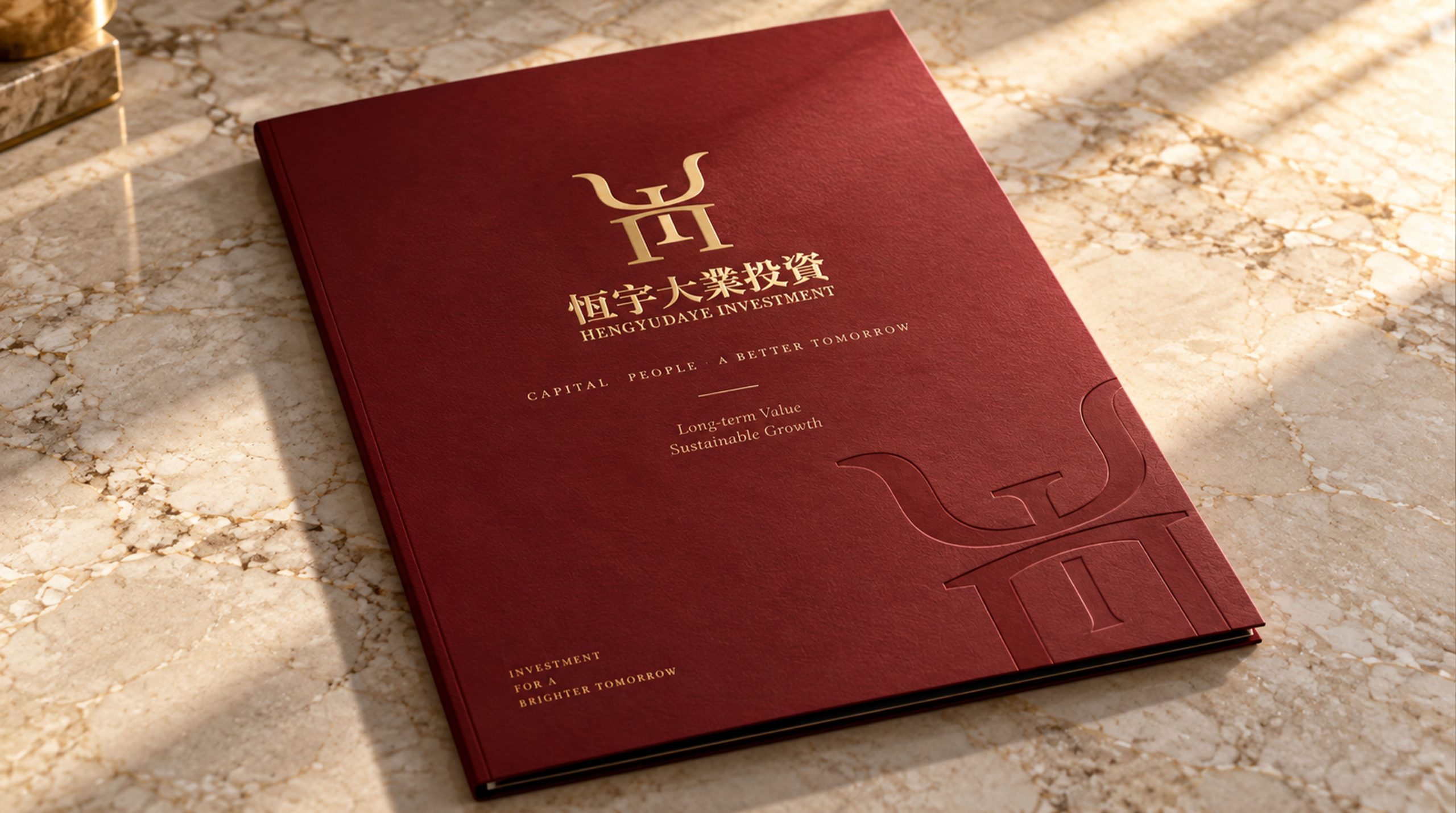
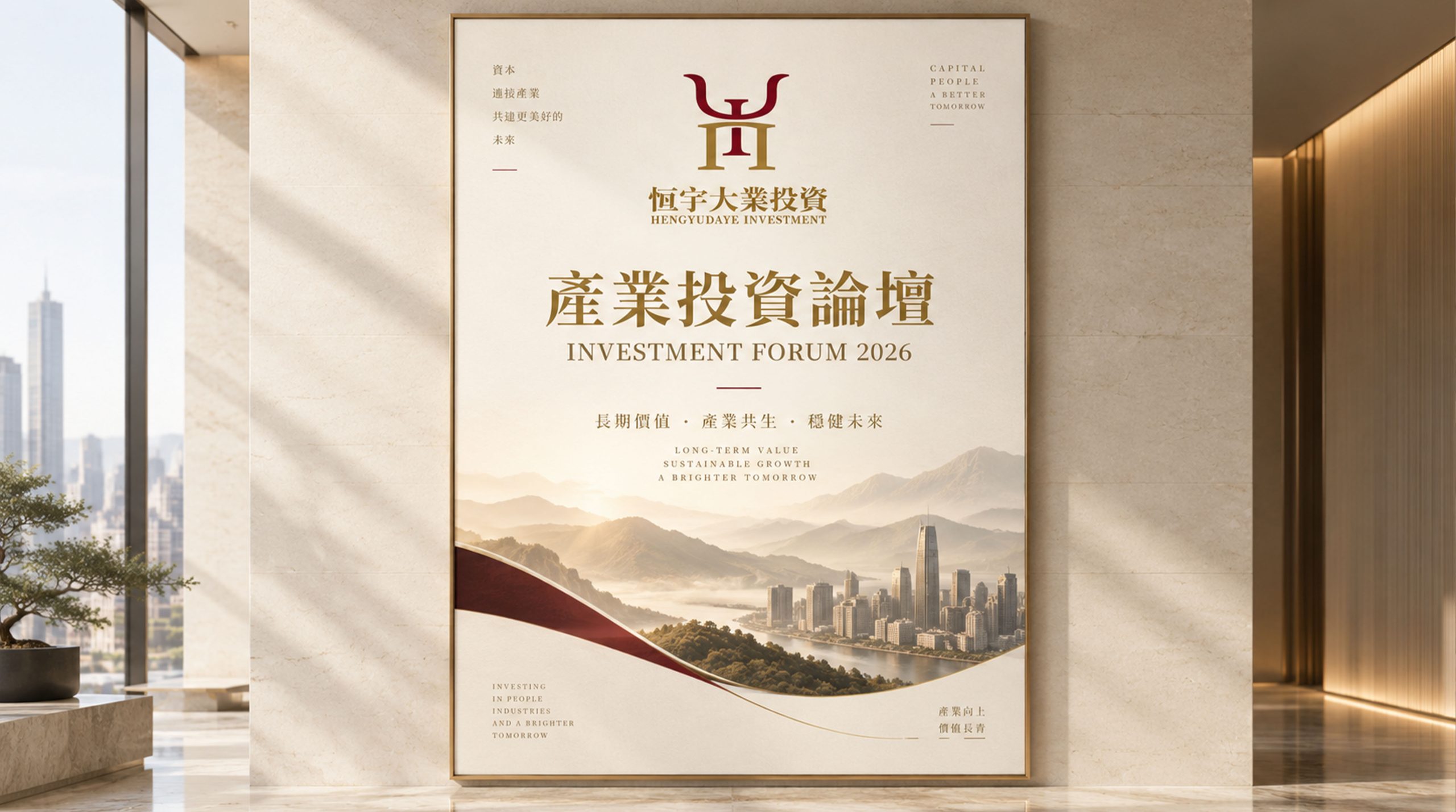
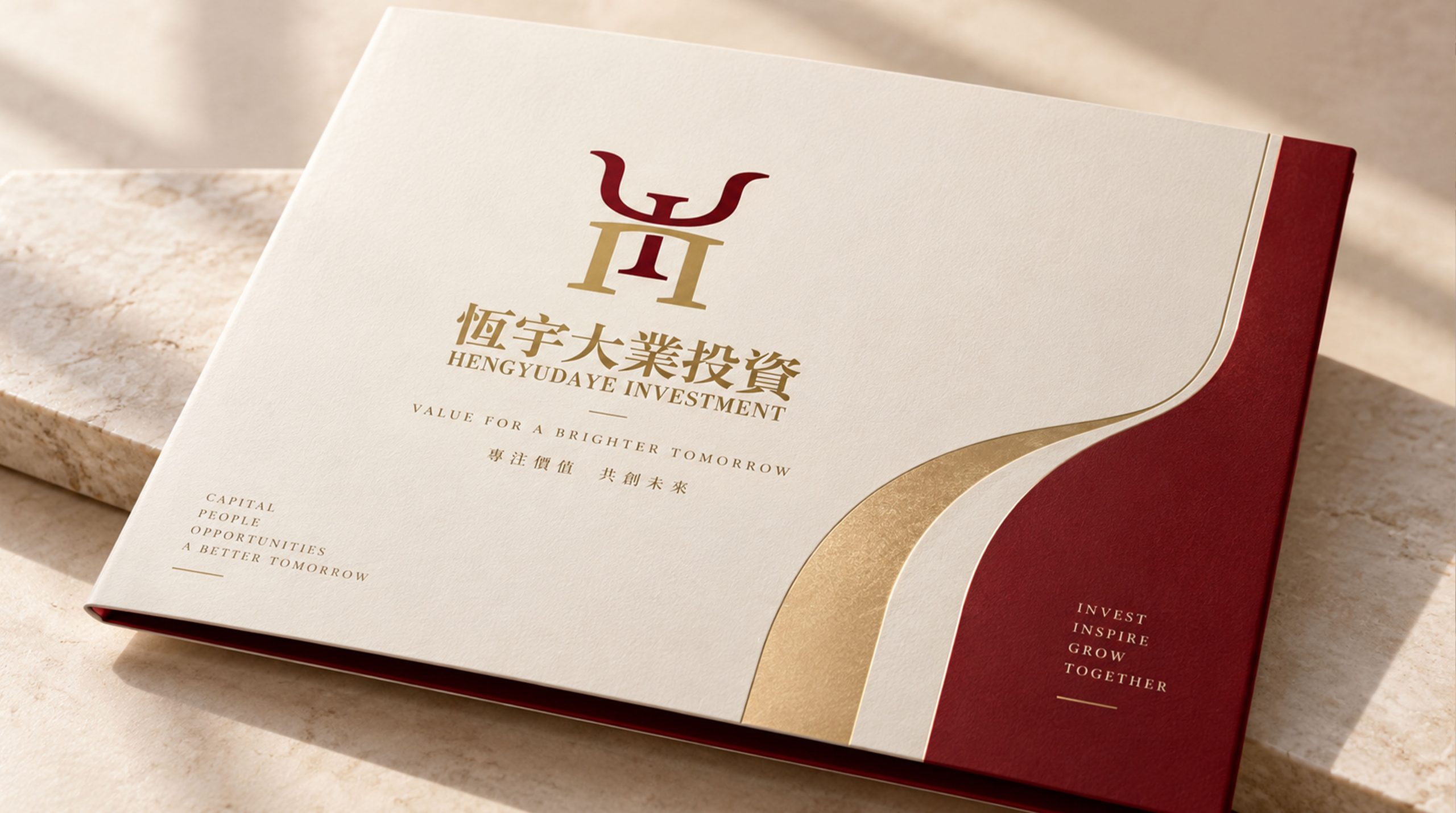
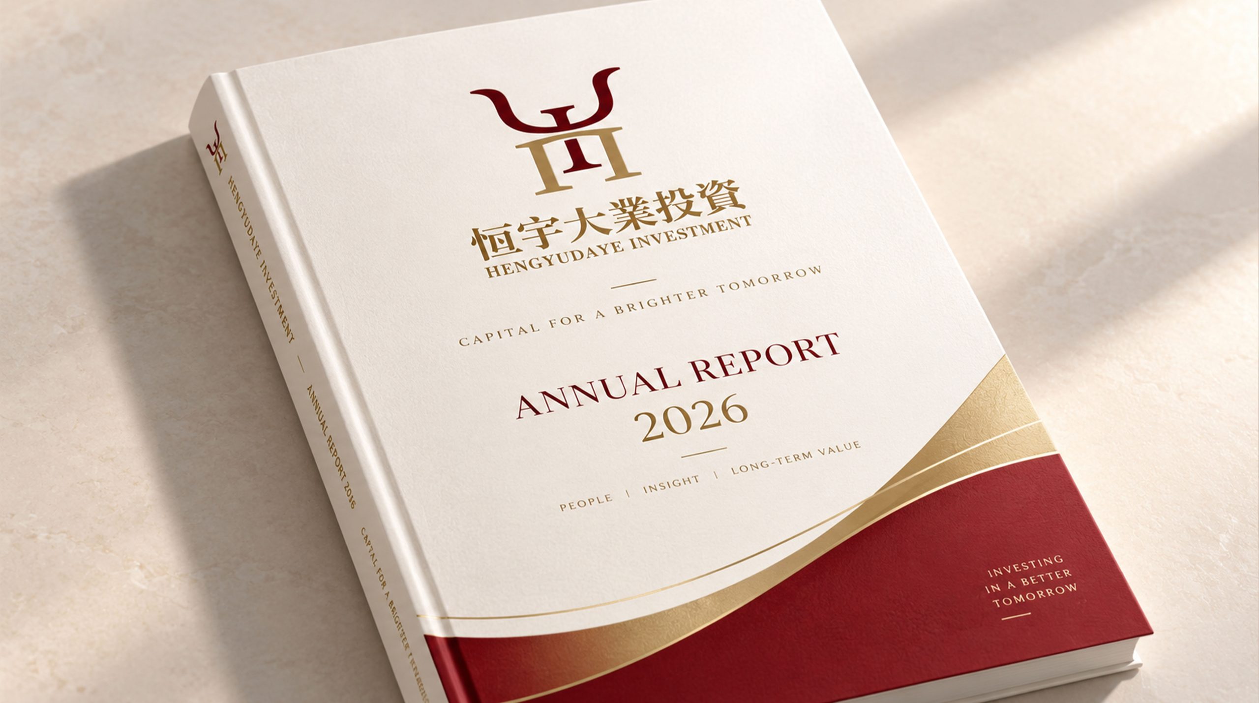
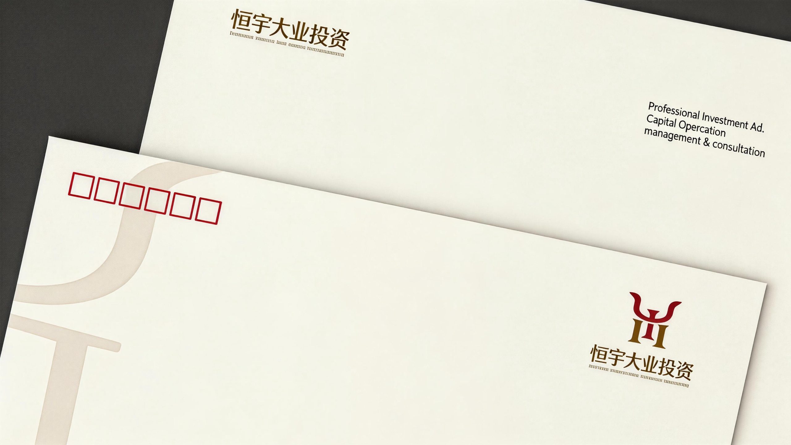
The logo has strong system scalability and can be widely used in luxury vehicle body logos, keychain nameplates and customized nameplates in the car; VIP membership cards, business cards, contract document covers and high-end gift packaging; brand flagship showroom door headers, reception area image walls, vehicle display area guides and light box signs; official websites, high-end reservation platforms, social media images and digital marketing materials; high-end business cocktail parties, brand tastings, industry summits and cross-border cooperation event images. In the dynamic vision, the flying wing curve of "Y" can gracefully stretch from the center to both sides, and then the double pillars of "H" stand steadily from bottom to top. Finally, the two colors of red and gold blend and shine at the intersection, symbolizing the brand's magnificent journey from a solid foundation to spreading its wings. HY heraldic graphics can be extended into visual mother elements and used for vehicle interior embossing, leather goods hot stamping, brand dark patterns and high-end packaging systems.
The logo contains the three core images of the Hengyu Daye investment brand: Noble Elegance - the red and gold color scheme and flying wing shape convey the top aristocratic temperament comparable to Rolls-Royce and Bentley; Solid Foundation - the double-column structure of the "H" letter symbolizes the solid foundation and long-term trust of the investment business; Grand pattern (Grand) Vision) - The spread of the "Y" letter conveys Hengyu Daye's brand ambition of "lasting broadness and extraordinary cause". The overall design conveys Hengyu Daye Investment's brand vision of "prestige and long-lasting, great success is expected".
Improper Usage (Protection Specification)
Do not change the fusion method, structural proportion or intersection relationship of "H" and "Y"; do not modify the curvature, rolling direction or end shape of the flying wing curve; do not change the hue, brightness or the upper and lower distribution relationship of noble red and brilliant gold; do not add gradients and strokes to the logo , shadow or three-dimensional effect; do not replace traditional Chinese characters with simplified fonts; do not rotate, tilt or extract "H" or "Y" separately from the fusion graphics; keep the white space around the logo not less than 25% of the height of the graphics; the minimum display width must not be less than 30mm.
design results
After the release of the logo, Hengyu Daye Investment's brand recognition and distinguished image in the field of high-end luxury car rental and investment have been significantly improved. "Red gold HY coat of arms", with its visual language of aristocratic temperament and classic taste, has become the core identification symbol of Hengyu Daye brand system. It is widely used in luxury vehicles, high-end showrooms and business social networking, showing the brand vision of "long-lasting nobility and extraordinary achievements".