










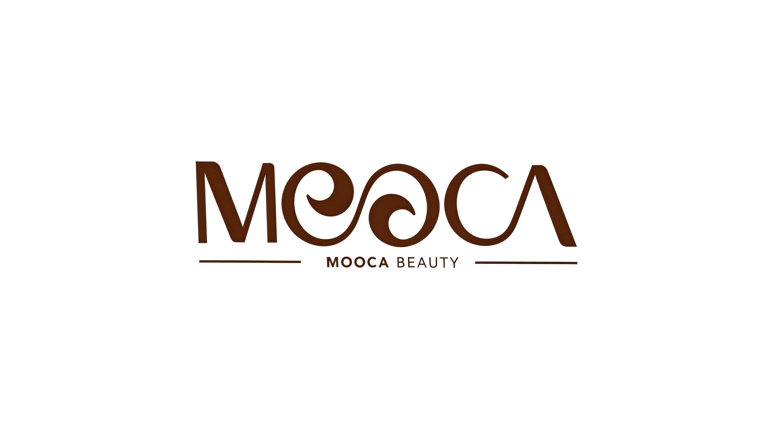
MOOCA BEAUTY is a high-quality beauty and lifestyle brand for modern and fashionable women. With "nature, simplicity, and elegance" as its core aesthetic proposition, MOOCA BEAUTY is committed to providing products and services that are both functional and aesthetic for women who pursue a quality life.
The brand name "MOOCA" has soft and exotic sounds, carrying the implicit charm of oriental aesthetics and the modern expression of international fashion. Qingmei Future was commissioned to lead the brand identity design.
The design goal of the brand logo is to demonstrate MOOCA BEAUTY's fashion positioning as a high-quality female beauty brand through the visual language of oriental aesthetics, international design sense and feminine temperament, in line with the high-quality life pursuits of modern fashionable women who are "natural, simple and elegant".
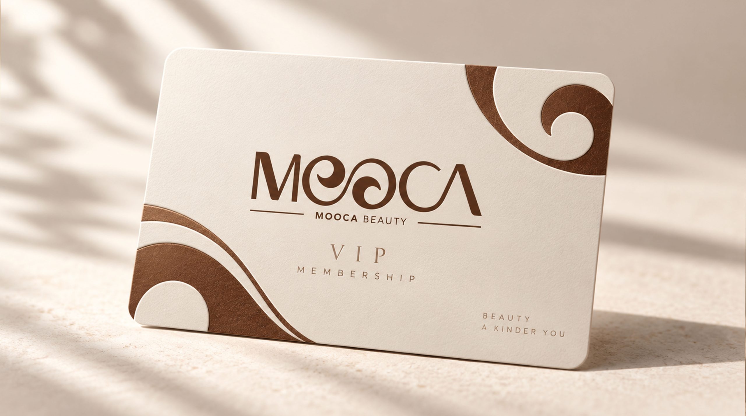
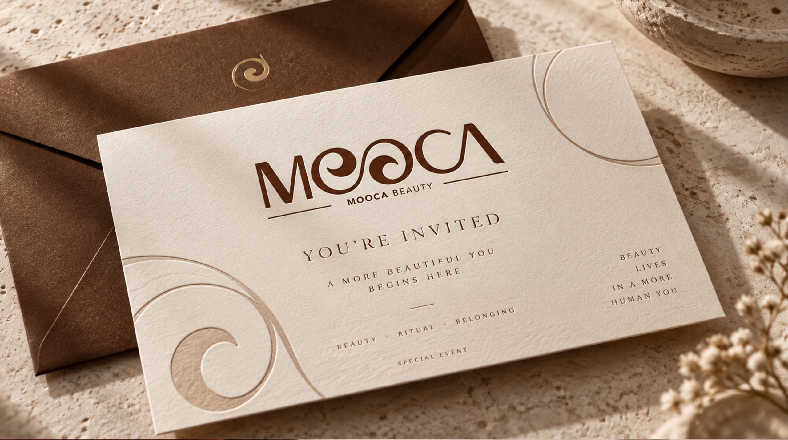
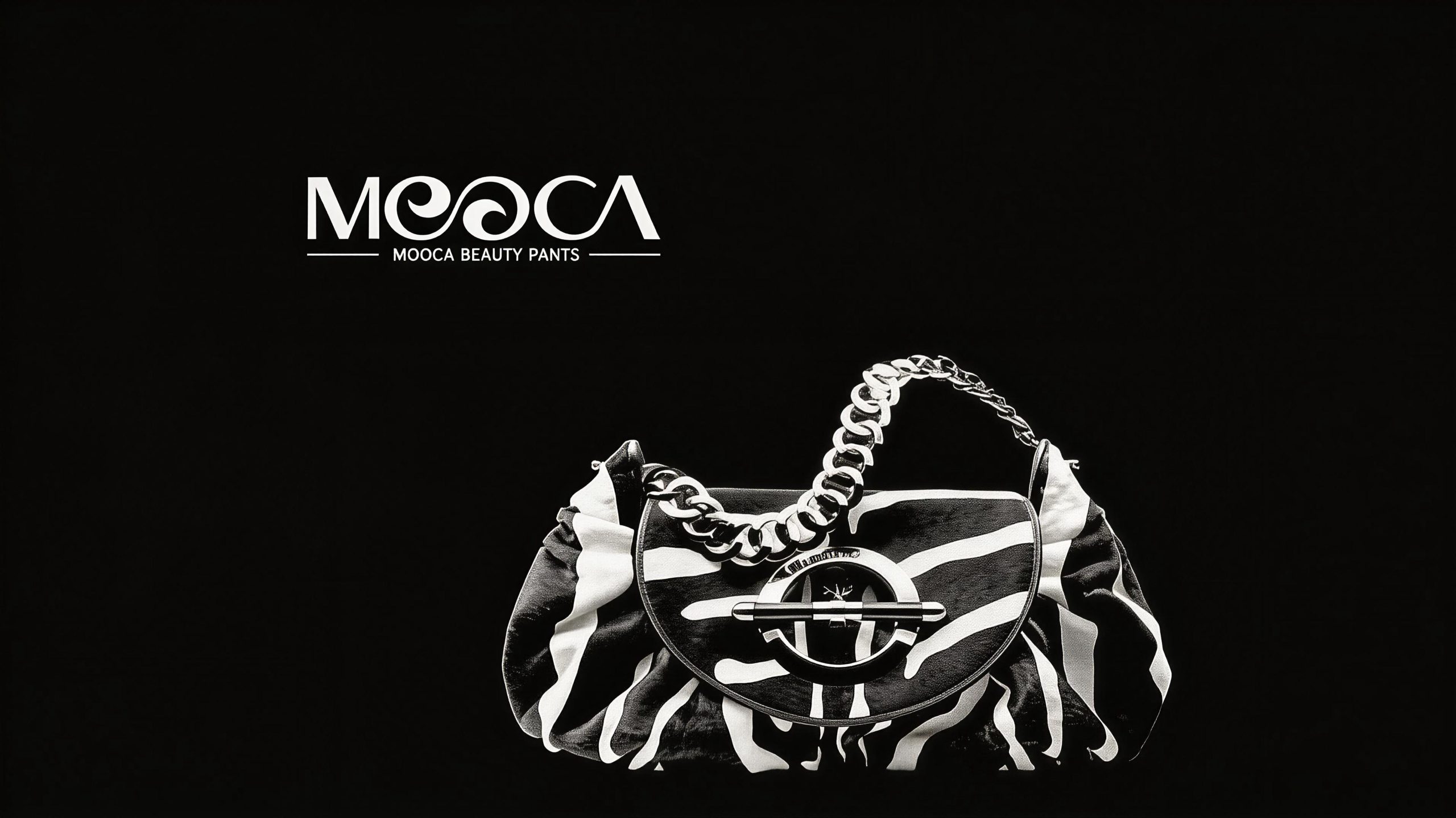
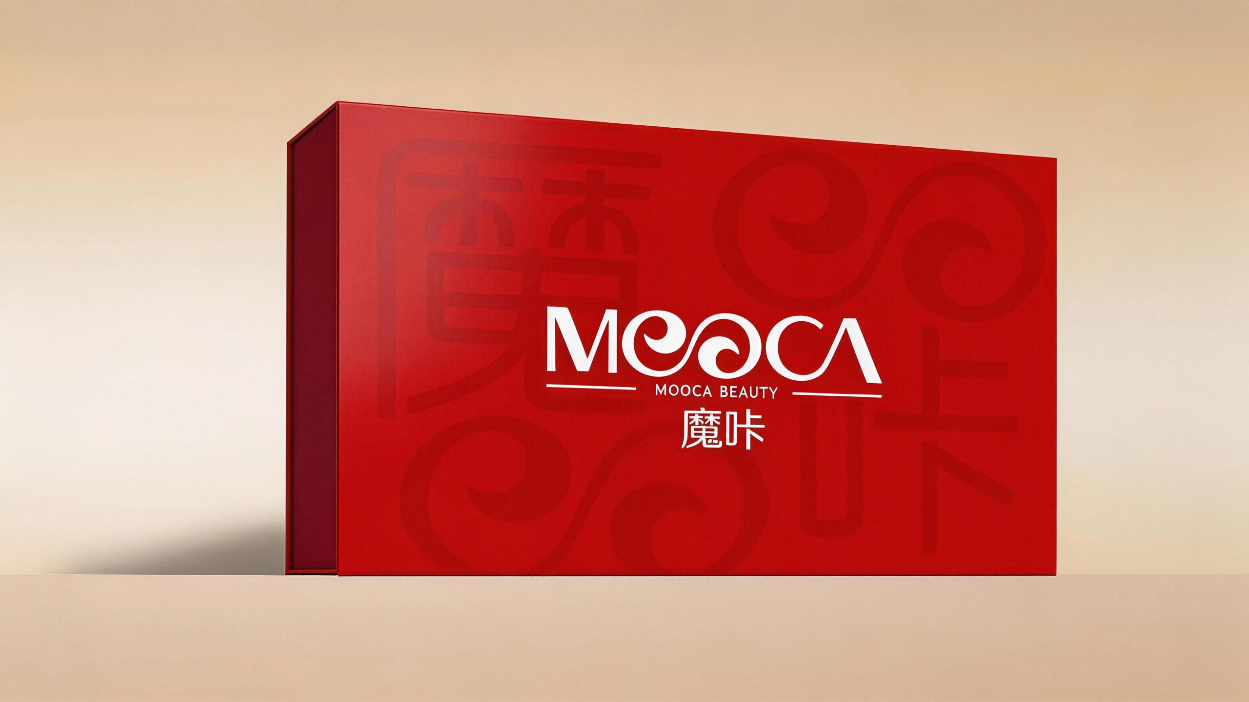
Design concept and graphic language
The logo uses "Scrollwork Logotype" as the core concept and the five letters of the brand name "MOOCA" as the only visual subject. Through the artistic recreation of the letter form, the rhythm of traditional oriental ornamentation is integrated into the modern font design. The key idea of the design is to connect the two "O" letters in the middle of "MOOCA" into an oriental curve. The shape is directly inspired by the traditional Chinese curly grass pattern. The curly grass pattern is one of the most elegant patterns in classical Chinese decorative arts. The continuously flowing S-shaped curve symbolizes the endless natural vitality. The two "O"s are no longer independent rings, but are interconnected and connected by a smooth scroll curve, just like the two stamens of the same curly grass - the "O" on the left rotates inward with a spiral curve, and the "O" on the right continues to stretch and rotate following this curve. The two share the same soft continuous line, forming an unbreakable organic whole. The overall design integrates the classical rhythm of Chinese curly grass patterns with the modern precision of international font design, reflecting the dual attributes of the MOOCA BEAUTY brand between oriental aesthetics and international fashion.
This curve of curly grass running through the double "O" also carries another aesthetic metaphor - the soft S-shaped line symbolizes the graceful figure curve of women. The ups and downs, turns and stretches of the curves are like the graceful contours of the female body from shoulders and neck to waist and hips, praising female beauty in the most subtle way, perfectly combining functionality and beauty. The letter "M" stretches upward with two symmetrical diagonal lines, like a towering shoulder line, conveying confidence and strength; the curly curve of the double "O" is the emotional center of the entire word mark, winding softly and rhythmically, conveying tenderness and elegance; the opening arc of "C" opens to the right, like an open embrace, conveying tolerance and nature; "A" uses a triangular structure to steadily consolidate the overall situation, like the lower edge of a skirt, conveying dignity and grandeur. The five letters form a rhythmic change of "rigid-soft-soft-soft-steady" from left to right, like an elegant melody, showing the rich layers of female beauty from beginning to end. The overall composition uses artistic curly cursive wordmarks to construct "Oriental Beauty", conveying the brand's cultural heritage and fashion style.
Font composition and color system
The main title "MOOCA" adopts a completely customized artistic font. The stroke thickness, curve and structural proportion of each letter have been designed and carefully considered one by one. The main strokes of the letters maintain a uniform thickness, conveying the stability and quality of the brand; while the strokes in the curved part of the curly grass naturally narrow at the rotation point and gradually become thicker at the stretch point, just like the rhythm of the brush when writing, giving the word mark a delicate texture like craftsmanship and a flowing charm like calligraphy. The overall style of the letters is somewhere between serif and decorative styles - the main structure remains simple and modern without serifs, while the curly grass decoration of the double "O" gives it a gorgeous oriental charm, achieving a perfect balance between simplicity and elegance. The subtitle "MOOCA BEAUTY" is arranged below the main title in standard capital sans-serif font, and is bounded by two thin horizontal lines on the left and right, forming a classic brand frame structure. The fonts are regular and restrained, and the spacing is loose and leisurely, highlighting the brand's beauty industry attributes in a restrained manner.
The main color, oriental brown #5C2E0E, is the only color used in the logo, representing the warmth of earth, nature and oriental aesthetics. This deep and textured brown, like the color of fine sandalwood, the mellowness of natural cocoa, and the calmness of oriental lacquerware, is the best among all colors to convey the dual brand keywords of "nature" and "elegance" at the same time. Brown is different from the common pink, rose gold or black and white colors in the beauty industry. The unique color selection establishes MOOCA BEAUTY's differentiated recognition among peers - it is not sweet, not cold, and conveys the calm attitude of high-quality life with earth-like warmth and wood-like calmness. Pure white #FFFFFF is used as the standard background color, and the purest background is used to set off the warm texture of the brown wordmark, creating a simple aesthetic atmosphere of "blank space is breathing". The overall color system runs through a single brown color, reflecting the brand proposition of "nature is luxury, simplicity is taste", and conveys the richest brand emotion with the least color.
Application extension and brand significance
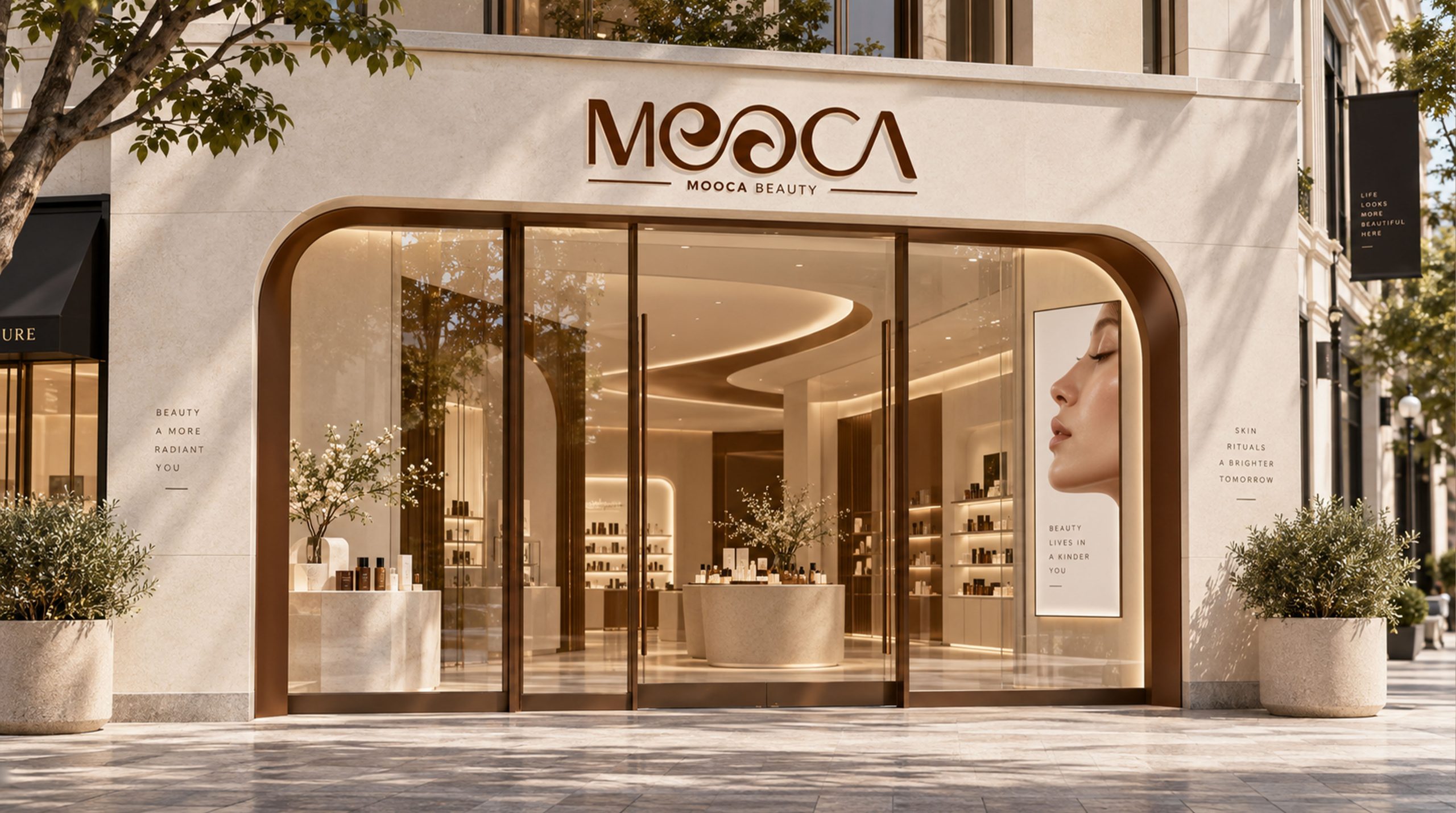
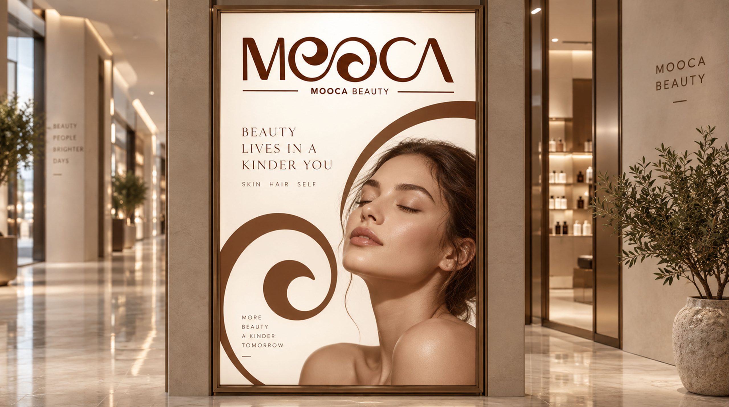
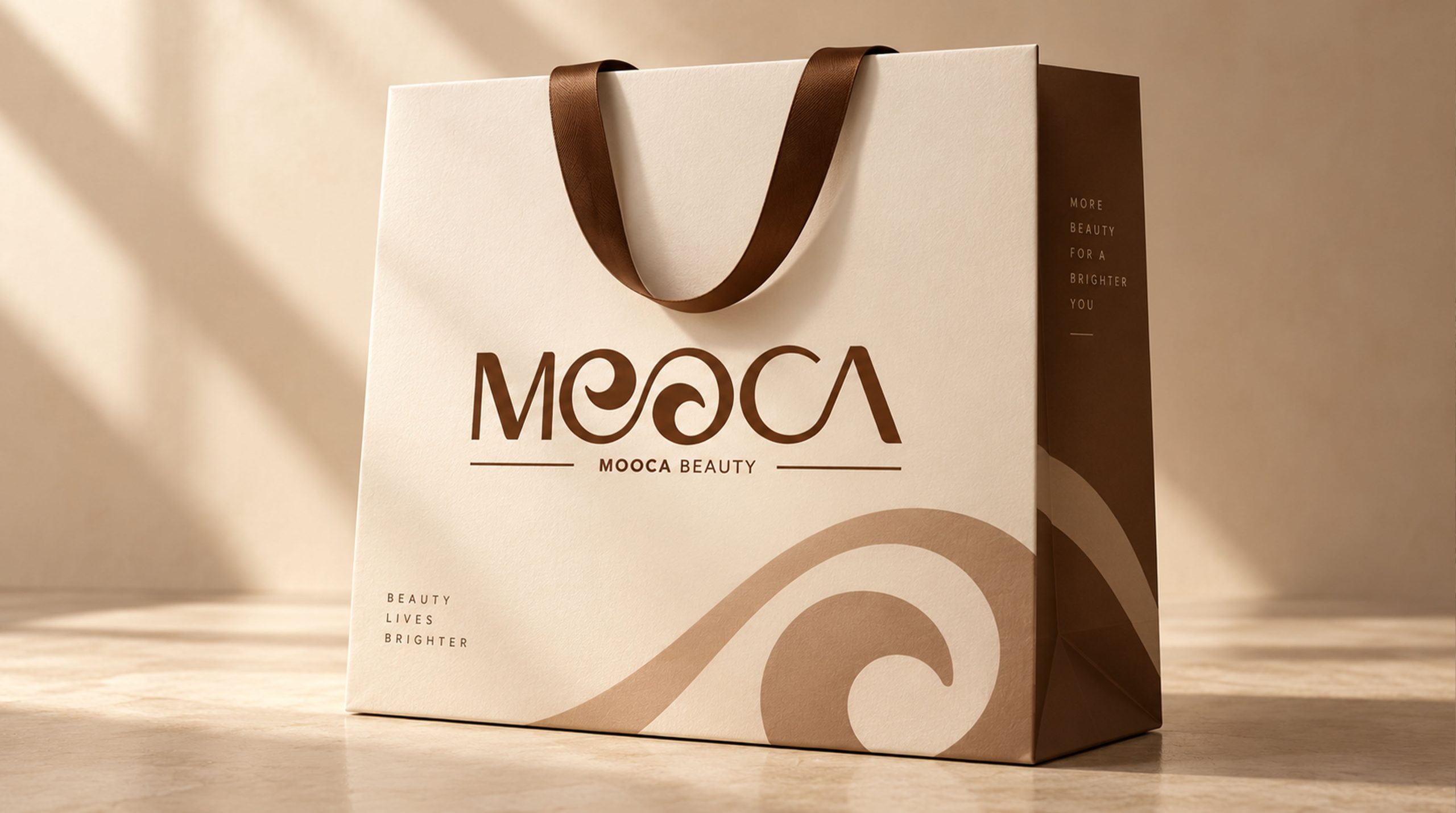
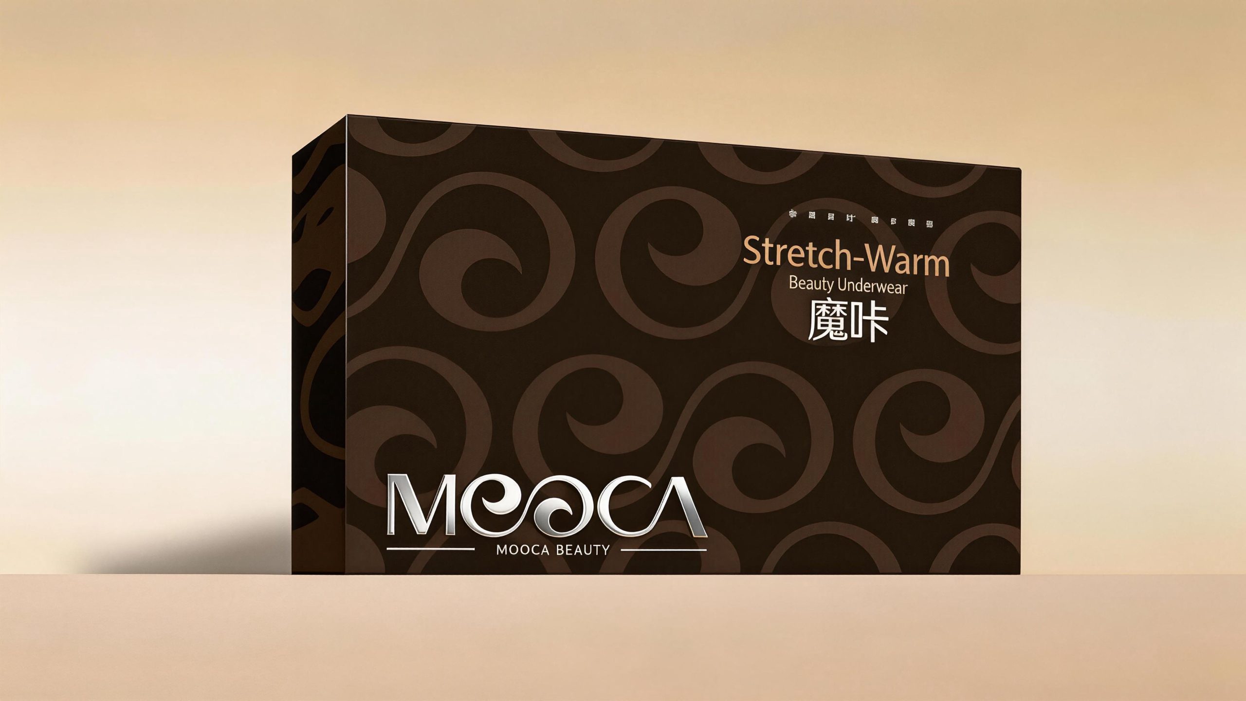
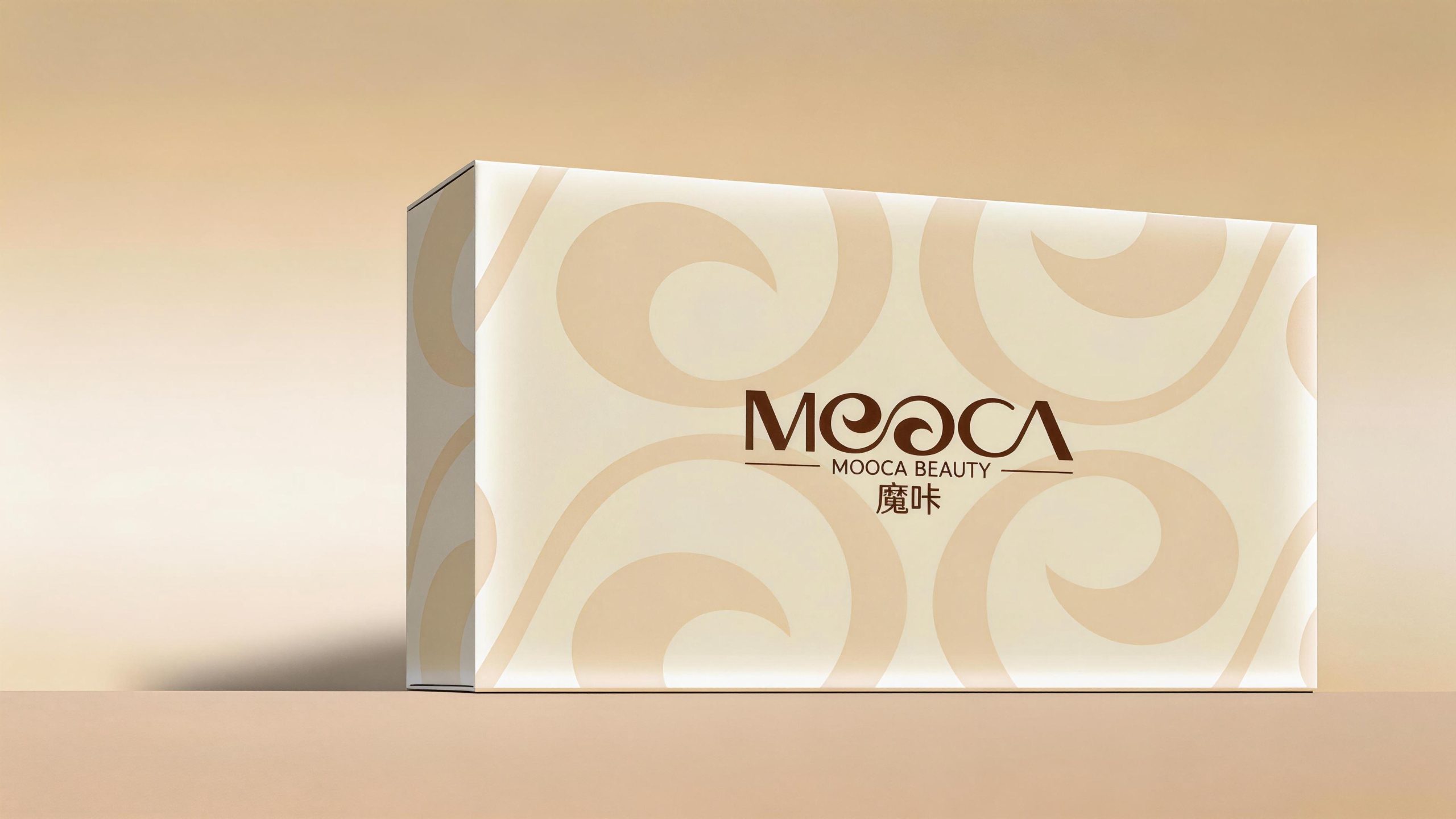
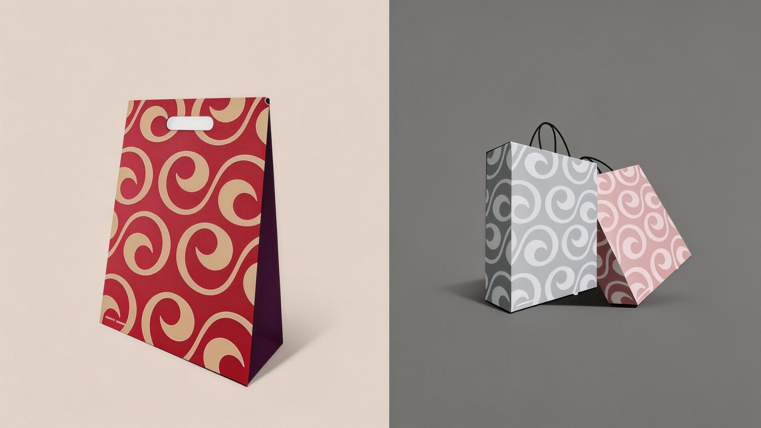
The logo has strong system scalability and can be widely used in product packaging bottles, outer boxes, labels and seals; brand flagship store fronts, counter displays, try-on area image walls and shopping bags; official websites, e-commerce details pages, social media images and fashion magazine advertisements; new product launches, beauty salons, fashion cross-border events and high-end shopping mall pop-up images; VIP membership cards, brand manuals, limited gift boxes and lifestyle peripheral products. In the dynamic vision, the curly curve of the double "O" can be slowly stretched and formed in a continuous writing, just like a curly grass growing and rotating naturally in the breeze, and then the other letters appear and return to their positions in sequence, symbolizing the brand philosophy that the beauty of nature blooms gracefully in time. The curly grass curve can be independently extracted into a brand super symbol, which can be used for packaging dark patterns, product bottle cap decoration, store environment patterns and brand imprints in digital interfaces.
The logo contains the three core images of the MOOCA BEAUTY brand: Oriental Elegance - the source of inspiration for the curly grass pattern and the rhythm of curves convey the implicitness and profoundness of Chinese classical aesthetics; Feminine Grace - the soft S-shaped curve symbolizes the graceful body curves of women, praising the natural beauty of every woman with visual language; Refined Quality (Refined Quality) Simplicity) - The minimalist expression in the form of a pure word mark and a single brown color is in line with modern fashionable women's pursuit of "nature, simplicity and elegance" for high-quality life. The overall design conveys MOOCA BEAUTY's brand vision of "bringing oriental charm to feminine beauty and enjoying simple elegance".
Improper Usage (Protection Specification)
Do not change the connection method, rotation direction or arc ratio of the double "O" curly curve; do not break the continuous curve of the double "O" into two independent circular letters; do not modify the hue, lightness or saturation of the main color of Oriental Brown; do not replace customization with standard fonts Artistic wordmark; do not add strokes, shadows, gradient light effects or texture overlays to the logo; do not rotate, tilt or extract the curly curve separately from the wordmark for use as a whole; keep the white space around the logo not less than 25% of the height of the wordmark; the minimum display width shall not be less than 35mm.
design results
After the release of the logo, MOOCA BEAUTY's brand recognition and fashion influence in the field of female beauty and lifestyle have been significantly improved. With its unique visual language that combines oriental charm and international design, the "Curly Grass Art Wordmark" has become the core identification symbol of the MOOCA BEAUTY brand system, perfectly combining functionality and beauty. The logo is widely used in product packaging, brand stores and fashion communication, showing the brand vision of "natural, simple and elegant" and in line with modern fashionable women's pursuit of high-quality life.