










Noble Cosmetics Group Co., Ltd. is a cosmetics company positioned in the high-end beauty market. With "Natural Beauty, Noble Charm" as its brand philosophy, it is committed to integrating natural essence and noble quality into every product, and providing high-quality skin care and beauty solutions for consumers who pursue the ultimate aesthetic experience.
The brand name "Noble" directly demonstrates the company's unremitting pursuit of high-end quality and noble experience. Qingmei Future was commissioned to lead the brand identity design.
The design goal of the brand logo is to demonstrate the brand positioning of Noble Cosmetics Group as a high-end beauty company through the visual language of nobility, natural beauty and elegance. At the same time, the logo is required to be simple and natural, so that it can be used flexibly on various product packaging and materials to ensure the perfect unity of exquisite nobility and practical extension.
Design concept and graphic language
The logo takes "Natural Crown" as the core concept, with the soft and elegant brand wordmark as the main body, and an exquisite crown auxiliary graphic placed above the wordmark, creating a brand identity that combines aristocratic temperament with natural beauty. The word mark and crown are one soft and one noble, one simple and one refined, forming a double-layered brand expression of "nature as the body and dignity as the soul". The overall design is based on the principle of "less but better" and does not add redundant decorative elements to ensure the applicability and scalability of the logo on various product packaging and materials, reflecting the dual attributes of Noble Cosmetics Group between high-end quality and practical aesthetics.
The crown graphics are outlined with extremely simplified lines, abandoning the complicated jewelry and gorgeous patterns that are common in traditional crowns. It only arches upward with three to five graceful arcs, forming a light and flexible crown outline. The ups and downs of the arc are like the blooming of flower petals and the ripples of water waves. While conveying the noble symbol of "crown", it also incorporates the soft and organic curve language of nature. The lines of the crown are slender yet powerful, and the arcs are rounded yet orderly, just like a corolla woven by natural hands - it is not a cold pile of metal and gems, but an elegant condensation of flowers, leaves and light. This design process accurately integrates the two brand characteristics of "nobility" and "natural beauty". The overall width of the crown maintains a precise proportional relationship with the word mark below, which is not overwhelming but sufficient to establish the brand's noble recognition, forming an elegant master-slave relationship between the graphics and the word mark.
The brand wordmark adopts a soft font design, with smooth and rounded curves running through the strokes, and a natural transition of soft arcs at the corners. Sharp corners and hard folds are completely abandoned, and the overall design presents a smooth touch like silk and a breath as gentle as a breeze. The changes in the thickness of the letters are subtle and natural - the vertical strokes are slightly thicker to convey a sense of quality and stability, the horizontal strokes and arc strokes are slightly thinner to convey a natural sense of lightness, maintaining clear readability and brand recognition amidst the softness. The font style is somewhere between classic serif and modern round font. It not only has the cultural heritage and elegant inheritance that a high-end brand should have, but also uses modern and simple processing to ensure applicability in different sizes and materials. The overall composition uses the classic brand structure of "top crown and bottom words" to build an "elegant aristocrat", conveying the brand's noble identity and natural aesthetics.
Font composition and color system
The brand's Chinese name is presented in customized soft Song font, with horizontal strokes as slender as silk and vertical strokes as gentle as jade. The sharp edges of the traditional Song font are replaced by softening at the edges, retaining the cultural charm of Song font while injecting the gentle texture unique to the cosmetics brand. The English name uses an elegant thin serif font, with slender and slender strokes, delicate and light serifs, and a narrow to high font ratio. It looks like an elegant aristocratic woman standing in the center of the stage with a restrained and calm demeanor. There is a moderate spacing between Chinese and English to maintain visual breathing, and the hierarchy is clear but not blunt, ensuring the consistency and high recognition of the brand in product packaging, counter display and digital communication. The overall design principle of the font is "soft but not weak, simple but not thin" - using soft strokes to reflect the natural and elegant brand attributes, and using a clear structure to ensure functionality in practical applications.
The main color, noble gold #C9A96E, is the core color of the logo, representing nobility, quality and classic heritage. This warm and subtle champagne gold is different from the over-shining bright gold. It conveys the brand style of "noble but not ostentatious" with a matte and restrained luster, just like the thin layer of gold foil on the top cosmetic bottle - it is touchable, shiny but not dazzling. Champagne gold is the color symbol with the most consensus of quality in the high-end beauty industry. It can present a consistent and high-end visual effect on various materials - matte paper, glossy cards, frosted glass, metal bottles - and meet the brand's needs for flexible use in different product packaging and materials. Auxiliary nude powder #E8D5C4 is used for the background tone and soft transition in the brand system, symbolizing the soft color of natural skin, just like the natural beauty of no makeup is better than makeup, and conveys the core keyword of the brand "natural beauty". Pure white #FFFFFF is used as the standard background color and white space, using the purest space to set off the exquisiteness of the golden logo, creating a clean and transparent atmosphere unique to high-end cosmetics brands. Dark brown #3C2415 is used for the application variation of the logo on a dark background, just like the color of a precious wooden packaging box, using a warm and thick background to support the noble luster of the brand. The overall color system is centered on the three colors of gold, nude and white, reflecting the brand's aesthetic proposition of "nobility comes from restraint, and natural beauty lies in purity".
Application extension and brand significance
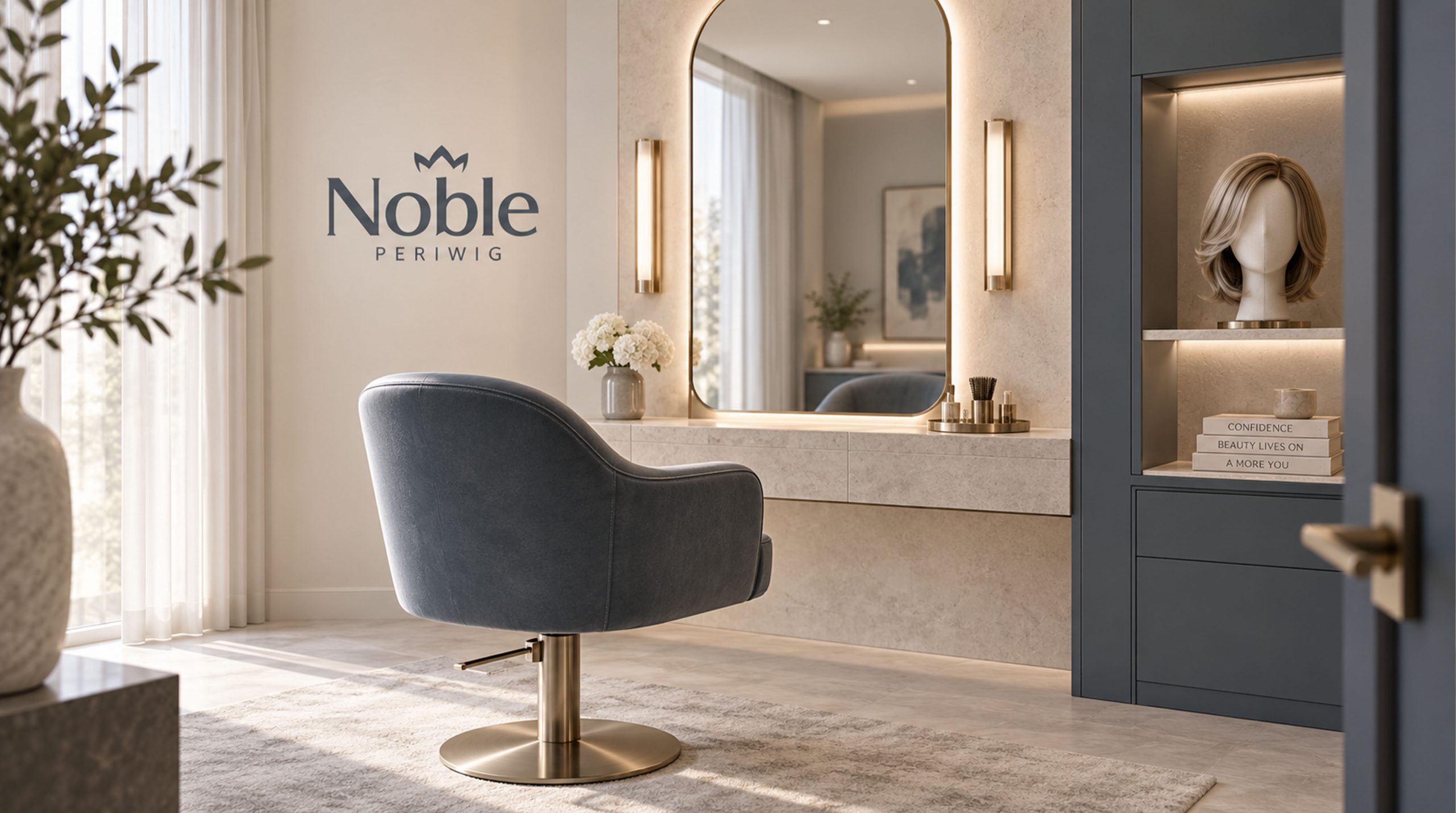
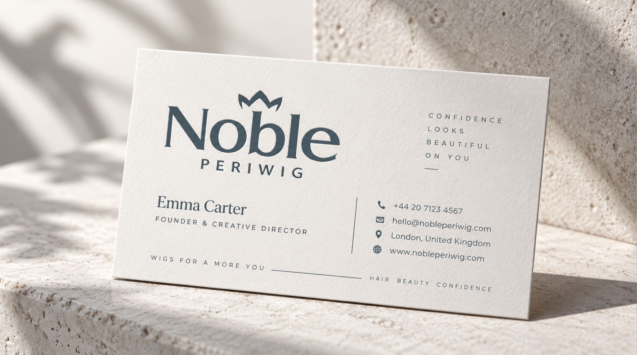
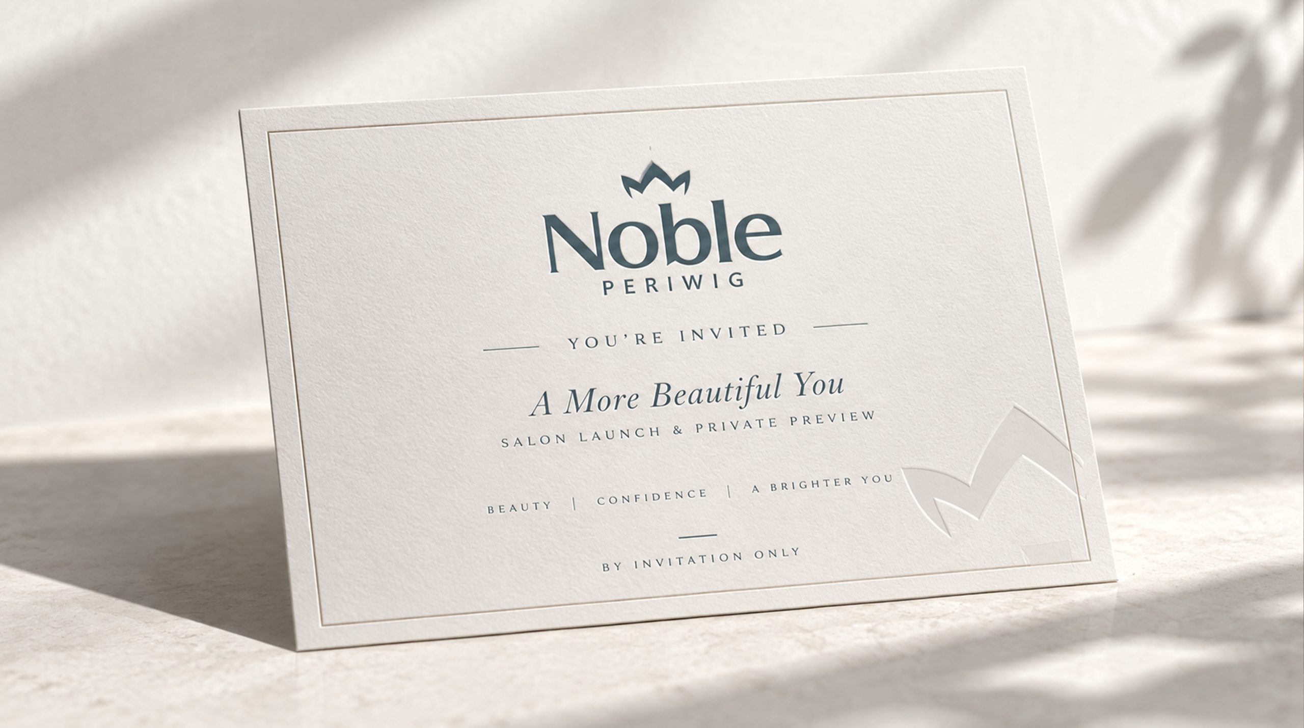
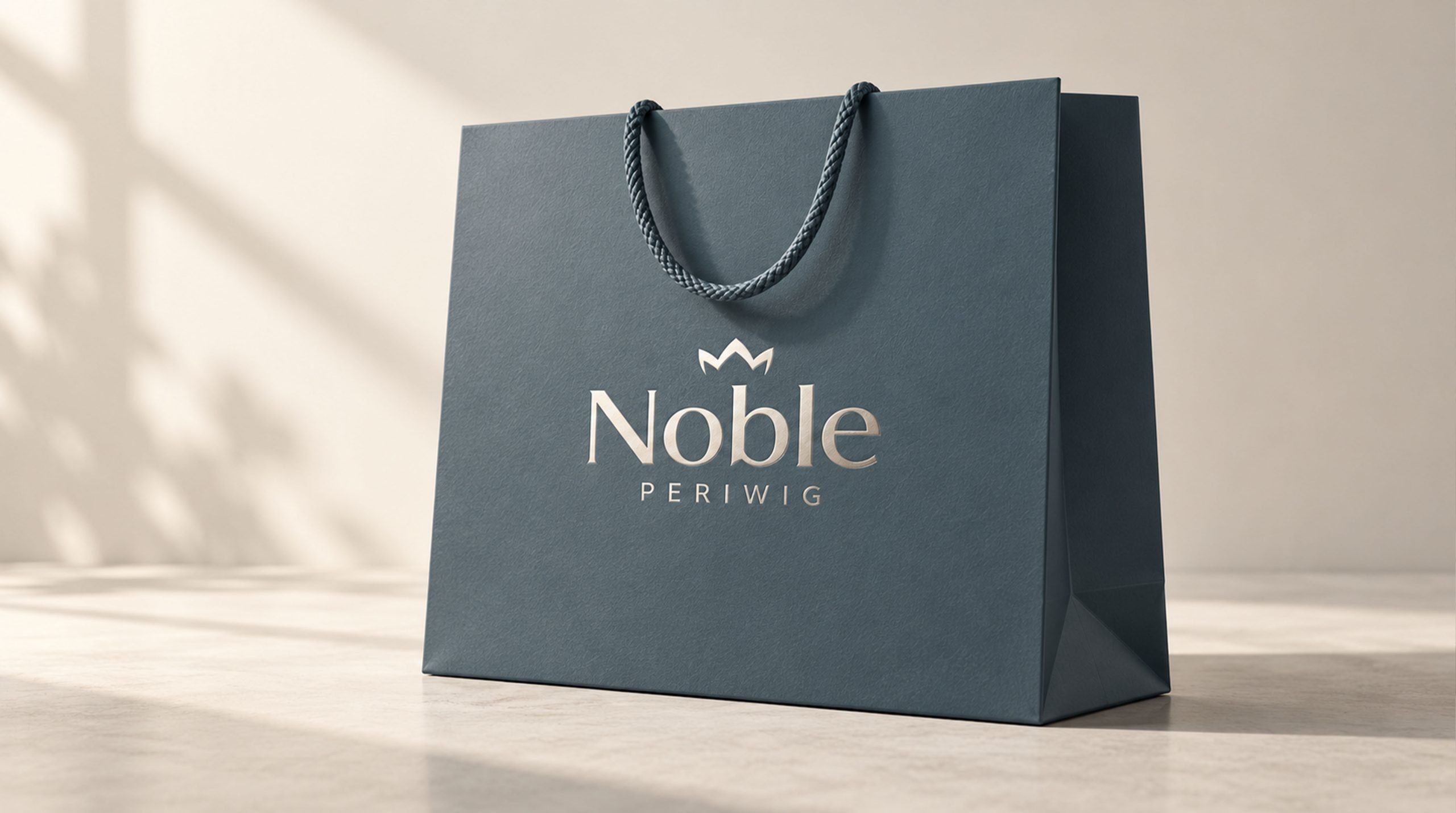
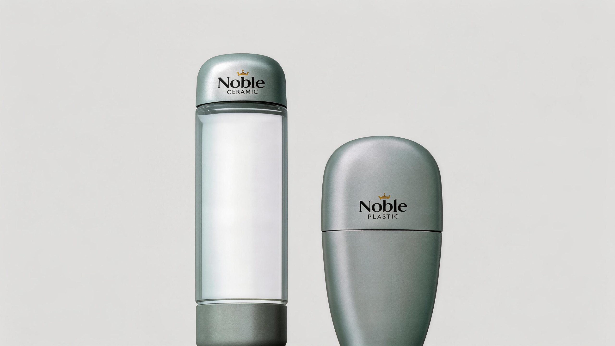
The core design advantage of the logo is that it is exquisite and noble while maintaining the practical characteristics of simplicity, ease of use, and strong ductility, making it suitable for wide application in different products. It can be extended to apply to skin care product bottles, lipstick tubes, powder boxes, eye shadow palette covers and product packaging boxes; brand flagship store door headers, counter light boxes, makeup tester nameplates and shopping bags; brand official websites, e-commerce details pages, social media images and fashion magazine advertisements; new product launches, beauty expos, high-end department store counters and cross-border joint event images; VIP membership cards, brand albums, limited gift boxes and holiday customized sets. The logo supports multiple presentation techniques on different materials - matte hot stamping is used for paper packaging, embossed embossing is used for metal bottle caps, silk screen printing is used for glass bottles, and laser engraving is used for acrylic display fixtures to adapt to diversified product lines and packaging needs with a unified brand image. In the dynamic vision, the arc of the crown can be slowly outlined with elegant strokes, just like a craftsman drawing a crown with a gold pen, and then the word mark gradually appears in a soft fade-in manner, symbolizing the elegant sublimation of the brand from natural beauty to a crown of nobility. The crown arc can be independently extracted as a brand super symbol, which can be used for brand imprints on product seals, packaging dark lines, counter decoration lines and digital interfaces.
The logo contains the three core images of the Noble Cosmetics Group brand: Noble Elegance - the crown auxiliary graphics directly highlight the brand's nobility and high-end positioning, and establishes the brand's identity with the most classic noble symbols; Natural Beauty - the soft font design and organic curve language reflect the natural and elegant attributes of the brand, conveying the brand concept of "beauty comes from nature"; Simple & Practical Versatile) - The minimalist graphic and text composition and restrained color system ensure that the logo is simple and natural, and can be easily used on various product packaging and materials. The overall design conveys the Noble Cosmetics Group's brand vision of "taking nature as the basis, nobility as the soul, and simplicity as the way".
Improper Usage (Protection Specification)
Do not change the number, curvature or proportional relationship with the word mark of the crown; do not modify the stroke curves, thickness changes or rounded corners of soft fonts; do not change the hue, brightness or saturation of the main color of noble gold; do not replace the crown graphic with a concrete jewelry crown or other Decorative graphics; do not add strokes, hard shadows, gradient light effects or texture overlays to the logo; do not rotate, tilt or separate the crown and wordmark into independent elements; keep the white space around the logo not less than 25% of the height of the graphic; the minimum display width must not be less than 25mm.
design results
After the release of the logo, Noble Cosmetics Group's brand recognition and noble image in the high-end beauty market have been significantly improved. "Crown + Soft Wordmark" has become the core identification symbol of the brand system with its exquisite and elegant yet simple and easy-to-use visual language. The logo has been successfully applied to the packaging, counters and communication materials of many of its product lines. It shows a consistent sense of high-end quality in different materials and processes, demonstrating the brand characteristics of "nobleness and natural beauty" and the practical value of "simple, natural and easy to use".