










Huaxia Fubon is a comprehensive investment company focusing on the field of financial investment. It uses its professional investment management capabilities and robust risk control system to create long-term and reliable wealth value for customers.
The brand name "Huaxia" represents the profound cultural heritage of China, and "Fubon" means a prosperous country and a prosperous country, carrying the company's grand vision of using financial power to help the country become strong and the society prosper. Through early communication and gaining customer approval, the design direction of Huaxia Fubon was determined to reflect its "investment" industry attributes and "reliable" corporate image. Qingmei Future was commissioned to lead the brand identity design.
The design goal of the brand logo is to demonstrate China Fubon's professional status as a financial investment company through the visual language of historical significance, financial industry attributes and reliable corporate image, and to accurately convey its industry essence of "investment" and "reliable" brand promise.

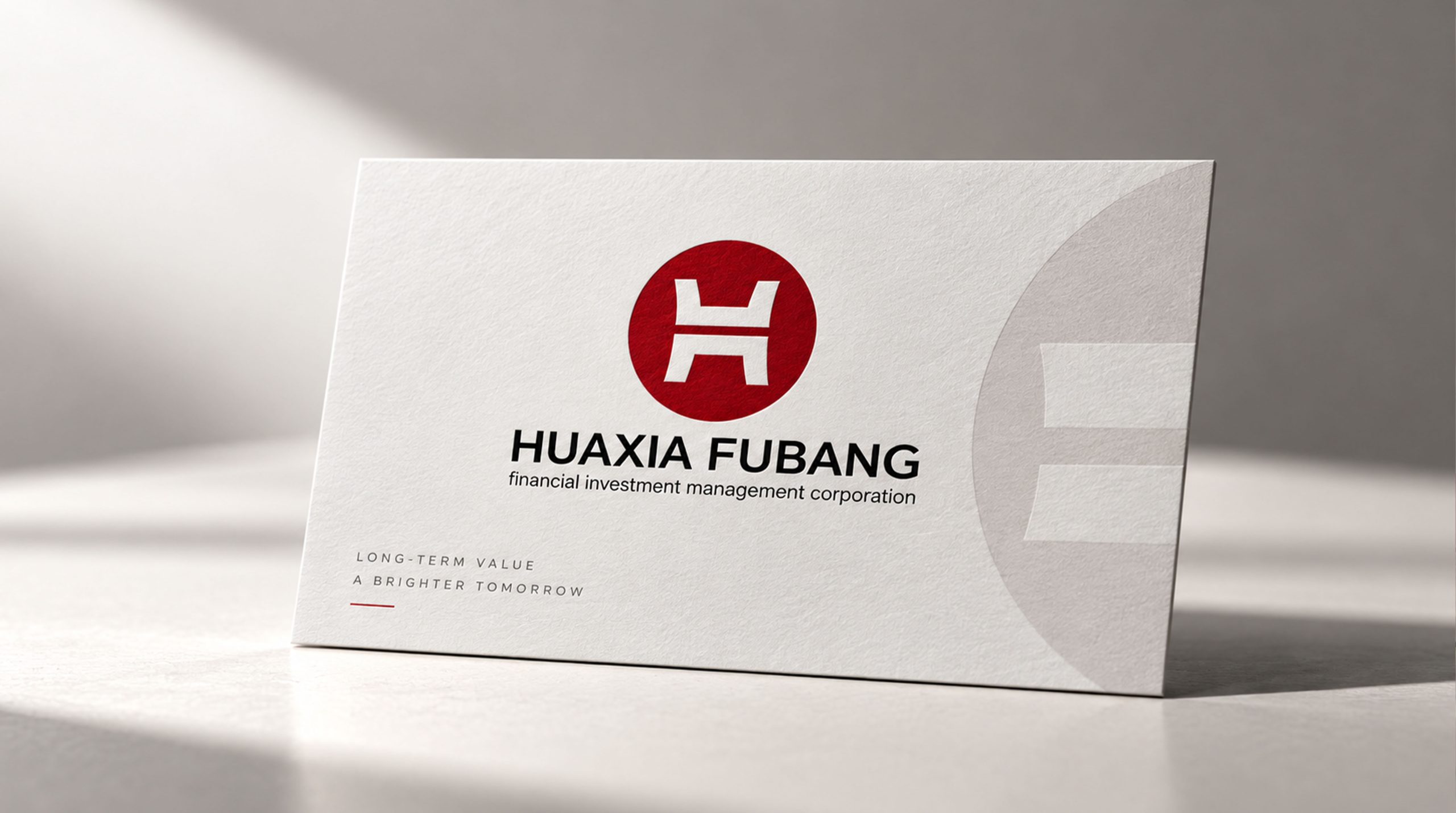

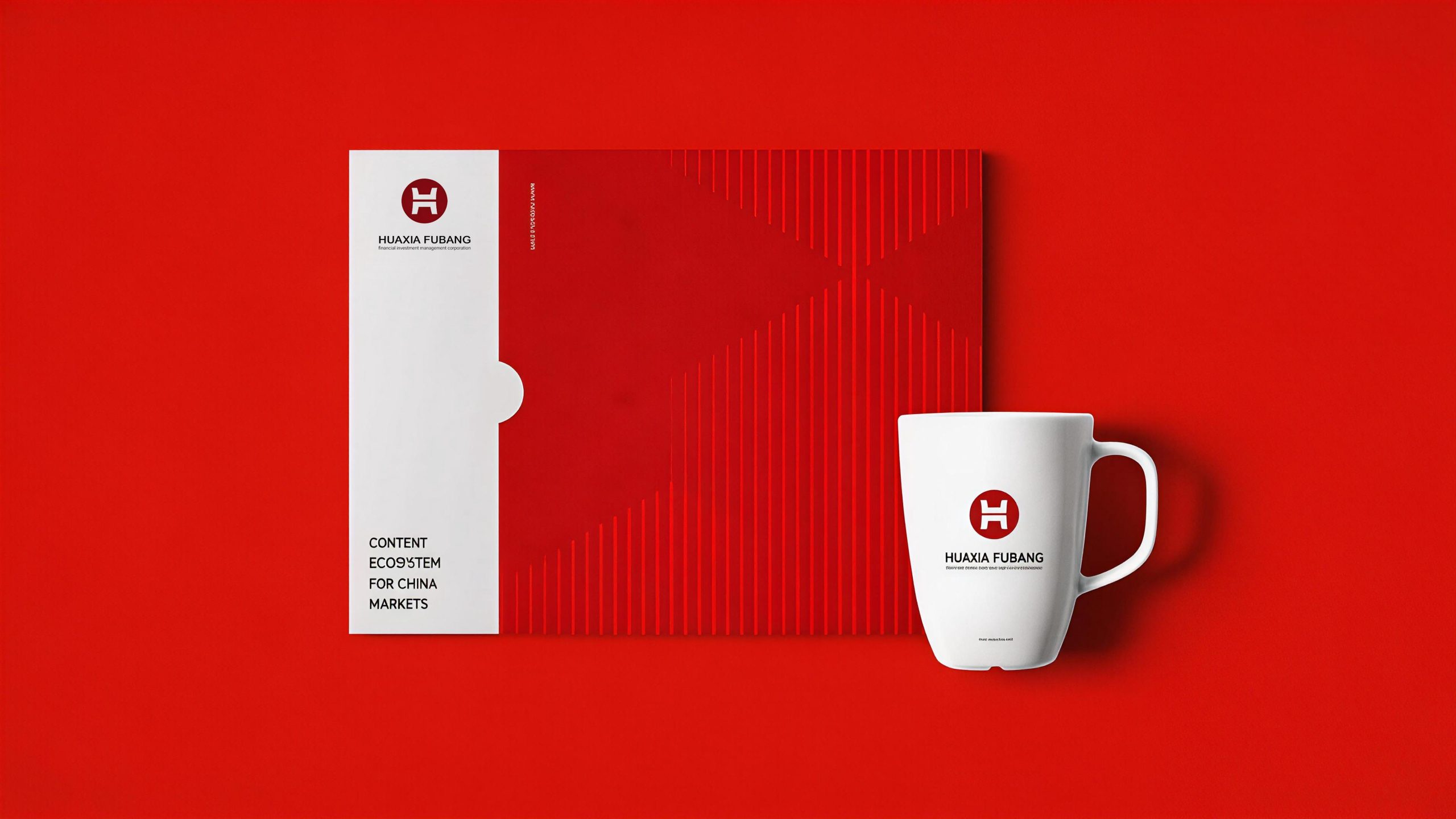
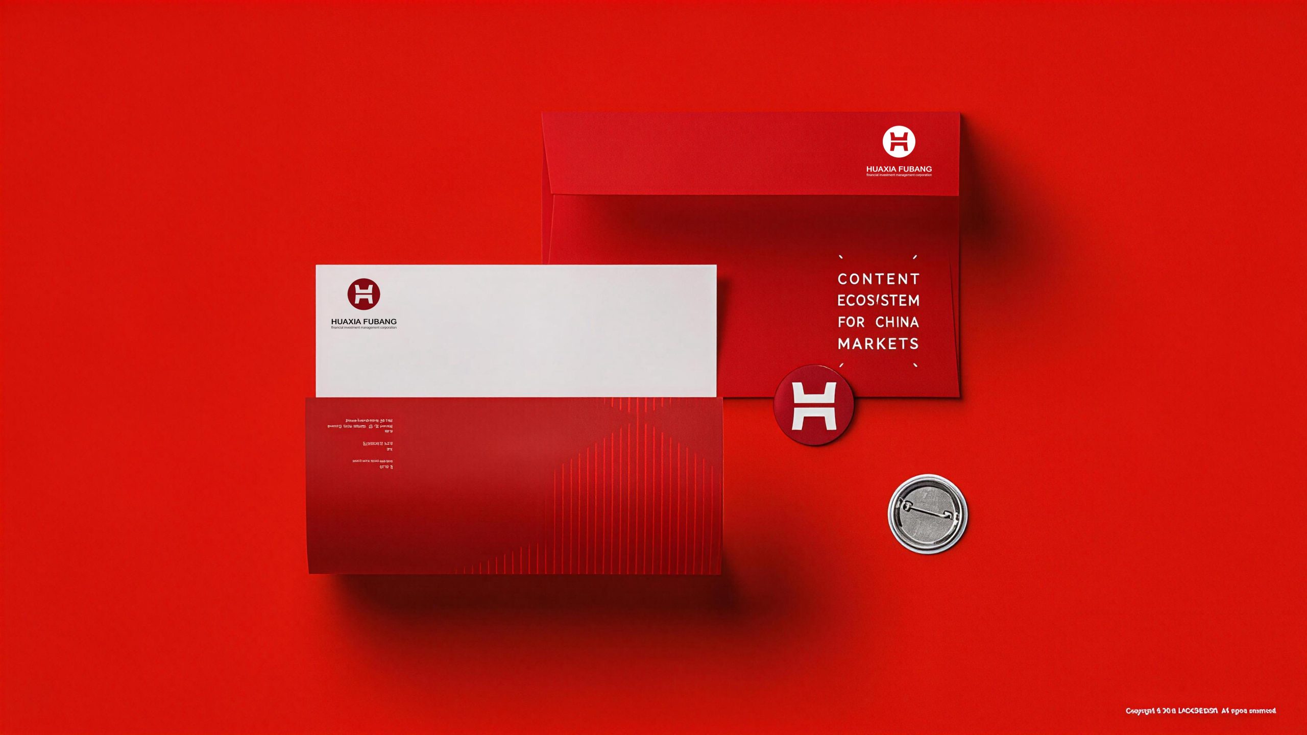
Design concept and graphic language
The logo takes "Coin Tripod" as the core concept, uses the ancient Chinese "Tripod" as the main element of the design, and cleverly embeds it into the circular frame, creating a dual image symbol that is both an ancient heavy weapon and an ancient coin. "Ding" was an important weapon for founding a country and a symbol of political power in ancient times, and political power in ancient times symbolized "money" and the supreme control of wealth. This cultural connotation is highly consistent with the nature of China Fubon's financial investment industry. A circular frame is added to the outside of the "ding", and the overall design looks like an ancient coin - the composition of the outer circle and the inner square directly echoes the classic shape of ancient Chinese copper coins, using the most intuitive financial symbol to establish a strong connection between the brand and the "investment" industry attributes. The overall design integrates the solemn authority of ancient heavy tools with the financial attributes of ancient coins, reflecting the dual attributes of Huaxia Fubon in cultural inheritance and financial expertise.
The shape of the tripod has been highly artistically summarized and refined, using simple and powerful geometric lines to create a clearly identifiable tripod-shaped outline. The body of the tripod is presented in an upright trapezoid shape, with a wide top and a narrow center of gravity, symbolizing the solid foundation of the enterprise and the soundness of the operation; the tripod's ears stretch upward from both sides of the tripod with two symmetrical arcs, like two open arms, conveying the open and inclusive investment philosophy and the corporate mind of embracing resources; the tripod's foot is supported downward by three powerful short lines, as stable as a rock and unshakable, symbolizing the word "reliability" - the enterprise's three-legged stance to protect the wealth of its customers. The middle part of the tripod is embellished with simple decorative patterns, echoing the unique Taotie decorative language of bronzes, injecting a hint of historical heaviness and cultural solemnity into the minimalist graphics. The circular outer frame is presented as a ring of uniform thickness, wrapping the tripod-shaped main body, forming a complete coin composition of "circle outside and tripod inside" - the circle symbolizes the smooth and continuous flow of financial circulation attributes, and the tripod shape symbolizes the square, stable and unshakable corporate faith. The outer circle and the inner square are both strong and soft, implying that Huaxia Fubon is stable and ever-changing in the financial market. The overall composition uses the cultural nested structure of "standing among coins" to construct the "important weapon of the country" to convey the brand's financial attributes and reliable image.
Font composition and color system
The Chinese "Huaxia Fubon" adopts a solemn modern Song style, with thin horizontal lines and thick vertical lines, clear strokes, and a correct structure. The four-character arrangement is balanced and steady, conveying the rigorous temperament and cultural heritage that a financial investment enterprise should have. The word "Huaxia" carries the grand narrative of civilization, and the word "Fubon" directly points to the brand vision of wealth and prosperity. The four words are combined into one to form a complete and powerful expression of the brand name. The English "HUAXIA FUBANG" is arranged below the Chinese characters in a standard uppercase sans-serif font. The fonts are regular and evenly spaced, maintaining the brand's recognition and professional image in international business scenarios. The hierarchy and priorities between Chinese and English are clear, ensuring the standardization and authority of the brand in financial documents, investment reports and business communications.
In terms of color, the logo chooses a combination of white and red, which is simple and steady, implying hope for the future. The main color Chinese red #CC2222 is used for the tripod-shaped main body and circular frame, representing the righteousness and strength of Chinese culture and the enthusiasm and determination of financial undertakings. Red symbolizes auspiciousness, prosperity and authority in the Chinese cultural context, and highly resonates with the national sentiment of the "Huaxia" brand name; red also conveys the aggressiveness of the investment industry and hope and confidence in the future, establishing a positive emotional association with the brand with the clearest color signal. Pure white #FFFFFF is used for the negative space and standard background color inside the tripod. The sharp contrast between white and red ensures the visual impact and clear recognition of the logo in various application scenarios. White symbolizes purity, transparency and justice, and conveys the financial investment company’s candid commitment to customers and the brand’s bottom line of compliant operations. The combination of red and white is visually concise and powerful, without any redundancy, and conveys the strongest brand signal with the fewest colors - red represents China's enthusiasm and hope, while white represents reliable transparency and justice. Auxiliary dark gray #333333 is used for the Chinese and English wordmarks, supporting the red graphics with a calm tone and forming a visual hierarchy between the graphics and wordmarks. The overall color system uses red and white as the core and dark gray as the supplement, reflecting the financial brand temperament of "simplicity means reliability, stability means strength".
Application extension and brand significance
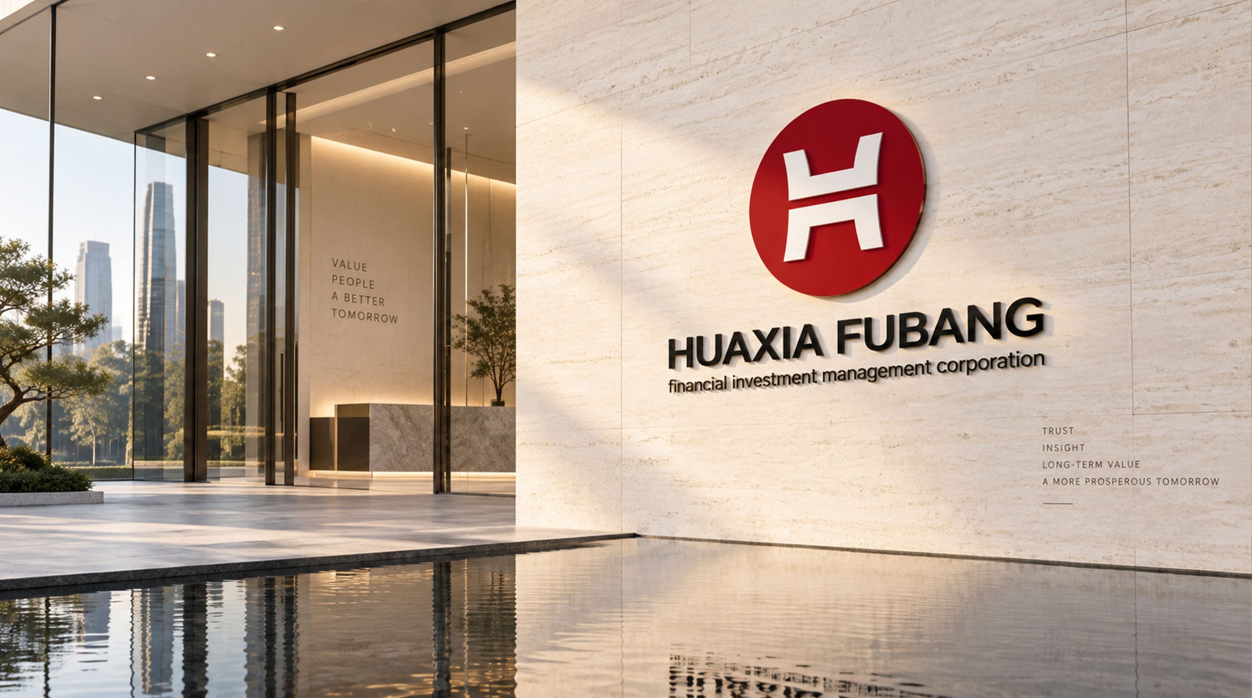
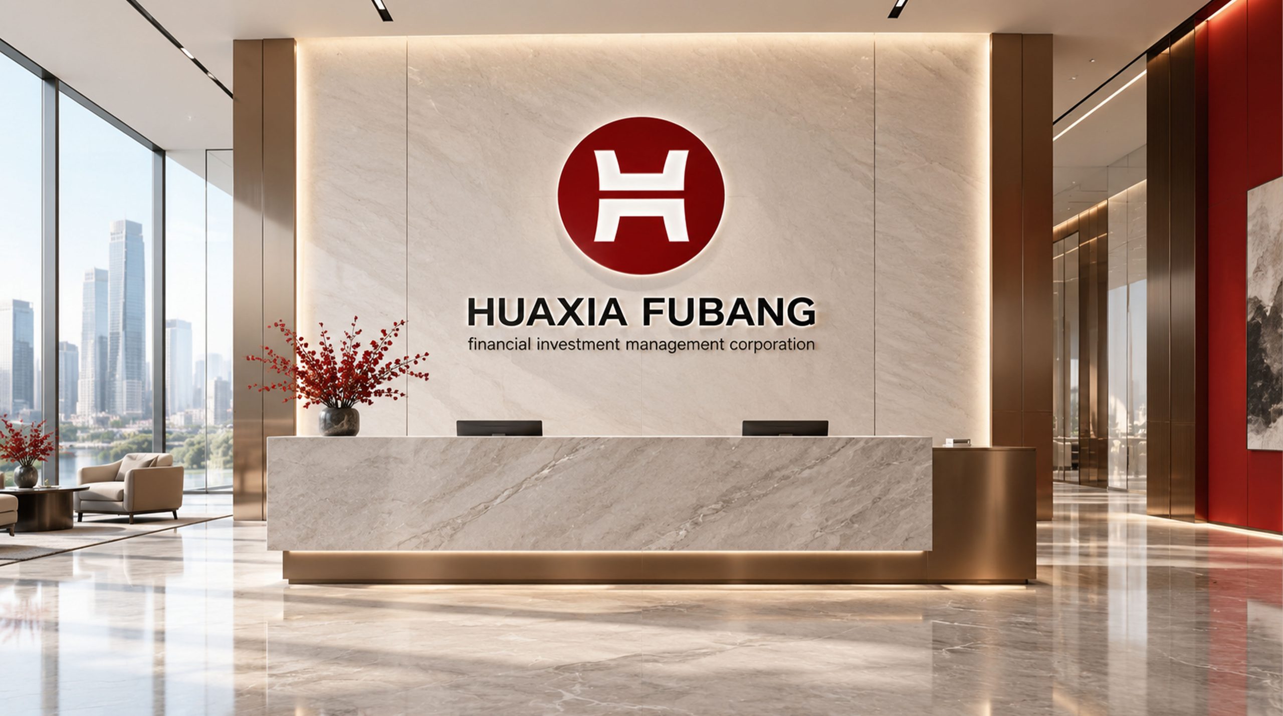
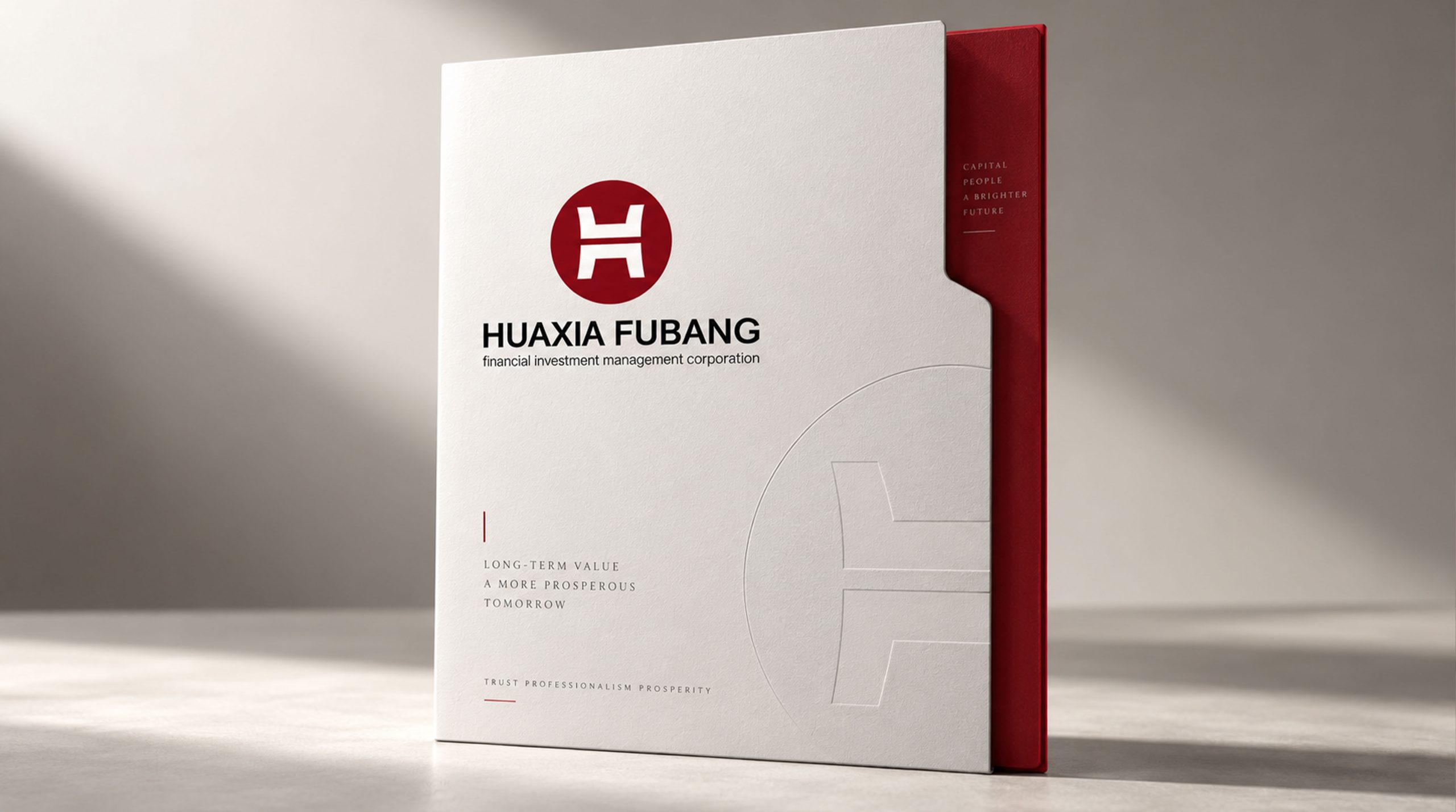
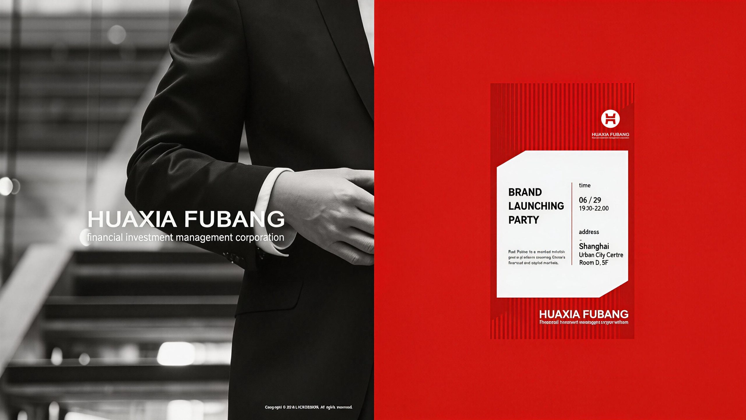
The logo has strong system scalability and can be widely used on the facade of the company's headquarters building, front image wall, VIP reception room and conference room nameplate; business cards, investment report covers, contract documents, fund product brochures and brand brochures; official website, investment management platform, mobile APP icons and digital marketing materials; financial industry summits, investment forums, road shows and government cooperation project reporting images; business gifts, annual souvenirs, partner gifts and corporate culture peripheral products. The red and white color matching of the logo maintains a highly consistent visual effect on various printing and screen media, ensuring the unity and professionalism of the brand image on different touch points. In the dynamic vision, the tripod shape can stand steadily from bottom to top, with the tripod's ears extending elegantly to both sides, and the circular outer frame then surrounding and closing to form, just like an ancient coin cast and formed in the long history of history, symbolizing China Fubon's magnificent journey of creating a modern financial brand with the wisdom of thousands of years of civilization. The coin tripod graphic can be extended into a visual mother element and used for financial product icons, report cover decoration, brand patterns and corporate culture space design.
The logo contains three core images of the China Fubon brand: National Treasure - the tripod-shaped totem conveys the brand's sense of mission and solemn commitment to devote itself to the financial industry as a "national treasure"; Financial Essence - the coin composition directly reflects the industry attribute of "investment", establishing a natural connection between the brand and the industry with the oldest financial symbol; Reliable & Stable (Reliable & Solid) - The three-legged solid structure and the simple and steady red and white color scheme convey the company's "reliable" core image and win the long-term trust of customers with an unshakable visual language. The overall design conveys Huaxia Fubon's brand vision of "building trust with strength, prospering with investment, and achieving long-term success with reliability".
Improper Usage (Protection Specification)
Do not change the proportion of the tripod outline, the arc of tripod ears or the number of tripod legs; do not modify the thickness, roundness or nesting relationship with the tripod shape of the circular frame; do not change the hue, brightness or saturation of the main color of Chinese red; do not replace red and white with gold, blue or other colors. Common colors in the industry; do not add gradients, strokes, shadows or three-dimensional effects to the logo; do not rotate, tilt or split the tripod-shaped and circular frames into independent elements; keep the white space around the logo not less than 25% of the diameter of the circle; the minimum display width must not be less than 25mm.
design results
After the release of the logo, Huaxia Fubon's brand recognition and reliable image in the financial investment field have been significantly improved. "Coin tripod" has become the core identification symbol of Huaxia Fubon's brand system with its dual cultural image of integrating ancient heavy weapons and financial coins. The simple combination of white and red is unique in the financial industry. It not only conveys a stable and reliable corporate image, but also implies hope and confidence in the future. This logo is widely used in business exchanges, investment roadshows and industry activities, demonstrating the brand vision of "building trust and rejuvenating the country with strength".