










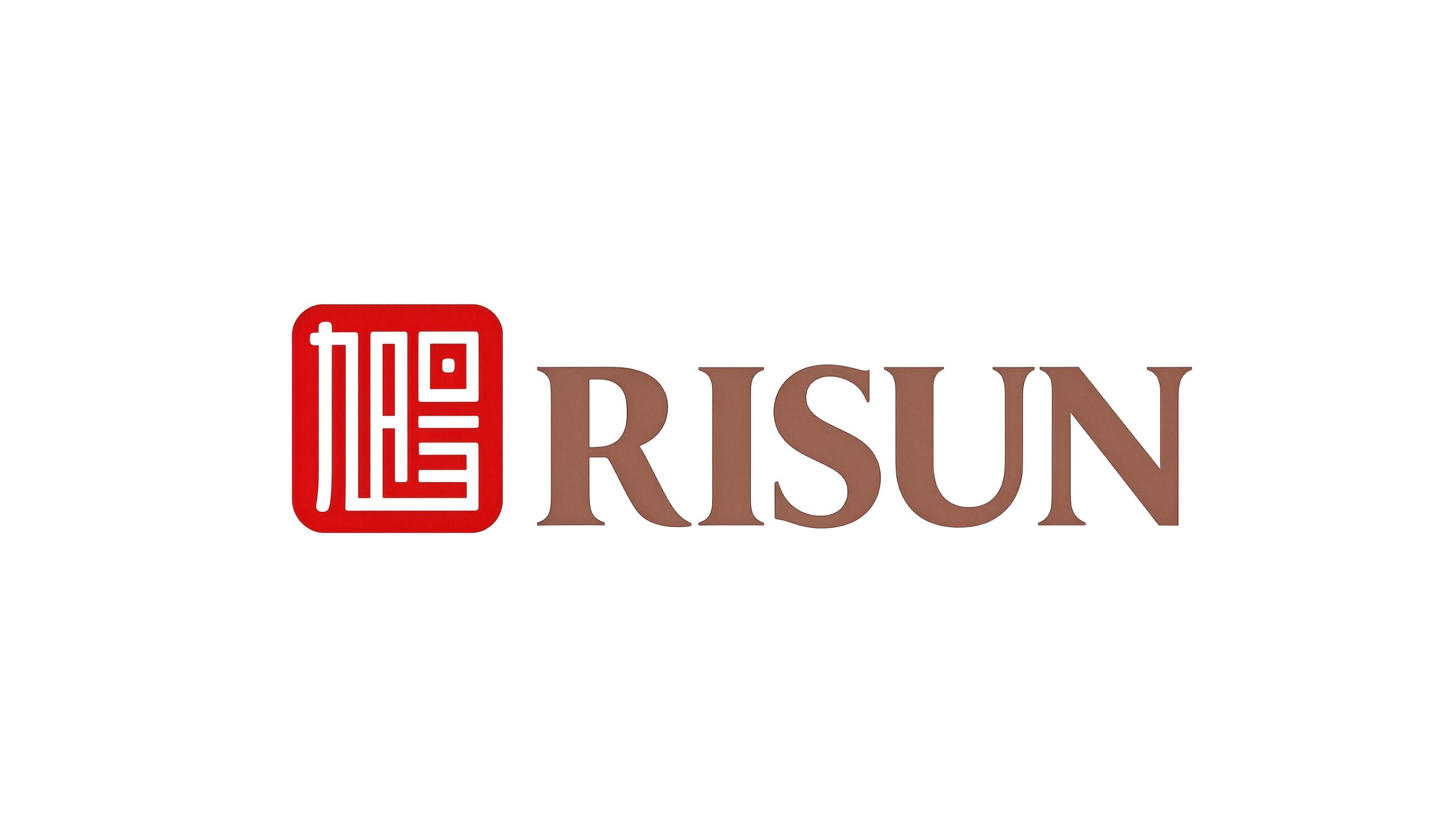
RISUN Group (RISUN) is China's leading comprehensive chemical and energy enterprise group. Its business covers many fields such as coking, chemical industry, new materials and new energy. Driven by technological innovation and industrial integration, it occupies an important position in the global chemical industry pattern. The brand name "Xu Yang" means the rising sun and the sunshine, carrying the company's vigorous, bright and ambitious development vision.
Facing the strategic needs of international development, the brand decided to redesign the logo. This time, the professional team of Qingmei Future was commissioned to lead the brand logo design. After an overall analysis of the nature of Xuyang Group and the internal requirements of the company, this unique brand logo scheme that combines Chinese and Western elements was finally presented.
The design goal of the brand logo is to demonstrate the industry status of Xuyang Group as a comprehensive chemical and energy enterprise through cultural heritage, international temperament and industry-differentiated visual language, and to convey the international development strategy and brand cohesion of "rooted in China, facing the world".
Design concept and graphic language
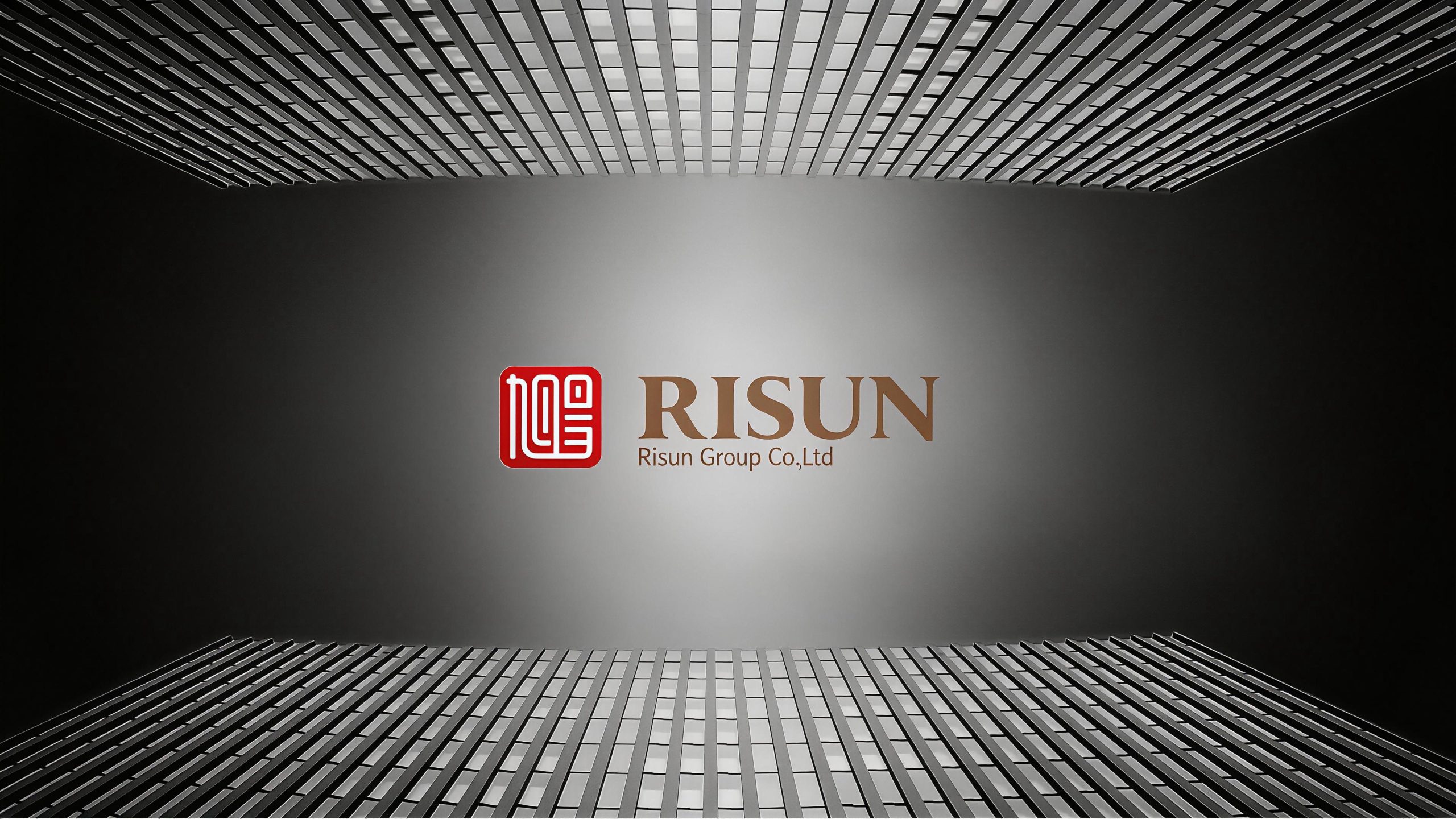
The logo adopts a left and right dual-zone structure, dividing the brand logo into left and right parts, and demonstrates Xuyang's international development route through a combination of Chinese and Western design techniques. The left side uses the traditional Chinese seal form, with the square red seal carrying the word "RISUN", representing the brand's Chinese cultural foundation and national identity; the right side uses a Western serif font to present the English name "RISUN" of "RISUN", representing the brand's globalization pattern facing the international market. Left, middle and right, seal and English, tradition and modernity coexist harmoniously in the same logo, completing the dual expression of "one brand, two contexts". The overall design reflects the dual attributes of Risun Group between cultural confidence and international expansion.
The seal on the left is the most culturally identifiable visual core of the logo. The seal is based on the traditional Chinese seal cutting art. Its square and neat outer frame is like a solemn corporate letter seal, conveying authority, commitment and unshakable brand belief. The two characters "Xu" and "Yang" inside the seal are presented in the style of seal script. The strokes are highly artistically summarized and refined, with uniform lines and square turns. The sense of order and precision of modern design are integrated into the simple aesthetics of seal script. The key idea of the design is that the two characters "Xu" and "Yang" are cleverly spliced together. The strokes of the two characters intersperse with each other at the intersection and share part of the stroke structure, just like two precision mortise and tenon pieces tightly meshed into one. It not only maintains the recognition of their respective glyphs, but also forms an indivisible organic whole. This splicing technique profoundly illustrates the cohesion within the enterprise - the sun and the sun, people and people, and business and business are closely connected and integrated into one, conveying the corporate spirit of "unity and cohesion as a seal". The seal's engraving lines are of consistent thickness and even spacing, creating a strict visual order among the square inches, reflecting the chemical company's ultimate pursuit of precision and standardization.
Font composition and color system
The English "RISUN" on the right uses the classic Roman Serif font (Roman Serif). The strokes are thin horizontally and thick vertically, the serifs are straight and clear, the font is broad and solemn, and the structure is open and grand. Ancient Roman font is the most authoritative and historical classic font in the West. It is widely used in the brand logos of top international companies and financial institutions. The selection of this font directly gives the Xuyang brand international business temperament and cross-cultural brand trust. The letter spacing is relaxed and relaxed, and the five letters "R-I-S-U-N" are arranged in sequence like five stable pillars, conveying the group's sense of scale and systematization capabilities. "RISUN" is horizontally aligned with the seal on the left side in terms of visual center of gravity. The squareness of the seal and the horizontal spread of the word mark form a stable visual balance. The left, middle, right and west are each in their proper place.
In terms of color, the design team broke with the norm and did not choose the blue color often chosen as a symbol in the chemical industry. Instead, it highlighted the uniqueness of the Rising Sun logo with a highly recognizable two-color combination of red and gold. Seal red #CC2929 is used for the seal on the left side and the seal character "Xu Yang", which represents the blazing energy of the sun and the vigorous vitality of the brand. Red is the most righteous and powerful color in Chinese culture. It also directly echoes the image of the "rising sun" in the brand name "Xu Yang" - the rising sun with a bright red light, declaring the brand's Chinese identity and high-spirited momentum in the most vivid color. Ray gold #B5997A is used for the English word "RISUN" on the right side, representing the warm rays of the sun and the accumulation of brand value. Gold echoes the image of "sunshine" in the brand name - the sun is shining and the golden light is brilliant, conveying the company's wealth accumulation and international quality style with warm and thick tones. Red represents the sun and gold represents light. The combination of red and gold is the color incarnation of the "rising sun" - a red sun bursts out and thousands of golden lights fill the earth. This color scheme is unique in the entire chemical industry, breaking through the blue-dominated visual convention of the industry and establishing an unmistakable visual identity with a strong brand personality. Pure white #FFFFFF and dark gray #333333 are used as the standard background color and auxiliary text color to ensure the clarity and systematicness of the logo in various application environments.
Application extension and brand significance
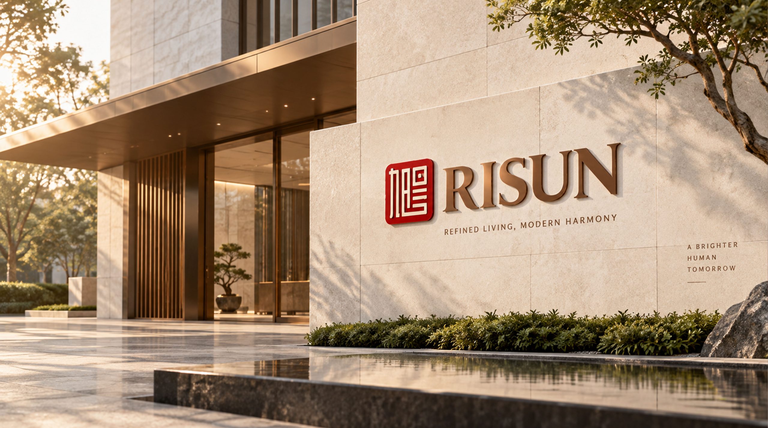
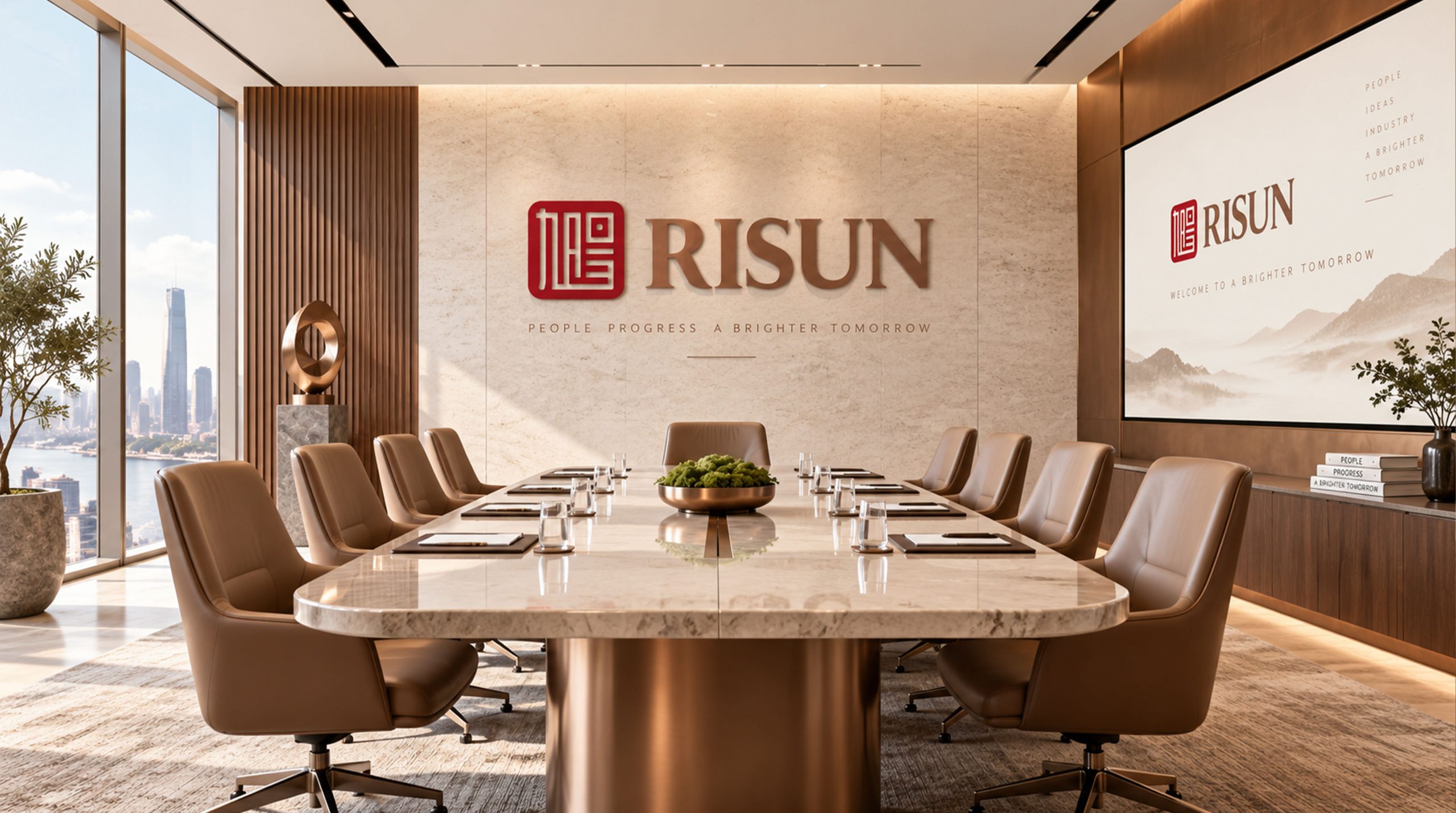
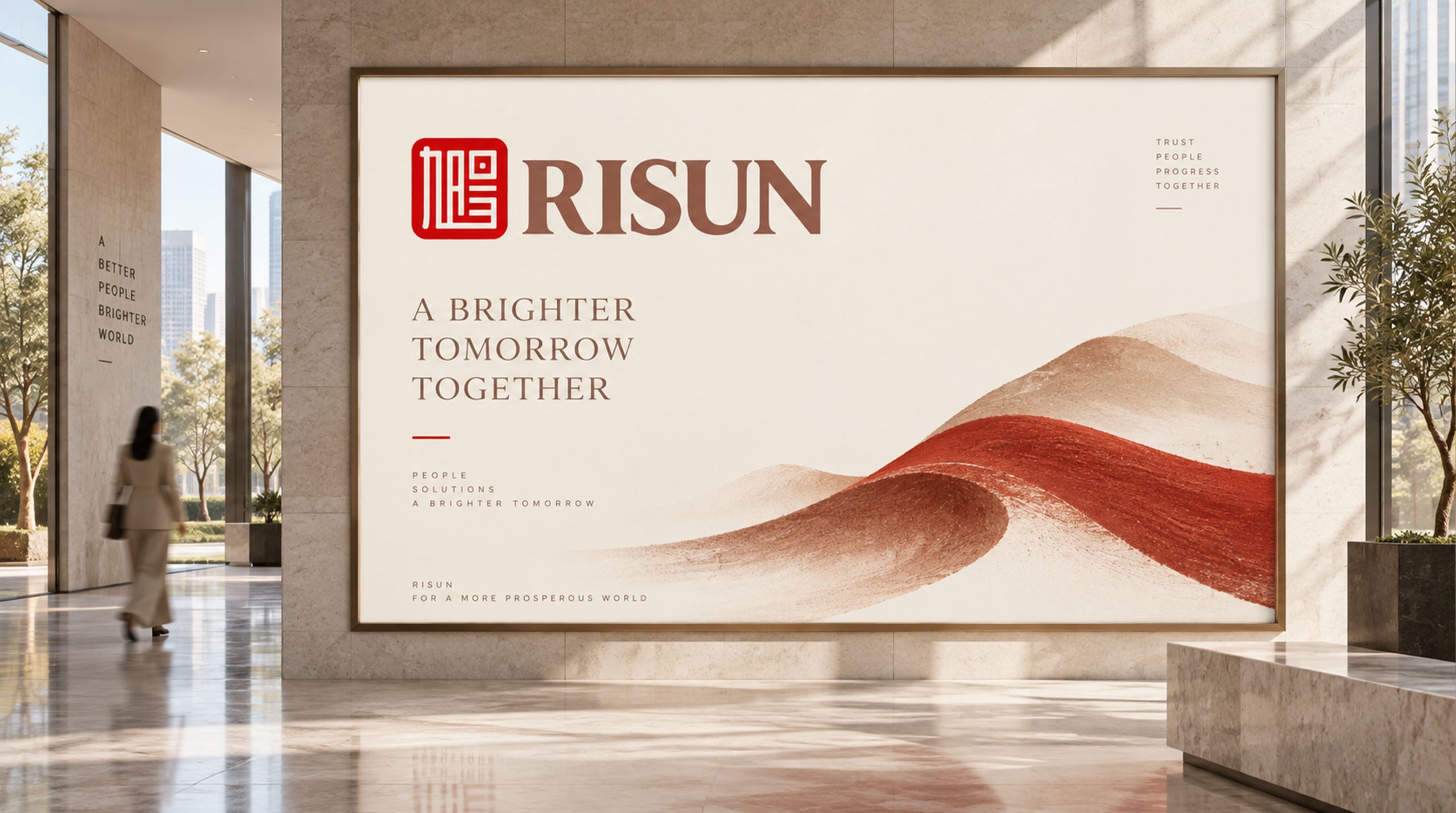
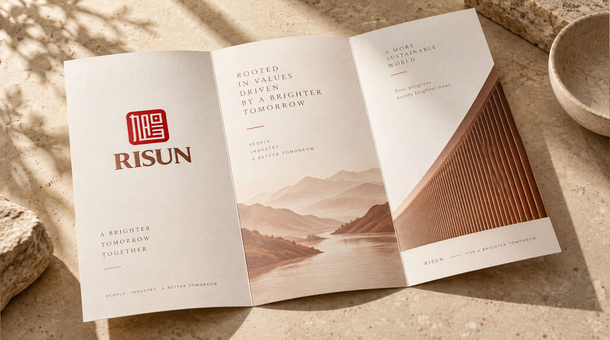
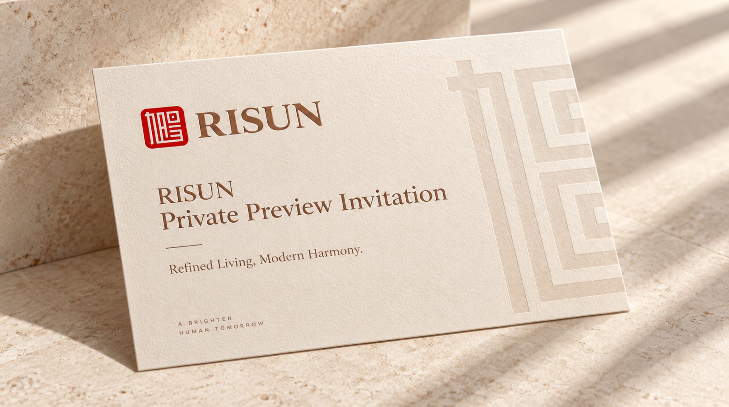
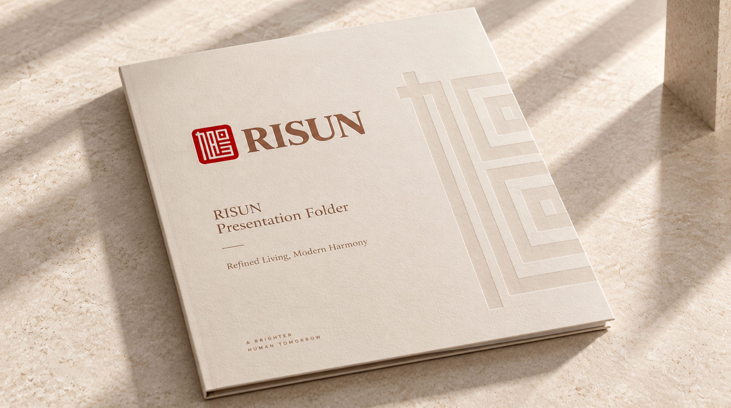
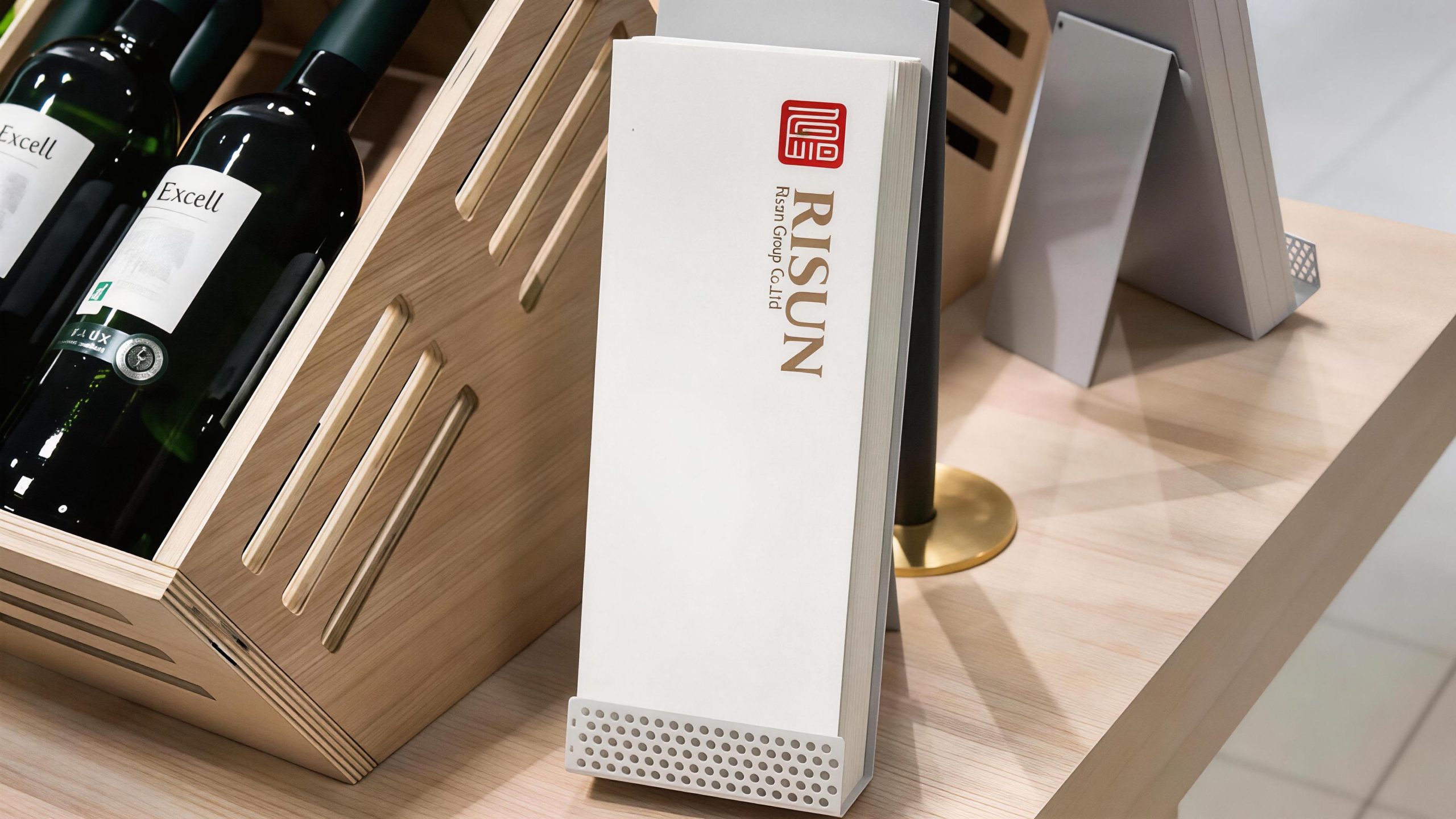
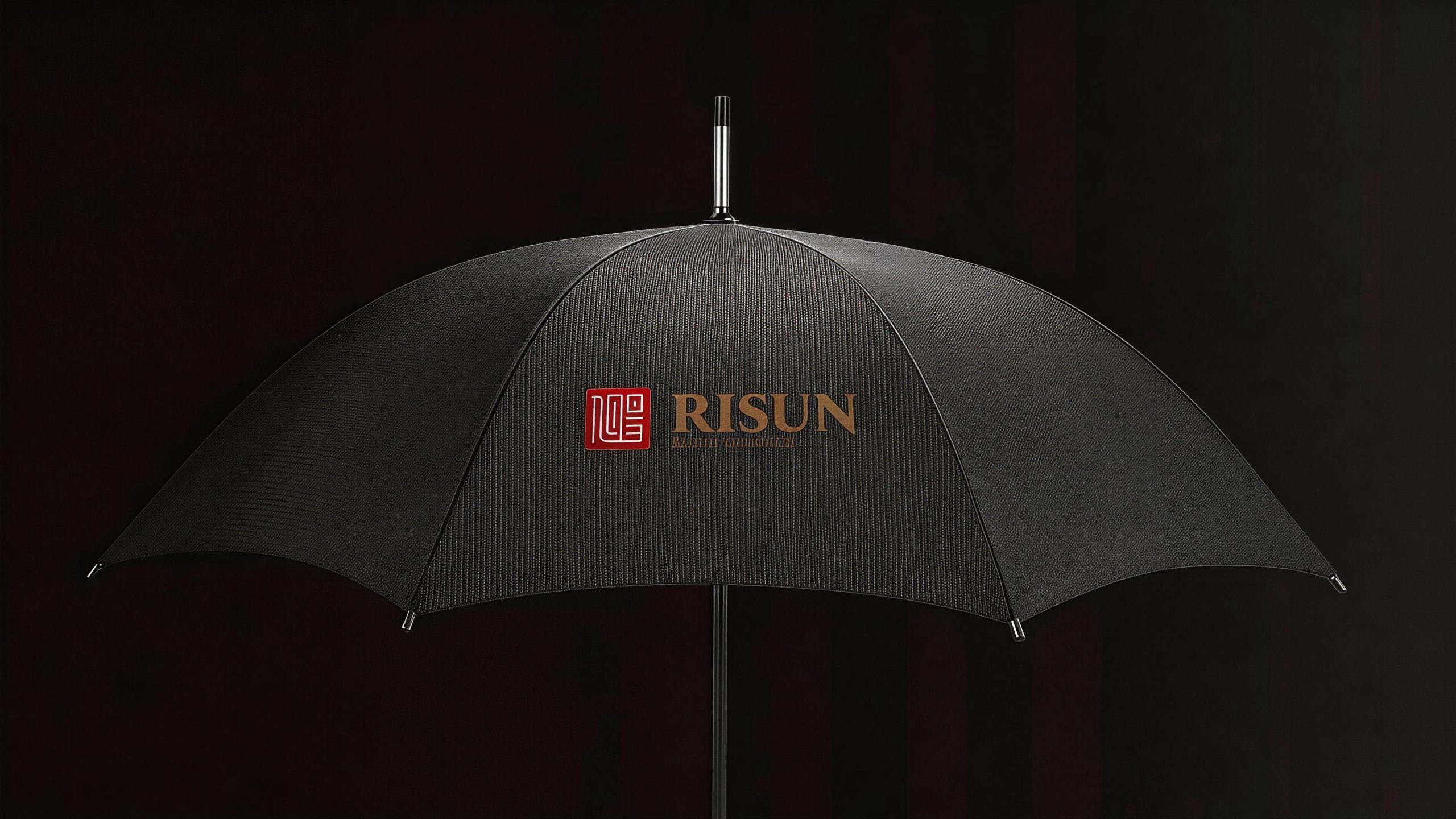
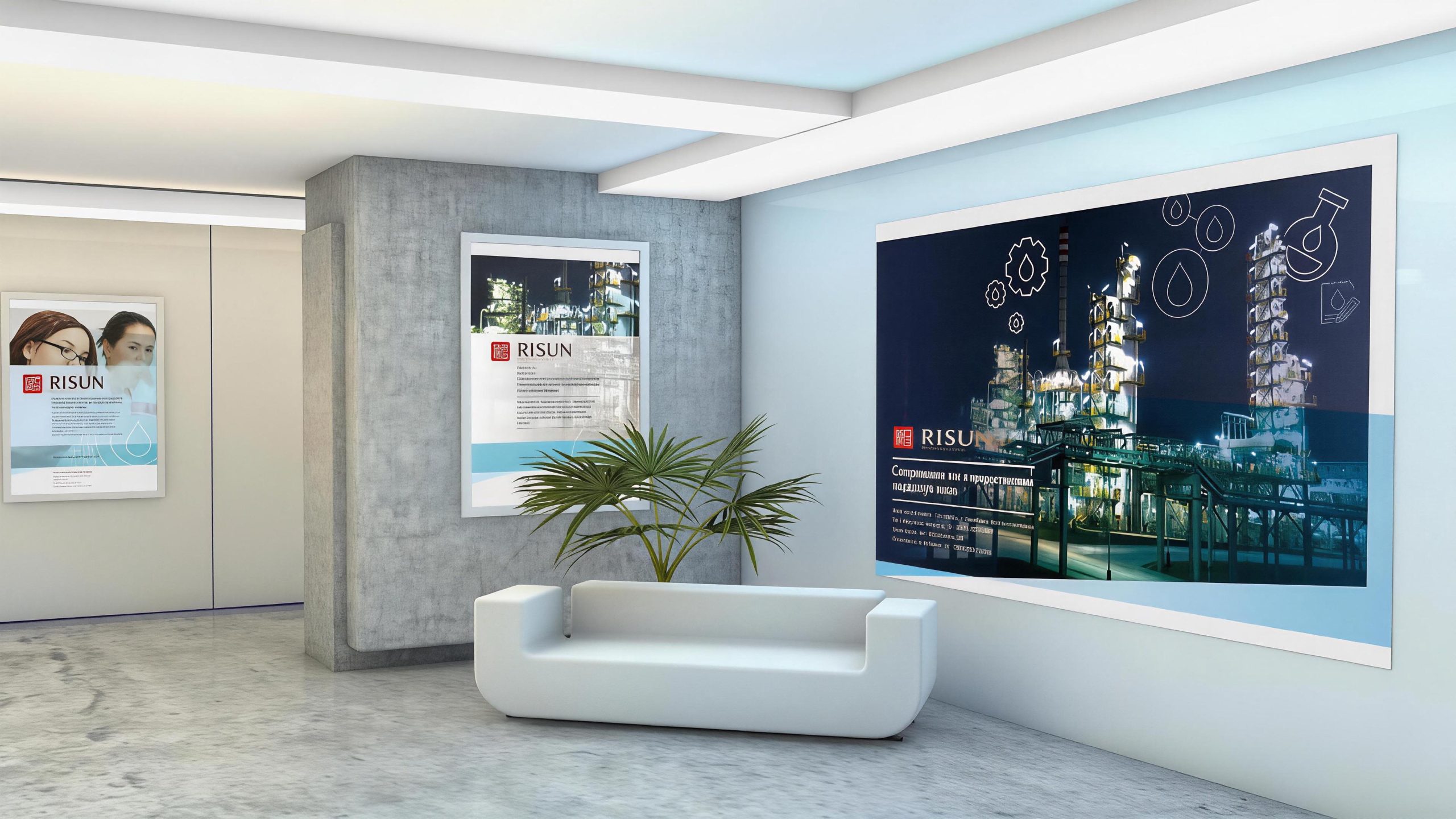
The logo has strong system scalability and can be widely used on the facade of the group headquarters building, front image wall, factory gate and industrial park guidance system; corporate business cards, business letters, annual report covers and investor relations materials; official website, group management platform, industry exhibitions and international trade fair images; chemical product packaging labels, technical documents, safety signs and quality certification documents; government cooperation project reports, industry summits, cross-border mergers and acquisitions and strategic cooperation conference images. In the dynamic vision, the red seal can be settled steadily from top to bottom like a seal carving. The two characters "Xu" and "Yang" gradually appear and join together in the seal, and then the golden "RISUN" wordmark extends smoothly from the right side, symbolizing the brand's strategic process of starting from the foundation of Chinese culture and steadily expanding into the international market. Seal graphics and seal script text can be extended into visual mother elements and used for high-end packaging dark patterns, brand watermarks, certificate borders and corporate culture space decoration.
The logo contains three core images of the Xuyang Group brand: Cultural Heritage - the red seal and the seal script "Xuyang" represent the brand's national identity and historical heritage deeply rooted in Chinese culture; Unity & Cohesion - the splicing and fusion of the words "Xu" and "Yang" symbolizes the close unity and indivisible cohesion within the enterprise; International expansion (Global) Expansion) - the ancient Roman serif English logo and the juxtaposition of Chinese and Western structures convey Xuyang's international development strategy for the world. The overall design conveys the brand vision of Xuyang Group of "rising sun, sunshine, integration of Chinese and Western, and everlasting foundation".
Improper Usage (Protection Specification)
Do not change the proportion of the outer frame of the seal, the splicing structure or stroke shape of the seal characters; do not modify the font style, word spacing or capitalization of the "RISUN" word mark; do not change the hue, brightness or left-right distribution relationship between the seal red and the light gold; do not change the seal on the left and the English words on the right The mark must be arranged up and down or reversed; do not add strokes, shadows, gradient light effects or texture overlays to the mark; do not split the words "Xu" and "Yang" in the seal into independent elements for use; keep the white space around the mark not less than 25% of the height of the graphic; the minimum display width shall not be less than 35mm.
design results
After the release of the logo, the brand recognition and cultural image of Xuyang Group in the chemical energy industry and international markets have been significantly improved. "Red Seal + Golden Roman Word Mark", with its unique visual language that combines Chinese and Western elements, stands out in the entire chemical industry and has become the core identification symbol of Xuyang's brand system. The logo is widely used in group operations, international trade and industry exchanges, demonstrating the brand vision of "rooted in China and facing the world", and has successfully established the uniqueness and high recognition of the Risun logo in the chemical industry.