










Langbol Group is a comprehensive enterprise dedicated to green environmental protection and high-end product research and development. With the corporate vision of "let light illuminate every corner of the world", its business territory covers the domestic market and actively expands global layout.
Facing the strategic needs of overseas markets, the brand needs a new logo that combines international design language and corporate spiritual connotation to establish distinct brand recognition and cultural identity on a global scale. This time, Qingmei Future was commissioned to lead the brand logo design for overseas markets.
The design goal of the brand logo is to use the visual language of internationalization, digitalization and ecological aesthetics to demonstrate the strategic height of Langpol Group as a green environmental protection and high-end product enterprise, convey the corporate vision of "hope, light and supreme glory", and fit in with the brand's development pattern facing the global market.
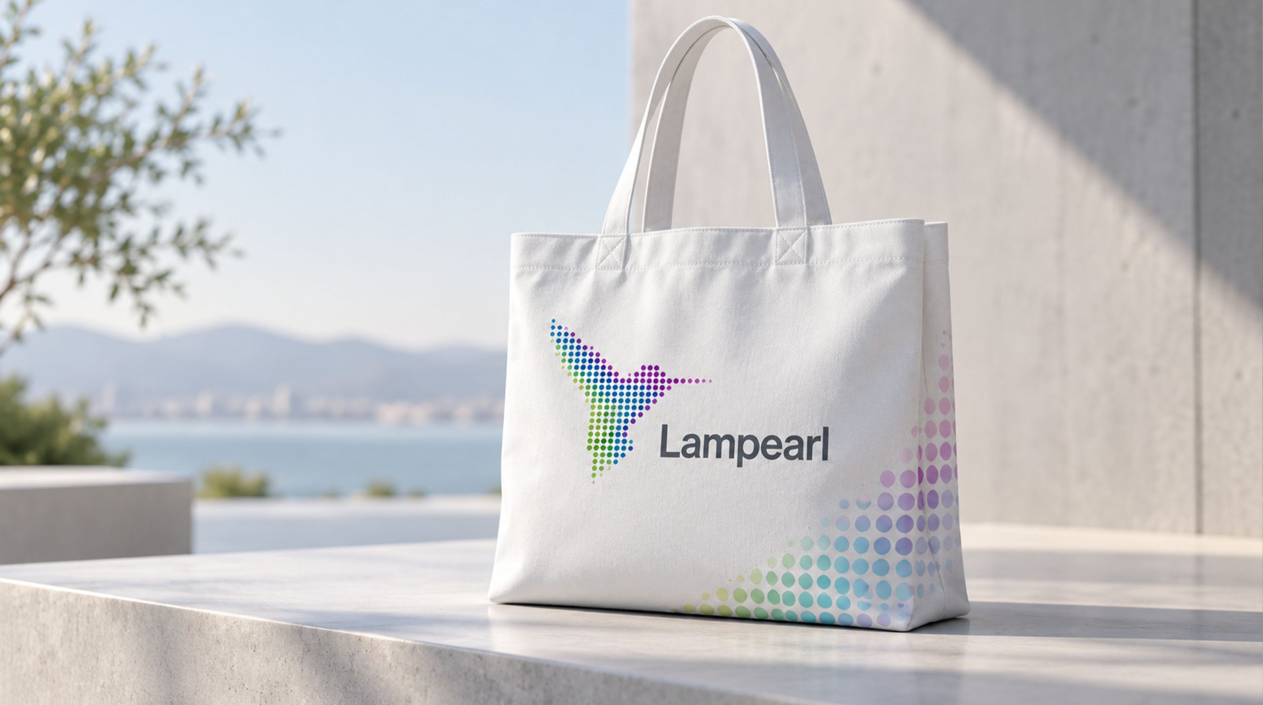
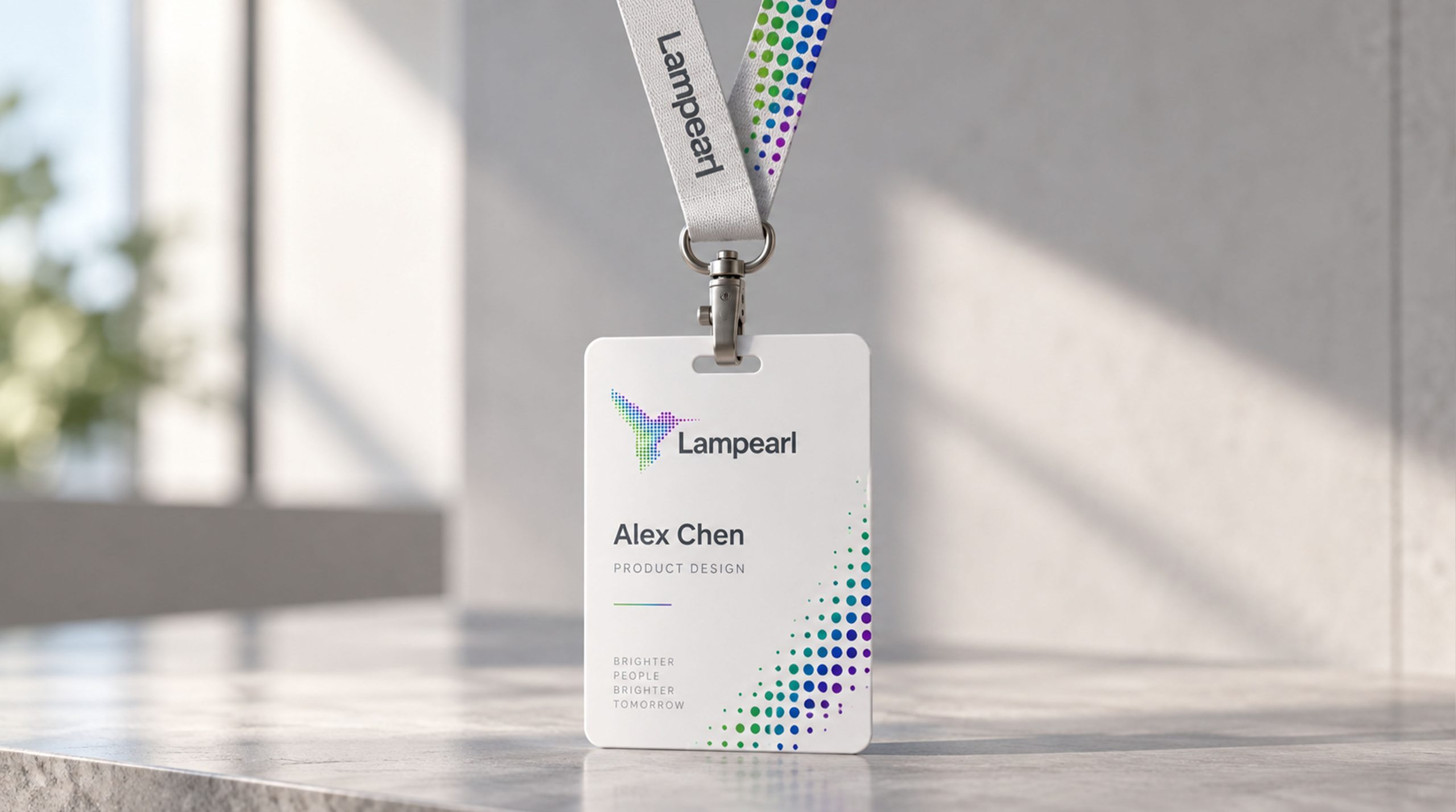
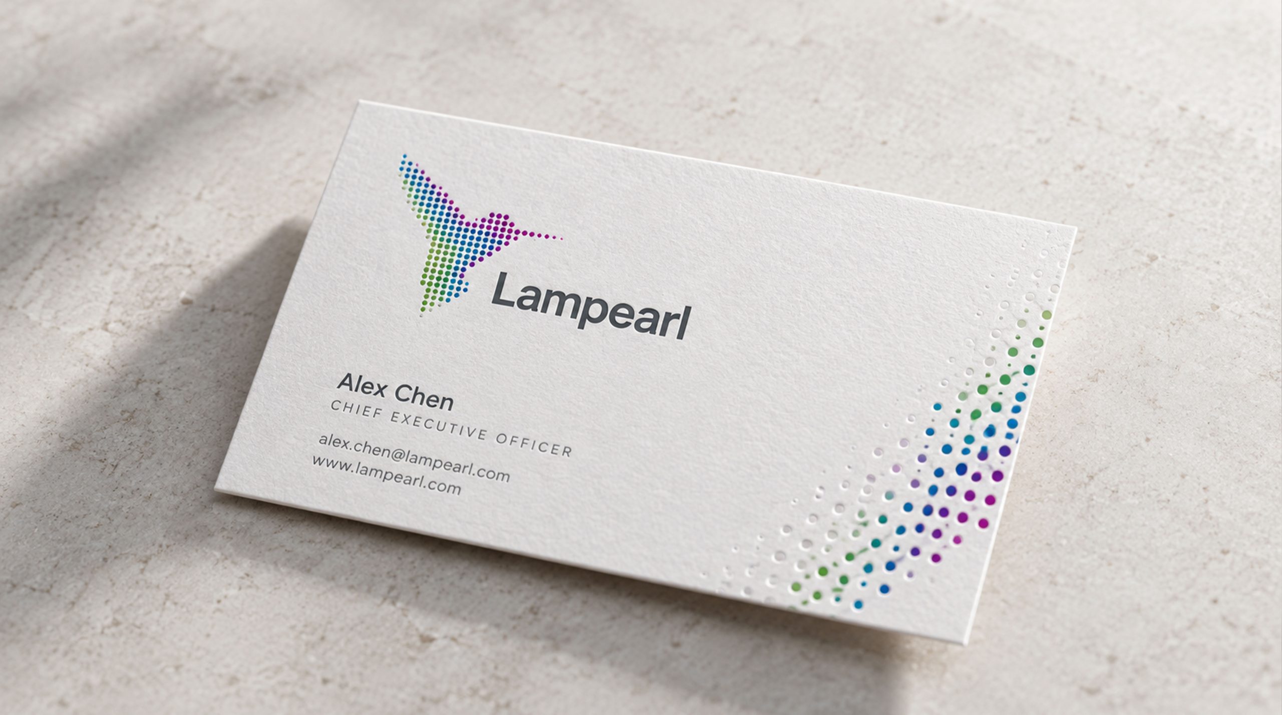
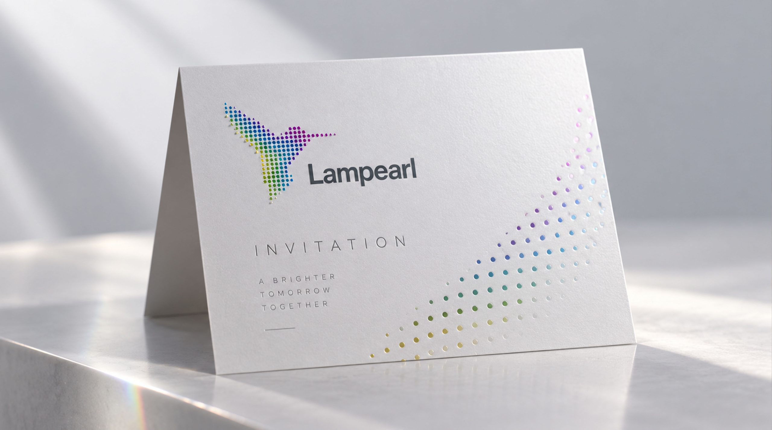
Design concept and graphic language
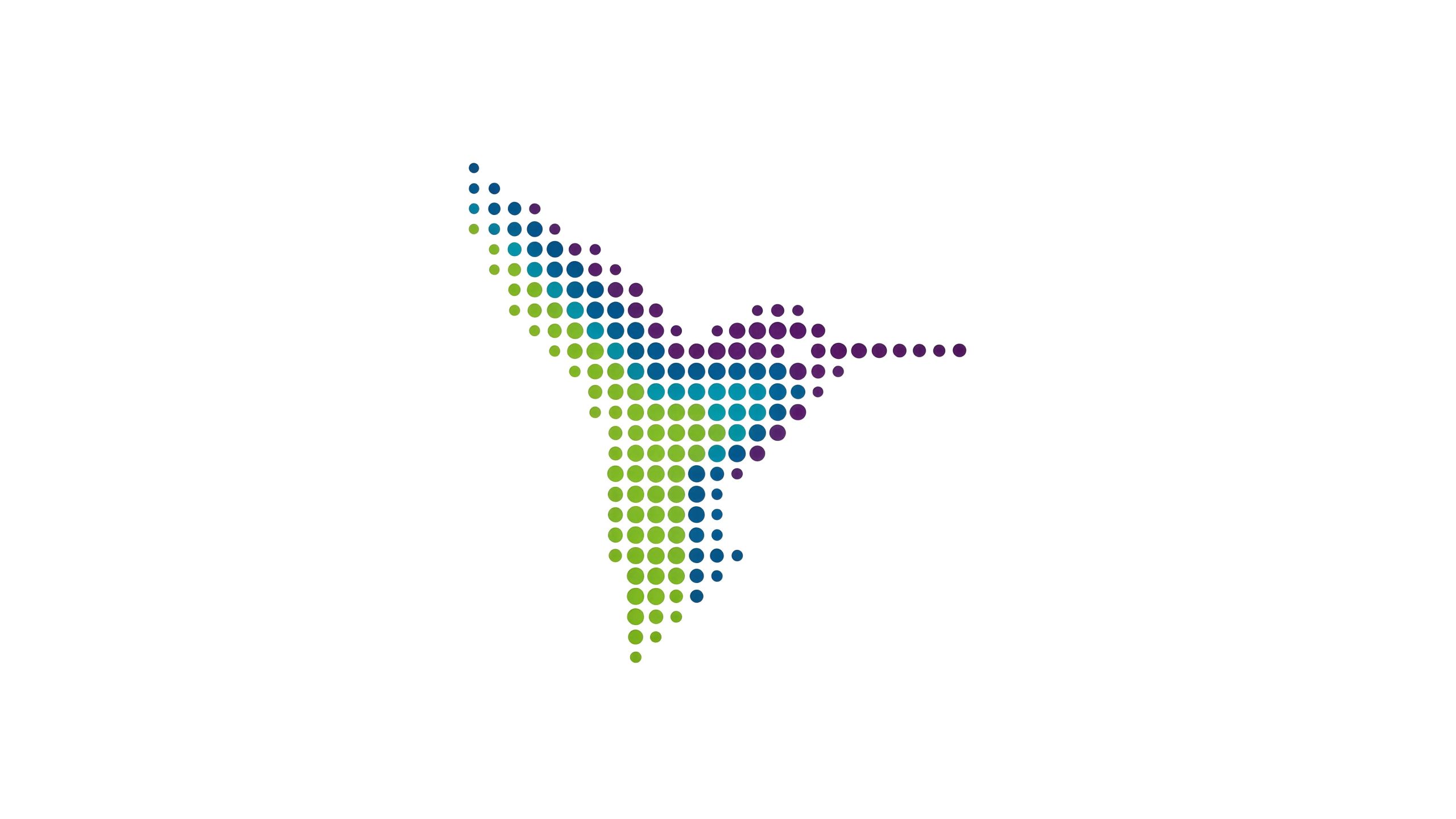
The logo takes "Sunbird" as the core concept and a flying sunbird as the main graphic. The sunbird, also known as the "wind bird" as we usually call it, symbolizes hope, light and the highest glory in cultural legends around the world. This meaning is highly consistent with Rambol's corporate vision of "let light illuminate every corner of the world". The sunbird appears in a side-flying posture, with its wings stretched upward, its tail feathers slender and drooping, and its long beak extending to the right front. The overall outline is agile and graceful, full of upward power, like a ray of light crossing the sky, bringing light and hope into the distance.
The most distinctive design technique of the logo is that the main body of the image is composed of hundreds of "small dots" of different sizes, which are combined into a complete outline of the sunbird in a pixelated dot matrix. This expression technique has been a popular design method in the world in recent years. It uses digital visual language to reinterpret the forms of natural life, giving traditional totems a sense of modern technology and international aesthetics. The dots gradually become sparse from the center of the bird's body to the wing tips, tail ends and beak, with a natural transition from dense to sparse, just like pixels gradually dissipating in space, creating a visual effect of "light particle diffusion" - the sunbird seems to be condensed from countless light points, and then spreads the light in all directions during flight, perfectly interpreting the brand vision of "let light illuminate every corner of the world". The size changes of the dots follow a strict grid order, maintaining the overall regularity and rhythm amidst the local randomness, reflecting the brand's corporate spirit of "freedom with order, innovation with regulation". Each dot is both an independent individual and a part of the whole, symbolizing the cohesion and synergy of Lambert Group's global regional markets under the brand banner. The overall composition uses the international design language of digital lattice to construct the "Sunbird of Light" to convey the brand's technological attributes and global pattern.
Font composition and color system
The logo is presented in a pure graphic form. The sunbird graphic itself is the core visual identity symbol of the brand in overseas markets. In the complete brand identity system, the English name of Langpole Group is placed below the graphic, using modern sans-serif fonts. The strokes are simple and even, and the font is broad and steady. It is consistent with the modern sense of dot graphics and conveys the professional image and brand trust of an international enterprise. The font style is clean and neat, without unnecessary decoration, ensuring clear identification and quick recognition of the brand in different cultural contexts around the world.
The overall color scheme consists of green, blue and purple, each color carrying independent and clear brand semantics. Ecological Green #7AB800 → #2E8B57 uses a multi-layered green gradient throughout the sunbird's wings and main body area, representing energy conservation, environmental protection and sustainable development, directly in line with the "green and environmental protection" corporate philosophy of Langpol Group. Green is a globally accepted color symbol for ecology and environmental protection, and has natural brand affinity and value recognition in overseas markets. Sky Blue #005B96 → #00A4E4 Different shades of blue dots are distributed in the middle of the sunbird's wingspan and core area of the body, representing freedom, vastness and technological innovation. Blue symbolizes the infinity of the sky and ocean, conveying the development pattern of the Lambert brand flying freely in the global market and the technological driving force for the future. Noble Purple #5B2D8E → #7B4F9D Elegant purple dots are embellished on key nodes of the wing tips, tail feathers and body contours, representing nobility, excellence and pursuit of quality. It is in line with the corporate strategy of Rambol Group to develop toward "high-end products". Purple is the most luxurious and differentiated color in the context of international brands, giving the logo a level of quality that surpasses its peers. The three colors on the body of the sunbird are not simply filled in areas, but are freely interspersed and gradually transitioned in dot units. Green is blue, and blue is purple, forming a rich and harmonious interweaving of colors, just like the colorful spectrum refracted by sunlight passing through a prism, symbolizing the integration and symbiosis of the brand's diverse businesses and the rich connotation of green technology. The overall color system uses the three colors of green, blue and purple in synergy, reflecting the brand strategic proposition of "green environmental protection as the foundation, technological freedom as the driving force, and high-end quality as the direction".
Application extension and brand significance
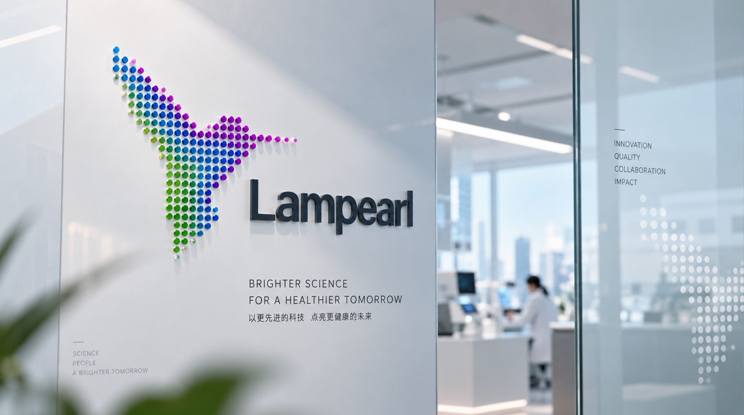
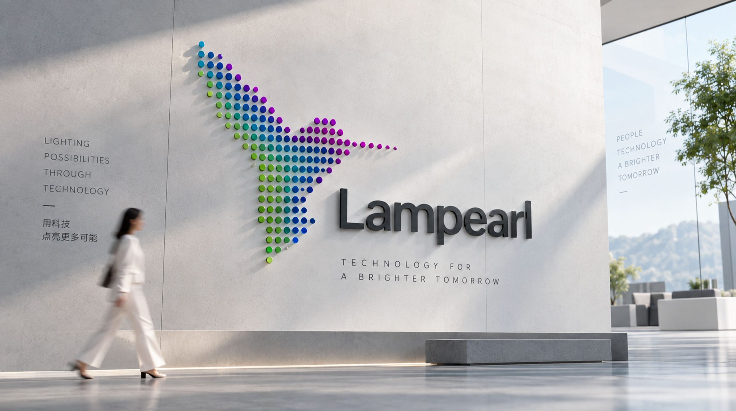
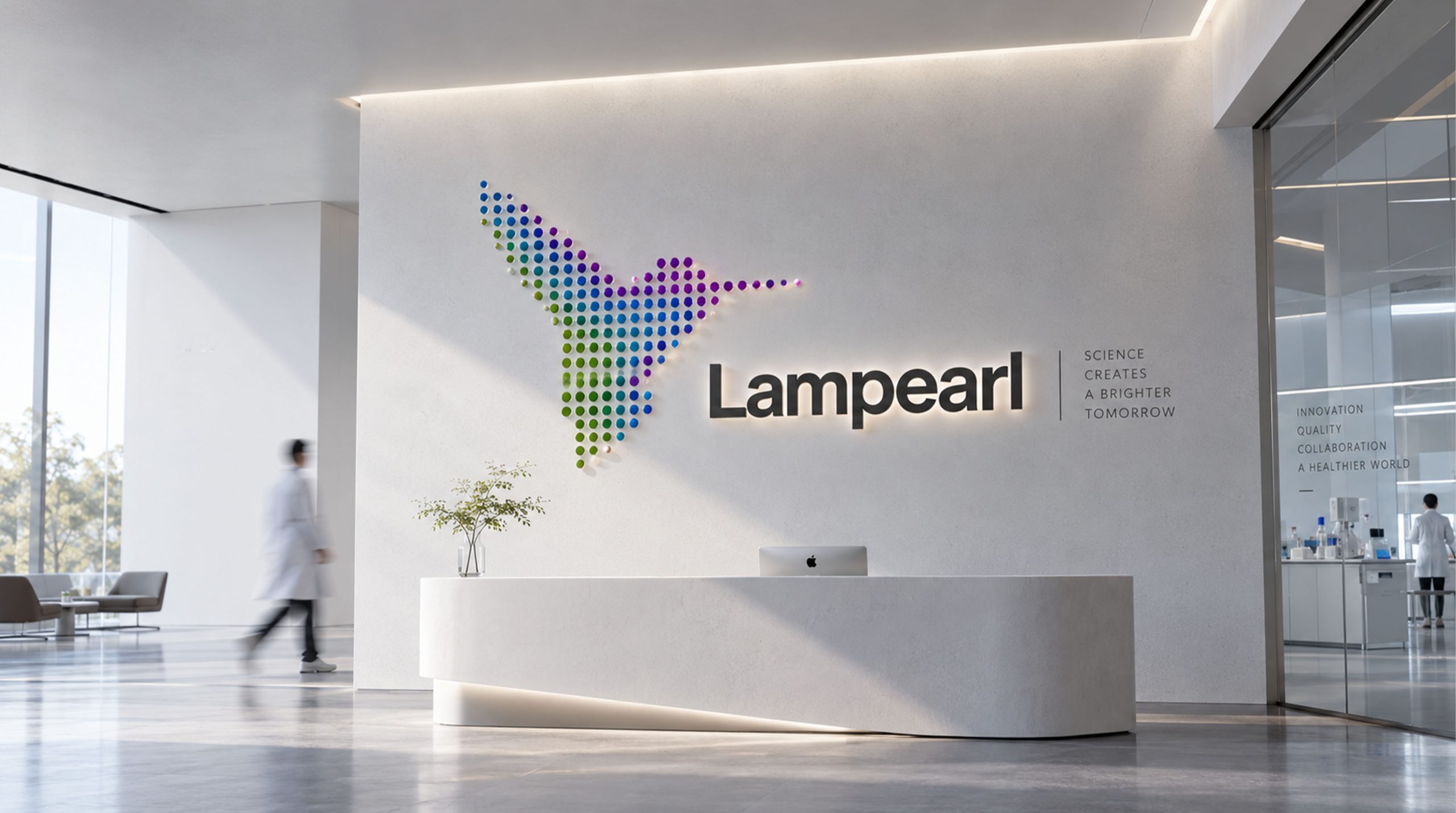
The logo has strong system scalability and can be widely used in overseas market product packaging, export commodity labels and multi-lingual technical documents; overseas offices and branch doors, front desk image walls and office environment visual systems; the group's English official website, overseas social media platforms, international digital marketing materials and overseas e-commerce pages; international exhibitions, global industry summits, transnational business negotiations and overseas partner promotion conference images; overseas market brand manuals, investor relations materials and cross-cultural communication materials. In the dynamic vision, hundreds of colorful dots can gather from all four sides of the picture, return to their positions one by one, and form. The outline of the sunbird gradually appears in the condensation of light points, and finally spreads its wings and flies, symbolizing the brand history of Rambol Group gathering strength and flying in all parts of the world. The dots can be disassembled into dynamic particle effects for use in brand transition animations for digital screens, interactive exhibition installations and data visualization systems. Dots of different sizes and colors can be extended into visual mother elements and used for zoning color identification, product line classification icons, brand patterns and environmental decoration systems in overseas markets.
The logo contains the three core images of Lambert Group's overseas brands: Hope & Light - the flying posture of the sunbird symbolizes hope, light and supreme glory, carrying the brand's lofty vision of "let light illuminate every corner of the world"; Green Innovation - the green theme and ecological concept convey the corporate core value and sustainable development commitment of Lambert Group's "green environmental protection"; Premium Excellence (Premium) Excellence) - The noble embellishment of purple and the international dot design language convey the brand's strategic direction and quality pursuit of developing "high-end products". The overall design conveys the overseas brand vision of Langpol Group to "illuminate the world with light, lead the future with green, and win the world with quality".
Improper Usage (Protection Specification)
Do not change the overall outline, flight posture or dot distribution density of the sunbird; do not modify the hue, brightness or distribution ratio of the green, blue and purple colors on the bird; do not replace the dots with squares, triangles or other non-circular elements; do not add strokes, shadows, gradient light effects or patterns to the logo. Physical superposition; do not reduce the dots to an unrecognizable level or merge the dots into solid color blocks; do not rotate, mirror the flight direction of the sunbird, or intercept local dot areas for use alone; keep the white space around the logo not less than 25% of the height of the graphic; the minimum display width must not be less than 35mm.
design results
After the release of the logo, the brand recognition and international image of Langpol Group in overseas markets have been significantly improved. "Polka Dot Sunbird", with its unique visual language that combines digital beauty and natural vitality, has become the core identification symbol of Longpole Group's overseas brand system. It is widely used in international exhibitions, overseas market promotions and cross-border business cooperation, showing the brand vision of "Hope, Brightness, Green and Excellence". The image of the sunbird, presented in the internationally popular dot design, has gained positive brand recognition and emotional resonance in different cultural markets around the world.