











K-COLD is a manufacturer specializing in refrigeration equipment, cold chain systems and intelligent temperature control.
For its rebrand, the company sought a visual identity that brings together technological precision, engineering logic and a human dimension.
The logo needed to balance industrial precision with visual warmth, reflecting the brand’s leadership in cold chain technology and intelligent manufacturing.
design concept
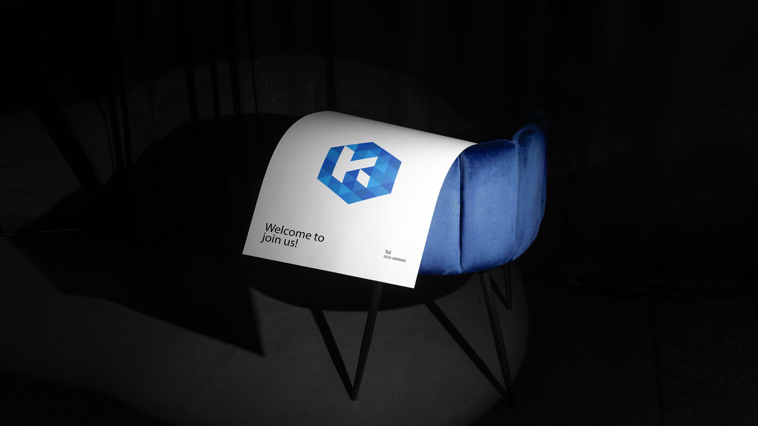
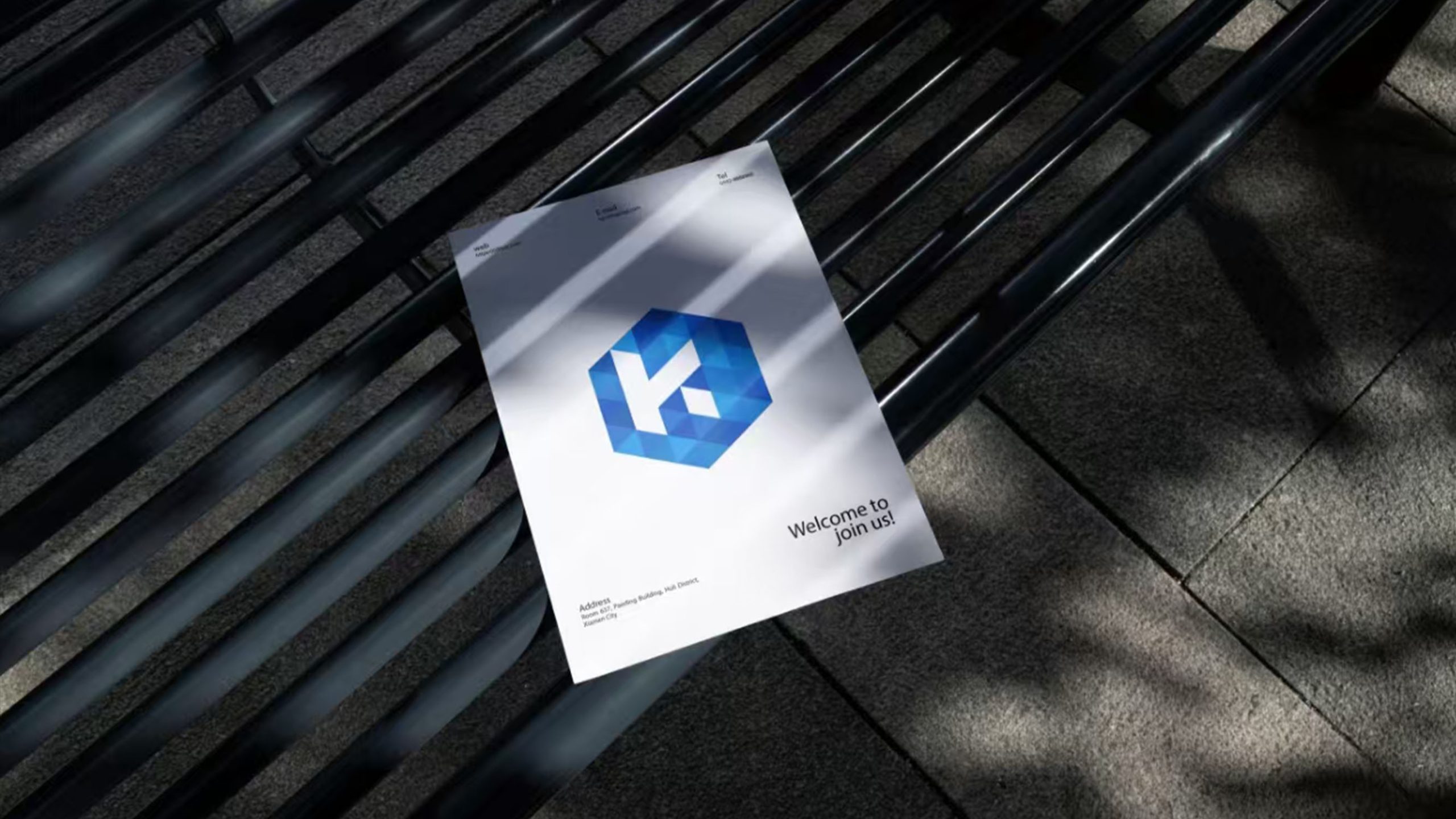
The design combines the letter “K” with a hexagonal structure. Found in snowflakes and crystals, the hexagon provides a natural reference for precision, balance and strength. The strokes of the “K” are integrated into a dimensional, ice-like geometry, creating a symbol with spatial depth and a crisp, crystalline character. The central idea is to use precise structure to express the power of temperature control, giving cold chain technology a distinctive visual form.
graphic language
Core structure: a hexagonal grid represents the stability and scientific foundations of cold chain systems. Embedded “K”: positive and negative space form the letter, reinforcing brand recognition. Geometric layers: overlapping blue facets create an ice-crystal effect. Spatial movement: a three-dimensional, refractive quality evokes the flow of energy and transfer of heat within refrigeration systems.
Fonts and composition
The K-COLD wordmark uses a technical sans serif typeface with clean, straight strokes that echo the symbol’s geometry. Subtly tapered stroke endings reflect the sharpness of ice crystals. The symbol can stand alone or combine with the wordmark in a standard horizontal lockup for equipment nameplates, product packaging and marketing materials.
color system
Primary ice blue #1A73E8 represents technology, purity and cooling power. Supporting deep blue #0B3B8E conveys stability and industrial strength. Pale blue #B3D7FF evokes the transparency of air and ice, while highlight white #FFFFFF suggests cleanliness and precision. Cool gradients build crystalline depth, creating a visual language inspired by the spectrum of ice.
Application and extension
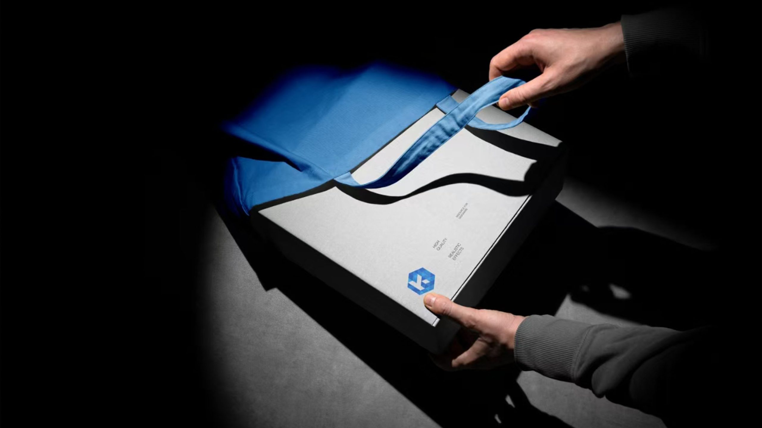
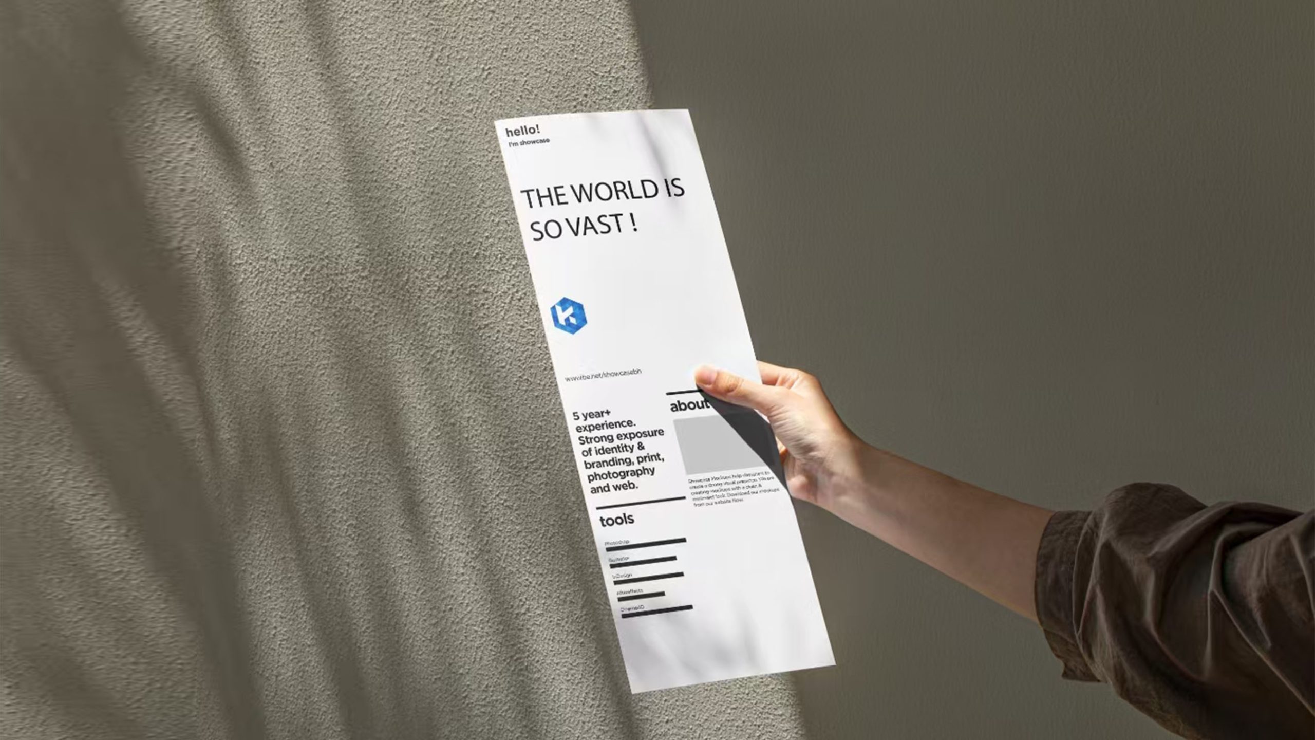
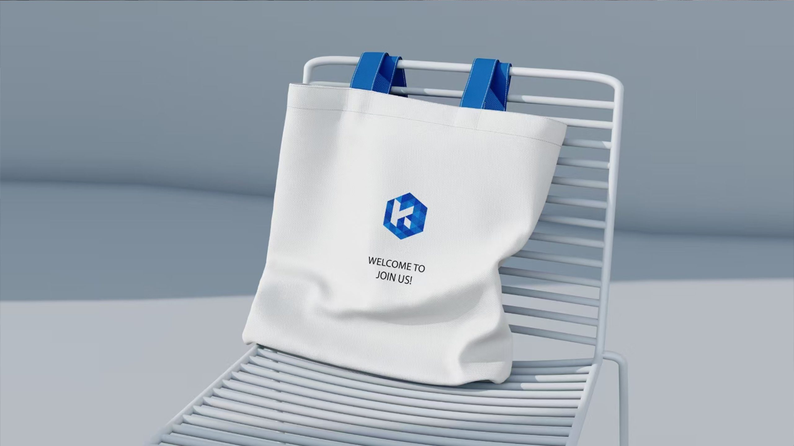
The logo adapts readily to industrial and digital applications. On products, it appears on refrigeration equipment nameplates, temperature-control housings, packaging and engineering drawings. In physical environments, it becomes dimensional signage for corporate showrooms, cold chain warehouses and vehicle liveries. Digitally, it can animate through shimmering crystal effects or temperature transitions to bring the technology to life. The hexagonal structure also provides the basis for a visual grid across the corporate website and presentation templates.
brand meaning
K-COLD’s brand spirit is expressed through three values: structural reliability, with the hexagon representing engineering rigor and system stability; technological precision, with crystalline geometry reflecting refrigeration expertise; and visual purity, with blue and white conveying calm, professionalism and trust. The logo embodies the brand’s focus and progress in temperature-control technology, bringing a human dimension to the science of cooling.
Improper Usage (Protection Specification)
Do not rotate the logo or alter the proportions of the “K.” Do not use warm colors or excessively saturated blues. Do not add shadows, outlines or embossed effects. A minimum reproduction width of 25 mm is recommended.
design results
Following its launch, K-COLD’s new visual identity became highly recognizable across the refrigeration equipment and cold chain logistics sectors. The hexagonal “K” became the company’s defining signature at international trade shows and in engineering applications, earning the client description “a symbol of ice-crystal technology.” The project is a key example of Qingmei Future’s work connecting industrial manufacturing, technology and material expression, with a precise balance of function and aesthetics.