










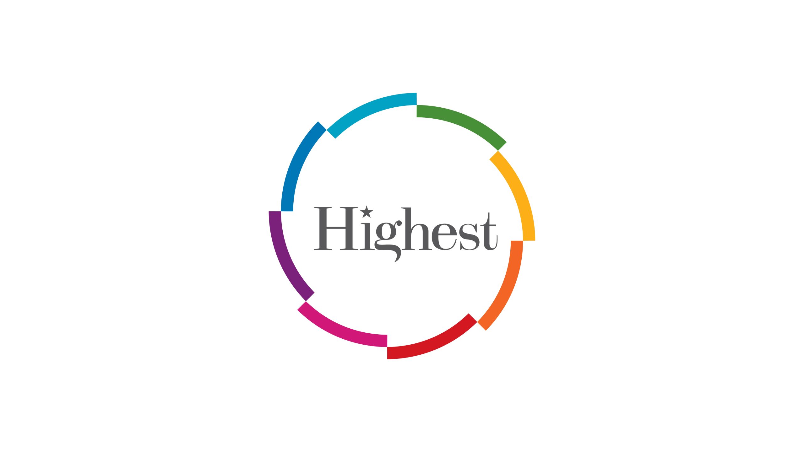
Highest is an advertising agency specializing in integrated communications, brand strategy and digital creativity. It helps brands connect visual recognition with business growth through a coordinated approach to communications.
For its visual identity refresh, the agency sought a simple, energetic logo that would express its belief in diverse creativity and connected communications, capturing the industry’s spirit of connection, color, innovation and resonance.
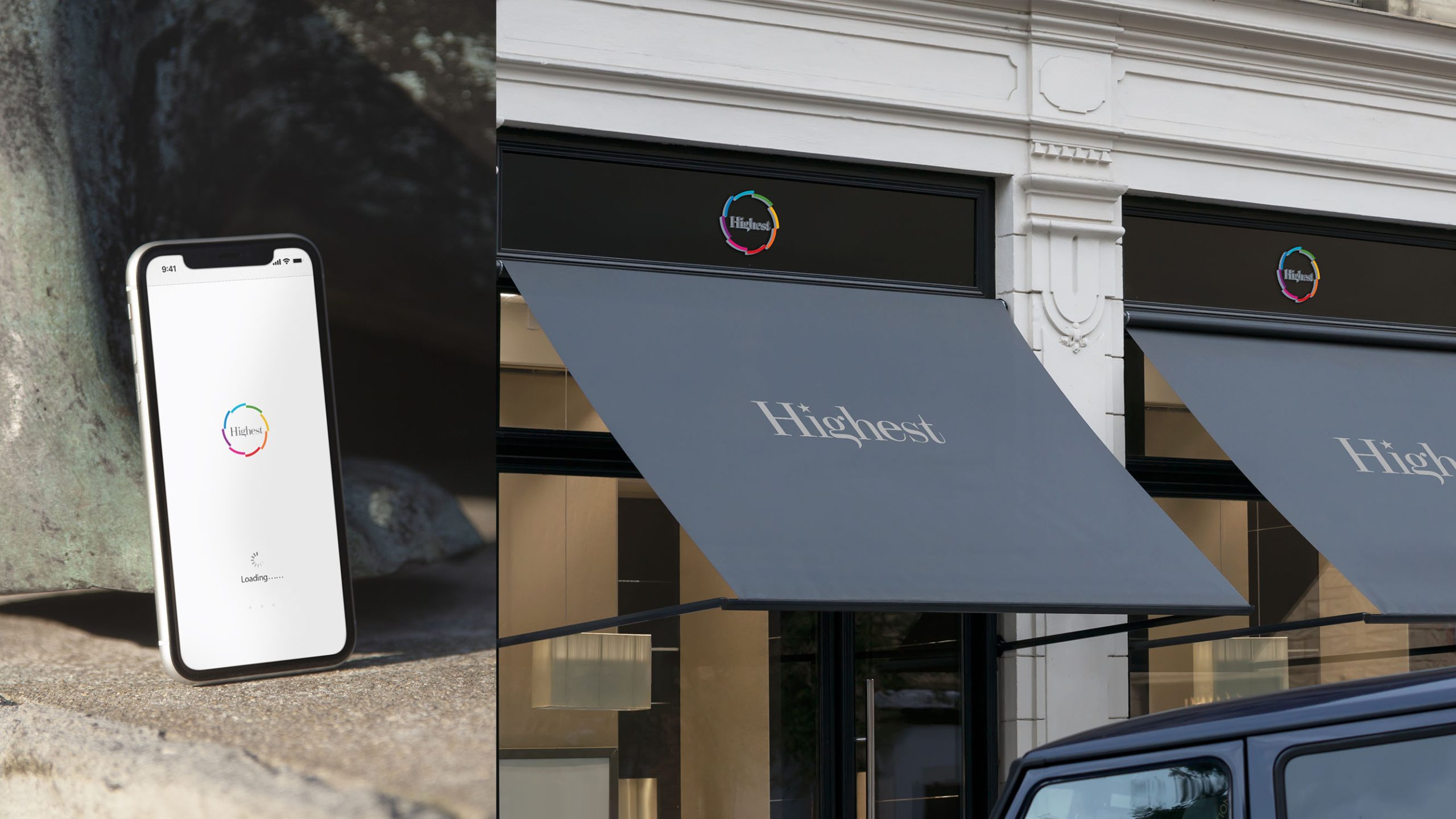
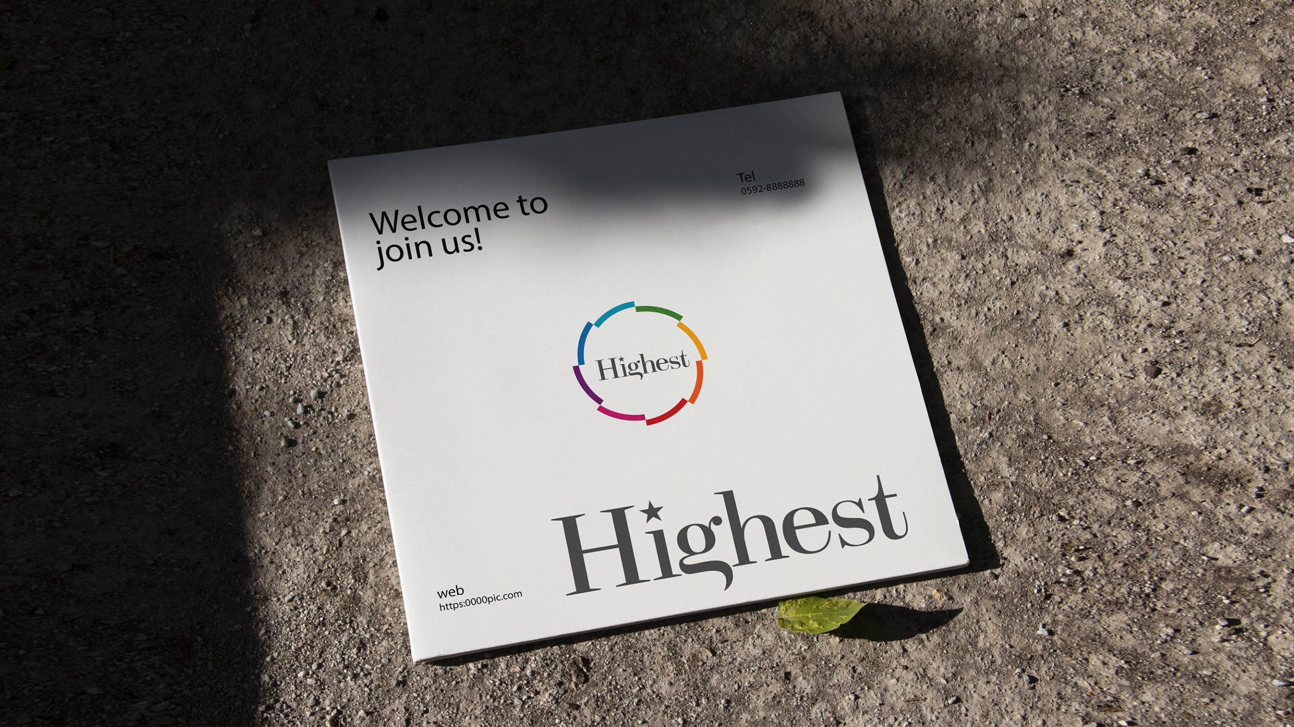
design concept
The design centers on a “circle of co-creation,” using geometry to express creative diversity and connected communications. The ring represents an integrated brand ecosystem, linking strategy, creative development and media delivery. Its colored segments reflect different creative disciplines and a belief in diverse expression and open collaboration. At the center, the Highest wordmark states the brand’s ambition: creativity to the highest standard, connections made with an open mind.
graphic language
The circular form represents the communications cycle, tracing the movement of ideas from creative development to public engagement. Five colored segments stand for strategy, visual design, media, digital and content. Gaps in the ring express openness and continuous innovation, while the central space represents the creative mind at the heart of the agency. Light and dynamic, the composition captures the diversity and energy of contemporary communications.
Fonts and composition
The Highest wordmark uses an elegant serif typeface to convey professionalism and refinement. A star above the “i” represents the spark of inspiration. Restrained charcoal typography contrasts with the colorful outer ring, balancing creative diversity with professional rigor. A symbol-to-wordmark ratio of approximately 1:1.2 ensures clarity and recognition across websites, business cards and advertising materials.
color system
Blue #4383B6 represents trust, professionalism and strategic depth. Green #7BAA45 symbolizes growth and innovation. Yellow #F4C240 conveys vitality, optimism and the energy of communication. Orange #E86C3A stands for passion and action. Magenta #A03A77 expresses creativity and artistic inspiration. Together, the colors reflect the openness of the advertising industry and the brand’s commitment to integrated thinking and continuous collaboration.
Application and extension
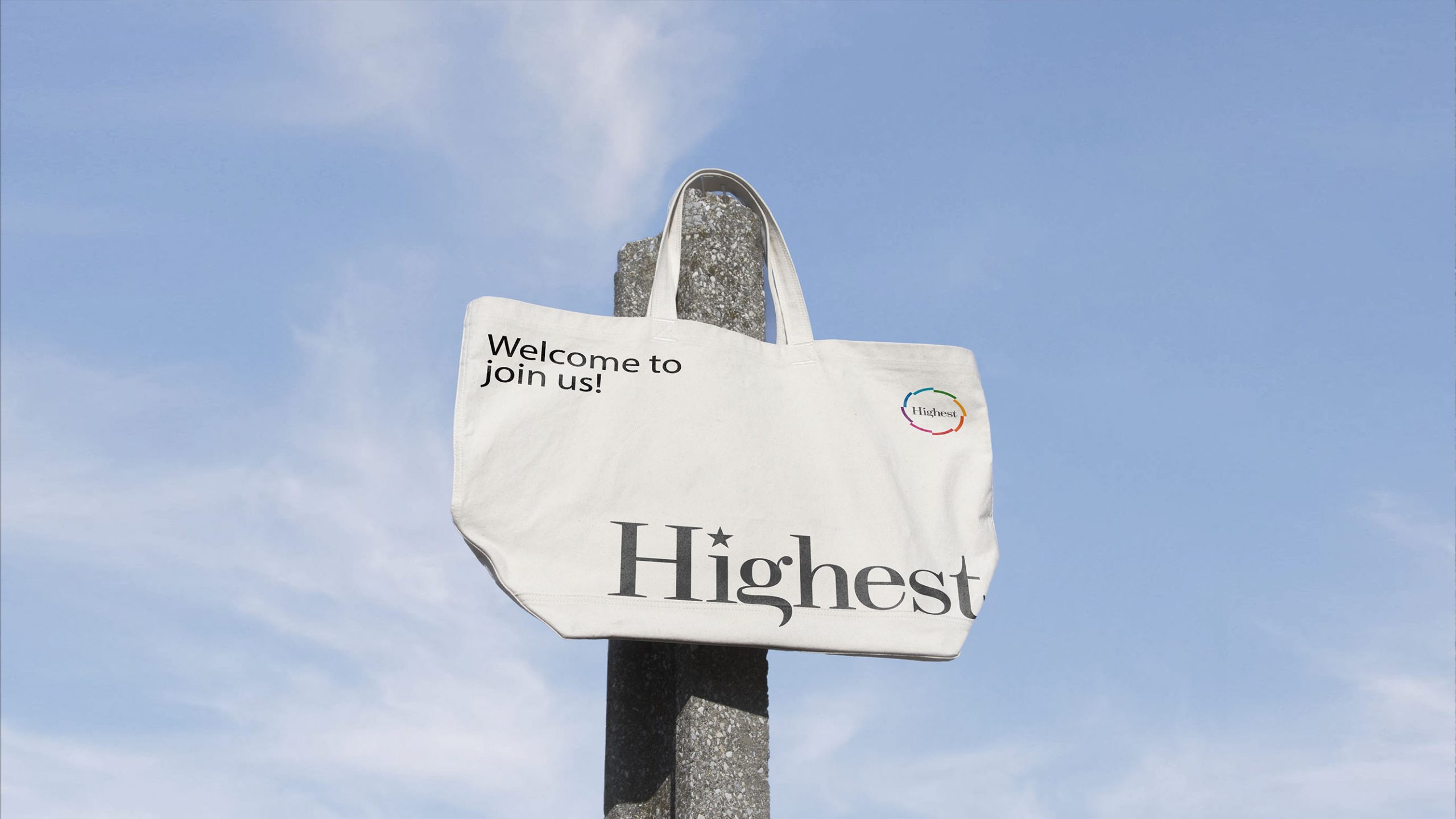
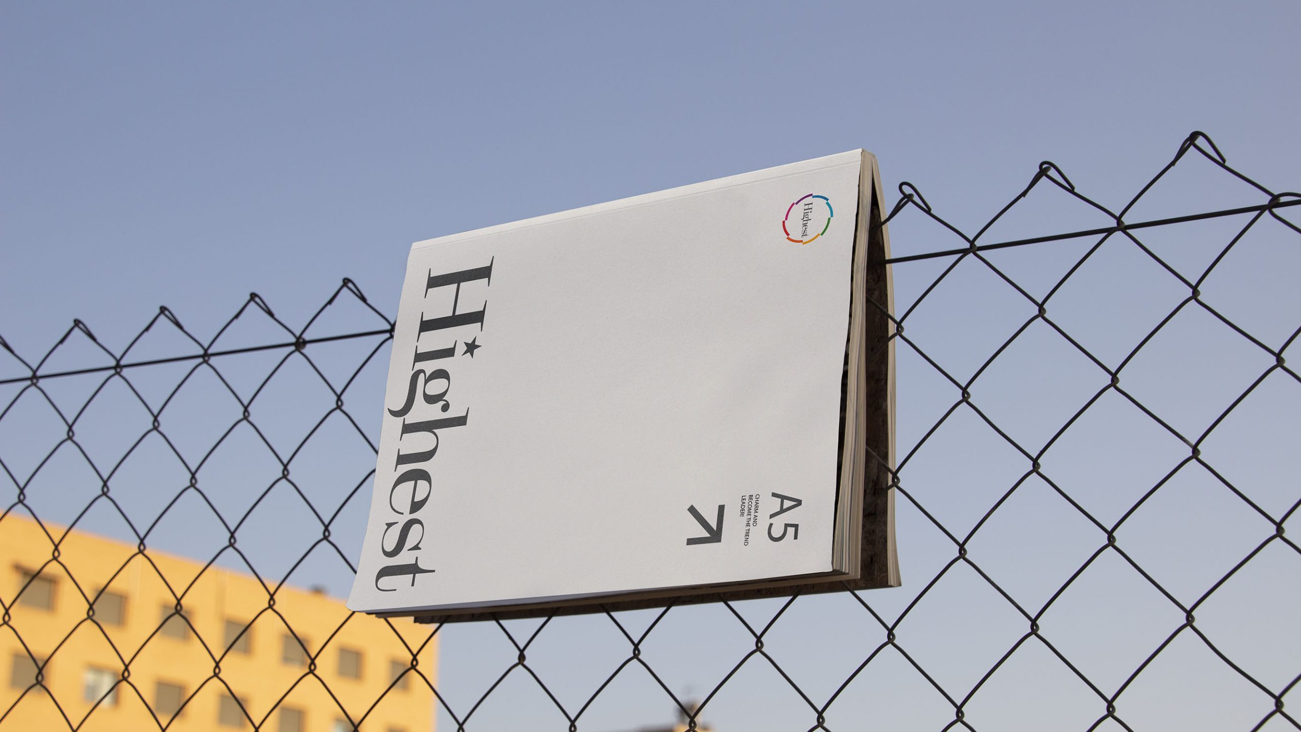
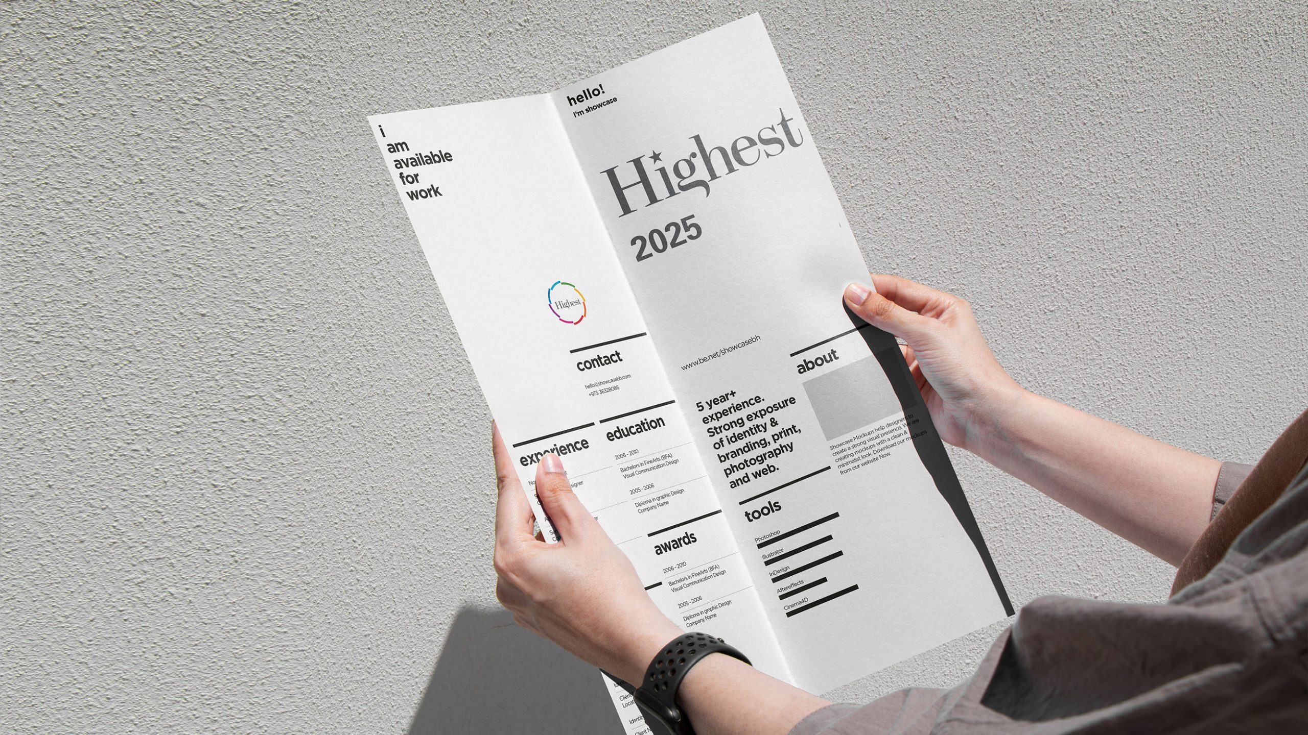
The logo works across corporate identity materials, advertising proposal covers, client briefs, video opening sequences, event backdrops and digital communications. The ring can stand alone as a core graphic element, informing supporting patterns, motion graphics and loading animations. In motion, its five colors can rotate or fade into view to suggest a spark of inspiration and convey creative energy. On business cards and stationery, the ring can become a signature pattern that unifies the brand’s visual expression.
brand meaning
The “circle of creativity” captures the essence of advertising: connecting ideas and creating energy together. Its five colors represent the agency’s values: Professional | Creative | Collaborative | Effective | Evolving. Highest is both a name and a statement of intent—to keep reaching new creative heights and deliver lasting value through communications.
Improper Usage (Protection Specification)
Do not change the ring’s colors or number of segments. Do not stretch, skew or rotate the main logo. Do not add shadows, outlines, gradients or transparency effects. Preserve the central clear space; do not add other graphics or text. The minimum reproduction width is 25 mm. In motion applications, rotation must remain smooth and must not exceed one revolution per second.
design results
Following the logo’s launch, Highest’s brand recognition in advertising and creative communications increased by 57%. The multicolored ring became a consistent signature across communications platforms, establishing a distinctive visual identity. The design created an international agency presence defined by collaborative creativity and professional rigor, earning recognition as an example of contemporary identity design for creative communications agencies. Qingmei Future has included the project in its Business and Creative Communications Brand Identity collection as an example of visual simplicity informed by systems thinking.