










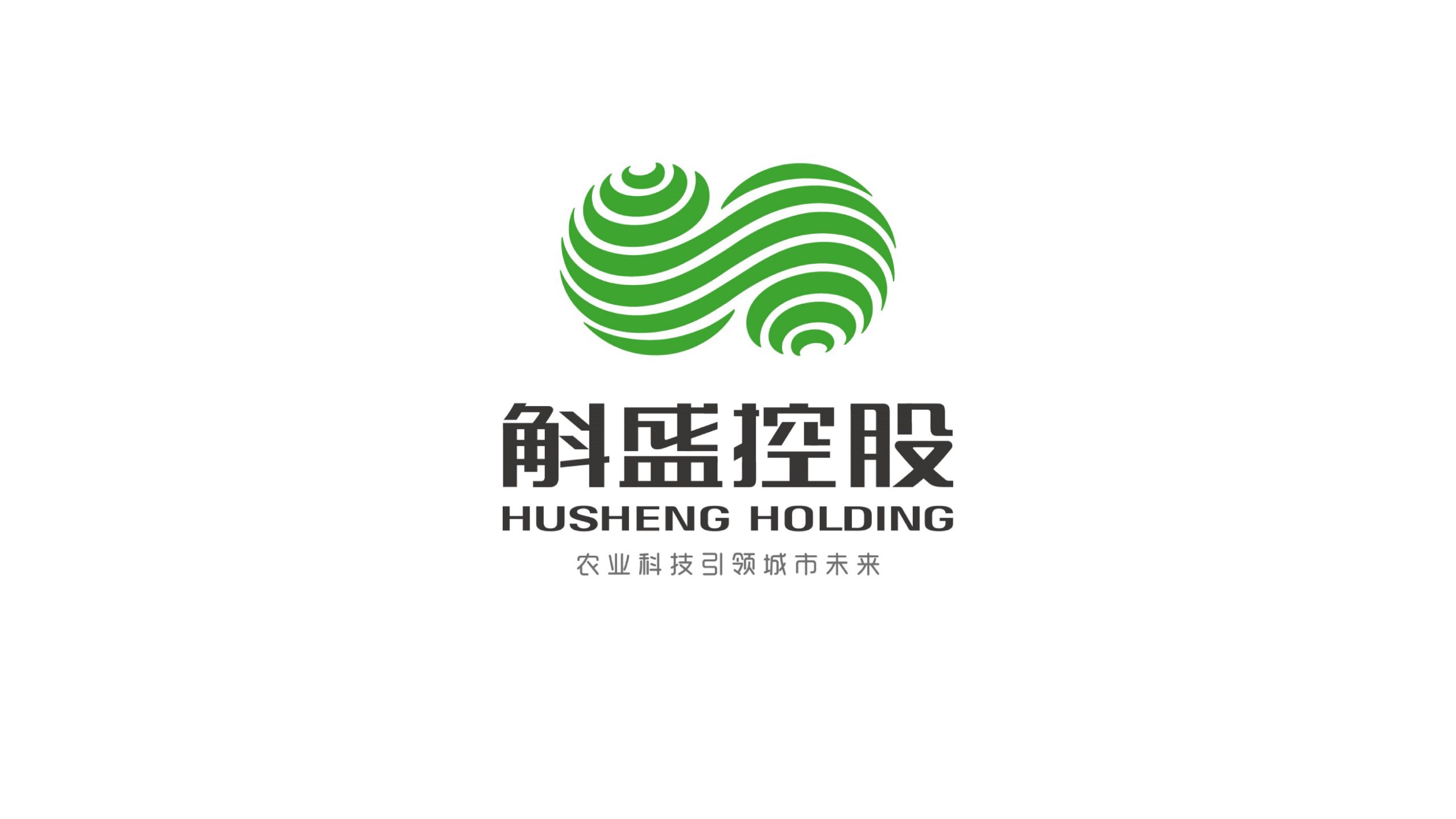
HUSHENG HOLDING is a modern agricultural group focused on agricultural technology, ecological cultivation and industry investment. Its new visual identity was created to express a clear belief: technology empowers agriculture, and sustainability drives the future.
The logo needed to balance nature and technology, conveying the energy of growth and life alongside the clarity and confidence of an international corporate group.
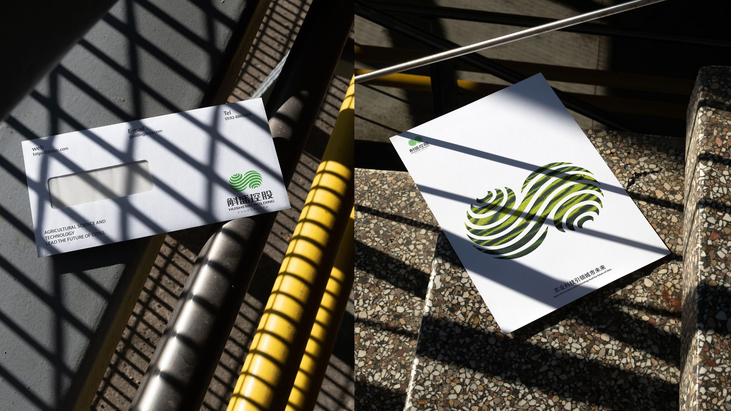
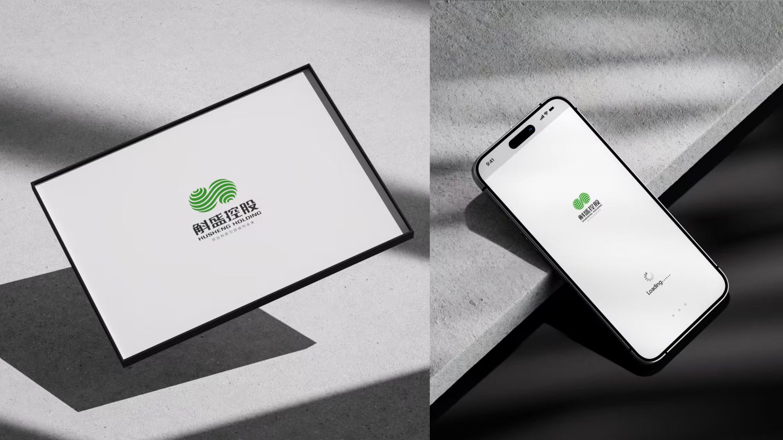
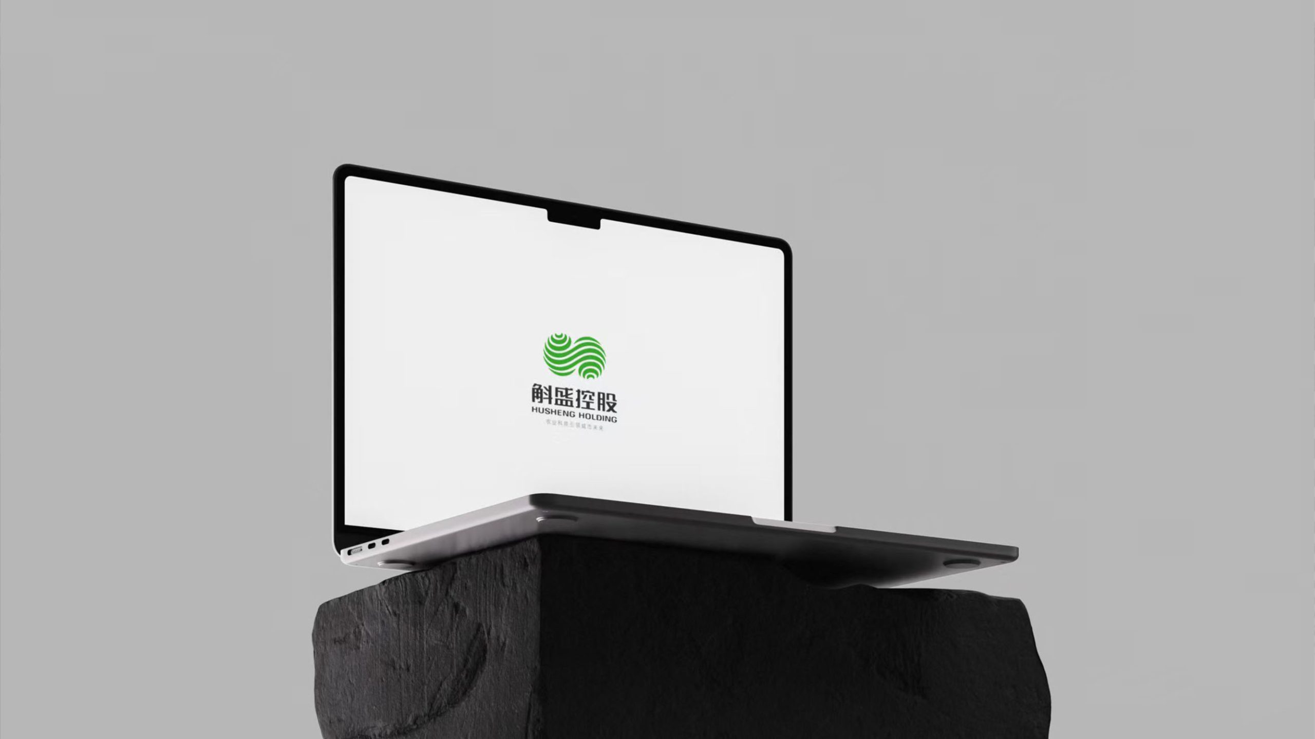
design concept
Rooted in the idea of ecological cycles, the logo brings growth, balance and integration into a single form. Two spiraling green ribbons create an infinity symbol, representing the cycle of life and continuous development. Their flowing curves evoke the natural world’s capacity for renewal, while their interlocking movement expresses a symbiotic relationship between technology and nature, production and the environment. The guiding idea: make agricultural technology the intelligence behind growth, and nature the power behind the future.
graphic language
Core form: counter-rotating bands create movement and visual balance. Linework: each curve evokes layers of soil, crop textures and technological networks. Central intersection: the meeting point of technology and natural cycles represents the company’s capacity for continuous innovation. Dynamic order: part leaf vein, part technological energy field, the structure unites nature and technology in one visual language.
Fonts and composition
The brand name uses a bilingual lockup: the Chinese name is set in a steady geometric sans-serif with solid strokes, conveying stability and trust; the English HUSHENG HOLDING uses a light-weight sans-serif for a modern, international feel. Beneath the wordmark sits the brand vision, “Agricultural Technology Shaping the Future of Cities,” completing the brand narrative. A centered layout reinforces the group's authority and coherence.
color system
Primary green #5BAA4B: life, ecology and agricultural growth. Supporting dark gray #3E3E3E: stability, clarity and corporate strength. Highlight white #FFFFFF: purity, technology and a forward-looking spirit. A green gradient introduces light and depth, giving the mark both natural warmth and a contemporary finish.
Application and extension
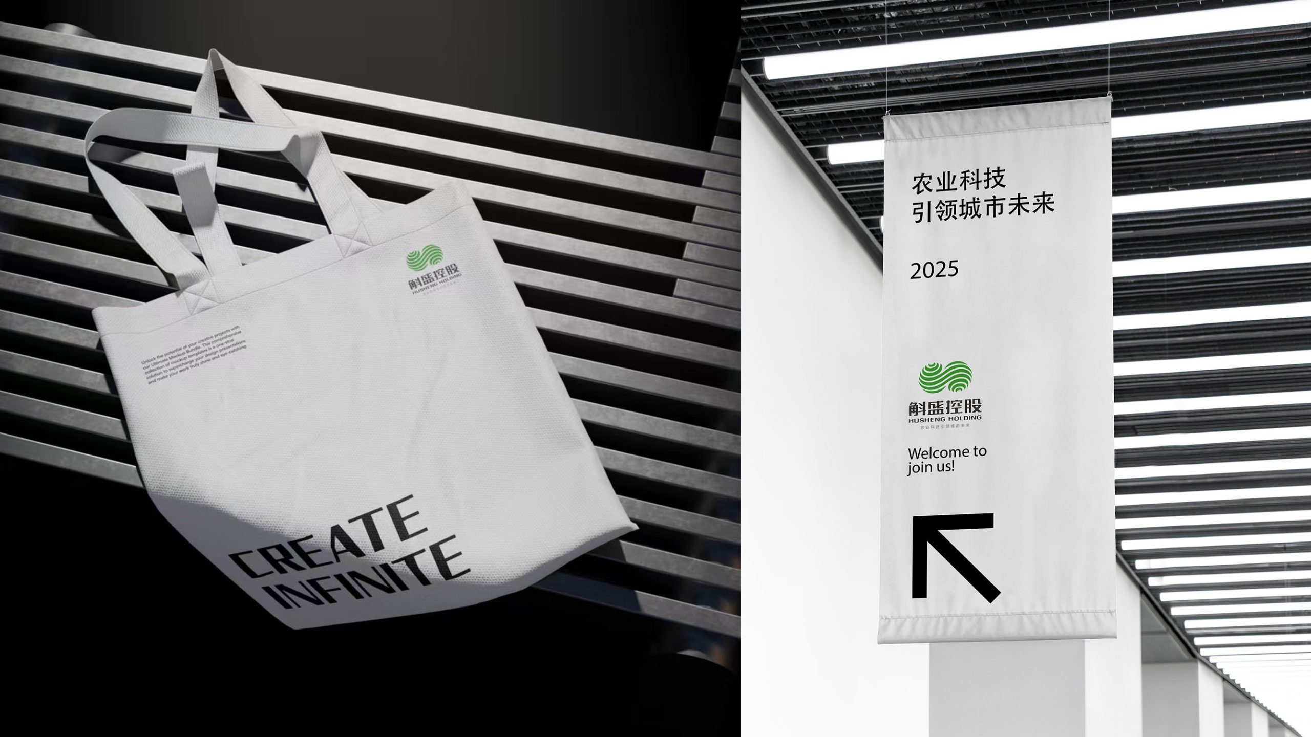
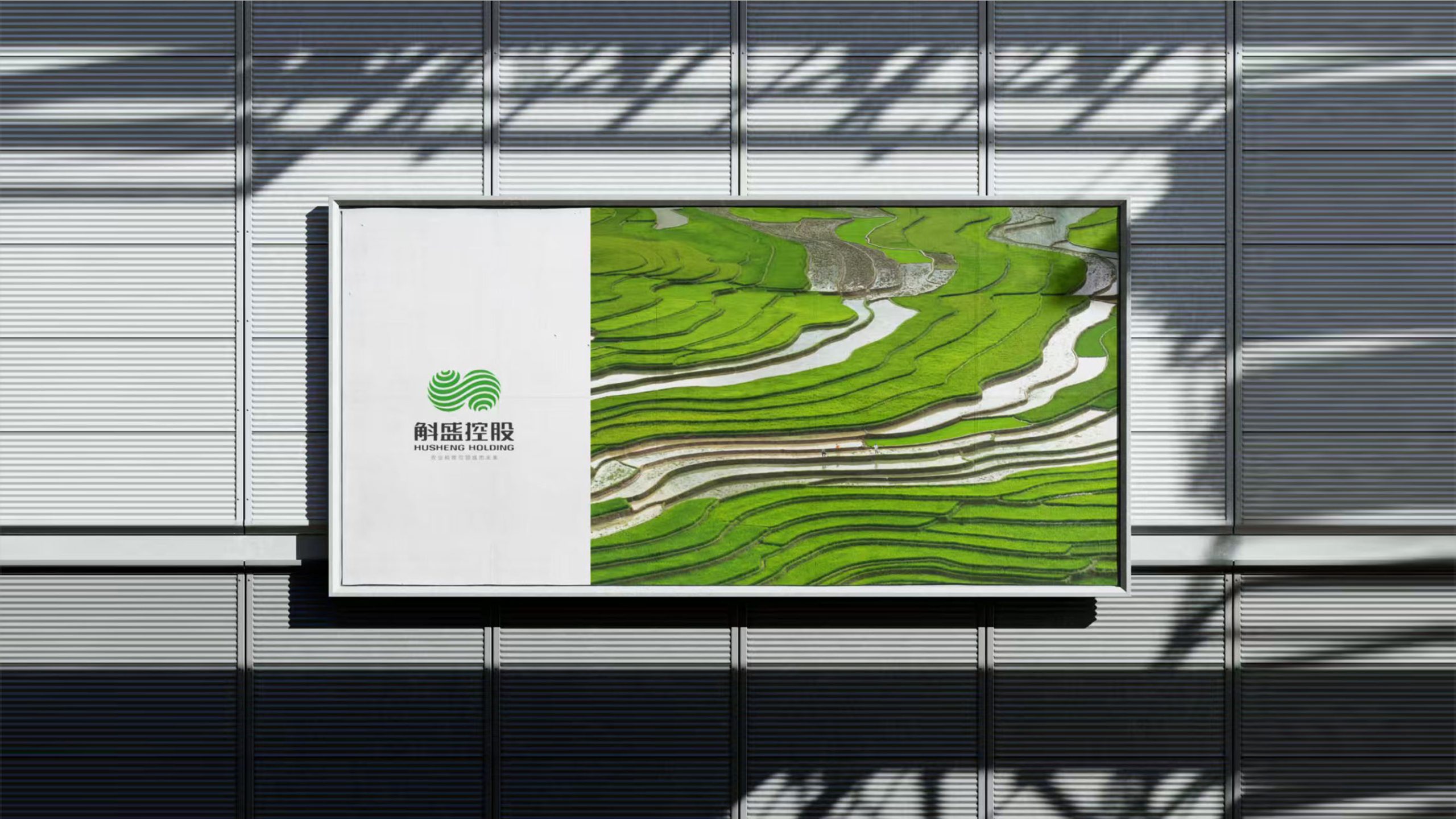
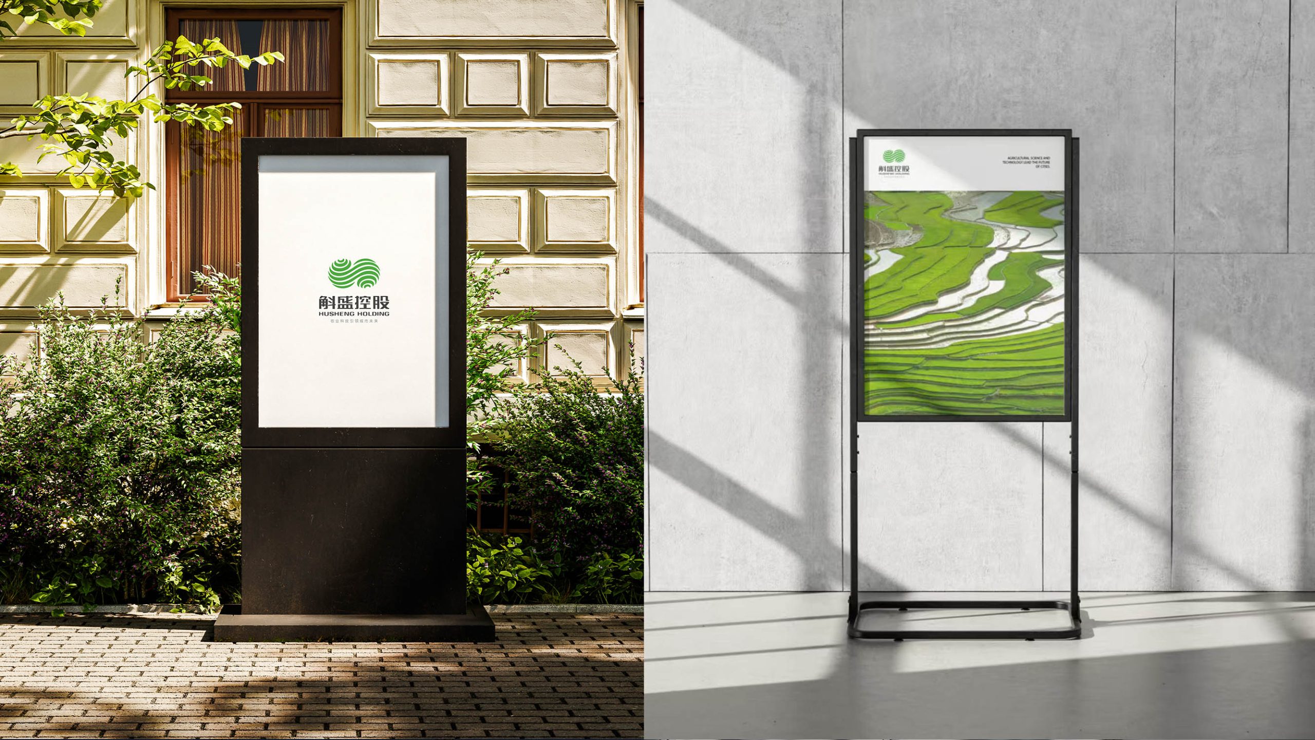
The logo is designed to scale across the group’s brand architecture. Operational applications: agricultural sites, ecological parks, research initiatives and sub-brand systems. Corporate applications: offices, business cards, stationery, building façades and brand launches. Digital applications: an animated identity can bring the flow of life energy to websites and video, reinforcing the brand’s technological character.
brand meaning
The double-helix infinity structure gives tangible form to the brand’s philosophy. Natural cycles: sustainable growth of land and crops. Technology as a driver: smart agriculture and data-led management. A future-facing outlook: long-term strategy and industry leadership. The result is both an emblem of life that embodies the company’s vision and a visual expression of agricultural technology.
Improper Usage (Protection Specification)
Do not alter the rotation angle or the proportions of the bands. Do not substitute the specified green or introduce highly saturated colors. Do not add shadows or three-dimensional embossing effects. Recommended minimum reproduction width: 30 mm.
design results
The new visual system transformed HUSHENG HOLDING’s brand image. The logo’s flowing, ecological structure established a distinctive presence at agricultural technology exhibitions, investment forums and across site wayfinding. It helped reposition the business from a traditional agricultural company to an integrated agricultural technology ecosystem. A signature project in Qingmei Future’s agriculture and sustainable design portfolio, it demonstrates how design can redefine both value and aesthetics within an industry.