










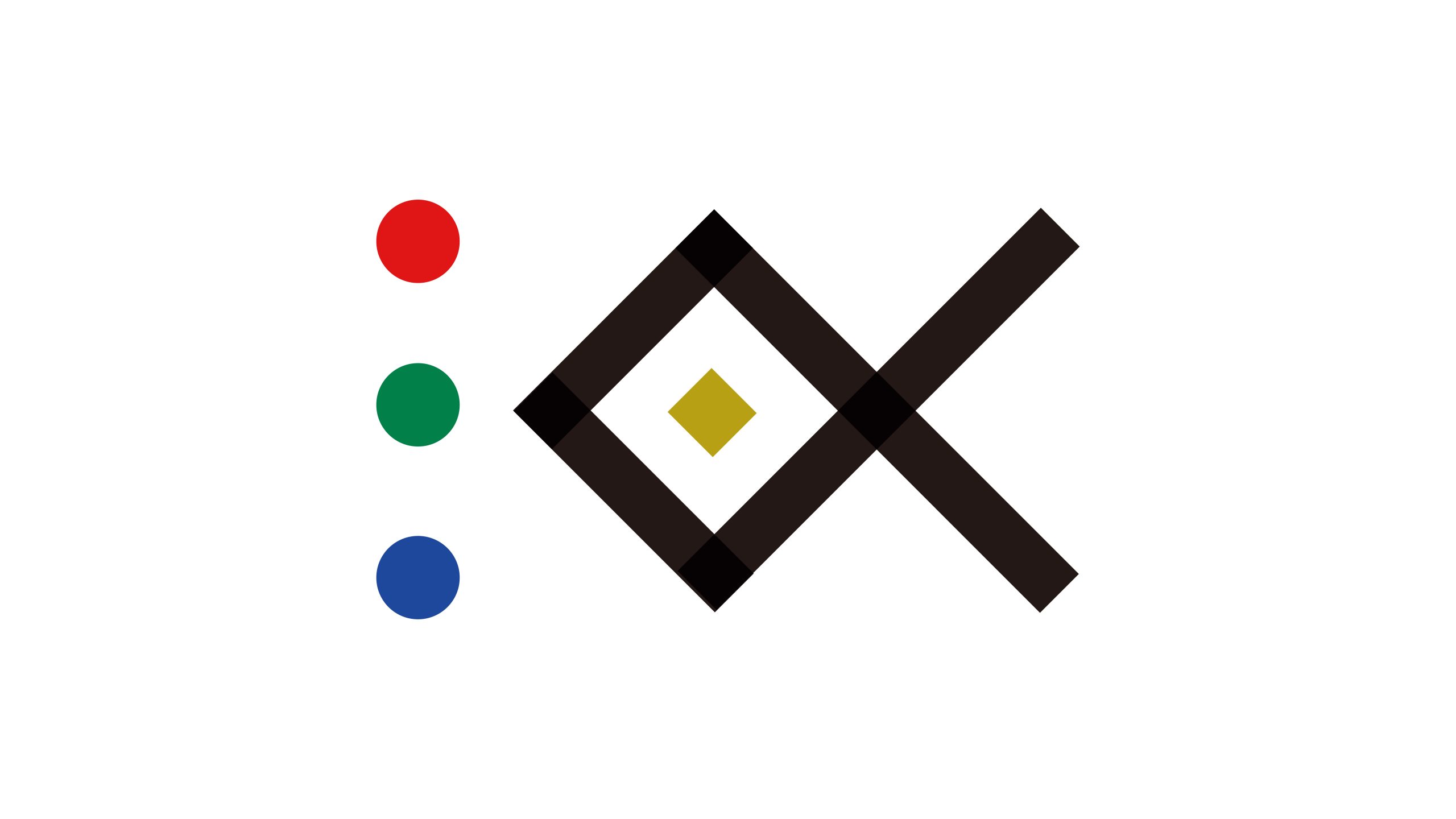
The Institute of Diverse Creativity brings academia and industry together through design thinking, arts research and interdisciplinary innovation. Positioned as “a laboratory where ideas meet,” it explores how innovation and social value can develop together through the integration of design, technology and culture.
The logo uses precise geometry to express the institute’s core principles of crossing disciplines, connecting ideas and creating together, establishing a symbol with intellectual depth and an international visual language.
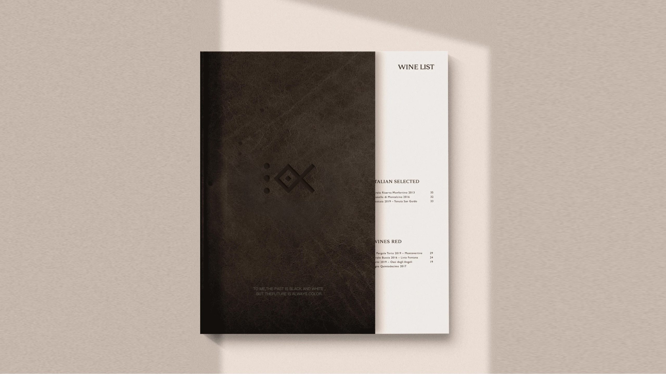
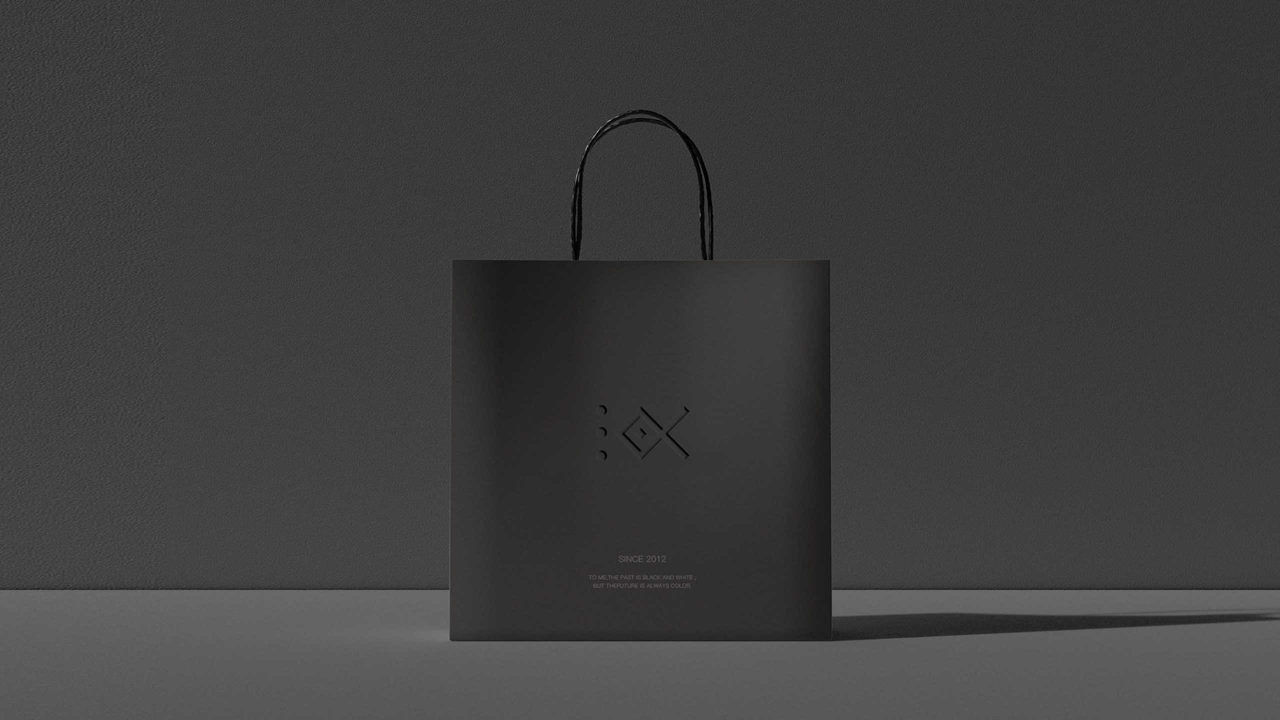
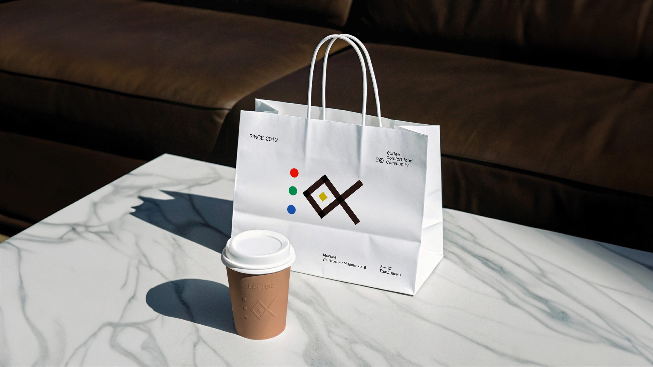
design concept
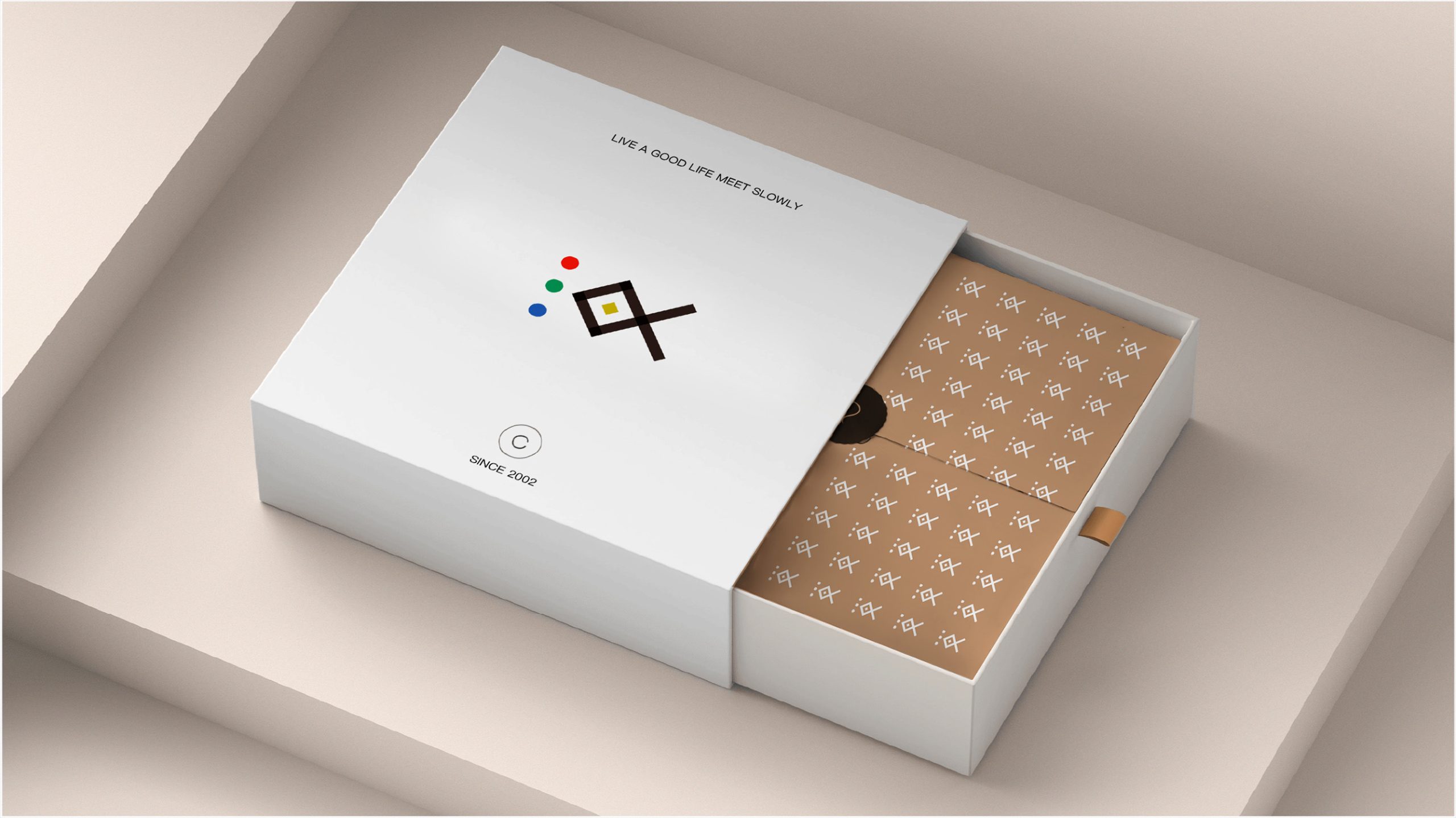
Built around the idea of “intersection and balance,” the logo combines two crossing diagonal lines with a central diamond to create an abstract coordinate system for thought. Three primary-color dots—red, green and blue—on the left represent the three sources of thinking: art, science and the humanities. The gold diamond at the center symbolizes ideas crystallizing into innovation. Balancing geometric order with an open composition, the mark expresses the brand’s belief: diverse perspectives converge to create innovation.
graphic language
Crossing diagonals: symbolize interdisciplinary connections and the convergence of knowledge from different fields. Central gold diamond: represents the core of innovation and the point where outcomes emerge—the center of a continuous cycle of research → practice → reinvention. Three-color dots: arranged in red, green and blue on the left, they represent incoming energy and the starting point for multidimensional knowledge. Geometric proportions: a 45° diagonal composition gives the mark balance, clarity and scope for extension. Combining academic symbolism with a distinctive visual system, the design adapts readily to a wide range of contexts.
Fonts and composition
Pair the logo with a modern sans serif such as Avenir or Source Han Sans to convey a technological, rational character. In bilingual lockups, set the English name in uppercase and use a clean Chinese sans serif to maintain a consistent visual rhythm. The recommended symbol-to-wordmark ratio is approximately 1:1.2. A symbol-left, wordmark-right arrangement supports international communication and ensures consistent recognition across publications, exhibitions and digital interfaces.
color system
Red #C6402A: creativity and passion, representing artistic thinking. Green #387956: reason and ecology, symbolizing scientific exploration. Blue #304C9D: knowledge, order and intellectual strength. Gold #C9A83D: wisdom, achievement and ideas brought to fruition. Black #1C1815: rigor and authority, reinforcing the structure. Anchored by black, the palette uses the three primary colors and gold to establish a visual rhythm—diverse in expression, unified in character.
Application and extension
The logo is designed for research reports, exhibition identities, publication covers, websites, digital interfaces, academic certificates and wayfinding. The three colored dots can become standalone information markers for departments, projects or subject areas. The central gold diamond can evolve into a key motion element, expressing the convergence of intellectual energy. In physical environments, the geometric lines can extend into the underlying structure of a wayfinding system, creating a coherent spatial identity.
brand meaning
The logo brings together the institute’s three defining principles. Interconnection: the convergence and integration of disciplines. Systemic Thinking: rational geometry that gives form to academic structure. Creative Genesis: the central gold point marks the birth of new knowledge and ideas. Together, these elements express the belief that knowledge emerges from diverse perspectives and evolves through their intersection, reflecting the institute’s mission to place thinking at its axis and innovation at its core.
Improper Usage (Protection Specification)
Do not alter the angles or proportions of the diagonal lines. Do not change the order of the colored dots. Do not remove or modify the central gold diamond. Do not add shadows, outlines, gradients or other effects. Maintain clear space around the logo equal to at least 20% of the symbol’s width. Minimum reproduction width: 25 mm.
design results
Following the launch, the institute’s recognition across international academic and design communities increased by 51%. The identity has been widely adopted across conference systems, publishing projects and exhibition communications. Its geometry and four-color palette reinforce an identity rooted in the flow of ideas and structural innovation, making it a distinctive example of rational aesthetics in academic branding. The project is now part of Qingmei Future’s Education and Innovation Institutions Visual Identity collection, serving as a benchmark for translating diverse thinking into a coherent design system.