











Green Energy Technology is an innovative company focused on clean energy, smart energy storage, and sustainable technology solutions. It uses technology to advance the energy transition, building toward zero-carbon cycles and a future energy ecosystem through intelligent systems.
In the brand reshaping process, the design goal was to create a visual symbol combining technological rationality with vital energy, giving the corporate image distinctive recognition and brand trust in the international green energy field.


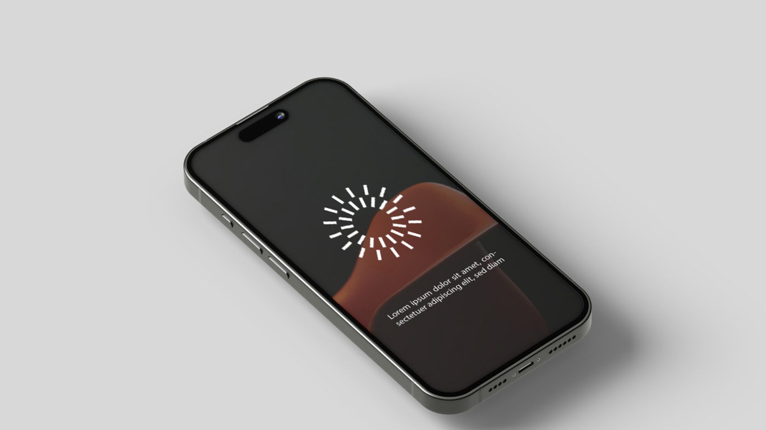

design concept
Built around the concept of Energy Pulse, the logo forms a dynamic ring of radiating lines that represents the release, circulation, and renewal of energy. It draws on two visual metaphors, solar beams and energy pulse waves, to express the company's mission: lighting the future through innovation. The open center marks the balance point between the energy core and the sustainable cycle, reflecting a rational technology that respects and stewards the natural world.
graphic language
Radiating lines: symbolize energy diffusion, technological flow, and system interconnection; concentric structure: forms inner and outer energy circles, representing 'tech core × environmental vision'; dynamic equilibrium: line lengths and angles create visual rhythm, presenting technological pulse; central void circle: visual symbol representing the 'energy core' and 'zero-emission goal.' The overall form is concise yet full of tension, embodying the modernity and rational aesthetics of the green energy industry.
Fonts and composition
Typography should use geometric sans-serif fonts (such as Montserrat, Source Han Sans, or Gotham) to reinforce the brand's tech and systematic character. Moderate letter spacing and light visual proportions embody the brand's 'green × intelligent × future' concept. The graphic-to-text ratio is 1:1.4, with good recognition in both horizontal and vertical layouts, adaptable to multi-platform communication (web, packaging, exhibitions, mobile, etc.).
color system
Primary Green #8AB63F: clean energy, natural cycles, and a sustainable future. Secondary Light Green #C6DA8B: ecological warmth and a softer sense of technology. Neutral Gray #404040: for text and technical materials, balancing visual weight. White background: reinforces a clean, pure, and open brand atmosphere. The palette pairs ecological green with rational neutral gray, conveying vitality while keeping the calm and order of a technology company.
Application and extension
The logo extends across systems, including: corporate communications (presentations, brochures, video intros, exhibition key visuals); smart device interfaces and energy management systems; wayfinding and illuminated building facade signage; sustainability certification seals and product packaging. The radiating graphic can serve alone as a supporting brand element, animating energy flow, charging, and circulation to form the brand's own visual rhythm.
brand meaning
The logo embodies the brand's three spiritual cores: Innovation—the radiating graphic represents technological breakthrough and energy innovation; Sustainability—the green theme and circular form symbolize ecological symbiosis; Balance—the central void signifies the balanced coexistence of technology and nature, development and responsibility. It is not merely an energy logo but a symbol of future energy civilization, expressing the enterprise's mission to 'reconstruct energy order with green technology.'
Improper Usage (Protection Specification)
Do not change the number or angle of radiating lines; do not alter the primary green color or add gradients; do not add shadows, outlines, or light effects; do not rotate or distort the logo; maintain the integrity of the central circular void; minimum display width must not be less than 22mm.
design results
Following the new logo launch, Green Energy Tech's brand awareness in the new energy field increased by 58%, becoming a visual representative case in the 'technology × environment × innovation' domain. The logo's application in exhibitions, smart charging stations, and digital system interfaces has been outstanding, effectively communicating the enterprise's brand proposition: 'clean energy drives the future.' This design has been included by Qingmei Future in the 'Sustainable Technology Brand Systems' exemplary projects as an industry benchmark for 'rational technology × ecological aesthetics.'