










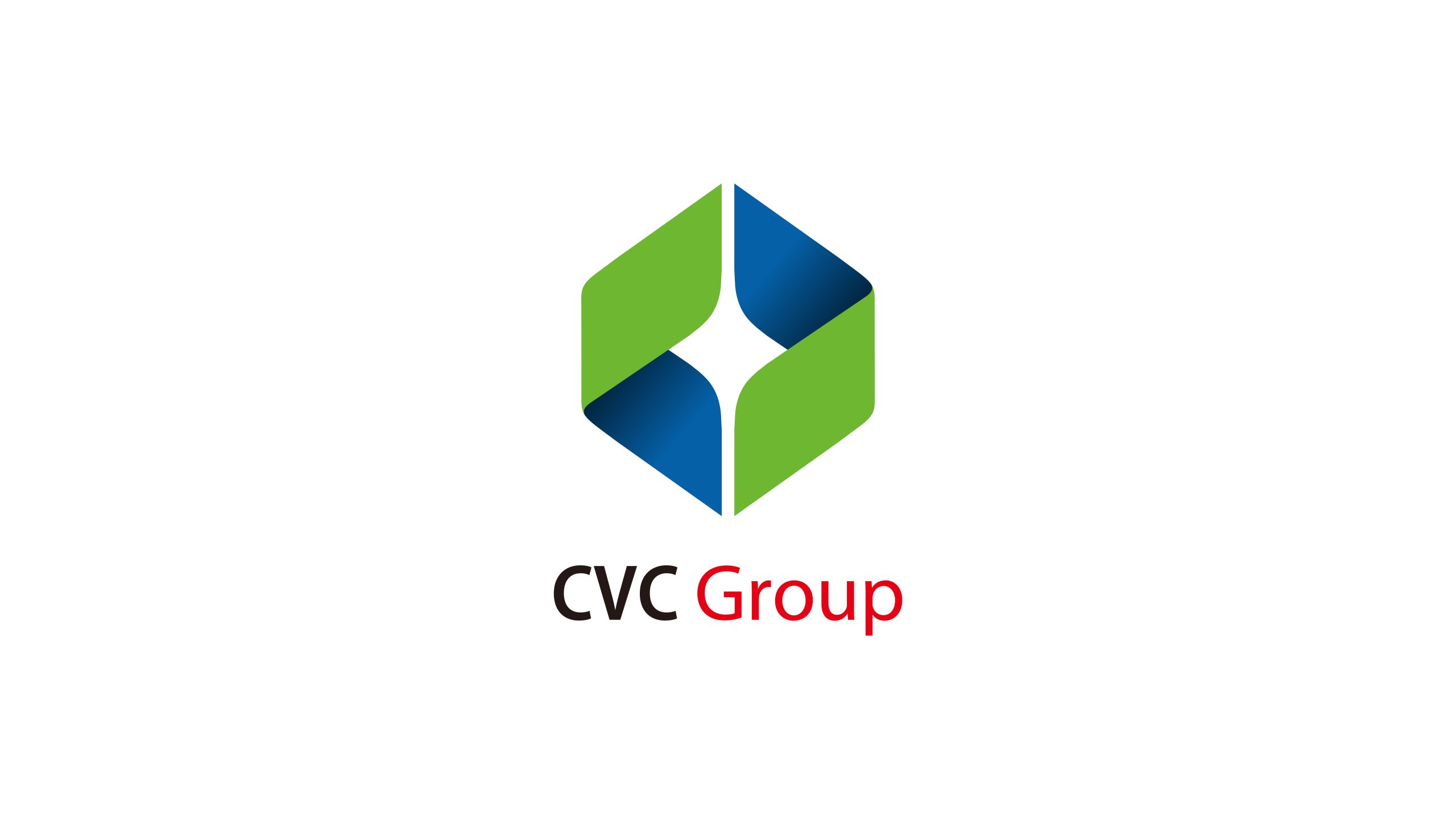
CVC Group is a diversified group centered on technology investment, industrial operations, and capital management. Through a visual system upgrade, the brand set out to project a rational, innovative, and steady image and to strengthen its international recognition in technology and finance.
The logo needed to find balance between geometric logic and symbolic spirit, embodying capital's power while conveying an open, innovation-oriented future vision.



design concept
The design is inspired by the idea of convergence and creation. A three-dimensional hexagon forms the core of the mark, representing the group's structured system and diverse industry portfolio. Negative space inside forms a shining star, a center of innovative energy that reflects the group's role in bringing capital and technology together. The contrast between a stable form and an igniting core expresses the brand's spirit: steady progress, with collective insight turned into light.
graphic language
Geometric logic: the outer hexagon represents system completeness and order; core form: the central light-shaped void symbolizes core innovation and growth energy; two-color structure: green and blue support each other, signifying the symbiosis of technology and capital, nature and rationality; three-dimensional composition: gradient angles reinforce spatial layers, expressing the group's multi-dimensional business and international extension.
Fonts and composition
The brand name consists of two parts: 'CVC' is presented in dark gray sans-serif, emphasizing stability and professionalism; 'Group' is set in red lightweight type, representing passion, action, and growth. The overall weight contrast creates visual rhythm, highlighting the group brand's balance between rationality and vitality.
color system
Tech blue #174A8B: symbolizes rationality, trust, and innovation; eco green #5CA343: represents sustainable development and growth; dynamic red #C8432A: conveys enterprise momentum and global vision; highlight white #FFFFFF: serves as spatial void, reinforcing light and focal point. The entire color system balances corporate temperament with industry attributes, highly adaptable to fintech, energy investment, and cross-border cooperation scenarios.
Application and extension
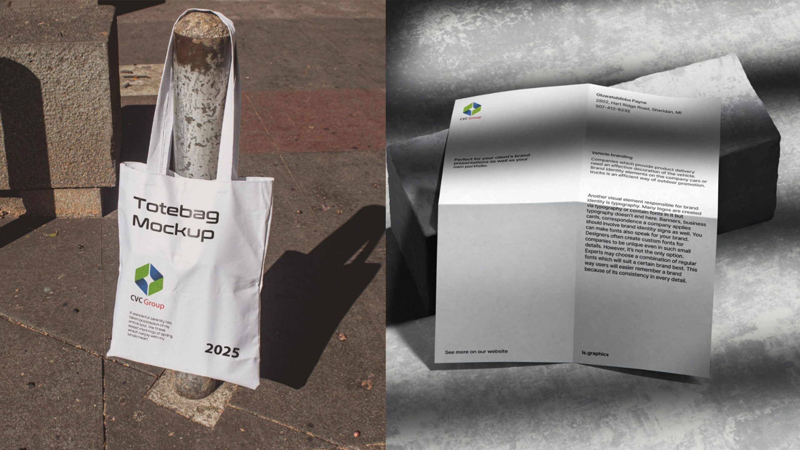
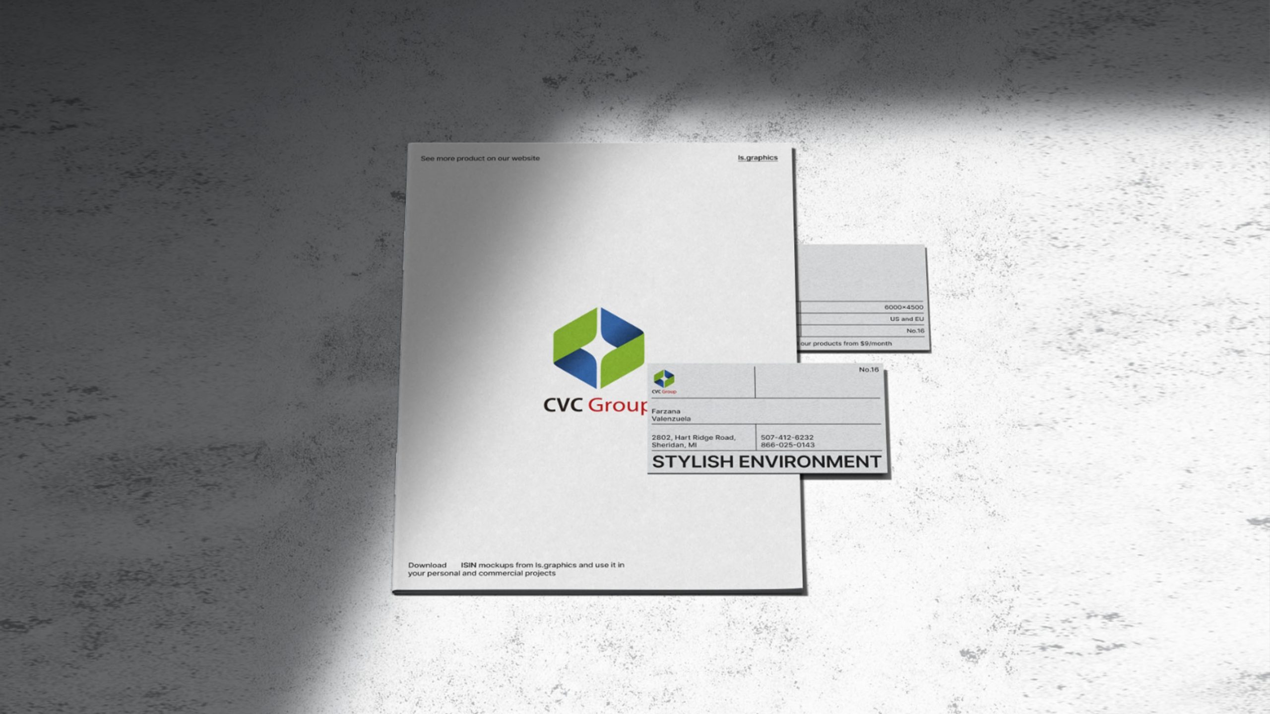
The logo system has high group-level adaptability: corporate identification level: used for group headquarters image walls, conference systems, report covers, and investment documents; industrial sub-brand level: the hexagonal matrix can independently evolve into identification symbols for different industrial modules (energy, tech, finance, real estate, etc.); digital communication level: the light-form center can be presented as 'energy convergence' animation in motion graphics, reinforcing the group's 'innovation-driven' image.
brand meaning
The logo interprets the enterprise's core values through its 'light-form void' structure: Capital—stability and structure; Vision—insight and direction; Creation—innovation and energy. CVC's three letters echo the three-color system, forming the group brand's systematic expression. It is not merely a logo but a visualization of a philosophy—capital empowers innovation, innovation illuminates the future.
Improper Usage (Protection Specification)
Do not adjust light-form void proportions or rotation angles; do not substitute primary colors or add shadows or outlines; do not use the green portion independently separate from the main composition; recommended minimum display width ≥ 30mm.
design results
Following the CVC Group logo launch, it demonstrated strong recognition and brand sophistication at international investment and tech forums. The hexagonal structure became the core identification symbol of the group's brand visual assets, symbolizing 'stability, convergence, growth' as systemic thinking. This case is considered one of Qingmei Future's representative works in 'capital tech × group branding × geometric structure design,' demonstrating design's deep response to corporate strategic logic.