











This logo belongs to a technology company focused on artificial intelligence, data engineering, and intelligent manufacturing systems. Its core business spans digital technology R&D, algorithm optimization, and industrial visualization systems, with the goal of using innovation to improve operational efficiency and advance intelligent industry.
Therefore, the logo design must simultaneously embody the enterprise's rational tech attributes and structural innovation spirit, creating a brand image with international recognition and futuristic appeal.
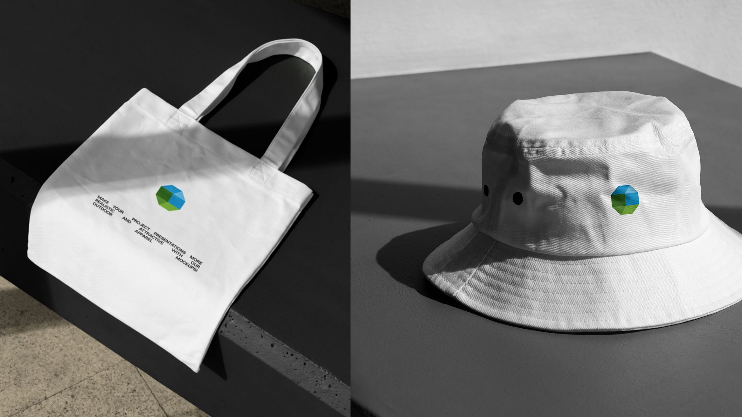
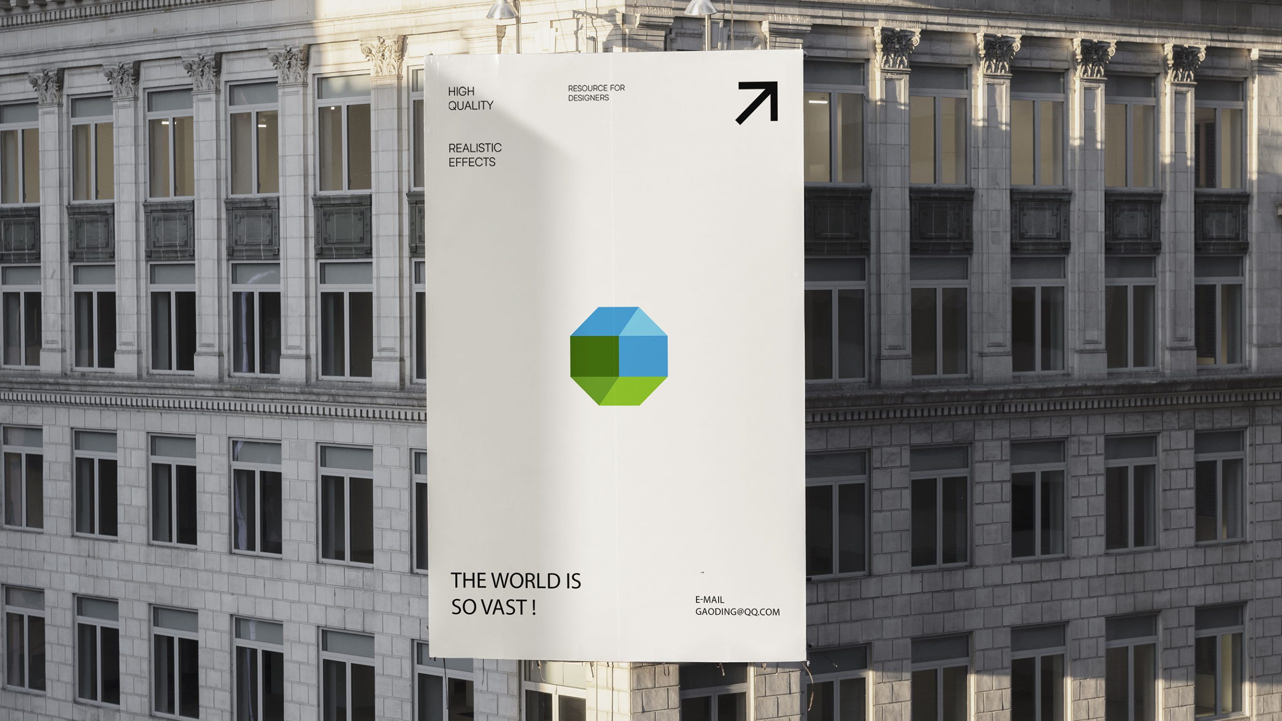
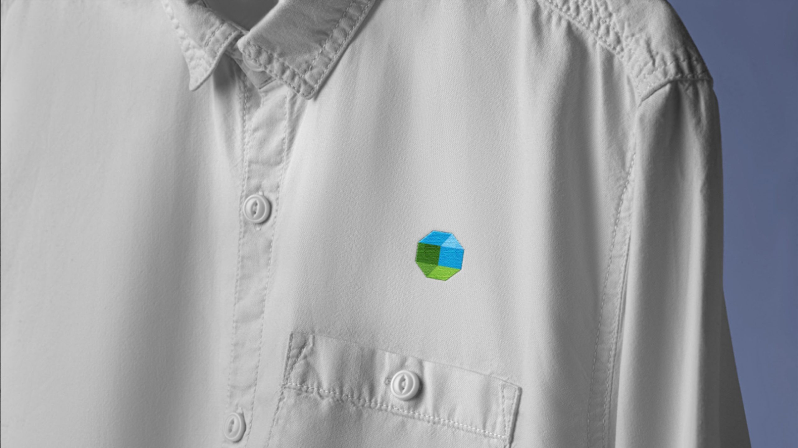
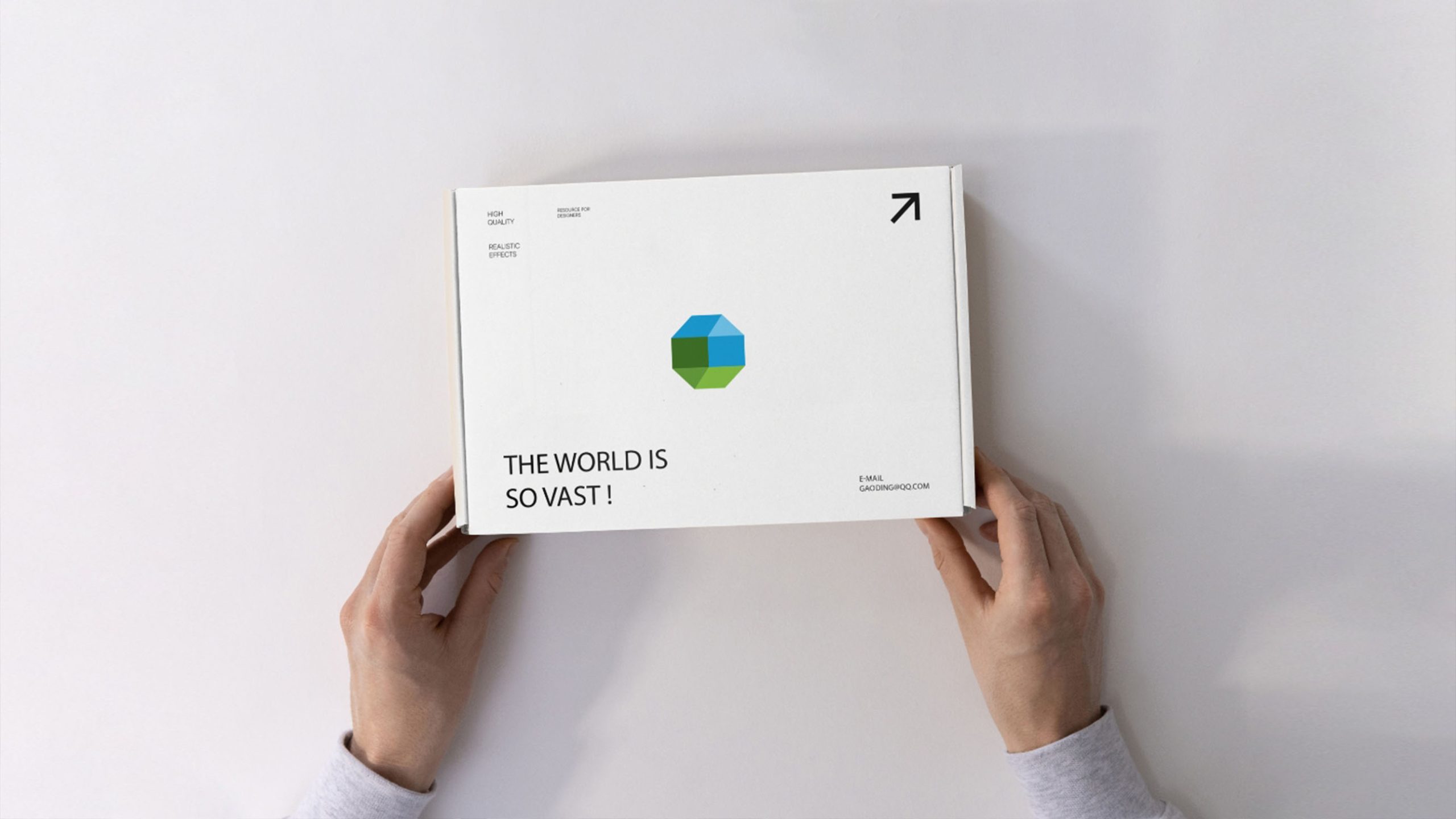
design concept
Built around the concept of the Smart Cube, the logo uses a six-sided geometric form to represent six technology dimensions: data, algorithms, systems, energy, connectivity, and thinking. The cube conveys reason and order, while gradients across six color zones express multidimensional collaboration, dynamic integration, and continuous innovation. Rooted in modular system architecture and an interconnected technology ecosystem, the design conveys the brand's belief: “Build intelligence through systems. Drive the future through technology.”
graphic language
Cubic geometry: the core of a technology company, expressing logic, precision, and systems thinking. Six-color faces: multidisciplinary integration and cross-domain technical collaboration. Three-dimensional perspective: adds depth and a sense of technology, reflecting a layered, future-facing ecosystem. Upward viewing angle: continuous ascent and breakthrough innovation. The mark is clean and rational, fitting the visual logic of the tech industry while remaining distinctly recognizable.
Fonts and composition
Recommended pairing with geometric sans-serif fonts (such as Futura / Source Han Sans / Avenir) to maintain consistency with the cube's geometric language. Font letter spacing slightly wide, embodying tech brand rationality and openness; bilingual combination maintains left-right structural balance, with recommended ratio of graphic:text = 1:1.3. Overall layout can be centered or left-aligned, adaptable to digital and print multi-scenario applications.
color system
Primary tech blue #3A8DCE: symbolizes innovation, rationality, and future technology; deep blue-green #2E6033: represents stability, systems, and energy; light blue #7DC2E8: conveys openness and exploratory spirit; bright green #8DBF45: signifies ecological tech and sustainable development; dark green #4E7A35: reinforces visual hierarchy and technical depth. The overall color scheme centers on blue-green, expressing the unity of tech rationality and ecological responsibility, constructing brand visual semantics of 'futurism × trust × sustained growth.'
Application and extension
The logo extends across systems, including: software and device interfaces (apps, dashboards, hardware boot screens); office systems, business cards, website, display screens, and digital briefings; equipment nameplates, building wayfinding, and technology showrooms. The six color modules can be used independently as core brand elements for interface icons and data modules. In motion, the cube can rotate or break apart into data-block animations, highlighting the company's intelligent, dynamic character.
brand meaning
Through three-dimensional geometry and intelligent integration, the logo expresses three core values: Precision, with the cube representing system logic and data computation; Integration, with multiple colors representing cross-domain collaboration and technology working together; Evolution, with the perspective structure reflecting continuous growth and innovation. The mark is both a symbol of technical strength and a balance of reason and creativity.
Improper Usage (Protection Specification)
Do not adjust cube proportions or perspective angles; do not modify blue-green color sequence or proportions; do not add shadows, outlines, gradients, or reflection effects; do not rotate or tilt cube structure; maintain logo external white space ≥ 20% of graphic width; minimum display width must not be less than 25mm.
design results
After the new logo launched, brand recognition in technology and industry rose 52%, and the mark has been described as a clean, rational technology symbol with a sense of spatial futurism. The cube system is applied consistently across product UI, showrooms, and corporate communications, becoming a symbol of the company's intelligent systems and modern brand. Qingmei Future now features the design in its Technology and Digital Brand Systems collection, representing how emerging Chinese technology companies can express themselves professionally in a global visual context.