










SUNNY HOME is a premium residential brand integrating wellness apartments, care services, and lifestyle management, positioned around 'sunlight, health, comfort, balance' in contemporary living spaces.
The brand seeks an international visual language to convey a philosophy of 'light-luxury healthy living'—where residence transcends space to become a state of mind and way of life.
design concept
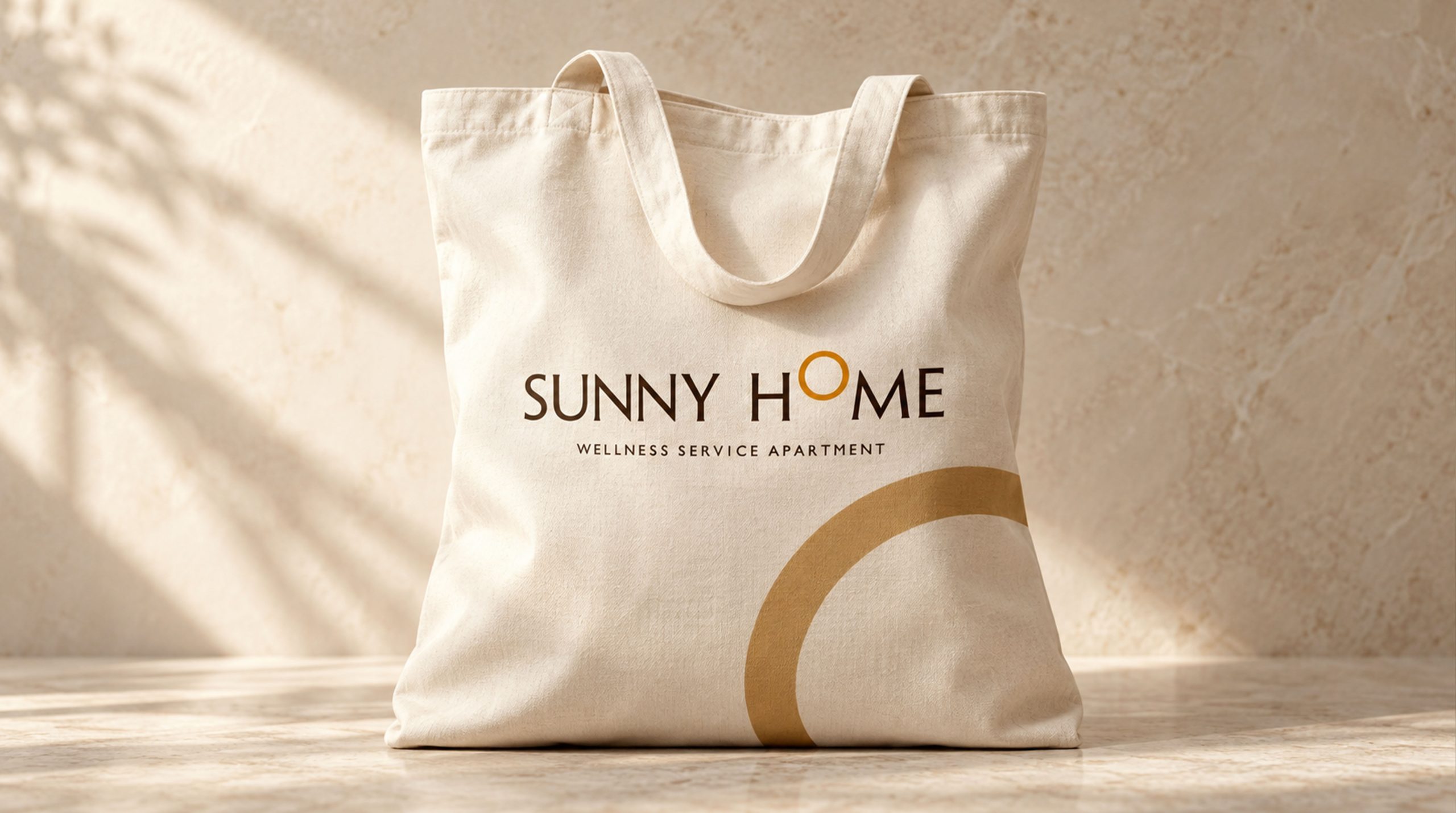
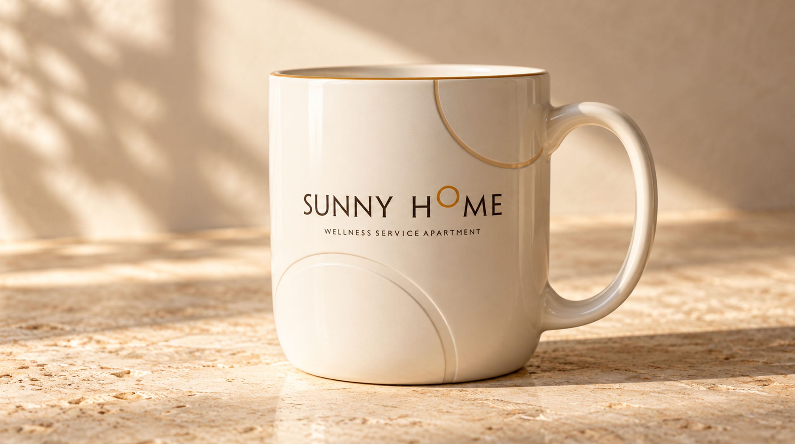
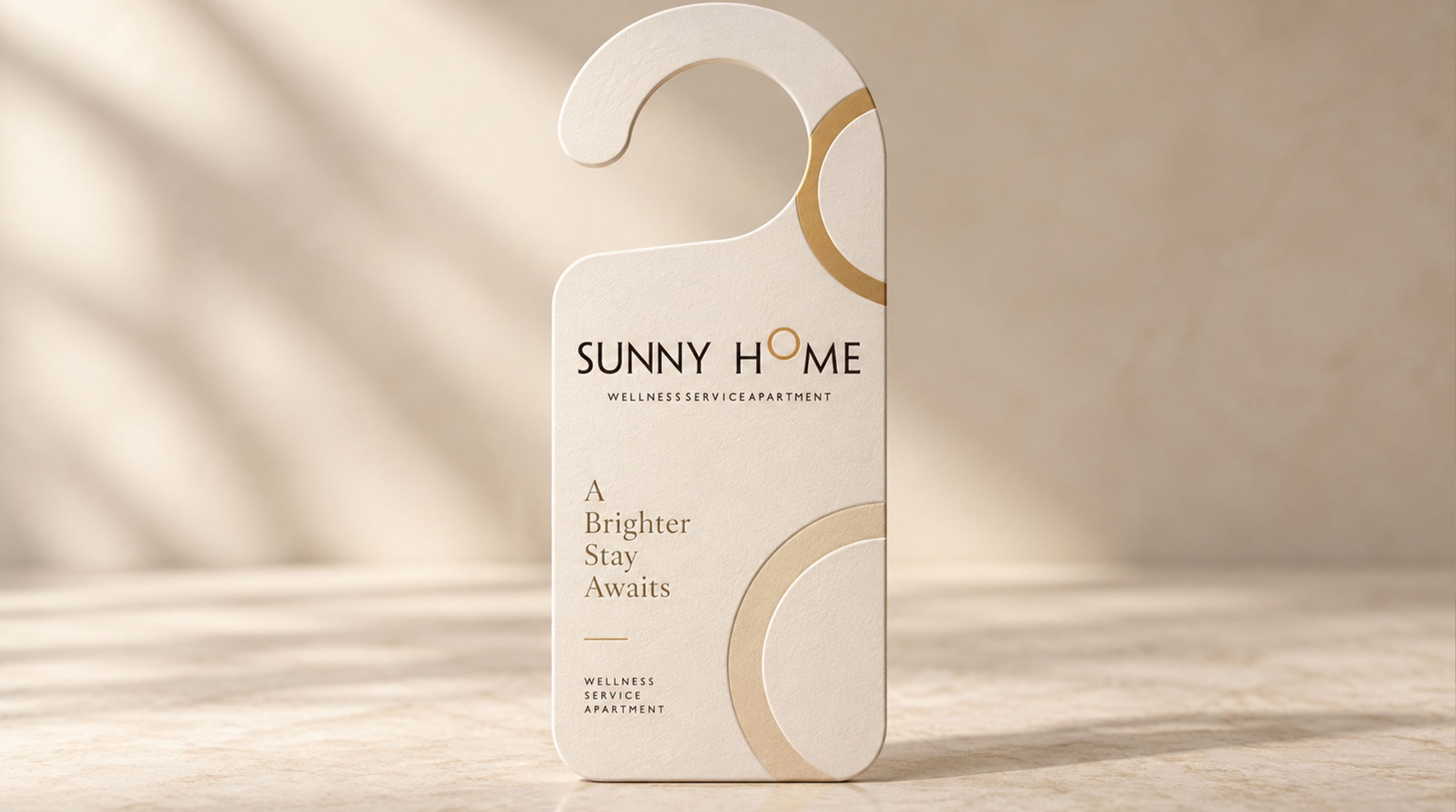
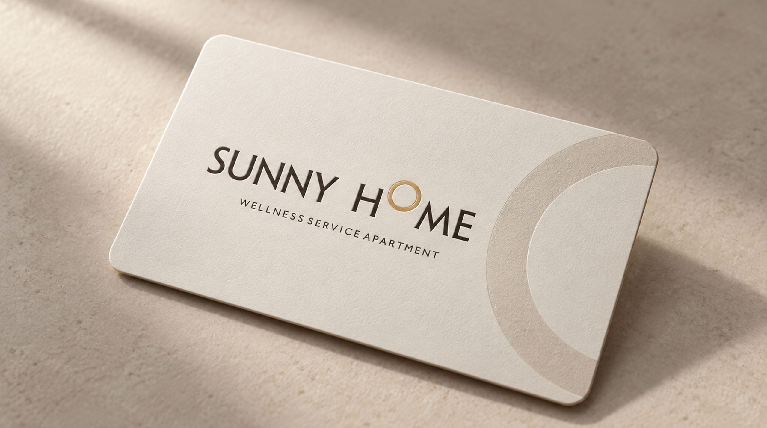
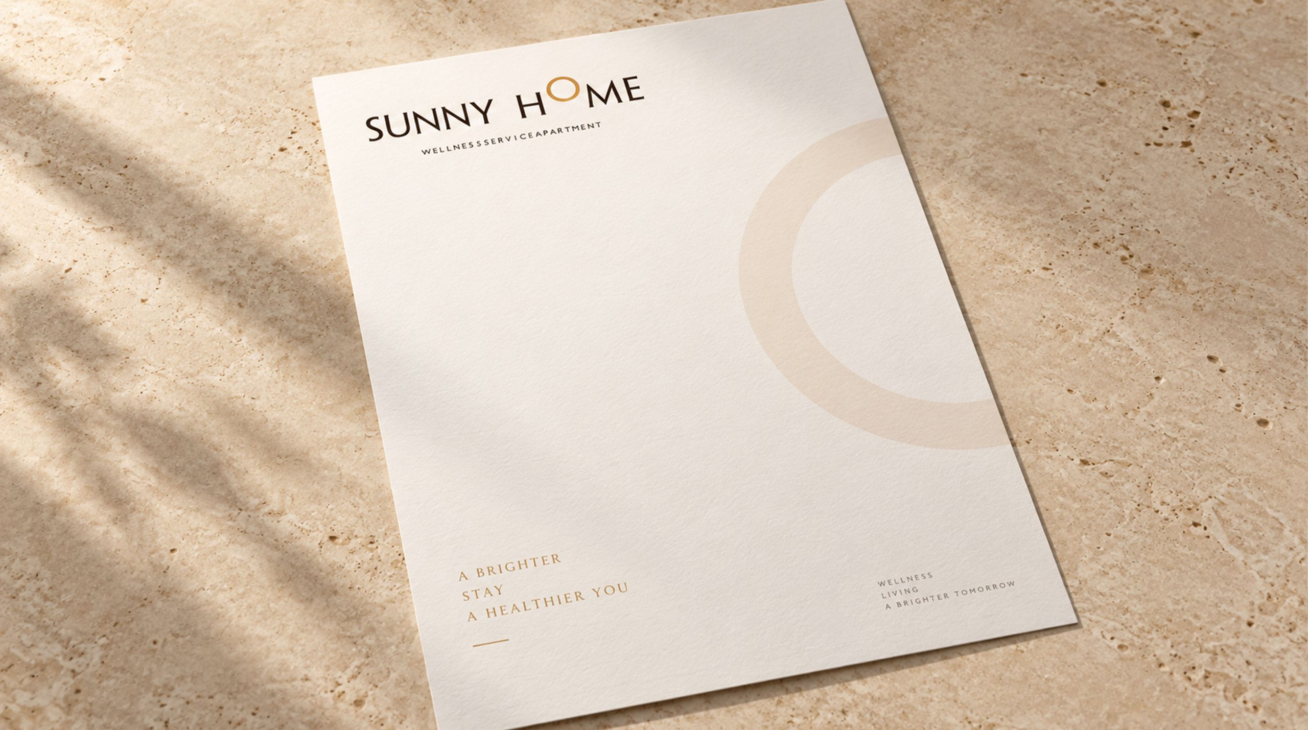
The logo combines minimal typography with a 'Sun Ring' as the core visual, embedding the concept of sunlight into the letter O to form a warm, spiritually resonant focal point. The ring represents light, cyclicality, and vital energy, while symbolizing 'the warmth of home' and 'the enduring cycle of healthy living.' The design employs 'rational line + emotional symbol' to express SUNNY HOME's proposition: rational space, emotional dwelling.
graphic language
Ring motif: drawn from sun and the completeness of home, signifying health, balance, hope; linear typographic structure: clean strokes echo the modern rationality of architectural space; golden O ring: warm gradient conveys solar atmosphere, balancing cool monochrome with lived warmth; extended letter spacing: creates premium, quietly luxurious spatial breathing room. The structure is simple, proportions elegant, forming highly recognizable 'spatial brand language.'
Fonts and composition
The logo uses all-caps 'SUNNY HOME' in a modern sans-serif (such as Didot Sans or Avenir Light) to emphasize architectural spatiality. Extended letterspacing conveys 'expansiveness and balance' in brand character. The tagline 'WELLNESS SERVICE APARTMENT' uses an ultra-light weight, reflecting the brand's refined service ethos and light-luxury sensibility. Mark-to-text ratio 1:1.4; horizontal structure optimized for web, signage, and print applications.
color system
Primary gold-copper #C79A60: sunlight, warmth, quality of life; supporting deep brown-black #2A1F1E: stability, calm, trust; neutral white #FFFFFF: spatial transparency and visual balance; pale taupe #E8E5E0: spatial extension, heightened warm texture. The color system emphasizes a visual philosophy of 'sunlight × space × warmth,' forming a brand impression unified in tonal layering and emotional temperature.
Application and extension
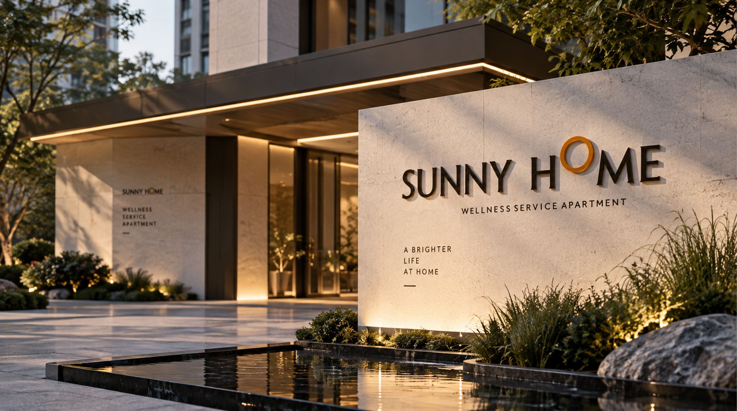
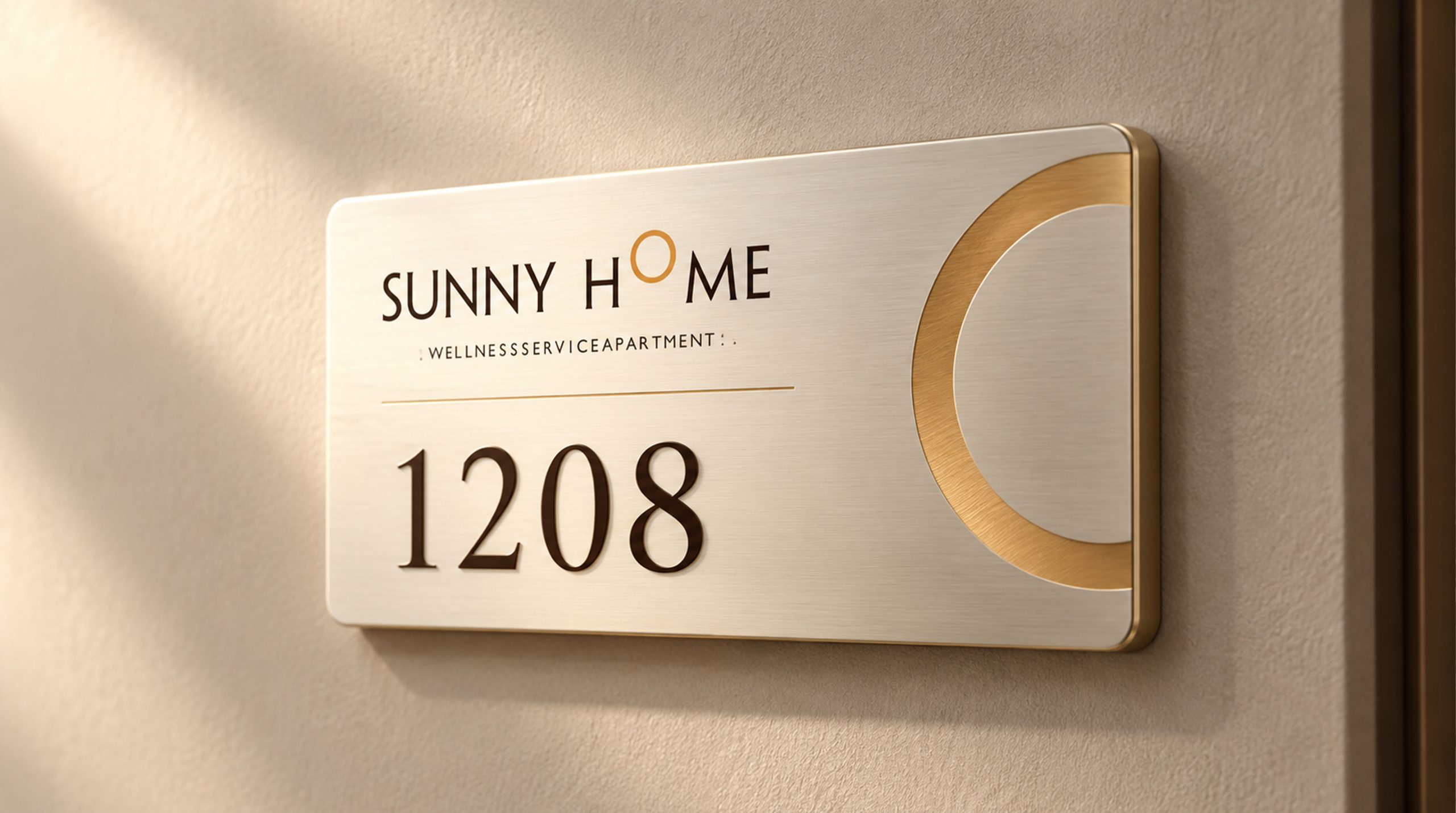
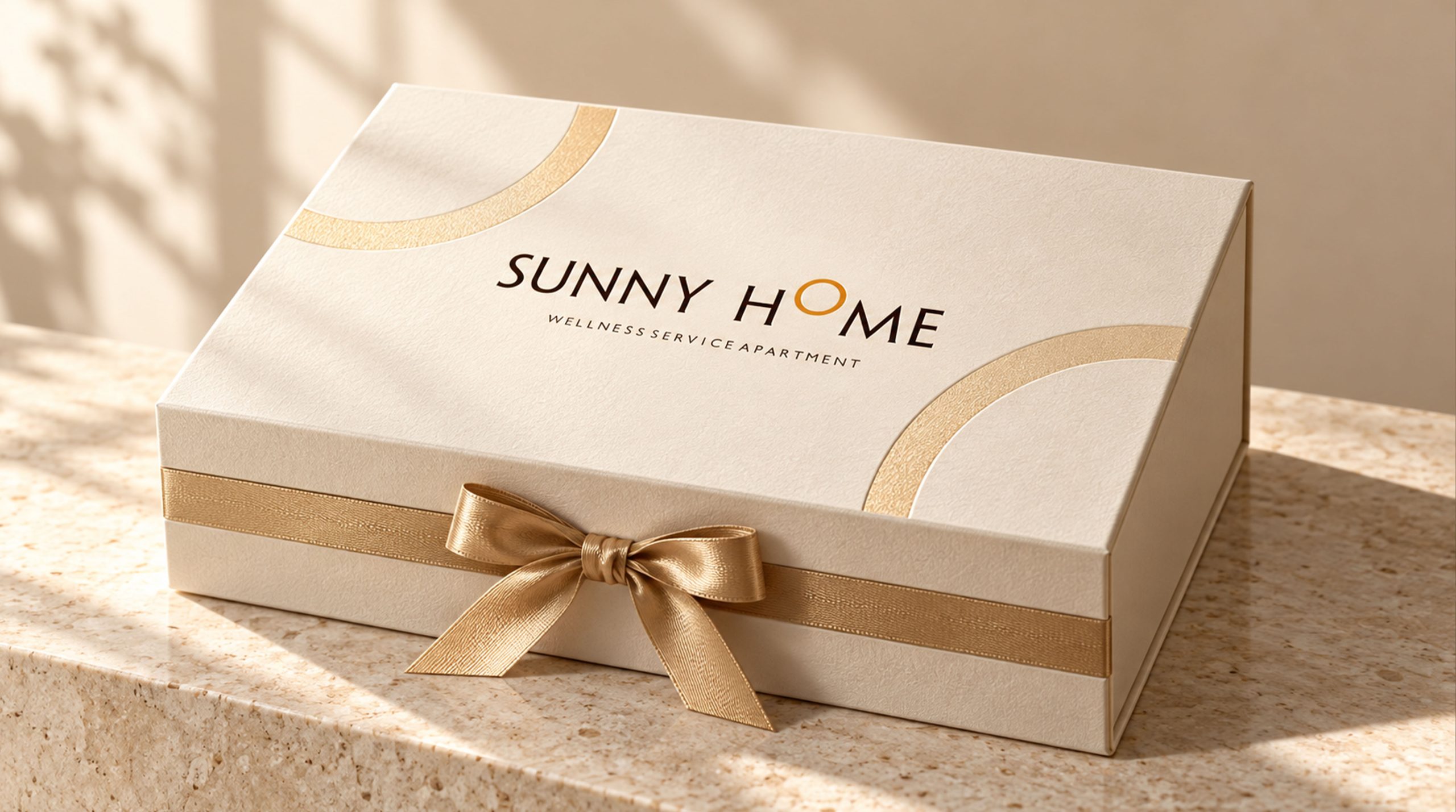
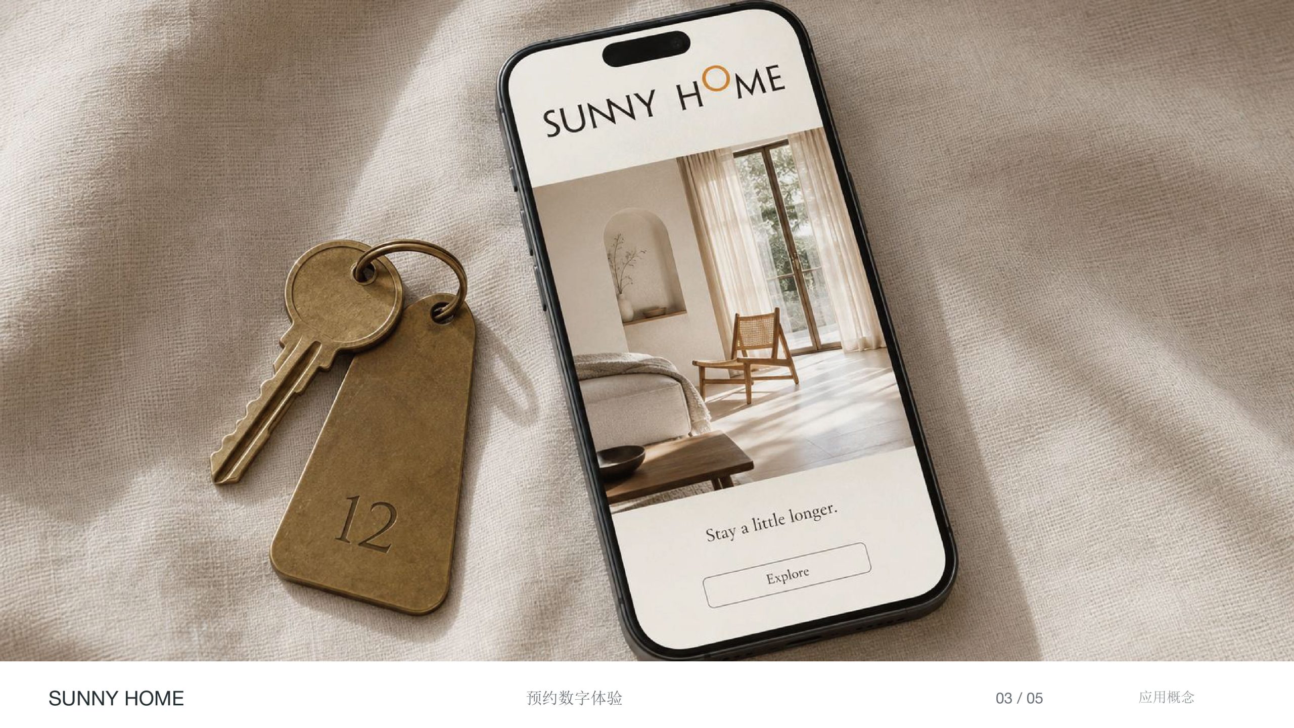
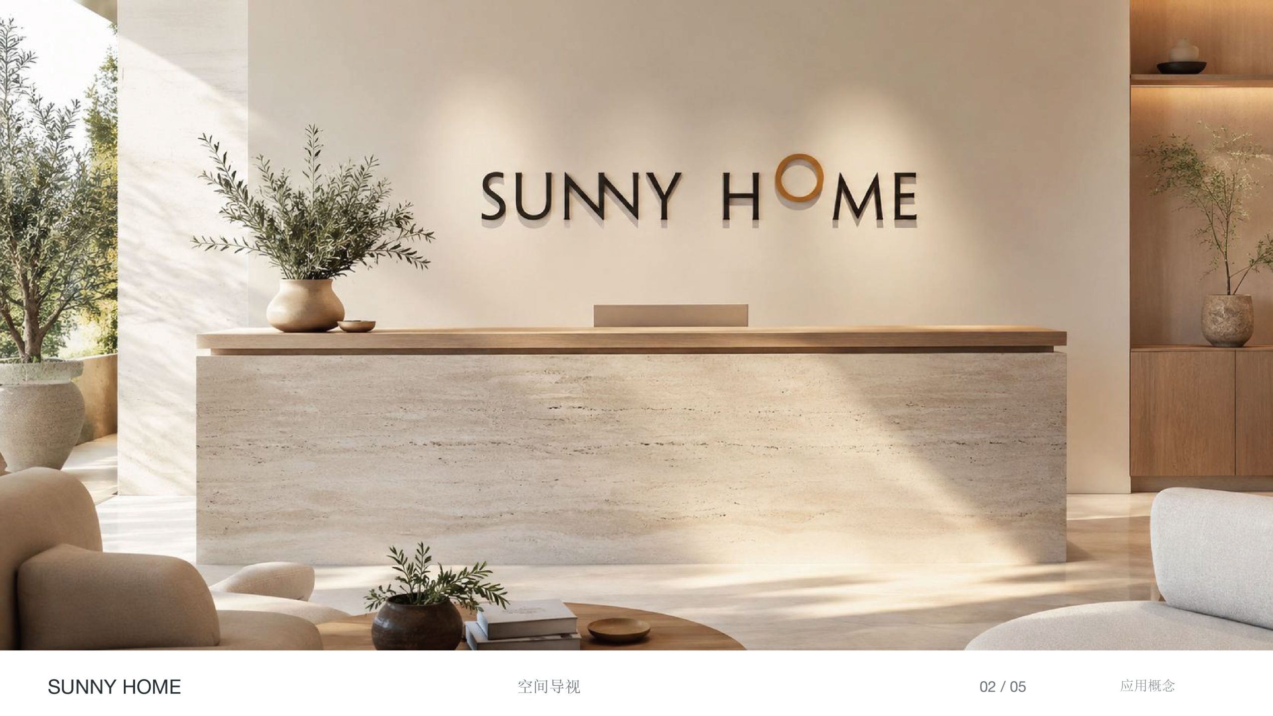
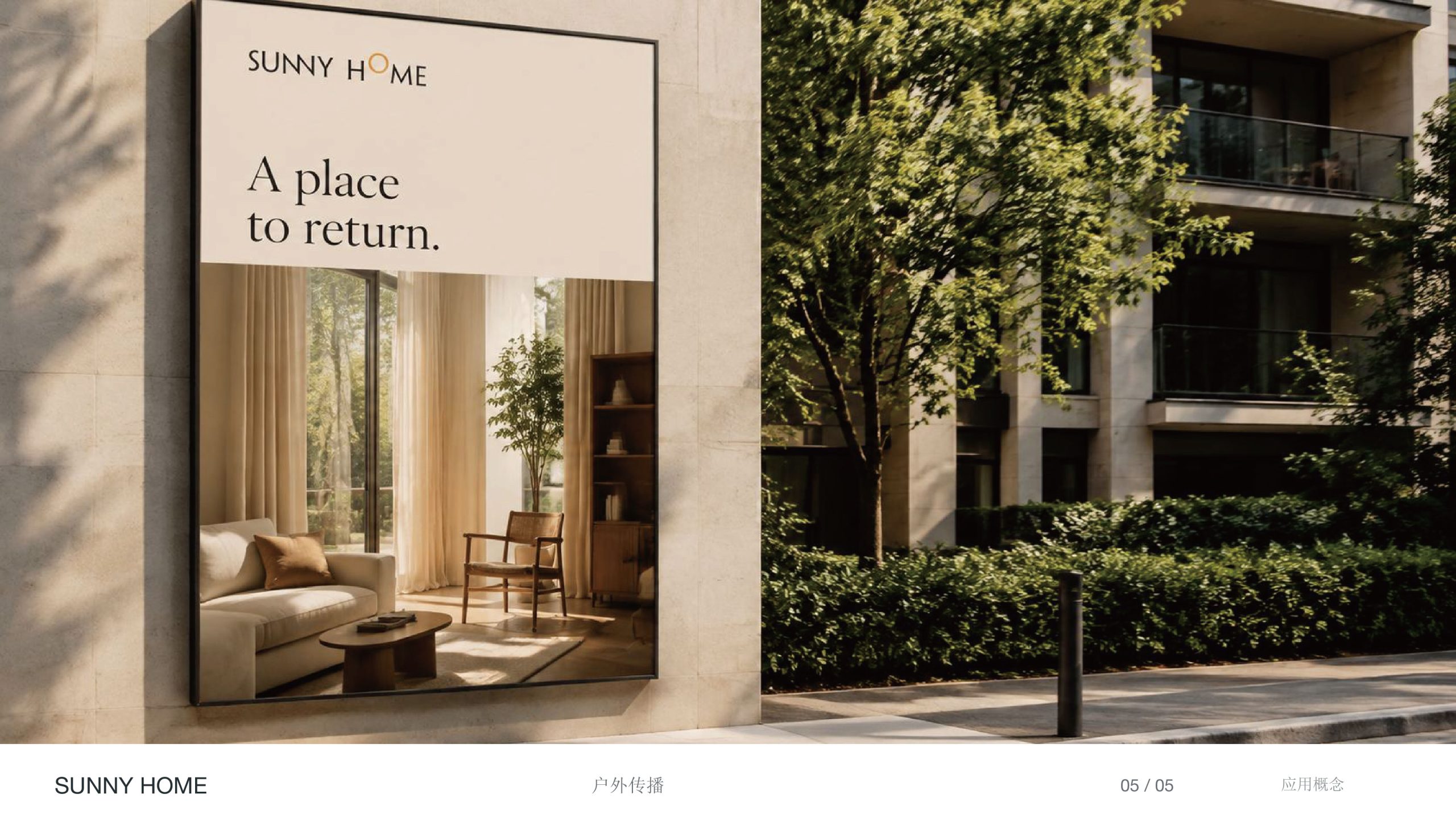
The logo applies broadly across: apartment facades, interior wayfinding, smart access systems; brand manuals, website interfaces, promotional materials, home fragrance and lifestyle products. In motion, the O-ring can animate as a light effect, expressing 'sunrise and flowing warmth.' The overall brand system extends into a 'sunlight and minimal space' theme, adaptable to wellness, real estate, hospitality, and urban renewal contexts across multi-platform communication.
brand meaning
The logo fuses SUNNY HOME's three core values: Sunlight—health, energy, positive living; Space—comfort, balance, rational design beauty; Home—belonging, warmth, spiritual solace. The ring signifies life's complete cycle, extending brand spirit into the convergence of 'healing sunlight' and 'living aesthetics.'
Improper Usage (Protection Specification)
Do not alter ring proportions or gradient direction; do not modify primary gold-copper tone or apply shadow effects; do not alter typeface structure or letterspacing; do not rotate or tilt the logo; maintain clearance ≥ 25% of cap height; minimum display width not less than 40mm.
design results
Following logo launch, SUNNY HOME achieved a 68% increase in brand recognition within the premium apartment and wellness real estate sector, successfully establishing a visual benchmark for 'light-luxury healthy living spaces.' Its 'golden ring + minimal type' became the core brand identifier, recognized by multiple real estate and hospitality media as 'Annual Spatial Aesthetic Design Representative.' Designed by Qingmei Future, the work is featured in the 'Space and Healthy Living Brand Visual Systems' case collection.