










ONE is a lifestyle brand rooted in 'minimalism and personal expression.' The brand vision is 'to make every moment the only one,' emphasizing the search for authenticity and focus in a complex world.
Product range spans apparel, home goods, digital accessories, and cultural merchandize. The brand seeks a simple yet emotionally resonant mark to convey the values of 'purity, independence, singularity.'
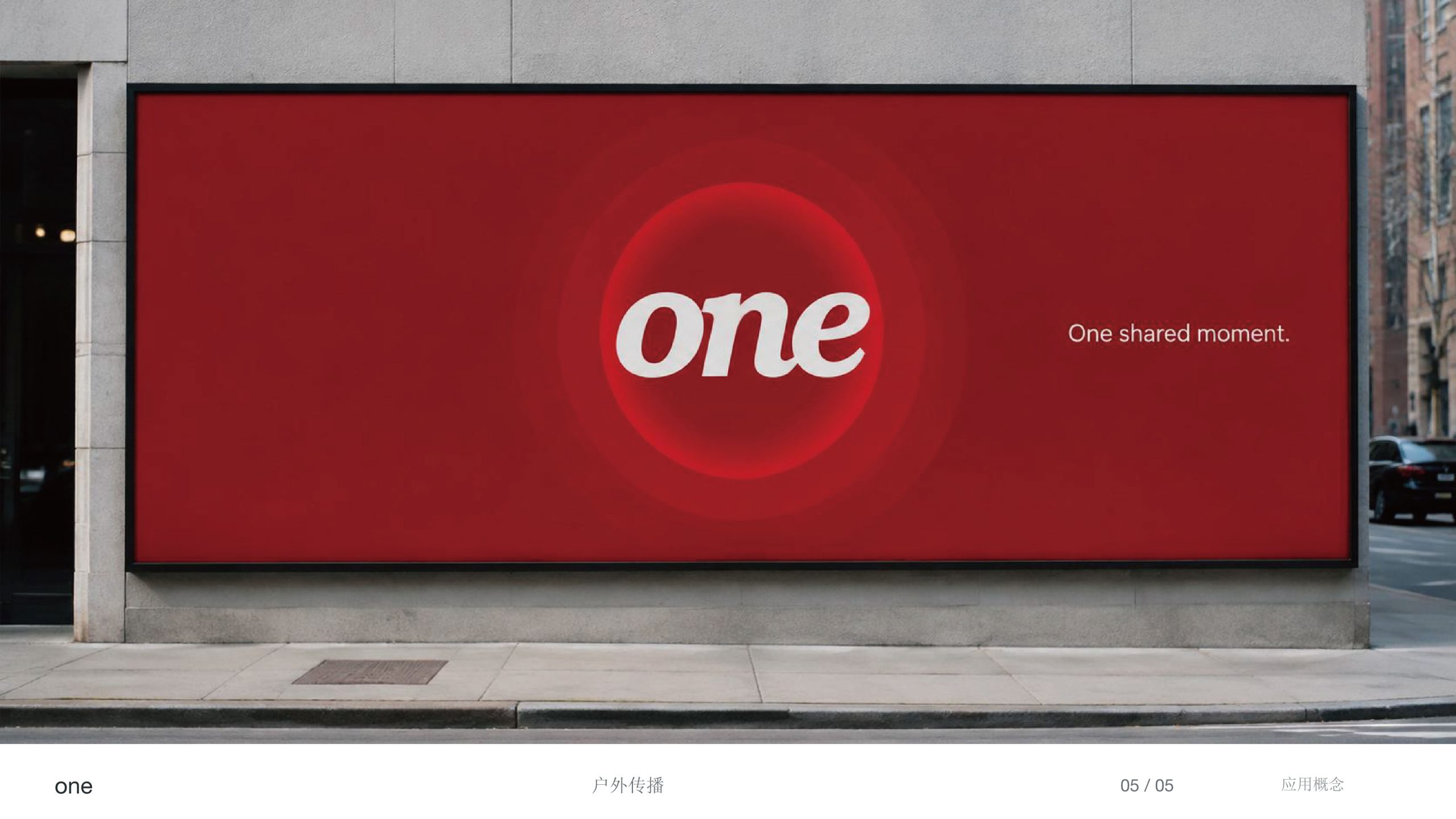
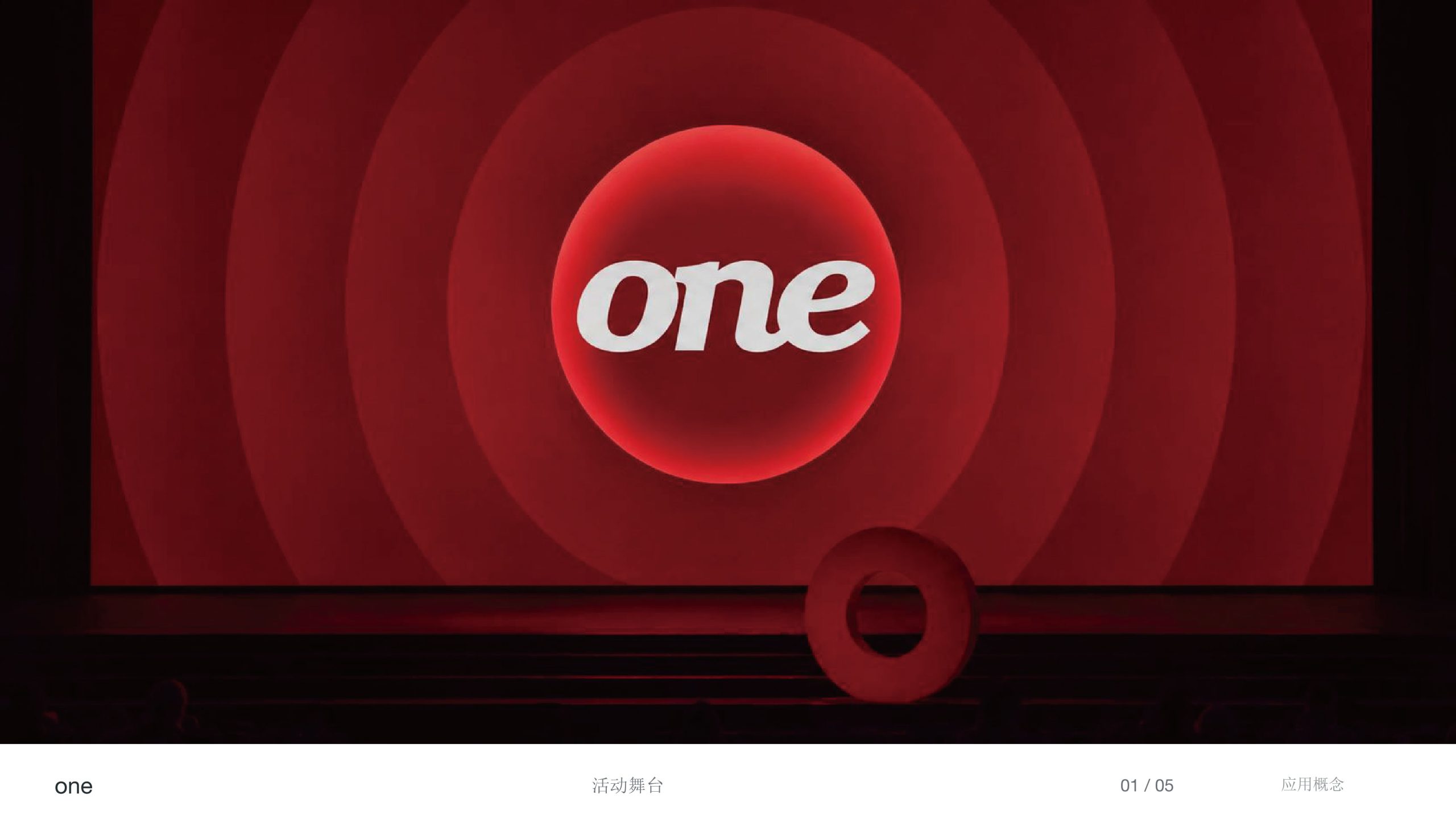
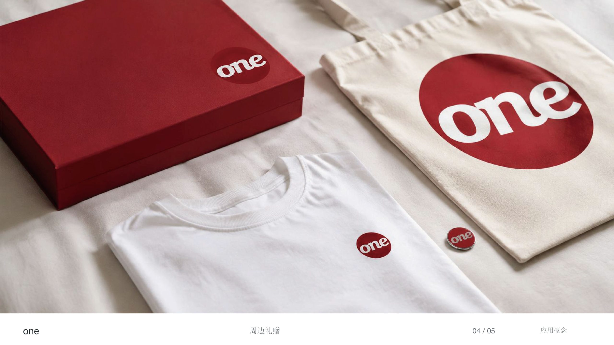
design concept
The logo's core concept springs from the philosophy of 'Oneness & Uniqueness.' The design employs an extremely minimal script form, building warmth and memory through handwritten fluidity. Letters o-n-e connect in natural ligature, signifying 'continuity, wholeness, flowing lived experience.' The overall form is light yet potent, embodying the brand's aesthetic philosophy: 'minimalism is abundance.'
graphic language
Connected structure: symbolizes coherence and completeness, conveying an 'integrated lifestyle' philosophy; rounded strokes: soften mechanical feel, emphasizing human warmth and tactility; letter slant: expresses forward motion and dynamism, symbolizing individual freedom and future consciousness; negative space: grants visual breathing room, embodying the spatial philosophy of minimal design. The mark reads more as a 'visual signature'—distinctly personal yet flexibly inclusive in brand character.
Font composition
The brand mark 'one' is a custom script typeface, with balanced stroke weight and fluid curves. The 'o' opens slightly high, signifying openness and connection; 'n' and 'e' tails slightly release, adding rhythm and extension. Overall visual center is balanced, stable yet dynamic.
color system
Pure black #000000: eternal and minimal, the purest visual language; extreme white #FFFFFF: void and contemplative space. The palette adheres to a 'monochrome philosophy,' eliminating all excess so that 'form is content' becomes the core brand expression.
Application and extension
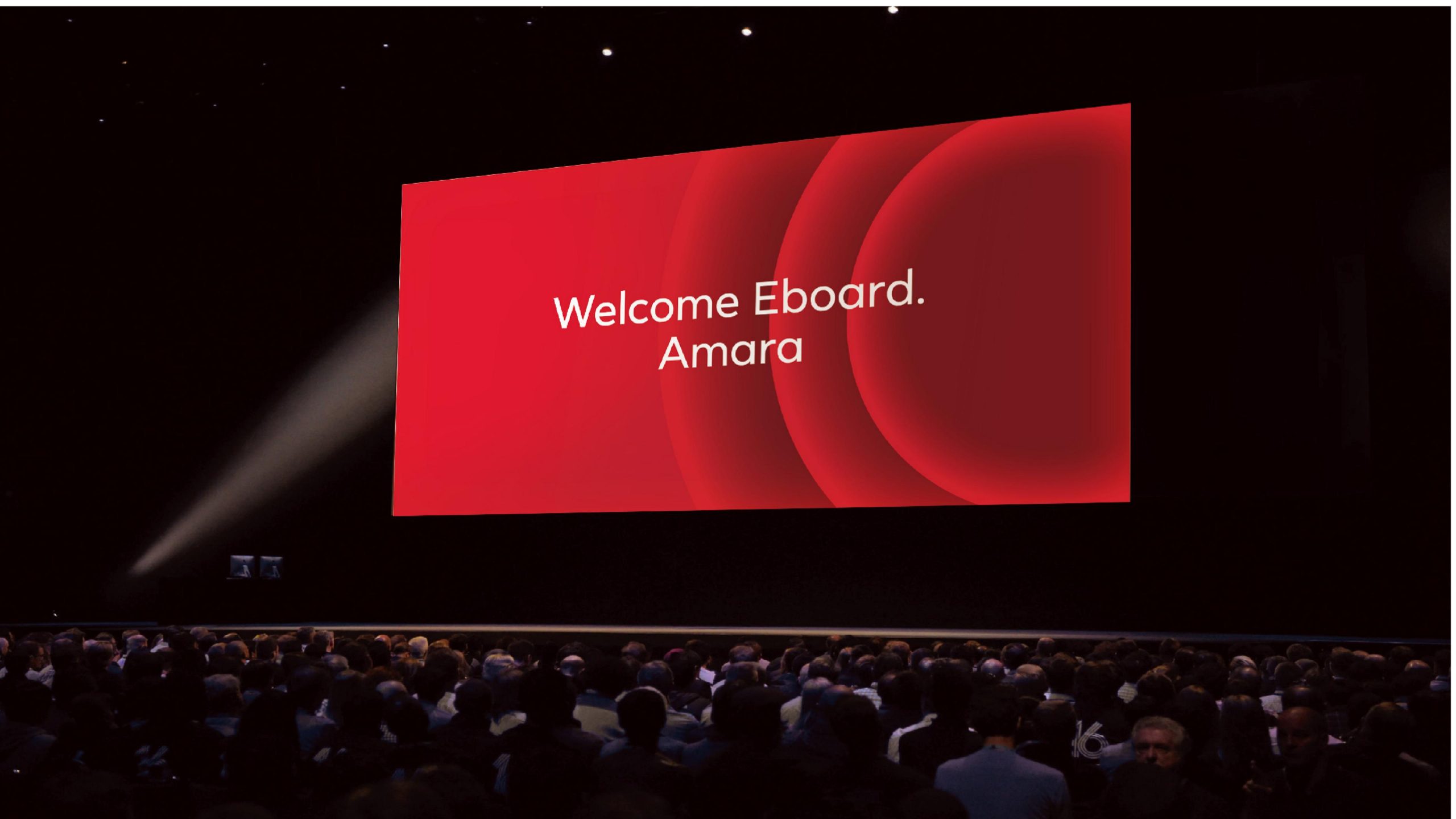
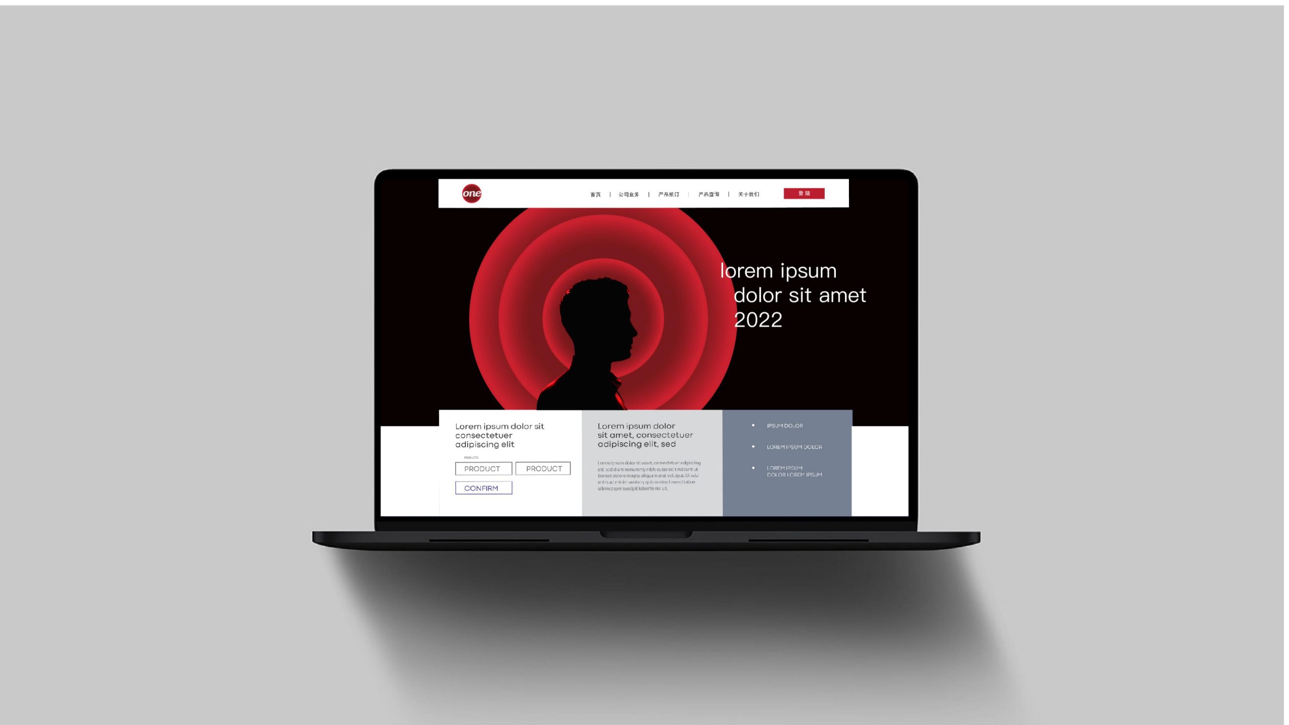
The logo demonstrates strong adaptability across carriers: Brand level—signature seal, website, social media avatar; product level—apparel hang tags, package seals, device engraving; spatial level—storefront, display walls, art installations, reinforcing the 'singular' spatial experience. In motion, the mark can animate stroke-by-stroke to express the concept of 'arising from one.'
brand meaning
The ONE logo expresses the brand's spiritual core of 'singular × minimal × eternal': Connection → continuity and unity of life; slant → posture of freedom and growth; monochrome → conviction in purity and permanence. It is not merely a mark but an attitude—refusing complexity, focusing on the present. Making singularity an enduring aesthetic order.
Improper Usage (Protection Specification)
Do not alter stroke weight or ligature method; do not add outline, shadow, or gradient; do not tilt or distort; minimum recommended display width ≥ 22mm.
design results
The ONE logo, with its visual logic of 'text as philosophy, minimalism as expression,' has become a defining symbol of the new generation of minimal lifestyle brands. Its pure black script commands artistic recognition while forming the cultural core of the brand—within simplicity lies power; within singularity, infinite possibility. This case demonstrates Qingmei Future's mature creative capacity in 'minimalism and brand-personified visual language,' achieving unity from 'wordmark' to 'cultural stance.'