










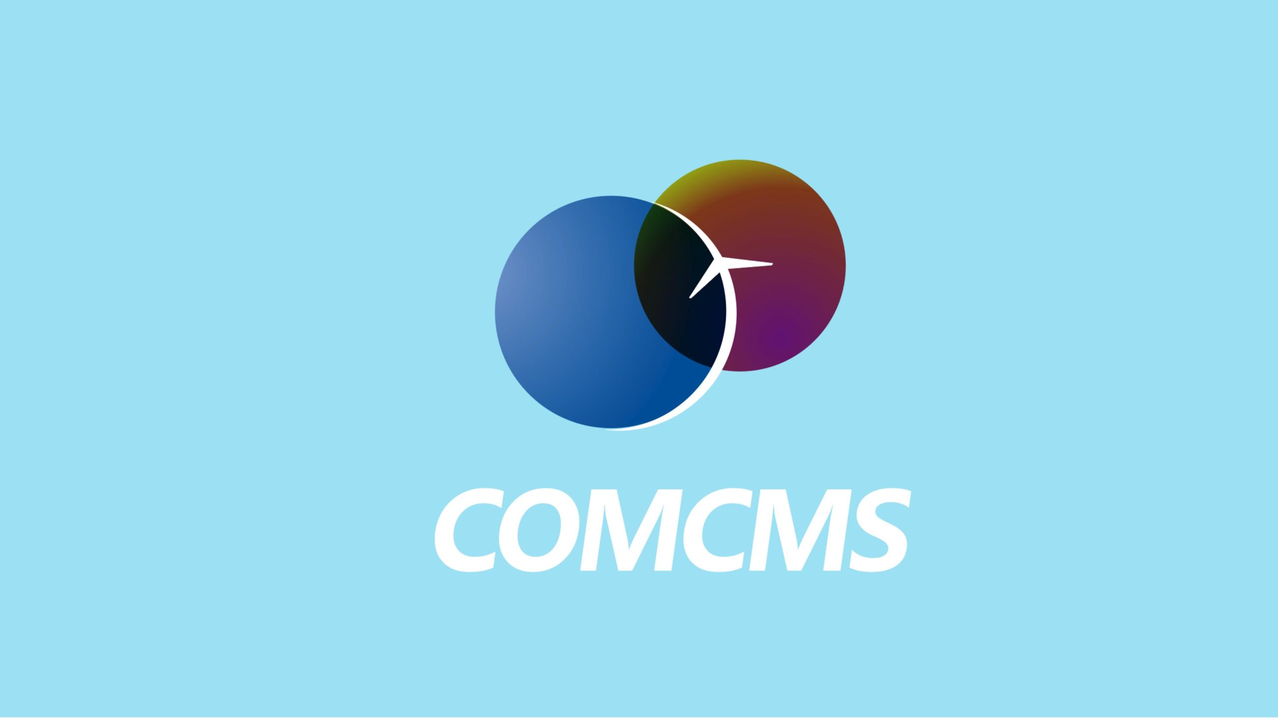
COMCMS is a company specializing in communication network management systems and information technology integration, providing full-stack communication solutions from software architecture to data visualization.
In the brand's visual system upgrade, the goal is to demonstrate the core spirit of 'connection, integration, and intelligent communication' through simple, modern graphic language, building an internationally-minded, technologically-savvy corporate identity.
design concept
The logo originates from the design concept of 'intersection and connection,' with two overlapping circles forming the core structure. The blue circle represents technology and communication systems, while the purple-tinged circle represents the extension of humanity and information value; the overlapping area symbolizes the intersection of data flow and intelligent collaboration. The curved arrow at the center signifies 'signal direction,' 'information transmission,' and 'continuous growth,' forming a dynamic order in technology brand visual language. Core concept: Make information flow more efficient, make connections more humane.
graphic language
Overlapping circles: Symbolize the two-way interaction between 'network and people,' 'technology and world' in communication systems; Gradient fusion: Color layering embodies data flow and integration; Arrow form: Dynamic lines extending from the overlapping area express directionality and futurism; Spatial layers: The overall composition balances stability with dynamic extension, forming an open and inclusive technological posture.
Fonts and composition
The brand name COMCMS employs a custom sans-serif typeface with stable structure, moderate weight, and slight stroke angles that echo the 'forward momentum and fluidity' in the logo. All-caps design reinforces the authority and international recognition of a system brand. Typography and graphics use compact composition, forming clear, efficient visual order.
color system
Technology blue #1C62A6: Symbolizes communication, stability, and rationality; Spectrum purple #673B91: Represents intelligence, innovation, and diverse information; Overlapping gradient #1C62A6 → #673B91 → #2C9B73: Simulates signal bands and spectrum fusion; Highlight white #FFFFFF: As the background of information carriers, highlights openness and transparency. The blue-purple gradient system conveys 'technological flow,' forming clear visual energy.
Application and extension
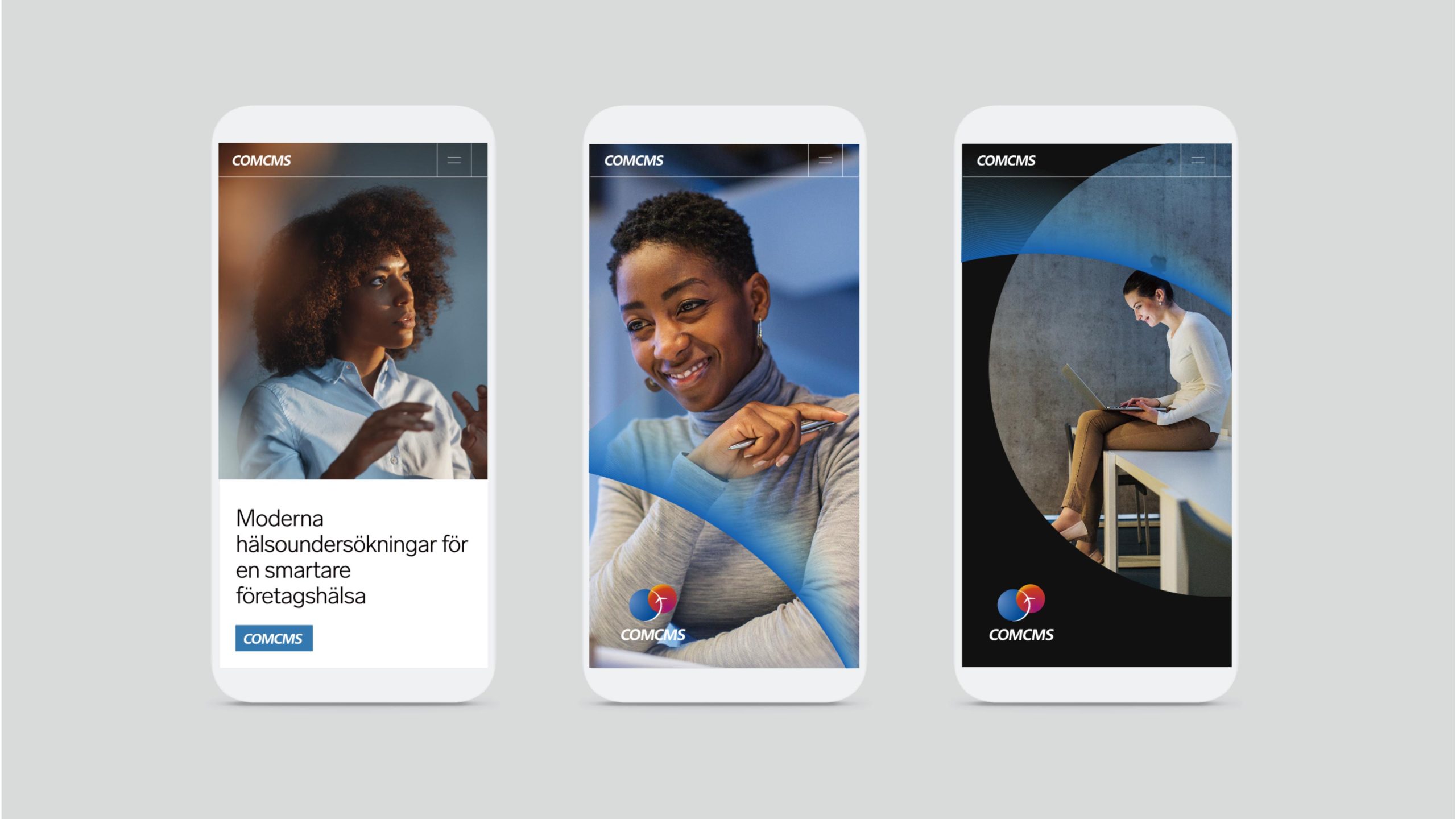
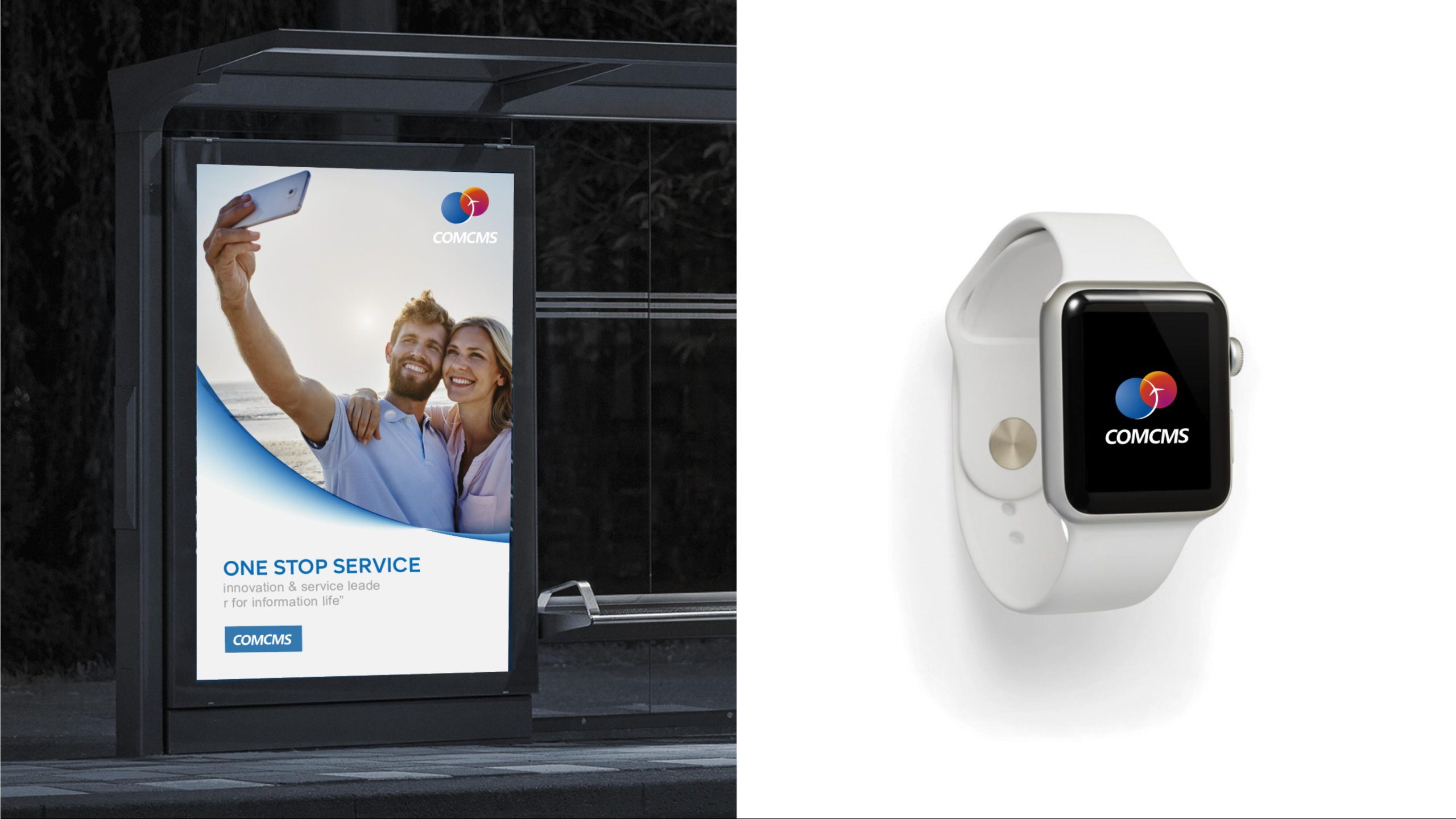
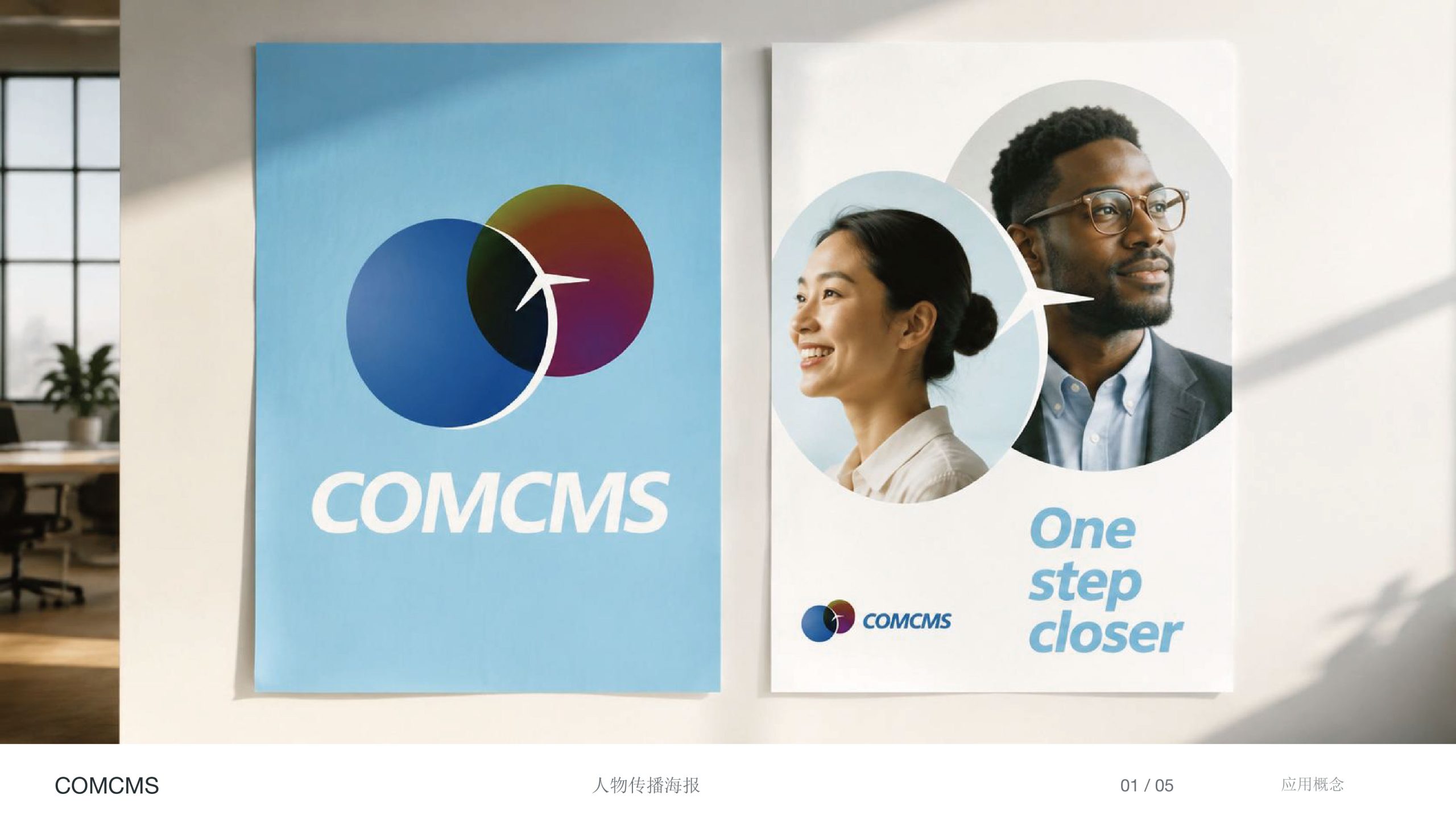
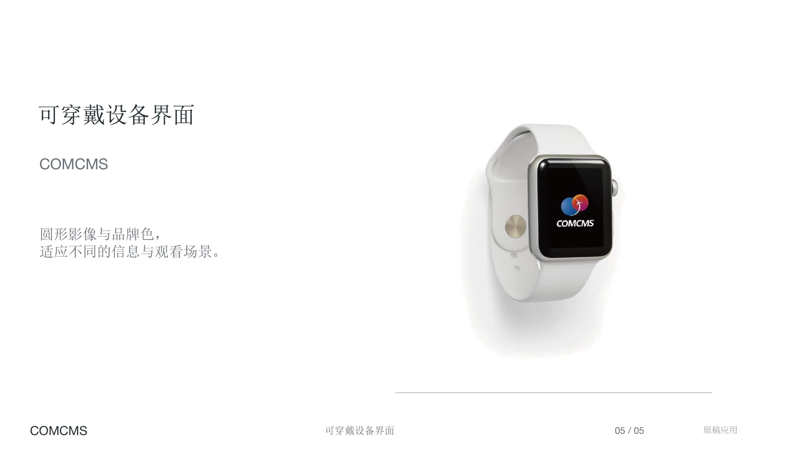
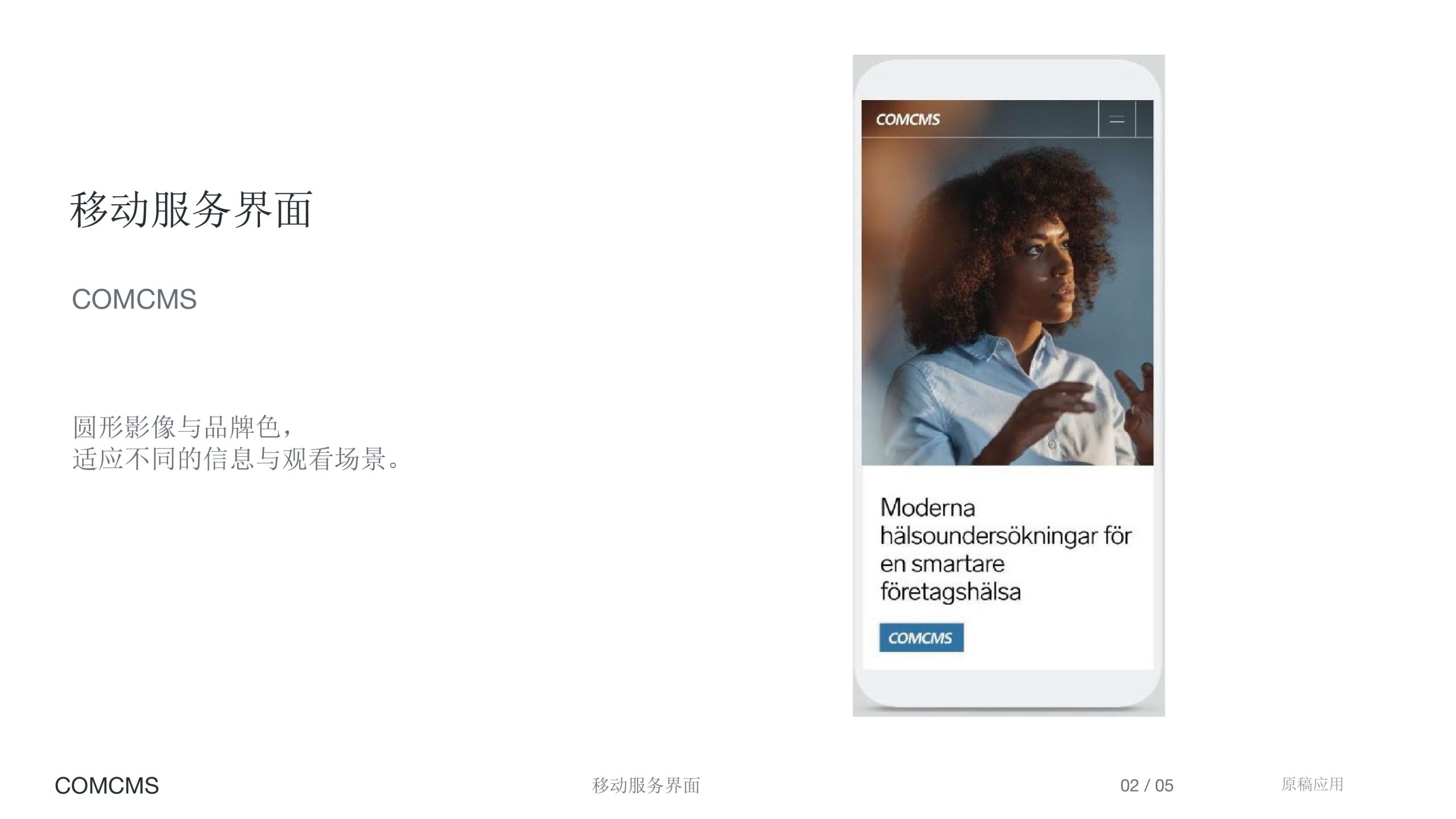
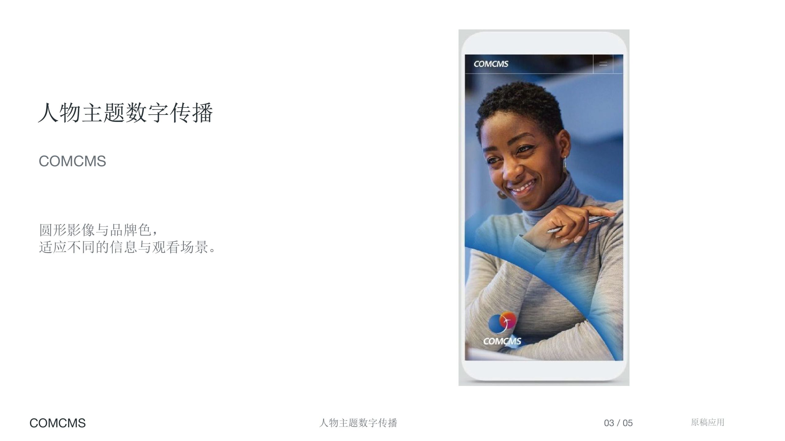
The logo possesses broad application adaptability within information technology systems: System level: Used for enterprise software login interfaces, backend management systems, and mobile icons; Communication level: Applied to exhibitions, PPT templates, technical white papers, and brand websites; Spatial level: Can reinforce recognition in office spaces, server rooms, and equipment labels. In the animated version, the circles can slowly rotate or merge, simulating data transmission processes to enhance technological feel.
brand meaning
The logo embodies three core spiritual dimensions of the communications industry: Connection — overlapping circles represent network interconnection and resource sharing; Collaboration — the overlapping area symbolizes data integration and system fusion; Momentum — the arrow form signifies continuous evolution and innovation in technology. It unifies the rational logic of communications with the fluidity of information into a simple geometric language, embodying the brand mission: 'Making the world more efficient through connection.'
Improper Usage (Protection Specification)
Do not adjust circle proportions and overlapping positions; Do not change gradient direction or replace primary colors; Do not add shadows, strokes, or three-dimensional treatments; Recommended minimum display width ≥ 30mm.
design results
Following the launch of the new COMCMS logo, a unified technology brand identity system was successfully established. The visual language of overlapping circles has formed high recognition across digital interfaces and display spaces, strengthening the brand's professional image in 'communication technology × system collaboration × information intelligence.' This design became a signature case for Qingmei Future in communication technology brand visualization, interpreting the brand philosophy of 'intelligent collaboration' through 'the form of connection.'