










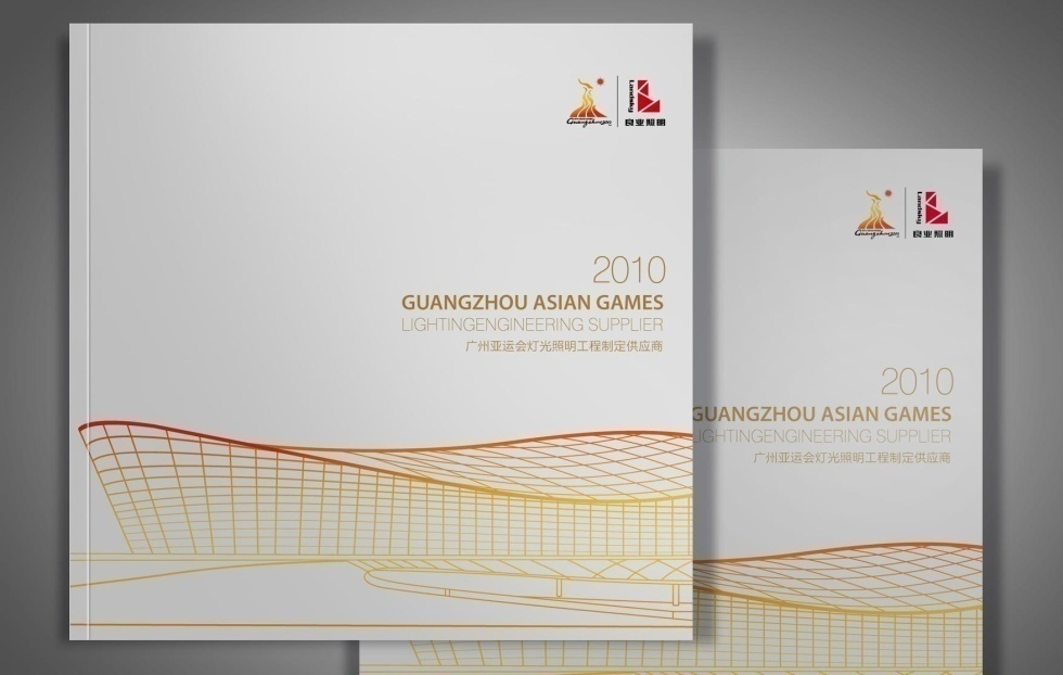
A corporate brochure and sustainability-themed visual system for Sinopec.
With “Green Energy · Sustainable Future” as its throughline, the design pairs a rational, ordered layout structure with a nature-inspired visual language to present Sinopec’s new image in energy transition, green technology and global cooperation.
The design balances “technological rationality × environmental warmth × an international voice,” with a green leaf motif running throughout the brochure as a symbol of life, cycles and renewable energy.
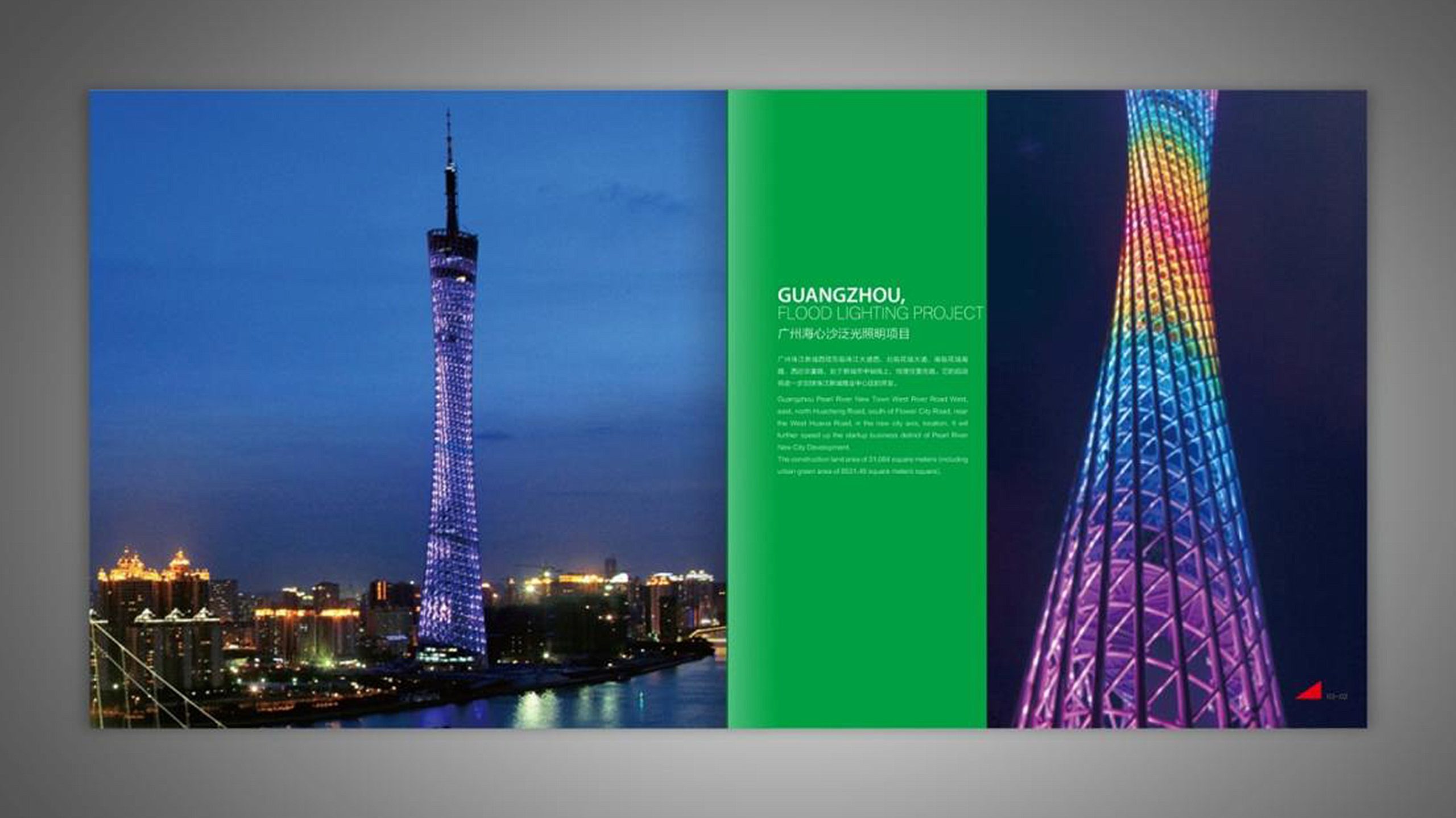
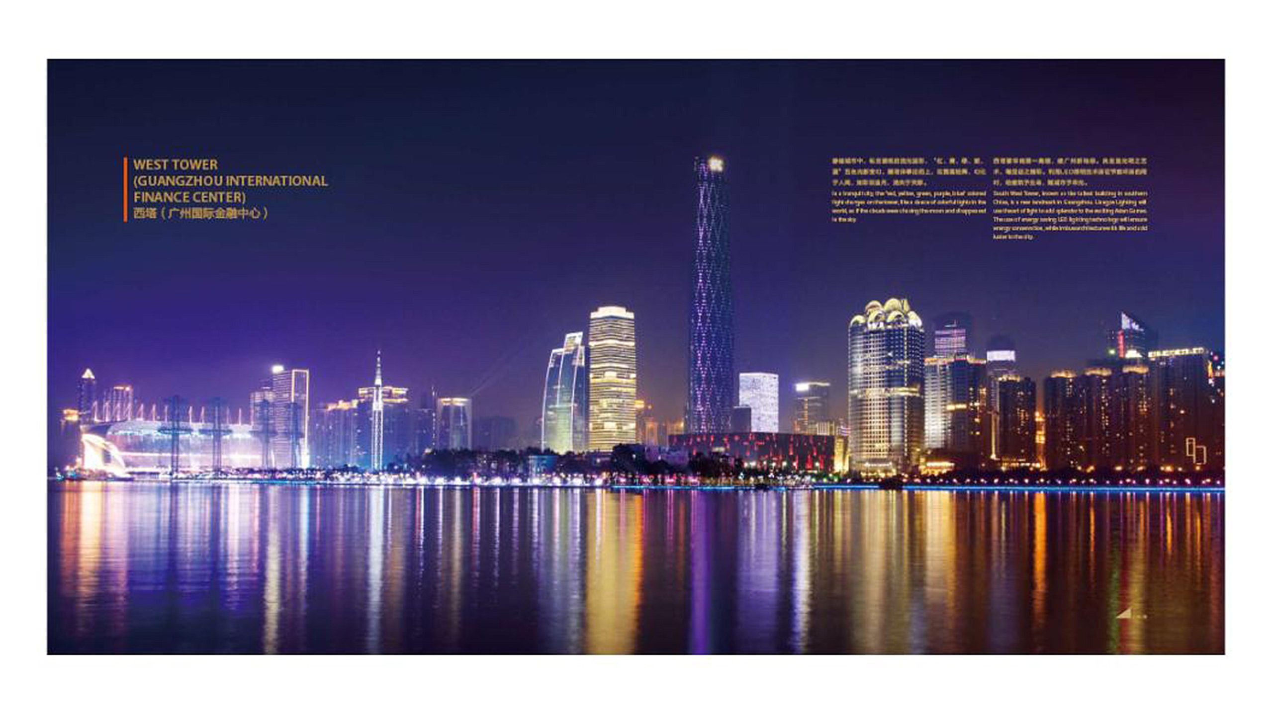
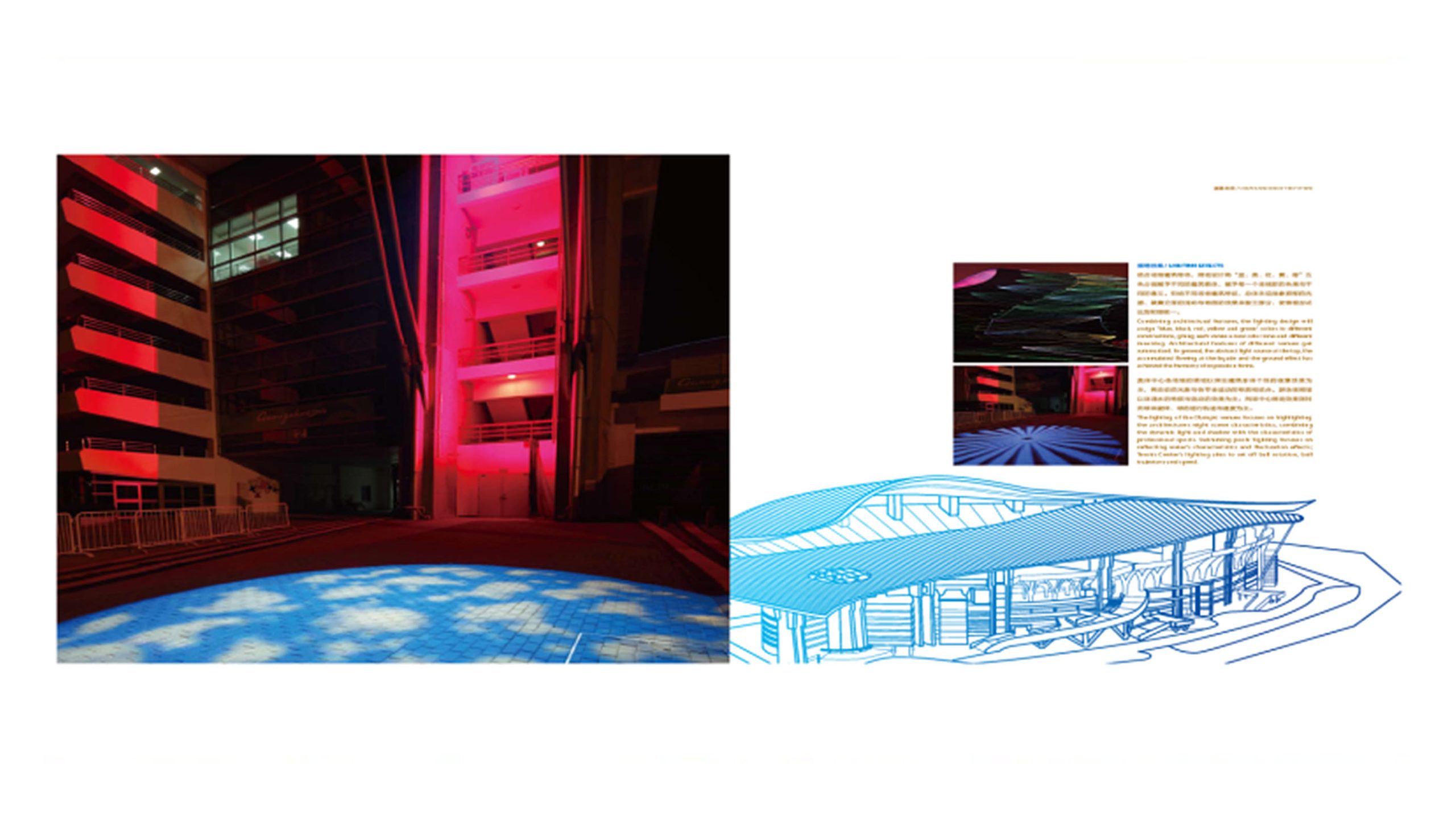
design challenge
As a traditional energy giant, Sinopec is in the midst of transitioning from fossil fuels to clean energy. The design needed to preserve the brand’s gravitas while signaling a forward-looking commitment to green technology and global sustainability.
The core challenges: how to make the idea of “green energy” tangible without reducing it to decoration; how to balance “energy technology” and “natural ecology” visually; and how to give the brochure strong recognition and credibility in international settings such as overseas exhibitions, partnership negotiations and report appendices.
Strategy and philosophy
The project is anchored in one design idea: “Green Power · Rational Order.” Visual concept: the green leaf is the master symbol, abstracted into geometric forms that suggest energy flow and the cycle of life. Structural logic: a modular information system presents corporate strategy, core businesses, green initiatives and social responsibility in a clear hierarchy. Color strategy: natural green is the core identity color, supported by Sinopec Red and silver-gray to balance brand recognition with green credibility. Graphic language: leaf veins extend into flowing curves that guide the eye across each layout. Typographic tone: restrained white space, grid discipline and an international type system give the reading experience the polish of financial-grade publishing. The core idea: make green the language of technology, and make rationality the warmth of the brand.
Design presentation
Cover: abstracted leaf veins form an energy-cycle graphic, paired with the red brand logo and a metallic silver texture to symbolize the fusion of technology and nature. Chapter structure: 1. Company Overview; 2. Energy Portfolio; 3. Technology & Innovation; 4. Green Action; 5. A Sustainable Future. Infographics: energy mix, carbon-emission targets and renewable investment trends are visualized with a unified palette and clear hierarchy. Visual details: green leaf elements recur on chapter openers and dividers, with curves linking modules into a continuous visual rhythm. Materials and finishing: matte laminated cover with spot UV highlighting the leaf veins; interior pages on heavyweight eco-friendly stock, embodying the sustainability message. The overall style is clean, pure and carries the quality of international publishing.
Achievements and Impact
The project helped Sinopec establish a new brand image in international communications and partnerships, one where “green energy and technological innovation go hand in hand.” By combining natural symbolism with a rational design system, the brochure achieved a visual shift from conventional energy promotion to a **“green-tech narrative.”** The system was subsequently extended to ESG reports, annual reports and international exhibition materials, becoming a core visual asset of Sinopec's sustainability communications.