










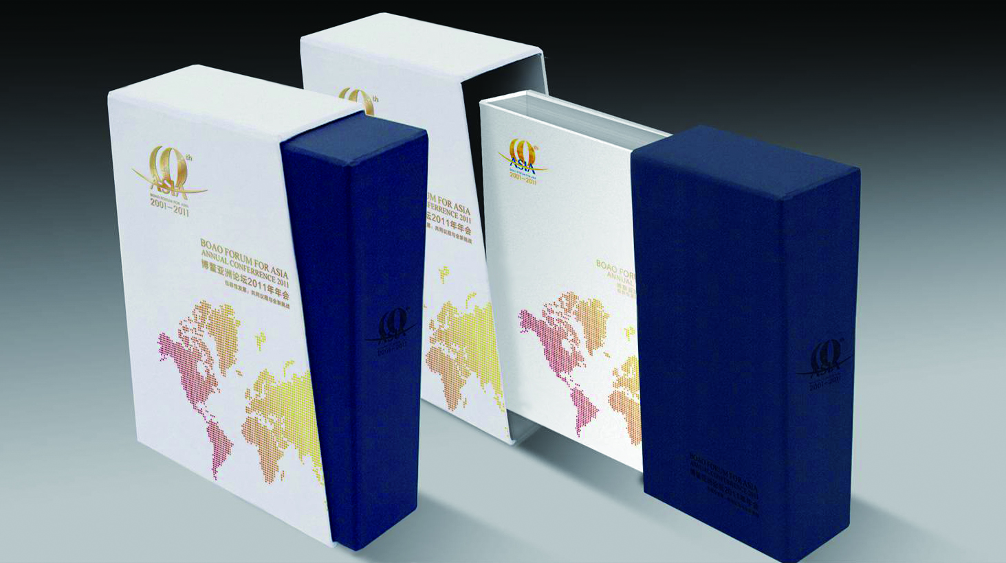
We created a national leasing brochure for Wanda Group's commercial complexes, using a systematic structure and an international visual language to showcase Wanda's nationwide footprint and integrated operational strength in commercial real estate.
Themed “The Power of Commerce · The Future of Cities,” the brochure combines structured data, visualized maps and brand storytelling to build a professional image and a foundation of trust in leasing communications.
The project was advanced in collaboration with the Anta Group business team in its early stages, with the designers ultimately completing the integration of the national leasing visual system.

design challenge
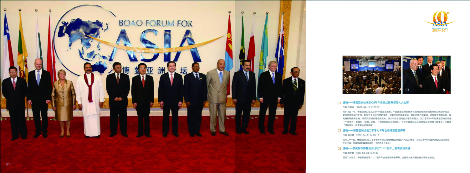
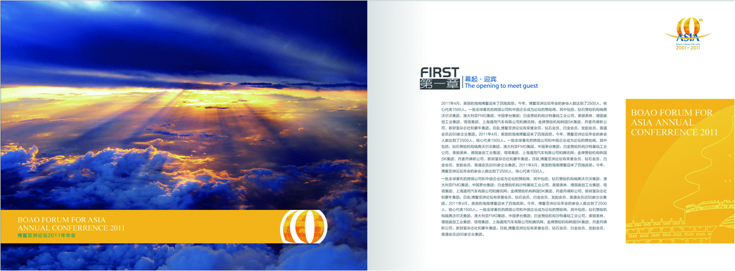
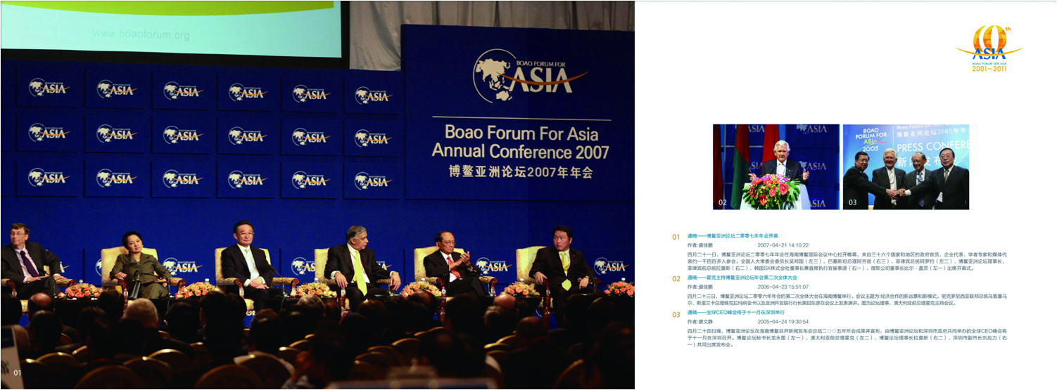
High volume, complex hierarchy: a large number of projects nationwide across diverse formats, requiring regional footprints and key metrics to be presented clearly within limited space. Strong commercial function: the audience of investors, brand tenants and commercial partners demands rigorous information logic, credible data and high visual quality. Unified brand standards: a consistent visual system was needed nationwide so regional teams could apply and communicate it easily. The challenge: turning data and spatial logic into a commercial narrative system with genuine brand warmth.
Strategy and philosophy
The design is built on the idea of “systematic commercial logic.” Structural logic: a four-tier information system moving from national landscape → regional footprint → project clusters → individual properties. Visual language: an international publishing-grade grid, combining diagrammatic maps with photographic spatial imagery to reinforce trust through both reason and emotion. Color system: Wanda Group blue as the primary color, complemented by gold linework and generous white space to express professionalism and premium business character. Chart system: flat commercial data visualization (format mix, footfall trends, brand composition, regional distribution) under unified visual standards. Brand narrative: through chapter hierarchy and visual rhythm, the ideas of scale, systemic strength and “builder of future cities” are translated into visual structure. Core idea: let commercial logic become the brand's visual order.
Design presentation
Cover design: a metallic blue ground with abstract architectural line drawings, symbolizing commercial networks and the fabric of the city; spot gold-foil logo and year reinforce authority. Chapter logic: 1. National Footprint (nationwide project map / strategic location map) 2. Regional Commerce (North / East / South / Southwest China) 3. Commercial Models (Mall / Plaza / Office / Hotel and other mixed-use models) 4. Brand Leasing (core brand matrix / signed brand mix) 5. Future Strategy (new city initiatives / digital operations / ESG model)
Visual structure: a 12-column grid with data and image spreads alternating; white space and dividing rules control the pacing. Materials and finishing: a metallic laminated cover with embossed architectural linework; heavyweight matte coated stock for the interior to ensure print quality. The overall style expresses “commercial scale × international business voice × brand systemic strength.”
Achievements and Impact
Following its launch, the brochure has been used at national leasing and partnership meetings, serving as the core showcase for Wanda's commercial portfolio. Its systematic visual structure, rational leasing logic and high-quality print production have strengthened Wanda's professional image and brand trust in commercial real estate. The project ultimately produced an extensible leasing brochure template system, adopted by regional teams for new project leasing and international exchange.